graph LR
    classDef unobserved fill:#fff,stroke:#333,stroke-dasharray: 5 5;
    classDef observed fill:#f5f5f5,stroke:#666;

    D["Treatment, D"] --> Y["Outcome, Y"]
    gamma["Unit fixed effects, γᵢ"] --> Y
    gamma -.-> D
    lambda["Time fixed effects, λₜ"] --> Y
    U["Unobserved confounders, U"] -.-> Y
    U -.-> D

    class U unobserved
    class D,Y,gamma,lambda observed

    linkStyle 0 stroke:#00BCD4,stroke-width:2px;
9 Two-way fixed effects: The old difference-in-differences
Keywords
A/B Testing, Causal Inference, Causal Time Series Analysis, Data Science, Difference-in-Differences, Directed Acyclic Graphs, Econometrics, Impact Evaluation, Instrumental Variables, Heterogeneous Treatment Effects, Potential Outcomes, Power Analysis, Sample Size Calculation, Python and R Programming, Randomized Experiments, Regression Discontinuity, Treatment Effects
9.1 Why simple comparisons fail — and how DiD fixes it
You might be asking about the chapter title: why “The old Difference-in-Differences”? The answer lies in a recent revolution in causal inference. In the last decade, a wave of research has exposed significant cracks in the traditional DiD approach, which was formally estimated through Two-Way Fixed Effects (TWFE). We now know this classic method can be fragile, especially when the treatment effect isn’t constant or when different units get treated at different times (a common scenario known as staggered adoption).
But for a long time, TWFE was the standard approach. For instance, it is the default method taught in textbooks like Angrist and Pischke (2008) and Angrist and Pischke (2015). The influence of this framework runs deep — Joshua Angrist, one of the authors of these books, received the 2021 Nobel Memorial Prize in Economic Sciences for his methodological contributions to the analysis of causal relationships.
So, with all these new developments, why do I start with the ‘old’ TWFE? First, because TWFE serves well to build intuition for how the time dimension enters the causal inference framework, which we haven’t covered so far. Second, because TWFE remains a valid way to estimate causal effects in simpler settings — specifically, when adoption happens simultaneously for all units and treatment effects are relatively homogeneous.2
To grasp the ingenuity of DiD, let’s consider a common business scenario. Imagine an e-commerce company wants to measure the impact of its paid membership program (e.g., Amazon Prime, Meli+, etc.) on customer spending. Your team wants to know if subscribing to the membership program actually causes customers to spend more money on the platform.
Approach 1: Before vs. After (within-group)
A naive approach would be to simply compare customers’ spending before and after joining the program. However, this simple “pre-post” comparison (also called first difference or within-group comparison) is fraught with potential pitfalls. What if there was a general upward trend in e-commerce spending during that period? Or what if a major holiday, like Black Friday, coincided with when many customers joined the program? These external factors — what data scientists call confounders — make it impossible to see if the membership program actually caused the change.
The figure above illustrates a scenario where the treatment has no effect on the outcome. If we only calculate the pre-post comparison, we may have the wrong impression that the subscription to the membership program increases the amount spent by subscribed users, while the increase actually comes from a natural positive trend in consumption (panel A of Figure 9.1). This is a classic example of confounding by time trends — we mistakenly attribute a general market trend to our specific intervention.
If however we had a comparable control group (panel B of Figure 9.1), we would notice how both the treated and control groups follow parallel trends (sometimes referred to as “PT”) before the treatment, and continue to follow parallel trends after the treatment. This is exactly what we would expect under the parallel trends assumption when the treatment has no causal effect.
Approach 2: Treated vs. Control (between-groups)
Another tempting, but equally flawed, approach would be to compare the spending of customers who joined the membership program with those who didn’t. This is a classic example of a cross-sectional comparison already introduced in Chapter 2. The problem here is one of self-selection.
The people who chose to join the membership program are likely different from those who didn’t in ways we can’t observe. They might be more frequent online shoppers, have higher disposable incomes, or simply be more deal-savvy consumers. These unobserved characteristics, and not the membership program itself, could be the real drivers of the difference in spending patterns.
The DiD solution: Comparing changes over time
This is where the ingenuity of DiD comes in. Instead of relying on these simple, and likely misleading, comparisons, DiD combines the before-and-after and the treated-and-control-group approaches. It does exactly what its name suggests: it calculates the difference in the differences.
We first look at the change in spending before and after the membership program for the group that was exposed to it (the “treated” group). Then, we do the same for a similar group that was not exposed to the program (the “control” group). Finally, we compare these two differences. The resulting “difference in differences” gives us a much more reliable estimate of the program’s causal effect.
By looking at the change within each group (the ‘before vs. after’ differences), we automatically control for characteristics that stay the same over time (e.g., customer’s registration date, which is ‘time-invariant’), effectively removing them from the equation. The difference within the control group specifically captures the general trends or external shocks that would have affected both groups had the treatment not occurred.
Then, by subtracting this ‘before vs. after’ difference of the control group from the ‘before vs. after’ difference of the treated group, we can isolate the effect of the treatment, assuming that the two groups would have followed similar trends in the absence of the treatment. This is the famous “parallel trends” assumption, which we will discuss later.
Figure 9.2 shows a scenario where the treatment does have a causal effect. Notice how both groups follow parallel trends before the treatment, but after the treatment, the treated group’s trajectory diverges from the control group’s trajectory. This divergence represents the causal effect of the treatment, and it’s precisely what DiD is designed to capture.
See that even when the treatment truly works, Panel A’s first difference approach still misleads us. The observed growth in the treated group reflects both the underlying trend and the causal effect of the intervention, and we can’t tell how much comes from each. Without a comparison group, we’d overestimate the treatment’s impact by attributing the entire increase to the intervention.
Panel B solves this by leveraging the control group trajectory as a benchmark. We can see that the control group also grew over time, but at a slower rate. Whatever growth the control group experienced represents the “natural” trend that would have occurred anyway. The additional growth in the treated group — the gap between Diff 2 and Diff 1 — is what we can credibly attribute to the treatment itself.
The time subscript enters the scene: Now we start working with data that has both individual units, denoted by subscript \(i\), and time periods, denoted by subscript \(t\). You are already familiar with \(i\) (e.g., in \(y_i\)), so we now add \(t\) to track changes over time: \(y_{i,t}\) represents the outcome for individual \(i\) at period \(t\).
How potential outcomes help us understand DiD
Recall the purely hypothetical exercise from Chapter 2, in which we had a table with potential outcomes for João and Maria and calculated the true effect of showing the “Super Promo Banner” — a marketing strategy of a food delivery app aimed at boosting orders by displaying special discounts to low-activity users. Here is a modified version of the same exercise, in Table 9.1.
| João (Low Orders) | Maria (High Orders) | |
|---|---|---|
| Did this person see the banner? (\(D_i\)) | Yes (\(D_{João}=1\)) | No (\(D_{Maria}=0\)) |
| Orders this month (observed) (\(Y_i\)) | 3 (\(Y_{João}\)) | 8 (\(Y_{Maria}\)) |
| Orders if NOT shown banner (\(Y_{i0}\)) | 2 (\(Y_{João,0}\)) | 8 (\(Y_{Maria,0}\)) |
| Orders if shown banner (\(Y_{i1}\)) | 3 (\(Y_{João,1}\)) | 8 (\(Y_{Maria,1}\)) |
In this hypothetical world, where we could see potential outcomes, the true effect of showing the banner would be:
- Effect for João = \(Y_{João,1} - Y_{João,0}\) = 3 (with banner) - 2 (without banner) = 1
- Effect for Maria = \(Y_{Maria,1} - Y_{Maria,0}\) = 8 (with banner) - 8 (without banner) = 0
But, in real life, we can never observe both potential outcomes for the same person. We don’t get to see what João’s orders would have been without the banner (\(Y_{João,0}\)), or what Maria’s orders would have been with the banner (\(Y_{Maria,1}\)). All we see is each user’s actual, observed outcome.
This leads many analysts to make the mistake of comparing the observed results for João and Maria and calling it the “effect” of the banner. For instance, \(Y_{João} - Y_{Maria} = 3 - 8 = -5\). And the analyst might jump to the conclusion that “wow, the banner actually makes things worse!”
So far, I’ve recapped the cross-sectional example from Chapter 2: we observed João and Maria at a single point in time, saw their outcomes, and faced the fundamental problem of causal inference — we can’t observe both potential outcomes for the same person.
Now, let’s add the ingredient that makes DiD possible: time. Given that we can’t observe their potential outcomes, what if we had observed João and Maria before the banner was shown? This historical information would give us a baseline for each user, allowing us to compare changes rather than levels.
Let’s adapt the example to see how this would work had we followed João and Maria for two periods, before and after the banner was shown. In Table 9.2, I’ll adjust the numbers slightly, increasing orders for both users in the second period to reflect a general upward trend.
| João (treated in t=2) | Maria (never treated) | |
|---|---|---|
| Orders on month \(t = 1\) | 2 (\(Y_{João,t=1}\)) | 8 (\(Y_{Maria,t=1}\)) |
| Orders on month \(t = 2\) | 4 (\(Y_{João,t=2}\)) | 9 (\(Y_{Maria,t=2}\)) |
| Treatment \(D_{i,t=2}\) | Yes (\(D_{João,t=2} = 1\)) | No (\(D_{Maria,t=2} = 0\)) |
In DiD, we use what happened before the treatment to approximate what would have happened without it (i.e., to create counterfactuals). Here’s how this works:
For João (treated): Before the banner was shown, João placed 2 orders (\(Y_{João,t=1} = 2\)). After seeing the banner, he placed 4 orders (\(Y_{João,t=2} = 4\)).
For Maria (control): In month 1, Maria placed 8 orders (\(Y_{Maria,t=1} = 8\)). In month 2, she placed 9 orders (\(Y_{Maria,t=2} = 9\)). She never saw the banner.
The first difference for João, \(\Delta Y_{João} = Y_{João,t=2} - Y_{João,t=1} = 4 - 2 = 2\) , represents the change in João’s orders from month 1 to month 2. However, this change includes both the effect of the banner (treatment effect) and any general time trends or external factors affecting both groups.3
The first difference for Maria, \(\Delta Y_{Maria} = Y_{Maria,t=2} - Y_{Maria,t=1} = 9 - 8 = 1\), represents the change in Maria’s orders from month 1 to month 2. Since Maria never received the banner, this change captures only the general time trends or external factors that would have affected João in the absence of treatment.
The DiD estimator is computed as \(\text{DiD} = \textcolor{#1d66db}{\Delta Y_{João}} - \textcolor{#bd1c1c}{\Delta Y_{Maria}} = \textcolor{#1d66db}{2} - \textcolor{#bd1c1c}{1} = 1\). If the assumptions we discuss later hold, this \(\text{DiD} = 1\) means the banner caused João to place 1 additional order compared to what he would have placed without it.4
Figure 9.3 visually illustrates the logic behind the DiD estimator. In Panel A, we observe the evolution of orders over time for both individuals: Maria (in red), who was never shown the banner, and João (in blue), who received the treatment in period \(t = 2\). Both exhibit a similar upward change from \(t = 1\) to \(t = 2\).
In Panel B, the DiD logic unfolds. João’s post-treatment outcome is 4 orders. If he had followed Maria’s trend (his counterfactual), we would expect his orders to rise by the same 1 unit Maria gained, putting him at 3 orders without the banner. The DiD estimate is João’s change (4 − 2 = 2) minus Maria’s change (9 − 8 = 1), yielding a treatment effect of 1.
This visual aid clarifies the core insight: DiD compares changes, not levels. The parallel trends assumption is fundamental — we must believe that without treatment, João’s trajectory would have mirrored Maria’s. If that assumption fails (say, João was already on a different trajectory), the estimate may capture those unrelated trends rather than the true effect. Parallel trends is what lets us interpret DiD as causal.
Next, I dig deeper into parallel trends: what the assumption really requires, how to check it, and what options you have when it appears to fail.
9.2 The parallel trends hypothesis
While DiD offers a compelling framework for causal inference, its validity hinges on a central assumption: the parallel trends hypothesis. This hypothesis states that, in the absence of the treatment, the outcomes of the treated and control groups would have evolved in a similar way. Notice we are not saying that the outcomes of the treated and control groups “would be the same” or “would have the same levels”, but that they would have evolved in a similar way or change at a similar rate.
The trick of the trade is to understand that the parallel trends hypothesis is not directly testable, because we can never observe the counterfactual: what would have happened to the treated group if they hadn’t received the treatment. However, we can look for evidence that supports or refutes this assumption by examining pre-treatment trends.
If the trends of the treated and control groups were parallel before the intervention, it lends credibility to the assumption that they would have continued to be parallel after the intervention in the absence of treatment. Conversely, if we observe diverging trends in the pre-treatment period, it’s a strong indication that the parallel trends assumption is violated, and the DiD estimate will likely be biased.
This becomes particularly challenging when dealing with only two time periods (before and after), as in the previous sections. With more time periods, we can visually inspect the pre-treatment trends and conduct statistical tests to assess their parallelism.
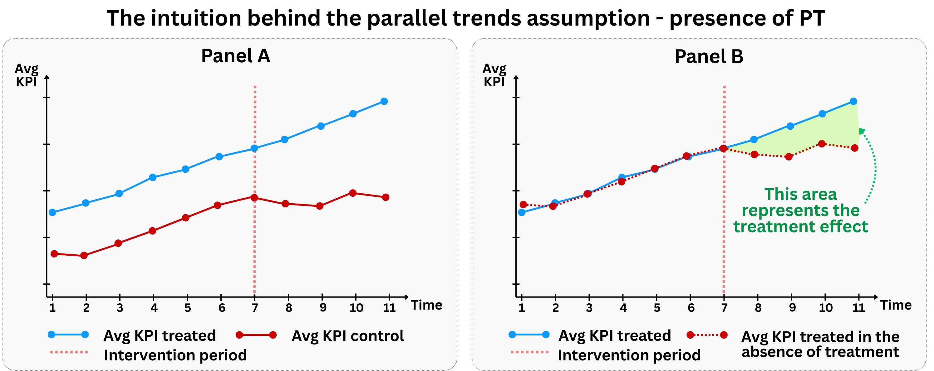
Figure 9.4 illustrates the graphical intuition behind the parallel trends assumption. In the pre-treatment period, both the treated group (blue line) and control group (red line) follow similar upward trends. This parallel movement in the pre-treatment period provides evidence that the parallel trends assumption likely holds, and gives us confidence that they would have continued to be parallel in the post-treatment period had the treatment not occurred.
This allows us to use the control group’s post-treatment trajectory as a reasonable counterfactual for what the treated group’s trajectory would have been without treatment. Without this assumption, we cannot isolate the causal effect of the treatment from other time-varying factors that might affect the groups differently.
A word of caution: finding parallel pre-treatment trends is consistent with the parallel trends assumption, but it does not prove it. The assumption is fundamentally about counterfactuals — what would have happened to the treated group in the absence of treatment. Pre-trends can look parallel even when post-treatment counterfactuals would diverge (for instance, if the treatment was anticipated or if the groups were converging toward different equilibria). Always combine visual inspection of pre-trends with domain knowledge about why the groups might or might not follow similar trajectories going forward.
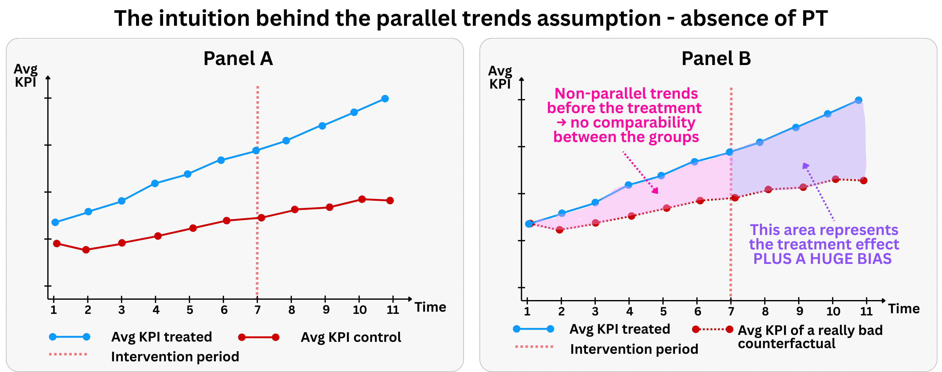
In contrast, Figure 9.5 shows a scenario where the parallel trends assumption is violated. Notice how the treated group (blue line) and control group (red line) follow different trajectories even in the pre-treatment period. This divergence in pre-treatment trends is a clear warning sign that the parallel trends assumption does not hold.
When parallel trends are violated, the DiD estimator becomes biased and unreliable. The fundamental problem is that we can no longer use the control group’s post-treatment trajectory as a valid counterfactual for the treated group. Since the groups were already evolving differently before the treatment, any difference in their post-treatment trajectories could be due to these pre-existing differences rather than the treatment effect itself.
9.2.1 What if parallel trends don’t hold?
So, what happens if the parallel trends assumption appears to be violated? Is all lost? Not necessarily. There are several strategies to address this challenge:
One option is to rely on “conditional parallel trends.” This means we accept that trends might differ, but we can explain those differences using data we have (covariates). In other words, parallel trends hold after adjusting for covariates \(X_i\) (often using regression adjustment, matching, or inverse probability weighting), restoring identification.
For instance, if the treated group was already on a faster growth trajectory due to demographic shifts, controlling for demographics could help. However, it’s important to be cautious: covariates that are themselves affected by the treatment should not be included.5
Moreover, the field of econometrics has been developing for a long time more sophisticated DiD estimators to address violations of the parallel trends assumption:
Propensity Score Matching (PSM) with DiD: Abadie (2005) proposed a semi-parametric DiD estimator based on propensity scores. The idea here is to use PSM to create a control group that is more comparable to the treated group on observable characteristics, thereby increasing the likelihood of satisfying the parallel trends assumption. This helps to balance the groups in the pre-treatment period.
Synthetic Difference-in-Differences: Arkhangelsky et al. (2021) introduced a method that combines the principles of synthetic control (where a synthetic control group is constructed as a weighted average of untreated units to mimic the treated unit’s pre-treatment trends) with DiD. This approach is particularly useful when a single treated unit is compared to multiple control units, and it aims to create a counterfactual that closely follows the treated unit’s pre-treatment trajectory.
9.3 The Stable Unit Treatment Value Assumption (SUTVA)
Another key rule for DiD is that one person’s treatment shouldn’t affect another person’s outcome. This is formally known as the Stable Unit Treatment Value Assumption (SUTVA). The logic is the same as we discussed in Section 4.1.1.2 and Chapter 6:
No Interference: The potential outcomes of one unit should not be affected by the treatment status of other units. In other words, there should be no “spillover” or “cannibalization” effects between the treated and control groups. For example, if a marketing campaign to promote some products in a marketplace (treatment group) leads to a significant increase in the demand for these products, it might depress the demand for substitute products in that same marketplace (the control group). This would violate the no-interference assumption, as the outcome of the control group is being affected by the treatment.
SUTVA violations from geographic and network spillovers are particularly common in practice. When treatment is assigned by region, customers near the border may cross over to shop in treated areas, or treated customers may reduce their activity in control regions. Either way, the control group’s outcomes become entangled with the treatment. The same logic applies to digital businesses: a ride-hailing platform testing surge pricing in one city might see drivers relocate to neighboring cities; an e-commerce platform promoting sellers in one region might shift customer shopping patterns across borders; in social networks, treating one user with a new feature can influence their friends’ behavior even if those friends are in the control group.
When you suspect geographic or network spillovers, consider using buffer zones (excluding units close to treated units from the control group) or explicitly modeling the spillover mechanism.
No Hidden Variations in Treatment: The treatment should be the same for all treated units. If there are different versions or intensities of the treatment, and these variations are not accounted for, the DiD estimate will be an average of the effects of these different treatments, which might not be what we are interested in.
Violations of SUTVA can be just as problematic as violations of the parallel trends assumption. To illustrate the “no hidden variations” condition, imagine a paid membership program that offers different benefit tiers: some customers get free shipping only, others get free shipping plus exclusive discounts, and a third group also receives priority customer support. If we lump all these customers together as “treated,” our DiD estimate averages across very different treatment intensities. The estimated effect wouldn’t correspond to any specific version of the program — it would be a weighted blend of heterogeneous treatments, making it hard to draw actionable conclusions about what actually drove the results.
9.4 Important details before using DiD
The way we design a study should follow the question we’re trying to answer — and how the real world works. Instead of forcing a method onto the data, I try to understand how the treatment happens in practice and build the analysis around that. My fellow economists call it “design-based inference.”
Before diving into the code, ask yourself these questions — your answers will tell you whether this TWFE DiD is the right tool:
Why are the treated units receiving the treatment? Is there a possibility of selection bias? Even if pre-treatment trends are parallel, there might be unobserved factors that are correlated with both the treatment and the outcome. Later in this chapter, after we introduce event studies, we will see how a symptom of selection bias called Ashenfelter’s dip (Section 9.5.5) can be detected by examining pre-treatment trends.
Are there any other events happening at the same time as the treatment? This is the problem of “compound treatments.” If another event that affects the outcome occurs at the same time as the treatment, it will be impossible to disentangle the two effects without further information and variation in the treatments.
Is there anticipation of treatment? Outcomes in the pre-treatment period must not be affected by people learning about or preparing for the treatment. If users can foresee the change and adjust before the official start, the “pre” period is already contaminated.6
Are all units being treated at the same time? This classic DiD setup works better with a single treatment date. However, in many real-world scenarios, treatment is rolled out over time. This is known as a “staggered adoption” or “multiple time periods” setting. As we discuss in Chapter 10, this can introduce significant challenges and potential biases.
9.4.1 Adjusting for serial correlation
When working with data that tracks the same units over multiple time periods, we need to be aware of a common issue called serial correlation (also known as “autocorrelation” or “time correlation”). This happens when the “noise” or “unexplained variation” in our data is connected across time periods for the same unit.
Think of it this way: if you’re tracking a customer’s spending behavior over several months, their spending in January is likely related to their spending in February, March, and so on. This makes sense. People tend to have consistent spending patterns, habits, and financial situations that persist over time.
Why does this matter? Serial correlation doesn’t mess up our main estimate of the treatment effect, the “point estimate”. But it does affect how confident we can be in our results. Specifically, it makes the standard errors of our regression artificially small (Bertrand, Duflo, and Mullainathan 2004). Since standard errors are our measure of uncertainty about the point estimate, this can lead us to think we found a significant effect when we actually didn’t. In other words, it inflates our risk of a “false positive”.
The mathematical intuition: Classical regression assumes that errors (the unexplained part of our data) are independent across time and across individuals. In mathematical terms:
Time independence: What I do today shouldn’t predict the “random” part of what I do tomorrow. (Mathematical version: \(Cov(\varepsilon_t, \varepsilon_s) = 0\), for \(t \neq s\)). In other words, for a given unit, the unexplained variation in one time period should be unrelated to the unexplained variation in other time periods
Cross-person independence: What I do shouldn’t predict the “random” part of what others do. (Mathematical version: \(Cov(\varepsilon_i, \varepsilon_j) = 0\), for \(i \neq j\)). In other words, for a given time period, the unexplained variation for one unit should be unrelated to the unexplained variation for other units
But in real life, these assumptions often don’t hold:
Example 1 - time correlation: My LinkedIn posting behavior this month is correlated with my posting behavior last month. If I posted a lot in January, I’m likely to post a lot in February too. This means \(Cov(\varepsilon_t,\varepsilon_{t-1}) \neq 0\). Translation: “My unexplained posting behavior this month is related to my unexplained posting behavior last month”.
Example 2 - cross-person correlation: My TV watching hours this week are correlated with my spouse’s TV watching hours, since we live together and often watch shows together. This means \(Cov(\varepsilon_i,\varepsilon_j) \neq 0\). Translation: “My unexplained TV watching is related to my spouse’s unexplained TV watching”.
Example: after observing the sales of 100 stores across 10 months, you don’t have 1,000 independent observations. You have 100 independent store sales histories. So your effective sample size for hypothesis testing is closer to 100 than to 1,000, right? What clustering says is: “For measuring uncertainty, your \(N\) is the number of clusters, not the number of observations.”
The solution: clustered standard errors
To fix this, we “cluster” our standard errors. This tells the model to treat each unit’s history as a connected bundle rather than independent points, correcting our uncertainty estimates. Tools like R’s fixest and Python’s linearmodels handle this automatically, as we will see in the code below.
One caveat: this method assumes we have many clusters — typically at least 30 to 50 (Cameron and Miller 2015). When working with fewer clusters, like comparing just a handful of regions, standard clustered errors can be deceptively small, leading to false positives. In those cases, we should use specialized alternatives not covered in this book, such as the wild cluster bootstrap (MacKinnon and Webb 2018), aggregation to the cluster level (Ibragimov and Müller 2016), or randomization inference (MacKinnon and Webb 2020).
9.5 The structure of DiD models: from aggregated to event studies
With the conceptual foundation in place, we now translate intuition into estimable models.
To understand the difference between the models we are about to build, think of aggregated DiD like taking a photo and event studies like recording a video. The aggregated model takes a “snapshot” that shows us the overall impact of our intervention, averaging out all the effects after the treatment happened. It’s useful for high-level summaries, like saying “on average, our new feature increased user engagement by 10%.”
But sometimes we need the full video. Event studies show us how the effects play out over time. They tell us whether the impact was immediate or gradual, if it grew stronger or weaker, or if it eventually wore off. We will begin with the aggregated model to establish the basics, then expand to event studies to capture these dynamic effects.
9.5.1 The aggregated DiD: a single estimate of the overall impact
Building on the conceptual foundation, let’s now get into the nuts and bolts: how do we actually run these models? We can implement DiD as a simple aggregated model for basic before-and-after comparisons, or expand it into more sophisticated event studies that track treatment effects over multiple time periods.
The aggregated DiD model is the standard tool for estimating a single, overall effect. It captures the core DiD logic in the simplest possible way.
The formal specification of the aggregated DiD model is:
\[Y_{it} = \gamma_i + \lambda_t + {\color{#b93939ff}\delta} D_{it} + X^{'}_{it} \beta + \varepsilon_{it} \tag{9.1}\]
- \(Y _{it}\) represents the outcome variable for unit \(i\) in period \(t\);
- \(D_{it}\) is the treatment indicator that equals 1 for treated units in post-treatment periods, and 0 otherwise;
- \(\delta\), the treatment effect: our parameter of interest, the average treatment effect of \(D_{it}\) on \(Y_{it}\).
- \(\gamma_i\) captures unit-specific fixed effects - individual-level characteristics that don’t change over time;
- \(\lambda_t\) captures time-specific fixed effects - period-specific shocks that affect all units equally;
- \(X^{'}_{it}\) is a vector of covariates for unit \(i\) in period \(t\);
- \(\beta\) is a vector of coefficients for the covariates;
- \(\varepsilon_{it}\) is the error term, with \(E[\varepsilon_{it}] = 0\)
That’s a lot of notation, so let’s break it down:
Covariates in DiD models can improve the precision of the estimates and, more importantly, help address potential violations of the parallel trends assumption if they are time-varying and affect the outcome. However, care must be taken when including covariates, especially time-invariant ones. I leave this discussion for the Appendix 9.A
Fixed effects
Fixed effects are the building blocks of TWFE DiD, with two key components working together to isolate the treatment effect. Individual Fixed Effects (\(\gamma_i\)) capture time-invariant characteristics of each unit across time periods, controlling for both observed and unobserved factors that don’t change over time. Meanwhile, Time Fixed Effects (\(\lambda_t\)) account for period-specific shocks that affect all units equally, such as holidays or technical issues that would impact both treatment and control groups.
These two types of fixed effects complement each other elegantly — individual effects control for “who you are” while time effects control for “when you are” — leaving only the variation needed to identify the treatment effect. We discuss these concepts in more detail in Appendix 9.A.
The causal structure of DiD
Let’s visualize these ideas with a causal graph. Figure 9.6 shows why naive comparisons fail and how DiD solves the problem.
The diagram reveals the confounding problem. Unit fixed effects (\(\gamma_i\)) capture stable characteristics that differ across units — for example, some stores are simply busier than others due to location or local demographics. These factors influence both whether a store ends up in the treatment or control group and its sales levels. A naive cross-sectional comparison (treated vs. control at one point in time) would conflate the treatment effect with these baseline differences.
Time fixed effects (\(\lambda_t\)) represent shocks that affect everyone equally — seasonal patterns, macroeconomic conditions, or platform-wide promotions. A naive pre-post comparison (before vs. after for the treated group alone) would attribute these common trends to the treatment.
DiD solves both problems simultaneously. By comparing changes over time (differencing out \(\gamma_i\)) between groups (differencing out \(\lambda_t\)), we isolate the treatment effect \(\delta\). The cyan arrow in the diagram marks what remains after this double-differencing: the causal path from treatment to outcome. However, notice that this strategy relies on the assumption that unobserved confounders \(U\) are time-invariant. If there are unobserved factors that affect the treatment and the outcome that change over time differently for each group (i.e., time-varying confounders not captured by \(\lambda_t\)), DiD may fail to isolate the causal effect.
\(\delta\) as the treatment effect
To see why, let’s take the difference between treated and control units, before and after treatment, doing algebra based on Equation 9.1:
For treated units (\(D_{1,pre}=0\), \(D_{1,post}=1\)):7
- Pre-treatment: \(Y_{1,pre} = \gamma_1 + \lambda_{pre} + {\color{#b93939ff}\delta} \times\) \(0\)
- Post-treatment: \(Y_{1,post} = \gamma_1 + \lambda_{post} + {\color{#b93939ff}\delta} \times\) \(1\)
For control units (\(D_{0,pre}=0\), \(D_{0,post}=0\)):
- Pre-treatment: \(Y_{0,pre} = \gamma_0 + \lambda_{pre} + {\color{#b93939ff}\delta} \times\) \(0\)
- Post-treatment: \(Y_{0,post} = \gamma_0 + \lambda_{post} + {\color{#b93939ff}\delta} \times\) \(0\)
Taking the difference-in-differences:
- \((Y_{1,post} - Y_{1,pre}) - (Y_{0,post} - Y_{0,pre}) = {\color{#b93939ff}\delta}\)
The fixed effects and covariates cancel out, leaving only \(\delta\) as our treatment effect.
Notice what the algebra just did: we computed the change for the treated units and subtracted the change for the control units. The control group’s trajectory serves as the counterfactual for what the treated group would have experienced without the intervention — not for the entire population. This means \(\delta\) identifies the Average Treatment Effect on the Treated (ATT, see Section 2.5 for a refresher), not the ATE.
This is one of the most commonly misunderstood points in applied DiD work. Many analysts report the DiD coefficient as “the effect of the program” without specifying for whom. But the DiD estimate tells us how the intervention affected the units that actually received it — it does not tell us what would happen if we extended the treatment to new, untreated units. The ATT and the ATE are only the same when the treatment effect is perfectly homogeneous across treated and untreated units, which is rarely a defensible assumption in practice.
In our OOH example, \(\delta\) tells us how much the Paraíba stores benefited from the campaign — not what would happen if we also ran billboards in Pernambuco. Those could be different numbers. Pernambuco stores might respond differently to OOH advertising due to local market conditions, competition, or consumer demographics. The ATT is the right estimand here: we want to know whether the campaign worked where it was actually deployed.
9.5.2 The aggregated DiD: applying it to our OOH example
Tip💻 Want to run the code? Set up your environment: click here
Data: All data we’ll use are available in the repository. You can download it there or load it directly by passing the raw URL to read.csv() in R or pd.read_csv() in Python.8
Packages: To run the code yourself, you’ll need a few tools. The block below loads them for you. Quick tip: you only need to install these packages once, but you must load them every time you start a new session in R or Python.
# If you haven't already, run this once to install the package
# install.packages("fixest")

# You must run the lines below at the start of every new R session.
library(tidyverse) # Data manipulation
library(fixest) # High-performance fixed-effects regression
# If you haven't already, run this in your terminal to install the packages:
# pip install pandas numpy linearmodels statsmodels (or use "pip3")
# You must run the lines below at the start of every new Python session.
import pandas as pd # Data manipulation
import numpy as np # Mathematical computing
from linearmodels.panel import PanelOLS # Panel data models for DiDA supermarket chain wants to evaluate the impact of an Out-of-Home (OOH) marketing campaign launched in the Brazilian state of Paraíba (PB for short). The goal is to understand whether the campaign effectively increased sales in the treated stores (located in Paraíba) by comparing them to the untreated stores (located in Pernambuco, PE for short, a neighboring state).
I simulated a dataset to represent the scenario described above. Here’s how the code variables map to the formal notation from Equation 9.1:
store: Store ID — this is our unit \(i\), andstorefixed effects give us \(\gamma_i\)period: Observation period — this is \(t\), andperiodfixed effects give us \(\lambda_t\)sales: Sales in millions of R$ — this is our outcome \(Y_{it}\)treatment: Dummy indicating whether the store is in the treated state (Paraíba = 1)treated_period: Equals 1 for treated stores in post-campaign periods — this is \(D_{it}\)relative_period: Event time \(k\), i.e., the number of periods from the campaign start (\(t = 7\)). We will use this variable in the event study section below, as we re-index time relative to the intervention start date.
Let’s first look at the raw data. Figure 9.7 shows the average sales trajectories for stores in Paraíba (treatment group, in blue) and Pernambuco (control group, in red) over time. The vertical dashed line marks the start of the OOH campaign (period 7).
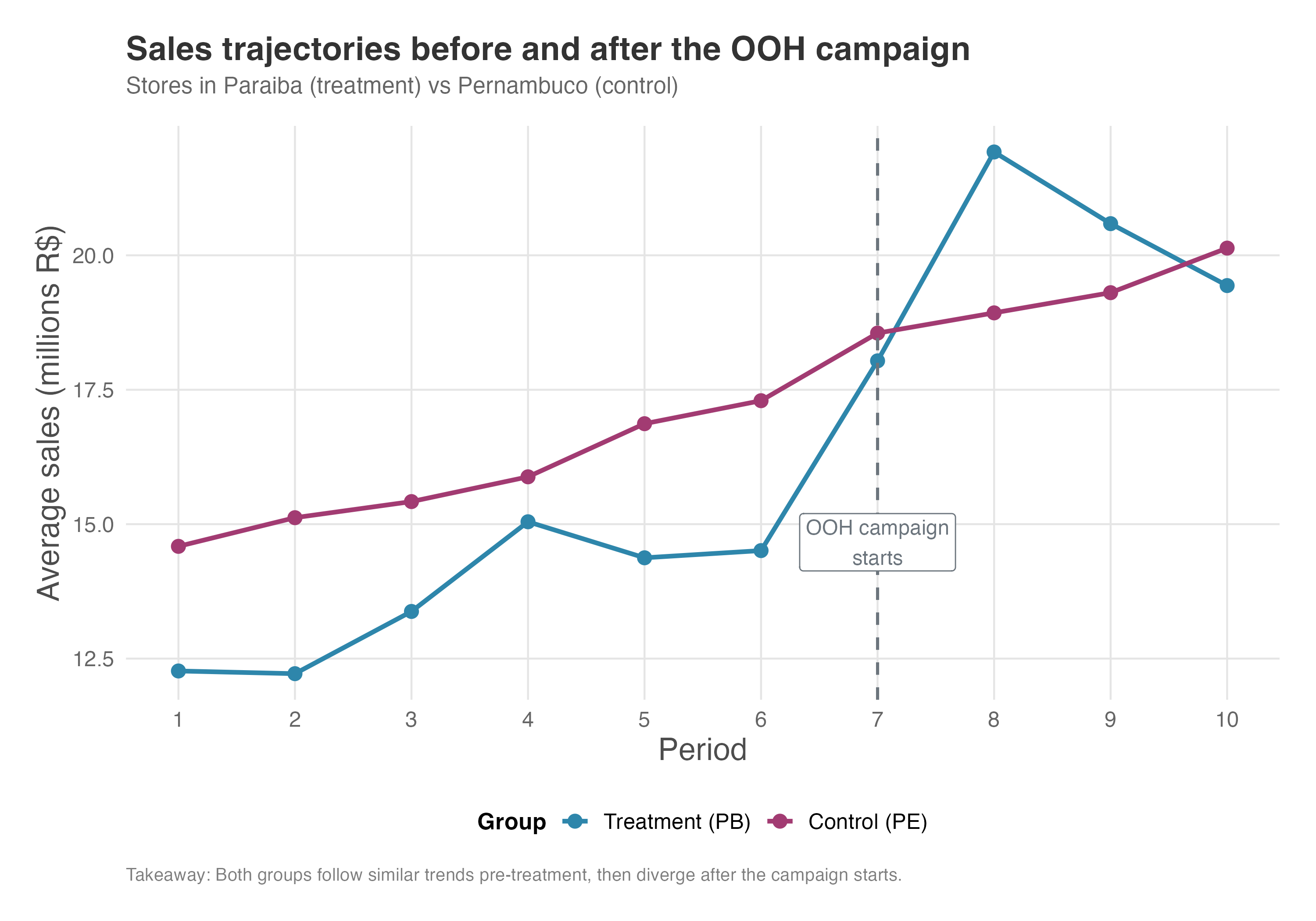
Notice that Paraíba stores start at a lower sales level than Pernambuco stores — this baseline gap doesn’t matter for DiD, because DiD compares changes over time, not levels, and the store fixed effects absorb these permanent differences. What matters is the trends: before the campaign, both states show relatively similar trends in sales, which is central to the parallel trends assumption. After the campaign begins, we can observe a noticeable increase in sales for stores in Paraíba compared to those in Pernambuco, suggesting a positive effect of the OOH campaign.
The code blocks below implement a regression model following equation Equation 9.1, where store indicates store fixed effects and period indicates period fixed effects. The terms that include cluster in their name indicate that we are accounting for serial correlation in the sales of each store, which is important for obtaining correct standard errors when there are multiple observations per store over time.
Take a look at the results in the tab:
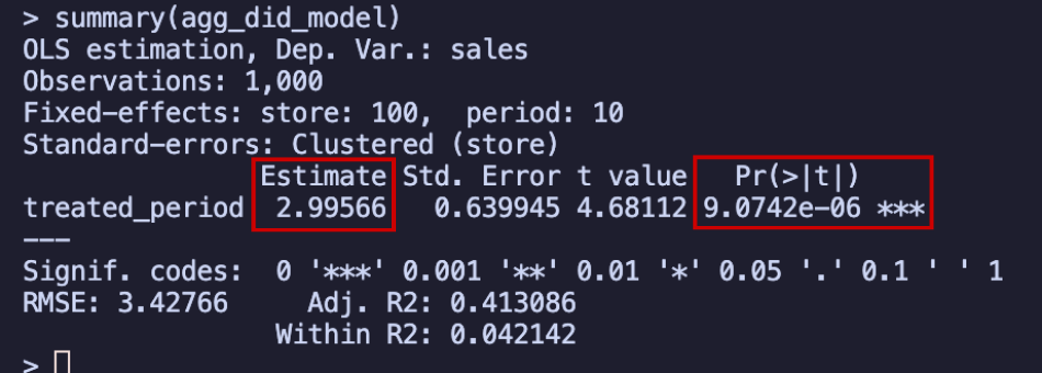
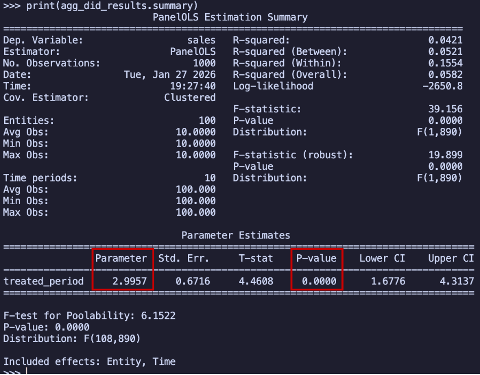
The stores in Paraíba experienced an average increase of R$2.99 million in monthly sales, and this increase is statistically significant (p-value less than 0.05). Here’s the key insight: since our outcome is measured in millions of Brazilian Reais per month, this estimated effect means that, on average, stores in Paraíba saw their monthly sales increase by R$2.99 million compared to stores in Pernambuco, which didn’t receive the intervention.
To put it another way: regardless of how much the Pernambuco stores were selling (which we can check in the data), the Paraíba stores sold R$2.99 million more per month on average. If all the assumptions discussed in previous sections are met, this represents the true causal effect of the intervention.
Note that this R$2.99 million is the average per-period effect, not the total cumulative impact of the campaign. If you want to know the total incremental revenue generated across all post-treatment months, you need to think more carefully about what this coefficient represents. We will return to this distinction in the section “What do the DiD coefficients actually measure?” (Section 9.5.6), after introducing the event study, where the answer becomes much clearer.
One thing worth flagging in this setting is the SUTVA concern we discussed earlier. Because treatment is assigned by state, geographic spillovers are a real threat. Customers from Pernambuco (the control state) might cross the border to shop at Paraíba stores after seeing the billboards, or Paraíba customers might reduce their shopping in Pernambuco.
Either pattern would contaminate the control group’s outcomes, biasing our estimate. When your treatment and control groups share a geographic border, it is worth considering buffer zones — for example, excluding stores near the state boundary — or at least checking whether control-group stores closest to the border behave differently from those farther away.
9.5.3 Event Study Designs: Looking beyond a single average effect
While the aggregated DiD model we just saw gives us one number - the average treatment effect - it doesn’t tell us the full story. Think of it like measuring the average temperature for an entire year: it’s useful, but it doesn’t tell you about the seasonal patterns or whether it was particularly cold in July or hot in December (I am in the southern hemisphere, so it’s the opposite of most books).
In that sense, the event study (also called dynamic DiD) design helps us see the complete picture by showing us:
- What happened before the treatment? - This helps us assess whether the parallel trends assumption is plausible, by checking whether the treated and control groups were following similar trends before the treatment.9
- How did the effect evolve over time? - Did it happen immediately, grow gradually, or fade away (such as in the novelty effects we discussed in the previous chapter)?
The notation for event studies
An optional but handy trick here is to think in terms of “event time” rather than calendar time. Instead of looking at the treated stores in period 9, we ask “what happened 2 periods before the treatment?”. Think of it like organizing your life around a major event, the treatment.
Here’s how it works: We define the treatment period as “event time zero” (\(k=0\)). Everything before that gets negative numbers:
- \(k=-1\): One period before treatment
- \(k=-2\): Two periods before treatment
- And so on…
And everything after the treatment gets positive numbers:
- \(k=1\): One period after treatment
- \(k=2\): Two periods after treatment
- And so on…
Because of perfect multicollinearity (i.e., if you include a dummy for every period, the columns add up to a constant and the model can’t be estimated) we discussed in Chapter 6, we need to choose one time period as our “reference point” when we run this analysis; everything else gets compared to this baseline. We typically choose \(k=-1\) (the period just before treatment) as our reference. Therefore, in plots the value you see for this period is not a finding, it’s a normalization choice.
This means:
- All other periods are compared to this baseline
- We can’t estimate an effect for \(k=-1\) because it’s our comparison point (it’s set to zero by definition)
What the results tell us: leads and lags
The mathematical specification for those interested:
\[Y_{it} = \gamma_i + \lambda_t + \sum_{k=-l}^{m} {\color{#b93939ff}\delta_k} D_{ki} + X^{'}_{it} \beta + \varepsilon_{it} \tag{9.2}\]
Most terms in the event study equation are the same as in Equation 9.1, so let’s focus on what’s new. The key difference is \(\sum_{k=-l}^{m} {\color{#b93939ff}\delta_k} D_{ki}\), where \(l\) is the number of pre-treatment periods and \(m\) is the number of post-treatment periods. These coefficients capture how the treatment effect varies across different time periods. Here’s what this notation means: instead of having just one treatment effect \(\delta\) like in our aggregated model, we now have a separate coefficient \(\delta_k\) for each time period relative to treatment.
Think of it as breaking apart our single treatment dummy into multiple pieces, one for each period before and after treatment begins. To make this more concrete, let’s say we have data from 6 periods before treatment through 4 post-treatment periods (from \(k=0\) to \(k=3\)), and we’re using \(k=-1\) as our reference.
\[Y_{it} = \gamma_i + \lambda_t + {\color{#b93939ff}\delta_{-6}} D_{-6,i} + \ldots + {\color{#b93939ff}\delta_{0}} D_{0,i} + \ldots + {\color{#b93939ff}\delta_{3}} D_{3,i} + X^{'}_{it} \beta + \varepsilon_{it} \tag{9.3}\]
The equation would expand to Equation 9.3. Each \(\delta_k\) tells us the treatment effect for that specific period, allowing us to see how the impact changes over time rather than just getting one average effect.10
\(\delta_k\) for pre-treatment period — the “leads”, \(k \lt 0\): These show us the difference between treated and control groups before anything happened. If our parallel trends assumption is correct, these should all be close to zero and not statistically significant. Think of these as our “quality check”: if we see big, significant differences before treatment, it means our groups weren’t following similar trends to begin with.
\(\delta_k\) for post-treatment periods — the “lags”, \(k \geq 0\): These show us how the treatment effect evolved over time:
- \(k=0\) tells us the immediate effect when treatment started
- \(k=1\), \(k=2\), etc. tell us if the effect grew, stayed the same, or faded over time
The beauty of event studies is that they create intuitive graphs. You can literally see whether the treated and control groups were following similar trends before treatment (parallel lines before \(k=0\)). And it also allows us to see whether there are any suspicious patterns just before treatment, like anticipation effects.
9.5.4 Event Study Designs: applying it to our OOH example
Let’s apply the event study approach to our OOH campaign. Remember, the campaign started in period 7, so periods 1-6 are our “pre-treatment” periods (\(k=-6\) to \(k=-1\)); and periods 7-10 are the treatment window (\(k=0\) to \(k=3\)). Since we’re using period 6 (\(k=-1\)) as our reference, we’ll estimate effects for all other periods relative to that baseline.
Let’s see this exercise as translating the differences between the two groups in the raw data of Figure 9.7 into a result that tells us how much the treatment affected the outcome in each period, which we can estimate by running the regression model Equation 9.2 and then plot the results. Let’s do it in R and Python as shown in the tabs below, and also the regression output.
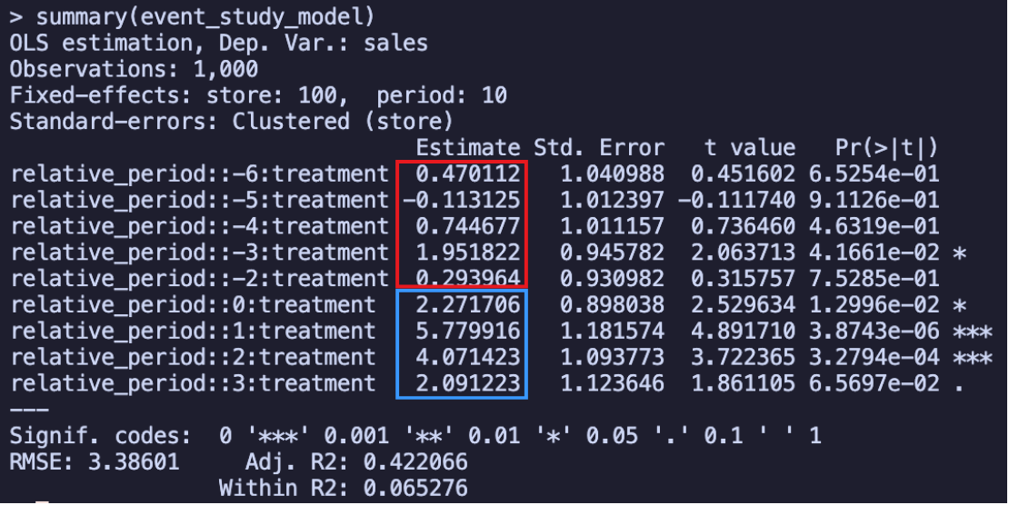
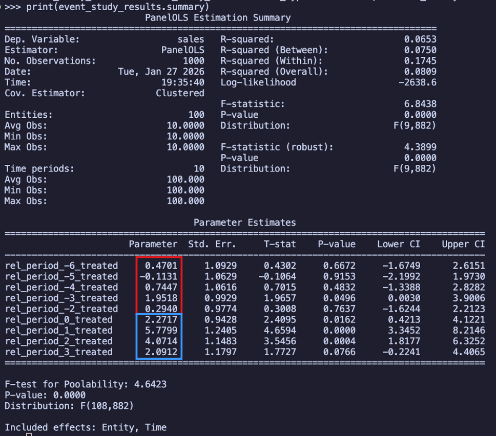
Again, notice that we are using Store and period fixed effects + clustered errors by store and using Reference period is -1. Remember that each estimate in these results is the Estimated average effects for each of the periods, and in this regression output above, I circled the leads in blue and the lags in red. So how do we interpret these results? In the month when the campaign started (relative period = 0), stores in Paraíba had an average increase of R$2.27 million in sales, statistically significant
The results reveal two key findings: no substantial pre-treatment differences and positive post-treatment effects.
Although we see statistical significance for the leading effect of period -3, we shouldn’t worry too much about it. When checking multiple time periods, it’s common to find one significant coefficient just by chance (the famous “multiple comparisons problem”). Relying on individual t-tests can therefore be misleading. A more robust approach is to test if all leading effects are jointly different from zero. This is done using an F-test, which evaluates the null hypothesis that the entire set of pre-treatment coefficients is zero. In our case, this joint test confirms that there is no significant difference between the groups, supporting the parallel trends assumption. Here is how you can run this test:
To better grasp how the effect unfolds over time and whether it persists, we can plot these estimates (Figure 9.12). The visual results reveal several important insights:
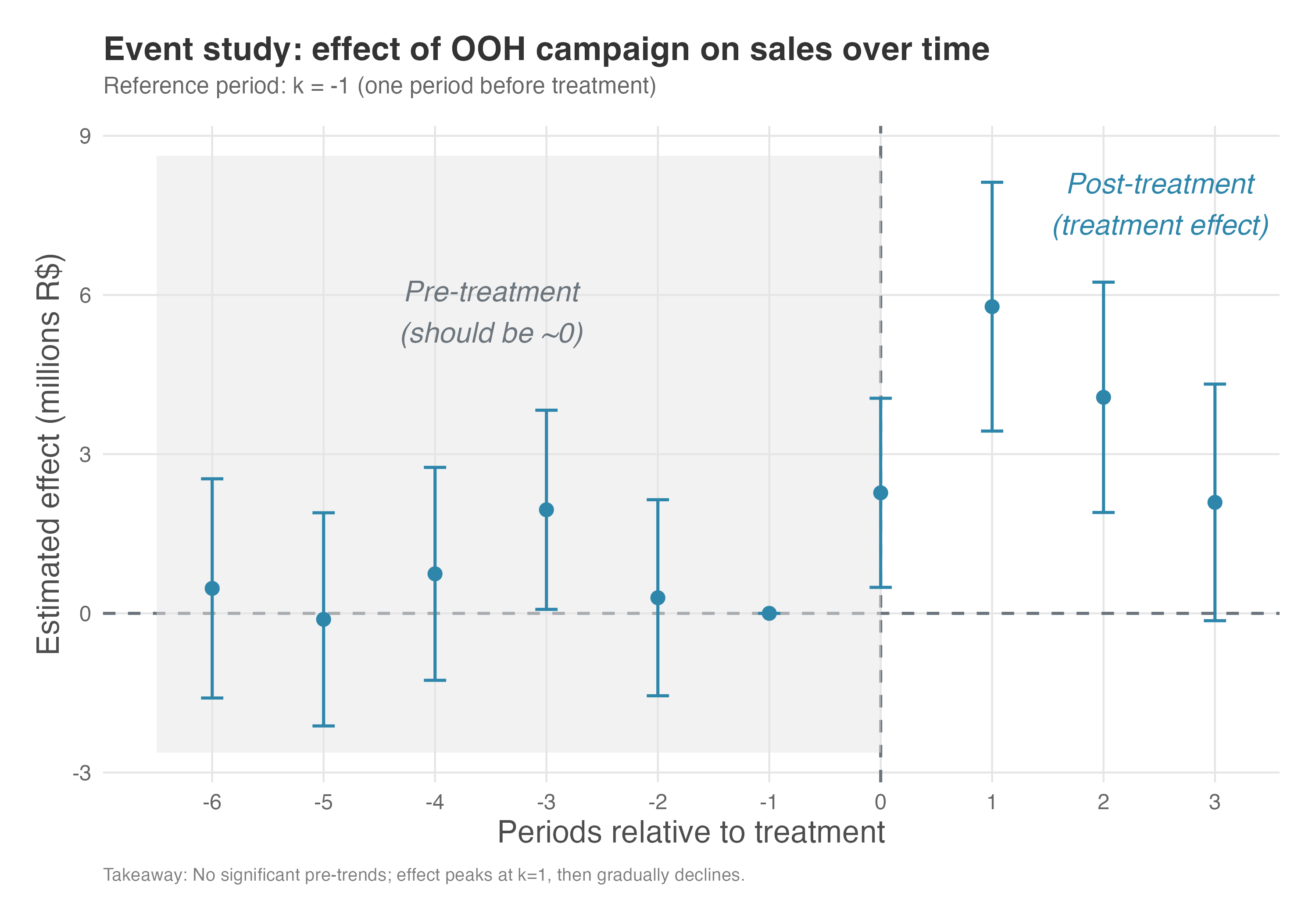
Before the campaign (k=-6 to k=-2): The pre-treatment coefficients (“leads”) are small and mostly not statistically significant, confirming that stores in Paraíba and Pernambuco were indeed following parallel trends before the campaign started.
During and after the campaign (k=0 to k=3): The post-treatment coefficients (“lags”) show how the effect evolved — immediate impact at k=0, then the trajectory through subsequent periods. This nuanced view tells us not just whether the campaign worked, but how it worked over time.
9.5.5 How selection bias breaks parallel trends: Ashenfelter’s dip
Our OOH example showed clean pre-trends — exactly what we want to see. But what does it look like when things go wrong? One of the most common and instructive failures comes from a phenomenon called Ashenfelter’s dip, first described by Ashenfelter (1978).
This pattern emerges from selection bias: when individuals choose to participate (or are chosen) based on characteristics related to the outcome. The classic example is job training programs.
Imagine a job training program designed to improve earnings. If individuals who are already struggling the most (e.g., those with declining earnings before the program) are more likely to enroll, then simply comparing their earnings trajectory to a control group might show a deceptive “dip” in their pre-program earnings, followed by an apparent improvement after the program. This could lead to an overestimation of the program’s true effect. The “dip” is a classic sign of selection bias, and it highlights the importance of carefully considering why certain individuals or units receive the treatment.
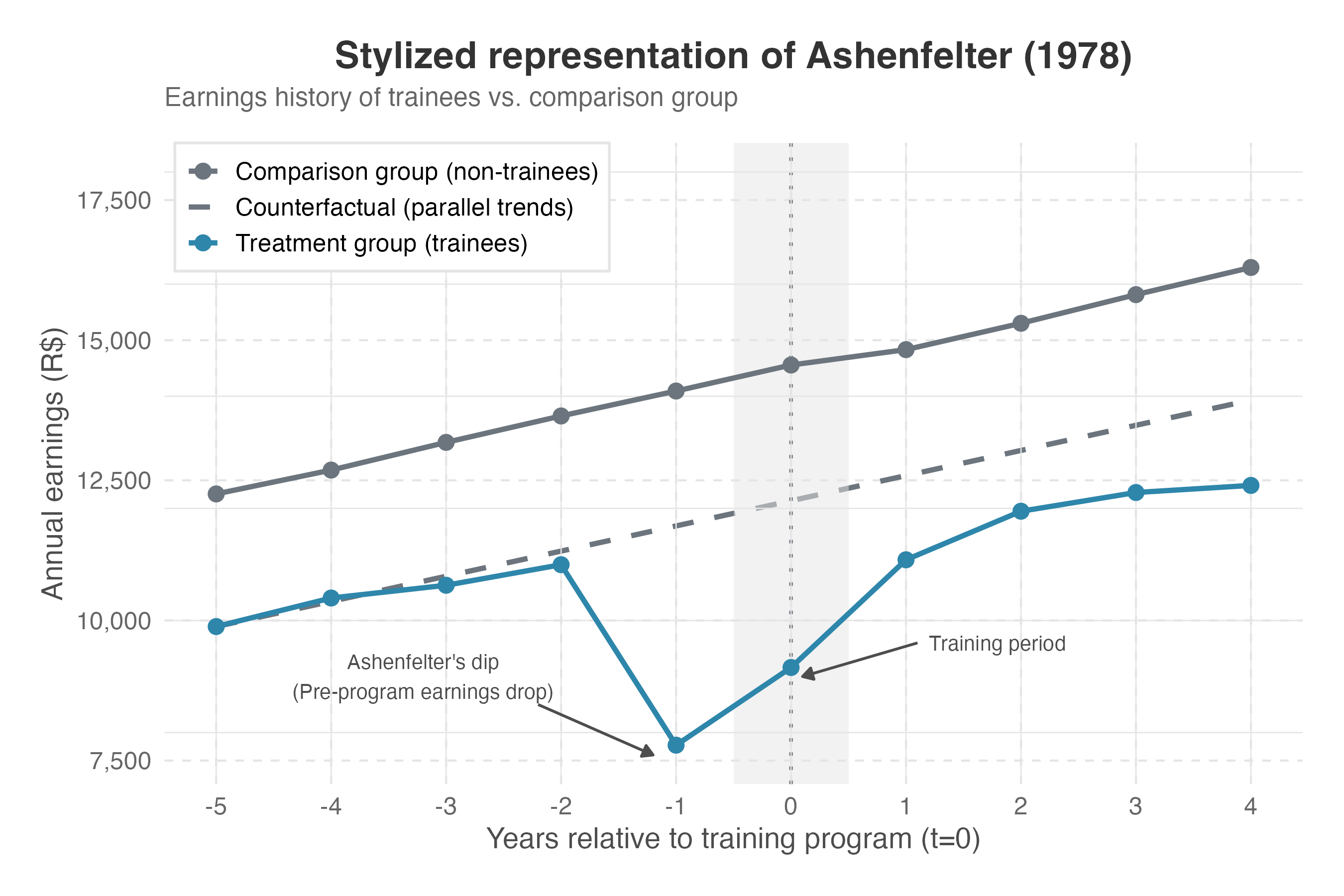
Figure 9.13 illustrates this phenomenon with simulated earnings data. Imagine individuals who are already struggling the most (those with declining earnings) are more likely to enroll in a job training program. The treatment group shows a steep decline in earnings before the program starts — these are the individuals who self-selected into training precisely because they were struggling.
After the program, their earnings recover. But how much of that recovery is the true program effect, and how much is simply regression to the mean? The dashed line (the counterfactual trajectory) shows what parallel trends would have predicted: a world where the treatment group follows the same trajectory as the control. The gap between the observed post-treatment outcome and this counterfactual is the apparent effect — but it’s inflated because we’re measuring from an artificially depressed baseline.
The event study as a diagnostic tool
This is precisely why examining pre-treatment coefficients in an event study is so valuable. If we run an event study on data affected by Ashenfelter’s dip, the pre-treatment coefficients will not hover around zero — they’ll reveal the selection bias pattern.
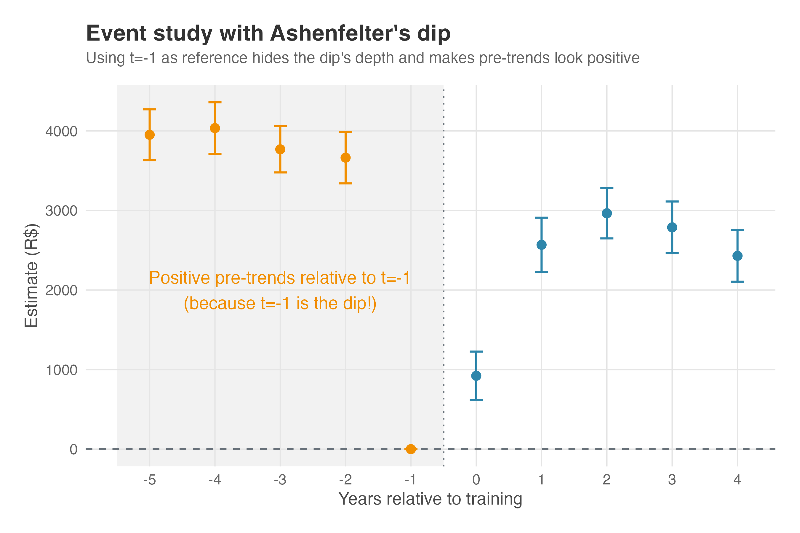
Figure 9.14 shows what happens when we estimate an event study on data with Ashenfelter’s dip. The pre-treatment coefficients (orange) are significantly positive, hovering around 3,700-4,000, then dropping to zero at the reference period (\(k=-1\)) — the bottom of the dip. This is the “smoking gun” of selection bias: the treatment group was doing relatively better in earlier periods, then experienced the characteristic “dip” that led them to self-select into the program.
Remember what these coefficients represent: the difference between treatment and control groups relative to the reference period. If parallel trends held, these pre-treatment coefficients should cluster around zero — the two groups would be on similar trajectories. Instead, we see a clear pattern: the treatment group’s relative position deteriorates as we approach the treatment, revealing that something systematic (selection bias) is driving the divergence.
WarningThe event study test is necessary but not sufficient
A clean event study (pre-treatment coefficients around zero) is consistent with parallel trends, but doesn’t prove it. The assumption is fundamentally about counterfactuals — what would have happened in the absence of treatment. Pre-trends can look parallel even when the post-treatment counterfactuals would diverge. Still, finding significant pre-trends (as in Figure 9.14) is strong evidence that something is wrong with your research design.
Does the reference period choice matter?
A natural question arises: what if we had chosen a different reference period for our event study? Standard practice uses \(k = -1\) (the period just before treatment), but this choice is somewhat arbitrary. Figure 9.15 shows what happens when we run the exact same event study regression on the exact same data, but change only the reference period.
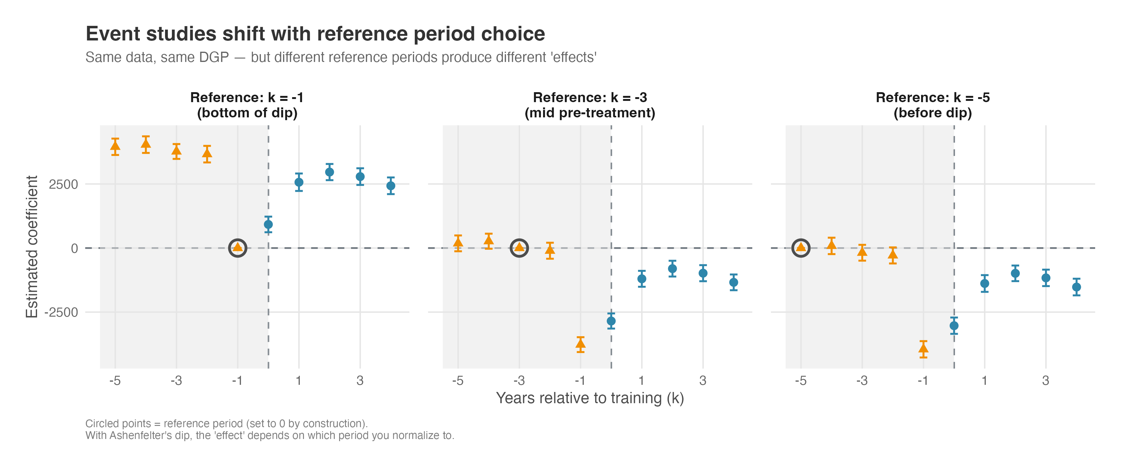
Three key observations emerge from Figure 9.15:
The reference period is set to zero by construction (circled points). This is a mechanical feature of how event studies work — we’re measuring everything relative to that period.
Changing the reference shifts the entire curve vertically — the shape stays the same, but every coefficient moves up or down by the same constant. In this simulated earnings example, the left panel (\(k = -1\)) anchors at the bottom of the dip, so the post-treatment coefficients sit high on the y-axis. The middle panel (\(k = -3\)) anchors at a mid-pre-treatment point, shifting the whole curve down. The right panel (\(k = -5\)) anchors well before the dip, pushing the curve down further. Same data, same shape, but the numerical value you would report for any single coefficient changes with the reference.
The diagnostic signal persists regardless of reference choice. In all three panels, we see significant coefficients in the pre-treatment period that shouldn’t be there if parallel trends held. Whether those coefficients are positive (left panel) or negative (right panel) depends on the reference, but their presence — and the clear pattern of divergence — reveals the selection bias.
The practical implication is subtle but important: when Ashenfelter’s dip is present, the magnitude of your estimated treatment effect depends on which period you normalize to. Using \(k = -1\) (standard practice) anchors everything to the bottom of the dip — the worst possible baseline if you want to estimate the true effect. But the qualitative conclusion that something is wrong doesn’t change: significant pre-treatment coefficients remain significant, just with different signs.
This is why experienced researchers don’t just look at whether pre-treatment coefficients are “positive” or “negative” — they look at the pattern. A clear trend in the pre-treatment coefficients (whether rising or falling toward the reference period) signals that the groups were on different trajectories before treatment, regardless of how you choose to anchor the comparison.
9.5.6 What do the DiD coefficients actually measure?
Now that we have both the aggregated DiD and the event study side by side, we can answer a question that trips up even experienced analysts: what exactly does the R$2.99 million from the aggregated model represent?
Remember the photo-versus-video analogy? The aggregated model gave us one snapshot — R$2.99 million (Figure 9.8). The event study gave us the full footage — four separate coefficients (Figure 9.10), each capturing a different post-treatment period. Table 9.3 puts them next to each other.
| Model | What it estimates | Value (millions R$) |
|---|---|---|
| Aggregated DiD | Single coefficient \(\delta\) | 2.99 |
| Event study, \(k=0\) | \(\delta_0\) (campaign launch) | 2.27 |
| Event study, \(k=1\) | \(\delta_1\) (peak effect) | 5.78 |
| Event study, \(k=2\) | \(\delta_2\) | 4.07 |
| Event study, \(k=3\) | \(\delta_3\) | 2.09 |
The pattern here reveals something important. The aggregated coefficient (R$2.99M) doesn’t match the sum of the event study coefficients (R$14.21M), nor does it match any single period’s effect. It lands in the neighborhood of their average: (2.27 + 5.78 + 4.07 + 2.09) / 4 \(\approx\) R$3.55M. In other words, the aggregated DiD tells you how much more a treated store sold in a typical post-treatment month — not across all months combined.
This matters the moment you walk into a stakeholder meeting. If the CMO asks “how much extra revenue did the campaign generate per month?”, the aggregated coefficient — roughly R$2.99 million — is your answer. But if they ask “what was the total incremental revenue across the entire post-treatment window?”, you need the sum of the event study coefficients: approximately R$14.21 million per store. Report the aggregated number as the total impact and you understate the campaign’s value by a factor of four. You can see this visually in Figure 9.12 — each post-treatment dot is a separate per-period effect, and the aggregated model compresses those four dots into a single number near their average. Useful for a quick summary, but it hides the dynamics: the peak at \(k=1\), the gradual decline, and the full cumulative impact.
TipAverage vs. cumulative: a rule of thumb
The aggregated DiD coefficient estimates the average per-period treatment effect on the treated (ATT). To get the cumulative impact over the entire post-treatment window, sum the event study post-treatment coefficients — or, as a rough shortcut, multiply the aggregated coefficient by the number of post-treatment periods.
One detail worth flagging: the average of the event study coefficients (R$3.55M) doesn’t perfectly match the aggregated coefficient (R$2.99M). The gap comes from how each model defines its baseline. The event study measures everything relative to a single reference period (\(k = -1\)), while the aggregated model implicitly averages over the entire pre-treatment window. When pre-treatment coefficients aren’t all exactly zero — recall the positive value at \(k = -3\) and the smaller one at \(k = -6\) in Figure 9.10 — these baselines diverge slightly. The cleaner your parallel trends, the closer the two estimates will agree.
Getting this distinction right is especially important when you translate results into business language — a topic we cover in Chapter 13 on business translations. Whether you feed the per-period average or the cumulative total into an ROI calculation changes the investment recommendation entirely. Confuse the two and you risk either underselling a successful campaign or overstating a marginal one.
9.6 When classic DiD breaks down: staggered treatment adoption
The classic DiD setup is deceptively simple: compare a treatment and control group before and after an intervention, and you’re done. This approach works well when the treatment happens all at once. But in real-world applications, especially in tech and digital businesses, treatments often roll out over time. Think of a new recommendation algorithm being gradually released to users over several weeks. That staggered rollout creates what we call treatment timing heterogeneity.
This staggered adoption complicates things. The traditional TWFE model, widely used in DiD settings with multiple time periods, wasn’t built to handle these situations. When used naively in staggered designs, it mixes units treated at different times, making comparisons across treated and not-yet-treated groups, but it also compares already-treated units to later-treated ones, violating a key principle: comparisons should be between treated and untreated units.
These “forbidden comparisons” can lead to misleading estimates, sometimes even flipping the sign of the true treatment effect. This happens especially when treatment effects vary over time or differ across groups (what economists call heterogeneous treatment effects). Unfortunately, both are common in practice.
Recent research tackled these problems head-on. Methodological advances by Callaway and Sant’Anna (2021), Sun and Abraham (2021), and others offer alternatives that are robust to treatment timing and heterogeneous effects. These newer estimators work by isolating clean comparisons: they compare treated units to those not yet treated (when possible), avoiding bias from treated-to-treated comparisons. They also allow treatment effects to vary over time, rather than forcing a one-size-fits-all estimate.
These methods may look more complex under the hood, but they bring us closer to the truth when reality refuses to be simple. In the next chapter, Chapter 10, I’ll show you how to use these modern DiD estimators with actual data, building on the same business scenario and code structure we’ve used so far.
9.7 Wrapping up and next steps
We’ve covered a lot of ground. Here’s what we’ve learned:
- Naive comparisons lie: Simple “before vs. after” or “treated vs. control” comparisons are almost always biased by time trends or selection effects.
- DiD is the solution: By comparing the changes in the treated group against the changes in a control group, we isolate the treatment effect—assuming parallel trends hold.
- TWFE is the workhorse: Two-Way Fixed Effects models use Unit Fixed Effects (“who you are”) and Time Fixed Effects (“when you are”) to implement this comparison regression-style.
- Event studies tell the full story: Aggregated DiD gives a single number, but event studies visualize the dynamic effect and provide a key falsification test (pre-trends).
- Clustering matters: Serial correlation in panel data is real. Always cluster your standard errors at the unit level to avoid false positives.
How to implement a TWFE DiD analysis:
- Plot the raw data: Before modeling, visualize the average outcomes for treated and control groups over time. Look for parallel movements in the pre-treatment period.
- Estimate the Aggregated Model: Run a TWFE regression (
feolsin R,PanelOLSin Python) including your treatment dummy, unit FEs, and time FEs. Cluster standard errors at the unit level. - Run an Event Study: Replace the single treatment dummy with “leads” and “lags” relative to the treatment start (usually using \(k=-1\) as reference).
- Validate Assumptions: Check if the “leads” (pre-treatment coefficients) are statistically indistinguishable from zero (individually or via a joint F-test). If they aren’t, you likely have a violation of parallel trends or selection bias.
- Interpret the Result: If assumptions hold, the “lags” (post-treatment coefficients) represent the causal effect of your intervention in each period.
In this chapter, we assumed that everyone in the treated group started the treatment at the same time. But in the real world — especially in tech rollouts — adoption is often staggered: some users get the feature in January, others in March, others in June.
It turns out that using the traditional TWFE model we just learned on staggered data can lead to disastrously wrong results (even flipping the sign of the effect!). In Chapter 10, we’ll explore why this happens and introduce the modern DiD estimators designed to handle staggered adoption correctly.
Appendix 9.A: Understanding fixed effects: The building blocks of TWFE DiD
Fixed effects are doing the heavy lifting in DiD — they’re what let us compare apples to apples. But what exactly are they controlling for? Below we’ll break down the two types of fixed effects used in TWFE DiD: individual fixed effects and time fixed effects.
Individual fixed effects (\(\gamma_i\)): Capturing time-invariant heterogeneity
Individual fixed effects control for all characteristics of each unit that remain constant over time. Think of them as each unit’s “baseline personality” or “inherent characteristics” that don’t change during our study period.
For example, in our Super Banner study, João might naturally be a high spender due to his income level, lifestyle preferences, or shopping habits. Maria might be a more conservative spender due to her different financial situation or spending philosophy. These individual characteristics don’t change from week to week, but they significantly influence spending behavior. Without controlling for them, we might mistakenly attribute differences in spending between João and Maria to the treatment, when they’re actually just reflecting their different baseline spending patterns.
The individual fixed effect \(\gamma_i\) essentially creates a separate intercept for each unit, allowing each person to have their own baseline level of the outcome variable. This is particularly powerful because it controls for both observed and unobserved time-invariant factors. Whether we can measure them or not, all characteristics that don’t change over time are automatically controlled for.
Time fixed effects (\(\lambda_t\)): Capturing period-specific shocks
Time fixed effects control for factors that affect all units equally in a given time period but vary across periods. These represent “macro” or “environmental” factors that create period-specific shocks or trends.
In our Super Banner example, imagine that during week 3 of our study, there was a major holiday that increased everyone’s spending across the platform. Or perhaps there was a technical issue that temporarily reduced app performance for all users. These are time-specific shocks that would affect both João (treatment group) and Maria (control group) equally, regardless of whether they saw the Super Banner or not.
Without time fixed effects, we might incorrectly attribute the holiday-induced spending increase to the Super Banner treatment. The time fixed effect \(\lambda_t\) creates a separate intercept for each time period, ensuring that period-specific factors that affect everyone equally don’t bias our treatment effect estimate.
How Fixed Effects Work Together
The beauty of the DiD approach is how these two types of fixed effects work together. Individual fixed effects control for “who you are” (time-invariant characteristics), while time fixed effects control for “when you are” (period-specific factors). This leaves us with only the variation that comes from the interaction between individual characteristics and time-varying factors—precisely what we need to identify the treatment effect.
This is why the parallel trends assumption is so important: it ensures that in the absence of treatment, the remaining variation (after controlling for individual and time fixed effects) would be the same for both treatment and control groups. When we add the treatment, any difference in this remaining variation can be attributed to the treatment effect.
Important considerations when including covariates
Time-invariant covariates: If you include characteristics that don’t change over time (e.g., store size, location characteristics) in a model with unit fixed effects (\(\gamma_i\)), the model will drop them because they are redundant (i.e., the covariate and the fixed effect will be perfectly collinear). The “unit fixed effects” already handle everything that stays constant.
Time-varying covariates: Time-varying covariates are valuable because they can help control for confounding factors that change over time and might otherwise bias the DiD estimate. For example, if there’s a general economic downturn that affects sales differently in Paraíba and Pernambuco, including a covariate for local economic conditions could help account for this.
Endogeneity of covariates: Be cautious about including covariates that might themselves be affected by the treatment. If a covariate is an outcome of the treatment, including it in the model would lead to biased estimates of the treatment effect.
Avoiding “bad controls”: Never include covariates that could be affected by the treatment — these are sometimes called “post-treatment” or “endogenous” covariates. For example, if you’re studying how a paid membership program affects customer spending, don’t control for “number of purchases this month” — that’s likely a mediator (the program increases purchases, which increases spending). Controlling for it would block part of the very effect you’re trying to measure. Safe covariates are those determined before treatment or those that are structurally unaffected by it (e.g., demographic characteristics measured at baseline). When in doubt, draw a causal diagram and check whether the covariate lies on a path from treatment to outcome.
In summary, while covariates can be powerful tools to improve the robustness and precision of DiD estimates, their inclusion requires careful consideration of their nature (time-varying vs. time-invariant) and their relationship with the treatment and outcome variables.
As Google advises, “NotebookLM can be inaccurate; please double-check its content”. I recommend reading the chapter first, then listening to the audio to reinforce what you’ve learned.↩︎
Throughout this chapter, I use DiD to refer to the general strategy of comparing changes across groups, and TWFE to refer to the specific regression implementation. When the distinction matters, I say TWFE DiD explicitly.↩︎
Don’t worry about the \(\Delta\) symbol, it is just a way to represent the change in a variable. It is not a new concept.↩︎
In plain language, it reads “João’s orders increased by 2 units between months 1 and 2. Maria’s orders increased by 1 unit between months 1 and 2. If some assumptions hold, then the banner caused João to place 1 additional order compared to what he would have placed without the banner”.↩︎
Another approach is to explicitly include group-specific time trends in your regression model (e.g., linear or quadratic time trends). However, this practice has fallen out of favor because it relies on strong assumptions: (1) that trends would have continued unchanged in the post-treatment period, and (2) that the functional form of the trend (linear, quadratic, etc.) is correctly specified. These assumptions are often difficult to justify empirically or theoretically.↩︎
Example: A marketplace announces a free shipping badge starting next month. As a reaction, sellers adjust now to qualify to that program by lowering prices or changing inventory, pulling sales into the pre-period. In this case, measuring the effect of the free shipping badge starting next month would be biased, since the treatment effect is in fact a combination of the free shipping badge and the sellers’ anticipation of it.↩︎
For simplicity, I’ve omitted the covariates and the error term in the equations below. In reality, we should use the expectation operator \(E[\cdot]\) on each side, which would yield 0 for the error term. The terms with covariates cancel out in the difference-in-differences calculation.↩︎
To load it directly, use the example URL
https://raw.githubusercontent.com/RobsonTigre/everyday-ci/main/data/did-twfe-ooh.csv.↩︎Some materials say “by ruling out effects before the treatment”.↩︎
Notice that there’s no \(\delta_{-1} D_{-1,i}\) term - that’s because \(k=-1\) is our reference period (set to zero). Each \(D_{k,i}\) is a dummy variable that equals 1 when a treated unit is observed in event time \(k\), and 0 otherwise.↩︎