1 Data, statistical models, and ‘what is causality’
A/B Testing, Causal Inference, Causal Time Series Analysis, Data Science, Difference-in-Differences, Directed Acyclic Graphs, Econometrics, Impact Evaluation, Instrumental Variables, Heterogeneous Treatment Effects, Potential Outcomes, Power Analysis, Sample Size Calculation, Python and R Programming, Randomized Experiments, Regression Discontinuity, Treatment Effects
Most people have heard of Machine Learning. But here is the deal, traditional Machine Learning (ML) is not the same as Causal Inference (CI), and you need to understand the difference to be able to use CI effectively. ML and CI answer different questions, are used for different types of decision-making, and rely on different assumptions. And in tech and business, using the wrong tool for the job can be expensive.
CI focuses on isolating the effect of a specific action or policy; like launching a new feature, increasing ad spend, or changing the layout of a product page. The key question is counterfactual (save this word; I’ll properly define it later): “What would have happened if we had vs. hadn’t done this?”. For example: “What is the impact of free shipping on average order value?”
To answer these questions, we need more than patterns — we need methods that approximate what would have happened in the absence of the change , ideally by comparing similar users or time periods. This involves interventions, counterfactual reasoning, and assumptions that go beyond prediction accuracy.
Machine learning, on the other hand, is optimized for prediction. It learns from patterns in past data to forecast future outcomes. For example: “What’s the probability that a user churns next month?”. These questions can be answered with high accuracy even if we don’t understand the underlying causes. The model might learn that users who visit the site on weekends churn less, but that doesn’t mean visiting on weekends causes lower churn. Correlation is enough if your only goal is to predict.
Causal inference asks “why” — which actions or factors actually drive outcomes (e.g., “y increased due to x”). Traditional statistics and machine learning find patterns (“when x increases, y also increases”) but don’t establish causation. Useful for prediction, not for understanding why.
Why this matters in business
Imagine your product team launches a gamified tutorial during onboarding to boost engagement.2 You roll it out to 50% of new users. Your ML team builds a model that predicts conversion based on early user behavior. They show that users who saw the tutorial convert more. Looks like a win, right?
Not necessarily! What if the tutorial was mostly shown to users who were already more likely to convert — maybe they had faster devices, or they installed the app during a weekday when engagement tends to be higher? If you stop there and take credit for that uplift, you might be mistaking correlation for causation.
This is where causal inference equips you to cut through ambiguity. For instance, a properly randomized A/B test allows you to ask the real question: “What would engagement have looked like for those same users had they not seen the tutorial?” That’s a counterfactual (what would have happened in the absence of the intervention). And answering it requires more than pattern recognition — it requires causal reasoning.
That’s why tech giants like Booking.com, Airbnb, Amazon invest heavily in internal causal inference teams. They know that good predictions are useful — but understanding what works and why is what helps them scale the right decisions, avoid costly flops, and communicate strategy with confidence.
1.1 Some terminology can get us a long way
Causal inference is exciting, but it stands on the shoulders of some core ideas from statistics and econometrics. If you’re already comfortable with regression analysis and hypothesis testing, feel free to skip the rest of this chapter. If not, no worries. Let’s walk through it together.
Causal inference has its own dialect. Before we can speak it, we need to agree on a few terms. These aren’t just academic definitions — they are the pieces we use to test product ideas, evaluate campaigns, and judge policy-making. In Appendix 1.A you will find more definitions on other statistical concepts that are also important to understand causal inference.
We’ll also use the Figure 1.1 below to walk through the grand scheme of things when doing inference — the mental map behind how we go from data to answers.
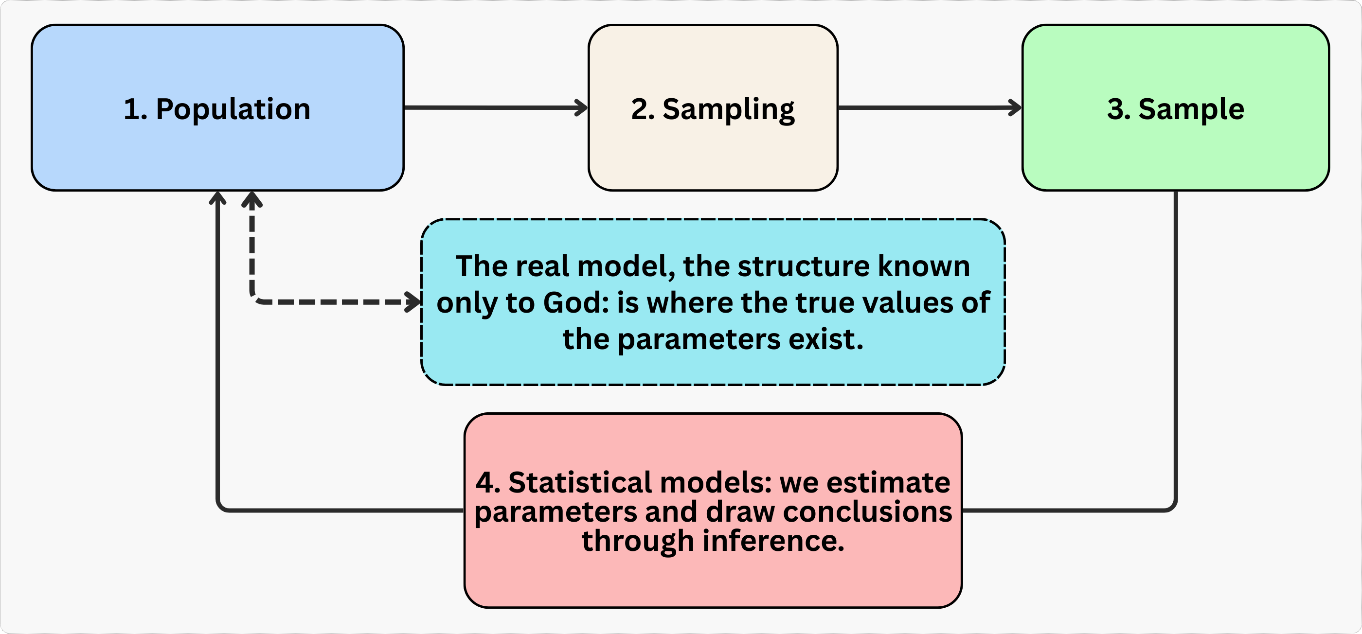
Let’s go step by step.
Population: It is the full group we care about. In a tech business, this might be all users of your app, or every buyer on your marketplace like Mercado Livre or Amazon. We usually can’t observe everyone, so we draw a sample.
Sample: It is a subset of the population that we can actually observe and analyze. It is extracted from the population using a sampling method. In tech, this might be 10,000 users randomly selected from your 1 million total users, or the data from your latest A/B test with 5,000 participants. The goal is that the sample reflects the population of interest well enough that what we learn from it can generalize (this may however not be the case, as we will see in Chapter 2).
Model: It is a simplified, structured representation of some real-world phenomenon. In econometrics, a model helps us describe how we think one variable relates to another (correlation) or affects another (causation) — for example, how ad spend affects sales, or how price affects conversion rate.
Parameter: This is the true effect we’re trying to learn, like “What’s the average impact of free shipping on user spending in a marketplace?”. This parameter is generally unknown to us, living in the realm of the “real model” — a structure “known only to the all-knowing God,” as one of my former professors used to say. We never get to see this truth directly.
Estimate: Here comes the fun part. Since we can’t know the parameter mentioned above exactly, we use data from our sample to estimate it. That estimate is our ‘best guess’ at the parameter, based on the model and data we’re working with.3
Econometrics: Think of econometrics as the Swiss Army knife of causal inference — it’s the branch of statistics and social sciences that uses statistical tools to test theories and evaluate policies. It’s what lets us turn economic intuition into measurable evidence.
Regression: A workhorse technique used to estimate relationships between variables. Sometimes that relationship is causal (like the effect of a treatment), sometimes not. We’ll talk a lot about what separates the two.
Outcome variable: It is also called ‘dependent variable’, ‘response variable’, or ‘regressand’. It is the result you’re trying to explain, usually denoted as \(Y\) or \(y_i\). For example, if \(Y\) represents purchase value on a marketplace, then \(y_i\) is the purchase value for the i-th user. So, \(y_{Robson}\) would be the purchase value for a user named Robson.
Covariates: Think of these as the “context” or “inputs” of your model. Machine learning folks call them ‘features’; economists call them ‘control variables’, ‘regressors’, or ‘independent variables’. These are the factors — denoted as \(x\) or \(x_i\) — that help explain why the outcome varies from person to person. Examples include user age, device type, or ad exposure.4 5
1.2 Estimand, estimator, and estimate
In our search for the truth (the parameter), we follow a clear three-step process. First, we need to define exactly what we’re looking for: this is called the estimand. Next, we need a method to calculate our best guess for that parameter: this method is called the estimator. Finally, the actual number we get from applying the estimator is called the estimate. To help you understand how these three concepts work together, let’s walk through a concrete example below.
1.2.1 Estimand: The “what” behind your analysis
The estimand is your question translated into a measurable target. It’s the specific effect you want to quantify, like “How much does a new recommendation algorithm increase daily watch time per user?” This is a population-level quantity that reflects what would happen, on average, if everyone received the intervention versus if no one did. In the next chapter, we will see that this parameter is called the Average Treatment Effect (ATE), but for now, let’s just call it the estimand.6
Tip: Define your estimand before touching data. A vague question like “Does the algorithm help?” won’t guide your analysis. A precise estimand like “ATE of the new recommendation algorithm on daily watch time per user” forces clarity - and sets you up to pick the right design and estimator.
1.2.2 Estimator: The “how” to achieve a meaningful number
Once you’ve defined your estimand, the estimator is the statistical recipe or method you choose to estimate (i.e., “approximate”) this value using your data. This recipe will turn raw observations in your data into a meaningful number, called the estimate.
For example, in a randomized experiment testing the new recommendation algorithm, a simple difference in average watch time between the treatment group (new algorithm turned on) and control group (original algorithm) is a valid estimator for the average treatment effect. Randomization ensures confounders (like user demographics) are balanced by design.7
1.2.3 Estimate: The number you actually get
The estimate is the final number your estimator produces. If your estimand is “the average treatment effect of the new algorithm on daily watch time” and you run a randomized experiment, the difference in means between treatment and control users is your estimate.8
Tip: Remember that estimates are uncertain. A raw result like “the algorithm increased watch time by 5 minutes” is incomplete. Always report a range: “5 minutes ± 0.8 minutes (95% confidence interval)”. Confidence intervals (also denoted by CI) distinguish real impact from noise. We will discuss confidence intervals and p-values later in this chapter.
A simple yet realistic example
Let’s clarify the concepts of estimand, estimator, and estimate using the following context: A streaming service tests whether a new recommendation algorithm increases user engagement.
Estimand: 30-day average treatment effect of the algorithm on daily watch time, in minutes, per user.
Design: Randomized A/B test with 100,000 active users. The treatment group (50,000 users) is exclusively exposed to the new algorithm, while the control group (50,000) is exposed to the original.
Estimator: Difference in average daily watch time between treatment and control groups in the 30-day period.
Estimate: After 30 days, the treatment group averages 35 minutes/day vs. 30 minutes/day for control. The average treatment effect estimate is +5 minutes per user per day (95% CI: 4.2–5.8 minutes).
1.3 Linear regression: our go-to tool
Data: All data we’ll use are available in the repository. You can download it there or load it directly by passing the raw URL to read.csv() in R or pd.read_csv() in Python.9
Packages: To run the code yourself, you’ll need a few tools. The block below loads them for you. Quick tip: you only need to install these packages once, but you must load them every time you start a new session in R or Python.
# If you haven't already, run this once to install the package
# install.packages("tidyverse")

# You must run the lines below at the start of every new R session.
library(tidyverse) # The "Swiss army knife": loads dplyr, ggplot2, readr, etc.
# If you haven't already, run this in your terminal to install the packages:
# pip install pandas numpy statsmodels (or use "pip3")
# You must run the lines below at the start of every new Python session.
import pandas as pd # Data manipulation
import numpy as np # Mathematical computing in Python
import statsmodels.formula.api as smf # Linear regression1.3.1 What exactly is a linear regression?
The linear regression is the backbone of applied causal inference. In plain terms, and under some assumptions, the coefficients you estimate with Ordinary Least Squares (OLS, the estimator) can be interpreted as changes in the expected average of your outcome \(Y\). Meaning, they tell you how much the outcome \(Y\) changes if you tweak one variable \(X\), while holding everything else constant. This “all else equal” interpretation is the bread and butter of causal analysis, as long as the assumptions for your identification strategy hold.
What makes OLS so powerful is its flexibility and familiarity. Many of the most popular causal inference methods boil down to some form of OLS:10
Regression Discontinuity Designs (RDD): You can set up a sharp RDD as an OLS estimation problem, where the treatment assignment jumps at a cutoff.
Difference-in-Differences (DID): The classic two-way fixed effects (TWFE) approach is just an OLS regression with group and time fixed effects.
Instrumental Variables (IV): The two-stage least squares (2SLS) method is essentially two rounds of OLS, and you can often get the same coefficients by “plug and play” with standard OLS routines.
This means that, whether you’re a student or a practitioner, you can often reach for OLS as your first tool, and adapt it to a wide range of real-world problems. It’s convenient, well-understood, and supported in every statistical software package.
1.3.2 The intuition on how it works
Conceptually, regression answers: “How much does Y change when I nudge X, while accounting for other factors?” For example:
Marketing: “If I spend R$100 more on ads, how many extra signups do I get?”
Pricing: “If I drop subscription prices by 5%, how much does revenue change?”
User Experience: “Does shaving 0.5 seconds off page load time boost conversions?”
So, how does OLS estimator actually work? It looks for the line that minimizes the squared gaps between your data points (navy blue dots) and the line itself (black line), as shown in Figure 1.2. Basically, it finds the path that hugs your data points as tightly as possible.
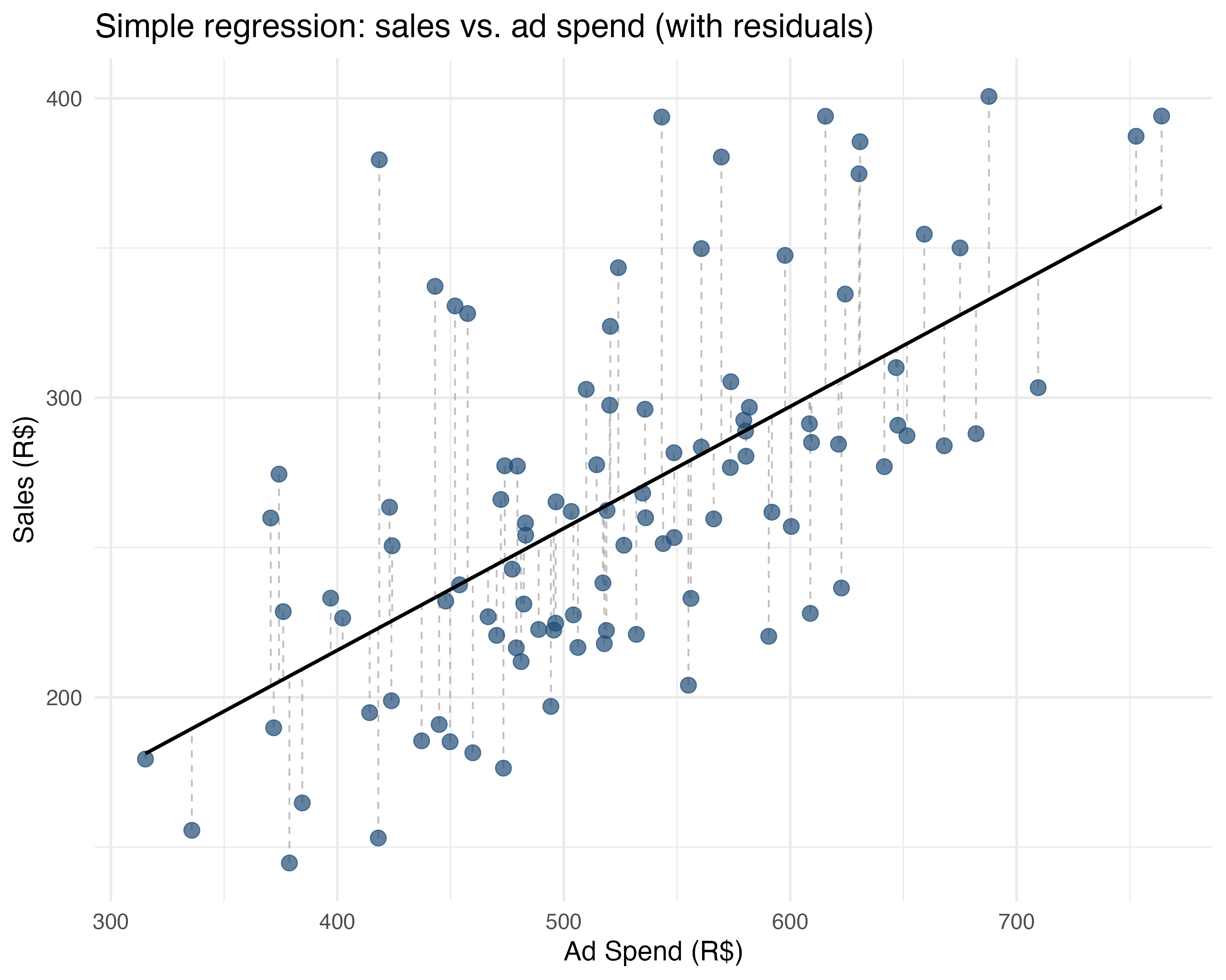
Going back to our marketing example: imagine you plot ad spend (\(X\)) on the horizontal axis and sales (\(Y\)) on the vertical axis. Each dot on the chart represents the sales of one campaign at a given level of ad spend. OLS finds the best line through these dots by solving for \(\beta_0\) (where the line crosses the Y-axis) and \(\beta_1\) (how steep the line is) in the equation \(Y = \beta_0 + \beta_1 X + \varepsilon\). The \(\varepsilon\) represents the error - how far each dot is from the line (shown by the dashed grey lines in Figure 1.2).11 Let’s see some examples:
Simple regression (one \(X\) variable): \(\text{sales} = \beta_0 + \beta_1 \text{ad\_spend} + \varepsilon\)
sales = 52.88 + 0.41 * ad_spendSlope (\(\beta_1\)): “Every R$1 increase in ads is associated with R$0.41 more sales”.
Intercept (\(\beta_0\)): “R$52.88 sales when ad spend is R$0” (baseline performance).
Multiple regression (several \(X\)s): \(\text{sales} = \beta_0 + \beta_1 \text{ad\_spend} + \beta_2 \text{holiday} + \varepsilon\)
sales = 77.23 + 0.35 * ad_spend + 21.49 * holidaySlopes: “Holding holidays constant, R$1 more in ads is associated with R$0.35 extra sales”.
Key insight: “All else constant” (ceteris paribus). This isolates each factor’s effect. But notice this interpretation holds if our model is close to the true model known to the all-knowing God, and if our sample represents the population well. The world is more complex than that, and often we won’t be able to observe a change in one factor as others are held constant, because these factors are “generated” simultaneously and come hand in hand, for instance. Examples are age and income, education and work experience, etc. But this is just a heads-up. Let’s worry about that in the next chapters!
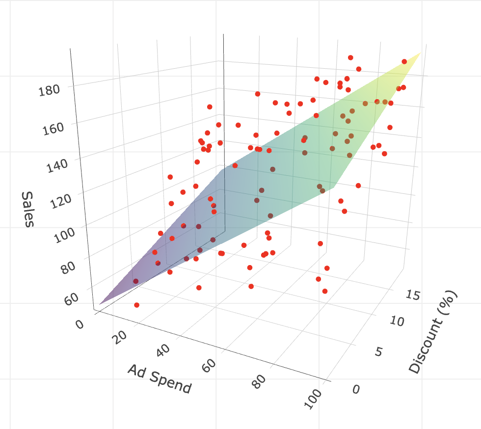
Plot with more multiple regression: Thinking geometrically, when we have only one variable (like ad spend) learned that we can visualize OLS as fitting a line through a 2D cloud of points, as in Figure 1.2. But what happens when we add a second variable, like discount?
In this case, we are no longer fitting a line in a 2D space, but a plane — imagine a rigid flat sheet — floating in a 3D cloud of points. The goal is the same: position this sheet to minimize the squared vertical distances (residuals) between the sheet and the data points. In Appendix 1.B, I provide the code to visualize this 3D plane.
If we add a third variable, we move to a 4-dimensional space. We can no longer visualize it (our brains are stuck in 3D), but the logic holds: we are fitting a hyperplane. The math doesn’t care about our inability to see it; it just keeps minimizing those squared errors, finding the “surface” that best fits the data.
What does \(\varepsilon\) mean?
In real life, variation is inevitable, so \(\varepsilon\) is the random “error” that captures everything that affects sales besides ad spend in \(\text{sales} = \beta_0 + \beta_1 \text{ad\_spend} + \varepsilon\). This could be random luck, seasonality, weather, a competitor’s flash sale, or even something as unanticipated as payday falling that week.
Since no two campaigns are exactly alike, even if you spent the same amount on ads in two different weeks, your sales would almost never be identical. That randomness - that unpredictable “stuff” - is \(\varepsilon\), and we may assume that its average is 0, which we discuss more in the next paragraph.
What happens when we “fit” or “train” the model?
As discussed around Figure 1.1, we can’t observe the true model and “God’s parameters” \(\beta_0\) and \(\beta_1\) directly. Instead, we estimate them using the data in our sample.
Our regression gives us the estimates \(\hat{\beta}_0\) and \(\hat{\beta}_1\); these are our best guesses, based on the campaigns we observed - they wear these cute hats ‘^’ so you can distinguish them from the true parameters \(\beta_0\) and \(\beta_1\). In the estimated equation, \(\widehat{\text{sales}} = \hat{\beta}_0 + \hat{\beta}_1 \text{ad\_spend}\), the error term leaves the formula because regression is about modeling what’s predictable (i.e., the average sales for a given ads spend).
The unpredictable part is still part of the game, but it’s now in the background, not in the main equation. Instead of including \(\varepsilon\), we now talk about residuals (\(\hat{\varepsilon}\)), which are just the “misses” between our estimated line and the actual points.
An intuition about \(\widehat{\text{sales}}\): We can always plug our original \(X\) data back into the equation with our estimated \(\hat{\beta}\) and it will output \(\hat{y}\), also known as the fitted or predicted values of the outcome. You can think of \(\hat{y}\) as a “noise-filtered” version of the outcome — a clean signal stripped of the random error \(\varepsilon\).
In machine learning applications, this is how we forecast or predict values outside of the data we have. In causal inference, it will be useful to generate a “clean version” of a variable to replace a “messy” one in the Two-Stage Least Squares (2SLS), a method we will use to solve non-compliance in experiments (Chapter 7).
Key intuition
\(\beta_0\) and \(\beta_1\) are the true, underlying relationship in the population - what we’d find if we had infinite data and no noise.
\(\hat{\beta}_0\) and \(\hat{\beta}_1\) are our estimates - our best shot, based on the actual data we have.
\(\varepsilon\) explains why our predictions aren’t perfect. It reminds us that there’s always uncertainty in the real world, and our model captures the predictable part - the rest is just life happening.
Analogous to the estimated \(\beta\), the \(\hat{\beta}\), the error \(\varepsilon\) has its estimated counterpart, the residual (\(\hat{\varepsilon}\)). The residuals are the “misses” between our estimated line and the actual points.
1.3.3 How to interpret other tricky coefficients
We have just covered the basics of linear regression and the intuition of “holding other factors constant”. However, causal inference often involves constructions where the interpretation of coefficients is less straightforward. In this section, we will explore these scenarios. After making sure you really understood the interpretation of coefficients for dummy variables, I will explain how to interpret coefficients for interactions and non-linear terms.
Let’s use a single example throughout this section to see how to interpret coefficients in different specifications. Imagine you are a Data Scientist at a tech company. You recently launched a New UI for your app, designed to increase user engagement. You ran an A/B test and collected data on 1,000 users.
Your outcome variable is Time on App (time_on_app), being the time a user spends on the app, in minutes per session. Your treatment variable is New UI (new_ui), being 1 if the user sees the new design developed by your company, and 0 otherwise.
We will run four different regressions to see how to interpret coefficients for:
- Dummy variables (e.g.,
new_ui, the treatment itself) - Categorical variables (e.g., dummies to represent ‘Casual’, ‘Power’, ‘Business’, which were created from the variable
user_segment) - Interaction terms (e.g., does the treatment New UI work better on iOS users (i.e., for those with
is_ios= 1)?) - Non-linear terms (e.g.,
account_ageand its square)
Let’s start with a bold assumption: these models are correctly specified. In the real world, that’s a luxury you rarely have (and must defend rigorously). But I’m making that leap here solely to show you how to interpret the coefficients.
1. Dummy variables: shifting the intercept
First, let’s look at the treatment variable itself. new_ui is a dummy variable: it takes the value 1 if the user sees the new design, and 0 otherwise (Old UI). We will start by running a simple linear regression to estimate the effect of the New UI on Time on App as in equation Equation 1.1:
\[ \text{time\_on\_app} = \beta_0 + \beta_1 \text{new\_ui} + \varepsilon \tag{1.1}\]
The resulting coefficients are 16.33 for the intercept (\(\beta_0\)) and 2.80 for the New UI (\(\beta_1\)).
About the intercept of 16.33, this is the expected Time on App for the “reference” or “control” group: that is, users who represent have New UI = 0.12 About the coefficient for New UI being 2.8, this is our treatment effect. Users with the New UI spend, on average, 2.8 minutes more on the app than those with the Old UI. In other words, on average, control users spend 16.33min on the app, while treatment users spend 16.33 + 2.8 = 19.13 min on the app.
Geometrically, a dummy variable acts as a switch that shifts the intercept of the regression line. For the reference group (Old UI), the expected value is just the intercept (\(\beta_0\)). For the treatment group (New UI), the expected value shifts up by \(\beta_1\) to become \(\beta_0 + \beta_1\). Because of this sum, in which the dummy’s coefficient adds to the baseline intercept when the dummy is 1, we say there is a shift of the magnitude of \(\beta_1\) in the intercept.
2. Categorical variables
Now suppose we have a user segment variable user_segment with three categories: Casual, Power, and Business. Mathematically, regressions can’t handle text labels directly, so we convert them into a set of dummy variables. R and Python handle this automatically, but it’s good to know what’s happening under the hood.
Remember: we must leave one category out to serve as the reference group. If we included dummies for all three categories, the information would be redundant (what we call ‘perfectly collinear’, meaning perfectly repetitive), and the math would break. Let’s pick Casual as our reference and estimate the regression in Equation 1.2.13
\[ \text{time\_on\_app} = \beta_0 + \beta_1 \text{new\_ui} + \beta_2 \text{Power} + \beta_3 \text{Business} + \varepsilon \tag{1.2}\]
The resulting coefficients are 13.22 for the intercept (\(\beta_0\)), 2.87 for the New UI (\(\beta_1\)), 4.87 for the Power segment (\(\beta_2\)), and 7.95 for the Business segment (\(\beta_3\)). But how to interpret those?
The intercept of 13.22 represents the expected Time on App for a Casual user, left as the reference group, with the Old UI (i.e., new_ui = 0). The New UI coefficient (2.87) indicates that users with the new design spend, on average, 2.87 minutes more than those with the Old UI, holding the user segment constant.
As for the segments, the coefficients tell us how they differ from the Casual group. Power users spend 4.87 minutes more than Casual users, and Business users spend 7.95 minutes more, assuming the same UI. Note that there is no coefficient for “Casual” because its effect is already included in the intercept, as mentioned. If you wanted to compare Business vs. Power users, you would simply subtract the Power coefficient from the Business coefficient (7.95 - 4.87 = 3.08). This tells us that Business users spend, on average, 3.08 minutes more than Power users.
3. Interaction Terms: when the treatment effect varies by group
What if you suspect the New UI works better on iOS than on Android? Perhaps the design feels more native to Apple devices. To capture this, we include is_ios (a dummy for iOS users) and add an interaction term: the product of the two variables (\(\text{new\_ui} \times \text{is\_ios}\)). The multiplication of the treatment variable with another variable, which we call “interaction terms”, allows us to measure how the impact of your treatment differs across groups (e.g. whether the new UI works better on iOS than on Android).14
\[ \text{time\_on\_app} = \beta_0 + \beta_1 \text{new\_ui} + \beta_2 \text{is\_ios} + \beta_3 (\text{new\_ui} \times \text{is\_ios}) + \varepsilon \]
The resulting coefficients are 15.82 for the intercept (\(\beta_0\)), 1.71 for the New UI (\(\beta_1\)), 0.83 for the iOS (\(\beta_2\)), and 1.72 for the New UI \(\times\) iOS (\(\beta_3\)).
The interaction allows the effect of the New UI to depend on the platform (iOS vs. Android). The intercept (15.82) represents the expected time for the reference group: Android users (i.e., is_ios = 0) with the Old UI (new_ui = 0). The coefficient for is_ios (0.83) tells us that, even without the new design, iOS users spend slightly more time on the app than Android users.
The new_ui coefficient (1.71) gives us the treatment effect specifically for the reference group (Android users, is_ios = 0). However, for iOS users, the story is different. The interaction term (1.72) captures the extra benefit the New UI provides on iOS compared to Android. This means the New UI is more effective on Apple devices. To find the total treatment effect for iOS users, we add the base effect to the interaction: 1.71 + 1.72 = 3.43 minutes. This confirms our hypothesis of heterogeneous treatment effects.
4. Quadratic terms and the diminishing returns
Finally, let’s look at Account Age, which measures how long the user has been on the platform, in years. We suspect a non-linear relationship: engagement grows as users get used to the app, but eventually plateaus or even drops as they get bored.
To model this “curve,” we include both the variable (\(\text{account\_age}\)) and its square (\(\text{account\_age}^2\)).
\[ \text{time\_on\_app} = \beta_0 + \beta_1 \text{new\_ui} + \beta_2 \text{account\_age} + \beta_3 \text{account\_age}^2 + \varepsilon \]
The resulting coefficients are 14.23 for the intercept (\(\beta_0\)), 2.85 for the New UI (\(\beta_1\)), 1.62 for the Account Age (\(\beta_2\)), and -0.24 for the Account Age Squared (\(\beta_3\)).
The intercept (14.23) represents the baseline engagement for a user with zero account age (a brand new user) on the Old UI. The coefficient for Account Age in linear form (1.62) tells us the average trajectory: each additional year on the platform adds roughly 1.62 minutes to the session time; but it would be unrealistic to consider that this would increase indefinitely, right?!
The Account Age Squared term (-0.24) tells a more nuanced story. It acts as a “gravity” force that pulls the effect of additional years on the platform down. As the account age increases, this negative squared effect (\(-0.24 \times \text{account\_age}^2\)) grows larger and “fights” against the positive linear effect (\(1.62 \times \text{account\_age}\)).15
If you know calculus, you can find where this curve peaks: \(1.62 - (2 \times 0.24 \times \text{account\_age}) = 0\). Solving for account_age gives us roughly \(3.4\) years. This means engagement rises until a user has been on the platform for about 3.4 years, after which the negative quadratic “gravity” overpowers the linear growth, and predicted engagement actually starts to drop. This captures the “diminishing returns” or saturation effect: users get more engaged over time, but only up to a point.
The four specifications above all use outcomes measured in levels — minutes on the app. But in business, finance, and decision-making, you will often encounter outcomes expressed as rates (conversion rate, click-through rate) or log-transformed variables (revenue, session duration). Reading coefficients correctly in those settings requires a few mechanical conversions that trip people up regularly. Appendix 1.C walks through each one with formulas and code.
1.4 Hypothesis testing and p-values
An estimate, like the effect of ad spend, is never a sure thing. It’s just a number calculated from a sample of data. Hypothesis tests help us figure out whether that effect could simply be due to random chance. Without this step, we risk making decisions based on numbers that look solid but may not be trustworthy.
Imagine you work at a tech company and just ran an A/B test to see if a new advertising strategy leads to more sales. After the experiment, you find that the group exposed to the new ads spent, on average, R$20 more per user than the control group. The question: is this increase solid, or could it just be the result of random noise in your sample?
This is where hypothesis testing, a tool from ‘statistical inference’, comes in. The core idea is simple: we want to check if the effect we saw (R$20 extra per user) is strong enough to rule out the possibility that it was just luck. In other words, is our result “statistically significant”?
How does it work?
For now, just follow these five steps. In chapter Chapter 5, we will cover all the details.
First you need to set a Null hypothesis (statisticians call it \(H_0\)): Usually, this hypothesis says “there’s no effect”. In our example, \(H_0\) would be “The new ad strategy has no impact on sales”.
Then you set a contrasting hypothesis, known as the Alternative hypothesis (statisticians call it \(H_1\)): This hypothesis usually says “there is an effect”. In our example: \(H_1\) would be “The new ad strategy does increase sales”.
Then you pick the proper Test statistic for your hypothesis test: This test statistic is applied to your data/sample to calculate a number that measures how far your result is from what you’d expect if there really were no effect.
The value of that test statistic is directly associated to a P-value: This is the probability of seeing an effect as big (or bigger) than what you found, just by random chance, if \(H_0\) were true.
- Example: If the p-value is 0.02, that means there’s a 2% chance of seeing this effect (or more) if the new ads didn’t actually do anything. So it seems unlikely that the effect is due to random chance, right?
How to make a decision: Traditionally, if the p-value is less than 0.05, we say the result is “statistically significant” and reject \(H_0\) (i.e., we reject there is no effect).16
Did not get it? No problem. Try reading it again while keeping in mind the following:
- The p-value answers a simple question: If the treatment really had no effect, what are the odds we would see a result this extreme just by luck? It measures the probability of observing data as extreme as ours assuming the true effect is zero.
- A low p-value discredits the “just luck” explanation. It provides evidence that the effect we observed is likely a genuine signal rather than random noise. When this happens, we say the result is statistically significant.
Important: Hypothesis tests don’t prove anything. A low p-value only tells you your data would be surprising if the treatment really had no effect. But “surprising” is not the same as “proof”. Moreover, p-values say nothing about whether your study design was good or whether an effect matters in the real world. Always scrutinize for bias, and ask whether the effect size is practically meaningful, not just statistically significant.
1.5 Confidence intervals
Where a p-value asks “Is there an effect?”, a confidence interval (CI for short) asks “How small or how large might the effect really be, given the noise in our data?”. CIs are based on the idea that, in repeated random samples, your estimate will vary, but most of the time, it’ll land within a predictable range of the true value.
For instance, a 95% CI is a range of values that we are confident contains the true effect, based on your data. If you repeated your experiment many times, 95% of those intervals would contain the real effect.
Let’s see an example: Back to our ad spend test, suppose your estimated effect is an increase of R$20 per user, with a 95% confidence interval of [R$12, R$28]. Here’s how to read this:
- You’re pretty confident (95% sure, in a frequentist’s sense) that the true effect of the new ads is between R$12 and R$28 per user.
- The confidence interval captures both the effect size and the uncertainty due to sampling variation.
- If the confidence interval doesn’t include zero, you have some evidence that the effect is not just noise.
1.6 Reading regression tables like a pro
For now I just need you to grasp the main concepts from this example. Let’s say you ran an experiment to test whether sending discount emails increases the amount of money spent by users. You fit the regression model \(\text{amount\_spent} = \beta_0 + \beta_1 \text{discount\_email} + \varepsilon\) and got the output table below. Here’s how to understand what each column means. Notice that each column in the output matches the color of the explanation below:
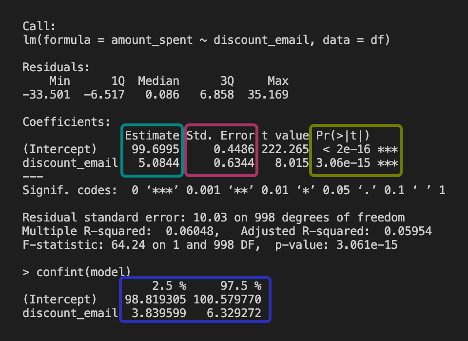
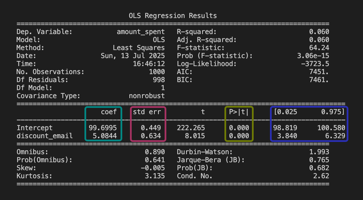
Estimate: This represents the “best guess” estimated effect given your data: e.g., “Sending a discount email increases sales, on average, by R$5.08 per user”. That is: the estimated effect is greater than R$5.08 for some users, and less than R$5.08 for others, but the average is R$5.08.
Standard error: It’s a measure of the variability of the estimate. It measures how much the estimate would vary if you repeated the study with different samples; smaller means more precise. FYI: the standard error is the square root of the variance of the estimate.
P-value: Shows whether the effect is statistically different from zero (if p-value < 0.05). In our example, it indicates the effect is statistically significant.
Confidence interval: The range where the true effect likely lies. Since [R$3.84, R$6.33] does not contain zero, this confirms the effect is likely positive.
Now let’s put everything together and interpret the table: If the estimate is R$5.08, the 95% CI is [R$3.84, R$6.33], and the p-value < 0.01, you can say, “We’re pretty confident the discount emails led to an increase in sales, probably between R$3.84 and R$6.33 per user. The chance this is just luck is less than 1%.”
1.6.1 A note about R-squared
If you have run regressions before, you were likely taught to always check the \(R^2\) (R-squared). This statistic ranges from 0 to 1 and tells you how much of the variation in the outcome (\(Y\)) is captured by your model.
In machine learning and prediction tasks, a high \(R^2\) usually what you would want. If you want to predict user churn or credit risk, you need a model that explains as much variation as possible to make accurate calls for each individual user.
In causal inference, however, the game is different. We care about the slope of the coefficient (\(\beta\)) — the estimated effect of our treatment — and whether it is unbiased. We don’t necessarily care if we can predict the outcome perfectly.
For example, imagine you are estimating the effect of a new feature on user retention. There might be a thousand other random factors that influence retention, resulting in a model with a low \(R^2\), say 0.05. But if your experiment is well-designed, your estimate of the treatment effect can still be precise, unbiased, and valuable for decision-making.
So, don’t worry about a low \(R^2\) if your focus is on understanding the impact of a specific intervention. It just means there is a lot of unexplained noise in the individual outcomes — which is typical in human behavior — but it doesn’t invalidate your causal finding.
1.7 Correlation is not causation, but what is causation?
You may have noticed that I keep coming back to randomized experiments in my examples. That’s because randomized experiments are the gold standard for causal inference. In these setups, running a simple linear regression often gives you a credible estimate of the true causal effect.
But most data you’ll run into wasn’t generated by random assignment. In these cases, running a regression and finding an “effect” isn’t enough to say it’s causal. What you’re really looking at is a correlation, and you’ve probably heard that old line “correlation does not imply causation”.
So what is causality, and when may we believe we’re really seeing it?
Causality means that changing X actually impacts Y:17 Judeal Pearl calls this the “do” operator: what happens to Y if you do change X? Donald Rubin talks about “potential outcomes”: what would happen to Y for the same unit, with and without the treatment? In both cases, the core idea is: causality is about understanding what would happen under different scenarios; one where you act, and one where you don’t.
To keep things practical, here are three classic criteria often used for thinking about causality:
- The cause generally comes before or at most at the same time as the effect. You can’t blame today’s sales on tomorrow’s ad campaign.
- Changing the cause means the effect would change. If you actively bump up ad spend (supposedly the cause), does sales really go up as an effect?
- No sneaky hidden variables are fooling you. There’s nothing else lurking in the background (like a holiday, or a viral TikTok trend) that explains both the ad spend and the sales increase. In other words, you’ve dealt with all the confounders.
Here’s the problem: in practice, correlation can easily lead us to believe we’ve checked the first two boxes, when in reality we haven’t. It can feel like we’ve established that the cause comes before the effect and that changing the cause changes the effect, but often that’s just an illusion; because we haven’t dealt with hidden confounders (after all, they are hidden).
That’s why so much of causal inference - whether you’re following Pearl or Rubin - focuses on how to rule out those hidden variables. Most methods are about creatively asking, “How can I make the world look like a randomized experiment, even when I can’t actually run one?”
1.8 Wrapping up and next steps
We’ve covered a lot of ground in this chapter. By now you can:
- Distinguish between prediction (machine learning asks “what will happen?”) and causation (causal inference asks “what would have happened if…?” by explicitly considering alternative scenarios).
- Speak the language of data analysis: population, sample, model, parameter, estimate, outcome, and covariates.
- Translate a business question into an estimand, select an estimator to calculate it, and interpret the resulting estimate - using linear regression and the basics of statistical inference.
- Understand causality: it means modeling what would happen if you actually changed something, not just noticing patterns. It’s about comparing real and alternative scenarios, and making sure hidden factors or simple correlations aren’t misleading you.
In the next chapter you will:
- See why raw data alone never proves causality; a causal model is required to avoid mistaking correlation for cause.
- Understand the mechanics of Omitted Variable Bias and Selection Bias, and why they are the arch-enemies of causal inference.
- Adopt the potential outcomes framework: always compare what happened to what could have happened.
- Appreciate why randomized experiments remain the gold standard: random assignment creates clean counterfactuals and wipes out selection bias.
- Meet the main causal estimands: average treatment effect (ATE), average treatment effect on the treated (ATT), Intention-to-Treat (ITT), Local Average Treatment Effect (LATE), Conditional Average Treatment Effect (CATE), and Individual Treatment Effect (ITE); and decide which one matches your question.
Appendix 1.A: defining key statistics concepts
Earlier, in Section 1.6, we learned how to read a regression table and what standard errors tell us—they show how much uncertainty there is in an estimate. We also mentioned correlation, which measures how closely two variables move together.
There is a lot more to statistics than what we’ve introduced so far, and teaching all of it is not the goal of this book. But let me do my best in this appendix to clearly summarize some formal definitions that will assist you, and give simple examples to help you understand them. This way, you’ll have the basics to follow the methods in this book and to learn more later if you want.
Random variables and probability distributions
A random variable is a quantity that can take on different values each time you observe it, due to chance or randomness. In our data, each user’s engagement time is a random variable—it varies from user to user, and you can’t predict it exactly for any one person.
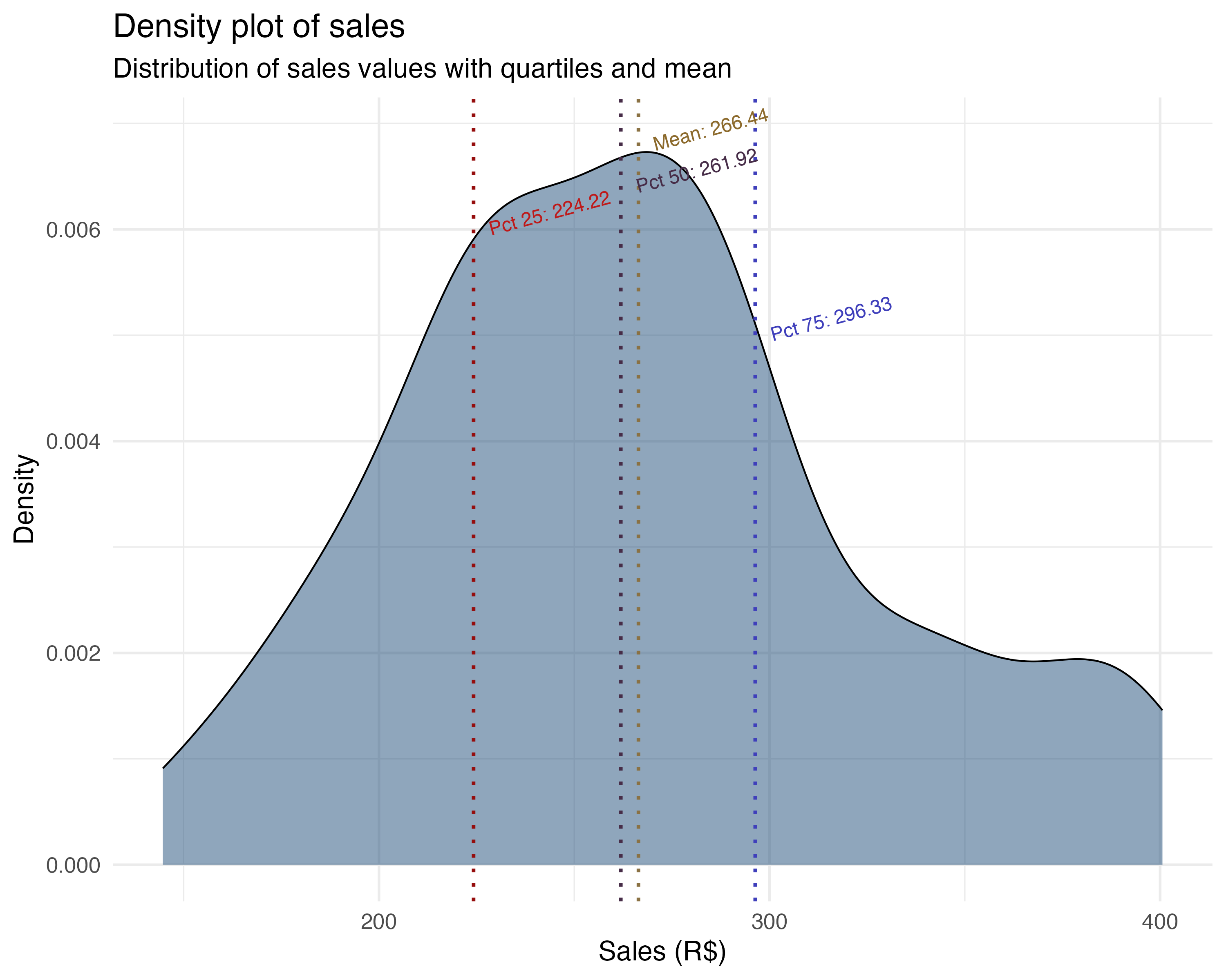
A probability distribution describes all the possible values a random variable can take and how likely each value is. For example, user engagement might be spread out in a bell curve (normal distribution), while recommendations shown (a count) might be more like a Poisson distribution. See the figure below for an example of a probability distribution.
The takeaway:
Expectation, expected value, mean, and average
Expectation, expected value, mean, and average are closely related, but there are subtle differences:
Expectation and expected value are terms from probability theory. They refer to the long-run average value of a random variable if you could repeat the process infinitely many times. In this sense, they are more abstract and theoretical than practical.
Mean and average are often used in statistics for the same idea, but usually refer to the value you actually can compute from your data (i.e., the sample mean).
In practice, when you calculate the average engagement across users, you’re estimating the expected value (mean) of engagement in the population. In other words, you are estimating the population mean.
The takeaway:
Conditional expectation, conditional average, and conditional mean
Conditional expectation, conditional average, and conditional mean all describe the average value of a variable, but only for a subset of cases; that is, those that meet a certain condition.
Conditional expectation is the theoretical average of a variable, given some condition (e.g., engagement given that recommendations_shown > 5).
Conditional mean and conditional average are the sample versions: the mean or average you actually calculate from data, restricted to cases meeting the condition.
For example, the conditional average of total_spent for users who spent more than 10 minutes in the app is the mean of total_spent among just those users.
The takeaway:
Variance and standard deviation
Variance measures how much a variable’s values spread out from the mean. A high variance means values are more spread out; low variance means they’re tightly clustered around the mean.
The standard deviation is the square root of the variance. It measures spread in the same units as the original variable, making it easier to interpret.
The takeaway:
Covariance and correlation
Covariance shows how two variables move together. If both increase at the same time, covariance is positive; if one goes up while the other goes down, it’s negative. Importantly, the covariance of a variable with itself is just its variance — so covariance generalizes the idea of variance to pairs of variables.
Correlation is a standardized version of covariance. It always ranges from -1 to 1, making it easy to compare across different variable pairs. A correlation of 1 means perfect positive linear relationship, -1 means perfect negative, and 0 means no linear relationship. Unlike covariance, correlation is not affected by the units or scale of the variables.
Covariance vs. Correlation
Covariance tells you the direction of a relationship (positive or negative), but its value depends on the units of the variables, so it’s hard to compare across different pairs.
Correlation tells you both the direction and the strength of a linear relationship, and is always between -1 and 1, making it easy to interpret and compare.
The takeaway:
Law of large numbers
The law of large numbers says that as you collect more data, the sample mean will get closer to the true mean of the whole population. In other words, with more users, your average sales becomes a better estimate of the real average. The figure below illustrates how the sample mean converges to the population mean as sample size increases.
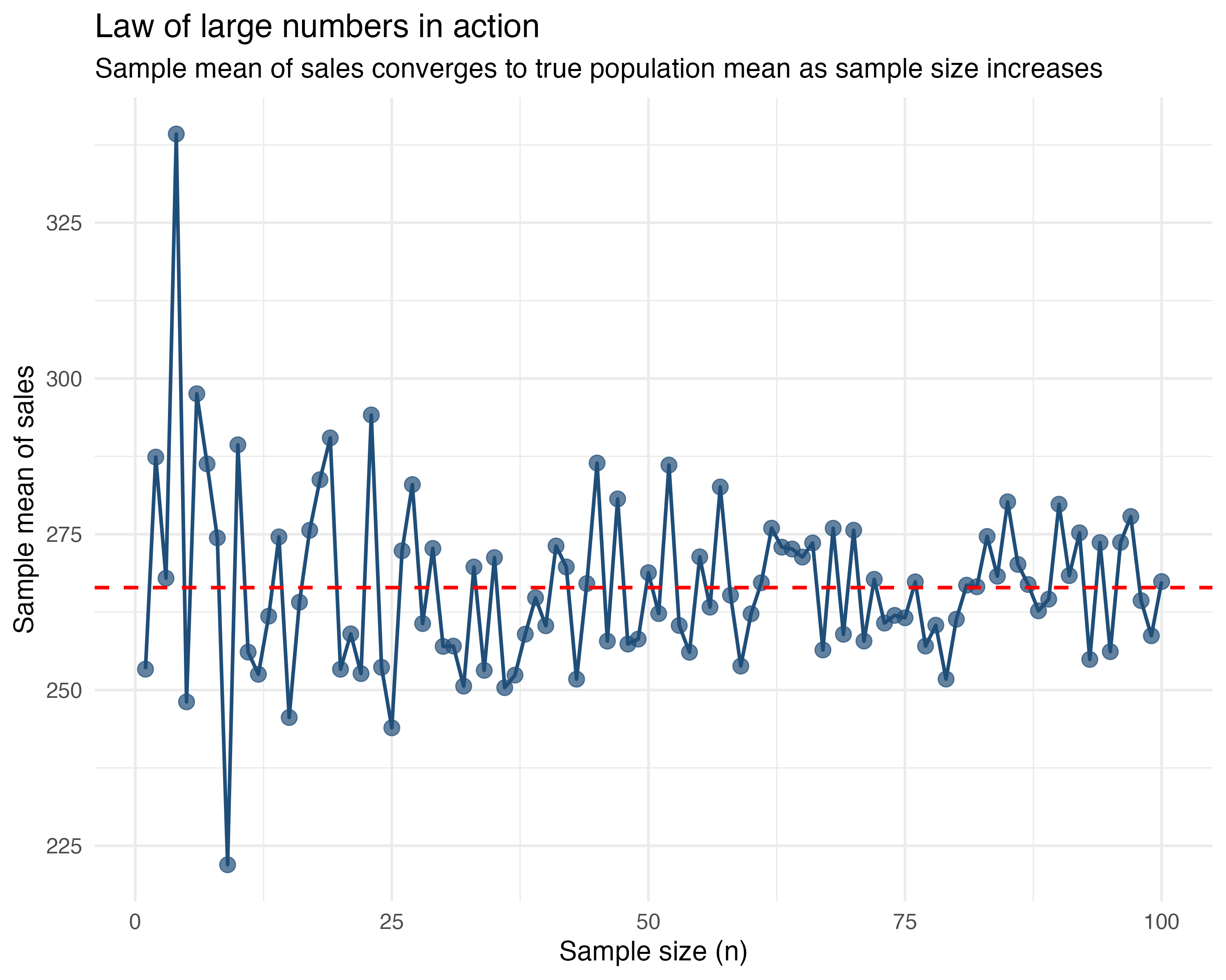
Let’s say you’re trying to estimate average sales. If you only look at 5 customers, you might get a fluke—maybe it’s all holiday shoppers. But if you look at 1,000 customers, that weirdness averages out. Your sample mean converges to the population mean.
The takeaway: Your boss should trust your estimate more when you say, “This is the average from 1,000 observations”, than when it’s from just 10.
Central limit theorem
The central limit theorem is a statistical superpower. It says that if you repeatedly take samples from a population and compute their means, those means will be distributed in a bell curve (increasingly similar to the normal distribution), even if the original data was messy or skewed.
This is why averages from large samples are more reliable. Let’s say we use the data on sales vs ad spend, which contains 100 observations, and randomly sample 30 users again and again. We do this 1000 times. For each time we sample, we calculate the average sales in this 30-observation sample and plot it.
The distribution of these 1000 averages of sales is approximately normal, as shown in the figure below.
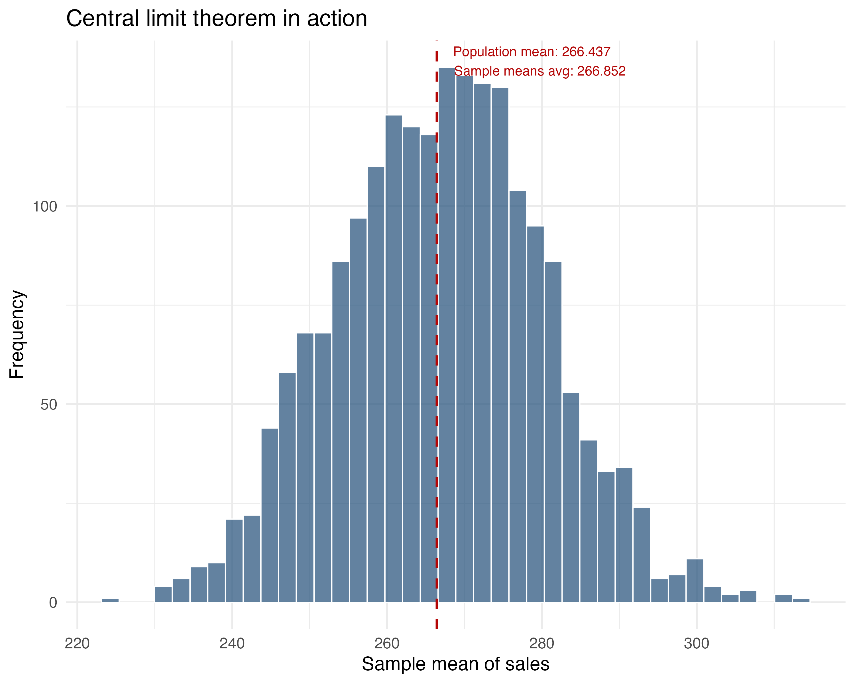
The takeaway: The average of many samples will cluster around the true population mean in a bell-shaped curve. This allows us to use normal distribution properties for inference (like p-values and confidence intervals) even if the individual data points aren’t normally distributed.
Appendix 1.B: Visualizing multiple regression
Appendix 1.C: Reading coefficients in different scales
The four specifications in Section 1.3.3 all use outcomes measured in levels — minutes on the app. But many real-world analyses involve outcomes expressed as rates or log-transformed variables. This appendix covers the mechanical conversions you need to read those coefficients correctly.
Absolute and relative effects
An absolute effect is the change in levels — R$5.08 per user per month. A relative effect expresses that change as a percentage of the baseline — a 5% lift in spending. Both are useful, but for different audiences. Absolute effects help with capacity planning and cost calculations — you can multiply R$5.08 by 1 million users and get a monetary figure for the P&L. Relative effects make it easier to compare across segments with different baselines — a 5% lift sounds different depending on whether the baseline is R$10 or R$10,000. Use both, but never mix them in the same sentence without labeling which is which.
From levels to percent change
Most teams want to read effects as percent change — it’s the format that sticks in a slide deck. The conversion is straightforward — divide the level change by the baseline level:
\[ \%\Delta = \dfrac{\Delta y}{y_{0}} \]
In plain English: percent change equals the change in outcome divided by the baseline outcome. The control-group average is denoted \(y_0\) in formulas and baseline in code. Multiply by 100 to express it as a percentage.
A R$5.08 absolute effect might sound small until you see it as a percentage — context matters. This small step prevents many miscommunications between product and finance.
Percentage points versus percent change
This distinction trips people up regularly. Percentage points measure the distance between two percentages. Percent change measures growth relative to the starting percentage. The formula connecting them:
\[ \%\Delta = \dfrac{\Delta \text{pp}}{p_{0}} \]
In plain English: percent change equals the change in percentage points divided by the baseline percentage.
Here is a vivid example. Suppose a control group has a 5.5% opt-in rate and the treatment group has 36%. That’s a 30.5 percentage point increase — but in relative terms, the adoption rate grew by 30.5 / 5.5 = 555%. Same data, wildly different framing.
Remember: the difference between 1% and 2% is not “just 1 point” — it’s a 100% increase. Always clarify whether you’re reporting percentage points or percent change.
When the model uses logs
Your regression spits out a coefficient of 0.045 on a log-transformed outcome. Your manager asks: “so what does that mean in reais?” This is where log translations matter — and getting them wrong is easy.
In a semi-log model (log of \(y\) on \(x\)), a coefficient \(\beta_{\text{semi}}\) means the outcome changes by roughly \(100 \times (e^{\beta_{\text{semi}}} - 1)\) percent when \(x\) increases by one unit.18 In a log-log model (log of \(y\) on log of \(x\)), \(\beta_{\text{elas}}\) is an elasticity: a 1% change in \(x\) leads to about a \(\beta_{\text{elas}}\)% change in \(y\).
Elasticities show up constantly in spend curves and pricing decisions. Suppose you estimate a log-log model for an e-commerce product and find a price elasticity of \(-1.2\). That means a 1% price increase is associated with a 1.2% drop in quantity demanded — demand is elastic, and raising prices would reduce total revenue. Both translations in code, using illustrative numbers:
Log transformations are common when outcomes are right-skewed (revenue, session duration, spend). When you encounter them, these translations apply directly.
As Google advises, “NotebookLM can be inaccurate; please double-check its content”. I recommend reading the chapter first, then listening to the audio to reinforce what you’ve learned.↩︎
The examples in this book are based on tech and digital businesses. If you ever get stuck on a term, feel free to check the glossary or search online. For now, ‘app engagement’ means how often and how long users interact with an app, which usually leads to more revenue, more ads seen, etc. Gamification is making a process feel like a game - showing progress bars, giving points, badges, or visual rewards as users complete steps. The goal is to make setup feel fun or rewarding, so more people finish it and keep coming back.↩︎
Some readers may have noticed: if our model is far from the true model - the one known only to the all-knowing God, or if our sample doesn’t represent the population well, then our estimate will be biased. We’ll dive into both of these issues in the next two chapters.↩︎
The subscript \(i\) in \(y_i\) and \(x_i\) refers to a specific individual in data. If you have 1,000 users, \(y_1\) is the outcome for user 1. If data is over time, we add a \(t\) subscript: \(y_{i,t}\) is the outcome for user \(i\) at time \(t\).↩︎
A quick warning: in causal inference, we can’t just throw in every variable we have. As we’ll see in Chapter 6, controlling for the wrong things (so-called “bad controls”) can actually create bias instead of removing it.↩︎
You might be wondering: what’s the difference between a parameter and an estimand? The estimand is the quantity you want to learn, your target. It’s the specific causal effect or comparison your question is trying to answer. The parameter is how that quantity is represented inside a model, the mathematical expression of the estimand in your chosen framework. We’ll make this clearer when we introduce causal estimands in the next chapter.↩︎
A randomized experiment - sometimes called an experiment, A/B test, or randomized controlled trial, is a study where you randomly assign units (such as users or customers) to different groups, typically “treatment” and “control”. Because group assignment is determined purely by chance, any differences in outcomes between the groups can be attributed to the treatment itself, rather than to pre-existing differences between the groups. We will study all about it in Chapter 4 and Chapter 5.↩︎
In practice, instead of difference in means, we often use linear regression to estimate effects even in experiments. Linear regression, explained in Section 1.3, yields the same average treatment effect (thanks to randomization) while allowing adjustment for covariates, for greater precision.↩︎
To load it directly, use the example URL
https://raw.githubusercontent.com/RobsonTigre/everyday-ci/main/data/advertising_data.csvand replace the filenameadvertising_data.csvwith the one you need.↩︎OLS isn’t your only option. Methods like Double Machine Learning (DML) or Causal Forests handle non-linearities better. But they share OLS’s structural limits: if you miss some assumptions, a fancier model just gives you a fancier biased estimate.↩︎
If you think back to high school math, it is a classic equation for a straight line we called “linear function”. Back then, our teachers called \(\beta_1\) “a” (the slope) and \(\beta_0\) “b” (the intercept), so we wrote it as \(f(x) = ax + b\) instead of \(Y = \beta_0 + \beta_1 X\).↩︎
Detailed explanation: \(\hat{\beta}_0 = 16.33\) is the expected time on app for the “reference” or “control” group because \(\beta_0 = \beta_0 + (\beta_1 \times \text{new\_ui})\) when \(\text{new\_ui} = 0\). And by definition of this A/B test, \(\text{new\_ui}\) is 0 for those in the control group↩︎
If you have three segments (Casual, Power, Business), you may include dummy variables for Power and Business, leaving Casual as the reference. The coefficient on the Power dummy tells you how Power customers differ from Casual customers, holding treatment and other covariates constant. This avoids the dummy variable trap while preserving interpretability.↩︎
Notice that our regression equation includes all three terms: the two individual variables (main effects) and their product (the interaction term). It would not make much sense to include only one of the variables or the interaction term without the others.↩︎
Think of it as a tug-of-war. For a user with 1 year on the app, the linear term adds about \(1.62\) minutes, while the squared term subtracts only \(0.24\) minutes (\(0.24 \times 1^2\)). The linear term wins, and engagement goes up. But for a user with 5 years, the linear term adds \(8.1\) minutes (\(1.62 \times 5\)), while the squared term now subtracts a hefty \(6.0\) minutes (\(0.24 \times 5^2 \approx 0.24 \times 25\)). The drag is getting heavier.↩︎
This threshold of 0.05 is rather arbitrary and can be adjusted based on the specific context. Some areas are more strict and consider 0.01 as the threshold, while others are more lenient and consider 0.1 as the threshold.↩︎
We could say causality means that exogenously (i.e., externally) changing the probability distribution of X actually changes the probability distribution of Y↩︎
The exact semi-log translation is \(100 \times (e^{\beta}-1)\) percent. The small-\(\beta\) approximation \(100\beta\) percent is often close enough.↩︎