12 Heterogeneous treatment effects: Different people, different reactions
A/B Testing, Causal Inference, Causal Time Series Analysis, Data Science, Difference-in-Differences, Directed Acyclic Graphs, Econometrics, Impact Evaluation, Instrumental Variables, Heterogeneous Treatment Effects, Potential Outcomes, Power Analysis, Sample Size Calculation, Python and R Programming, Randomized Experiments, Regression Discontinuity, Treatment Effects
12.1 When the average hides the decision
A few years ago a doctor prescribed me metoclopramide, a common anti-nausea drug. For most people it does its job, but it left me extremely restless and worse off, a rare but known adverse reaction. The clinical trials are not wrong: on average, the drug probably helps many people. That average does not tell me whether I will be one of them.
That gap between the average and the individual is the whole subject of this chapter. Up to now we have worked hard to estimate one number as credibly as possible: the average treatment effect. That number can answer the general “did it work?” — but not the question that drives the business decision: for whom did it work, and what do we do about it?
Imagine a marketing team with a fixed budget for discount coupon campaigns. They can send a discount to only a slice of the user base, not everyone. Sending a coupon to a customer who would have bought anyway wastes margin. Sending one to a customer who will not convert wastes the coupon too. The extra profit is in finding the users whose behavior actually changes because of the discount — and spending the limited budget on them. DoorDash, for instance, reports using causal inference to “estimate the true incremental effect of a given promotion on each user” and then choosing whom to treat under a fixed budget (Xu et al. 2025).
To make this concrete, I will use one simulated dataset throughout the chapter. Say a company ran a clean experiment that randomly gave a R$5 coupon to half of 20,000 users (D = 1) and nothing to the other half (D = 0).2 Then it measured each user’s observed_profit: the profit they generated over the following weeks, recorded the same way for everyone in the experiment, treated or not.
For every user we also observe four features built from their purchase history, all measured before the experiment started: recency (how long since their last purchase, 0 = just bought, 1 = long lapsed), frequency (how many times they have bought), past_spend, and disc_sens (a discount sensitivity score in \([0, 1]\)).3 Because we simulated the data, we know the true effect for each user, stored in the dataset as true_cate — the ground truth we get to grade our methods against, something real data never hands you.
This chapter uses machine-learning (ML) tools, so we first need to match a few ML terms to the terminology used earlier in the book:
- feature = covariate / control variable / regressor (the predictors \(X\) — here
recency,frequency,disc_sens, andpast_spend) - train / fit a learner = estimate a model
- (base) learner = model / estimator
- prediction = fitted value / estimate
The outcome (\(Y\), here observed_profit) keeps its name throughout — I avoid the ML labels target and label for it. The name is deliberate: observed_profit is the profit we observe for every user, treated or not — not the coupon’s “incremental profit” (its uplift), which is the causal effect the rest of the chapter sets out to estimate. Terms with no earlier-chapter equivalent (honesty / sample splitting, out-of-bag, and nuisance functions) are defined where they first appear.
Suppose you run the experiment, estimate the average treatment effect, and obtain the results in Table 12.1:
| Quantity | Value |
|---|---|
| Average treatment effect (difference in means) | R$0.30 per user |
| 95% confidence interval | [R$0.15, R$0.46] |
| Share of users the coupon actually pays off for | about 11% |
The experiment estimates a statistically significant increase of R$0.30 in profit per user. That average could lead the company to cancel the program, even though it answers the wrong question for a targeted campaign. A minority of users generates roughly R$7 each in incremental profit, while the coupon produces a small loss for the majority. Averaging the two groups makes the overall effect look small.
Every effect in this table — and in the rest of the chapter — is measured on profit before subtracting the R$5 the coupon itself costs. For most users the effect is already slightly negative: sending them a coupon lowers their profit by about R$1. A small group responds strongly enough to be worth treating, and that is what “pays off” means in the last row: the coupon lifts a user’s profit by more than the R$5 it costs, not merely by more than zero.
This chapter asks who benefits and by how much, so the budget can be directed toward the 11% of users whose response covers the coupon cost. The methods that follow estimate effects that vary across users, but they still depend on the assumptions that make those effects causal.
Data: All data we’ll use are available in the repository. You can download it there or load it directly by passing the raw URL to read.csv() in R or pd.read_csv() in Python.4
Packages: To run the code yourself, you’ll need a few tools. The block below loads them for you. Quick tip: you only need to install these packages once, but you must load them every time you start a new session in R or Python.
# If you haven't already, run this once to install the packages:
# install.packages(c("tidyverse", "grf", "policytree", "DiagrammeR"))

# You must run the lines below at the start of every new R session.
library(tidyverse)   # data wrangling and plots
library(grf)         # generalized random forests: causal_forest() and friends
library(policytree)  # learned targeting rule (the policy tree in the last section)
# If you haven't already, run this in your terminal to install the packages:
# pip install pandas numpy scipy statsmodels econml scikit-learn mcf (or use "pip3")
# You must run the lines below at the start of every new Python session.
import pandas as pd
import numpy as np
import statsmodels.formula.api as smf # OLS with a formula interface
import statsmodels.api as sm # array-interface OLS for the validation checks
from scipy import stats # t-test in the power-problem section
from econml.dml import CausalForestDML # causal forest estimator
from econml.validate.drtester import DRTester # RATE / TOC evaluation
from sklearn.ensemble import RandomForestRegressor, RandomForestClassifier
from sklearn.model_selection import train_test_split # held-out validation splits
from mcf.optpolicy_functions import OptimalPolicy # exhaustive policy tree over a candidate split grid12.2 What we are trying to estimate
Before reaching for any algorithm, we need to be precise about the target, because “the effect of the coupon on each user” can mean three different things, and they are not equally within reach.
The effect on this user: the one we cannot have. Recall the potential-outcomes framework from Chapter 1 and the estimands discussion in Section 2.5: each user \(i\) has two potential outcomes, \(Y_i(1)\) if they get the coupon and \(Y_i(0)\) if they do not. The individual treatment effect (ITE) is the difference between the two, \(\tau_i = Y_i(1) - Y_i(0)\): how much this specific user’s profit changes because of the coupon. It is exactly what a business dreams of, and it is unobservable. Seeing it would require watching the same user live through the same weeks twice, once with the coupon and once without.5 No method in this chapter escapes that, however sophisticated it looks.
The effect on users like this one: the one we can estimate. Take one user from our dataset, call her Maria: lapsed for months, buys often when she is active, high discount sensitivity. We cannot ask “what does the coupon do to Maria?”, but we can ask the next best question: what does the coupon do, on average, to users who look like Maria? That is the conditional average treatment effect, or CATE:
\[ \tau(x) = \mathbb{E}\!\left[\, Y_i(1) - Y_i(0) \mid X_i = x \,\right]. \]
Read it from right to left: gather the users whose features \(X_i\) match the profile \(x\), then average their effects. Conditioning on \(x\) is the formal way to say something intuitive such as “the effect depends on who the user is”. If this sounds like an interaction between treatment and the user’s characteristics, that is the right intuition (Molak 2023). We will begin with interaction models.
Mind the gap between the two. A CATE is still an average. A local one, taken over users similar to Maria, but an average all the same. “Users like Maria gain about R$5” does not mean Maria gains R$5: she might gain R$9 while her data twin gains R$1. For instance, a drug can have a CATE of 0.5 in a group where no individual has an effect of 0.5 — one patient is saved, another is harmed, and the average sits where nobody lives (Facure 2023). Every per-user number a model hands you is a statement about a group, not a promise to a person.
So watch the vocabulary too: the literature often calls the CATE the individualized treatment effect — one suffix away from the individual treatment effect, yet a different object (Molak 2023). When a tool promises “individual-level effects”, read the fine print: it is delivering CATEs.6
A coarser cousin. A subgroup effect is a CATE with a blunt definition of “like Maria”: the average effect among “iOS users,” or among “users who lapsed more than 60 days ago.” It is the same object at a lower resolution: handy when you need a rule you can explain in one sentence, but limiting when the real drivers are finer than the buckets.
Finally, the CATE is a means to an end. The experiment’s ATE answered the average question — did the coupon move profit at all, before its cost? — and the CATE answers the decision this chapter cares about: whom to treat, given that we cannot treat everyone (Facure 2023). The goal is a targeting rule: estimate \(\tau(x)\) credibly, then turn it into a rule for spending the coupon budget on the users where it pays off.
12.3 Before the algorithms: identification still comes first
The methods in this chapter are more flexible than the OLS used so far, but flexibility does not replace identification assumptions. Their output has a causal interpretation only when those assumptions hold. Machine learning methods adapted to causal tasks facilitate estimation, but do not ensure the identification of causal effects (Brand et al. 2023). Machine learning does not fix omitted variable bias — it just fits a more elaborate model on whatever variation you give it.
Three assumptions support a causal interpretation. The first two are the same pair that licenses any selection-on-observables analysis:
Unconfoundedness. Conditional on the observed features \(X_i\), treatment is as good as randomly assigned — there is no unmeasured factor that drives both who gets the coupon and how they respond. This is the conditional independence assumption from Section 6.4.2. In our example this is satisfied by design, because the coupon was randomized. That is the cleanest home for heterogeneity work: an experiment with rich features. With purely observational data you are betting that you measured everything that matters, and that is a hard bet.
- A reminder of how badly the observational bet can go: one study took 663 large-scale randomized advertising experiments run on Facebook and asked whether state-of-the-art observational methods, fed more than 5,000 user-level features, could reproduce the experimental effects. They could not. The verdict was that “despite having access to large-scale experiments and rich user-level data, we are unable to reliably estimate an ad campaign’s causal effect” (Gordon et al. 2023). More data and a fancier model did not close the gap. Randomization did.
Positivity (overlap). Every type of user must have a real chance of being in either arm — the common support requirement we met in Section 6.4.3. Formally, the propensity score \(e(x) = P(D=1 \mid X=x)\) must be strictly between 0 and 1 for all \(x\): within every group of lookalike users, treatment can be likely or unlikely, but never guaranteed or impossible (Chernozhukov et al. 2024). If some kind of user is never treated, no method can tell you their effect; it can only extrapolate, and extrapolation is not estimation.
No interference. One user’s coupon must not change another user’s outcome. Randomization does not buy this one — it is about users being separate units, not about how treatment was assigned. Coupon sharing within a household, referrals, or treated users competing with untreated ones for the same stock would all violate it in a real campaign, and every estimator in this chapter takes its absence for granted. Designs that measure spillovers directly appear in Chapter 15.
A fourth requirement is specific to heterogeneity work, and just as easy to violate: every feature in \(X\) must be “frozen” at the moment of assignment. Our four features qualify because they are drawn from purchase history that predates the experiment. Many tempting additions do not: whether the user redeemed the coupon, their engagement after the campaign, their follow-up purchases, their post-campaign satisfaction. Anything measured after assignment is potentially affected by the coupon, which makes it a mediator or a collider in disguise — the bad controls we met in Section 6.3.
Split users on a variable like that and you stop asking “for whom does the coupon work?” and start asking “among users who already responded one way, how do the numbers look?”. Randomization does not protect you here: it guarantees a clean average effect, not a clean \(\tau(x)\) built on post-treatment features.
Whether a variable is a good, bad, or neutral control depends on its position in the causal graph and the estimand, not only on when it was measured. A safe operational rule is the feature freeze: snapshot the feature table at assignment time, and let nothing measured after that moment in.
Every method here assumes you are in one of two settings: a randomized experiment, like our coupon example, or observational data where unconfoundedness and overlap can be defended with evidence. If you are in neither, the fix is identification, not a more flexible estimator. Randomization is the cleanest route to a credible CATE, but it is not the only one. Instrumental variables (Chapter 7), regression discontinuity (Chapter 8), and difference-in-differences (Chapter 9 and Chapter 10) each have heterogeneous-effects variants that inherit their design’s assumptions. If your data fit one of those designs, begin with its identification strategy.
12.4 Manual heterogeneity: useful, but fragile
Long before causal forests, analysts looked for heterogeneity by hand. These manual methods are worth knowing because they are transparent, they are often enough, and seeing where they strain is the best motivation for what comes next. The three common options are subgroup means, OLS interactions, and separate regressions by treatment arm.
Subgroup means. Pick a feature you suspect matters, split users into a subgroup and its complement, and compare the treated-minus-control difference within each. In our coupon data, splitting on discount sensitivity gives a hint: users above the median sensitivity show an effect of about R$0.86, those below about −R$0.25. This difference points in the right direction, but it captures only part of the heterogeneity because no single feature determines the true effect.
OLS with interaction terms. The regression workhorse from Section 1.3 extends naturally: interact the treatment with features and read the coefficients. The limitation is that an OLS interaction can estimate only the heterogeneity represented by the interaction terms you specify. If the true effect depends on recency \(\times\) frequency \(\times\) disc_sens together, a model with only pairwise terms will miss it. On our data the interaction model recovers sensible pieces (a positive D:disc_sens coefficient of about 2.96, a D:recency of about 4.57, both highly significant), yet its implied CATE correlates only 0.64 with the truth — it picks up the part of the pattern a straight line can describe and misses the part that only appears when several features move together.
Separate regressions per arm. Fit one model on the treated users and another on the controls. Then, for every user, ask both models the same question — “how much profit would this person bring?” — and subtract the control answer from the treated one. That gap is this user’s estimated effect — and because each model ties profit to the user’s own features (recency, discount sensitivity, and the rest), the gap shifts from one user to the next.
A bargain-hunter and a loyal big spender come out with different numbers, and that spread of gaps across users is the heterogeneity; average it over everyone and you are back to a single ATE. The appeal is intuitive: each group gets its own model, free to behave however it likes, with nothing forced to carry across the two. The catch is just as concrete: each model only ever sees one arm, so it learns from half the users, and the estimate gets shaky wherever an arm is thin — a rare kind of customer, or a small treatment group. It is simple enough to run today, and it is the seed of the T-learner we meet later.
All three share a hazard that has nothing to do with which features you chose. A subgroup or interaction that you specified before looking at the data can have an ordinary confidence interval for that planned question. But once you start slicing the data many ways and keep the slice that looks interesting, you start manufacturing false positives. Test twenty subgroups at the 5% level and, even if the coupon helped no one differently, you expect one “significant” subgroup by luck alone.
This is the multiple testing problem we met in Section 5.5.2: searching many subgroups or metrics inflates the chance of a spurious finding unless the search is planned or evaluated on independent data. Chopping a continuous feature like recency into arbitrary bins makes it worse — different cutpoints tell different stories, and it is tempting to keep the one that confirms your hypothesis.
Manual methods do not just risk missing real heterogeneity; they can lead you to fake heterogeneity and then tempt you to report it as if the significant subgroup had been fixed in advance (e.g. HARKing: hypothesizing after results are known). We need an approach that searches for variation systematically and then lets us check whether the variation is real.
12.5 From manual rules to meta-learners
The first systematic idea is to stop hand-specifying interactions and let a flexible model do the bookkeeping. Meta-learners are recipes that turn any off-the-shelf predictor (a gradient boosting model, a random forest, even a regression) into a CATE estimator by combining outcome predictions (Künzel et al. 2019). Two are worth understanding because they bracket the trade-off.
The S-learner (“S” for single) fits a single model for the outcome, using all the features \(X\) together with the treatment indicator \(D\). Once we have that model, we predict each user’s outcome twice: once with the treatment turned on (\(D=1\)) and once with it turned off (\(D=0\)). The difference between those two predictions is our estimate of the treatment effect for that user.
It reuses all the data efficiently, but it has an important limitation. When treatment is one feature among many and its contribution to outcome prediction is small, regularization can shrink its influence toward zero and obscure a real effect. The S-learner can therefore understate both the average effect and its heterogeneity.7
The T-learner (“T” for two) goes the other way. It fits two models, one per arm, which is the separate-regressions idea from above generalized to any learner, and subtracts their predictions. Because each arm gets its own model, the T-learner can capture very different response surfaces in the treated and untreated groups, but it pays for that flexibility with variance. Wherever one arm is thin, say a rare type of user or a small treated group, that arm’s model is estimated on little data and the difference between predictions gets noisy.
Both rest on the potential outcomes framework. Each predicts what a user’s outcome \(Y\) would have been in the other group, so each is just a different strategy for filling in the missing potential outcome for every user. They also share the same limitation: their CATEs are just differences between outcome predictions. If the prediction model misses a real response pattern, the estimated heterogeneity misses it too; if the model chases random bumps in the sample, those bumps can become fake treatment-effect heterogeneity. The recipe itself does not tell us how to separate signal from noise.
That limitation matters because flexibility lets the learner explore endless ways the effect might vary: which features interact, where to split a continuous one, how to rank users, which response patterns to fit. That flexibility also creates overfitting: the learner can mistake random noise for signal, making a pocket of users look unusually responsive only because this sample happened to be noisy there.
But the statistical problem runs deeper than overfitting: the same data usually does both jobs — it finds the pattern and then measures it. When a subgroup is singled out because it looked unusually responsive, measuring the effect on those very same rows folds in the noise that made it stand out, so the estimate is flattered from the start.
So when one dataset discovers the subgroup, ranking, or partition and then estimates its effect, an ordinary confidence interval answers the wrong question. It reports the uncertainty as if you had committed to that segment in advance, ignoring the extra uncertainty from the search that made the segment look interesting in the first place. Statisticians call this post-selection inference.
Other meta-learners, such as the X-learner and DR-learner, refine these ideas; Molak (2023) provides an accessible overview. The remaining problem is how to search for heterogeneity without overfitting while retaining valid uncertainty estimates. The fix has to separate discovery from measurement, or use methods that reproduce that separation.
That is the problem the example customer Maria represents. She is a lapsed user who buys often when she is active and has high discount sensitivity, but we do not want to hand-code “users like Maria” with arbitrary cutoffs for recency, frequency, and discount sensitivity. We also do not want a flexible model to discover that profile and then pretend the uncertainty is the same as if we had specified it in advance. We need a method that searches for users like her without using the same observations to discover the group and estimate its effect.
12.6 Why trees and forests help
Trees are a natural fit for that job because they partition users into groups and estimate something within each group, which is exactly the CATE idea: gather comparable users, then estimate the coupon effect for that profile. The subsections that follow build the method up one idea at a time:
- how a single tree carves the data into groups,
- how methods built for predicting outcomes can be adapted to estimate causal effects,
- how honesty uses separate observations to choose the groups and estimate their effects, and
- why a whole forest of these trees beats any single one.
The four subsections stay in words and pictures. If you want the same argument in notation — what each method is aiming at, which piece of it we cannot observe, and how the splitting rule is rewritten to work around that — Appendix 12.A walks through it.
12.6.1 How a single decision tree is built
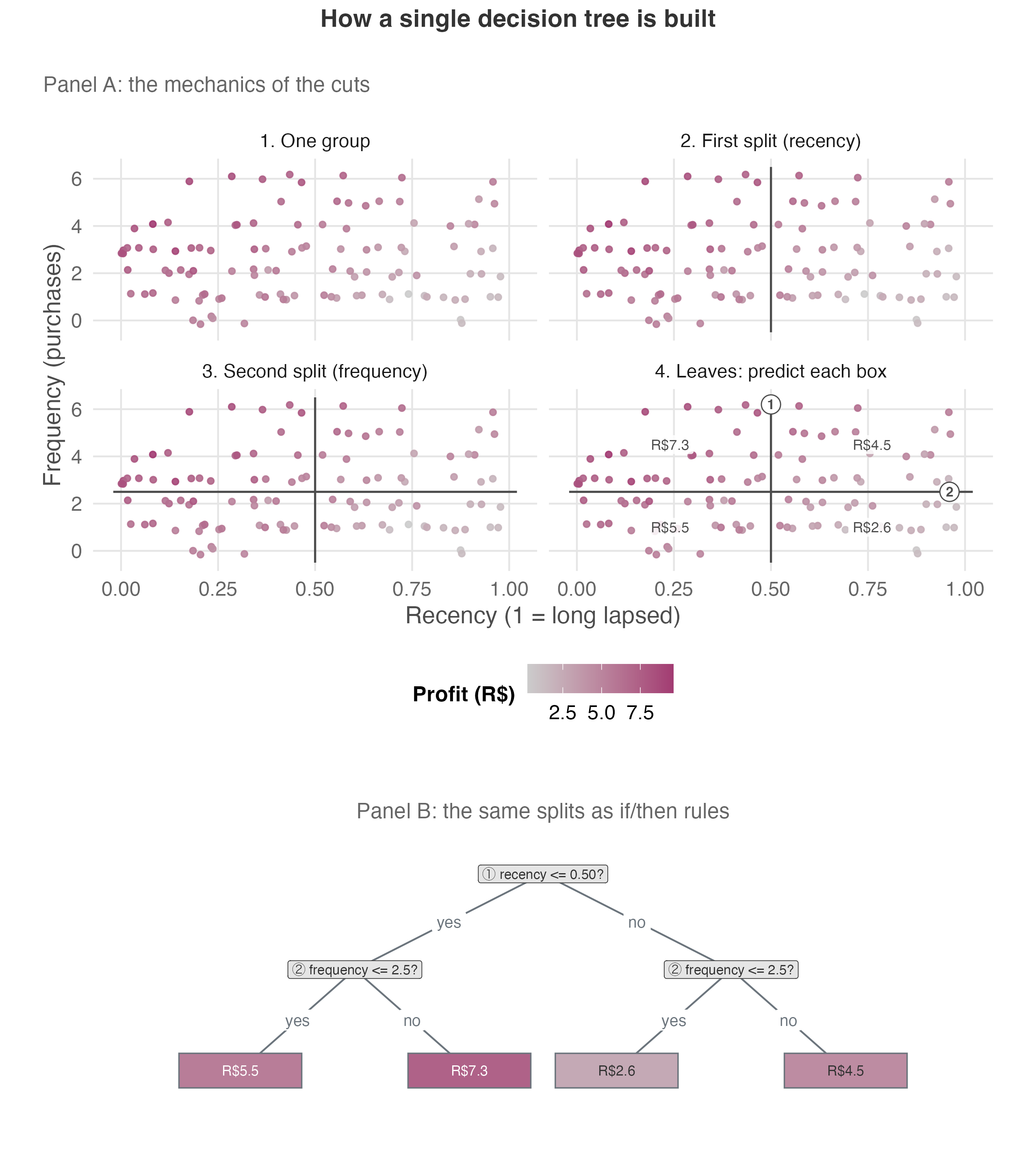
Let’s set “treatment” aside for a moment, since trees were built for prediction, not for estimating treatment effects. An ordinary decision tree predicts an outcome we can observe, say how much profit a user brings in over the coming weeks. It asks yes/no questions about the features (for instance, is recency at or below 0.50? has the user bought at least three times?) and splits the group after each answer until every user lands in a leaf. In this predictive-tree example, the leaves separate high-profit from low-profit users.
The process is recursive: it splits the whole base once, then asks the same kind of question inside each resulting group. Each leaf holds a single prediction, the average outcome for the users who landed there (in Figure 12.1, their average profit). Picture a triage flowchart that keeps subdividing a crowd into ever more similar pockets.
Two questions define the whole tree: Where to split? At each step the tree scans every feature and every threshold and keeps the cut that makes the two resulting boxes the most internally similar — the one that best separates high-profit from low-profit users. It is a greedy, one-cut-at-a-time search for homogeneous boxes.
And when to stop splitting? Left unchecked, a tree keeps splitting until each leaf holds a single user, memorizing noise instead of signal. We hold it back with a few constraints:
- a maximum depth, which caps how many times the tree can split in sequence, so it can’t keep branching indefinitely;
- a minimum number of users per leaf, which forces every group to be large enough that its estimate reflects a real pattern rather than a handful of unusual users; and
- a minimum improvement required to justify a split, which blocks any split that barely sharpens the prediction, so the tree only divides when the gain is worth it.
Together, these constraints balance two risks: a tree too coarse to capture real structure and one so fine that it overfits. They make the overfitting risk from the previous section explicit and manageable.
Figure 12.1 walks through the build one cut at a time, then redraws the finished tree as the if/then rules it stores.
12.6.2 The causal tree: the difference between predicting outcomes and predicting treatment effects
Now that we’ve covered the traditional predictive trees, let’s bring treatment effects back into the picture. In ordinary prediction trees, every user in the training data used to fit the predictive model carries a label we can see: the profit they earned, whether they churned, whatever KPI we’re modeling.
A causal tree needs a different label. The label we want is not the profit a user generated, but how much the coupon changed it: that user’s own incremental response, the counterfactual difference between the profit they’d generate with the coupon and the profit they’d generate without it.
That label doesn’t exist. Each user either gets the coupon or doesn’t, never both, so for any single person we observe one side of that difference and never the other. This is the fundamental problem of causal inference, and it’s why we can’t aim a machine-learning model straight at the treatment effect the way we aim it at an outcome. So we adapt the tree instead.
A causal tree is that adaptation. It keeps a similar structure to what we saw in Figure 12.1 but changes the question it asks at every split. The prediction tree looks for cuts that best predict the outcome: how much profit each user generates. The causal tree looks for cuts that best separate users with different treatment effects: those for whom the coupon changes profit by different amounts.
But how can the causal tree separate users by an effect it never observes? It does not start by knowing the groups. It proposes candidate groups using ordinary feature rules: recency above this cutoff, frequency below that cutoff, and so on. For each candidate split, it asks: among the users who would land on each side of this rule, what is the treated-minus-control gap in observed profit?
When the coupon is randomized — or as good as random once we condition on the features — that gap estimates the effect for that candidate group. The tree keeps the feature split that makes the group-level effect estimates most different, subject to the usual minimum-size and stopping rules we discussed in the previous subsection. No user gets an observed effect label; candidate groups get scored by estimated effects, and the best-scoring feature rules then define the tree.
In the coupon example, a leaf of the tree would no longer contain “users with predicted profit around R$X over the campaign.” It would gather “users for whom the treated-minus-control coupon effect is around R$Y.” Both tree types draw boxes around groups of users. What changes is what each tree groups on: the prediction tree groups users by the profit they generate, the outcome we observe directly. The causal tree groups them by how much of that profit the coupon caused, the incremental effect rather than the absolute amount.
Mechanically, the tree looks for splits that make the estimated treatment effect as different as possible across leaves. In plain language, it asks: “Where can I cut the data so that the effect in one group looks clearly different from the effect in another?”8 This direct focus on treatment-effect differences fixes one limitation of the S- and T-learners from the last section. Those methods estimate effects indirectly: first predict the outcome with and without the coupon, then subtract the two predictions — inheriting the weak spots we saw there: a regularized S-learner can shrink a real effect toward zero, and a T-learner gets noisy wherever one arm is thin.
12.6.3 Honest causal trees: choosing and measuring on different data
A causal tree does two jobs on the same data: first it finds a promising box, then it measures the effect inside it. But if both are done on the same rows of data, the tree is grading its own exam. It chose the split precisely because those users looked unusually responsive, so measuring the effect on those same users flatters the estimate with the very noise that made the box look good. This is the post-selection-inference problem made concrete.
The fix is honesty, also called sample splitting. We split the data in two: one part is used by the tree to choose the splits, and the other part is used to estimate the treatment effect inside each leaf (Athey and Imbens 2016). Despite the name, “honesty” here is not about ethics. It is what makes the uncertainty numbers — the standard errors and confidence intervals — trustworthy. Because we no longer estimate a leaf’s effect on the rows that made it look promising, honesty reduces the false-positive risk described in the manual section.
Figure 12.2 shows the mechanics stripped of the coupon example, for simplicity: read Y as the observed outcome, D as the treatment assignment, and the X columns as user features such as recency and frequency. The method assigns each row at random to one of two jobs, drawing the leaves (yellow cells) or scoring them (orange ones), so the two halves differ only by chance. The held-out estimate therefore measures the same subgroups the splitting half found — but with fresh users, so the numbers no longer carry the noise that shaped the boundaries.
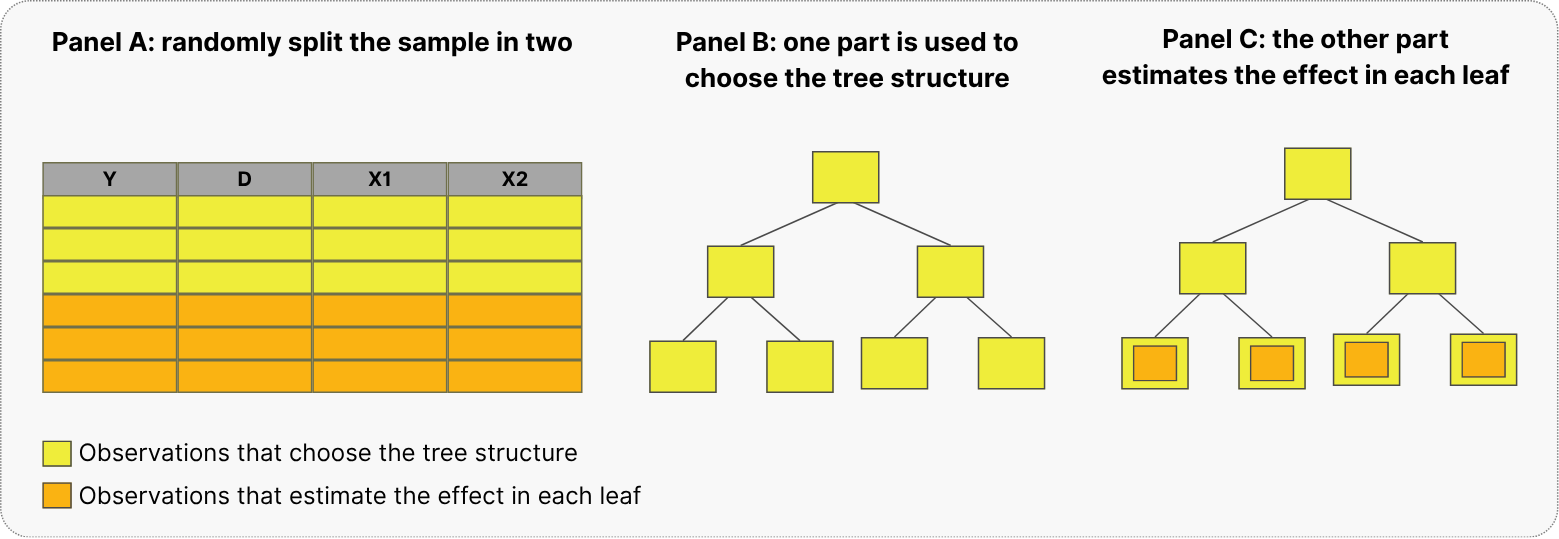
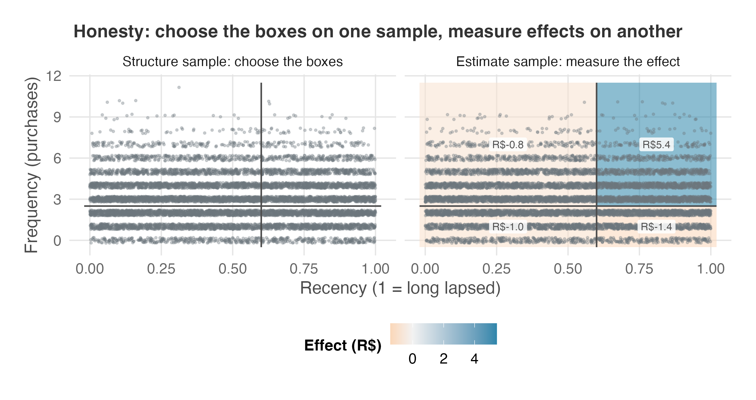
Figure 12.3 runs that same structure/estimate split on our coupon data. The structure sample draws four boxes; the estimate sample then measures the treated-minus-control gap inside those fixed boxes. The lapsed, frequent buyers — recency past about 0.6, three or more purchases — are the only group with an estimated effect around the R$5 coupon cost, while the other three groups sit near −R$1. That is exactly what an honest tree is useful for: it separates the search for a promising subgroup from the measurement of that subgroup’s effect. The estimate is still uncertain, and still needs the validation checks that come next, but it is less contaminated by the search that found the box.
12.6.4 From one tree to a forest
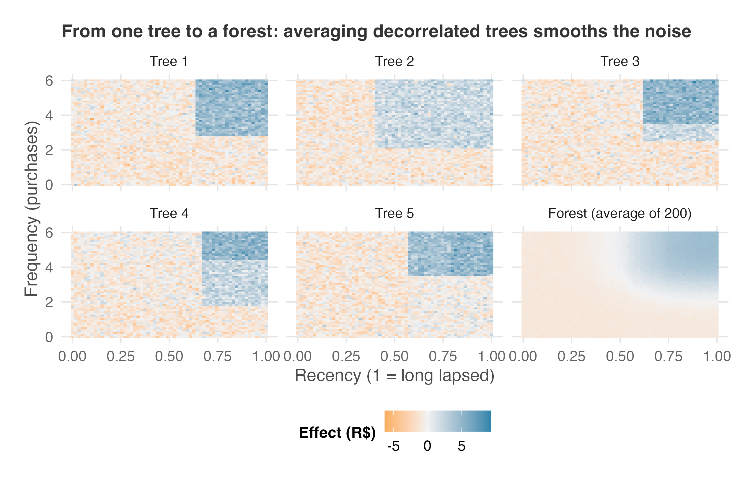
Everything so far rested on a single tree — and a single tree, honest or not, is unstable. Nudge the data and the splits jump around: a threshold of 0.6 slides to 0.55, and a whole branch can reorganize. The solution is the one ordinary prediction already uses: grow many trees and average them. A random forest grows hundreds of decision trees, each on its own random draw of the data, then averages their predictions so that no single noisy partition dominates. Classical random forests draw those samples with replacement — that is bagging, short for bootstrap aggregating. The causal forests in this chapter draw theirs without replacement instead, a choice that matters for the confidence intervals we get to later.
But averaging only helps when the trees make different mistakes. If every tree were trained on the same customers and allowed to use the same features at every split, they would tend to draw the same boundaries and repeat the same errors. A random forest avoids that by giving each tree a slightly different view of the coupon data: each tree grows on a different subsample, and each split gets only a random subset of candidate features.
The panels in Figure 12.4 show the result. Each tree draws a blocky, slightly different map of where the coupon seems to work. Once you average many of those maps (the bottom row, right-most panel), the unstable boundaries fade and the shared pattern becomes clearer: lapsed, frequent buyers are the group where the coupon payoff consistently shows up.
A causal forest grows many honest causal trees on different subsamples instead of asking one tree to decide who looks like Maria. Each tree puts Maria in a leaf with the users its own rules consider similar, estimates the coupon effect in that leaf, and the forest averages those estimates. The averaging makes the number less jumpy; the honesty keeps each tree from using the same rows to both find Maria’s group and measure its effect.
The first payoff is a built-in way to predict for users the forest did not train on (out-of-bag prediction). Because each tree leaves some users out, Maria’s CATE can be built from the trees that never used Maria while growing. In practice, use the estimator’s out-of-bag or held-out prediction mode for this step. The methodological requirement is that the CATE used to score a user should come from trees that did not train on that same user.
The second payoff is uncertainty you can use. With enough honest trees, the estimate for a profile like Maria’s stops depending so much on any one random split. It concentrates around the CATE for users with that profile, and its sampling variation becomes regular enough to support confidence intervals. That is the practical meaning of Wager and Athey (2018): the interval is about the true CATE for users like Maria, not Maria’s unknowable personal response. Generalized random forests extend the same idea beyond treatment-effect estimation (Athey et al. 2019). For targeting, this matters because a coupon rule based on “R$5, plus or minus R$1” is a different decision from one based on “R$5, plus or minus R$8.” The interval does not make the decision by itself; the validation checks in the next section supply the rest.
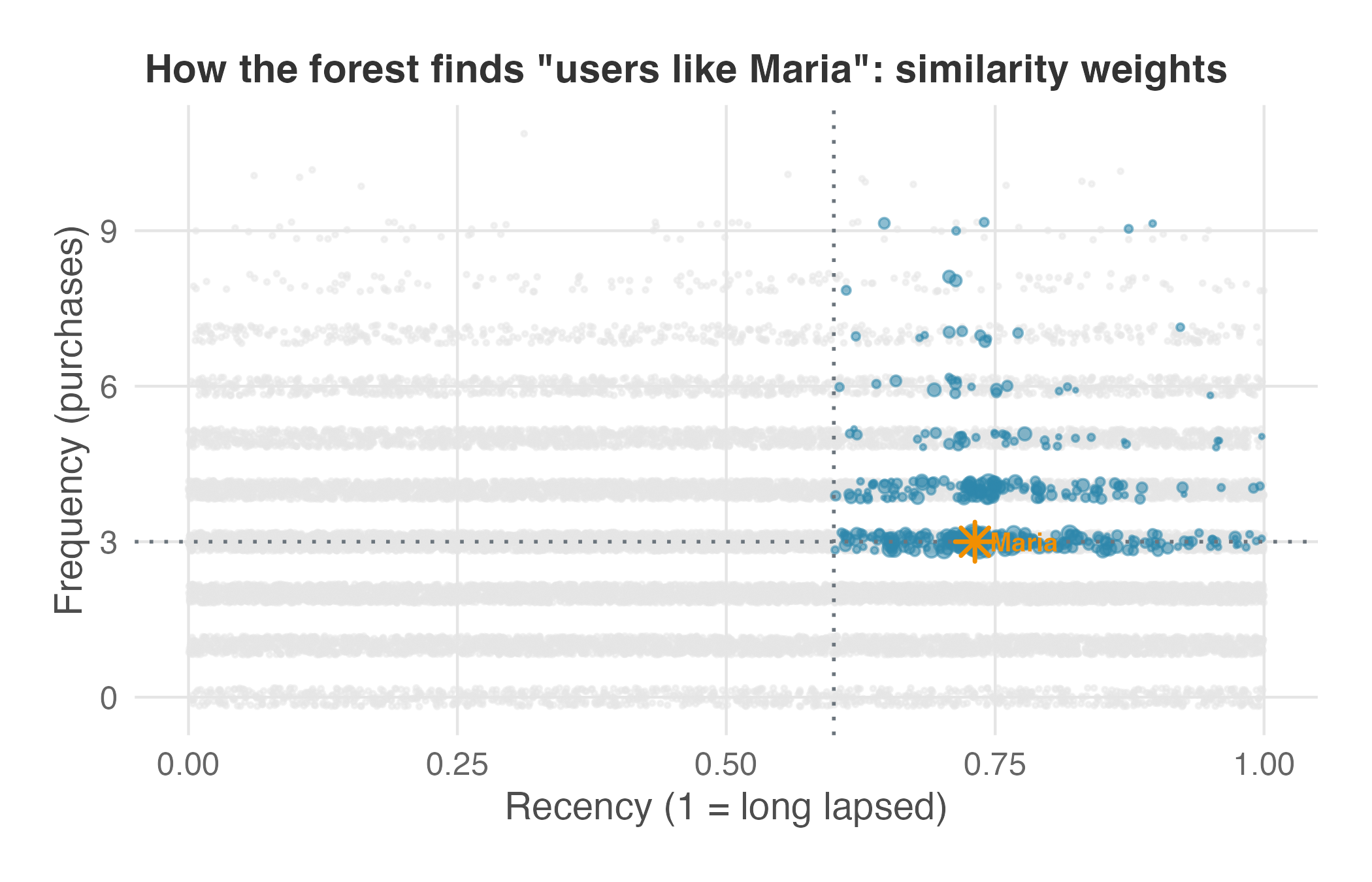
A forest returns a different number for every user even though each tree computes group averages inside its leaves. Maria’s personal-looking estimate comes from where she lands across the trees. Each tree grew on a different subsample with different split rules, so each tree groups Maria with a somewhat different set of users. A user who shares a leaf with Maria in most trees is someone the forest keeps judging similar to her; a user who almost never shares her leaf is someone the forest keeps judging different. Count those shared leaves across the whole forest and every user gets a weight: how much their data should count when estimating Maria’s effect (Athey et al. 2019).
Those weights are the estimate. The heavily weighted users form Maria’s comparison neighborhood — the forest’s data-driven answer to “who counts as a user like Maria?” — and her CATE is the treated-minus-control profit gap inside that neighborhood, with each user counting in proportion to their weight. No other user lands in exactly Maria’s combination of leaves, so no other user gets exactly her neighborhood, and that is why every user receives their own number. Note what the forest is not doing: it is not reading a personal effect off Maria’s own row. It is running the CATE recipe from the start of the chapter:
- gather comparable users,
- estimate the average coupon effect for that profile, and
- let the forest learn the neighborhood instead of drawing the bins by hand.
Figure 12.5 shows that neighborhood on the coupon data. Every user is plotted by recency and frequency; the highlighted points are the ones the forest weights most heavily for Maria, sized by weight. They pile up where she lives — recency past about 0.6, three or more purchases — the same region the honest tree boxed in Figure 12.3, now as a graded neighborhood instead of a hard-edged box.
12.6.5 The double machine learning behind the forest
In both Python and R, the forest first removes from the outcome and treatment whatever the user’s features already predict, then estimates the coupon’s effect from what remains. That step has a name, residualizing. For each user we subtract the value the features predicted and keep the leftover, the part the features could not explain, and we do this to the outcome and the treatment alike.
The effect itself comes from how those two sets of leftovers move together, which the forest works out user by user. Subtracting the predictable part is only the setup; the effect lives in what is left. Econometricians know this as Robinson’s partialling-out, or the Frisch–Waugh–Lovell logic. It uses two models: one for the outcome and one for the treatment.
First, the outcome side. An outcome model \(m(X)=E[Y\mid X]\) predicts a user’s expected outcome from their features \(X\) alone: “what outcome do we expect from a user who looks like this, ignoring the coupon?” Subtract that prediction from what actually happened and you are left with the outcome residual \(\tilde Y = Y-\hat m(X)\), the part of the outcome the features could not explain.
Second, the treatment side. A treatment model, the propensity \(e(X)=E[D\mid X]\) — the same propensity score from the positivity check — predicts a user’s chance of getting the coupon from the same features: “how likely is a user who looks like this to be treated?” Subtract that from whether they actually got it and you are left with the treatment residual \(\tilde D = D-\hat e(X)\), the part of treatment the features could not explain, the “as good as random” wiggle.
With both residuals in hand, the recipe is short: fit \(m\) and \(e\), form \(\tilde Y\) and \(\tilde D\), then regress \(\tilde Y\) on \(\tilde D\). That slope is the coupon’s effect, and the forest lets it vary from one user to the next. This residualize-then-estimate step is called orthogonalization. It reduces the estimator’s sensitivity to small errors in \(m\) and \(e\). The terminology differs across implementations: grf describes this step as orthogonalization and relates it to the R-learner, a cousin of the meta-learners from earlier, while EconML makes the double-machine-learning connection explicit in the estimator name CausalForestDML (Chernozhukov et al. 2018).
That is the intuition behind double machine learning. The forest starts from two predictions for each user: their expected outcome and their expected chance of being treated. These predictions must be accurate enough for residualization, but they are not the target of the analysis. That is why they are called nuisance predictions. Flexible machine-learning models estimate these nuisance functions, after which the forest estimates how the coupon effect varies across users (Brand et al. 2023).
The procedure therefore has two stages: residualization removes the variation predicted by the features, and the forest estimates how the remaining treatment effect varies across users. We return to residualizing, with a worked picture, in Chapter 15.9
The code fits the forest, estimates each user’s CATE, and attaches the confidence interval needed for a decision.
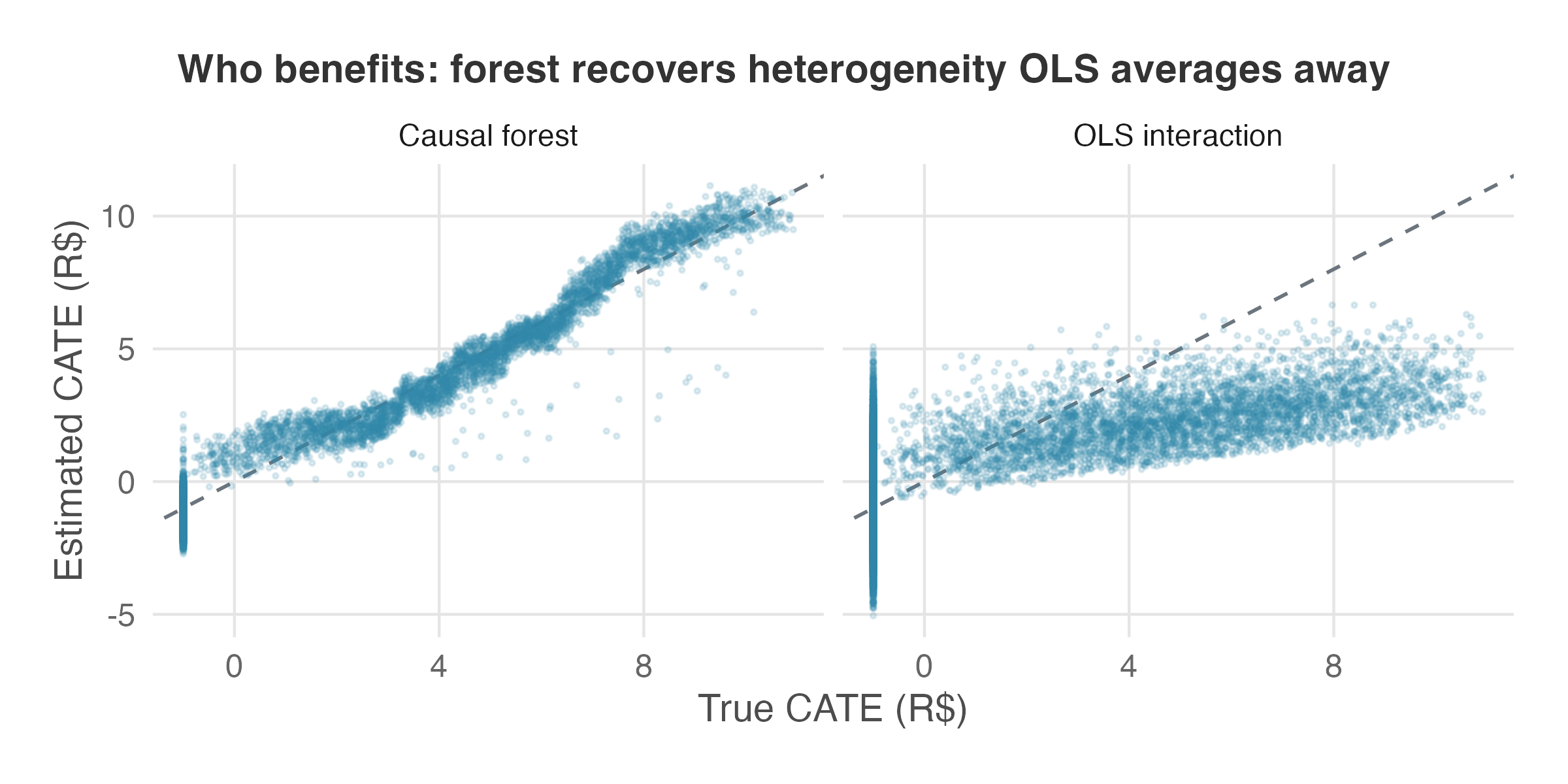
After residualization, the forest estimates a CATE for each user and learns how that effect varies with the features. Unlike the OLS model in Section 12.4, it does not require the analyst to specify every treatment-feature interaction in advance. Figure 12.6 compares the two approaches. It plots each user’s estimated coupon effect (their CATE) against the true effect used to simulate the data, side by side for the forest and the OLS interaction. The forest’s estimates line up closely with the truth, a correlation of about 0.98, and it correctly picks out the small group of high-value users worth R$5 or more in extra profit from a single coupon. The OLS interaction, limited to the few terms we specified, pulls almost everyone toward the average (correlation about 0.64) and misses most of the discount-sensitive users.
12.7 How to trust the results before acting
A causal forest will always return a CATE for every user, and those numbers will always vary from person to person — even when the true effect is identical for everyone and the variation is pure noise. Before any of them moves a budget, ask two questions in order. First, is the heterogeneity real? Use checks designed to catch variation that only looks like signal. If it survives, ask what the forest found: which users respond, and which features identify them? The first half of this section answers the false-positive concern from Section 12.4; the second interprets the fitted pattern and shows what an inconclusive result means.
12.7.1 Is the heterogeneity real?
Start with calibration, which asks whether the spread the forest claims — estimated effects that differ from one user to the next — holds up out of sample.
The test is a single regression, and it runs on the two residuals the forest was already built from (Section 12.6.5): the outcome residual \(\tilde Y = Y - \hat m(X)\) and the treatment residual \(\tilde D = D - \hat e(X)\). Residualizing is what makes the grading possible. Once the features’ predictions are subtracted, the only systematic thing left that can move a user’s outcome residual is the treatment: what remains is the true effect times the treatment residual, plus noise. That leftover is observable, so the forest can be scored on how well its estimates stand in for the unknown true effect inside it.
Take each user’s out-of-bag CATE — the one predicted by trees that never saw them — and split it in two: the part the forest says about everyone (the average predicted effect, \(\bar\tau\)) and the part it says about this user (their deviation from that average, \(\hat\tau(X_i) - \bar\tau\)). Regress the outcome residual on both pieces, and two coefficients come back: one grading the average, one grading the spread.10
The coefficient on the average piece should land near 1: that says the forest has the overall effect right. The coefficient on the deviations is the differential coefficient, and its p-value tests whether the forest’s predicted deviations carry out-of-sample information about how the effect actually varies. The differential coefficient tells you whether to take the forest’s personal deviations at face value, shrink them, or discard them. A coefficient of 1 means face value — a user the forest places R$2 above the average really does respond about R$2 above it. Around 0.5 means the forest claimed twice the spread it should have. Around 0 means the deviations carry no information about who actually responded, so the forest dressed up noise as heterogeneity; that is why a significant coefficient doubles as evidence that real heterogeneity exists and the forest tracks it — though a flat one is not proof that effects are equal, as the power section at the end of this pre-flight shows. On the coupon data both coefficients come back close to 1 — the average at 1.00, the differential at 0.99 with a p-value below 0.001 — so the out-of-sample calibration supports using the forest’s predicted spread as a targeting signal, subject to the remaining checks in this pre-flight.
Calibration says the spread holds up out of sample; it does not say what the spread is made of. The best linear projection (BLP) answers that: regress each user’s treatment effect on their features and read one coefficient per feature — as close as this method comes to a plain-English summary of who responds. The subtlety is what stands in for the unobservable effect on the left-hand side of that regression: not the raw CATE estimate, but a doubly robust score: the estimate plus a correction term built from the same outcome and treatment residuals as the calibration test. “Doubly robust” means the score still recovers the effect if either the outcome model or the treatment model is somewhat off — and that substitution is what keeps the coefficients’ standard errors honest (Semenova and Chernozhukov 2021).
Here the estimated effect rises with recency (4.66), discount sensitivity (3.09), and frequency (0.61), all significant at p < 0.001, while past spend sits at essentially zero. That is a story a marketer can check against what they already believe — lapsed, frequent, discount-sensitive buyers are the ones a coupon moves, and how much someone has spent in the past says nothing about whether it moves them. A projection pointing somewhere implausible would not sink the model by itself, but it would be a reason to slow down and find out why.
Before those coefficients go into a slide, though, notice the trap in comparing them: each one is in its own feature’s units. Recency’s 4.66 is reais across its whole 0-to-1 scale; frequency’s 0.61 is reais per purchase, and users differ from each other by many purchases. Ranked raw, frequency looks like an afterthought when it is nothing of the sort. The fix is to run the projection again with standardized features, so every coefficient means the same thing — reais per one standard deviation of that feature. On that footing the order changes: recency 1.34, frequency 1.05, discount sensitivity 0.70, past spend −0.06 (p = 0.44) — frequency rises from last place to a near tie with recency, because the raw ranking was a units artifact, not a finding.11
On either footing, remember what kind of number this is: a coefficient here summarizes how the estimated effect varies with a feature across the user base, not the effect of changing the feature — nothing in the projection says that nudging a user into buying more often would raise their coupon response. We come back to the discount-sensitivity pattern with a picture in Figure 12.9.
Calibration and the projection both describe the spread. Neither tells you whether you can act on it, and acting means ranking users and treating the top of the list. So the next check grades the ranking itself.
GATES (Grouped Average Treatment Effects) grades the ranking in coarse buckets: sort users by predicted CATE, cut the sorted list into a few equal-sized groups — quintiles here, so five groups of 4,000 users each, from lowest predicted effect to highest — and compare the uplift each group actually realized, measured as the treated-minus-control difference in average profit inside the group (Chernozhukov et al. 2023). If the top bin’s realized uplift is no larger than the bottom’s, the ranking is noise and targeting on it will not beat treating people at random. On the coupon data the bottom four quintiles sit in a flat band between −R$1.31 and −R$0.73, and the fifth jumps to +R$5.66. Only that top quintile clears the R$5 the coupon costs, which is where the budget should go.
GATES is often drawn as a smooth climb from bucket to bucket, but a flat bottom is not a failure here: the true effect in this simulation is a threshold rule rather than a gradient, so users either clear the bar or they do not, and everyone below it looks alike. What would fail the check is a top bucket indistinguishable from the rest. There is no GATES figure in this chapter — the five uplifts are the whole result, and the code block at the end of this section computes them in a few lines.
The TOC curve (Targeting Operator Characteristic) asks the same question at full resolution (Yadlowsky et al. 2023). Where GATES chops the ranking into five buckets, the TOC slides the cutoff smoothly from the single most responsive user down to the least. Figure 12.7 plots it: the horizontal axis is the share \(q\) of users you would treat, taking them in order of predicted CATE, and the vertical axis is how much more than the overall average effect that top-\(q\) slice actually gained, with a 95% confidence band. A curve that starts above zero and stays there is a ranking worth targeting on. Ours stays above zero until the last fifth of users, then falls to zero by construction — by then “the top slice” is everybody, and everybody cannot beat the overall average.
Whichever version you run, one rule holds: build the ranking on data independent of the data that evaluates it, or the test is grading its own homework. The all-in-one shortcut that some causal-forest examples reach for can report targeting value that is not there, and it does so far too often to trust (see the grf note on evaluating RATEs).
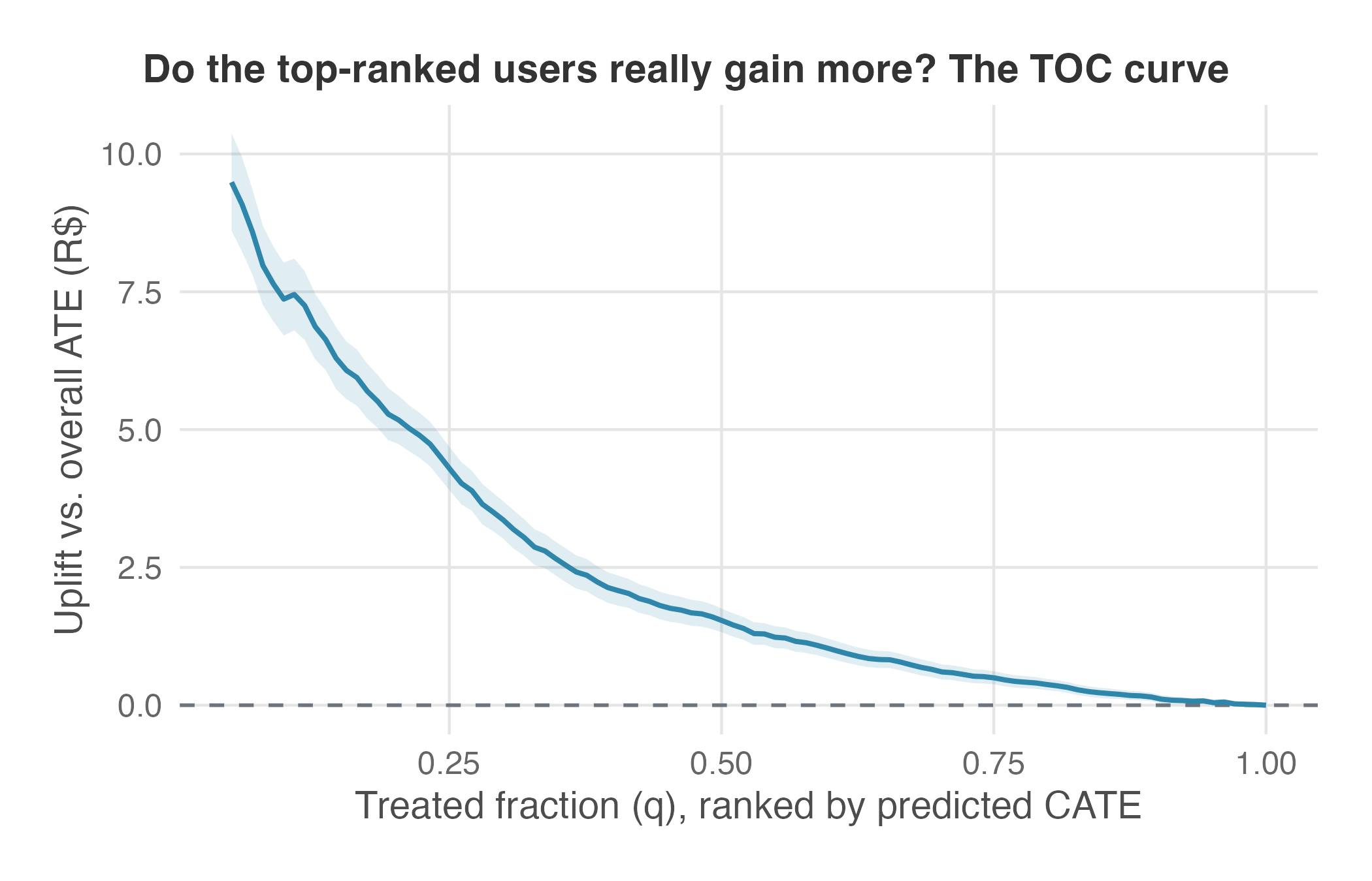
The curve is the picture; the RATE (Rank-Weighted Average Treatment Effect) is the number that summarizes it. A RATE is an area under the TOC curve, and how you weight the slices when you add them up is a choice with consequences (Yadlowsky et al. 2023). The AUTOC (Area Under the TOC curve) takes the plain, unweighted area. Because the top-ranked users sit inside every slice, that plain area ends up leaning hard on the very top of the ranking, which is why AUTOC has the most power when only a small group responds. The Qini coefficient instead weights each slice by how many users it covers, so it counts the broad middle more and does better when the response is spread thinly across the whole base.
Ours is a small-group problem — around a tenth of users are worth treating — so AUTOC is the right target here, not merely grf’s default. It comes back at 2.70, with a 95% confidence interval of [2.50, 2.91]. Positive, and clear of zero: the ranking carries real information, and targeting by CATE beats targeting at random. The weighting choice can change the conclusion: a diffuse response can produce a large Qini coefficient and a small AUTOC, while a response concentrated in a narrow group can produce the reverse.
The remaining numerical checks cover overlap, placebo behavior, and stability under subsampling.
Overlap (positivity). The forest works by comparing treated and untreated users who look alike, so the comparison only exists where both kinds were actually available. That is the positivity assumption (Section 6.4.3), and you check it with the estimated propensity score — each user’s estimated probability of having been treated, given their features. What you hunt for is a score creeping toward 0 or 1. Near 1 means users of that type were almost all treated, so the forest has few untreated lookalikes to compare them against; it extrapolates instead of comparing, and its CATE there deserves a wide interval. Near 0 is the same failure in reverse. Randomization is supposed to settle this — the assignment probability was 0.5 by design — but the estimated scores can still drift in a thin corner of the data. Here they all land between 0.36 and 0.65. No observed region is close to all-treated or all-control, so the CATEs are not leaning on obvious extrapolation.
Placebo (permuted treatment). A placebo test asks what the forest does when there is definitely nothing to find. Shuffle the treatment column at random — so D no longer records who actually received a coupon — and refit. Shuffling treatment removes its relationship with the outcome, so any remaining heterogeneity is produced by sampling variation or model fitting. The test passes when the spread of predicted effects shrinks toward zero and the calibration coefficient is no longer significant. If instead the forest still finds responsive segments in a column of random labels, the real fit needs much closer scrutiny before it supports targeting. On the coupon experiment the standard deviation of the predicted effects drops from R$2.95 to R$0.44 and the differential coefficient falls from 0.99 to 0.03 (p = 0.43) — flat, as it should be. The signal in the real fit is not an artifact of the fitting procedure.
Stability on less data. A real pattern survives when you take data away; a fragile one dissolves. Refit the forest on a random subsample and ask whether the same story returns. On 2,000 users — a tenth of the experiment — the differential coefficient is still 1.10 (t = 11.6) and the estimates still correlate 0.95 with the planted truth.12 The check is harsher than it looks: heterogeneity takes far more data to detect than an average effect — the closing section of this pre-flight puts a number on how much more — so a pattern that holds at a tenth of the sample has room to spare.
Two practices that do not return a number still matter: read the confidence intervals and check the fitted pattern against domain knowledge.
Confidence intervals and adaptive search. Every CATE and every segment average arrives with a confidence interval, and the interval is what tells you whether to believe the point estimate: a segment worth “+R$6 per user” whose interval runs from −R$2 to +R$14 is not a segment you fund, it is a segment you are guessing about. But intervals alone will not protect you, because each one prices the uncertainty in a single estimate and says nothing about how many estimates you looked at to find it. A forest inspects an enormous number of candidate subgroups, and the more anyone inspects, the likelier it becomes that one looks special by chance. That is the multiple testing problem — the same false-positive trap that made the by-hand approach in Section 12.4 unreliable, now running at machine scale. The stronger defense is structural: use out-of-sample validation where possible, and build the ranking on data independent of the data that evaluates it.
Consistency with domain knowledge. Ask someone who understands the business whether the estimated pattern has a plausible mechanism. “Lapsed, frequent, discount-sensitive buyers are the ones a coupon moves” is a sentence a marketer will nod at, because there is a story behind it. “Users who signed up on a Tuesday respond most” is a red flag however clean the statistics look, because there is none — and the likeliest explanation is a coincidence in this particular sample. A finding nobody can explain is a finding you should expect to be fragile.
Table 12.2 summarizes the seven scorable diagnostics: what each check asks, what a pass looks like, what the forest returned, and which decision that result supports. Examining confidence intervals and checking consistency with domain knowledge remain part of the interpretation even though they do not receive rows.
grf numbers; the chapter’s companion scripts reproduce every row in both R and Python (the Python versions run on held-out splits, so their values differ slightly but return the same verdicts). The BLP row projects on standardized covariates so its coefficients compare across features; the forest itself is fitted on the raw features.
| Diagnostic | What we want | Coupon result | Decision |
|---|---|---|---|
Calibration (test_calibration) |
Differential coefficient near 1 and significant | 0.99 (p < 0.001) | Predicted spread carries out-of-sample signal — proceed to the remaining checks |
| Best linear projection (per 1 SD) | Associations that match domain knowledge | Projected CATE difference per 1 SD: recency +R$1.34, frequency +R$1.05, discount sensitivity +R$0.70 (all p < 0.001); past spend −R$0.06 (p = 0.44) | The story is plausible — proceed |
| RATE (TOC) | Positive, confidence interval clear of 0 | AUTOC 2.70, 95% CI [2.50, 2.91] | Ranking by CATE beats random targeting |
| GATES (CATE quintiles) | Realized uplift concentrated in the top groups | Q1–Q4 between −R$1.31 and −R$0.73; Q5 at +R$5.66 | Only the top quintile clears the R$5 cost — aim the budget there |
| Overlap | Propensities far from 0 and 1 | Estimated propensities all within [0.36, 0.65] | No extrapolation regions |
| Placebo (permuted treatment) | Apparent heterogeneity collapses | SD of predicted effects drops from 2.95 to 0.44; differential coefficient 0.03 (p = 0.43) | The signal is not a machinery artifact |
| Stability (n = 2,000 subsample) | The pattern survives on less data | Differential coefficient 1.10 (t = 11.6); correlation with the planted truth still 0.95 | Heterogeneity is not fragile — carry it into targeting tests |
The code behind the main diagnostics is short.
12.7.2 What the forest actually found
The checks above are what license acting on the model. The three figures below do something different: they make the fitted pattern legible — which features the forest leaned on, how the estimated effect moves across one of them, and how the effects are spread across the user base. Read them as interpretation, not as further validation. None of them could rescue a forest that had failed calibration or GATES.
Start with what the forest leaned on. Its variable importance is a depth-weighted count of how often each feature gets split on — splits near the top of a tree count for more.13 Figure 12.8 puts recency and frequency at the top — the two eligibility gates the forest uses to isolate the responsive group — with discount sensitivity next and past spend near the floor.
The pattern matches a marketer’s prior story instead of pointing to a mystery variable, and it lines up with the standardized projection, where frequency (1.05 per SD) sits just behind recency (1.34) — an agreement the raw coefficients hid, since frequency’s 0.61 per purchase looked small next to numbers that span a whole 0–1 feature. One disagreement of emphasis remains, and it is about shape rather than units: the effect turns on at a frequency threshold instead of climbing smoothly with it, and a linear summary compresses that step into a slope while the forest splits on it as often as it needs. The substance agrees — the responsive users are picked out by their behavior, not by how much they have spent.
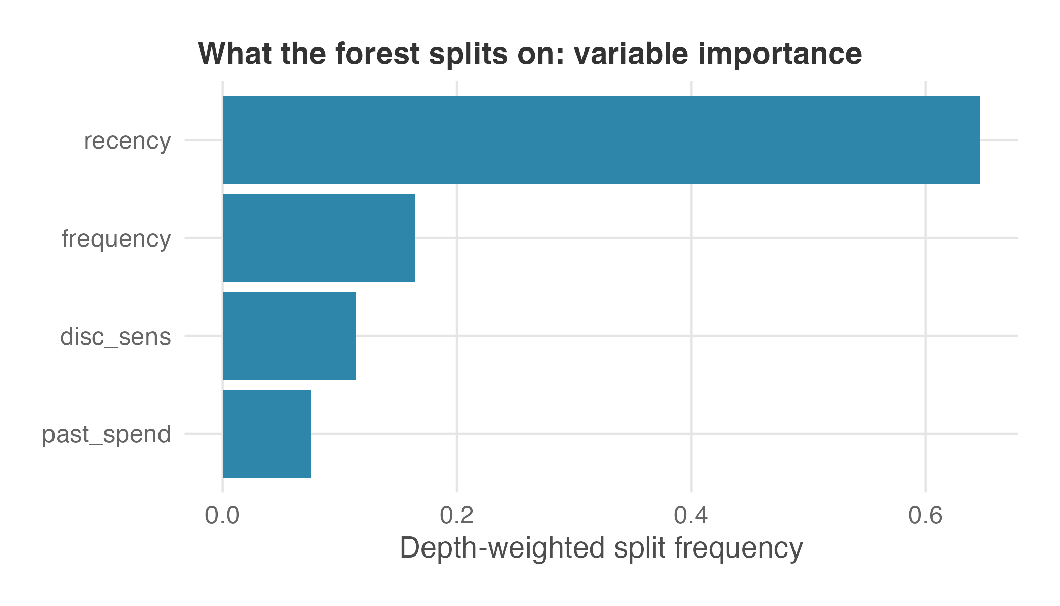
grf’s depth-weighted split frequency, higher when the forest splits on a feature often, especially near the top of its trees. Recency and frequency lead, discount sensitivity follows, past spend barely registers. This describes how the fitted forest uses the features, not the size of any effect.
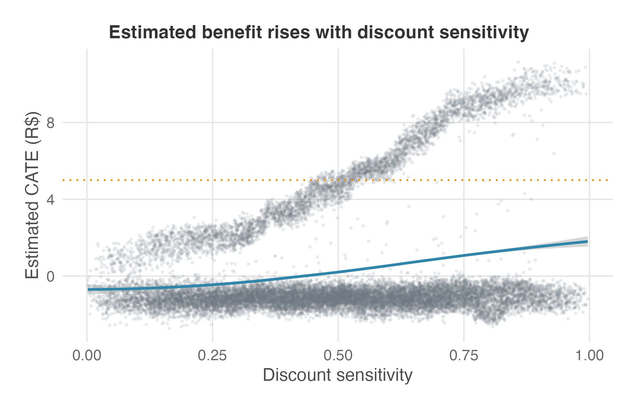
The second picture takes one of those features and shows how the estimated effect moves across it. Figure 12.9 plots each user’s estimated effect against their discount sensitivity — a companion view of the pattern the best linear projection summarized as a single coefficient, not the projection itself. Read it in two layers: each faint dot is one user, and the solid curve is the average estimated effect at each level of sensitivity, with a shaded band for the uncertainty in that smoothed trend. The band is descriptive — it prices the trend line’s own wobble, not the estimation error inside each CATE, and it is not a confidence interval for any single user’s effect.
The curve climbs steadily with sensitivity, a sensible monotone pattern, yet it stays below the R$5 cost line (dotted) even at the high end. The resolution is in the dots: the ones sitting above the cost line are the profitable users, and they cluster at high sensitivity only where recency and frequency line up too — so the curve, an average over everyone at that sensitivity, is pulled back under the cost. That is exactly why a single-feature rule misses them, and why the histogram that follows still shows a profitable tail. A flat or wrong-way curve here would not disprove the model by itself, but it would be a reason to slow down and ask why the fitted pattern conflicts with the business story.
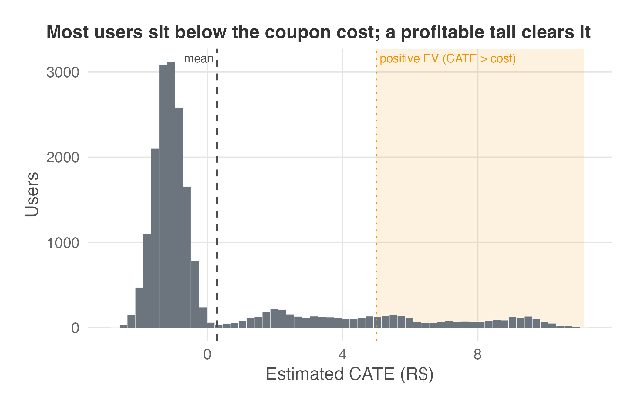
The third figure shows the distribution of estimated effects: the spread first recovered in Figure 12.6, now viewed on its own. Figure 12.10 is a histogram of the estimated effects: the horizontal axis is the estimated effect of a coupon on one user, the vertical axis is how many users carry that estimate. Most users sit below the coupon cost, and a thinner tail on the right clears it — the profitable minority that the chapter-opening average buried. Reading the spread, not just its mean, is the whole reason we left a single OLS coefficient behind. The average said coupons lose money; the distribution says they lose money on most users and make money on a few, which is a different instruction to the business.
12.7.3 “No heterogeneity detected” may be a power problem
A final question is how to interpret these checks when they come back empty. The temptation is to take a null at face value — flat calibration, overlapping GATES buckets, so “everyone responds the same, case closed.” Resist it. Detecting heterogeneity is a much harder statistical problem than detecting an ATE. The ATE is one difference; heterogeneity is a difference of differences, estimated on slices of the sample — the standard error doubles before the search even starts, and the effect differences worth finding are usually smaller than the ATE itself.
A useful rule of thumb quantifies the difference: detecting an interaction half the size of the main effect takes about sixteen times the sample (Gelman 2018; Gelman et al. 2020, sec. 16.4).14
I made the heterogeneity in this simulation deliberately strong. The planted effects average R$0.38 and have a standard deviation of R$2.8, so the variation is about seven times the average effect. That is why every method in this chapter performs well with 20,000 users and why the forest still detects the pattern in a 2,000-user subsample.
Heterogeneity in real campaigns is often weaker. Rerun the same pipeline with the same average effect and noise, but shrink the planted spread to half the ATE. The 20,000-user experiment still pins down the ATE (a t-statistic above 4). Yet the calibration differential coefficient falls to −0.12 with a p-value of 0.77, and the forest’s correlation with the planted truth drops from nearly 1 to roughly 0.2–0.3 across implementations. Same users, same sample size, genuinely different effects across the base — and every check above reads “nothing here.”
So hold a heterogeneity null to the standard Chapter 5 set for any null result: ask what the confidence interval covers, not just whether the p-value cleared 0.05. An interval on the differential coefficient wide enough to contain both 0 and 1 is absence of evidence, not evidence of absence: the experiment is too imprecise to distinguish no heterogeneity from a well-calibrated CATE model. If targeting is the goal, size the experiment for the smallest effect difference you need to detect, not only for the ATE. A sample with adequate power for the ATE can still be an order of magnitude too small for heterogeneity analysis.
Only once the heterogeneity survives these checks is it worth turning into a decision.
12.8 From CATE to targeting
A validated CATE is an input, not an answer. The decision you actually face is whom to treat under a limited budget. We turn the per-user estimates into a decision in three steps: rank users by CATE until the budget runs out, compare that ranking with predicted coupon redemption, and learn a targeting rule directly from the estimates.
Uplift, not propensity. Before ranking users, distinguish purchase propensity from treatment effect. A propensity model predicts how likely each user is to buy — marketing’s use of the word, not the propensity score from the validation section, which is the probability of being treated. That likelihood of buying says nothing about the coupon: a user can be almost certain to buy whether or not you send them one. A CATE model — an uplift model, as marketers call it — predicts how much the coupon changes what each user spends. These are different questions, and they rank users in different orders: the users most likely to buy are often not the users the coupon influences most.
A CATE ranking sorts users into four kinds marketing already has names for — though it cannot tell the first two apart, and it does not need to. Sure things would buy with or without the coupon; their CATE is near zero, so a coupon just gives away R$5 on a sale that was going to happen anyway. Lost causes would not buy either way; their CATE is also near zero, and the coupon is wasted on them too. Sleeping dogs are users the coupon actively hurts — their CATE is negative (Gutierrez and Gérardy 2017). For example, a discount email can remind a churned user to cancel a subscription they had forgotten, or teach a full-price buyer to hold out for the next deal.
That leaves the persuadables, the users with a positive CATE — the only group whose behavior the coupon improves. But positive is not the same as profitable: with a R$5 coupon, the campaign pays back only for the persuadables whose CATE clears that cost.
A propensity score cannot tell these four groups apart: sure things sit at the top of the propensity ranking, and persuadables can sit anywhere in it. Our own forest illustrates the point: past_spend, the best single predictor of who is likely to buy, is the feature the forest relies on least when estimating who the coupon changes (Figure 12.8). A campaign that targeted “our best customers” here would send discounts to sure things and miss the persuadables almost entirely.
Rank, cut, and compare. A simple fixed-budget targeting policy is to rank users by estimated CATE, walk down the list, and treat people until the budget runs out. To turn “effect” into “money,” subtract the treatment cost — here, the R$5 coupon — from each user’s CATE to get their expected value if treated, \(\text{EV} = \hat{\tau}(x) - \text{cost}\). One caveat before the table: the numbers below are computed from the model’s own CATE estimates, so they say what the model expects each policy to earn — not what a campaign actually earned. The out-of-sample check of the chosen policy comes later.
| Policy | Model-implied net incremental value |
|---|---|
| Blanket: give everyone a coupon | −R$94,300 |
| Random 20% of users | −R$19,000 |
| Target the top 20% by CATE | +R$2,400 |
| Treat only users with positive expected value (~11%) | +R$5,600 |
The policies produce different expected results because they treat different users and shares of the base. Giving everyone a coupon loses six figures because the typical user is estimated to return about −R$1 in incremental profit against a R$5 cost. A random 20% loses money for the same reason: most users in any random sample are not persuadables. Ranking by CATE turns the program profitable, and stopping where expected value crosses zero — at about 11% of the base — captures essentially all of the gain the model predicts.
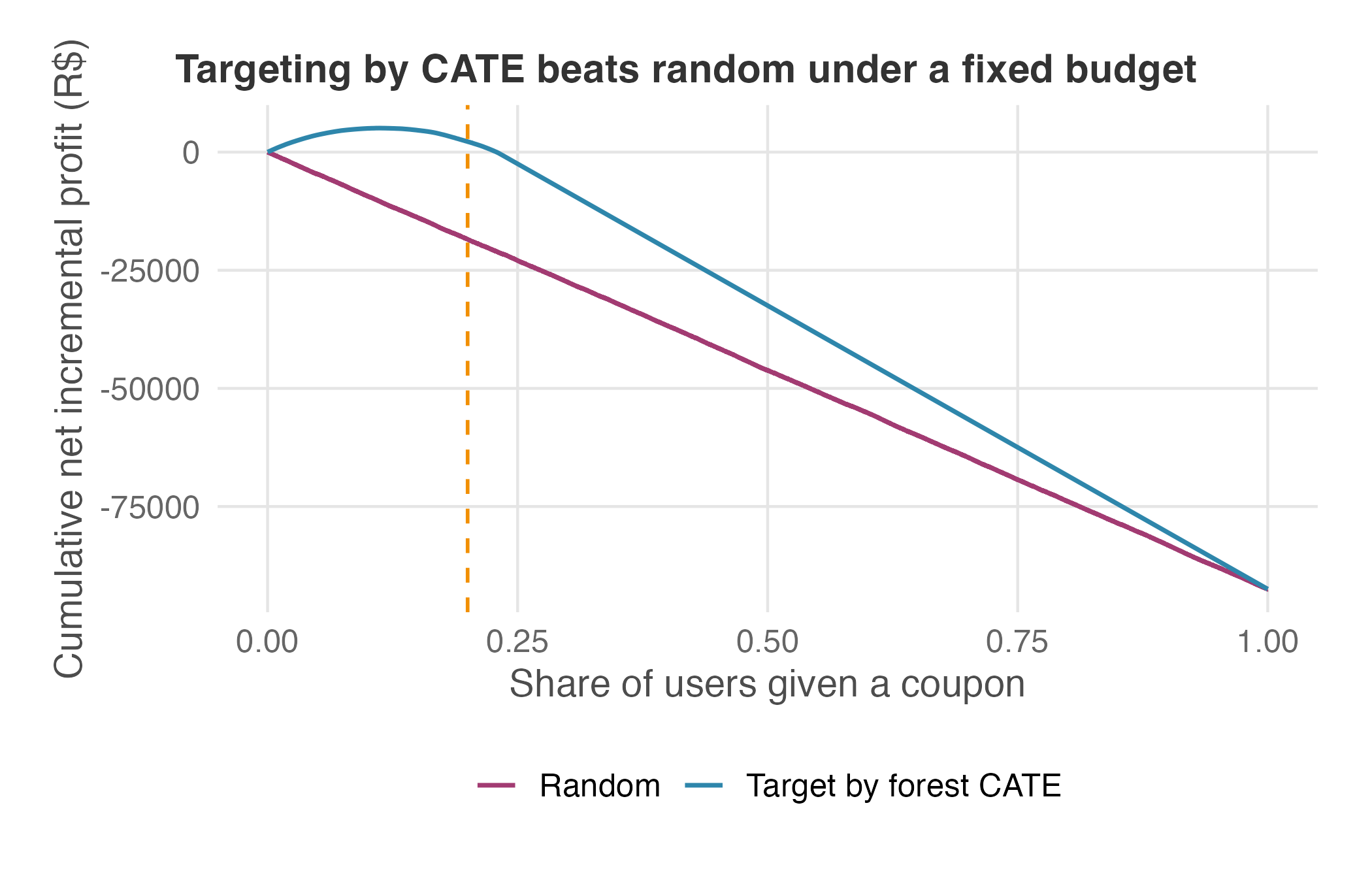
Figure 12.11 then scores those same policies against the truth. Because we simulated the data, we can rank users by the forest’s estimated CATE and still score each policy on the true effects we planted: the vertical axis is cumulative true net value (each treated user’s true CATE minus the R$5 cost), the horizontal axis is the share of users treated, and users enter in order of estimated CATE on one line and in random order on the other. The model picks the order; the truth does the scoring — so the curve shows what each policy would actually earn, not what the model expects.
Read the CATE-ordered line by its shape. It climbs while the budget reaches positive-value users and peaks around the 11% mark, where the marginal user’s true value turns negative. That peak is the most the program can make; beyond it, further coupons go to users who cost more than they return, so the curve declines. At the 20% budget line the curve has given back part of the peak but still sits far above the random line, which heads steadily down toward the blanket-coupon loss.
A plot like this is called a cumulative-gains curve, or a Qini curve in the uplift-modeling literature, and the vertical gap between the two lines at any budget is the value targeting actually creates over random assignment (Gutierrez and Gérardy 2017).15
On your own data no one hands you the true effects, so you cannot draw this exact curve: uplift models have no per-user ground truth to grade against. The workable substitute is a realized curve evaluated on held-out data, using the same separation between ranking and evaluation as GATES and the TOC. Rank held-out users by predicted CATE; at each budget share, take the top-ranked slice and compute the uplift it actually realized — the treated-minus-control difference in average profit inside the slice, times the number of users you would treat — then subtract the coupon cost and plot that cumulative value against the share treated. That realized curve is how the Qini curve is computed in practice, and its peak picks the cutoff the same way the true-effect peak does here.
The targeting matrix. Ranking by CATE answers “who would respond?”, but a real campaign must also ask whether the user will redeem the coupon. The scores can disagree because they come from different models. The CATE averages over a user’s lookalikes, while a redemption model can use pre-treatment signals absent from the CATE model, such as past redemption rates. A user whose lookalike group gains a lot can still be one the offer rarely reaches, and for them the group’s CATE overstates what this campaign will collect. The wrong fix is to multiply the two scores: the treatment here is coupon assignment, so the CATE already averages over redeemers and non-redeemers among users with the same features, and scaling it by a predicted redemption probability double-counts the non-redemption it already contains. If pre-treatment redemption history really carries information about treatment response, add it to the CATE’s feature set and re-estimate the effect instead. Crossing who benefits (high or low CATE) with who acts (high or low predicted redemption) gives the two-by-two strategy map we first sketched in Chapter 14, now recast for coupons:
| High CATE (large incremental profit) | Low CATE (little to gain) | |
|---|---|---|
| High redemption | Core audience — the CATE-minus-cost rule already says treat them | Low-value engagers — stop spending here |
| Low redemption | Missed opportunity — fix the offer, not the product | Irrelevant — ignore |
A timing note before you build this matrix: the redemption axis must be predicted redemption, estimated from pre-treatment history (past redemption rates, for instance). Actual redemption of this campaign’s coupon is a post-treatment outcome — exactly the kind of variable the feature-freeze rule from the identification section told you to keep out of the model.
The Missed opportunity quadrant contains users whose predicted effect is large but whose predicted redemption probability is low. For this group, test whether changes to the offer or delivery mechanism, such as a clearer email, one-tap redemption, or a reminder, increase redemption. The matrix alone cannot establish why redemption is low, and it does not replace the decision rule — that stays estimated CATE minus cost.
12.8.1 A learned rule: the policy tree
Ranking by CATE and the targeting matrix both rely on cutoffs you choose by hand. A policy tree automates that choice. You give it a per-user reward for each possible action — here, R$0 for skipping the coupon and the estimated CATE minus the R$5 cost for sending it — and it returns a short set of if-then rules, arranged as a shallow decision tree, that assigns each user to coupon or no coupon so that the total reward is as high as possible. The search over candidate trees is exhaustive, not greedy, so the rule it returns is the best tree of its depth for the rewards you supplied (Zhou et al. 2023).16
One note on the reward scores. In production you would feed the tree doubly robust scores rather than the raw forest CATE. A doubly robust score — the same construction behind the best linear projection — still lands on the right answer if either the outcome model or the treatment model is correct, even when the other one is wrong (Brand et al. 2023), which is why it is the standard input for policy learning (Athey and Wager 2021). I use the CATE net of cost here so the path from the forest to the decision stays easy to follow. To switch, policytree::double_robust_scores(cf) returns one score per action: keep both columns and subtract the R$5 cost from the coupon column only — the no-coupon column keeps its own score rather than being set to zero. Expect close but not identical results to the simple version; they are different estimates of the same reward.
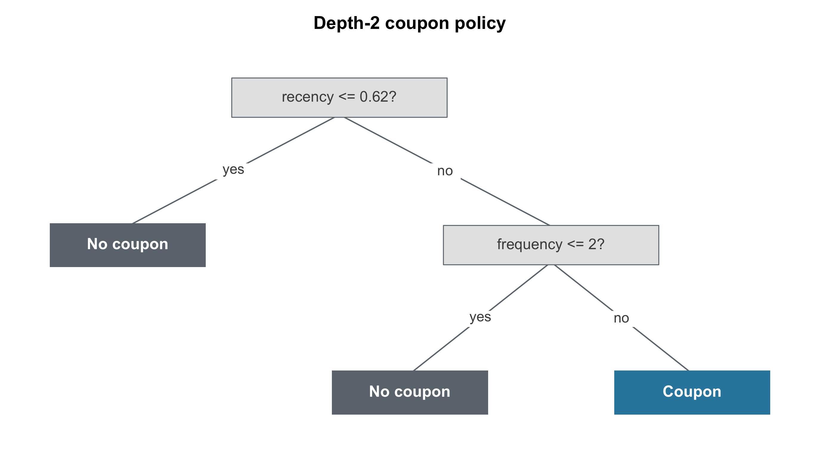
Figure 12.12 shows the depth-2 tree learned on our data: send a coupon only to users who buy often (frequency above two) and have lapsed (recency past about 0.6), and skip everyone else. A product team can inspect and test this short rule more easily than the full forest.
Score the rule before trusting it, because it has two valuations and they disagree. It treats 22% of users, and scored by the model’s own out-of-bag estimates it expects about +R$365 net of coupon costs. Scored against the planted true_cate — the check only a simulation allows — the same allocation earns essentially nothing: about R$55 below zero (policytree’s score; mcf’s near-identical rule lands just above zero, the same verdict). The gap is the tree’s depth. The planted rule needs three gates — recency, frequency, and discount sensitivity — and a depth-2 tree can express only two. It picks the recency and frequency gates but must treat that whole box. The low-sensitivity users inside it have true effects below the R$5 cost and almost exactly cancel the profitable minority. That coarseness is also why the tree’s +R$365 falls so far short of the targeting table’s +R$2,400 for the top 20% by CATE: the ranking picks users one at a time, while the tree can only take or leave its whole box. Compare Figure 12.11, whose truth-scored optimum treats about 11% — half this rule’s reach. The tree still did its job: this is the best depth-2 rule for the scores we gave it, delivered as a readable policy hypothesis. In this simulation the binding limitation is the depth we chose, not the method — so the natural next step is to allow one more level and check what changes.
Given a third level, the tree finds the missing gate (Figure 12.13). Fit on the same reward scores, it keeps the recency and frequency gates and now also gates on discount sensitivity, treating only the frequent, lapsed users whose sensitivity is above about 0.53. The new rule reaches about 10% of users — right where the truth-scored curve in Figure 12.11 peaks — and its two valuations now point the same way: about +R$5,400 by the model’s own estimates and about +R$4,900 against the planted truth, roughly 95% of the most any allocation can earn here (R$5,165, from treating exactly the users whose true effect exceeds the R$5 cost — which on this data is precisely the planted three-gate rule). The two numbers still sit about 10% apart, with the model’s own estimate on top. Out-of-bag estimation protects each user’s score from self-prediction, but the search then picks the rule whose estimated value is highest, so estimation error inflates the winner’s total: the tree is selected and valued on the same scores. That optimism is what the holdout below is for, and the deeper you search, the more there is to catch.
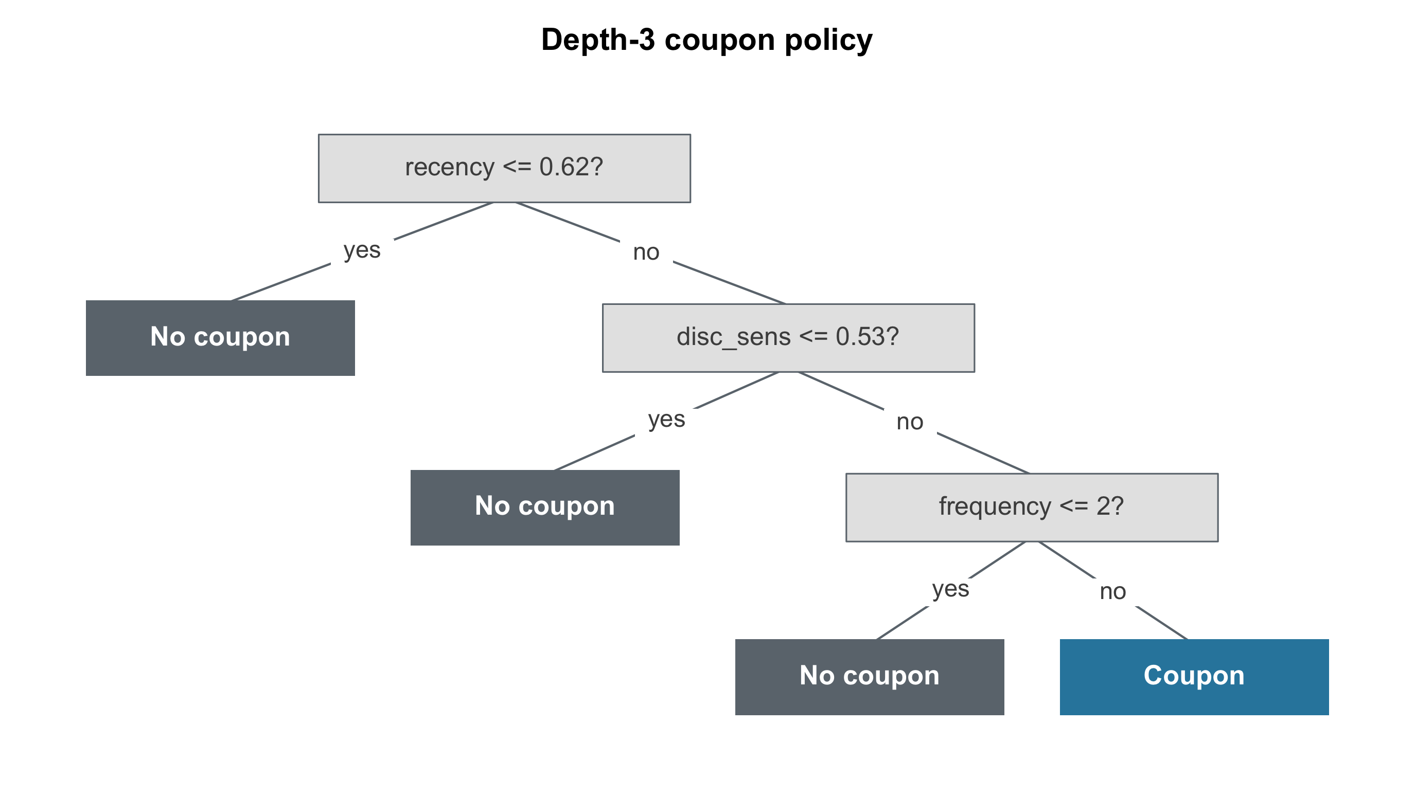
Depth increases computational cost sharply. On 20,000 users, the exact search that makes the depth-2 tree provably optimal at that depth is computationally impractical at depth 3 (Sverdrup et al. 2020). The depth-3 tree above comes from policytree’s hybrid_policy_tree, which runs the exact search one level at a time (Sverdrup et al. 2026): it finished in under a minute, but it is no longer guaranteed to find the best possible depth-3 tree — here it happens to land on the planted rule. On the Python side, mcf searched depth 3 over its candidate split grid (100 evaluation points per feature) and took roughly an hour where depth 2 took twenty seconds, arriving at nearly the same treatment region. The close agreement occurs because the planted rule is exactly three gates deep. Real data does not announce its depth, a deeper tree has more room to fit noise in the scores, and no depth can recover a gate the CATE estimates never captured — this tree found discount sensitivity only because the forest’s estimates already carried it. Choose depth the way you validate the rule: against held-out data, not by the tree’s own score.
A learned rule is a hypothesis. The tree was trained and evaluated on the same experiment, so the profit it promises is an in-sample number. Before the rule reaches the full base, measure it out of sample: roll it out while keeping a randomized slice of users on business-as-usual as a holdout, and compare the two groups to measure the policy’s realized incremental value — the same design the original experiment used to measure the coupon.
Then keep watching after launch. The CATEs were estimated on one period’s users, and the rule decays: the customer mix shifts, seasons change, and the policy itself changes behavior (users can learn that lapsing triggers a coupon, which trains them to lapse on purpose). Re-estimate the forest and re-learn the tree on a regular cadence, always against that standing holdout. Finally, specify the constraints before deployment. Fairness requirements, exclusion lists, frequency caps, margin floors, and regulatory limits should be part of the policy rather than added in response to a failure.
The shallow tree here is the simplest case of policy learning, the broader theory of choosing an optimal assignment rule under budget and fairness constraints. That theory — including the doubly robust objective and settings with more than two possible actions — gets a dedicated section in Chapter 15. The manual ROI arithmetic that turns a per-segment CATE into a budget line is developed in Section 14.6.1. Targeting is where the heterogeneity analysis stops being a description and becomes a decision.
12.9 What can go wrong
Even when the validation statistics look sound, acting on the estimate creates ongoing risks. Some have a diagnostic in the validation section. Others cannot be detected by any in-sample check and require standing safeguards: a frozen feature table, a permanent holdout, and a pre-launch audit. Review each risk before rollout.
False positives from slicing. This is the multiple testing problem of Section 5.5.2 running at machine scale: a forest effectively inspects thousands of candidate subgroups, so some will look responsive by luck alone — a segment promising +R$6 per user that evaporates when you refit. Honest estimation and out-of-sample validation reduce this risk but do not eliminate it. Do not allocate budget to a segment until the result survives a placebo test and is reproduced in new data.
Hidden confounding. This risk only bites with observational data — our coupon was randomized, which is why the chapter insisted on that scope up front. Suppose instead the coupons had been sent by an old marketing rule that targets lapsed users, and lapsed users were already due to bounce back on their own: every CATE absorbs that bias, and the forest reports the biased numbers with tight, confident intervals, because the model cannot warn you about a variable it never saw. No in-sample check detects this problem. Examine how treatment was assigned and, before using the estimates for targeting, run the sensitivity analysis in Chapter 13 to assess how strong an unmeasured confounder would have to be to erase the result.
Post-treatment features. These are the bad controls of Section 6.3 returning as feature engineering. Add “redeemed the coupon” to the feature table and the forest will discover that redeemers respond most — but that is the outcome leaking into the segmentation, not heterogeneity, and the same goes for post-campaign engagement and follow-up purchases. The screening question for every candidate feature is “could the treatment have changed this value?” — a timestamp after assignment day is an automatic disqualifier. Freeze the feature table at assignment time, as this chapter’s four features were.
Weak overlap. Where a region of feature space is nearly all-treated or all-control, the forest has no lookalikes to compare, so the CATE there is extrapolation, not estimation (Section 6.4.3). Our randomized data kept every estimated propensity between 0.36 and 0.65; a pilot that only ever couponed high spenders would not — and the forest would still hand you a number for everyone else. The overlap check in the validation section is the detector. Treat a wide interval in a thin region as a stop sign, not a detail: do not fund a segment whose CATE rests on extrapolation.
Model instability. Refit the forest on a new week of data and the ranking may change most in the middle of the distribution, where CATEs differ by only a few centavos. Users near a targeting threshold can move in and out of the campaign from one refit to the next. The stability check catches the gross version of this; for the subtle version, compare the rank ordering across refits before wiring the score into anything automated. Then target broad, stable tiers — treat the top 20%, say — rather than razor-thin score differences the next refit will redraw.
Over-trusting individual predictions. A CATE is a high-resolution group average — the effect on users like Maria, never on Maria herself, as the estimand section established — and individual effects vary around it. Quote “this user is worth R$7.20” and you have made a promise the method cannot keep; the first spot check that contradicts an individual prediction costs the whole model its credibility. Communicate segment-level averages with their confidence intervals, and never price a single person to the cent.
Short-term optimization. A rule that maximizes this month’s incremental profit conditions on behavior users can learn to game: if lapsing triggers a coupon, users learn to lapse — the feedback loop the targeting section flagged — and long-run margin erodes while every short-run readout looks great. Only a standing holdout, watched over a horizon longer than one campaign, reveals the drift. Define the outcome over the horizon the business actually cares about — Chapter 14 discounts effects that decay for the same reason — and see Tran et al. (2024) for methods that formally connect short-run experiments to long-run outcomes.
Fairness. None of our four features names a protected attribute, yet recency, frequency, and spending patterns correlate with income and geography, so an “optimal” policy can systematically exclude — or exploit — a protected group without any feature admitting it. That is a disparate-impact liability, legal as well as ethical, and no accuracy metric will flag it. Before launch, tabulate the learned rule’s treat-and-skip decisions across the groups you are obligated to protect, and ship the constraints inside the deployment as hard rules — the exclusion lists and audits from the policy-tree section, with the fuller treatment of constrained policy learning in Chapter 15.
These risks do not rule out heterogeneity analysis, but they require safeguards: validate the estimates, freeze features at assignment, prefer stable targeting tiers, retain a randomized holdout, and audit which groups the policy treats and excludes.
12.10 Wrapping up and next steps
The main conclusions are:
An average close to zero can still hide the decision. Our coupon’s average effect was R$0.30 per user — small enough for a CFO to round to zero. It was really two groups added together: about 11% of users who returned roughly R$7 each in extra profit, and a majority who cost more in margin than they gave back. The average answers “did the coupon work?” The business question is “who did it work for?”, and averaging destroys the answer.
You can estimate the effect on people like a given user, never the effect on that user. Maria either gets the coupon or she doesn’t; we never see both versions of her, so her personal effect is unknowable. What we can estimate is the conditional average treatment effect, the CATE: the average effect among users whose features look like Maria’s. Every tool that promises “individual-level effects” is really handing you a group average with high resolution.
The assumptions that make an effect causal do not go away because you switched to machine learning. You still need unconfoundedness (nothing you failed to measure drives both who got treated and how they responded) and overlap (every type of user had a real chance of landing in either group). A causal forest fits a more flexible model on whatever variation you feed it. It does not create variation that isn’t there, and it will not warn you about a confounder it never saw.
Only use features that existed before treatment was assigned. Whether the user redeemed the coupon, how engaged they were afterwards, what they bought next — all of these are affected by the treatment. Split users on them and you are no longer asking “for whom does the coupon work?” but “among users who already responded, how do the numbers look?” Snapshot the feature table on assignment day and let nothing dated after that in.
Hand-built heterogeneity is transparent but limited. You can split users into subgroups, add interaction terms to a regression, or fit one model per treatment arm. All three are transparent and sometimes enough. But an interaction term only finds the pattern you thought to write down: on our data, the OLS interaction model’s estimated effects correlated only 0.64 with the truth, while the forest reached 0.98. And when you slice the data twenty ways and keep the slice that looks interesting, you will find a “responsive” segment by luck alone.
A causal forest searches systematically for treatment-effect heterogeneity while separating subgroup discovery from effect estimation. It grows hundreds of trees; each tree cuts the users into groups and measures the treated-minus-control gap inside each group. Three ingredients make it trustworthy. Honesty: the rows used to choose where to cut are not the rows used to measure the effect, so the forest cannot flatter an estimate with the same noise that made the group look promising. Averaging: hundreds of trees, each grown on a different subsample, cancel out each other’s unstable boundaries. Residualizing: before looking for heterogeneity, the method subtracts from both the outcome and the treatment whatever the features already predict, so the forest spends its power on how the effect varies rather than on the background. What comes out is an effect estimate for every user, with a confidence interval you can use.
A forest hands you a different number for every user whether or not the heterogeneity is real, so you have to test it. That is what the pre-flight checklist is for. Calibration asks whether the users the forest predicted would respond more actually did, and by the predicted amount. The best linear projection asks which features are associated with larger or smaller effects, and in which direction, so you can check the pattern against what the business already believes. GATES sorts users by predicted effect, cuts the list into buckets, and compares the uplift each bucket actually realized. The TOC curve and its summary number, the RATE, ask whether treating the top of the ranking beats treating people at random. Overlap checks that no group of users was almost entirely treated or entirely untreated. A placebo test shuffles the treatment column and confirms the apparent heterogeneity collapses. A stability check refits on a fraction of the data and asks whether the same story comes back. And two checks return no number at all: read every confidence interval before you believe a point estimate, and say the finding out loud to someone who knows the business — if nobody can name a mechanism, expect it to be fragile.
“We found no heterogeneity” often means “our sample was too small to see it.” An average effect is one difference. Heterogeneity is a difference between differences, estimated on halves of the sample, so its standard error is twice as large before the search even begins. Detecting an interaction half the size of the main effect takes roughly sixteen times the sample size. An experiment with adequate power to measure the average effect can be an order of magnitude too small to say anything about who it falls on.
Rank users by how much the coupon changes their behavior, not by how likely they are to buy. Purchase propensity and treatment effect are often confused in targeting decisions. Your best customers buy with or without the discount, so couponing them just burns margin. The users worth paying for are the ones whose behavior actually changes — and they can sit anywhere in a propensity ranking. In our data, past spending (the best single predictor of “likely to buy”) was the feature the forest relied on least. On the model’s own arithmetic, ranking by estimated effect instead flipped the program from a R$94,300 loss if we couponed everyone to a R$5,600 gain.
A learned targeting rule is a hypothesis until a holdout says otherwise. A policy tree turns the forest’s thousand-tree score into a short if-then rule a product team can read and argue with — ours came back as “coupon only frequent buyers who have lapsed.” But a rule’s promise and its performance are different numbers: ours expected about +R$365 from its own estimates and earned essentially nothing against the planted truth (about R$55 below zero), because a depth-2 tree cannot express the third gate (discount sensitivity) the profitable segment needs. One level deeper, the tree recovered that gate and both valuations turned strongly positive (about 10% apart) — in this simulation the depth constraint, not the method, was the shortfall. Roll a rule out against a randomized slice of users kept on business-as-usual, measure what it actually earned, and re-estimate as the user mix drifts.
How to run a heterogeneity analysis on your own data:
Confirm the average effect is credible before you go looking for who it falls on. Randomized assignment is the clean case. With observational data you are betting you measured every confounder — a bet that has failed badly even with thousands of features.
Build the feature table as of assignment day. Purchase history, tenure, past behavior: yes. Anything that happened after the treatment landed: no.
Start with a regression that interacts treatment with your features. It is transparent, it takes one line, and if the decision is coarse it may be all you need.
Fit an honest causal forest —
causal_forest()in R’sgrf,CausalForestDMLin Python’seconml— and pull an estimated effect and a confidence interval for every user.Validate the estimates before presenting or using them. The calibration coefficient should sit near 1 and be significant. The best linear projection should point at features a domain expert recognizes. The RATE should be positive with a confidence interval clear of zero — and build the ranking on one half of the data and evaluate it on the other, or you are grading your own homework. Pick AUTOC when you expect a small group to respond, Qini when you expect a weak response spread across everyone. GATES should show a top bucket standing clear of the rest. Propensities should stay away from 0 and 1. The placebo fit should collapse to nothing. The pattern should survive on a subsample.
If the checks come back empty, look at what your confidence interval covers before concluding everyone responds the same. An interval on the calibration coefficient wide enough to include both 0 and 1 means you learned nothing, not that there was nothing to learn.
Turn effects into money. Subtract the cost of treating from each user’s estimated effect. Sort by what’s left. Walk down the list until the budget runs out or the next user costs more than they return.
If you need a rule people can read, learn a shallow policy tree — and check that your package searches every possible tree rather than picking splits greedily one at a time. A greedy search on our data recommended treating nobody.
Launch against a standing holdout. Keep a randomized group on business-as-usual so you can measure what the rule really earned, and refit on a cadence as customers, seasons, and behavior shift.
Specify the constraints before deployment: exclusion lists, frequency caps, margin floors, and a fairness audit of which groups the policy excludes.
If you want more practice before moving on, the Mixtape session: Machine learning and heterogeneous effects labs walk through heterogeneous-effects and policy-learning exercises end to end on real data, and the grf package vignettes include hands-on examples of causal_forest, best_linear_projection, and rank_average_treatment_effect on benchmark datasets. Reproduce the coupon analysis, then change the true effect function in the data-generating script and compare how the forest and OLS recover the new pattern. And if you want the machinery stated formally rather than described, Appendix 12.A derives how a splitting rule built for predicting outcomes gets rewritten to estimate treatment effects instead.
This chapter closes Part II. You can now estimate a credible average effect and a credible picture of who it lands on — which is the middle of the job, not the end. Part III covers everything that happens after the estimate. It begins by learning to stress-test our own results before a skeptic does, using placebo tests, negative controls, balance and overlap checks, and sensitivity analysis for the confounders you cannot see (Chapter 13).
Then we translate a statistically significant effect into a forecast of financial return that accounts for effect decay, gradual adoption, cannibalization, capacity constraints, and uncertainty (Chapter 14). Finally we map what lies beyond this toolkit: structural causal models, causal discovery, Bayesian methods, treatments that change over time, spillovers between users, and the full theory of policy learning that this chapter’s policy tree only sampled (Chapter 15). The through-line is the same: identification determines whether an estimate is causal; more flexible estimation cannot substitute for it.
Appendix 12.A: From predicting outcomes to predicting treatment effects
Earlier in the chapter I described a prediction tree as looking for cuts that make each box internally similar, and a causal tree as looking for cuts that make the effect estimates as different as possible across boxes. Those read like opposite instructions. They are not. They are the same instruction stated from either side of a quantity that does not change when you move the cut, and this appendix shows why.
The path there has four steps: write down what each problem is aiming at, find the one piece of the causal version that is missing, replace it with something we can observe, and then rewrite the criterion. Everything here is standard (Athey and Imbens 2016; Wager and Athey 2018; Athey et al. 2019); the way it is laid out follows the Mixtape session on heterogeneous effects that the wrap-up already points you to.
Two problems with the same shape
Both problems aim at a conditional average, and both grade themselves the same way. Prediction wants the expected outcome for a user with features \(x\), and the causal version wants the expected effect for that same user. Writing \(m\) for the outcome model the chapter introduced in Section 12.6.5, the two targets are:
\[ \begin{aligned} m(x) &= \mathbb{E}\!\left[\, Y_i \mid X_i = x \,\right] \\[0.5em] \tau(x) &= \mathbb{E}\!\left[\, \tau_i \mid X_i = x \,\right] \end{aligned} \tag{12.1}\]
Each target can also be defined as the value that minimizes squared error, which is the form needed here. Ask what single number you would guess for a whole group of lookalike users if you were graded on squared error. The answer is their average, so each target in Equation 12.1 is also the solution to a minimization:
\[ \begin{aligned} m(x) &= \operatorname*{arg\,min}_{a \in \mathbb{R}} \; \mathbb{E}\!\left[\left(Y_i - a\right)^2 \mid X_i = x\right] \\[0.8em] \tau(x) &= \operatorname*{arg\,min}_{a \in \mathbb{R}} \; \mathbb{E}\!\left[\left(\tau_i - a\right)^2 \mid X_i = x\right] \end{aligned} \tag{12.2}\]
The squared-error framework is the same; only the estimand changes. A tree inherits that framing: every leaf groups lookalike users and stores their average.
The column that does not exist
The trouble is in the training data. To fit the prediction problem you need pairs \(\{Y_i, X_i\}\), and every one of those is sitting in your table. To fit the causal problem you would need pairs \(\{\tau_i, X_i\}\) — and \(\tau_i = Y_i(1) - Y_i(0)\) is the individual treatment effect from Chapter 12’s opening, which nobody observes for anybody. Each user is treated or not, never both.
That is the whole obstacle, and it is worth being blunt about how narrow it is. The target is fine. The criterion is fine. One column of the training data does not exist, and everything that follows is a workaround for that single absence.
Splitting the effect into two observable pieces
The workaround is to stop asking for \(\tau_i\) directly and ask for two things we can estimate instead. Group the users by their features, look at the treated ones and the untreated ones separately, and take the difference:
\[ \begin{aligned} \mathbb{E}\!\left[\tau_i \mid X_i\right] &= \mathbb{E}\!\left[Y_i(1) - Y_i(0) \mid X_i\right] \\[0.8em] &= \mathbb{E}\!\left[Y_i \mid X_i, D_i = 1\right] - \mathbb{E}\!\left[Y_i \mid X_i, D_i = 0\right] \end{aligned} \tag{12.3}\]
Both terms on the last line are ordinary conditional means of an observed outcome. The second equality is where the causal assumptions get spent — the same ones the chapter laid out before any algorithm appeared: consistency and no interference, so that the outcome we record for a treated user is their \(Y_i(1)\); conditional exchangeability, \(\left(Y_i(0), Y_i(1)\right) \perp D_i \mid X_i\), which is the conditional independence assumption of Section 6.4.2; and positivity, so that both groups actually exist inside every feature profile (Section 6.4.3).
Read that independence statement carefully, because it is easy to garble. What it requires is that the potential outcomes be independent of \(D_i\) given \(X_i\). It asks nothing at all about whether they depend on \(X_i\) — and in our coupon data they plainly do, since the effect was built to vary with recency, frequency, and discount sensitivity. That dependence is not a problem to be assumed away; it is the entire thing we came to measure. If the potential outcomes were independent of \(X\), no feature would carry information about the effect and there would be no heterogeneity to find. Conditioning on \(X\) is the mechanism, not the thing being ruled out.
Why the criterion turns into a maximization
Minimizing squared error against the unobservable effect is equivalent to maximizing the spread of the leaf-level estimates. That claim is true, but only under two conditions, and stating them is not pedantry — the result is false without either one.
First, each leaf’s predicted value is the mean of the effects inside it, \(\bar\tau_\ell = \frac{1}{n_\ell}\sum_{i \,:\, X_i \in \ell} \tau_i\), not some arbitrary constant we are free to choose. Second, we are comparing candidate partitions of the same parent sample, so the number of observations and their overall mean are held fixed while only the cut moves.
Before the algebra, distinguish the tree’s piecewise-constant target from the true CATE. A tree predicts one constant per leaf, not \(\tau(x)\) directly. Write \(\ell(x; \Pi)\) for the leaf that profile \(x\) falls into under partition \(\Pi\), and give the tree’s piecewise-constant target its own symbol:
\[ \tau_\Pi(x) = \mathbb{E}\!\left[\, \tau_i \mid X_i \in \ell(x; \Pi) \,\right] \tag{12.4}\]
Keep four objects straight, because the argument below trades on the differences between them. \(\tau(x)\) is the true CATE. \(\tau_\Pi(x)\) is the population average effect over a whole leaf — coarser than \(\tau(x)\), and it shifts whenever the cuts shift. Then \(\bar\tau_{\ell(i)}\), the leaf mean from the previous paragraph, is the finite-sample oracle quantity: the sample analogue of \(\tau_\Pi(x)\), and — read its definition again — an average of the individual \(\tau_i\), so it is exactly as unobservable as they are.
Which leaves the fourth, and the only one you can actually put in a leaf. An operational tree stores \(\hat\tau_\ell = \hat\mu_1(\ell) - \hat\mu_0(\ell)\): the average outcome among treated users in the leaf minus the average among controls. That is Equation 12.3 applied inside a single box, so the assumptions that licensed it are what let \(\hat\tau_\ell\) stand in for \(\bar\tau_\ell\) here. The derivation below runs on the oracle quantity because that is the only way to see the criterion’s shape; the estimator is what makes it usable.
This is why Athey and Imbens (2016) carry \(\Pi\) around in their notation, writing \(\mu(x; \Pi)\) and \(\hat\tau(X_i; S^{tr}, \Pi)\) rather than bare \(\mu(x)\) and \(\tau(x)\). The tree’s target moves when the cuts move; the true CATE does not. The same distinction applies on the prediction side, where \(m_\Pi(x)\) is the leaf-constant approximation to \(m(x)\).
With that in hand, expand the squared error one leaf at a time, using the leaf means an oracle tree would store if the individual effects were observable. The cross-term collapses because \(\bar\tau_\ell\) is the leaf mean, and what survives is:
\[ \sum_{i} \left(\bar\tau_{\ell(i)} - \tau_i\right)^2 = \sum_{i} \tau_i^2 \;-\; \sum_{\ell \in \Pi} n_\ell \, \bar\tau_\ell^{\,2} \tag{12.5}\]
The first term on the right does not mention the partition \(\Pi\) at all. Move the cut wherever you like and \(\sum_i \tau_i^2\) is unchanged, so it cannot affect which split wins. Minimizing the left side is therefore the same problem as maximizing \(\sum_\ell n_\ell \bar\tau_\ell^{\,2}\), the leaf-size-weighted sum of squared leaf effects.
This is how Athey and Imbens (2016) define their criterion. They define it with the squared-outcome term already subtracted out:
\[ -EMSE_\mu(\Pi) = -\mathbb{E}\!\left[(Y_i - \mu(X_i;\Pi))^2 - Y_i^2\right] - \mathbb{E}\!\left[(\hat\mu - \mu)^2\right] \]
Dropping a term that every candidate partition shares changes nothing about their ranking, which is what licenses discarding the unobservable \(\sum_i \tau_i^2\) in the treatment-effect case.
Two cautions about Equation 12.5. It is equivalent to maximizing between-leaf dispersion, but the quantity \(\sum_\ell n_\ell \bar\tau_\ell^{\,2}\) is not literally that dispersion: it differs from the centered \(\sum_\ell n_\ell (\bar\tau_\ell - \bar\tau_{\text{parent}})^2\) by the fixed amount \(N \bar\tau_{\text{parent}}^{\,2}\). Same ranking of splits, different quantity. That equivalence is why Wager and Athey (2018) can describe the rule as “maximizing the variance of \(\hat\tau(X_i)\).” And when you see this written as \(\max \sum_i \bar\tau_{\ell(i)}^{\,2}\), summing over users rather than leaves, the leaf sizes are already in there — every one of the \(n_\ell\) users in leaf \(\ell\) contributes the same \(\bar\tau_\ell^{\,2}\).
The same argument on the prediction side produces the same criterion shape. Athey and Imbens (2016) write conventional CART as:
\[ -MSE_\mu(S^{tr}, S^{tr}, \Pi) = \frac{1}{N^{tr}}\sum_{i \in S^{tr}} \hat\mu^2(X_i; S^{tr}, \Pi) \]
That is the exact twin of the causal criterion in Equation 12.6 below. Minimizing variation within leaves and maximizing variation between leaves are the same operation, because the total variation in a fixed sample is fixed: whatever you take out of one, you put into the other. “Make the boxes internally similar” and “make the boxes differ from each other” were never two goals. They are one goal, seen from either end.
Three criteria, not one
The equivalence above is an oracle result: it still has \(\tau_i\) in it, so it motivates a splitting rule rather than describing one you can run. Athey and Imbens (2016) separate three objects that are easy to blur together.
The infeasible criterion is the one that scores a partition using effects nobody observes. The left side of Equation 12.5 is a stripped-down version of it: a finite-sample oracle loss, useful here because it ranks partitions the same way once the partition-invariant terms drop out. Athey and Imbens (2016)’s formal object is heavier — a partition-level \(MSE_\tau(S^{te}, S^{est}, \Pi)\) that keeps the test and estimation samples separate — but it is infeasible for the same single reason, and the ranking argument above is what carries over. Note that nothing like this was ever needed on the prediction side, where the corresponding criterion was computable all along; that asymmetry explains why causal-tree splitting needs a substitute for individual effects. The adaptive criterion replaces the missing effects with estimates and is what a plain causal tree maximizes:
\[ \begin{aligned} &-\widehat{MSE}_\tau(S^{tr}, S^{tr}, \Pi) \\[0.6em] &\qquad = \frac{1}{N^{tr}} \sum_{i \in S^{tr}} \hat\tau^2(X_i; S^{tr}, \Pi) \end{aligned} \tag{12.6}\]
This is the “maximize the sum of squared effect estimates” rule in operational form. But it rewards a split that spreads estimates by luck just as much as one that spreads them through real heterogeneity. The honest criterion fixes that by charging for the uncertainty it creates:
\[ \begin{aligned} &-\widehat{EMSE}_\tau(S^{tr}, N^{est}, \Pi) \\[0.6em] &\qquad = \frac{1}{N^{tr}} \sum_{i \in S^{tr}} \hat\tau^2(X_i; S^{tr}, \Pi) \\[0.6em] &\qquad\quad - \left(\frac{1}{N^{tr}} + \frac{1}{N^{est}}\right) \sum_{\ell \in \Pi} \left( \frac{S^2_{treat}(\ell)}{p} + \frac{S^2_{control}(\ell)}{1 - p} \right) \end{aligned} \tag{12.7}\]
Taking the symbols in the order they appear: \(S^{tr}\) is the sample that chooses the splits and \(N^{est}\) the size of the sample that will estimate the leaves; \(S^2_{treat}(\ell)\) and \(S^2_{control}(\ell)\) are the within-leaf variances of the outcome among treated and control users in leaf \(\ell\), computed on the splitting sample \(S^{tr}\) — the criterion has to anticipate the estimation sample’s behavior using only data it can see; and \(p\) is the probability of treatment, which is where this version assumes a randomized experiment like our coupon trial. Observational applications need the propensity-score adjustment Athey and Imbens (2016) discuss instead of a single \(p\). In their own words, the criteria “reward a partition for finding strong heterogeneity in treatment effects and penalize a partition that creates variance in leaf estimates.”
Note which way the logic runs, because the chapter’s honesty section is easy to read backwards. Honesty is the estimation design — split the rows, choose the tree on one half, measure the leaves on the other. The criterion in Equation 12.7 is then derived under that design, and the penalty is what falls out of doing the accounting properly. The criterion anticipates honesty; it is not forced into existence by it.
One more difference in the same spirit, and worth scoping to its source rather than stating as a law of causal trees: in the double-sample causal trees of Wager and Athey (2018), every leaf must hold at least \(k\) estimation-sample observations from each treatment arm. A prediction tree has no per-arm requirement — it needs enough rows. A causal tree needs enough rows on both sides of the comparison, since a leaf with no treated users has no treated-minus-control gap to report. That is the arm-aware version of the minimum-leaf-size rule from the chapter’s tree-building section.
From a causal partition to a causal forest
It is tempting to picture all this as two random forests — one fit to treated users, one to controls — grown side by side. Resist that picture; it describes something else. Four constructions are worth keeping apart:
- A T-learner fits two separate outcome models, one per arm, and subtracts their predictions. Because nothing ties them together, the two models can learn two entirely different partitions of the feature space. This is the estimator the chapter introduced among the meta-learners.
- A causal tree builds one shared partition. Inside each leaf it estimates one mean outcome among the treated observations and one among the controls, then subtracts them to get that leaf’s effect estimate (Athey and Imbens 2016). One partition, two arm-specific means per leaf — not two trees.
- The original causal forest grows an ensemble of causal trees and aggregates their treatment-effect estimates, with the treated-minus-control leaf mean as the within-leaf estimator (Wager and Athey 2018).
- The generalized random forest, which is what
causal_forestactually runs today, keeps recursive partitioning, subsampling, and random feature selection, but stops treating the answer as a plain average of tree-level estimates. It residualizes the outcome and the treatment first, guides its splits with gradient-based pseudo-outcomes computed from those residuals, and then derives each user’s CATE from forest weights plugged into a local estimating equation (Athey et al. 2019).
That last rung is where the chapter’s two separate descriptions meet. The comparison-neighborhood story — count how often a user shares a leaf with Maria, turn those counts into weights, estimate the effect in the weighted neighborhood — and the residualizing story in Section 12.6.5 are not competing accounts of the forest. They are two halves of the same construction: residualizing decides what the trees split on, and the weights decide how the final estimate is assembled.
A note for readers running both languages, since this chapter keeps R and Python side by side. Both tools take the route just described: grf::causal_forest documents it in its algorithm reference, and Python’s CausalForestDML pairs the same residualization with a generalized-random-forest final stage built on honest trees and local moment equations. What differs is everything around the shared idea — separate codebases, different APIs, and different machinery for the uncertainty, with econml documenting a bootstrap-of-little-bags construction for its intervals. On this chapter’s simulated data the two reach the same substantive conclusions, which is the claim the validation table makes; their estimates and diagnostics are not interchangeable.
Two qualifications before you close the appendix. First, this family of forests draws each tree’s sample without replacement. That is a real departure from classical bagging, which resamples with replacement, and it is one of the ingredients behind the confidence intervals — alongside honesty, a condition on how fast the subsample grows with the data, and regularity conditions on the trees themselves (Wager and Athey 2018). Subsampling alone does not guarantee valid intervals. Second, and this is the practical residue of the whole appendix: the two terms in Equation 12.7 reward different kinds of feature, and a causal tree can profit from either. The first term pays a split for separating users whose effects differ, and the outcome level earns nothing there — a feature that predicts profit beautifully but predicts the coupon’s effect not at all adds zero to it. The second term pays for something else entirely: making outcomes more alike inside each leaf, which sharpens both the treated and the control mean and so shrinks the penalty. A split on a pure outcome predictor can therefore improve the criterion even when both children have the same treatment effect — Athey and Imbens (2016) make this point directly, and note it is why the gap between the adaptive and honest criteria matters more for treatment effects than it ever did for prediction.
So the two jobs draw on overlapping but distinct lists. A strong outcome predictor need not be a strong effect predictor, though it can still earn its place by making the effect estimates more precise. In this chapter, past_spend illustrates the distinction: the best single predictor of who buys, and the feature the forest leaned on least when working out whom the coupon changes (Figure 12.8). What that shows is that the two rankings come apart — not that predicting the outcome is useless to a causal tree.
As Google advises, “NotebookLM can be inaccurate; please double-check its content”. I recommend reading the chapter first, then listening to the audio to reinforce what you’ve learned.↩︎
A heads-up for when you read causal-forest documentation: many implementations call the treatment
W, following the notation in that literature. Same variable, but I’ll stick with the \(D\) this book has used since Chapter 2.↩︎These first three variables form what is commonly called RFM, which stands for Recency, Frequency, and Monetary value. It is widely used in customer segmentation and machine learning to summarize customer behavior: when they last engaged, how often they engage, and how much value they bring.↩︎
To load it directly, use the example URL
https://raw.githubusercontent.com/RobsonTigre/everyday-ci/main/data/coupon_allocation_experiment.csvand replace the filenamecoupon_allocation_experiment.csvwith the one you need.↩︎This is the “fundamental problem of causal inference” from Chapter 1: we see at most one of the two potential outcomes for any user.↩︎
Some people may promise to estimate the effect on this specific user, i.e. the individual treatment effect (ITE). Although I understand why that target is attractive, I have not yet seen compelling reasons to believe it can be estimated reliably in realistic scenarios.↩︎
Regularization penalizes model complexity: a feature’s influence is reduced or removed unless it improves prediction enough to offset the penalty. Ridge regression shrinks coefficients, lasso can set them to zero, and gradient boosting, random forests, and neural networks impose complexity controls in different ways.↩︎
If that sounds like the opposite of what a prediction tree does — earlier I said it keeps the cut that makes each box most internally similar — the two are actually the same rule written from either side. Within a fixed sample the total variation is fixed, so removing variation from inside the boxes is the same act as adding it between them. Appendix 12.A shows the algebra, along with the conditions it needs and the difference between the rule a causal tree would like to use and the one it can actually compute.↩︎
The residualize-then-estimate logic generalizes beyond forests. The
DoubleMLpackage, available in R and Python, is a separate implementation of the broader double/debiased machine learning framework — not theCausalForestDMLestimator this chapter’s Python code uses — and a natural next stop if you want a DML-centered workflow for ATEs, GATEs, CATEs, and policy rules; see the DoubleML heterogeneity guide.↩︎In
grf, the regression is \(\tilde Y_i = \alpha\,\bar\tau\,\tilde D_i + \beta\,\big(\hat\tau(X_i) - \bar\tau\big)\,\tilde D_i + \varepsilon_i\), fit by OLS with no intercept and heteroskedasticity-robust standard errors, with one-sided p-values.test_calibrationprints \(\alpha\) asmean.forest.predictionand \(\beta\) asdifferential.forest.prediction. This is the best linear predictor of Chernozhukov et al. (2023) — the same paper behind GATES below — written in residualized form: they weight by \(1/\big(\hat e(x)(1-\hat e(x))\big)\) and fit the CATE proxy on a separate split, while here the forest supplies the proxy and residualizing handles the propensity.↩︎Standardize only the projection covariates —
best_linear_projection(cf, scale(X)). The forest’s own features can stay raw: a tree split depends only on how feature values are ordered, so standardizing them would change nothing.↩︎That correlation is a simulation-only luxury: real data has no planted truth to check against, so you lean on the calibration coefficient, which is computable anywhere.↩︎
That is
grf’s statistic, and it is what Figure 12.8 plots.econml’sfeature_importances_measures something related but different: how much treatment-effect heterogeneity each split creates, also depth-weighted. The companion scripts report each measure under its own name and save them as separate figures.↩︎The arithmetic, for two pre-defined halves of an experiment with \(n\) users: each half’s effect is estimated on \(n/2\) users, so its standard error is \(\sqrt{2}\) times the full-sample ATE’s; differencing the two halves’ effects multiplies it by \(\sqrt{2}\) again — twice the ATE’s standard error in total. Twice the standard error costs four times the sample to undo (Chapter 5), and a target half the size costs another four: \(4 \times 4 = 16\). The 16 is a planning default, not a law: it leans on the half-size assumption — a reasonable starting point, no more — and on the standard coding of the interaction term.↩︎
For budgets with per-user costs, or several competing offers at once, this curve generalizes to constrained assignment: pick the best action per user under a cost constraint, often by solving a small optimization problem. The single-coupon, single-budget case here is its simplest slice.↩︎
This is also why I reach for
mcfrather than the more familiareconml.policy.PolicyTreein Python. A greedy tree-builder fixes one split before looking at the next, so it can miss a rule like this one, where neither feature looks useful until you split on both. On this data,econml’s greedy policy tree recommends treating no one. R’spolicytreeconsiders every eligible split and finds the real optimum. Python’smcfsearches exhaustively over a grid of candidate split points per feature — not every raw value — and lands on nearly the same rule. Greedy learners are fine for many problems; just confirm your tool searches exhaustively rather than greedily before trusting a shallow policy rule.↩︎