graph LR
    classDef unobserved fill:#fff,stroke:#333,stroke-dasharray: 5 5;

    X["Running Variable <br/> (Loyalty Score)"] --> D["Treatment <br/> (Free Shipping)"]
    X --> Y["Outcome <br/> (Future Spending)"]
    D --> Y
    U["Unobserved Confounders"] -.-> Y
    U -.-> X

    class U unobserved

    linkStyle 0,2 stroke:#00BCD4,stroke-width:2px;
8 Regression discontinuity design: Cutoffs as natural experiments
Keywords
A/B Testing, Causal Inference, Causal Time Series Analysis, Data Science, Difference-in-Differences, Directed Acyclic Graphs, Econometrics, Impact Evaluation, Instrumental Variables, Heterogeneous Treatment Effects, Potential Outcomes, Power Analysis, Sample Size Calculation, Python and R Programming, Randomized Experiments, Regression Discontinuity, Treatment Effects
So far, we’ve explored the challenge of finding a proper control group to approximate the counterfactual for the treated. Experiments are not always feasible, and finding valid instruments is not always possible. But sometimes nature or business rules do the hard work for us, creating settings where treatment is assigned based on whether someone crosses an arbitrary threshold or cutoff. When that happens, we get something close to an experiment generated by the circumstances, which we call a natural experiment.
This is exactly what Regression Discontinuity Design (RDD) offers us: a quasi-experimental method that exploits thresholds to define treatment assignment. Consider fintechs that offer lower interest rates to customers with a credit score above a certain threshold, without advertising it; or universities that accept applicants who score above a cutoff on an admission exam. These arbitrary thresholds create natural experiments where we can isolate the causal effect of lower interest rates on future borrowing behavior or the effect of university admission on future earnings.
The key insight is simple: compare people who barely made the cutoff to those who barely missed it. Someone who scored 650 on a credit check is nearly identical to someone who scored 649, yet only one of them gets the lower interest rate. This narrow comparison creates two groups that differ only in their treatment status, mimicking the random assignment of an experiment.2 Any difference in outcomes at this boundary can be attributed to the treatment itself.
This chapter covers two flavors of this design:
Sharp RDD: The cutoff is a hard line. Cross it and you always get the treatment; fall short and you never do. Think of a scholarship that automatically goes to every student with a GPA (Grade Point Average, a numeric summary of academic performance on a 0–10 scale) of 7.0 or above, no exceptions.
Fuzzy RDD: The cutoff is more of a nudge than a guarantee. Crossing it makes treatment much more likely, but not certain. For example, qualifying for a loan program encourages uptake, but some eligible customers still decline while a few ineligible ones get approved through exceptions.
ImportantTreatment isn’t always ‘above the cutoff’
In the examples above, being above the cutoff triggers treatment. But many settings work the other way around: conditional cash transfer programs, for instance, grant eligibility to families whose income falls below a poverty line. The logic of RDD is the same either way; just note which side defines treatment. For simplicity, I use only “above cutoff = treatment” examples in this chapter.
Beyond Sharp and Fuzzy RDD, researchers have developed extensions for more complex settings. If any of the extensions below sound relevant to your work, see the Appendix on RDD extensions at the end of this chapter.
- Regression Kink Design (RKD) applies when the policy changes the rate of treatment rather than switching it on or off (e.g., overtime pay that kicks in at 40 hours — your paycheck doesn’t jump, but the rate at which you earn more bends upward).
- Multi-Score RDD applies when eligibility depends on multiple running variables simultaneously (e.g., a scholarship requiring scores above thresholds in both Math and Writing).
- Geographic RDD exploits spatial boundaries (e.g., comparing order frequency just inside vs just outside a food delivery app’s service area).
8.1 The sharp case: when a score guarantees the treatment
At its core, RDD exploits arbitrary rules to create conditions resembling a true experiment. Researchers call this a quasi-experimental method because it lets us estimate causal effects with rigor sometimes comparable to randomized trials. Sharp RDD applies when treatment follows a single, clear rule: cross the threshold, get the treatment. No exceptions, no discretion.
I will start with an education example — scholarships and GPAs — rather than business applications. Education settings are familiar to almost everyone, making the core concepts and mechanics of the RD design easier to absorb. Once you’ve built this intuition, we’ll apply the same framework to industry scenarios: an e-commerce platform testing free shipping and a fintech startup measuring whether loans drive cross-selling revenue.
Consider a scholarship program where students automatically receive a scholarship if their GPA is 7.0 or higher on a 10-point scale. Students below 7.0 do not receive the scholarship. In RDD terminology, the GPA is the running variable — a continuous score that determines treatment eligibility. The cutoff is 7.0, the threshold separating scholarship recipients (treated) from non-recipients (control). And because every student with GPA ≥ 7.0 receives the scholarship while every student below does not, we say the treatment assignment is deterministic.3
Figure 8.1 shows this visually. The x-axis displays the running variable (GPA, from 4 to 10); the y-axis shows the probability of receiving the scholarship — not the outcome itself, just whether you get treated.
Read the figure left to right. On the left (GPA from 4 to 7), the probability sits flat at zero: no one in this range gets the scholarship. At the cutoff (the vertical dashed line at 7.0), the probability jumps from 0 to 1. On the right (GPA from 7 to 10), it remains at one: everyone gets the scholarship. The annotations reinforce this: GPA < 7.0 means control group (no scholarship); GPA ≥ 7.0 means treatment group (scholarship). No overlap, no gray area.
This deterministic jump is what makes Sharp RDD “sharp.” When we discuss Fuzzy RDD later, you’ll see the probability doesn’t jump all the way from 0 to 1 — it increases at the cutoff but doesn’t reach certainty. Keep this figure in mind for contrast.
But treatment assignment is only half the story. The interesting part comes when we look at outcomes — whether receiving a scholarship affects students’ future earnings, for instance. Figure 8.2 shows an RDD results plot. Each point represents one student, with GPA on the x-axis and future earnings (in thousands of R$) on the y-axis.
Each blue dot inside the shaded region represents a student whose GPA falls within a comparison window; gray dots outside represent students farther from the cutoff. This shaded region (roughly GPA 5.5 to 8.5) is the bandwidth — the range of observations used for estimation.
Why limit ourselves? Because students with a GPA of 6.9 are far more comparable to students with a GPA of 7.1 than students at 4.0 are to those at 10.0. The bandwidth focuses on students who barely passed versus those who barely failed — the most similar except for treatment status. Students outside the bandwidth are excluded as too different.
Next, we follow some of the logic from Section 1.3.3 and fit a regression line on each side of the cutoff: the left line captures GPA-to-earnings relationship for students without the scholarship; the right line captures it for students with. These lines are fitted only within the bandwidth.
The vertical gap between the two lines at the cutoff — marked with an orange arrow — is what we’re after. This jump is the treatment effect: the estimated causal impact of the scholarship on earnings. Here, it’s approximately R$8,000.4 If scholarships had no effect, the lines would meet smoothly with no gap. Notice we are missing confidence intervals here, but we’ll get to that later.
Why does this work? Students with a GPA of 6.99 and 7.01 are essentially identical — same ability, same motivation, same background — except one barely missed the scholarship and one barely got it. Any difference in earnings at this boundary must be caused by the scholarship.
Before moving on, here’s the vocabulary you’ll need:
- Running variable: The continuous score that determines treatment eligibility (GPA). It goes on the x-axis.
- Cutoff: The threshold on the running variable that triggers treatment (7.0).
- Treatment assignment: The rule mapping running variable to treatment status. In Sharp RDD, crossing the cutoff guarantees treatment.
- Bandwidth: The window around the cutoff defining which observations are used. Narrower bandwidths focus on more comparable units but reduce sample size.
- Treatment effect (AKA “jump”): The vertical gap between regression lines at the cutoff — the estimated causal effect.
With these concepts, we’re ready to examine the assumptions that make RDD credible.
8.1.1 A note on local effects and generalizability
Before diving into assumptions, consider a fundamental limitation of RDD: the treatment effect we estimate is local to the cutoff. We’re measuring what happens to students with a GPA of 6.99 versus 7.01, not what would happen if we gave scholarships to everyone.
This locality is a strength because students just above and below the cutoff are nearly identical, giving us strong internal validity. But it is also a limitation because we cannot automatically assume the same effect would hold for students with a GPA of, for instance, 4 or 10. This is the same internal vs. external validity trade-off we discussed in Chapter 4.
In practice, this means you should think carefully about whether the cutoff population is representative of the broader population you care about. If your question is “What’s the effect of scholarships on a typical student?”, RDD might give you a credible answer if most students hover around the threshold. But if the cutoff captures an unusual slice of your student body, extrapolating the effect to all students requires additional assumptions you cannot test.
Researchers have developed methods to extrapolate RDD estimates, though they come with caveats. The core idea is that if you control for all relevant student characteristics, GPA no longer predicts who gets treatment — making it safe to compare students anywhere on the GPA scale (conditional independence, Section 6.4.2).
Angrist and Rokkanen (2015) show that if the running variable has no direct effect on the outcome once you condition on relevant covariates, you can use regression adjustment to estimate treatment effects for the entire population.
Dong and Lewbel (2015) take a different approach, using the local RDD estimate as a trusted anchor and estimating a trend that indicates how the treatment effect grows or shrinks as you move away from the cutoff — useful for marginal extrapolation, though projecting all the way to students with a GPA of 4 or 10 pushes the method’s limits.
These methods expand the scope of RDD, but they come with trade-offs:
- Pro: They allow you to answer broader policy questions (e.g., “What if we gave scholarships to everyone?”) rather than just the local effect at the threshold.
- Con: They require additional assumptions that are often untestable. Conditional independence is the same bet we made in Chapter 6: that you’ve controlled for all confounders. If that bet is wrong, your extrapolated estimates inherit the familiar biases of standard regression.
The bottom line: the local estimate at the cutoff is your safest, most credible result. Extrapolation beyond the cutoff is possible but requires a leap of faith in assumptions you cannot verify directly. Be transparent about this when reporting results.
8.2 Key assumptions and validation for sharp RDD
Sharp RDD relies on a few key assumptions to ensure that comparing people just above and just below the cutoff is a fair contest — much like a randomized experiment. Let’s walk through each one: what it means, why it matters, and how to check it.
8.2.1 Continuity of potential outcomes
This assumption requires that the outcome would change smoothly across the cutoff if no treatment existed (econometricians call this “continuity of potential outcomes”). RDD attributes the entire jump at the cutoff to the treatment — so the treatment must be the only thing causing a discontinuity at that point. Nothing else should be changing right at the threshold.
Figure 8.3 illustrates this logic. The left panel shows what we assume would happen without treatment: the outcome changes smoothly across the cutoff, with no jump. The right panel shows what we actually observe: a visible jump at the cutoff. RDD attributes this discontinuity entirely to the treatment effect. We never get to see the left panel, due to what we called the fundamental problem of causal inference. A good proxy for it would be using data from a period when the treatment did not exist yet, but it’s still not the same thing as observing the potential outcome. Therefore, the real work lies in validating this assumption indirectly, as we’ll see shortly.
Violation example 1: For example, imagine an e-commerce platform wants to measure the effect of its discount campaign on spending. To avoid bias, it gives a R$10 discount on the next purchase (the treatment) to customers who spent over R$100 last month (the cutoff). This is done without revealing the eligibility rule of previous purchases. For our RDD to be valid, we must assume that the purchasing habits of someone who spent R$99.99 last month and someone who spent R$100 would have been almost identical if neither had been given the discount.
If individuals who crossed the R$100 mark, for reasons unrelated to the R$10 discount, have different purchasing habits, then we couldn’t confidently attribute the entire observed jump to the R$10 discount. It is the continuity assumption that allows us to confidently declare: “Nothing else is causing a sudden change at this exact point; therefore, the observed jump is solely due to our treatment.”
Violation example 2: Another violation to the assumption that “if this treatment had never existed, the outcome we care about would have changed smoothly as people moved across the cutoff” is when there is another event or change that happens precisely at the cutoff, simultaneously with our treatment.
For instance, companies perform simultaneous tests, sometimes with teams not aware of each other’s interventions. So imagine that at the same R$100 threshold, the site also upgrades these users to a “VIP” status that sends them different marketing campaigns and fast shipping.
In this case too, if we see a jump in their future spending, we can’t tell if it was because of the R$10 discount campaign or the new VIP status. Our estimate would be contaminated and the continuity assumption would be violated.
How to check for it
Check for violation example 1: This assumption is fundamentally untestable because we can never observe the potential outcome for the treated group in the absence of treatment (remember Chapter 2). However, we can perform an indirect, but powerful, check by examining the continuity of observable covariates at the cutoff, but before the treatment was applied.
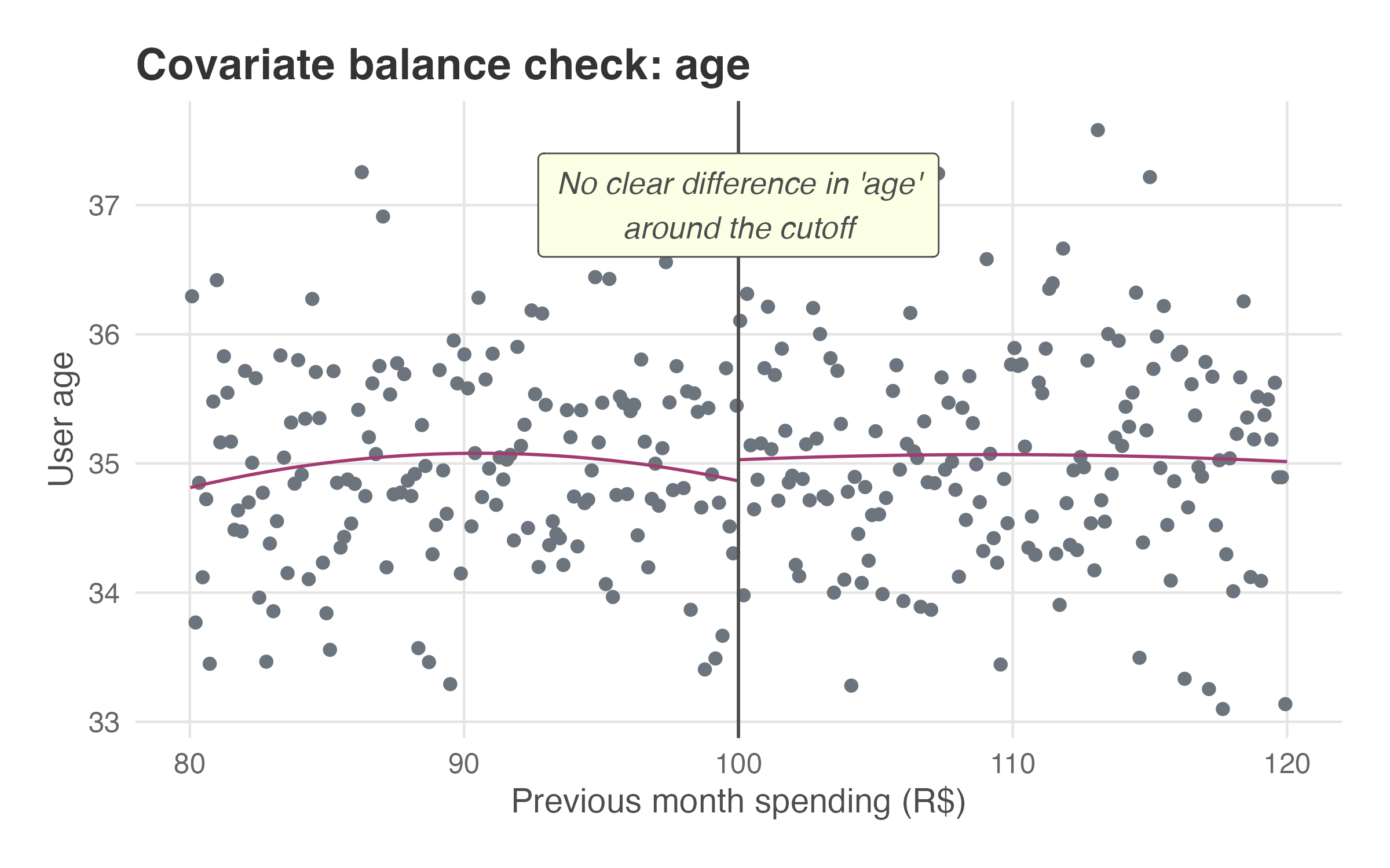
The logic is simple: if customers just above and below the cutoff look similar in terms of observable characteristics (age, history), they are likely similar in unobservable characteristics too. When covariates show no jump at the cutoff, it strengthens our confidence that any observed jump in the outcome is due to the treatment, not due to preexisting differences. This indirect check is known as a covariate balance test.
Figure 8.4 shows what a covariate balance test looks like. Each point represents a customer, plotting their loyalty score against their age. The fitted lines on either side of the cutoff show no visible jump, suggesting that customers just above and below the threshold are similar in terms of age. We may repeat this test for several observable covariates (e.g., age, history) to verify that groups are comparable across multiple characteristics.5
Check for violation example 2: Checking for simultaneous events at the cutoff isn’t something you can easily test with data — it’s more of a detective mission. You must dive into your company’s institutional background: chat with product managers, engineers, and other teams to uncover any policies or features that might trigger at the same threshold. Also check experiment logs, product specs, and repositories for overlapping interventions. In summary, this part is about asking around and double-checking that your cutoff is truly clean.
NoteWhy the age balance plot looks different from previous figures
You may notice that the fitted lines in Figure 8.4 (and in results that follow) are not restricted to the bandwidth. This is intentional: the conceptual figures I showed earlier were designed to teach the logic of local regression around the cutoff, which is what the RDD tables in the next section will show. Plots such as Figure 8.4, however, are generated by rdplot() in R or Python and serve a different purpose — diagnostic visualizations meant to help you see the overall pattern of the data and spot any discontinuity at the cutoff. We don’t actually retrieve the estimates from these plots. In sum, trust the numbers from the tables generated by rdrobust(), and use the plots from rdplot() for diagnosis.
8.2.2 No manipulation of the running variable
This assumption means that users shouldn’t be able to precisely control the running variable to strategically place themselves on one side of the cutoff. If people can easily “game the system” to get the treatment, it introduces a nasty selection bias that breaks the RDD model (see Section 2.3 for more on selection bias).
Let’s get back to the grades example: you can’t precisely control your score. Sometimes you study hard and barely pass with a 7.00 out of 10 points; other times you study just as hard but barely fail with a 6.99. The same logic applies here — users shouldn’t be able to control the running variable to land just above the cutoff. If they could, they’d always game it, and we’d have selection bias.
In the discussion of “Continuity of potential outcomes”, I mentioned that the e-commerce gave a R$10 discount to customers who spent over R$100 last month, without revealing the eligibility rule in advance. I emphasized that the rule was kept hidden to ensure users couldn’t anticipate the treatment or manipulate the running variable to just cross the cutoff, so this assumption holds.
Violation example: Imagine a customer has a cart total of R$98 and knows that next month the e-commerce will give a R$10 discount to customers who spend over R$100 now. If this customer is highly motivated to get the discount, she will find a cheap R$3 item to add to her cart, pushing her total to R$101. She has just manipulated her running variable to get the treatment.
If this happens a lot, the group of customers with cart values just above R$100 is no longer comparable to the group just below R$100. The group above the cutoff will be over-represented by price-sensitive customers who are actively looking for a deal. The group below the cutoff might contain more casual shoppers.
So if we later see that the discount group buys more frequently, we can’t tell if it’s because of the discount itself or because they were a more engaged and strategic group of customers to begin with. The manipulation breaks our clean comparison.
How to check for it
While we can never be 100% certain there’s no manipulation, we can examine the distribution of the running variable around the cutoff. If users aren’t gaming the system, there’s no reason to believe that, just by chance, an unusually large number of shoppers would have a cart value of exactly R$100.01 while an unusually small number have a cart of R$99.99. In other words, the number of people should be smoothly distributed around the threshold.
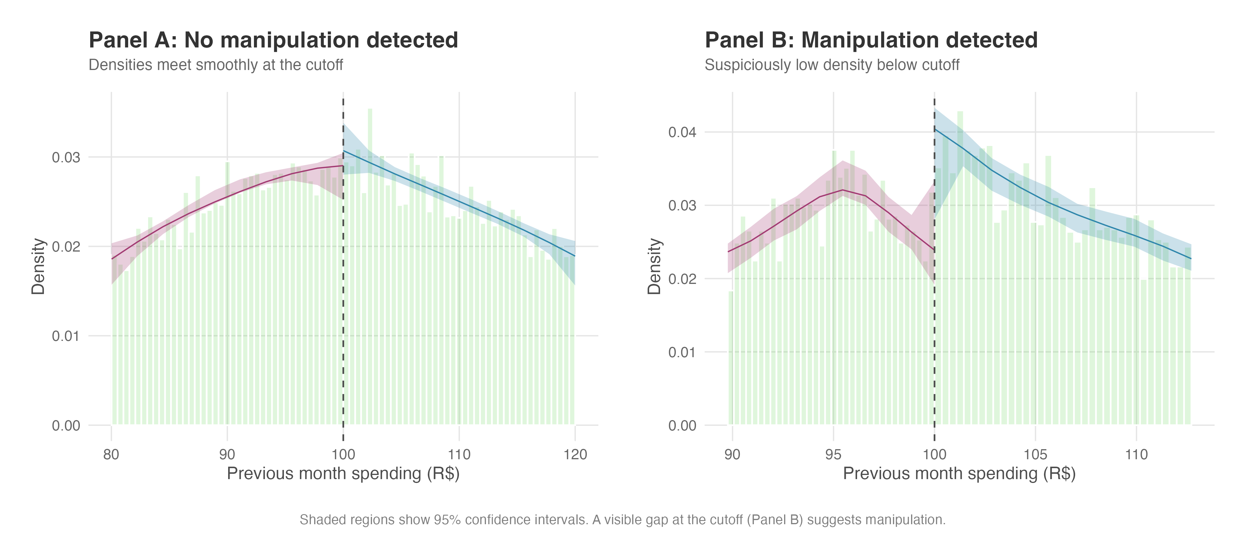
A sudden, suspicious spike in the number of users just above the cutoff is a huge red flag. This suggests that people are actively manipulating their cart value to get over the line. We can formally test this using a density discontinuity test, which statistically compares the density of observations just above and below the cutoff (Cattaneo, Jansson, and Ma 2020).6 The rddensity package implements this test, and we’ll walk through exactly how to run and interpret it in our hands-on example later.
Figure 8.5 shows what to look for. The solid lines estimate the density of observations on each side of the cutoff, with shaded 95% confidence bands around them. In Panel A, no manipulation: the two density curves nearly meet at the cutoff, and their confidence intervals overlap substantially — exactly the smooth, continuous pattern we need. In Panel B, trouble: users are piling up just above the cutoff to grab the discount, creating a visible spike on the right. A gap like this puts your “as-good-as-random” assumption in jeopardy.
A note on the “donut hole” approach
When you suspect some manipulation at the cutoff but believe it’s not severe enough to invalidate the design entirely, one practical remedy is the donut hole RDD (Barreca, Lindo, and Waddell 2016; Noack and Rothe 2023).
This involves excluding observations in a small window around the cutoff (e.g., dropping customers with loyalty scores between 99 and 100) and estimating the treatment effect using only observations outside this “donut hole.” The intuition is that the most manipulated observations are those closest to the cutoff.
If your results are robust to this exclusion, it strengthens confidence that manipulation isn’t driving your findings. However, this approach trades off precision for robustness, as you lose the most informative observations.
Barreca, Lindo, and Waddell (2016) is the first disseminated paper to use this technique, and Noack and Rothe (2023) provide a preliminary formalization of the econometric properties of donut RDDs, showing that donut estimators can exhibit higher bias and variance than conventional RDD estimators, so use this technique as a robustness check rather than a default approach.
8.2.3 Bandwidth, kernel, and functional form
When we run an RDD, we’re fitting a local regression on either side of the cutoff. That means two choices matter: how wide a window of data to use (the bandwidth) and what shape the regression takes (the functional form).
About choosing the bandwidth
The bandwidth determines the range of the running variable around the cutoff that we analyze. This choice involves a classic bias-variance trade-off:
A smaller bandwidth: Using only observations very close to the cutoff reduces bias because these individuals are highly comparable. However, it also reduces the number of observations, which increases the variance of our estimate, making it less precise.
A larger bandwidth: Including observations further from the cutoff increases the sample size and reduces the variance. However, it increases the risk of bias because the individuals further away from the cutoff may be less comparable.
In practice, we don’t eyeball this trade-off subjectively. Researchers like Calonico, Cattaneo, Titiunik, and collaborators have developed data-driven methods that automatically select an optimal bandwidth by minimizing a measure called the mean squared error of the estimator — balancing the bias from using observations too far from the cutoff against the variance from using too few observations (Calonico, Cattaneo, and Titiunik 2014; Cattaneo, Idrobo, and Titiunik 2020). These methods are the default in modern software packages like rdrobust, which we use in our examples, so you rarely need to specify a bandwidth manually.
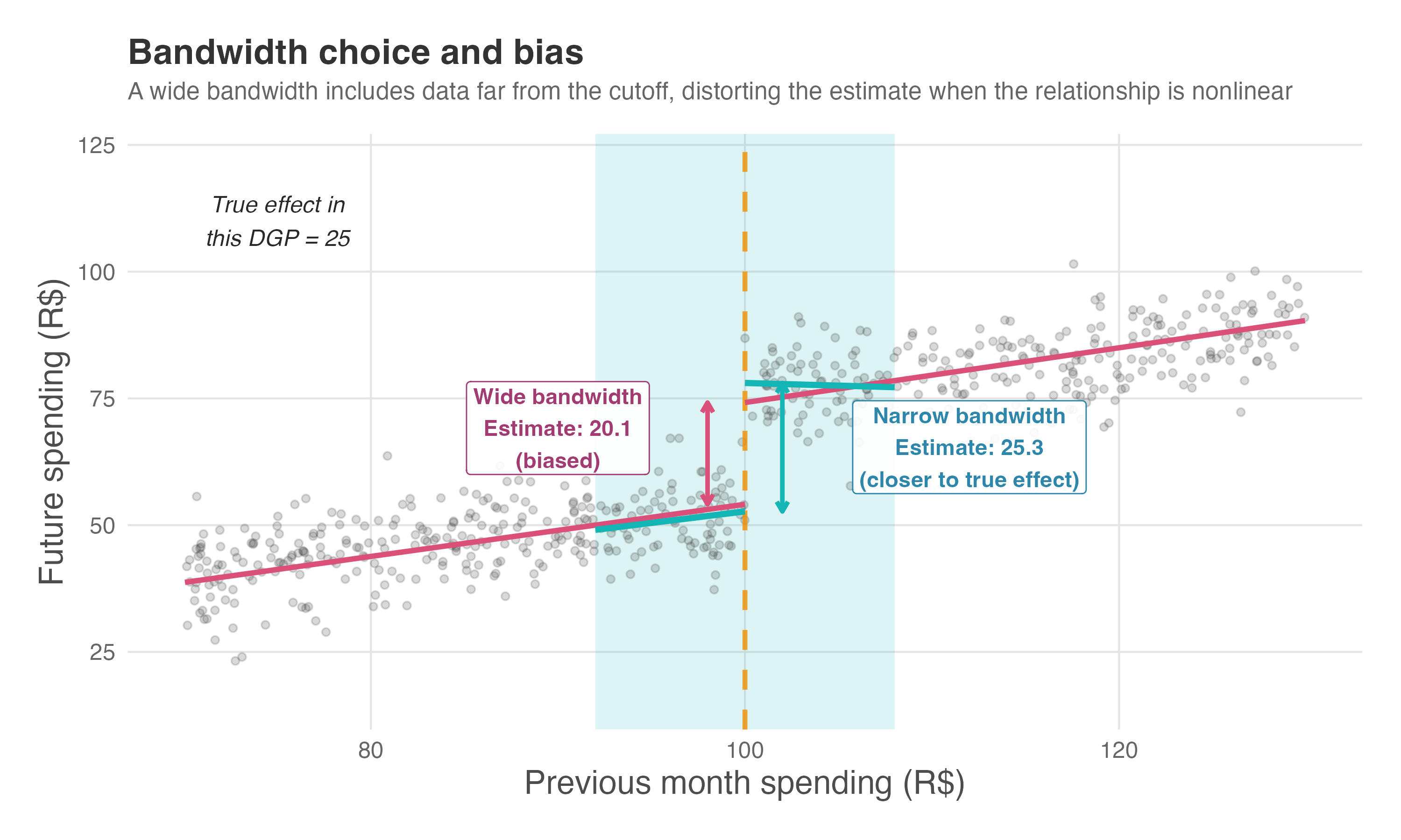
Figure 8.6 illustrates why this matters. In a simulated setting where we know the true treatment effect is 25, we compare two bandwidth choices. The wide bandwidth (pink lines) stretches the regression across a range where the relationship between spending and future behavior is nonlinear. The linear fit gets pulled by data far from the cutoff and understates the jump — here it estimates roughly 20, about 20% lower than the truth. The narrow bandwidth (teal lines), by contrast, focuses on observations close to the threshold where the linear approximation holds. Its estimate lands near 25, recovering the true effect.
About choosing the kernel
Once we’ve selected a bandwidth, we need to decide how to weight observations within that window. This is the job of the kernel function. The kernel assigns a weight to each observation based on its distance from the cutoff — and different kernels make different choices about how to distribute those weights.
Think of weights as a measure of relevance of an observation to the fitted regression line: the higher the weight, the more influence that observation has on the fitted regression line and, ultimately, the estimated treatment effect. An observation with double the weight of another will pull the regression twice as hard in its direction.
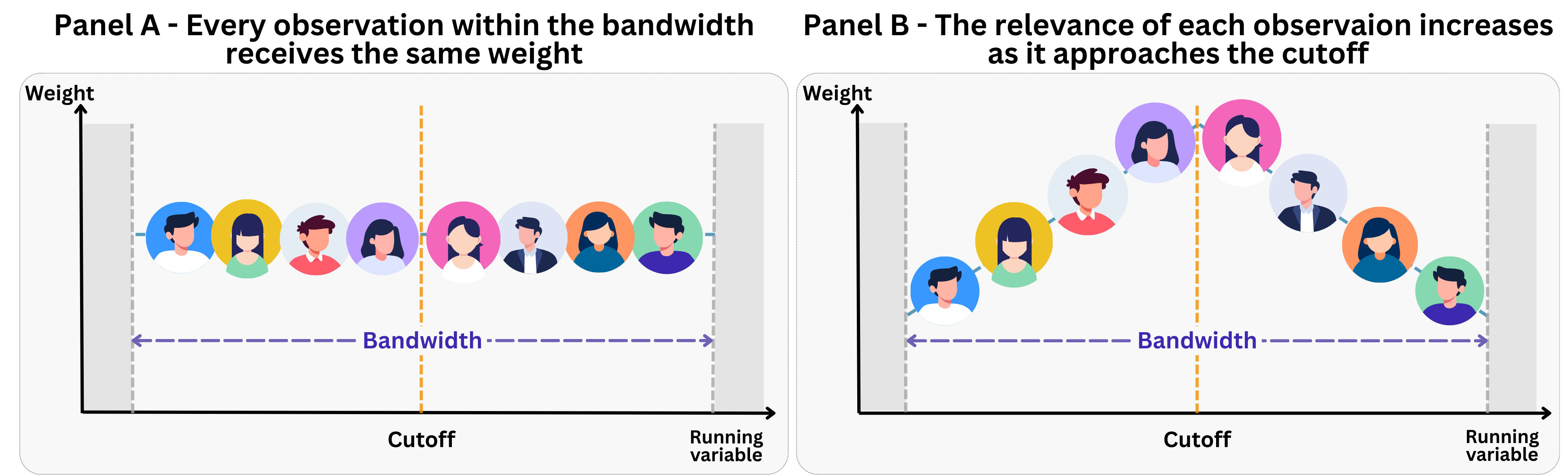
The two most common kernel functions are depicted in Figure 8.7:
Panel A - Uniform (rectangular) kernel: Every observation inside the bandwidth receives the same weight, and observations outside it receive zero weight (zero relevance to the regression). This is simple to interpret — you’re essentially running a standard regression on a trimmed sample. However, it treats someone at the edge of the bandwidth identically to someone right at the cutoff.
Panel B - Triangular kernel: Observations closer to the cutoff receive higher weight, with the weight decreasing linearly as you move away. This is more intuitive for RDD because the individuals nearest the cutoff are the most comparable to each other — they should have more influence on the estimate.
Which should you use? The triangular kernel is the default in rdrobust we will use in our examples because it minimizes mean squared error at the boundary, which is exactly where RDD estimates the treatment effect. The uniform kernel, by contrast, is often preferred when your main goal is hypothesis testing, as it can yield more reliable standard errors in smaller samples (Cattaneo, Idrobo, and Titiunik 2020).
That said, kernel choice typically matters far less than bandwidth choice. If your results flip depending on which kernel you use, that’s a sign the effect is fragile — not that you picked the “wrong” kernel. As a robustness check, you can verify that your conclusions hold across different kernel specifications.
About choosing the functional form
Once we select a bandwidth, we need to decide what kind of line to fit. In the past, it was common to use higher-order polynomials (like cubics or quartics) fitted to the entire range of the running variable (which we call global polynomials). However, this practice is now strongly discouraged. While using the full dataset can reduce variance, it often introduces significant bias — and avoiding bias is our primary goal in causal inference.
High-order polynomials (imagine fitting a very curvy line through your data) also tend to wiggle wildly at the edges of the data, leading to misleading estimates of the jump at the cutoff (Imbens and Gelman 2019). So the standard approach today is to use local linear methods: fitting linear regressions within optimal, data-driven bandwidths around the cutoff. As a robustness check, you can verify if your results hold when using local quadratic polynomials, but you should generally avoid anything higher.
With these considerations in mind, we are now ready to see Sharp RDD in action. Let’s move on to a hands-on example.
8.3 Sharp RDD in practice: free shipping and customer spending
An e-commerce platform suspects that offering free shipping might boost future purchases. The hypothesis is straightforward: customers who receive free shipping will spend more in subsequent months because they feel valued and face lower friction at checkout. But without a randomized experiment, how can we test this without confusing the effect of free shipping with the characteristics of customers who receive it?
Well, the company may assign free shipping to customers whose loyalty score reaches 50 or above, calculated from past purchase frequency and engagement.7 Importantly, the rule is not publicized — customers don’t know the threshold exists. This secrecy is deliberate: if customers knew the rule, they might game their behavior to cross the 50-point line, creating selection bias. With the rule hidden, crossing the threshold happens naturally as customers shop, giving us the quasi-random variation we need.
So there we have a relevant business question: does free shipping cause higher future spending, or are customers who get it simply the type who would spend more anyway? The magnitude of such cause can then be used to calculate the return on giving free shipping to customers, a topic we will cover in Chapter 13.
8.3.1 Why naive comparisons fail
Let’s check the causal structure in Figure 8.8. The running variable \(X\) (loyalty score) determines treatment \(D\) (free shipping) — customers scoring 50 or above get it, those below do not. But \(X\) also affects the outcome \(Y\) (future spending) directly: higher-scoring customers tend to be more engaged and spend more, regardless of free shipping. Meanwhile, unobserved confounders \(U\) (motivation, disposable income, brand affinity) influence both the running variable and the outcome.
Without the cutoff, we would have a classic confounding problem: any correlation between free shipping and spending could reflect selection, not causation. To see why, consider a naive comparison: simply take the average spending of customers who received free shipping (treated) and subtract the average spending of those who didn’t (control). In our simulated data, you will see that this naive difference is far from the true treatment effect of R$250.
Where does this massive bias come from? It’s pure selection. Customers who cross the 50-point threshold aren’t random — they’re the engaged customers (high \(U\)). And engaged customers spend more regardless of whether they get free shipping. The naive comparison conflates two effects: (1) the true boost from free shipping, and (2) the fact that high-engagement customers were going to spend more anyway.
You might think: “Can’t we just control for the loyalty score in a regression?” Good instinct, but it won’t fully solve the problem. The relationship between loyalty score and spending is non-linear — a concave curve where early engagement gains taper off. OLS assumes a straight line, so it misspecifies the functional form. This misspecification biases the treatment coefficient downward. RDD avoids this because it estimates locally at the cutoff, where any smooth curve is approximately linear.
The cutoff changes everything. At the threshold, customers are nearly identical in their loyalty scores — someone at 49.9 and someone at 50.1 have essentially the same shopping history, engagement level, and (crucially) similar unobserved characteristics. The only thing that differs is treatment status.
For example, consider two customers: Yuri scores 49.8 and Jura scores 50.2. Both have similar purchase histories, similar engagement with the platform, and probably similar motivation. But Jura gets free shipping and Yuri doesn’t. If Jura spends R$250 more next month, we can attribute that difference to the free shipping rather than to Jura being a “better” customer. This is the quasi-random variation RDD exploits.
8.3.2 The econometric equation: connecting to what you already know
I created a simulated dataset to demonstrate the estimation process. The data includes a running variable (loyalty score), an outcome (future spending), and covariates. I built in a known treatment effect — a jump of R$250 in future spending for customers who receive free shipping — so we can verify whether our RDD analysis recovers it.
| Concept | Notation | Description |
|---|---|---|
| Running variable | \(X\) | Loyalty score (0–100 scale), normally distributed around 50. Determines treatment eligibility. |
| Outcome | \(Y\) | Future spending in R$. I introduced a jump of R$250 for customers with \(X \geq 50\) as an effect of receiving free shipping. |
| Treatment | \(D\) | Free shipping indicator (1 if \(X \geq c\), 0 otherwise). |
| Cutoff | \(c = 50\) | Threshold on the running variable that triggers treatment. |
| Covariates | \(W\) | age and history. |
| Bandwidth | — | Range around the cutoff used for local comparison (e.g., \(X\) between 45 and 55). |
The econometric approach relies on local regression, focusing on observations closest to the cutoff. This restriction makes sense because customers just below and just above 50 points are nearly identical. The only systematic difference is treatment status — free shipping. By comparing these highly similar groups, we isolate the causal effect.
Formally, the outcome \(Y_i\) (future spending) is modeled as a function of the running variable \(X_i\) (loyalty score), a treatment indicator \(D_i\) (1 if score ≥ 50, 0 otherwise), and optional covariates \(W_i\):
\[Y_i = \alpha + {\color{#b93939ff}\tau} D_i + \beta_1 (X_i - c) + \beta_2 D_i\,(X_i - c) + \gamma' W_i + \varepsilon_i \tag{8.1}\]
If you worked through Section 1.3.3, this equation should look familiar. Recall that a dummy variable coefficient represents a shift in the intercept — when the dummy equals 1, its coefficient adds to the baseline. Here, \(D_i\) is our treatment dummy (free shipping = 1), and \(\tau\) is precisely that intercept shift: the vertical jump in expected spending when a customer crosses from untreated to treated.
The model components are:
- \(\tau\), the treatment effect: captures the jump in spending at the threshold. This is the coefficient on the treatment dummy \(D_i\), and it works exactly as we saw in Section 1.3.3 – it shifts the intercept upward for treated units.
- \(\alpha\): the intercept, representing expected baseline spending at the cutoff for untreated customers; what a customer with a loyalty score of 50 would spend if they did not receive free shipping.
- \(\beta_1\): the slope of the relationship between loyalty score and spending below the cutoff.
- \(\beta_2\): an interaction term that allows the slope to differ above the cutoff.8
- \(\gamma'\): a group of coefficients on the covariates \(W_i\), which can improve precision.
- \(c = 50\): the cutoff.9
Note that the parameter \(\tau\) answers your business question directly. It tells you: “How much more does a customer spend, on average, because they received free shipping?” In our simulation, I built in a true effect of R$250, so if our analysis is working correctly, we should estimate \(\hat{\tau} \approx 250\).
Recall from Section 8.1.1 that \(\tau\) is a local effect — it applies to customers at the cutoff, those with loyalty scores hovering around 50. We cannot assume the same R$250 boost would apply to customers scoring 30 or 80. If stakeholders ask, “What would happen if we gave free shipping to everyone?”, remind them that extrapolating beyond the cutoff requires additional assumptions we cannot verify. The RDD estimate is credible precisely because it stays local.
Finally, the choice of bandwidth — the range of loyalty scores around 50 that we include — is critical. A bandwidth that is too narrow leaves us with few observations and high variance; one that is too wide includes customers who are less comparable, introducing bias. Modern practice uses data-driven methods developed by Calonico, Cattaneo, and Titiunik (2014) and Cattaneo, Idrobo, and Titiunik (2020) to select an optimal bandwidth that balances this tradeoff. The rdrobust package implements these methods, so you rarely need to choose a bandwidth manually.
Tip💻 Want to run the code? Set up your environment: click here
Data: All data we’ll use are available in the repository. You can download it there or load it directly by passing the raw URL to read.csv() in R or pd.read_csv() in Python.10
Packages: To run the code yourself, you’ll need a few tools. The block below loads them for you. Quick tip: you only need to install these packages once, but you must load them every time you start a new session in R or Python.
# If you haven't already, run this once to install the packages:
# install.packages(c("tidyverse", "rdrobust", "rddensity", "lpdensity"))

# You must run the lines below at the start of every new R session.
library(tidyverse)   # Data manipulation and visualization
library(rdrobust)    # RDD estimation and plotting
library(rddensity)   # Density tests for manipulation
library(lpdensity)   # Local polynomial density estimation
# If you haven't already, run this in your terminal to install the packages:
# pip install pandas numpy matplotlib rdrobust rddensity scipy
# You must run the lines below at the start of every new Python session.
import pandas as pd # Data manipulation
import numpy as np # Mathematical computing
import matplotlib.pyplot as plt # Visualization
from rddensity import rddensity, rdplotdensity # Density tests
from rdrobust import rdrobust, rdplot # RDD estimation and plotting
from scipy.stats import binned_statistic # For binned statistics (fuzzy RDD)
from scipy.special import expit # Logistic function8.3.3 Assumption checks
Before estimating the treatment effect, we validate the assumptions discussed in Section 8.2. This involves two checks: (1) testing for manipulation of the running variable and (2) verifying that observable covariates are balanced around the cutoff.
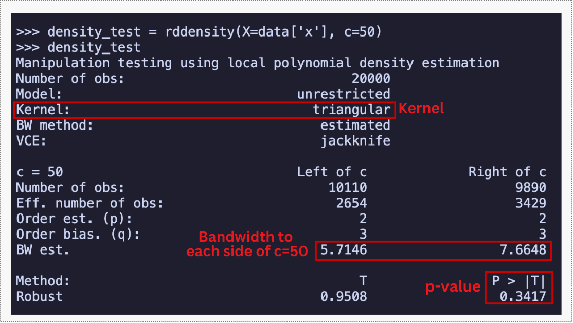
We begin by checking whether customers manipulate their loyalty score to land just above the threshold, as discussed in Section 8.2. The rddensity function tests whether the density of observations is continuous at the cutoff.
The key result of this continuity test is the p-value, shown in the R and Python outputs below. A value well above 0.05 means we fail to reject the null hypothesis that the density is continuous at the cutoff — no evidence of manipulation.
The full output also includes a binomial tests table, which checks whether observations are roughly 50/50 split around the cutoff in increasingly narrow windows; large p-values across the board confirm no asymmetry.
I encourage you to run rdplotdensity() to visualize this result: if the density curves nearly overlap with intersecting confidence intervals at x = 50, you have visual confirmation that the distribution flows smoothly through the cutoff – similar to what we saw in Figure 8.5 Panel A.
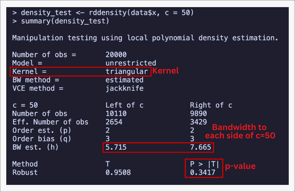
If customers were gaming the system to receive free shipping, we would see a suspicious pile-up of loyalty scores just above 50. Instead, the distribution flows smoothly through the cutoff — customers aren’t strategically pushing their scores over the line. This gives us confidence that crossing the threshold is effectively random.
Next, we verify that observable characteristics are balanced around the cutoff. This is a placebo test: we run the RDD specification using pre-treatment covariates (age, history) as the outcome. If the design is valid, we should see no jump in these variables at the threshold.
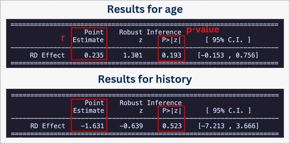
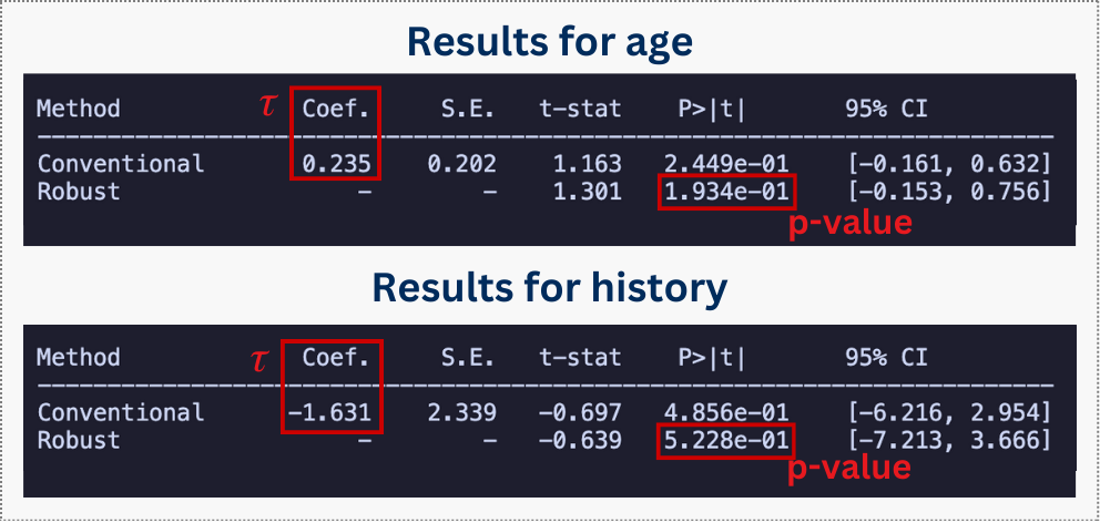
These results above show p-values well above 0.05 for both age and history. This means we cannot reject the null hypothesis of continuity — in plain English, there is no statistically significant jump in these characteristics at the cutoff. This confirms that customers just above and just below the threshold are comparable.
Although these output tables provide the statistical evidence that our groups are comparable, it is helpful to visualize this. I encourage you to run the rdplot() code above to see for yourself that there is no visible jump at the cutoff, similar to what we saw in Figure 8.4.
With both checks passed, we have confidence that the quasi-random assignment logic of RDD holds here. We are now ready to estimate whether free shipping moves the needle on customer spending.
8.3.4 Estimating the causal effect
With our validation checks passed, we now estimate the causal effect of free shipping on future spending. The rdrobust package automatically selects an optimal bandwidth, fits local polynomials on each side of the cutoff, and provides robust standard errors that account for the estimation uncertainty in bandwidth selection.
We begin with the baseline specification: a local linear regression using a triangular kernel. The triangular kernel gives more weight to observations closer to the cutoff — a sensible default since those observations are most informative about what happens right at the threshold.
The output for the code above shows an estimated effect of R$254, close to the true value of R$250 that I built into the simulation. As we will see shortly in Table 8.1, this success contrasts sharply with the failure of naive OLS estimation.
But first, look at what happens when we add age and history. The standard error shrinks, yet the point estimate stays steady at R$254. This stability — along with the previous evidence we gathered from the density test and covariate balance — suggests a valid RDD. Unlike in OLS, where we often need covariates to kill bias, RDD identification comes from the variation around the cutoff.
Sensitivity to kernel and polynomial choices
As we discussed in Section 8.2.3, the RDD estimate also rests on modeling choices: how we weight observations (the kernel) and how we model the relationship between the running variable and the outcome (the polynomial order). A credible analysis should demonstrate that results are stable across reasonable alternatives. If conclusions flip when you swap a triangular kernel for a uniform one, or move from linear to quadratic, that fragility is a red flag, not a reason to cherry-pick the specification that tells the best story.
Kernels assign weights to observations based on their distance from the cutoff. Think of it as encoding how much we “trust” observations further from the threshold to inform us about what happens right at it. The two most common choices are:
- Triangular (default in
rdrobust): weights decrease linearly as you move away from the cutoff, reaching zero at the bandwidth’s edge. This prioritizes observations closest to the threshold, which makes intuitive sense since those are the most comparable.11 - Uniform: all observations within the bandwidth receive equal weight. Simpler to interpret, but treats someone at the edge identically to someone right at the cutoff.
In practice, kernel choice shouldn’t change your conclusions substantively. If it does, your effect is likely fragile.
Polynomial order controls how flexibly we model the running variable’s relationship with the outcome on each side of the cutoff. The standard linear specification (p = 1) assumes the relationship between x and y is approximately straight within the bandwidth, which is reasonable when the bandwidth is narrow. A quadratic specification (p = 2) allows for curvature, capturing more complex patterns but risking overfitting near the boundaries.
Higher-order polynomials can wiggle erratically at the edges of the estimation window, potentially distorting the estimated discontinuity, as the line over-reacts to noise at the boundaries. For this reason, methodologists generally recommend sticking with linear or quadratic specifications (Imbens and Gelman 2019). Anything higher is rarely justified and often counterproductive.
Good practice: Run your main specification with the defaults (kernel = "triangular", p = 1), then verify that conclusions hold under a uniform kernel and a quadratic polynomial. Reporting all three in a robustness table, as we do in Table 8.1, signals transparency and strengthens credibility.
Summary of results
Table 8.1 consolidates our findings. The first two rows show what happens when we ignore the RDD logic: naive regression and OLS with covariates both miss the true effect of R$250. The remaining rows show RDD estimates across different specifications — all hovering around R$250, confirming that our result is not an artifact of arbitrary modeling choices.
| Specification | Estimate | 95% CI | BW | SE | Notes |
|---|---|---|---|---|---|
| OLS | 426.1 | — | — | — | Biased |
| OLS + covariates | 190.5 | — | — | — | Biased |
| RDD baseline | 254 | [246.5, 263.8] | 9.33 | 4.4 | ✓ |
| RDD + covariates | 255 | [248.3, 263.8] | 9.02 | 3.9 | −11% SE |
| RDD uniform kernel | 256.7 | [248.9, 266.5] | 7.43 | 4.5 | Stable |
| RDD quadratic | 255 | [244.3, 263.8] | 14.59 | 5.0 | Wider CI |
Takeaway: Free shipping causally increases future spending by about ~R$254 for customers right at the loyalty-score threshold. This local estimate is robust across RDD specifications and provides credible evidence that the policy moved the needle on purchasing behavior — at least for marginal customers.
8.3.5 Visualizing the discontinuity
Numbers tell part of the story, but a well-constructed graph can give a clarity that tables do not. In RDD, visualization serves a dual purpose: it provides a sanity check on our regression results and communicates the logic of the design to skeptical audiences.
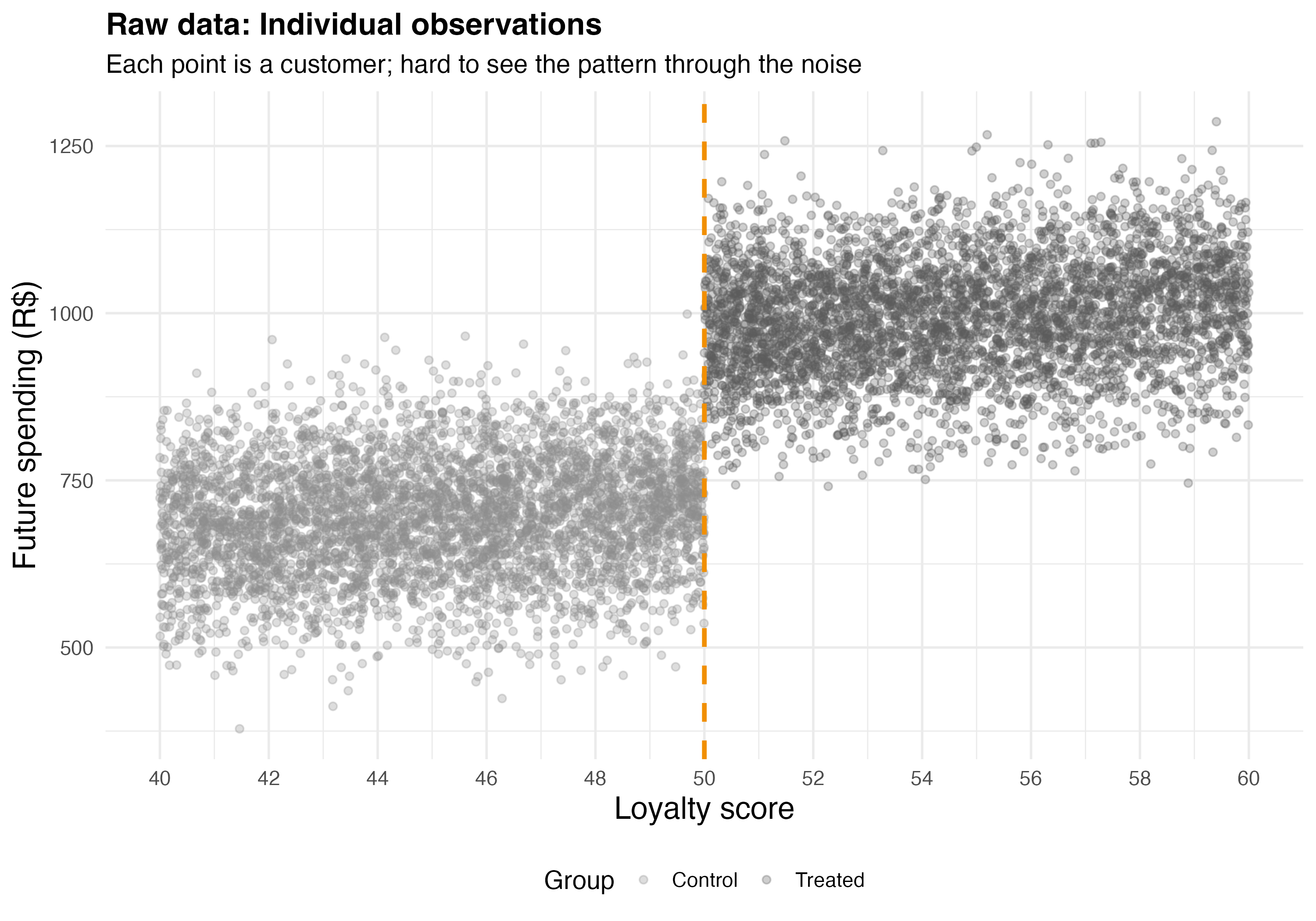
Let’s start with the raw data. With thousands of observations, Figure 8.9 shows the problem: you can squint and perhaps convince yourself there’s a jump at 50, but the magnitude of that jump isn’t obvious.
Binning solves this. Instead of plotting 20,000 scattered points like in Figure 8.9, we group observations into small intervals along the running variable and plot the average outcome within each bin. The rdplot function from the rdrobust package handles this automatically — it divides the running variable into evenly-spaced bins, calculates the mean outcome in each bin, and overlays fitted polynomial lines on each side of the cutoff. One note: binning is purely for visualization; the regression analysis is always performed on raw individual-level data.
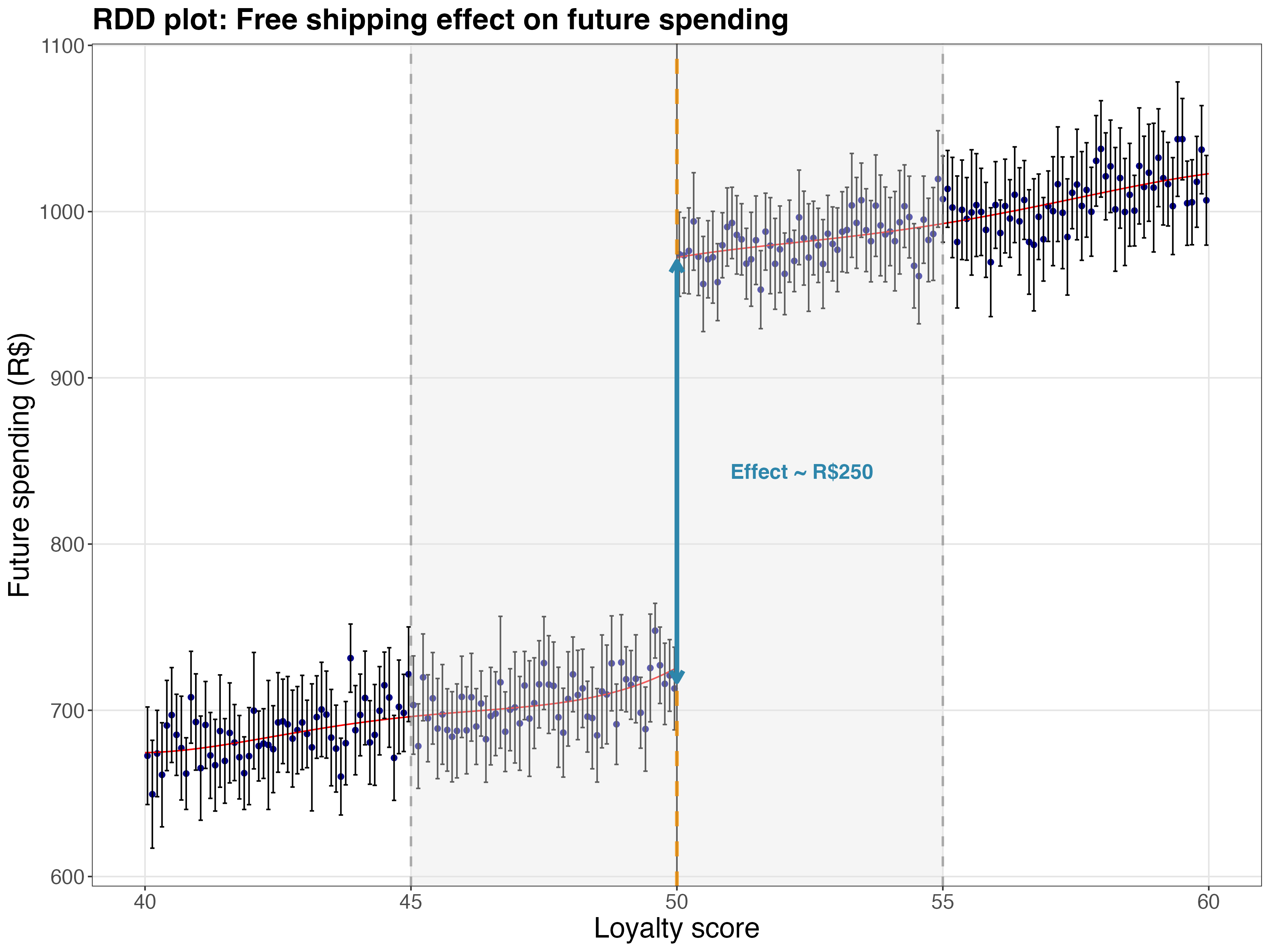
Figure 8.10 makes the story clear. On the left side of the cutoff, the fitted line shows how spending relates to loyalty among customers who didn’t qualify for free shipping. On the right, a parallel line shows the same relationship for those who did qualify. The vertical gap at the cutoff — R$254, close to the true effect of R$250 — is our estimated treatment effect, now visible rather than buried in a regression table.
In this type of plot, confidence intervals (vertical bars) are also an advantage, as they help to confirm the statistical significance of the estimate: they don’t overlap, indicating the gap is unlikely to be due to chance. Notice how the binned means (the dots) track the fitted lines closely on both sides. This visual agreement between the data and the model suggests the local linear specification is capturing the true relationship, not imposing a shape the data doesn’t support.
8.4 The fuzzy case: when a score only influences the probability of treatment
So far, we’ve explored Sharp RDD, where treatment assignment follows a strict rule: cross the threshold and you always get treated; fall short and you never do. But real-world policies rarely work so cleanly. Eligibility rules get bent, people decline offers, and exceptions get made. This is where Fuzzy Regression Discontinuity Design comes in.
The difference lies in what happens at the cutoff. In Sharp RDD, the probability of treatment jumps from 0 to 1 — a hard switch. In Fuzzy RDD, the probability increases at the cutoff, but doesn’t reach certainty. Some people below the cutoff still get treated (through exceptions or alternative channels), and some above the cutoff don’t (they decline, don’t follow through, or fall through the cracks).
Figure 8.11 shows this contrast. Sharp RDD (left) is a deterministic rule: below the cutoff, nobody gets treated; above it, everybody does. Fuzzy RDD (right) is probabilistic: crossing the threshold nudges people toward treatment without guaranteeing it.
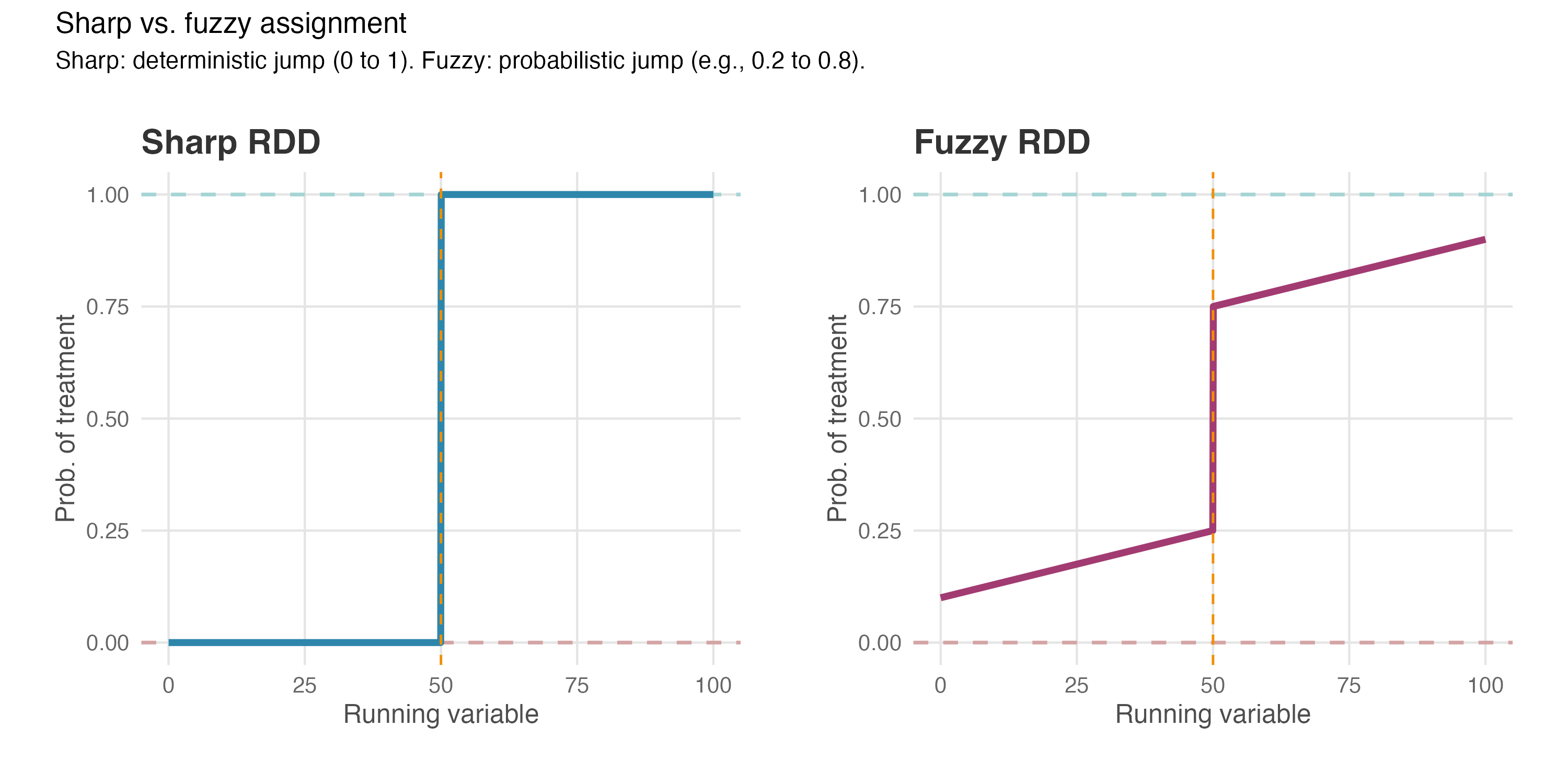
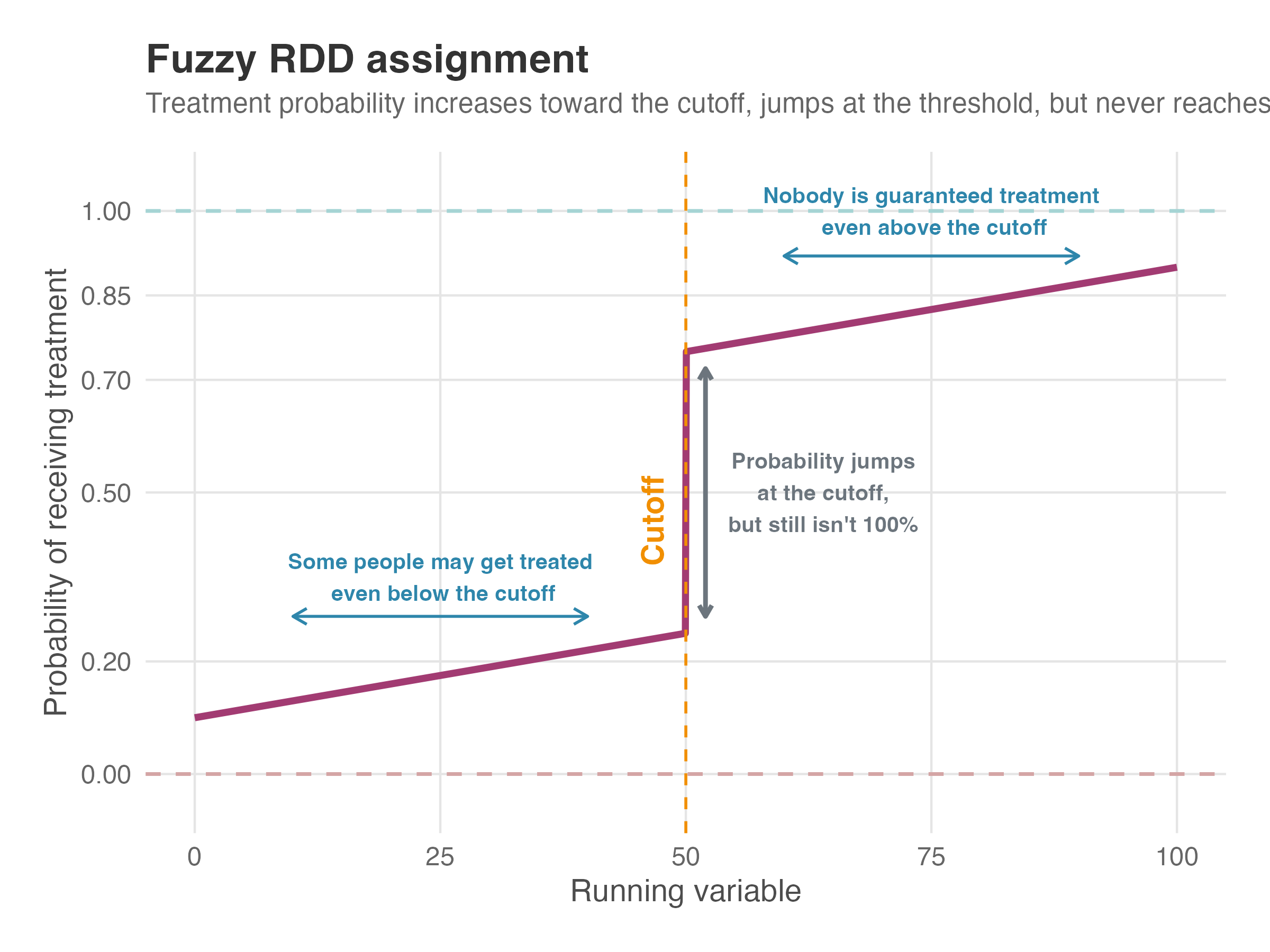
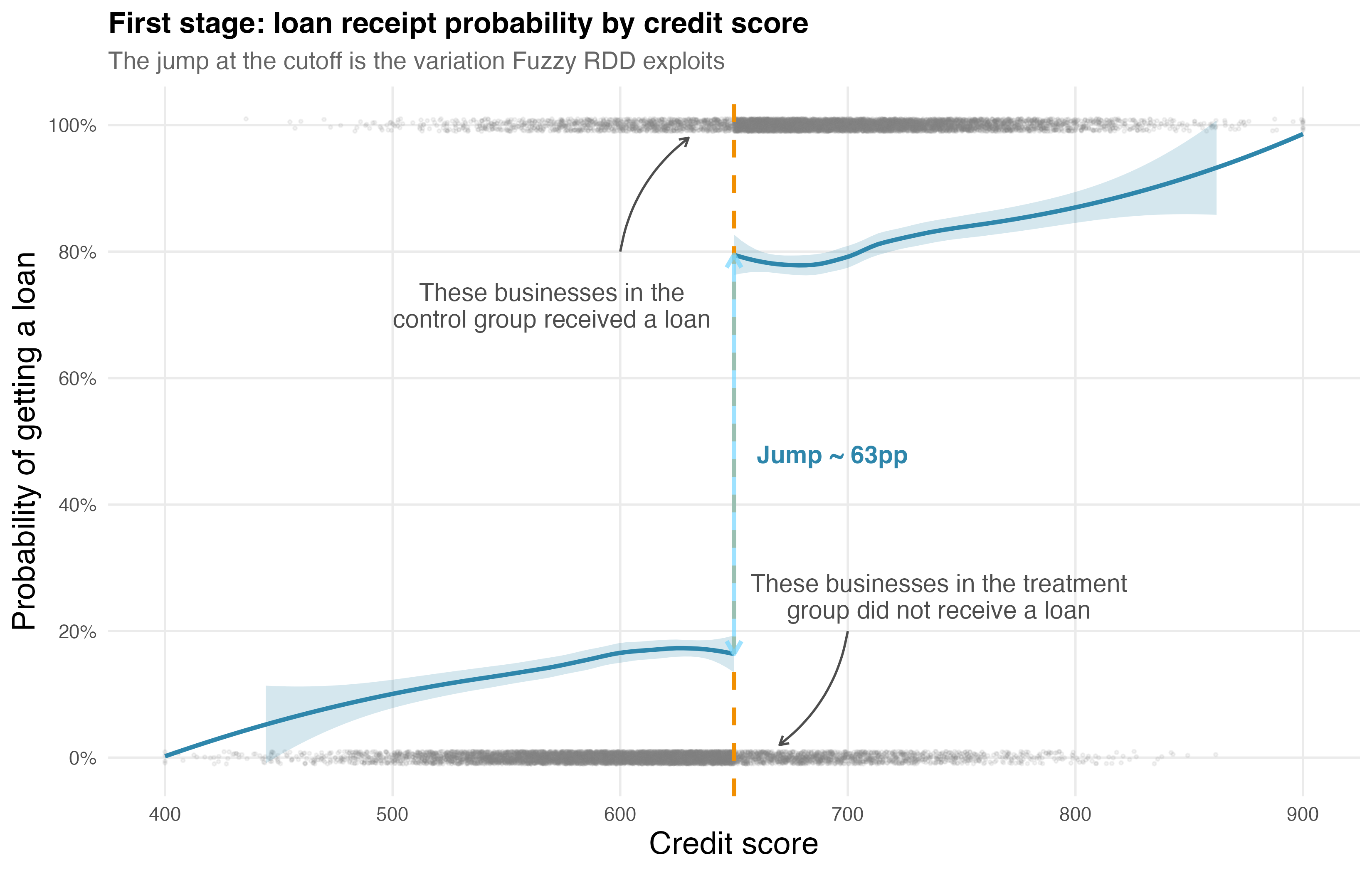
Figure 8.12 zooms in on the fuzzy case. Read it left to right: as the running variable increases toward the cutoff, treatment probability rises (but doesn’t start at zero — some people below the cutoff still get treated). At the cutoff, probability jumps — this discontinuity is what we exploit — but it doesn’t reach 100%. After the cutoff, probability keeps climbing, yet never hits certainty.
This “fuzziness” means we cannot simply measure the jump in outcomes at the cutoff and call it a treatment effect. Instead, Fuzzy RDD employs an instrumental variables (IV) approach: we use eligibility (crossing the cutoff) as an instrument for actual treatment receipt. The cutoff creates quasi-random variation in who gets treated, and we exploit that variation to estimate causal effects. If you’ve read about non-compliance in experiments (Chapter 7), you’ll recognize this logic — Fuzzy RDD is essentially RDD combined with IV.
The result is a Local Average Treatment Effect (LATE): the causal effect for compliers — those whose treatment status was changed by crossing the threshold. It does not apply to “always-takers” (who get treatment regardless of eligibility) or “never-takers” (who refuse treatment even when eligible).
8.5 Fuzzy RDD in practice: loans and cross-selling revenue
A fintech startup offers small business loans based on a proprietary credit score. They want to know: does getting a loan cause businesses to become more engaged customers, or are loan-takers simply the type of businesses that would have engaged more anyway?
The fintech uses a credit score threshold of 650 for loan pre-approval. But here’s the wrinkle: not every pre-approved business (score ≥ 650) takes the loan. Some find better terms elsewhere, or decide they don’t need capital. Meanwhile, some businesses below the cutoff may get loans through manual review or partner lenders. This imperfect compliance creates a fuzzy discontinuity — common in real-world business settings.
The outcome we care about is secondary revenue: revenue from other banking products apart from the loan itself (checking accounts, savings, credit cards, insurance). If loans cause customers to consolidate their banking with the fintech, secondary revenue should rise. If that lift is real and causal, the fintech should view loans as strategic investments in customer lifetime value. If not, they should rethink their product bundling strategy.
8.5.1 Why naive comparisons fail
Let’s check the causal structure in Figure 8.13. The running variable \(X\) (credit score) determines eligibility \(Z\) — the instrument. Eligibility affects whether businesses actually receive a loan \(D\), and loans affect the outcome \(Y\) (secondary revenue). But here’s the problem: unobserved confounders \(U\) (business ambition, growth orientation, financial savvy) affect both who takes a loan and who generates more revenue.
graph LR
    classDef unobserved fill:#fff,stroke:#333,stroke-dasharray: 5 5;

    X["Running Variable <br/> (Credit Score)"] --> Z["Eligibility <br/> (Instrument)"]
    Z --> D["Treatment <br/> (Loan Taken)"]
    X --> Y["Outcome <br/> (Revenue)"]
    D --> Y
    U["Unobserved Confounders <br/> (Ambition/Growth)"] -.-> Y
    U -.-> D
    U -.-> X

    class U unobserved

    linkStyle 0,1,3 stroke:#00BCD4,stroke-width:2px;
This creates a selection problem that’s worse than in Sharp RDD. Consider two business owners:
Junia scores 660 (above cutoff, eligible) but declines the loan. She’s conservative, prefers to grow slowly, and doesn’t want debt. She also happens to generate modest secondary revenue — not because she didn’t get a loan, but because she’s cautious by nature.
Bruce scores 640 (below cutoff, ineligible) but gets manually approved because he aggressively pursued the loan officer. He’s ambitious, growth-oriented, and would generate high secondary revenue regardless of the loan — he’s the type who engages heavily with any financial product.
If we naively compare loan-takers to non-loan-takers, we’re comparing people like Bruce to people like Junia. The comparison conflates the causal effect of loans with the selection effect of who chooses to take loans. In our simulated data, this naive comparison overstates the true effect by about 100% — it attributes to the loan what’s really driven by business ambition.
Even controlling for credit score and observable covariates doesn’t fully solve the problem, because we can’t observe “ambition” directly. OLS still carries residual bias from the unobserved confounder.
Fuzzy RDD cuts through this by using the discontinuity in eligibility as an instrument. At the cutoff, businesses are nearly identical in credit scores, yet their probability of getting a loan jumps sharply. By focusing on this jump and scaling appropriately, we isolate the causal effect from selection.
8.5.2 The econometric approach
I created a simulated dataset to demonstrate the estimation process. The data includes a running variable (credit score), treatment (loan receipt), outcome (secondary revenue), and covariates. I built in a known treatment effect — a boost of R$5,000 in secondary revenue for businesses that receive loans — so we can verify whether Fuzzy RDD recovers it.
| Concept | Notation | Description |
|---|---|---|
| Running variable | \(X\) | Credit score (400–900 scale), centered around 650. |
| Outcome | \(Y\) | Secondary revenue in R$ over the next year — revenue from other banking products, excluding the loan itself. |
| Eligibility | \(Z\) | Indicator for crossing the cutoff (1 if \(X \geq c\), 0 otherwise). Acts as the instrument. |
| Treatment | \(D\) | Actually receiving the loan (1 if loan taken, 0 otherwise). Not everyone eligible takes the loan, and some ineligible businesses get loans through manual review. |
| Cutoff | \(c = 650\) | Credit score threshold that triggers loan pre-approval. |
| Covariates | \(W\) | Business age (business_age) and employees (employees). |
Fuzzy RDD uses a two-stage approach, similar to what we learned in Chapter 7. The first stage estimates how eligibility affects treatment uptake; the second stage uses the predicted treatment to estimate the effect on outcomes.
First stage — the impact of eligibility on treatment probability: \[D_i = \alpha_0 + \pi Z_i + \alpha_1 (X_i - c) + \alpha_2 Z_i\,(X_i - c) + \varepsilon_i\]
Second stage — the impact of treatment on the outcome: \[Y_i = \beta_0 + {\color{#b93939ff}\tau} D_i + \beta_1 (X_i - c) + \beta_2 Z_i\,(X_i - c) + \gamma' W_i + u_i\]
The key parameters:
- \(\tau\), the Local Average Treatment Effect (LATE): the causal effect of loans on secondary revenue for compliers — businesses whose loan status was changed by crossing the eligibility threshold. This is what we’re after.
- \(\pi\): the first-stage coefficient — the jump in treatment probability at the cutoff. A large, significant \(\pi\) means we have a strong instrument.
The rdrobust package handles this two-stage estimation automatically when we specify the fuzzy option. We don’t need to run the stages separately.
8.5.3 Assumption checks
Before estimating the treatment effect, we validate the assumptions discussed in Section 8.2, plus the IV-specific assumptions that Fuzzy RDD requires. Just as in Sharp RDD, we need to check:
Continuity of potential outcomes: In the absence of loans, secondary revenue would change smoothly across the credit score cutoff. We check this by testing covariate balance.
No manipulation: Businesses cannot precisely manipulate their credit scores to land just above the threshold. We check this with a density test.
And regarding the IV-specific assumptions, the tests are just as we discussed in Section 7.4:
First-stage relevance: Crossing the cutoff must significantly increase the probability of receiving a loan. Without a strong first stage, our instrument is weak and the LATE estimate unreliable.
Exclusion restriction: Eligibility affects secondary revenue only through its effect on loan receipt, not directly. This is untestable but plausible if the fintech doesn’t advertise the threshold or treat eligible customers differently in other ways.
Monotonicity (no defiers): No business would take a loan if ineligible but refuse it if eligible. This rules out perverse responses and is typically plausible.
Let’s run the checks.
The results tell us we’re in good shape. Let me walk you through the findings of each check, and you are welcome to run the script from our repository for further details:
Density test: The p-value is 0.85 — nowhere near the 0.05 threshold. We cannot reject continuity in the density of credit scores around the cutoff. Translation: no evidence that businesses game their scores to land just above 650. The running variable looks clean.
Covariate balance: Business age shows no jump at the cutoff (p = 0.66), and neither does employee count (p = 0.53). Businesses just above and below 650 look statistically indistinguishable on these observable characteristics.
But remember: these tests are performed on the aggregate mix of all units near the cutoff, not just the ones who take the loan. Because we cannot verify who the compliers are, we rely on the assumption that the share of compliers, always-takers, and never-takers evolves smoothly across the threshold. Passing this test is a requirement, but it doesn’t prove anything (i.e., it is necessary, not sufficient). We must also use business logic to argue that there is no hidden reason why “compliers” would suddenly change just across the threshold.
First-stage relevance: This is the defining check for Fuzzy RDD. The jump in treatment probability at the cutoff is 0.625 — a 62.5 percentage point increase — with a z-statistic of 27.7 and a p-value indistinguishable from zero. The 95% confidence interval [0.59, 0.68] is tight and doesn’t come close to including zero. This is a strong first stage. Eligibility powerfully predicts loan receipt, exactly what we need for the instrument to work.12
Figure 8.14 visualizes the first stage. Below the cutoff, roughly 15–20% of businesses receive loans (mostly through manual review). Above the cutoff, the probability jumps to around 80%. This ~63 percentage point discontinuity is the variation Fuzzy RDD exploits — a strong instrument that gives us statistical power to estimate the LATE.
With all checks passed — no manipulation, balanced covariates, and a strong first stage — we have confidence that the quasi-random assignment logic holds. We’re ready to estimate the causal effect.
8.5.4 Estimating the causal effect
Now for the payoff: estimating the Local Average Treatment Effect (LATE). This tells us the causal effect of receiving a loan on secondary revenue for compliers — businesses whose loan status was changed by crossing the credit score threshold.
The main specification yields a LATE of R$4,241 with a 95% confidence interval of [R$2,723, R$5,267]. The true effect I built into the simulation is R$5,000 — comfortably inside the confidence interval. Compare this to naive approaches: a simple comparison of loan-takers vs. non-loan-takers gives ~R$10,000 (double the true effect), and OLS with controls still yields ~R$5,500 (biased upward). Fuzzy RDD corrects the selection bias that plagues these simpler methods.
Adding covariates (business age, employees) barely moves the point estimate — R$4,220, virtually identical — as expected, since these covariates are balanced at the cutoff. But the confidence interval tightens to [R$2,917, R$4,978], and the z-statistic jumps from 6.2 to 7.5.
Covariates buy us precision without changing the story. I encourage you to visit the script for this chapter and verify robustness by trying alternative kernels (kernel = "uniform") or polynomial orders (p = 2). If estimates remain stable across specifications, that strengthens credibility.
8.5.5 Visualizing the discontinuity
The RDD plot for Fuzzy RDD shows the reduced form — the jump in the outcome (secondary revenue) at the cutoff. This is not the treatment effect directly; the LATE is computed by dividing the reduced-form jump by the first-stage jump in treatment probability. But the visual helps confirm that there’s a genuine discontinuity to exploit.
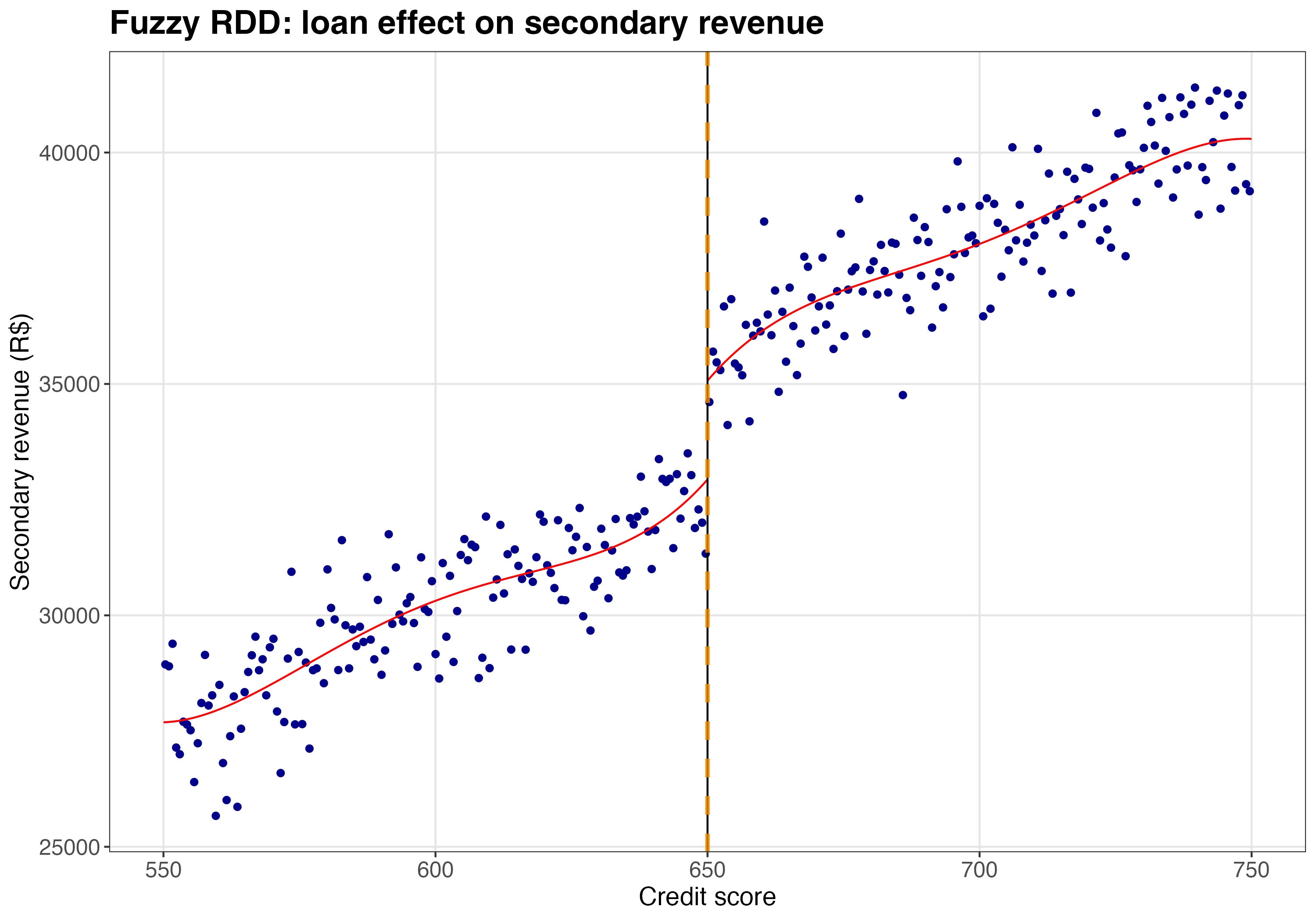
Figure 8.15 shows a visible jump in secondary revenue at the cutoff. But remember: this reduced-form jump (~R$2,708) isn’t the treatment effect. To get the LATE, rdrobust divides by the first-stage jump (~0.63), yielding ~R$4,300 — close to the true effect of R$5,000.
Takeaway: Loans function as a gateway product. For compliers — businesses that took loans because they crossed the eligibility threshold — receiving a loan causally increases annual secondary revenue by about R$5,000.
This finding justifies viewing loans not merely as interest-earning assets, but as strategic investments in customer lifetime value. The fintech can use this insight to refine product bundling, adjust customer acquisition costs, and develop retention strategies that leverage the increased engagement from loan customers.
For example, imagine your finance team flags a segment of borrowers as “unprofitable” because their expected default costs exceed interest income by R$200 per loan. A standard credit model would cut them. But if an average loan generates an extra R$5,000 in annual secondary revenue (payments, insurance, transfers), that “unprofitable” loan is actually netting the company R$4,800 per year.
By incorporating this causal estimate into your Lifetime Value (LTV) models, you can safely lend to riskier segments that competitors — who only look at interest income — would reject, capturing market share while staying profitable. But let’s not worry about this business-ish stuff for now; it’s a skill you’ll learn in chapter Chapter 13.
8.6 Wrap up and next steps
Here’s what we’ve learned:
Cutoffs create natural experiments. RDD allows us to estimate causal effects by comparing units just above and just below an arbitrary threshold, assuming they are essentially identical except for the treatment.
Sharp vs. Fuzzy. In Sharp RDD, the cutoff strictly determines treatment (probability jumps from 0 to 1). In Fuzzy RDD, the cutoff only increases the probability of treatment; we handle this using an Instrumental Variables approach where eligibility is the instrument.
RDD effects are local in two senses.
- First, they apply to units near the cutoff — we can’t automatically extrapolate to units far from the threshold.
- Second, in Fuzzy RDD, we estimate a LATE: the effect on compliers (those induced into treatment by crossing the cutoff). Generalizing these estimates to the broader population requires strong assumptions about effect homogeneity.
Assumptions are key. Validity hinges on two main conditions: no manipulation of the running variable (people can’t game the system to cross the line) and continuity of potential outcomes at the cutoff (in the absence of treatment, outcomes would evolve smoothly through the threshold — there’s no hidden “second treatment” kicking in at the same point).
How to apply RDD in practice:
- Visualize. Always plot the outcome and the running variable. If you can’t see the jump, a regression is unlikely to find a robust one.
- Validate assumptions. Run a density test to check for manipulation of the running variable, and run covariate balance tests to check whether observable characteristics jump at the cutoff — discontinuities would raise red flags about manipulation or compound treatments.
- Estimate. Use local linear regression with optimal bandwidths (e.g.,
rdrobust) rather than global polynomials.
RDD is powerful, but it requires a scoring rule with a clear cutoff. What happens when a policy change hits an entire group at a specific point in time, while another group stays untouched?
In the next chapter, we will explore Difference-in-Differences (DiD). We will move from comparing people just across a threshold to comparing the trends of treated and control groups over time. You will learn how to handle parallel trends assumptions and what to do when “staggered” rollouts complicate the standard two-way fixed effects model.
Appendix 8.A: RDD extensions
The sharp and fuzzy RDD designs covered in this chapter are the bread and butter of applied RDD analysis. But the real world is rarely as simple as a textbook example. You will often encounter messy situations where the canonical setup doesn’t quite fit. This appendix introduces four important extensions: Regression Kink Design, Multi-Cutoff RDD, Multi-Score RDD, and Geographic/Boundary RDD. My goal is to build your intuition for when each might apply and point you toward key references for deeper study.
8.6.1 Regression kink design (RKD)
Standard RDD looks for a jump in the outcome at a threshold. But sometimes policies or rules don’t create a jump in the treatment level — instead, they change the slope or rate at which the treatment intensity grows. Regression Kink Design (RKD) exploits this kind of discontinuity. Figure 8.16 illustrates the difference between these two designs.
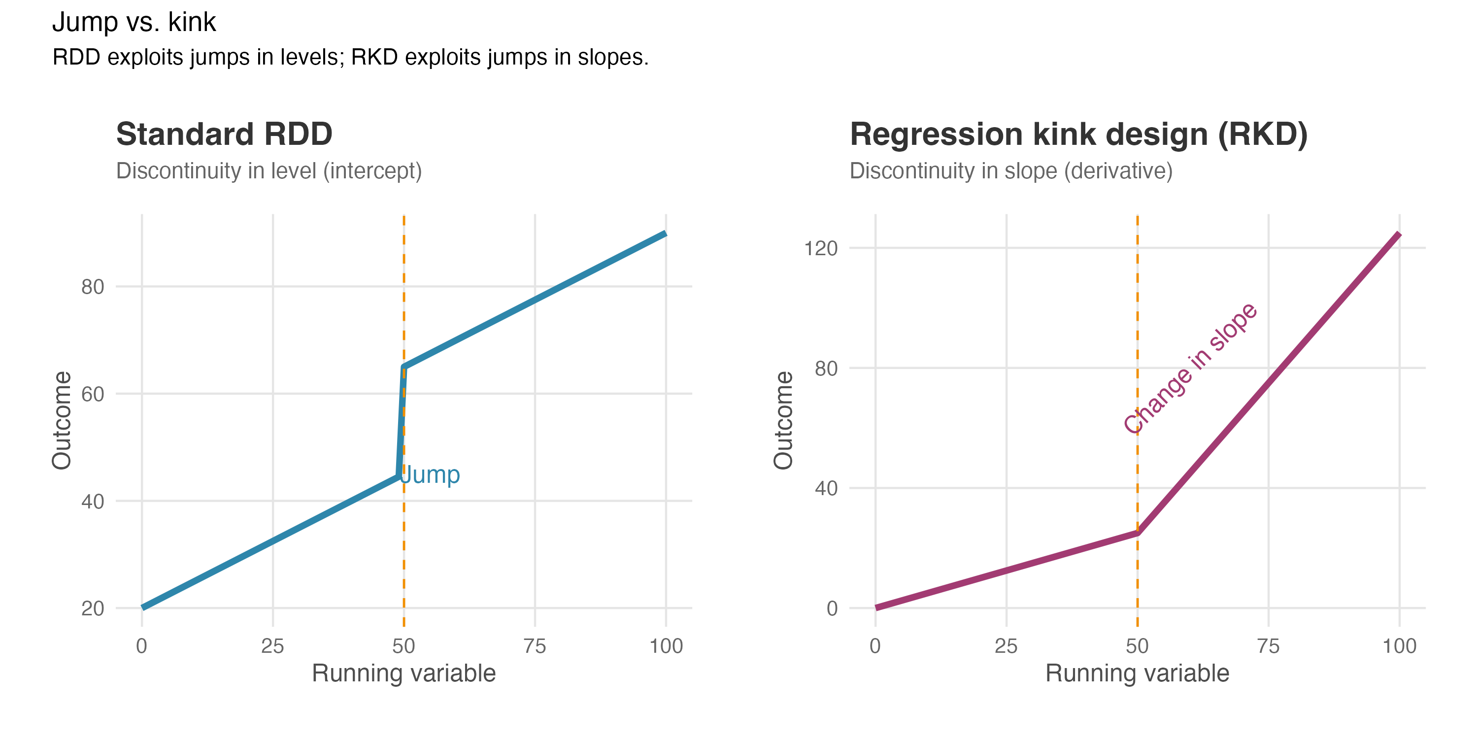
How it works: Think of a progressive tax system. Below R$10,000 annual income, you pay 10% tax; above that threshold, you pay 20% on every additional real. Your total tax bill doesn’t suddenly jump at R$10,000 — it changes smoothly. But the rate of increase bends sharply at that point. The tax function has a “kink” rather than a “jump.”
In an RKD, we test whether the outcome variable (say, hours worked) also “bends” (i.e., exhibits a kink) at the same threshold. If the slope of the outcome changes at the exact same point where the policy intensity changes, we can attribute that kink in the outcome to the policy (Card et al. 2015).
When it’s useful: RKD applies whenever…
- The treatment is continuous (like a tax rate, subsidy amount, or benefit level) rather than binary
- The treatment intensity changes at a known threshold, not the treatment status itself
- You observe a clear kink in how treatment varies with the running variable
Example: A fintech offers cashback rewards where customers earn 1% on purchases up to R$5,000 per month, and 2% on purchases above that amount. You want to know if this increased rate affects spending behavior. Here, there’s no jump in whether customers receive cashback — everyone gets it. But the rate changes at R$5,000. RKD would test whether spending behavior also bends at that threshold.
Key assumptions: RKD requires similar assumptions to standard RDD, but applied to the rate of change. The trend of the average potential outcome must be smooth — i.e., no sudden bends — except for the one caused by the policy. Importantly, RKD typically requires more data than RDD because estimating a change in slope is statistically more demanding than estimating a jump in level.
Software and references: RKD can be implemented with the rdrobust package using local polynomial regression, though with adaptations. For a rigorous treatment, see Card et al. (2015) and Ganong and Jäger (2018).
8.6.2 Multi-cutoff RDD
In many real-world applications, treatment assignment follows an RDD rule, but the cutoff varies across different groups or contexts. Researchers distinguish between two types of multi-cutoff settings:
- Non-cumulative cutoffs: Different groups face different cutoffs, and a unit is only exposed to the cutoff of its group. For example, a national poverty alleviation program might use a specific income threshold for rural areas and a different one for urban areas. A household in a rural area is only affected by the rural cutoff.
- Cumulative cutoffs: The running variable determines which cutoff a unit faces, often determining the “dose” of the treatment. Think of tax brackets or tiered subsidies: crossing cutoff \(c_1\) gives you benefit level 1; crossing cutoff \(c_2\) adds benefit level 2. Here, the same unit could theoretically cross multiple thresholds if their score increased.
How to analyze it: You can estimate treatment effects at each cutoff separately (cutoff-specific effects) to explore heterogeneity. Does the program work better in rural areas (low cutoff) than urban ones (high cutoff)?
Alternatively, you can estimate a single average effect by normalizing and pooling. This involves centering the running variable for every unit (subtracting their respective cutoff so that 0 always means “at the threshold”) and running a single RDD analysis on the pooled data. This “normalizing-and-pooling” strategy increases statistical power but averages out potentially interesting heterogeneity (Cattaneo et al. 2016).
Software and references: The rdmulti package allows for rigorous estimation and plotting in these settings. See Cattaneo et al. (2016) for the theory and practical guidelines.
8.6.3 Multi-score RDD
Sometimes treatment eligibility depends on two or more running variables simultaneously.
How it works: Consider a scholarship that requires students to score above 600 in Math AND above 600 in Language. Or a bank that automatically approves credit limit increases only if a customer has a credit score above 700 AND a debt-to-income ratio below 30%.
In these cases, the treatment is not determined by a single point on a line, but by a frontier or boundary in a multi-dimensional space. The “cutoff” is the set of all combinations of scores where treatment status changes.
For the “Math AND Language” example, a student could barely miss treatment by missing the Math cutoff, missing the Language cutoff, or missing both. This means we have different populations of “marginal” units, and the treatment effect might vary along this frontier.
Application: Geographic RDD (discussed next) is actually a special case of Multi-Score RDD where the two “scores” are Latitude and Longitude. The treatment boundary is the border on the map.
Software and references: Estimating effects along a boundary requires specialized techniques often adapted from the geographic RDD literature or using multivariate local polynomials. Wong, Steiner, and Cook (2013) provides a comprehensive framework for these designs.
8.6.4 Geographic/Boundary RDD
Geographic RDD exploits spatial boundaries — such as state lines, city limits, or school district borders — as sources of quasi-random treatment assignment. When a policy or law changes discontinuously at a geographic boundary, individuals living on opposite sides of that boundary can serve as treatment and control groups.
How it works: The running variable is now a unit’s location (typically latitude and longitude), and the cutoff is a geographic boundary line or curve. Treatment is assigned based on which side of the boundary a unit falls on.
For example, consider two adjacent counties where one adopted a new minimum wage law and the other did not. Businesses located just across the border from each other are likely similar in most respects, but they face different minimum wage requirements. By comparing outcomes for businesses very close to the boundary, we can estimate the effect of the policy (Keele and Titiunik 2015).
When it’s useful: Geographic RDD applies when…
- A policy, law, or treatment changes discontinuously at a geographic boundary
- You can measure units’ locations precisely
- Units just across the boundary from each other are plausibly comparable
Example: A city implements a congestion pricing zone in its downtown area. Businesses just inside the zone face new costs while those just outside do not. Geographic RDD could estimate the effect of congestion pricing on business revenue by comparing establishments near the zone boundary.
Key considerations: Geographic RDD introduces unique challenges…
- Distance metrics: How you measure “closeness” to the boundary matters. Euclidean distance, driving distance, and walking distance may give different results.
- Sorting and selection: Unlike traditional RDD where individuals can’t precisely manipulate test scores near a threshold, people and businesses can choose where to locate. If sorting happens, the comparison breaks down.
- Spillovers: Units on one side of the boundary might affect units on the other side (e.g., workers commuting across a border).
- Two-dimensional bandwidth: Deciding “how close is close enough” is harder because you are drawing a window on a map (2-dimensional), not just a line (1-dimensional) (Cattaneo, Titiunik, and Yu 2025).
Software and references: The rd2d package implements methods for boundary discontinuity designs using bivariate location data. See Keele and Titiunik (2015) for foundational methodology, Keele and Titiunik (2018) for extensions with spillovers, and Cattaneo, Titiunik, and Yu (2025) for recent advances in estimation and inference.
8.6.5 Summary
| Extension | Key feature | Typical application |
|---|---|---|
| Regression Kink Design | Treatment intensity (not status) changes at threshold | Tax brackets, benefit schedules, tiered pricing |
| Multi-Cutoff RDD | Same treatment rule, different cutoffs across groups | Multi-state policies, decentralized programs |
| Multi-Score RDD | Eligibility depends on multiple scores simultaneously | Programs requiring multiple qualifications |
| Geographic RDD | Geographic boundary determines treatment | Policy differences across jurisdictions |
These extensions share the core logic of standard RDD — comparing units just above and below a threshold — but adapt it to more complex settings. If you encounter one of these scenarios in your work, the references above provide the methodological foundation to proceed.
Further reading: For a comprehensive treatment of RDD extensions, see Cattaneo, Idrobo, and Titiunik (2024) which covers all these topics in depth with empirical examples. The rdpackages website (rdpackages.github.io) provides software and tutorials for implementing all variants discussed here.
As Google advises, “NotebookLM can be inaccurate; please double-check its content”. I recommend reading the chapter first, then listening to the audio to reinforce what you’ve learned.↩︎
Standard RDD assumes we can compare units “just above” and “just below” the cutoff when the running variable is continuous, as we will explore in this chapter. If the score is discrete (e.g., 0 to 10 NPS), there is a gap between treated and control. For example, if treatment starts at a score of 7, you cannot find anyone with a score of 6.9 — the closest comparison is someone at 6 versus someone at 7, which may not be as similar as we’d like. Estimating the effect then requires specific assumptions to bridge this gap (see Cattaneo and Titiunik (2022) and Cattaneo, Idrobo, and Titiunik (2024) in case you need such applications).↩︎
Notice the use of “receive” the scholarship. The fuzzy RDD flavor we will see later is different, where treatment is not guaranteed for all students above the cutoff.↩︎
This figure uses simulated data with a known treatment effect of R$8,000, so you can verify RDD recovers the true effect.↩︎
When testing multiple covariates, be mindful of adjusting your inference for multiple comparisons. Testing many variables increases the chance of finding a spurious “significant” result by chance. See the discussion on multiple testing corrections in Chapter 5.↩︎
“Density of observations” means how crowded or sparse the data is at different points of your running variable. Think of an histogram. If you divide your running variable into small intervals (“brackets” or “bins”) and count how many users fall into each bin, that count represents the density. High density = lots of observations clustered in that range. Low density = fewer observations in that range.↩︎
E-commerce platforms assign loyalty scores to customers by tracking their purchase behavior, engagement, and recurring interactions, often through a points-based system where customers earn points for how much they spent or specific actions taken.↩︎
If interpreting interactions feels tricky and understanding the intuition behind \(\beta_2\) is hard, revisit Section 1.3.3 for a refresher.↩︎
Centering the running variable at \(c\) (i.e., using \(X_i - c\) rather than \(X_i\)) makes interpretation clearer: at the cutoff, \(X_i - c = 0\), so the intercept \(\alpha\) directly represents expected spending for untreated customers at that exact point.↩︎
To load it directly, use the example URL
https://raw.githubusercontent.com/RobsonTigre/everyday-ci/main/data/advertising_data.csvand replace the filenameadvertising_data.csvwith the one you need.↩︎Interpret “weights” as the relative importance given to each observation in the estimation. The triangular kernel implies that users that are around the cutoff are more important for the estimation than users that are far from the cutoff.↩︎
Recall from Section 7.4: if the first stage is weak (a small jump in treatment probability around the cutoff), your LATE becomes unreliable and standard errors inflate. If your first stage is weak, Fuzzy RDD may not be the right tool for your setting.↩︎