graph LR
    Push[Push notification] --> Purch[Purchase]
6 Causal assumptions: Think first, regress later
Keywords
A/B Testing, Causal Inference, Causal Time Series Analysis, Data Science, Difference-in-Differences, Directed Acyclic Graphs, Econometrics, Impact Evaluation, Instrumental Variables, Heterogeneous Treatment Effects, Potential Outcomes, Power Analysis, Sample Size Calculation, Python and R Programming, Randomized Experiments, Regression Discontinuity, Treatment Effects
A frustrated student once confided that he did not enjoy studying causal inference because it was “too constrained by assumptions.” All those conditions made the field feel fragile to him.
He had it exactly backwards, I explained. Every piece of information you extract from data relies on assumptions. Even counting the number of registered users in a spreadsheet assumes the data is complete and accurate. Being explicit about assumptions is not weakness; it is the opposite.
What sets causal inference apart from other data science areas is precisely this: it forces us to articulate what we know and what we believe about the world before we claim to have learned anything from it. Every method in this book comes with a checklist of what must be true for the estimate to be valid. That transparency is rare in analytics, for example, and it is what makes causal inference anti-fragile.
When assumptions are explicit, they can be challenged, tested, and defended. When they are hidden, as in most “just run the model” workflows, bias lurks undetected and everything becomes fragile: it works until it doesn’t, and you never know why.
This chapter is about learning to read those checklists — the fine print that tells you what you’re betting on when you make a causal claim. The more fluent you become in assumptions, the sharper your intuition grows, and the more confidently you can stand behind your numbers.
Each subsequent chapter will show you how to challenge your own results, which is how you earn trust in them, and Chapter 14 is entirely dedicated to this topic. But for now, let’s get fluent in what these assumptions are and how they shape your estimates.
6.1 The challenge of real-world data
This chapter marks a turning point. We’ve learned the gold standard — the randomized experiment. But here’s the uncomfortable truth: you won’t always get to run one. The budget isn’t there. The VP needs answers yesterday. The data already exists. Now we enter messy territory: observational data, where we don’t know the full model and can’t measure everything that matters.
The challenge? Answering questions with data that was never designed to answer them. Which variables should we potentially include in our model? For instance, imagine you work for an e-commerce platform. Your VP asks: “Did the new recommendation algorithm we launched last month actually increase user purchases?” You check the data and see that users exposed to the new algorithm spent 15% more than those who weren’t. Case closed?
Not quite. Without a principled framework for choosing how to compare users and what variables to add to the model (controls or control variables), analytics teams often fall into one of three flaws:
1. The naive comparison: Simply comparing the average purchasers of the two groups (mean(purchases | new algorithm) - mean(purchases | old algorithm)). As we saw in Chapter 2, this ignores selection bias: users who got the new algorithm might already be your most engaged customers (e.g., rolled out to power users first). You already know this means “comparing apples to oranges”.
2. The “controlled” comparison: Adding a few obvious covariates (like region or device_type) to a regression and assuming you’ve “controlled for the main confounders”. This relies on the implicit assumption that, after these few adjustments, the treatment assignment is “as good as random”. It rarely is. Unobserved factors like user motivation or brand loyalty often remain, biasing the results. Unarmed with a proper way to think about the relationships between variables, you can’t even start to see the cracks in your model.
3. The “kitchen sink” approach:2 Swinging to the other extreme, analysts throw every available variable into the regression, hoping to control for everything. This feels safer (the “more data is better!” feeling), but it’s often worse as some variables can act as bad controls:
- Post-treatment variables (outcomes occurring after the intervention) can block the very effect you’re trying to measure.
- Colliders, variables caused by both treatment and outcome, can create spurious correlations when you control for them.
- Irrelevant variables just add noise and increase the variance of your estimates and making it harder to detect effects that are actually there.
We must become skeptical of our own models, explicitly state our assumptions about how the world works, and understand the rigorous conditions required to claim causality.
This requires us to do a deep dive into the workhorse of observational inference: Ordinary Least Squares (OLS). But before we run any regressions, we must unpack the key assumptions that make this tool valid for causal inference. Understanding them is basically self-defense against “causal charlatans” who promise to find truth in data automatically.
6.2 Here is a tool for you: Causal graphs
Before we dive into the “how-to” of choosing control variables, we need a language to express our assumptions about the world. That language is the Directed Acyclic Graph (DAG) — a diagram where nodes represent variables and arrows show the direction of causation. You might have already seen one in Figure 2.4. That diagram, with variable names and arrows serves a specific purpose: to map out the data generating process (DGP).3 It tells the story of how data is created, not just what the data looks like.
By drawing a DAG, we are forced to plan our strategy before touching the data. We explicitly state our assumptions about how the world works, which reveals the limitations of our analysis — such as unobserved confounders (hidden variables that affect both the treatment and the outcome) we cannot fix. This visual map allows us to rationalize our choices, clearly defining which variables must be controlled for and which must be left alone.
NoteYour DAG is a hypothesis
Drawing a DAG does not make it true. A DAG represents your assumptions about how the world works — assumptions that can be wrong. Two analysts faced with the same business question might draw different DAGs based on their domain knowledge.
The value of the DAG is that it forces you to make these assumptions explicit, debatable, and criticizable. When presenting results, be prepared to defend your DAG and acknowledge alternative structures.
To read this map, we must understand the concept of a path. A path is any sequence of arrows connecting one variable to another, regardless of the direction of the arrows. Now think of variables along the way as floodgates in a channel. These gates either let correlations pass through or shut them off. For example, if “Weather” affects both “Umbrella Sales” and “Ice Cream Sales,” the weather variable is an open floodgate connecting umbrellas and ice cream — even though one doesn’t cause the other. Our goal is to distinguish between paths that transmit the causal effect we want to measure and those that transmit bias.
That brings us to two essential concepts: frontdoors and backdoors. Think of them as the “good” and “bad” channels in your DAG. Master these, and you’ll learn which covariates enable causal estimates and which ones sabotage them.
6.2.1 Frontdoor paths: information flows of the causal effect
The arrows in a DAG represent causal links, flowing from the cause to the effect. You can think of these paths as channels through which information flows. If a channel is open, information flows between the variables that are connected by them, creating an association in the data. When we trace the arrows starting from our treatment towards our outcome, we are tracing the front door paths. These are the “good channels” that carry the causal information we want to measure.
Let’s exemplify this with a Push notification campaign (treatment) and its effect on Purchase by clients in a marketplace (outcome). Direct effects take the shortest path. Imagine the user sees the push notification created by the app, does not even click to open it, but the reminder works: they remember they need to buy something and go do it. The path is simply Treatment → Outcome, as illustrated in Figure 6.1.
Indirect effects on the other hand take a detour through a mediator (save this name!). Suppose the push notification includes a discount coupon. In this case, the user might buy specifically because of the coupon. The path is Treatment → Mediator → Outcome, as illustrated in Figure 6.2.
graph LR
    Push[Push notification] --> Discount[Discount coupon]
    Discount --> Purch[Purchase]
In reality, both often happen simultaneously, as in Figure 6.3. For instance, users might buy because the push reminded them they need to buy something (the direct effect: Push → Purchase), and because the notification included a discount coupon that they then used (the indirect effect: Push → Discount → Purchase). The total causal effect of the campaign is the sum of the signal flowing through all these front door paths.
graph LR
    Push[Push notification] --> Discount[Discount coupon]
    Discount --> Purch[Purchase]
    Push --> Purch
WarningIf you want to estimate the total effect of the treatment, do not control for mediators! ⤵
In the language of regression and also in the language of DAGs, when we control, adjust, or condition on a variable, we are effectively blocking the flow of information through that node. If you control for the Discount coupon (the mediator), you close the indirect path (Push → Discount → Purchase). By holding the coupon usage constant, you force the model to look for the effect of the Push aside from the coupon mechanism.
This means that after controlling for the discount coupon, your model will capture only the effect flowing through the green line in Figure 6.4 (the direct effect). You will systematically remove the effect of the discount itself. Since most of the time we want to estimate the total impact of the treatment, we must leave the mediator alone, as total impact equals direct + indirect effects.
graph LR
    Push[Push notification] --> Discount[Discount coupon]
    Discount --> Purch[Purchase]
    Push --> Purch

    linkStyle 2 stroke:#039e2f,stroke-width:1.5px;
6.2.2 Backdoor paths: information flows that can bias our estimate
Not all paths carry causal signal. Some paths carry “spurious” information — bias. These are the backdoor paths.
A backdoor path connects the treatment and outcome not because one causes the other, but because some other variable (or chain of variables) links them — often a common cause, known as a confounder. Visually, a backdoor path is any path that starts with an arrow pointing into the treatment (e.g., Treatment ← Confounder → Outcome).
Let’s introduce Phone OS as a confounder (e.g. Android vs iOS). Imagine that iOS users are more likely to receive the notification because the app is better optimized for that system (OS → Push). At the same time, these users also tend to spend more on average, potentially due to higher disposable income (OS → Purchase).
This creates the backdoor path denoted by the red arrows in Figure 6.5:4 Push ← OS → Purchase. See how the heads of the arrows in red link Push notification to Purchase? This means that if you forget to include the confounder in the model, you may attribute to the treatment effect what actually should be attributed to the confounder. This happens because the confounder is a common cause of both the treatment and the outcome, acting as an statistical bridge between them, that can create a spurious correlation.
graph LR
    classDef unobserved fill:#fff,stroke:#333,stroke-dasharray: 5 5;

    OS[Phone OS] --> Push
    OS[Phone OS] --> Purch

    Push[Push notification] --> Discount[Discount coupon]
    Discount --> Purch[Purchase]
    Push --> Purch

    linkStyle 0,1 stroke:red;
Even if the push notification had zero effect on purchases, the data would still show a correlation between them. Why? Because iOS users are both more likely to get the push and more likely to buy. The “signal” flowing through this backdoor path is bias.
Fortunately, we can close a backdoor path by controlling for the confounder. In our example, if we “hold Phone OS constant” by including it in our regression, we effectively block the flow of information through that node. Looking only within Android users, or only within iOS users, the spurious correlation disappears.
Within those groups, the treatment becomes “as if random” — a property called conditional independence, which we’ll formalize later. For a dramatic example of what happens when we fail to condition on a confounder, see Figure 6.11 illustrating the Simpson’s Paradox in the appendix: ignoring a confounder can actually reverse the direction of an effect.
“In theory there is no difference between theory and practice. In practice there is.” — Yogi Berra (North-American baseball player and coach)
The problem gets trickier when we can’t observe or measure the confounder, which is common in data science. Consider Boredom. Let’s say a bored user is more likely to check their phone (increasing exposure to the push notification) AND more likely to browse the shop for entertainment (increasing the probability of purchasing).
This creates a backdoor path: Push ← Boredom → Purchase, depicted in Figure 6.6 by the dashed red arrows. Even though “Boredom” is an important part of the process, it usually remains unobserved in our database.
Here is an important rule for drawing DAGs: All non-trivial variables relevant to describing the phenomenon should be included, even if we can’t measure or see them. Just because a variable isn’t in your data CSV file doesn’t mean it ceases to exist in the real world. If it causes both treatment and outcome, it is generating bias, whether you measure it or not. If you don’t have a name for it, just call it “unobserved” or “U”, as is common in most books.
Why bother including variables we can’t measure? Because drawing the DAG positively forces us to be explicit about our assumptions on how the world works. It prevents us from pretending the problem doesn’t exist just because the data doesn’t.
NoteVisual convention for this book
We will indicate unobserved variables with dashed nodes and dashed arrows. Knowing it’s there is the first step to addressing it through design rather than just statistics.
graph LR
    classDef unobserved fill:#fff,stroke:#333,stroke-dasharray: 5 5;

    OS[Phone OS] --> Push
    OS[Phone OS] --> Purch
    Bore[Boredom] -.-> Push
    Bore[Boredom] -.-> Purch

    Push[Push notification] --> Discount[Discount coupon]
    Discount --> Purch[Purchase]
    Push --> Purch

    class Bore unobserved

    linkStyle 2,3 stroke:red;
Since we cannot measure Boredom, we cannot put it in our regression. We cannot close this backdoor. As a result, our estimate will remain biased.
So, is all hope lost? Not quite. Causal inference offers other strategies when we face unobserved confounders. For instance, if we can’t close the backdoor with data (conditioning), we close it with design. This is where the methods we will see in the next chapters, like Instrumental Variables, Difference-in-Differences, and Regression Discontinuity, come in. They rely on different assumptions that don’t require measuring all confounders.5
This previous visual framework increasingly clarifies the recipe for choosing control variables:
Identify backdoor paths: Look for variables that cause both treatment and outcome.
Control for confounders: Shut these backdoor paths to eliminate bias.
Leave front doors open: Do not control for mediators if you want to measure the total effect of the intervention, or you will kill the very effect you’re trying to measure.
There is a fourth rule, but it is more complex and we will cover it with a data example in the next section. It is to avoid colliders. We should not control for variables caused by both treatment and outcome, as this ironically opens a new backdoor path. More on this in the next section.
6.3 A crash course in good and bad controls
We have seen that choosing controls is not just about “throwing everything into the regression”. Some variables help you identify the causal effect, while others can bias your results or simply add noise. To master this art, we need to move beyond abstract rules and see how these variables behave in practice.6
6.3.1 Part 1: rationalizing with DAGs
Let’s imagine you are a Data Scientist at a subscription-based app that is similar to Spotify. The Product Manager that collaborates with you asks: “Does the Premium Subscription actually cause users to use the app more?”
To see how each variable type bends or breaks our estimates, we’ll simulate a dataset. You know that simulation lets us write the DGP ourselves: those hidden rules that determine how data came to be. Because we set the rules, we know the ground truth. In our universe, Premium Subscription boosts App Engagement by exactly +9.2 minutes per week.
We have a dataset with the following columns. Which ones should you include in your regression?
premium- Treatment: denotes the subscription type (1 = Premium, 0 = Free).engagement- Outcome: app engagement measured as minutes used per week.user_activity- Confounder: measures past app activity. Users who have historically been more active are both more likely to subscribe to Premium and more likely to show higher engagement going forward.ad_free- Mediator: it is a feature of Premium subscriptions. Premium users get an ad-free experience, which leads to higher engagement.ticket- Collider: it indicates whether the user opened a support ticket. Premium users are more likely to open tickets because they have higher expectations; heavy users are also more likely to open tickets because they encounter more bugs.age- Outcome predictor: it measures the user’s age. Older users tend to use the app less, but age has no influence on whether someone subscribes to Premium.marketing- Treatment predictor: it indicates whether the user was randomly targeted for a marketing campaign. Being targeted increases the likelihood of subscribing to Premium, but the campaign itself doesn’t directly change engagement.shoe_size- Noise: it records the user’s shoe size. Has no relationship to anything — just random variation in the data.
Before running any regressions, let’s draw the DAG for each variable type. These diagrams will predict what should happen to our estimate. Then we’ll validate those predictions with data.
Confounders, which are good controls
A Confounder (user_activity) is a variable that causes both the treatment and the outcome.
In our case, highly active users are more likely to subscribe to Premium (Activity → Premium) and they naturally use the app more (Activity → Engagement). If we ignore this, we will see a huge correlation between Premium and Engagement, but part of it is just “selection bias” — we would be crediting the subscription for engagement that would have happened anyway.
Action: You MUST control for confounders. This closes the backdoor path (the red arrows in Figure 6.7) and isolates the true effect.
graph LR
    Activity[User Activity] --> Premium
    Activity --> Eng[Engagement]
    Premium --> Eng

    linkStyle 0,1 stroke:red,stroke-width:2px;
Mediators, which are usually bad controls
A Mediator (ad_free) sits on the causal path between treatment and outcome — as we covered in the frontdoor section. Here, the Premium subscription causes an Ad-Free experience, which causes higher engagement (Premium → Ad-Free → Engagement).
This is part of the “mechanism” of why Premium subscription works, so controlling for ad_free blocks this mechanism, stripping away the effect you want to measure. By controlling for ad_free, you’d be asking: “What is the effect of Premium, holding the ad-experience constant?” But free users don’t get an ad-free experience, so you’re killing the very effect you want to capture.
Action: Do NOT control for mediators (unless you specifically want to isolate remaining direct effects). Controlling for ad_free blocks the causal path (the green arrows in Figure 6.8), stripping away the indirect effect.
graph LR
    Premium --> AdFree[Ad-Free Exp]
    AdFree --> Eng[Engagement]
    Premium --> Eng

    linkStyle 0,1 stroke:green,stroke-width:2px;
Colliders, which are bad controls
This is the most counter-intuitive case. A collider (ticket) is a variable that is caused by both the treatment and the outcome – notice how both point into the ticket variable.
Why is ticket a collider? Because Premium users are more likely to open support tickets because they’re paying for the service and expect it to work flawlessly (Premium → Ticket). At the same time, heavy users are also more likely to open tickets because they encounter more bugs (Engagement → Ticket).
So what happens if you control for ticket? You create a spurious negative correlation through a mechanism called explaining away.
Here is the intuition: imagine you filter your data to only users who opened a support ticket. Now ask yourself: “Why did this person open a ticket?” There are two possible explanations — they’re Premium (and expect premium service), or they’re a heavy user (and encountered bugs).
If you learn that a ticket-opener is not Premium, you now have reason to believe they must be a heavy user. Otherwise, why would they have bothered opening a ticket? This reasoning links Premium and Engagement in your mind, even though they were independent before you filtered.
The result is a negative induced correlation: within ticket-openers, being non-Premium becomes associated with high engagement. This spurious negative association partially cancels out the true positive effect of Premium on Engagement, biasing your estimate downward.
Action: Do NOT control for colliders. It opens a backdoor path where none existed before, as illustrated in Figure 6.9. The green arrow is the causal effect you want to measure; the purple arrows show the collider structure that, when conditioned upon, creates a spurious alternative path between Premium and Engagement.7
graph LR
    Premium --> Eng[Engagement]
    Premium --> Ticket[Support Ticket]
    Eng --> Ticket

    linkStyle 0 stroke:green,stroke-width:2px;
    linkStyle 1,2 stroke:purple,stroke-width:2px;
WarningSample selection is conditioning
You don’t need to include a collider in your regression to condition on it. If your dataset is filtered to users who opened a support ticket, you have already conditioned on the collider. Be careful with samples defined by post-treatment outcomes — e.g., analyzing only “converted” users, or only users who remained active, etc. These are often colliders in disguise.
Neutral controls
We have covered confounders, mediators, and colliders, all of which affect bias: they distort your estimate away from the truth. But there is another class of variables that doesn’t introduce bias. Let’s call them neutral controls in the sense of bias; they don’t shift your point estimate up or down; instead, they affect how precise that estimate is.
Recall from earlier chapters that any estimate comes with uncertainty. If you ran the same analysis on a different sample of users, you’d get a slightly different number. Confidence intervals capture this uncertainty: they tell you the range where the true effect likely falls. Neutral controls don’t affect the center of that range; they affect its width.
Outcome predictors (e.g.,
age): These variables are strong predictors of the outcome. Including them is GOOD. They don’t reduce bias, since they’re not confounders, but they have explanatory power over the outcome, they absorb residual variance. This reduces standard errors, making your estimate more precise.Treatment predictors (
marketing): These variables predict the treatment assignment but have no direct effect on the outcome. Including them is usually BAD for precision. Once the model “explains” some of the treatment variation using such variables, there’s less variation left to link to the treatment to the outcome. The exception is blocking variables in randomized experiments: if you stratified randomization by a variable (e.g., region), including it as a control can improve precision and is recommended.Noise (
shoe_size): Variables unrelated to anything. Including them is in some sense neutral (harmless for bias, but eats up degrees of freedom).
Notice that the rules above assume that these variables are measured before the treatment is assigned. A post-treatment variable that looks like an “outcome predictor” could actually be a mediator or collider, and including it would bias your estimate. Always ask: Was this variable determined before or after treatment?
The DAGs gave us predictions about what each variable type would do to our estimate. Now let’s run the regressions and see if the data confirms what the theory predicted.
6.3.2 Part 2: internalizing with data
Tip💻 Want to run the code? Set up your environment: click here
Data: All data we’ll use are available in the repository. You can download it there or load it directly by passing the raw URL to read.csv() in R or pd.read_csv() in Python.8
Packages: To run the code yourself, you’ll need a few tools. The block below loads them for you. Quick tip: you only need to install these packages once, but you must load them every time you start a new session in R or Python.
# If you haven't already, run this once to install the package
# install.packages("tidyverse")

# You must run the lines below at the start of every new R session.
library(tidyverse)
# If you haven't already, run this in your terminal to install the packages:
# pip install pandas numpy statsmodels scipy.stats (or use "pip3")
# You must run the lines below at the start of every new Python session.
import pandas as pd # Data manipulation
import numpy as np # Mathematical computing in Python
import statsmodels.formula.api as smf # Linear regression
from scipy.special import expit # For logistic transformation
from scipy.stats import norm # For normal distribution (Appendix)
import matplotlib.pyplot as plt # For plots (Appendix)Now let’s see how these choices play out in the actual estimates. We know the True Causal Effect is 9.2 because we simulated the data. This gives us a definitive benchmark: we can measure precisely how much bias each variable type introduces.
I ran seven regressions, systematically adding control variables to the mix. The results below showcase exactly how each model performs in terms of bias and precision.
Naive: In the simple regression engagement ~ premium, the coefficient estimate for premium subscription was 14.0, which is 52% greater than the true causal effect of 9.2 (i.e., a +52% bias). The standard error was 61% higher than the baseline model that we call “Good control (confounder)”, discussed below.
The Naive model fails to separate the effect of Premium from User Activity. Without adjusting for the confounder, anyone who is already highly engaged is more likely to subscribe and more likely to show high engagement, inflating the estimate.
Good control (confounder): In the regression engagement ~ premium + user_activity, the coefficient estimate for premium subscription was 8.7, which is just 5% lower than the true causal effect of 9.2 (i.e., a -5% bias). Let’s elect this model serves as the baseline for standard error comparisons. By closing the backdoor path through user_activity, we recover the true effect within sampling error. All subsequent models add variables to this specification.
Bad control (mediator): In the regression engagement ~ premium + user_activity + ad_free, the estimate for premium subscription collapses to 0.7, representing a -92% bias. This happens because we blocked the mechanism! Controlling for the ad-free experience strips away most of the effect, since that’s precisely how Premium boosts engagement. The standard error also balloons by 119%.
Bad control (collider): In the regression engagement ~ premium + user_activity + ticket, the estimate for premium subscription drops to 3.8, showing a -59% bias. Why? Conditioning on the collider opens a spurious backdoor path that creates a negative correlation between Premium and Engagement.
Think about it: if we look only at users who opened tickets, and we know a user isn’t Premium, it becomes much more likely they are a “Heavy User” (otherwise, why would they have opened a ticket?). This artificially links “Not Premium” with “High Engagement,” dragging our estimate downward and “eating away” the true positive effect.
Good control (outcome predictor): In the regression engagement ~ premium + user_activity + age, the result is 9.0, only -2% off. This matches the accuracy of the baseline model Good control (confounder) but with 75% lower standard error (we gained precision!). Adding a strong outcome predictor helps the regression explain variation in the \(y\) variable and absorbs residual variance, making our estimate far more precise.
Bad control (treatment predictor): In the regression engagement ~ premium + user_activity + marketing, the estimate we get is 9.04, still close to the true effect, but with 68% higher standard error. Why? marketing helps predict who gets the treatment, but has no direct effect on the outcome.
By including it, the model “explains” a significant portion of the variation in treatment assignment. This leaves less variation available to link the treatment to the outcome, effectively discarding useful information. You get a “noisier” estimate for no good reason.
Although this didn’t break our specific example, this behavior is a common silent killer of results. You might include a variable thinking “better safe than sorry,” only to find that it adds no value in bias reduction but inflates your standard error just enough to make a significant result look insignificant. You end up failing to detect an effect that is actually there, purely because you “controlled” for the wrong thing.
Neutral (noise): In the regression engagement ~ premium + user_activity + shoe_size, the result is 8.7, almost identical to the baseline Good control (confounder). No harm, no benefit. The noise variable just eats degrees of freedom.
This crystallizes the golden rule of control selection: Control for confounders to eliminate bias. Control for outcome predictors to boost precision. Stop there. Do not control for mediators or colliders, or you will break your analysis. When in doubt, draw the DAG.
And yes, this applies even to randomized experiments. Randomization protects you from pre-treatment confounders, but it cannot save you from post-treatment bad controls. If you include a mediator or collider in an experimental regression, you will introduce bias. You can ruin a perfectly good experiment with a bad regression.
But knowing what to control for is only the first step. You can identify the perfect set of confounders to close every backdoor, yet still fail to get a causal estimate if the statistical tool you use to perform that adjustment—the regression itself—is misapplied. Theoretical identification is one thing; estimation is another.
6.4 When does regression adjustment achieve causality?
You have selected your variables carefully. You included the confounders and excluded the colliders. Now you run lm() or .fit(). Does the resulting number represent a causal effect? Not necessarily.
Regression adjustment is a powerful tool, but it is not a magic wand. It attempts to replicate the logic of a randomized experiment using observational data. But for this mathematical emulation to work — for it to truly mimic the clean “all else equal” of a lab setting — four rigid assumptions must hold. If they do not, your causal claim fails, no matter how good your variable selection was.9
And without the leverage of quasi-experimental designs (e.g., difference-in-differences, instrumental variables, etc.), this plagues not only simple tools like OLS, but also sophisticated “Causal AI” methods like double machine learning.10 No algorithm can bypass these requirements: they all demand that the assumptions we are about to discuss hold in your data.
Now going back to our simpler world, regression adjustment aims to model the outcome as a function of treatment and covariates, trying to isolate the treatment effect by comparing treated and control units with similar covariate values.
My use of the term aims stresses that regression adjustment requires explicit assumptions that must be defended. You can’t just run the model and claim causality. You must defend the following assumptions.
These are the four pillars that support your analysis:
- SUTVA: No interference between units and no hidden versions of treatment.
- Conditional independence: Treatment is “as random” after adjusting for covariates.
- Common support: Comparable units exist in both treated and control groups.
- Correct functional form: You’ve correctly modeled the relationship between the treatment, the outcome, and the covariates.
These assumptions are demanding, and violating them means your estimates are biased, but at least they’re explicit. You can debate their plausibility, test some of them (like overlap), and communicate the limitations of your analysis to the stakeholders. This transparency is what separates principled causal inference from the three flawed approaches we discussed at the start of the chapter — the naive, the “controlled” comparison, and the “kitchen sink” — that pretend these issues don’t exist.
These concepts will matter throughout the rest of the book. In some chapters we’ll rely on these assumptions; in others we’ll show how to work around them so they’re no longer needed for identification. That’s where identification strategies come in.
Now let’s do a deep dive into these hypotheses, along with some examples of when they are violated and what happens when they are violated.
6.4.1 SUTVA: The “no surprises” assumption
The Stable Unit Treatment Value Assumption (SUTVA) is easy to overlook, but it is important. It has two parts:
No interference: One unit’s (e.g., one user’s) treatment status doesn’t affect another unit’s outcome, neither positively nor negatively.
Consistency (well-defined intervention): The treatment is well-defined, meaning there are no hidden “versions” of treatment that matter. When we say a unit was “treated,” this treatment should mean the same thing for everyone.
No Interference is frequently violated in business settings due to network effects. If you give a discount to User A, and User A tells User B about your product, User B’s purchase behavior is affected by User A’s treatment. In a marketplace, if you boost the visibility of Seller X, you might cannibalize sales from Seller Y. In these cases, the “control” group isn’t a pure control — it’s affected by the treatment of others.
Consistency means that there shouldn’t be multiple versions of the treatment lumped together. Use the “no surprises” rule: if your “treatment” is “received an email,” but some users got a polite nudge and others got a 50% discount, you have multiple versions of treatment. A simple binary “treated/untreated” variable will mash these effects together, giving you a confusing average that doesn’t represent either version accurately.
In practice, if you suspect interference (e.g., word-of-mouth, marketplace spillovers), you might need to change your unit of analysis — randomizing at the city or cluster level instead of the user level. If you have “hidden versions” of treatment, you should separate them into distinct treatment variables.
Relation to DAGs: The DAGs we’ve drawn so far represent a single user’s causal structure and assume that structure applies identically to everyone. This only works if treatment is well-defined, consistent across users, and there’s no interference. If SUTVA fails, the simple DAG breaks down:
No Interference: If this fails, a simple DAG
T → Yis insufficient because it misses arrows from other people’s treatments to my outcome (Other_T → My_Y).Consistency: If this fails, the node
Tis ambiguous — it represents multiple different versions of treatment mashed together — making the causal effect in the DAG ill-defined.
You can draw DAGs for systems with interference, but they become more complex (e.g., including nodes for neighbors’ treatments or network structure). The simple individual-level DAGs we use throughout this book implicitly assume SUTVA holds.
When this assumption fails, you are either measuring a mix of effects or contamination. With interference, your control group is no longer a valid counterfactual because it has been indirectly affected by the treatment of others. With hidden versions of treatment, your estimate is a weighted average of different interventions, which might be meaningless if the interventions have opposing effects.
Randomized experiments don’t automatically fix SUTVA, but they make it easier to design around it. For interference, you can randomize clusters (like cities) rather than individuals. For consistency, strict experimental protocols ensure that every treated unit receives the exact same intervention.
What if you can’t avoid interference? Then you must account for SUTVA violations, either in your design (the “defensive” strategy, avoiding the problem) or in your model (the “offensive” strategy, embracing the problem and accounting for it). The simpler path is to design around interference: randomize across non-overlapping geographies or time windows so treated and control units never “contaminate” each other.
If that’s not possible, you can relax the no-interference assumption by modeling the network structure explicitly (see Hudgens and Halloran 2008; Aronow and Samii 2017). These methods estimate both direct and spillover effects, but require stronger assumptions about how interference operates – and stronger assumptions mean more ways to go wrong. This book does not cover these advanced methods, but the references above offer a rigorous starting point.
6.4.2 Conditional independence: The “as good as random” assumption
Imagine you have two customers, Maria and João. They are the same age, live in the same city, use the same device, and have the same purchase history. The only difference is that Maria was exposed to the new recommendation algorithm of an e-commerce platform (treatment) and João wasn’t (control).
If these two customers are truly identical in all ways that matter for their spending after the treatment, then the fact that Maria got the treatment and João didn’t is “as good as random”. It’s as if a coin flip decided it. This is the intuition behind Conditional Independence Assumption, known as the CIA: once we control for the relevant characteristics (covariates \(X\)), the treatment assignment is as good as if it were random.
Just so you know the mathematical notation for that, no need to memorize it: \[ Y(0), Y(1) \perp D \mid X \]
In plain language: within any group of customers who share the same characteristics (\(X\)), treatment assignment is as good as random. That means treated and control units are comparable: they would have behaved similarly under the same conditions, whether that’s both receiving treatment or both being in the control group. So any difference in their observed outcomes can be attributed to the treatment itself, not to pre-existing differences between the groups.11
The catch is that this assumption is untestable. You can never prove that you’ve measured everything that matters. What if Maria is simply more impulsive than João? If you didn’t measure “impulsivity” (and let’s be honest, you probably didn’t), and impulsivity drives both algorithm exposure and spending, then CIA fails. You have “unobserved confounding,” and your estimates will be biased.
This is the central gamble of observational causal inference (i.e., the part that doesn’t rely on randomized experiments). You are betting that your set of covariates \(X\) is rich enough to capture all the confounding factors. In a randomized experiment, you don’t need to make this bet — randomization guarantees independence. In observational studies, you must defend it with domain knowledge.
Relation to DAGs: This assumption is directly linked to the backdoor criterion. Conditional independence holds if the set of covariates \(X\) you control for effectively blocks all backdoor paths between the treatment and the outcome in your DAG. If there is an open backdoor path (e.g., via an unobserved confounder), the assumption fails.
When this assumption fails, bias shows up. Unobserved confounders bias OLS, and no amount of adjustment for observed covariates can fix this. Suppose you’re estimating the effect of a premium subscription on user engagement, controlling for demographics, past behavior, and device type. But unobserved motivation drives both subscription decisions and engagement. Motivated users subscribe and engage more, while less motivated users do neither. Your treatment effect estimate conflates the true subscription effect with the effect of motivation.
This is part of the fundamental problem of observational causal inference: you can never be certain you’ve measured all the confounders. This limitation is precisely why randomized experiments remain so valuable — they guarantee conditional independence by design, as we discuss in the next section.
WarningSystematic measurement error can create bias
Even if you measure all confounders, systematic measurement error can still create bias. Example: suppose you control for “income”, but your data only contains self-reported information. If higher-income users are more likely to get the treatment and are more likely to under-report their income, the gap between true income and measured income creates a backdoor path you cannot fully close.12
6.4.3 Common support and avoiding extrapolation
Even if conditional independence holds, you need common support (also called “overlap” or “positivity”). The core idea is simple: you can only compare what you can actually observe. For instance, if every high-income iOS user in your data got the treatment, there is no empirical basis for estimating what would have happened to them without the treatment. You have no comparable control users to learn from.
Formally, for every profile you might encounter — every combination of covariates \(X\) like age, income, device, tenure, etc. — there must be some chance of being treated and some chance of not being treated. Statistically, for every combination of covariates \(X\), the probability of receiving treatment \(D\) must be strictly between 0 and 1:
\[ 0 < P(D = 1 \mid X = x) < 1 \]
Lack of overlap is the empirical failure of this assumption. It happens when treated and control groups live in completely different regions of the data. When this occurs, your model is forced to extrapolate. It compares treated units in one region of the data to control units in another, relying entirely on the model’s mathematical formula (functional form) to bridge the gap.
Consider a fintech company trying to estimate the effect of a premium account (i.e., the treatment) on investment returns (i.e., the outcome). Premium accounts are expensive, so in practice only high-net-worth customers sign up. When you look at the data, every customer with net worth above R$500K has a premium account, and no one below R$100K does. Overlap exists only in the band between R$100K and R$500K net worth.
To estimate what the wealthiest customers (above R$500K) would have earned without the premium account, the model has no untreated wealthy customers to learn from. In this scenario, regression can’t compare high-net-worth premium customers with high-net-worth non-premium customers for the extremes.
So it does the next best thing: it learns the pattern among middle-income users (R$100K–R$500K) and extends that pattern upward. But wealthy customers may behave in fundamentally different ways — different tax schemes and investment strategies, different risk tolerance, access to opportunities the model knows nothing about. If that’s the case, your estimate is just a mathematical guess.
Figure 6.10 makes this danger visible. In the orange-shaded “danger zone” (net worth above R$500K), you see only blue points (Premium customers). There are no Non-Premium customers in this region for the model to learn from. The model has no choice but to extend its fitted line (the dashed orange line) from the overlap zone into unknown territory. This is extrapolation, prediction, not causal inference. You’re relying on a mathematical assumption to fill the gap, not on data.
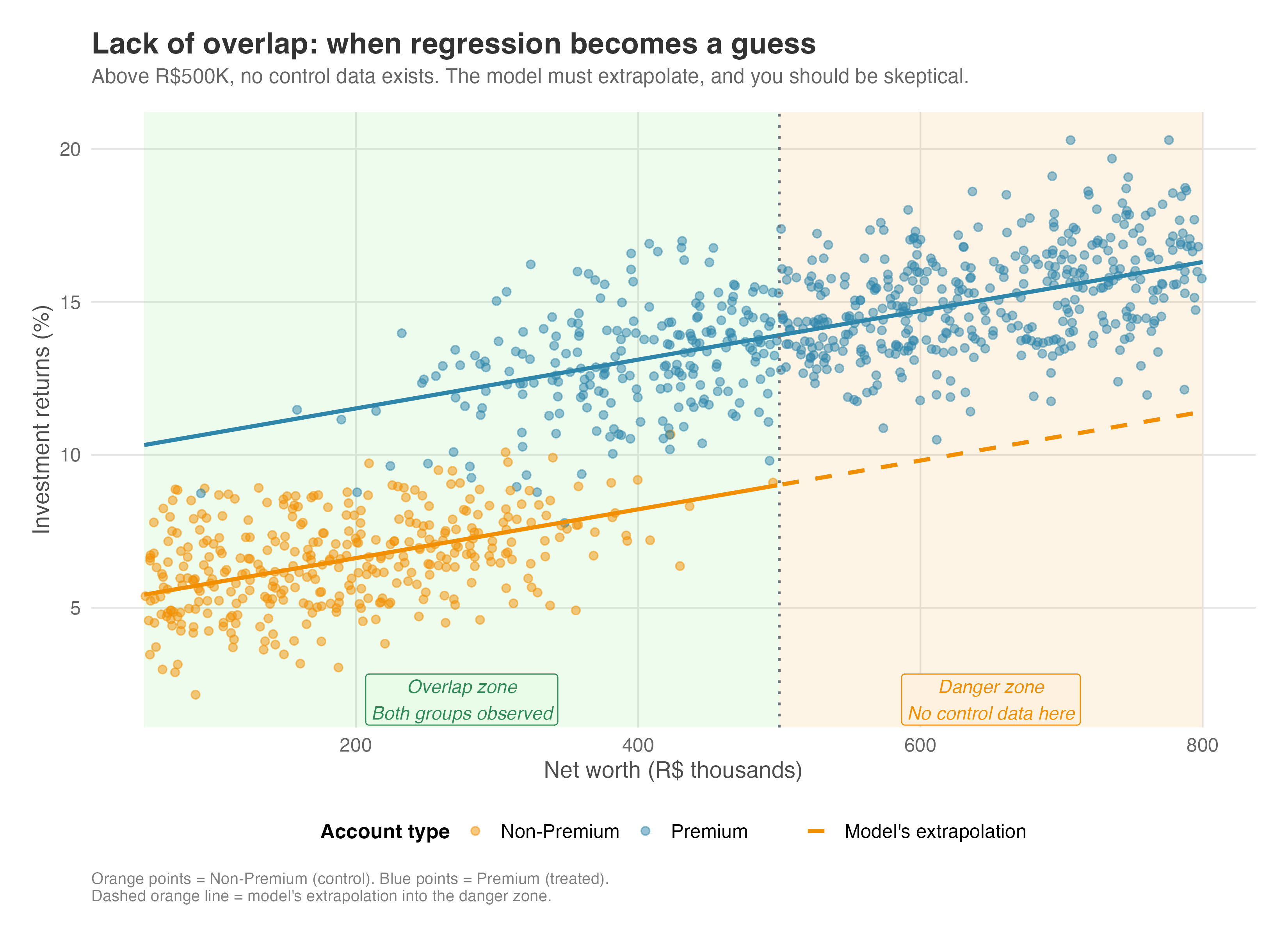
Lack of common support is a red flag. It means your data doesn’t fully support the comparison you’re trying to make. In practice, you should diagnose this by checking the distributions of covariates or propensity scores (i.e., the probability of receiving treatment given observed characteristics; see Appendix: IPW for details). If they don’t overlap, you have two honest options: restrict your analysis to the region where they do overlap (trimming), or explicitly acknowledge that your results depend heavily on modeling assumptions.
Relation to DAGs: This assumption has nothing to do with the DAG structure. You can draw a valid DAG where confounding is perfectly controlled, yet still fail to estimate the effect because of lack of overlap. The DAG tells you what variables to control for; Common Support tells you if you have enough data across the spectrum of those variables to make a fair comparison.
When this assumption fails, OLS extrapolates into regions with no data. Even when positivity technically holds, poor overlap makes estimates fragile. A few observations in the tails of the distribution of the probability of getting treatment can dominate the estimate, and small changes in model specification can produce large swings in results. Randomization prevents this by design: every unit has a known, positive probability of treatment. There’s no extrapolation, no extreme weights, no overlap problems.
6.4.4 Correct functional form: Getting the shape right
“Functional form” sounds abstract, but it just means: does your model’s math match reality? You must correctly model how covariates relate to the outcome. If the relationship between age and spending is a U-shape (young and old people spend a lot, middle-aged spend less), but you fit a straight line, your model is misspecified. You will get the wrong answer.13
If you get the shape wrong, you introduce bias. One may say that this “misspecification” problem is redundant once we satisfy the Conditional Independence Assumption (CIA), since correctly including \(Age^2\) in the model to address the non-linearity helps causal identification only when \(Age^2\) is a confounder. But to keep the reader cautious, let’s keep this as a separate assumption.
Relation to DAGs: Like common support, this is largely separate from DAGs. A standard DAG is qualitative — it tells you that Age affects Spending (Age → Spending) — but it doesn’t tell you how (linear? quadratic? threshold?). Functional form is about the quantitative shape of these relationships. While the DAG guides which variables to put in the model, Functional Form guides how to enter them (e.g., as a raw variable, a squared term, or a log).14.
When this assumption fails, misspecified outcome models bias OLS. If the true relationship between covariates and outcomes is nonlinear but you impose linearity, your treatment effect estimate is wrong. The problem is that you rarely know the correct specification. You can check model fit, but these diagnostics don’t guarantee that your specification is right. Misspecification is always a possibility, and it’s often impossible to rule out. For a practical demonstration of how this bias manifests and how to visualize it, see the discussion in the Appendix OLS misspecification.
In contrast, randomized experiments sidestep this assumption. They ensure unconditional independence without requiring you to model outcomes. Just clean, credible causal estimates.
6.5 About randomization, but in other words
So where does this leave us? We’ve spent this entire chapter discussing how to extract causal insights from observational data. But as we’ve seen, this requires heroic assumptions. We have to assume we’ve measured every single confounder (conditional independence), that our groups are comparable (common support), and that we know the mathematical shape of the world (functional form). Now let’s apply this new language to discuss randomized experiments.
Randomized experiments solve these problems by design. Think back to the DAGs we drew. Observational bias comes from open backdoor paths — arrows flowing from confounders into the Treatment node (Confounder → Treatment). Regression attempts to block these paths by mathematically “controlling” for them. But this only works if we can measure and include all of them.
Randomization works differently. It doesn’t block the path; it simply avoids the creation of undesired paths in the first place. When you randomize treatment (e.g., by flipping a coin), you completely sever the link between the outside world and the treatment assignment. It doesn’t matter how “motivated” or “bored” a user is; the coin doesn’t care. In DAG terms, randomization deletes all arrows pointing into the Treatment node.
- Solves selection bias (CIA): Since nothing causes treatment except the coin, there are no backdoor paths to block. Unobserved confounding is mathematically impossible.
- Solves common support: By design, everyone has a known probability (e.g., 50%) of receiving treatment. There are no “types of users” who only exist in one group.
- Solves functional form: You don’t need to correctly model the relationship (linear, quadratic, etc.) because you aren’t relying on a model to adjust for differences. Simple averages work.
- Easier to defend SUTVA: While randomization doesn’t automatically guarantee SUTVA, it makes it easier to address. For interference, you can randomize clusters (e.g., cities) so treated and control units never contaminate each other. For consistency, strict experimental protocols ensure every treated unit receives the exact same intervention.
This is why the randomized experiment is the Gold Standard of causal inference. It is the only method that guarantees the “all else equal” condition without caveats.
In fact, the experiment serves as the conceptual gateway for the rest of this book. In the next chapters, as we explore advanced methods like Instrumental Variables, Difference-in-Differences, and Regression Discontinuity, you will see that they all share a common goal: trying to find a “natural experiment” in the messy real world that mimics the clean logic of a randomized trial.
Knowing when to stop and say, “we cannot answer this reliably without an experiment,” should be one of your most valuable contributions. Here is a framework for that conversation:
- High stakes & likely unobserved confounding: If the decision is critical and you know unmeasured factors (motivation, intent) drive behavior, regression is too risky. Action: Run an experiment. No amount of math can fix missing data.
- Poor overlap: If treated and control groups are fundamentally different (e.g., comparing loyal 10-year customers to brand new users), regression will extrapolate wildly. Action: Run an experiment to create a valid comparison group.
- Feasible timeline: If you can wait 2-4 weeks, the increase in certainty is almost always worth the delay. Action: Run an experiment.
6.6 Wrapping up and next steps
We’ve covered a lot of ground. Here’s what we’ve learned:
- Regression adjustment is your default tool for observational data, but it must be used thoughtfully. It isolates the treatment effect by comparing treated and control units with similar covariate values.
- The four pillars of valid regression: SUTVA (no interference), Conditional Independence (no unobserved confounders), Common Support (comparable groups), and Correct Functional Form.
- Directed Acyclic Graphs (DAGs) help you map assumptions about the world, distinguishing between “good” frontdoor paths (causal) and “bad” backdoor paths (bias).
- Control variable selection follows clear rules:
- Include confounders: Variables that cause both treatment and outcome. Controlling for them closes backdoor paths.
- Include outcome predictors: Variables that affect the outcome but not the treatment. Controlling for them improves precision.
- Exclude mediators: Variables on the causal path. Controlling for them blocks the effect you want to measure.
- Exclude colliders: Variables caused by both treatment and outcome. Controlling for them opens spurious paths.
Before running any regression, draw your DAG, identify backdoor paths, select controls to close backdoors, check the bad controls list, assess common support, consider functional form, and ask the hard question.
In the chapters ahead, we will explore methods that work when regression’s assumptions become implausible:
- Instrumental Variables: You will learn how to leverage exogenous variation to identify causal effects even when unobserved confounders lurk in your data.
- Regression Discontinuity: You will see how sharp cutoffs in treatment assignment can create quasi-random variation that mimics an experiment.
- Difference-in-Differences: You will discover how to exploit natural experiments and policy changes to estimate treatment effects by comparing trends over time.
Appendix 6.A: Additional discussions
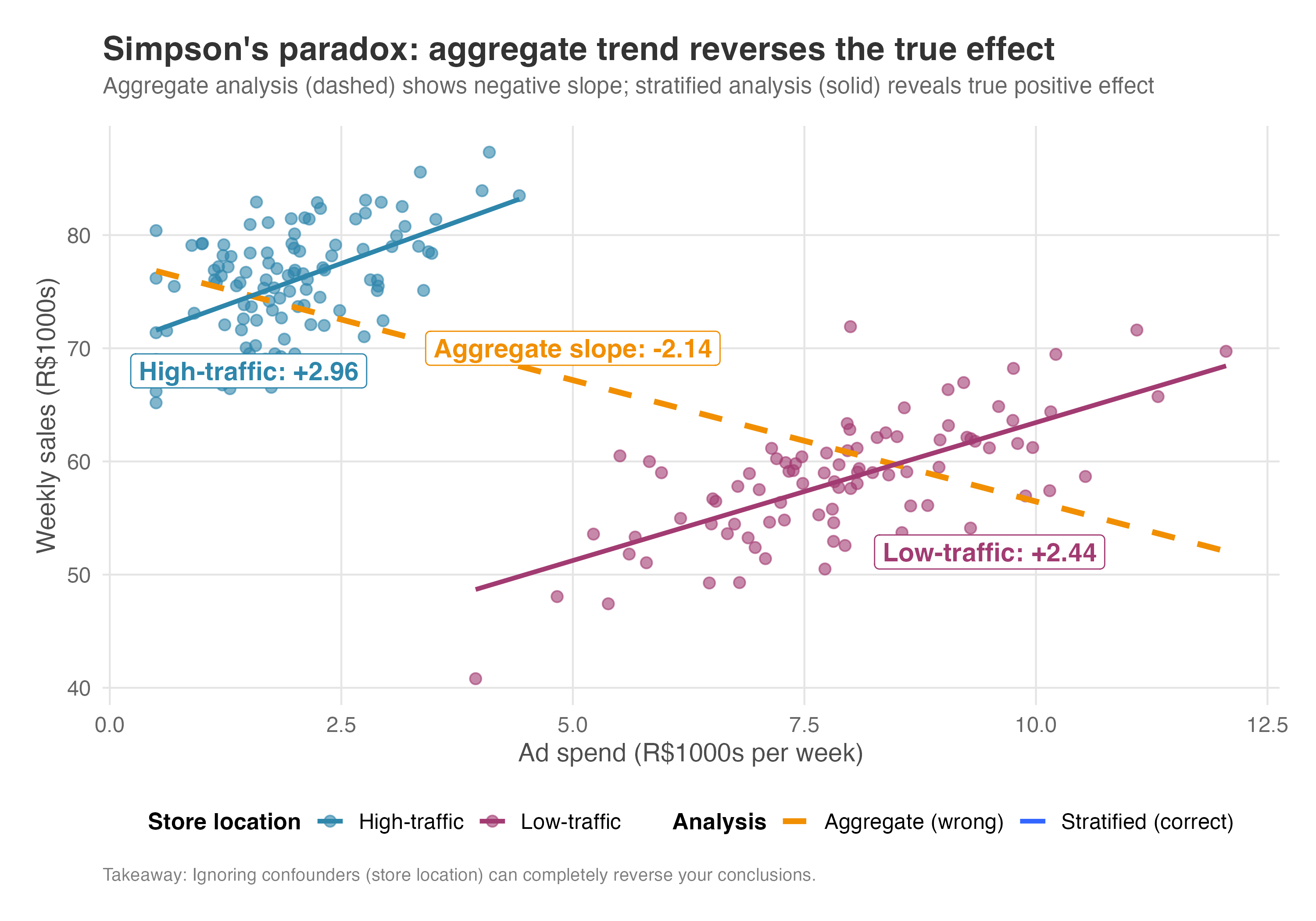
Simpson’s paradox: When aggregation reverses the effect
Simpson’s paradox is confounding in disguise, but with a dramatic twist. An effect that appears positive in every subgroup can reverse when you aggregate the data. This happens for the same reason we discussed earlier: failing to condition on a confounder.
Consider this scenario. Suppose you’re analyzing whether advertising drives sales across your retail stores. Looking at the aggregate data, you see the opposite of what you’d expect: stores that spend more on ads have lower sales on average. Should you cut the ad budget?
But when you break down the data by store location, the story changes. Within high-traffic stores, more ad spend leads to higher sales. The same is true within low-traffic stores. So why does it appear to backfire in the aggregate?
The answer is confounding by location. Low-traffic stores (those in declining malls or remote areas) struggle to attract customers naturally, so they must advertise heavily just to stay afloat. Despite their high ad budgets, they start with lower baseline sales because of their disadvantaged locations. High-traffic stores (downtown flagships, busy shopping districts) enjoy a steady stream of walk-in customers. They spend less on ads because they don’t need them, yet they have higher baseline sales thanks to their prime locations.
When you aggregate, you’re comparing high-ad-spend stores (mostly low-traffic, with lower sales) to low-ad-spend stores (mostly high-traffic, with higher sales). The location difference in baseline sales creates a downward-sloping line that has nothing to do with advertising effectiveness.
This reversal is Simpson’s paradox in action: advertising has a positive effect within each location type, but appears negative in the aggregate because composition differs between high-spenders and low-spenders. In causal inference terms, the paradox arises when you fail to condition on a confounder. Once you stratify by location, or include it as a control variable, the paradox disappears and the true positive effect emerges.
The lesson: Always check for confounders that differ between groups. Aggregation can hide or reverse true effects when subgroups have different baselines.
Figure 6.11 makes this vivid. The dashed orange line (the aggregate) slopes downward, suggesting ads hurt sales. But within each location type (blue for high-traffic, magenta for low-traffic), the true relationship slopes upward. The aggregate line is a statistical illusion created by confounding.
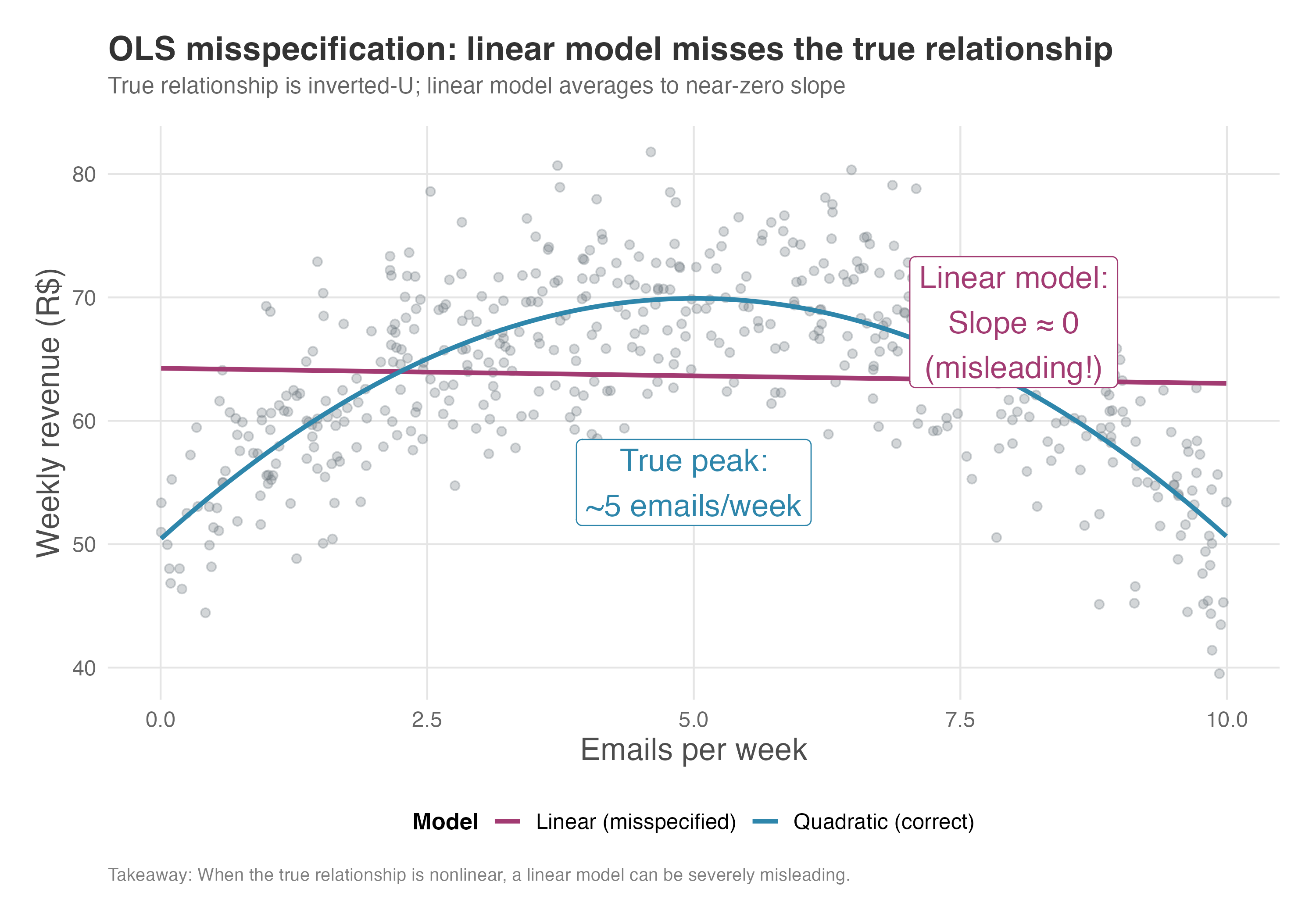
OLS misspecification: When linearity assumptions fail
Regression adjustment assumes you’ve correctly specified the relationship between variables. When this assumption fails, your estimates are biased. Let’s see how misspecification manifests in practice.
Suppose you’re analyzing email marketing at an e-commerce company. The marketing team believes that sending more promotional emails drives more revenue. But the true relationship is an inverted U: at low frequencies, each additional email increases weekly revenue (customers become more aware of deals). Past a certain point, email fatigue sets in, and additional emails actually decrease revenue as customers unsubscribe or tune out.
If you fit a linear model (regressing revenue on email frequency), you impose a straight line where the truth is curved. In our simulation, the linear model estimates a coefficient of -0.12 — suggesting that each additional email decreases revenue by 12 cents. Worse, this coefficient isn’t even statistically significant. A naive analyst might conclude: “Emails have no effect on revenue; let’s stop sending them”.
This conclusion is completely wrong. The quadratic model reveals the true story: the linear term is +7.79 and the quadratic term is -0.78. In plain language, the first few emails add about $7.80 each to weekly revenue. But each email also incurs a “fatigue penalty” that grows quadratically. The optimal frequency is around 5 emails per week; beyond that, the marginal effect turns negative. The linear model, by averaging the upward and downward portions of the curve, collapses this rich structure into a meaningless near-zero slope.
The bias from misspecification depends on where your data lives. If your sample includes mostly low-frequency senders, the linear fit will be steeper and positive (capturing the upward portion of the curve). If your sample includes mostly high-frequency senders, the linear fit may even be strongly negative. Neither tells you the true shape.
You can guard against misspecification by including flexible functional forms: polynomials, splines, or interactions. Diagnostic plots also help: plot residuals against the predictor and look for patterns. If residuals are systematically positive or negative in certain regions, your model is misspecified there.
Figure 6.12 shows this problem visually. The gray points represent our simulated data, where revenue rises with email frequency up to about 5 emails per week, then declines. The magenta line is the linear model: it fits a nearly flat slope (close to zero) because it averages the upward and downward portions of the curve. The blue curve is the quadratic model, which correctly captures the inverted-U shape. The annotations highlight two key takeaways: the linear model’s misleading near-zero slope, and the true optimal frequency around 5 emails per week.
Inverse Probability Weighting (IPW)
While Regression Adjustment (OLS) attempts to model the outcome (\(Y\)) to account for confounders, Inverse Probability Weighting (IPW) takes a different causal path: it attempts to reweight the data to make the treated and control groups look statistically identical.
The intuition is simple: if treated users are, on average, older than control users, we can “down-weight” the older treated users and “up-weight” the older control users until the age distribution is the same in both groups. We do this for all confounders simultaneously using the propensity score — the predicted probability that a user receives treatment based on their observed characteristics.
How IPW works
Estimate the propensity score: First, we build a model (usually a logistic regression) to answer the question: “How likely is this person to be treated, given their profile?” This probability, denoted \(e(x) = P(D=1|X=x)\), is the propensity score.
To make this concrete, imagine you’re analyzing whether a premium subscription increases user engagement. Users who subscribe tend to be power users already — they’re older, use the app more frequently, and have been customers longer.
The propensity score captures this: “Given that Maria is 35, logs in daily, and has been a customer for 2 years, there’s an 80% chance she’d subscribe”. This 0.8 becomes her propensity score.
Calculate weights: We assign a weight to each unit equal to the inverse of the probability of receiving the treatment they actually received.
- Treated units get weight \(w_i = \frac{1}{e(x_i)}\).
- Control units get weight \(w_i = \frac{1}{1 - e(x_i)}\).
Estimate the effect: We calculate the difference in weighted average outcomes between the treated and control groups.
The logic of weights
Imagine a treated user who had a very low probability of being treated (e.g., \(e(x) = 0.1\)). This user is “surprising” or “rare” in the treated group — they look more like a control user. IPW gives this user a large weight (\(1/0.1 = 10\)). Ideally, this one user “stands in” for the 9 other similar users who, based on probability, should have been treated but weren’t (or vice versa). By amplifying these rare cases, we reconstruct what the population would have looked like if treatment had been assigned randomly.
Think of it like survey weighting. If you survey a neighborhood and accidentally over-sample retirees, you’d down-weight their responses so they don’t dominate your conclusions. IPW does the same thing — it corrects for the “accidental” imbalance created by non-random treatment assignment.
Now that we understand the mechanics, a natural question arises: when should you use IPW instead of OLS?
IPW vs. OLS: Which one to choose?
Both methods aim for the same goal: adjusting for observable confounding under the same core assumptions. However, they differ in philosophy and practice:
Design vs. analysis: IPW allows you to separate the design stage (balancing the data) from the analysis stage (estimating the effect). You can iterate on your propensity score model until you achieve good covariate balance before you ever look at the outcome variable. This prevents “p-hacking” or consciously/unconsciously selecting a model that yields a significant result.
In practice, this separation is convincing. You can show a skeptical stakeholder that treated and control users have similar age distributions, income levels, and tenure — all before revealing any results. This transparency builds trust that you’re not cherry-picking a model that happens to show what you wanted.
Modeling focus: OLS requires you to correctly specify the relationship between \(X\) and \(Y\) (the outcome model). IPW requires you to correctly specify the relationship between \(X\) and \(D\) (the propensity score model). In some settings, you might have a clearer understanding of how treatment was assigned than how the outcome is generated.
Ask yourself: Do I understand why users received treatment? (e.g., eligibility rules, targeting criteria, self-selection patterns) Or do I understand what drives the outcome? (e.g., established predictors of conversion or churn). Your answer points you toward IPW or OLS.
Efficiency: If the outcome model is correctly specified, OLS is generally more efficient (has smaller standard errors) than IPW. Why? OLS uses information about the outcome directly, which is ultimately what we care about. IPW only uses the outcome at the final step — it “throws away” information by collapsing everything into weights first. When weights are stable, this loss is minimal; when weights are extreme, it’s costly.
IPW weights can be unstable, especially if propensity scores are close to 0 or 1, which inflates variance. In practice, you can stabilize IPW weights by (1) trimming observations with extreme propensity scores (e.g., dropping users with \(e(x) < 0.05\) or \(e(x) > 0.95\)), (2) using stabilized weights that multiply the standard weights by the marginal probability of treatment, or (3) applying weight “winsorization” to cap extreme values. Always visually inspect the distribution of your weights before trusting IPW estimates.
WarningExtreme weights can dominate your estimate
A single observation with a propensity score of 0.01 receives a weight of 100, meaning it “counts” as 100 people. If this observation has an unusual outcome, it can single-handedly determine your treatment effect. Always plot the distribution of weights before trusting IPW results.
Doubly robust estimation
So, must you pick a side? Not necessarily. Modern causal inference often uses Doubly Robust (DR) estimators, which hedge your bets. DR methods combine both approaches: they weight the data using IPW and then run a weighted regression outcome model.
The “double robustness” property is a beautiful safety net: you only need to get one of the two models correct (either the propensity score model OR the outcome model) to get a consistent (asymptotically unbiased) estimate.
It’s like wearing both a seatbelt and having an airbag. Either one can save you in a crash. But if both fail — say, the seatbelt is unbuckled and the airbag doesn’t deploy — you’re in trouble. DR estimators work the same way: you need at least one model to be reasonably correct.
Of course, if both models are wrong, the safety net fails. DR does not guarantee protection against dual misspecification.
As Google advises, “NotebookLM can be inaccurate; please double-check its content”. I recommend reading the chapter first, then listening to the audio to reinforce what you’ve learned.↩︎
This expression comes from ‘kitchen sink regression’, in which the analyst throws “everything but the kitchen sink” into the regression.↩︎
Recall that the DGP is essentially “God’s algorithm” to generate the data. It is the absolute, hidden set of rules that determined how your data came to be. Also recall that in the real world, we are merely mortals trying to reverse-engineer God’s code to figure out what truly caused what.↩︎
In the wild, DAGs usually have all black arrows. I’m coloring these red to help your eyes instantly distinguish the “bad” backdoor paths (bias) from the “good” causal paths we want to trace.↩︎
Two other strategies worth knowing are: (1) Find a proxy: If we can’t measure Boredom directly, maybe we can measure “time since last app open” or “frequency of app open”. If the proxy is good enough, controlling for it might partially close the backdoor. (2) Sensitivity Analysis: We can admit we don’t know the bias but calculate “how bad” it would have to be to invalidate our results. Tools like sensemakr help us argue: “Even if an unobserved confounder exists, it would need to be 3x stronger than any observed variable to explain away our effect”.↩︎
This section is heavily inspired by Cinelli, Forney, and Pearl (2024). If you want to go beyond my intuitive explanation below, their paper is a must-read.↩︎
Notice: “Collider” is a role, not a fixed identity. A variable acts as a collider only relative to a specific path. The same variable might block one path (as a collider) while transmitting effects on another. I recommend reading chapter 8 of Huntington-Klein (2023) for a more in-depth explanation.↩︎
To load it directly, use the example URL
https://raw.githubusercontent.com/RobsonTigre/everyday-ci/main/data/advertising_data.csvand replace the filenameadvertising_data.csvwith the one you need.↩︎Another popular approach is Inverse Probability Weighting (IPW), which models the treatment assignment rather than the outcome. We discuss IPW and when to prefer it over OLS in the Appendix.↩︎
In comparison to OLS, Double Machine Learning (DML) — a method that uses flexible ML models to control for confounders — is much more powerful, but in the absence of clean identification strategies and under violation of its required assumptions, it will still yield biased results. There are, of course, proper uses of fancy estimators coupled with clean identification strategies (see Chang (2020), Jung, Tian, and Bareinboim (2021) and Ahrens et al. (2025)), but these are rarely the “magic bullet” solutions sold by most internet influencers.↩︎
In formal “potential outcomes” notation, the equation says that both potential outcomes — what a unit would have experienced under control (\(Y(0)\)) and under treatment (\(Y(1)\)) — are statistically independent of whether they actually received treatment (\(D\)), once we account for observed characteristics (\(X\)).↩︎
While random error attenuates estimates toward zero; systematic error can bias in any direction. When using proxy variables or survey data, “controlling for” a variable may not fully close the backdoor.↩︎
In other words, regression adjustment requires that you correctly specify how covariates relate to the outcome. If the true relationship is nonlinear but you assume linearity, your treatment effect estimate will be biased.↩︎
An important nuance worth knowing: The full Structural Causal Model (SCM) underlying a DAG does include structural equations that specify functional form. Although the DAG is qualitative (what you see when you draw arrows), the underlying SCM is quantitative, but this is a topic for Chapter 16↩︎