13 Translating causal estimates into metrics for decision making
A/B Testing, Causal Inference, Causal Time Series Analysis, Data Science, Difference-in-Differences, Directed Acyclic Graphs, Econometrics, Impact Evaluation, Instrumental Variables, Heterogeneous Treatment Effects, Potential Outcomes, Power Analysis, Sample Size Calculation, Python and R Programming, Randomized Experiments, Regression Discontinuity, Treatment Effects
13.1 The estimate is not the decision
You’ve spent weeks designing a study, collecting data, and building the report. The p-value indicates the result is statistically significant. Now what?
Even robust causal estimates are useless if they don’t help you make better decisions. A statistically significant lift of R$2.34 per user per month in incremental profit doesn’t mean much on its own. You have to weigh it against what it costs to implement the change and maintain it, and only then can you answer the question every executive cares about: is it worth doing?2
Answering that question requires recognizing this chapter’s central claim: a statistically significant causal effect and a profitable investment are not the same thing.
A familiar pattern: the product team runs an A/B test and finds a R$2.34 per-user lift in monthly incremental profit. The analyst multiplies R$2.34 by 5 million users and 12 months and gets R$140 million. The CFO approves the project; six months later the actual aggregated lift settles at R$65 million — less than half the projection.
The reasons compound. Effects decay as novelty fades, production rollout rarely covers the full eligible population for the full projection window, and the marginal users acquired after launch are less engaged than the beta testers. No single assumption was wrong, but the errors stacked — and the team lost credibility not because they were bad at causal inference, but because nobody translated the estimate into a realistic forecast.3
This chapter helps you avoid that mistake by translating the causal estimates from Part II into the language leadership uses, and by carrying uncertainty through every step so you can present a range of scenarios rather than a single number.
Most of the time, this translation happens before a full rollout. You ran the experiment on a small slice — a 5% holdout, one region, one cohort, a four-week window — and now you have to decide whether the effect you saw is large enough to scale across the company. The pipeline takes the causal estimate from that slice and forecasts the business impact of rolling it out everywhere, so the go/no-go decision rests on a forecast, not on a hunch. The same machinery also works after a rollout, when you’re checking whether the bet paid off — but the pre-rollout case is where most readers will use it, and it’s the case the rest of the chapter follows.
Along the way, two stakeholders will challenge you as they would in real-world meetings:
Daniel (CFO) cares about P&L impact, ROI — return on investment, or whether the value created is large enough to justify what you spent — and whether the numbers survive stress tests.4
Vanessa (CPO) cares about what to prioritize, which users benefit most, and where to invest next.
We’ll follow one estimate — R$2.34 per user per month from a personalized feed experiment (Chapter 3) — through every stage of the pipeline: scaling, decay, the waterfall, ROI, breakeven, uncertainty, and the one-pager.5 An early section pauses on a second example, the email frequency experiment (Chapter 7), to work out which estimand to translate when compliance is partial — the ITT vs. LATE fork. After that illustration, the feed carries the rest of the chapter on its own.
Figure 13.1 maps the path of the business translation pipeline. Notice that uncertainty is not an afterthought but the final stage: the 95% confidence interval around your causal estimate is your scenario range, with the lower bound as the worst plausible outcome and the upper bound as the best.6 Re-running the financial metrics at both bounds gives you a range of outcomes, and your decision should rest on that range — not on the point estimate alone.
13.1.1 What the pipeline assumes
Like every method in this book, the translation pipeline has assumptions — six of them — and if any one breaks, the downstream financial number is biased in a specific direction:
- The causal estimate you start with is unbiased. The translation pipeline cannot rescue a flawed estimate. Whatever bias survived your A/B test, DiD, IV, or RDD carries straight through to every financial number downstream.
- The effect fades at a predictable rate. Treatment effects rarely stay constant — novelty wears off, users churn, behavior reverts. The pipeline assumes that fade is smooth and stable enough to model with a single number per period (we’ll formalize this as the effect-persistence factor \(\lambda\) in Section 13.4). If the real fade is sharper, lumpier, or differs across user segments, the multi-month projection drifts.
- The per-user effect holds up as you reach more users. Multiplying a per-user lift across millions of customers assumes the lift doesn’t shrink as the audience grows. It can shrink for plenty of reasons: later adopters are less engaged than early ones, the feature stops feeling novel, supply runs out, or the market reacts to the rollout.
- The investment cost is known and stable. Every return-on-investment number divides value by cost. If the engineering build overruns, ongoing maintenance was undercounted, or the rollout cost structure differs from what the experiment used, the cost number moves — and the return moves with it. A cost that doubles cuts the return in half.
- The measured lift is genuinely new — not borrowed from another product or period. A new homepage feed may shift purchases away from the search page; a flash sale may pull next month’s demand into this month. In both cases the per-user lift on the treated surface is real, but the company-wide net gain is smaller — the experiment never sees the offsetting drop on adjacent surfaces or in later periods. The pipeline assumes the lift is incremental at the company level, not shifted from elsewhere.
- Each metric means the same thing during the experiment and after rollout. Definitions drift quietly: “monthly active users” can be redefined between quarters, “revenue per user” can switch from gross to net, “profit per user” can absorb a new cost line. Multiplying the right per-user effect by the wrong denominator produces a confidently wrong forecast.
Each of these has a “how to check” recipe in Appendix 13.B. Before you present the final number, ask yourself which one you are least confident in — that’s the one to stress-test first. The translation is only as strong as its weakest assumption.
Let’s start with a simple question: do you have it clear which number you are translating?
13.2 Which number are you translating?
Data: All data and code are available in the repository. This chapter works with illustrative numbers rather than external datasets — every value is defined inline, so you can run each block independently.
Packages: To run the code yourself, you’ll need a few tools. The block below loads them for you. Quick tip: you only need to install these packages once, but you must load them every time you start a new session in R or Python.
# If you haven't already, run this once to install the packages:
# install.packages(c("tidyverse", "scales"))

# You must run the lines below at the start of every new R session.
library(tidyverse)  # Data manipulation and visualization
library(scales)     # Number formatting (dollar, comma, percent)
# If you haven't already, run this in your terminal to install the packages:
# pip install numpy pandas matplotlib scipy
# You must run the lines below at the start of every new Python session.
import numpy as np # Numerical operations
import pandas as pd # Data manipulation
import matplotlib.pyplot as plt # VisualizationDaniel: “You’re telling me the daily-email program brings in R$4.2 of revenue per invited customer over 60 days — but R$13.6 per customer who actually switches? Which one do I put in the forecast?”
Vanessa: “And which one tells me whether the product actually works?”
Getting either question wrong is a common source of miscommunication between data science and finance, and it usually comes from presenting the headline number without checking whether it’s the right number for the question the audience is asking.
The personalized feed was a server-side change — every user assigned to treatment saw the new homepage, so the ATE (R$2.34 per user per month) is the ITT, and there is no compliance gap to worry about. That simplicity is a luxury that most experiments don’t enjoy. Take the daily-email experiment from Chapter 7: users were randomly invited to switch from weekly to daily promotional emails, but only 36% of invited users actually switched, against 5.5% in the control group — a first-stage gap of 31 percentage points that forces the ITT-vs-LATE distinction into the open. The ITT — the effect of offering the switch — is R$4.2 per invited customer over 60 days; the LATE — the effect on compliers who actually switched — is R$13.6. Both are valid: each answers a different question, and the one you present reshapes the business case.
Present the R$4.2 ITT to a product team as “the effect” and you’ll kill a program that works brilliantly for its adopters (LATE = R$13.6 per complier). Present the R$13.6 LATE to a marketing team as “expected return per invited customer” and you’ll overstate the budget case by 3×. Pick the estimand that matches the question your stakeholder is asking.
A note on units before you compare these three numbers: each lives in a different construct by design, because each answers a different question. The feed is measured in R$ per user per month in profit — revenue minus all variable costs (payment processing, fulfillment, support; see Chapter 3 for the definition of profit_30d). The email ITT and LATE come from Chapter 7 in revenue per customer over 60 days, with different denominators (invited customers vs. compliers). Before any of these can sit usefully in the same conversation, we have to convert each one into the units its decision needs.
Time first. The email experiment ran for 60 days continuously, so dividing each 60-day figure by 2 gives a per-30-day rate. This is fine as a planning approximation when the effect accumulated roughly linearly across the window. (If the effect was front-loaded — say, novelty drove most of the bump in the first two weeks — this overstates the steady-state monthly value. Worth checking against a daily decomposition if you have one.)
Cost next, but for the ITT only. The ITT and the cost share the same denominator: both are “per invited customer.” Chapter 7 reports the ITT as R$4.2 of revenue per invited customer over 60 days, and the invitation cost as R$1 per invited customer to send. Same denominator, so subtraction is mechanical:
\[ \text{ITT}_{\text{net, monthly}} \;=\; \frac{\text{R\$4.2} - \text{R\$1}}{2} \;=\; \text{R\$1.60 per invited customer per month}. \]
Read it as: “for every customer we invite, we expect a net R$1.60 of incremental revenue per month after paying the R$1 to send the invitation.” This matches Chapter 7’s own “R$3.2 net gain over 60 days,” just rescaled to a monthly rate.
Why we do NOT subtract the cost from the LATE. The R$1 cost is paid for every invitation — including the ~69% of invited customers who don’t switch. The LATE, by contrast, measures the causal effect on the compliers only: “for users who actually switched, how much extra revenue did the change in email frequency produce?” That is a product question — does the feature work for the people using it? — and the answer to it does not depend on what you spent reaching customers who said no. Cost-attributing the invitation spend back to the compliers would silently turn the LATE from a product number into an acquisition-economics number (“how cheap is it to manufacture a complier?”) — a different and equally legitimate question, but one we are not asking here. So the LATE only gets a time conversion:
\[ \text{LATE}_{\text{monthly}} \;=\; \frac{\text{R\$13.6}}{2} \;=\; \text{R\$6.80 per complier per month, in revenue}. \]
After both conversions, here are the three estimates in matched per-month units, with each row labeled by what it measures:
| Estimand | Per-month value | Construct | Question it answers |
|---|---|---|---|
| Feed (ATE) | R$2.34 / user | Profit (revenue − variable costs) | “What’s the per-user impact of rolling this out?” |
| Email ITT | R$1.60 / invited customer | Net of the R$1 invitation cost | “What net return do I get per invitation?” |
| Email LATE | R$6.80 / complier | Revenue uplift only (no cost adjustment) | “Does the feature work for people who use it?” |
One caveat before you put any of these next to each other on a slide: even after the conversions, these are still three different constructs. The feed’s R$2.34 nets out all variable costs, while the email’s R$1.60 only nets out the R$1 invitation cost — Chapter 7 abstracts the rest away (fulfillment, payment processing, and support on the incremental purchases the daily emails drive). R$1.60 is therefore much closer to profit than R$4.2 was, but it isn’t strictly the same construct, and the LATE row (R$6.80) is in revenue terms by design because it answers a product question. Use each row for the question it was built for; don’t average the column.
Picking the wrong one means killing a feature that works or scaling one that doesn’t — the kill-vs-scale logic, the hidden-gem-vs-dud diagnostic, and the compliance-as-lever framing for cases like this all live in Section 7.5.1, so there’s no need for this chapter to re-derive them. For our purposes, the point is just that the email program faces this compliance question at all.
The personalized feed doesn’t face this question: because the rollout was server-side, 100% of assigned users were treated, and the ATE is the only number we need. From here on, the feed is the spine — scaling, decay, waterfall, ROI, and the one-pager all run off that single R$2.34.
For a mapping of which causal method produces which estimand — and the scaling implications of each — see Appendix 13.A.
You know what your estimate measures and who it applies to. Time to turn it into money.
13.3 From statistical units to financial units
Your study usually tells you what happens to a sample of the users, but the rollout decision needs a number for the full population. That’s what scaling does — and it’s where the forecast starts.
Daniel about the personalized feed experiment: “OK, so the effect is R$2.34 per user per month. We have 5 million monthly active users (MAU).7 That’s R$140 million a year, right?”
Daniel’s arithmetic is right — R$2.34 per user × 5 million users × 12 months does come out to about R$140 million a year. But that arithmetic bakes in three assumptions: that the per-user effect holds at population scale, that the per-month rate persists across the year, and that the metric you measured is the metric your CFO actually needs. Let’s take them one at a time.
The first step is making the unit of your effect match the unit used to run the business. If your regression is per-day-per-store but decisions are monthly-per-region, convert before you discuss value. The shape of the decision often lives in these small unit choices.
The personalized feed measures profit per user over 30 days, and 30 days is close enough to a month that we can treat the per-30-day estimate as a monthly rate. The real work is scaling from sample to population: multiply the per-user effect by the count of eligible users, assuming MAU stays roughly stable over the projection (if your user base is growing or shrinking materially, adjust the base accordingly). R$2.34 × 5 million = R$11.7 million per month.
Map the metric type to the financial metric you’re using. The personalized feed measures incremental profit — the causal lift in revenue minus everything that scales with usage (serving costs, payment fees, support, and the like). So the R$11.7 million is already net of variable costs — but it is not yet net of the fixed R$4M build investment; we bring that in when we compute ROI. If your experiment measures revenue or sales, multiply by the share of each R$1 of revenue that survives after variable costs before computing ROI — otherwise you’ll overstate the true return.
To project a year, multiply that monthly figure by 12 → R$140 million. That step assumes the per-month effect is stable across all 5 million users and that no decay or seasonality erodes the estimate over the year. We’ll start by discounting for decay in the next section.
From here, treat the financial translation as a partnership. You bring the causal quantities you own: expected active users, incremental transactions, usage, or per-user profit. Finance supplies the unit economics: cloud cost per API call, third-party vendor fees, payment processing fees, support cost, and margin assumptions. These usually live in accounting and FP&A (Financial Planning & Analysis) pipelines, where teams maintain cost models, budget allocations, and unit economics as part of their daily work.
If finance has a range instead of a point estimate, keep the range. That uncertainty is exactly what feeds the sensitivity analysis later. If no one can give you the number, that is not a nuisance to hide — it is a decision risk worth reporting.
Keep one boundary clear: not all losses sit on an FP&A spreadsheet. Promotional cannibalization, support tickets triggered by a confusing feature, churn from a bad experience — these are negative treatment effects. You cannot look them up in a cost model; you have to estimate them with the same causal machinery you used for the revenue lift.
You now have the first financially legible number: R$11.7 million per month, or R$140 million per year under deliberately naive assumptions. The next question is whether that effect persists, scales, and survives production. It usually does not.
13.4 Accounting for Effect Decay Over Time
Daniel about the personalized feed experiment: “So R$11.7 million per month times 12 is R$140 million a year. I’ll put that number in the board deck.”
Hold that thought. We’ve translated the effect and valued it per user; the next link is projecting it forward, and this is where projections typically fail. That R$140 million is the naive version.
Before you present it, we must discount for at least two sources of overestimation:
- effects tend to decay over time, for instance, as novelty fades, and
- they hit diminishing returns as you scale to less responsive segments.
13.4.1 The decay formula
Ideally, the decay rate should come from data. If your design lets you observe the treated-control gap over several periods, you can estimate how quickly the effect fades instead of assuming it. In the TWFE chapter, for instance, the event-study coefficients showed the post-treatment path period by period; with enough periods, that same shape could be used to estimate whether the effect decays, grows, or stabilizes after launch.
But estimating decay is not free. It may require a longer holdout, extra monitoring, slower rollout, or more analyst time, so you have to weigh the precision you gain against the cost of waiting. For many business uses — especially a first-pass sanity check or a conservative set of safety bounds — a simple heuristic is enough: assume the effect decays at a constant rate each period.
The common version of that heuristic is geometric decay. Other options include linear decay, piecewise step-downs, or a fitted curve, but the geometric form dominates in practice because it needs only one parameter (the effect-persistence factor \(\lambda\)), keeps the cumulative math tractable, and is easy to defend to a finance partner.
In this model, the effect in any period \(t\) equals the initial effect multiplied by an effect-persistence factor raised to the power of time:
\[ \text{Effect}_{t} = \text{Effect}_{0} \times \lambda^{t} \]
Where \(\text{Effect}_{0}\) is the starting effect you estimated for your intervention, \(\lambda\) is the per-period effect-persistence factor (\(0 < \lambda < 1\)), and \(t\) is the number of periods elapsed. Equivalently, the decay rate is \(1 - \lambda\).
When \(\lambda = 0.90\), 90% of the effect persists each period — a 10% monthly decay. With the personalized-feed estimate, that means an initial R$2.34 lift becomes R$2.34 in month 0, R$2.11 in month 1, R$1.90 in month 2, and R$1.71 in month 3. Across those four periods, the decayed value is about R$8.05 per user, instead of R$9.36 if the effect stayed constant.
One terminology warning before we reuse this math: here, \(\lambda\) models the persistence of the treatment effect, not customer churn. Customer Lifetime Value (CLV) models often use the same geometric form, but there the analogous parameter usually means the probability a customer remains active. Below, we use the decay formula to compute the incremental lifetime value of the treatment effect. If you want population-level value after customer churn, add a separate survival term.
13.4.2 Decay over time: customer lifetime value uplift
The personalized feed lifts profit by R$2.34 per user per month. But that effect won’t last forever — for instance, competitors adapt to your innovation and user behavior shifts. If you naively multiply the effect of R$2.34 by 12 months, you’ll overstate the annual value. So the responsible approach:
- shrink the effect each month by a decay factor (\(0 < \lambda < 1\));
- discount each future R$ for the time value of money — a R$1 received today is worth more than R$1 received next month, because you could invest today’s real and earn a return in the meantime.
- The discount rate \(r\) captures that opportunity cost: if your company’s next-best investment earns 1% per month, a future real is worth \(1/(1+0.01)\) of today’s real;
- and sum across the projection horizon (\(\sum_{t=0}^{T-1}\)).
The result is the incremental Customer Lifetime Value — how much extra value, in today’s reais, one treated user generates because of the treatment over the projection window, above the baseline value they would have generated without it. Read the “\(\Delta\)” as “the lift caused by the treatment”: it’s the difference between what happens with the intervention and what would have happened without it, not a level on its own.8
\[ \Delta \text{CLV} = \sum_{t=0}^{T-1} \dfrac{\Delta \text{Profit}_{0} \times \lambda^{t}}{(1+r)^{t}} \]
where:
- \(\Delta \text{Profit}_{0}\) is the initial incremental profit (R$2.34 per user per month in our example — before any decay and before netting the fixed investment),
- \(\lambda\) is the effect-persistence factor from the decay formula above (\(0 < \lambda < 1\); higher means slower decay),
- \(r\) is the discount rate — your opportunity cost of capital,
- \(t\) indexes the time periods, and
- \(T\) is the projection horizon (e.g., 12 months).
This formula models how the effect shrinks over time (via \(\lambda^t\)), but it assumes the user is still around to experience that effect. If users churn off the platform — cancel, uninstall, or go inactive — we need to multiply by a survival rate each period to get the population-level CLV uplift. At 5% monthly churn, by month 6 you no longer have the same user base you started with.
If you want to project the total value across your whole user base (not just per surviving user), you’d also need to multiply by something like a survival rate \(s^t\) each period — the probability a user is still active at time \(t\). The formula would become: \(\Delta \text{CLV} = \sum_{t=0}^{T-1} \dfrac{\Delta \text{Profit}_{0} \times \lambda^{t} \times s^{t}}{(1+r)^{t}}\).
Back to the personalized feed: assume the effect decays by 10% each month (\(\lambda = 0.90\)), and set \(r = 0\) so the reader can see the effect of decay by itself. The headline calculation gives R$16.79 per user: \(R\$2.34 \times (1 + 0.90 + \cdots + 0.90^{11}) \approx R\$16.79\).
In a real business case, use your company’s monthly WACC or hurdle rate. A common annual range is about 8% to 15%, which is roughly 0.64% to 1.17% per month; using \(r = 0.01\) lowers this example to about R$16.10. Over twelve months that difference is small next to the decay assumption, but for longer horizons, higher inflation, or riskier projects, do not set \(r\) to zero.
Match the rate to the cash flows: monthly cash flows need a monthly discount rate, nominal reais need a nominal reais rate, and riskier projects should use a risk-adjusted hurdle rate. The code below shows the decay-only version. If your finance partner insists on the fully discounted figure, just restore the discount line.
The decay rate is itself a causal parameter: it describes how quickly the causal effect fades after treatment. It deserves the same rigor as the original effect estimate, because the CLV projection is sensitive to it. Appendix 13.B, Assumption #2 walks through how to estimate \(\lambda\) from holdout data, with a worked code example.
Where do \(\lambda\) and \(r\) come from? Ideally, \(\lambda\) comes from data. After the study window ends, you need a way to keep estimating the effect over time — a holdout group for an A/B test, repeated event-study coefficients for a DiD, or an extended post-intervention window for a time-series analysis. The rate at which the gap closes is your empirical \(\lambda\). The discount rate \(r\) is different: it is not estimated from the study, but reflects your opportunity cost of capital — typically your company’s weighted average cost of capital (WACC) or a risk-adjusted hurdle rate (Horngren, Datar, and Rajan 2012). Ask your finance partner for the right number.
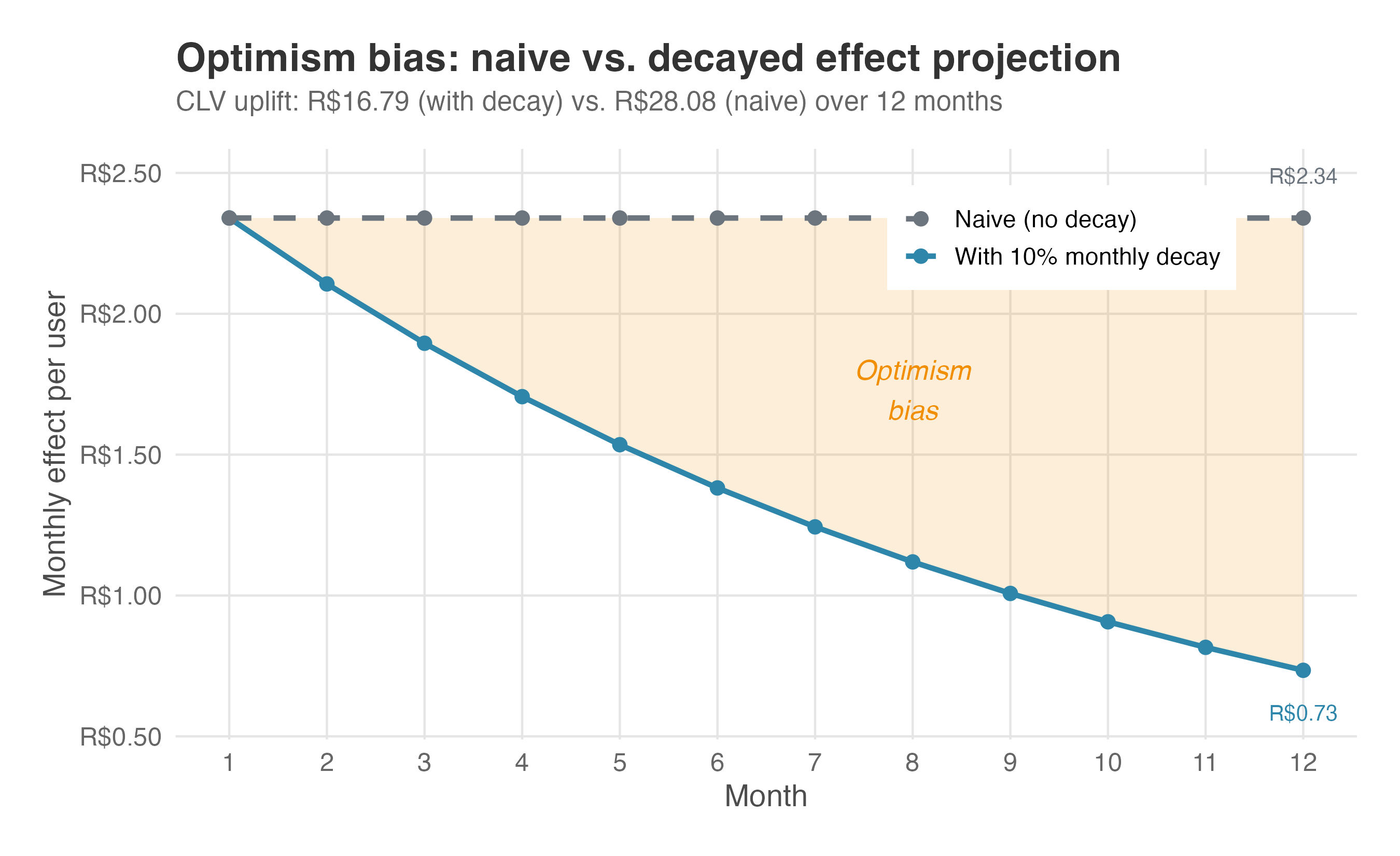
Even a simple two-line model that decays the effect by a fixed percentage each month is far more realistic than naively multiplying by 12. The gap between the decayed and undecayed estimate widens over time — the shaded area in Figure 13.2 is your “optimism bias.”
Daniel about the personalized feed experiment: “So the real number is R$84 million, not R$140 million. That’s the one I’ll defend to the board. Is this the worst case scenario?.”
R$84 million is more honest than R$140 million, but in business we should present a forecast as a range — a worst case and a best case so everyone in the room knows what the stakes are. Every friction we’re about to walk through (diminishing returns, adoption curves, interference, capacity) is a lever that pulls the base case down and widens the band around it. So no, R$84 million isn’t the worst case — we’re not done discounting.
13.5 The projection waterfall
13.5.1 Diminishing returns
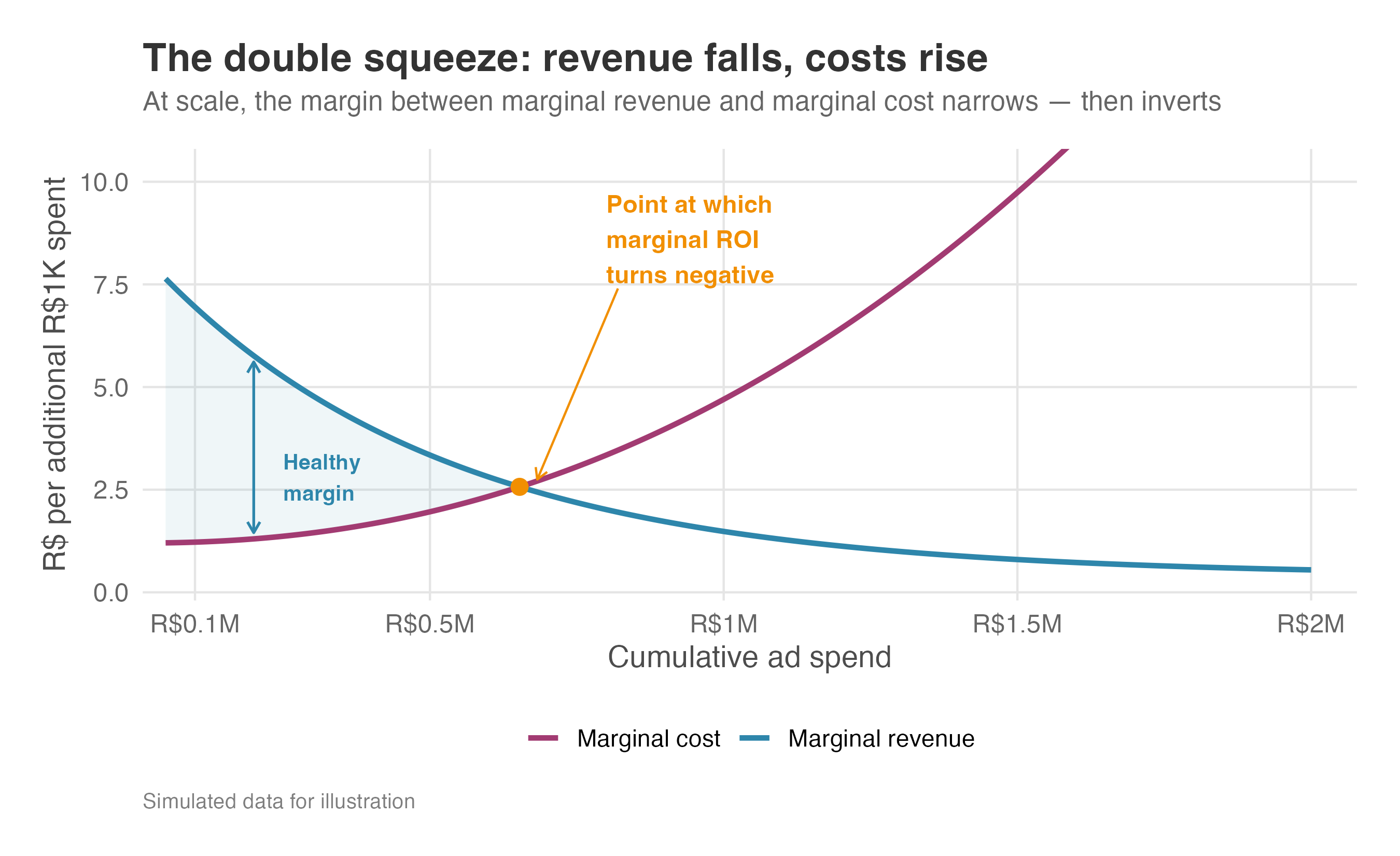
Where decay models erosion over time for each single user, diminishing returns model erosion across users. The ATE from your experiment is an average that blends high responders and low responders into a single number. Your first spend tranche captures the most responsive segment of users — where the per-user effect sits above the ATE. As you push further out, you reach progressively less responsive users, and the marginal effect falls below the experimental average. The experiment tells you the average return at its scale — not the marginal return at the scale you’re projecting to.
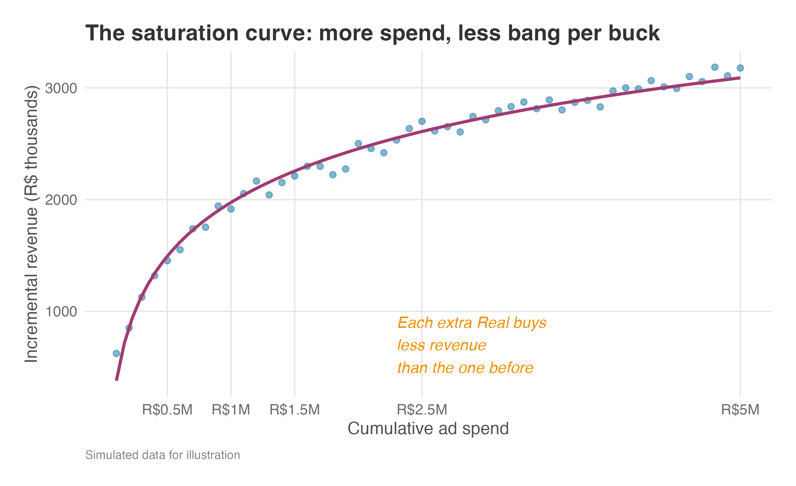
That is the shape in Figure 13.3. The first R$500K of spend buys the steep part of the curve: warm users, cheap reach, large incremental revenue. After the R$1.5M mark, the curve flattens — each additional Real still buys some lift, but less than the previous one. Scaling the original ATE as if every new user looked like the early treated users turns an average return into an inflated forecast.
This is why scale projections should not assume linear returns by default. Linear scaling requires each new user to be as responsive as the experimental average; increasing returns require a specific mechanism, such as network effects or learning. In ordinary rollout forecasts, diminishing marginal returns are the conservative starting point.
The squeeze is worse than it appears. Not only does marginal revenue fall as you saturate the audience — the cost of reaching each additional user rises too. Your first R$ of ad spend buy prime placements that reach warm, high-intent users; later tranches buy mid-tier inventory and retargeting against people who already ignored you, at higher cost per impression and lower conversion. ROI is a ratio, and at scale both sides move against you. If scaling from R$1M to R$3M in spend halves your marginal revenue per user and doubles your marginal cost per acquired user, the marginal ROI doesn’t fall by half — it falls to a quarter (Figure 13.4). Always estimate marginal ROI, not just average ROI — and when you project ROI at a new spend level, adjust both curves, not just the revenue saturation.
13.5.2 How much of the impact survives rollout
Vanessa: “What’s the realistic adoption curve? We won’t hit 100% on day one.”
Decay is already priced into the projection. How much of the experimental estimate will survive scale and production frictions? Think of this as a waterfall: you start with the naive projection and discount it down, one factor at a time.9 The naive R$140 million annual impact from the personalized feed has already been cut to ~R$84 million after discounting for decay.
Adoption curves. Whatever the causal method you use, the rollout audience is rarely identical to the population your causal estimate was built on. In the personalized-feed experiment, the rollout was server-side: 100% of treated users saw the new homepage on their next visit. Production rollout is a different question. Even server-side launches can ramp through QA gates, capacity checks, regional releases, and holdout cells before the full eligible population sees the feature. Recall the daily-email experiment from Chapter 7: the switch offer reached 100% of the test group, but only 31% of invited users actually switched. In production, even that 31% would ramp gradually — maybe 5% in week one as marketing seeds the inbox, climbing toward 31% only by month three as nudges and reminders compound. Multiply the per-user effect by the adoption curve, week by week, not by the steady-state ceiling.
Network effects and interference at scale (SUTVA in the wild). In Chapter 6, we discussed SUTVA — the assumption that treating one user doesn’t affect another. In a controlled A/B test on a 5% sample, treating a user with a new feature rarely impacts the control group. But what happens when you roll that feature out to 100% of users?
Imagine a ride-hailing app tests a new dispatch algorithm that prioritizes the closest drivers to high-value riders. In the 5% A/B test, the treated riders get faster pickups, leading to a massive increase in rides taken (a high ATE). But when you roll this out to 100% of riders, the total number of drivers hasn’t changed much: faster pickups for high-value riders come at the expense of slower pickups for everyone else, and the city-level impact might be zero or even negative.
This is market interference. Whenever users compete for a shared, constrained resource — drivers, inventory, server compute, or even attention in a social feed — individual-level experiments will overestimate the global impact. If your product operates in a two-sided marketplace, a naive forecast based on a user-level A/B test will almost always disappoint finance. When scaling, always ask: Are my users competing for a constrained resource? If yes, you need cluster randomization (testing at the city or region level) to estimate the true P&L impact.
Cannibalization. A homepage feed that surfaces “items you might like” doesn’t always create purchases — sometimes it just intercepts purchases the user was about to make through search anyway. The treated user buys a R$80 sneaker through the feed; the counterfactual is the same user typing “sneaker” into the search bar five minutes later. The experiment’s control captures this within-user substitution, so the per-user lift is real. But cross-surface cannibalization — feed revenue stealing from search revenue — only shows up when you measure the whole funnel.
Capacity constraints. A R$11.7 million monthly lift sounds like pure upside until you ask what has to deliver it. The personalized feed pushes users toward a tight set of best-selling SKUs. In the test cell that meant a few thousand extra orders — well within slack. At full rollout it would be tens of thousands per day, and the warehouses that stock those SKUs run out by mid-week. For the rest of the week the feed shows “out of stock” and the lift collapses. Whenever supply is finite, actual impact sits below the statistical estimate.
These frictions erode the estimate even when your experiment perfectly represents the target population. But what if it doesn’t? If the experimental sample itself is unrepresentative — skewed toward power users, a single geography, or an unusual time window — the per-user ATE reflects that population, not your full user base. The marginal user you acquire next quarter is typically less engaged than the beta tester who opted in last quarter.
Before scaling any causal estimate — A/B test, DiD, IV, RDD, time-series, or heterogeneous-effects — run through this checklist:
- Sample representativeness. Is the population your estimate identifies for a random draw from the deployment population? If not, expect attenuation.
- Time-period representativeness. Did the study window cover representative conditions? Holiday traffic, promotional events, and seasonal peaks distort baselines.
- Context shift. Does the deployment context differ from the study context — geography, user mix, competitive landscape, payment infrastructure?
- Recency. How long ago was the analysis run? Effects have shelf lives — users habituate, competitors adapt, and the product evolves.
The estimand-method reference table in Appendix 13.A flags what each method identifies and for whom — revisit it before scaling any estimate to a new population.
The personalized feed was tested on Brazilian e-commerce users during a normal traffic period; Mexican users face different competitors, different purchasing habits, and different payment infrastructure, so a R$2.34 lift in São Paulo does not automatically transfer to Monterrey. When moving to new geographies or segments, treat the original estimate as a prior, not a fact. As item 4 in the checklist warns, effects have shelf lives — re-validate annually for persistent features and per-campaign for marketing interventions.
Imagine a team rolling out an ad campaign nationally based on results from a few regions, only to discover the effect was regional: the campaign worked in the Southeast where brand awareness was low, but produced near-zero lift in the South where the brand was already saturated. They committed tens of millions in national media spend based on a much smaller regional test. When in doubt, replicate. A confirmation experiment that costs less than 0.1% of the projection it validates is the cheapest insurance you will ever buy.
Putting rough numbers on each discount, here’s the complete waterfall for the personalized feed (Figure 13.5):
| Factor | Illustrative discount | Running total |
|---|---|---|
| Naive projection (R$2.34 × 5M × 12) | — | R$140M |
| Effect decay (10%/month) | −40% | ~R$84M |
| Adoption ramp (gradual rollout in year 1) | −10% | ~R$76M |
| Representativeness (marginal users are less engaged) | −5% | ~R$72M |
| Cannibalization / SUTVA | −3% (range: 0–10% depending on product overlap) | ~R$70M |
Note: Naive projection: R$2.34 × 5M × 12 ≈ R$140M. Effect decay uses the formula in Section 13.4 with \(\lambda = 0.90\) and \(r = 0\): R$2.34 × 5M × \(\sum_{t=0}^{11}0.90^t\) = R$84.0M. The remaining rows apply illustrative planning discounts to the previous running total: adoption ramp = R$84.0M × 0.90 = R$75.6M; representativeness = R$75.6M × 0.95 = R$71.8M; cannibalization/SUTVA = R$71.8M × 0.97 = R$69.6M. The R$2.34 ATE comes from Chapter 3; 5M MAU is what we assumed in the beginning of this chapter; \(\lambda = 0.90\) comes from the decay assumption introduced above and stress-tested in Appendix 13.B. The final three discounts are illustrative business-planning assumptions.
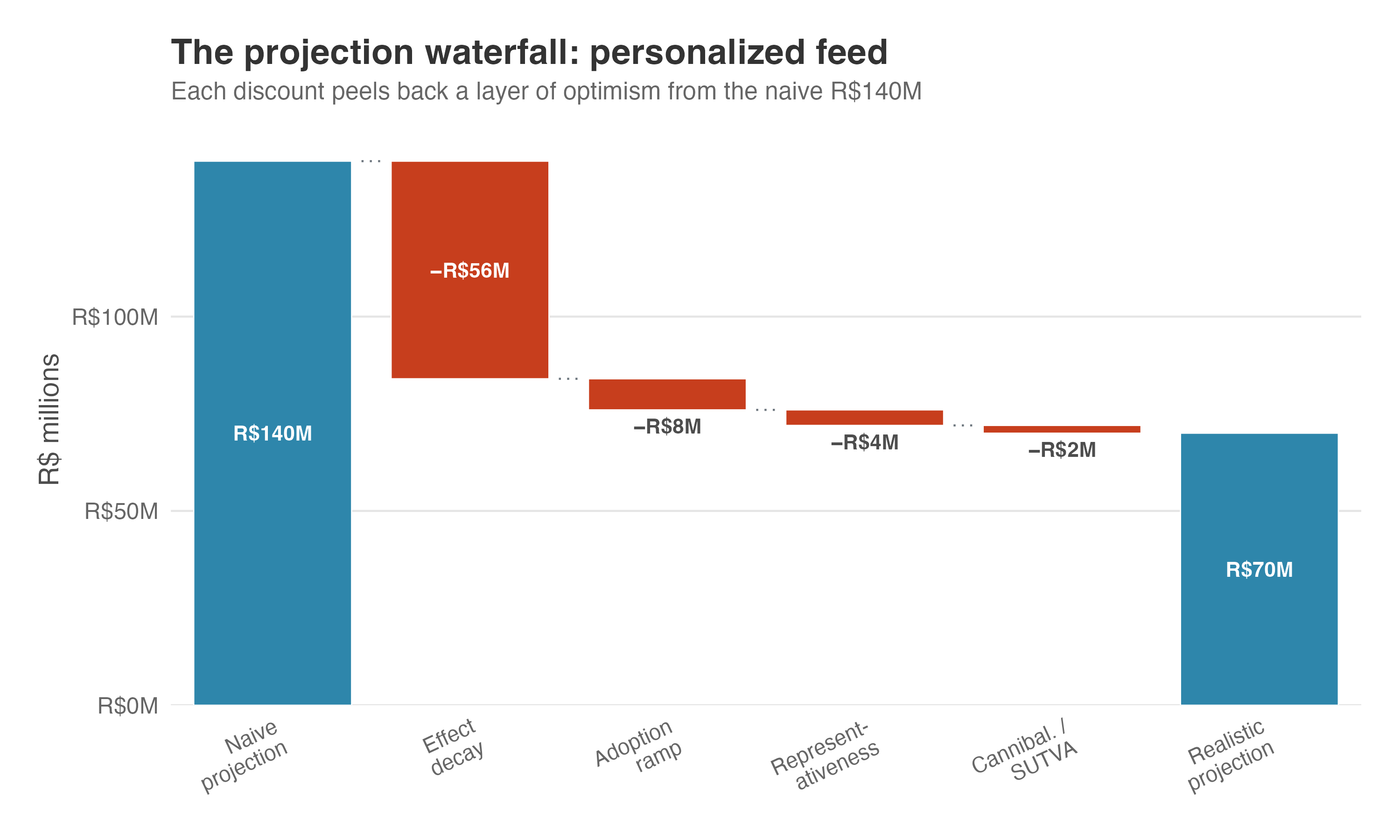
Estimate yours from pilot data and post-launch monitoring. The exact numbers matter less than the discipline of discounting before you present. A smaller, realistic number builds more trust than a large, naive projection that never materializes.
The naive R$140M has landed at roughly R$70M — still substantial, but honest. Does it justify the investment?
13.6 Does it justify the investment?
The headline metric is ROI — incremental value over cost. The tools below all serve the same question from different angles: sensitivity tells you whether the ROI survives stress, and breakeven tells you the minimum effect for ROI > 0. Each metric is defined from scratch, so no finance background is required — but the novelty is in how each connects to the causal estimate.
Daniel, reviewing the personalized feed numbers: “You’ve shown me the effect after we account for detractors. Now convince me this is worth the investment.”
Before we begin: every financial metric below is computed from the point estimate (R$2.34 per user per month). As we saw in Chapter 3, the 95% confidence interval spans [R$1.75, R$2.93] — so the ROI numbers in this section are themselves a range, not a point. We make that range explicit in the Carrying uncertainty through section.
13.6.1 Return on investment (ROI)
The Return on Investment (ROI) tells you how much net value you get back for each Real spent to implement and maintain the intervention. The formula is:
\[ \begin{aligned} \text{ROI} &= \dfrac{\text{Incremental Revenue} - \text{Variable Costs} - \text{Investment}}{\text{Investment}} \\[1.2em] &= \dfrac{\text{Incremental Net Profit}}{\text{Investment}} \end{aligned} \]
Two quantities in the numerator deserve names. Incremental profit is the causal lift in user-level profit: revenue minus variable costs, already measured by profit_30d in Chapter 3. Net profit is that incremental profit minus the fixed investment that made the experiment possible (build, infrastructure, one-time costs). ROI compares net profit to the investment that produced it.
If ROI is positive, the project pays back the investment and leaves value on top; if it is negative, the project does not recover its cost. Suppose an intervention creates R$6M in incremental profit after variable costs and costs R$4M to build. Net profit is R$2M, so ROI = R$2M / R$4M = 0.5, or 50%. To say that out loud: “For every R$1 invested, the project returned the R$1 and created another R$0.50 on top.” Now flip the result. If the same project creates only R$3M against the R$4M investment, net profit is -R$1M and ROI = -0.25, or -25%. Read aloud: “For every R$1 invested, the project returned only R$0.75, so we lost R$0.25 per Real invested.”
The recipe depends on the metric your experiment returns. If it returns revenue, first subtract variable costs to get incremental profit; if it already returns profit, as the personalized-feed experiment does, skip that step. Then subtract the fixed investment to get net profit, and divide by investment. When variable costs are negligible — as they often are for digital features where serving one more user costs almost nothing — revenue ≈ profit, and the first step disappears.
For the personalized feed, Daniel’s finance team estimates a total development and infrastructure investment of R$4 million. Where does that figure come from? Recall the stakeholder’s go/no-go threshold from Section 3.4: R$0.80 per user per month is the smallest lift that “covers the cost of building and maintaining the personalization engine.” Multiply that threshold by the user base — R$0.80 × 5M MAU = R$4M per month — and you have an illustrative build budget calibrated to recoup itself in roughly one month of threshold-level profit. The same R$4M leaves comfortable headroom over the full 12-month horizon: even at the threshold (and after 10% monthly decay), cumulative profit is ~R$28.7M, so any investment below ~R$28M still clears positive ROI. We sensitivity-test that envelope below.
The feed’s 20× ROI comes straight from the decay-adjusted profit calculation: ((R$2.34 \(\times\) (1 + 0.90 + \(\cdots\) + 0.90\(^{11}\)) \(\times\) 5M) - R$4M) / R$4M \(\approx\) (R$84M - R$4M) / R$4M = 20\(\times\). That headline sits inside a range: at the CI bounds [R$1.75, R$2.93], the annual ROI spans roughly 15× to 25×, a range we formalize in the Carrying uncertainty through section. First: how sensitive is this number to the assumptions behind it?
13.6.2 Sensitivity analysis
Daniel, still on the personalized feed: “Those cost numbers are guesses. How do the numbers hold up if you’re wrong?”
A 20× ROI still looks generous, but Daniel is right to push. Below, I vary fixed investment and monthly decay rate at 5M MAU and read off the resulting ROI. The code in the callout lets you push the user-base lever too.
| Fixed investment | 0% decay | 10% decay | 20% decay |
|---|---|---|---|
| R$4M | 34× | 20× | 13× |
| R$6M | 22× | 13× | 8× |
| R$8M | 17× | 9× | 6× |
Even under the most pessimistic scenario — R$8M fixed investment with 20% monthly decay — the feed still delivers a 6× return. That’s a robust business case. If your numbers don’t survive this kind of stress test, revisit your assumptions before presenting to leadership.
One more check: if your ROI calculation depends on estimated costs (as ours does), show how sensitive the result is to those assumptions. A robust conclusion should survive reasonable variation in the invented parameters. When a cost estimate is a guess, say so and show what happens when it doubles.
The table above stress-tests two of the assumptions — cost and decay rate — at a fixed user base. But there’s a second source of uncertainty: the effect estimate itself. In the Carrying uncertainty through section, we re-run these same financial calculations at the CI bounds to see how every metric holds up when we account for statistical uncertainty, not just parameter uncertainty.
Vanessa: “Before we commit three months of engineering time to the next experiment, can we know upfront whether it’s worth running?”
13.6.3 Breakeven analysis
A helpful back-of-the-envelope calculation: what’s the minimum effect you need for the plan to make sense? I call this the breakeven effect — the smallest per-user-per-period lift that covers the fixed investment cost. It’s a direct application of the cost-volume-profit break-even formula from managerial accounting (Horngren, Datar, and Rajan 2012, 91), applied here to experimentation:
\[ \text{Breakeven effect} = \dfrac{\text{Investment}}{\text{Users} \times \text{Effective periods}} \]
Read the denominator as user-periods — here, user-months — available to pay back the build. With no decay, 5M users over 12 months gives 60M user-months. If the build costs R$4M, each user-month needs to generate R$4M / 60M = about R$0.067 just to break even. That is the floor before decay shrinks the denominator.
Decay reduces the denominator because later months are not full-strength. Under geometric decay, month 0 counts as one full-strength month, month 1 counts as \(\lambda\), month 2 as \(\lambda^2\), and so on. That is why effective periods equals \(1 + \lambda + \cdots + \lambda^{T-1}\): it converts a decaying stream into the equivalent number of full-strength periods.
The result is still measured in the same units as the experiment’s ATE: R$/user/month in this example.
For the personalized feed, 10% monthly decay means \(\lambda = 0.90\). Over 12 months, the persistence sum is \(1 + 0.90 + \cdots + 0.90^{11} \approx 7.18\). The breakeven effect is therefore R$4M / (5M × 7.18) ≈ R$0.11 per user per month. The observed R$2.34 lift clears that line by about 21×.
Daniel, scanning the breakeven numbers: “R$0.11 per user to break even, R$2.34 measured. This one’s a no-brainer. But what about the three experiments I have lined up? How do I decide whether they’re worth running upfront?”
13.6.4 From breakeven to experiment design
ROI, sensitivity, and breakeven were all computed after the experiment returned a result. But you can make analogous calculations before collecting a single data point. Remember I promised we would be able to reject a bad investment before spending any money on it? Here’s how.
Think about what you already know at the design stage. Two separate questions sit on your desk: what can the experiment detect? and what would the business act on? The first comes from the power analysis in Chapter 5, which gives you the MDE — the smallest effect the experiment is powered to detect, given sample size, \(\alpha\), and target power. The second comes from the planning discussion in Chapter 3, which gives you the smallest lift stakeholders consider worth shipping: R$0.80 per user per month. That second threshold is the minimum effect of interest (MEI) Georgiev (2019).10
These two thresholds are separate inputs — MDE is a fact about your experiment, MEI is a fact about your investment. In a well-designed test, you choose the sample size so that MDE is no larger than MEI, saving resources where possible (smaller sample sizes, shorter test windows, and so on). Here, the MDE was set equal to the MEI; combined with the user base from your product team, those numbers are enough to answer the question: if the true effect is only as large as the MEI, does the project still make money?
The link is the breakeven effect we computed in the breakeven section above. Keep the three thresholds separate:
- The MEI is the business decision threshold: the smallest effect stakeholders would treat as worth shipping.
- The MDE is the statistical design threshold: the smallest effect the experiment is built to detect with the planned power.
- The breakeven effect is the financial threshold: the smallest effect that pays back the fixed investment.
Two design-stage checks fall out of this:
- Profitability check: MEI > breakeven effect. The smallest effect stakeholders would ship must clear the financial floor; otherwise even a “win” loses money.
- Power check: MDE ≤ MEI. The experiment must be powered to detect anything stakeholders would act on; otherwise a real, ship-worthy effect can slip below the detection threshold.
If both are true, the experiment is designed around an effect that is both detectable and profitable. If the MEI sits below breakeven, the stakeholder threshold is too low for this investment: a statistically significant result could be real and still not pay for the build. If the MDE sits above the MEI, the experiment is too underpowered for the business question: it might miss an effect that would have been worth shipping.
This is the direct connection between the power analysis in Chapter 5 and the business case here. Power analysis should answer the business question, not only the statistical one.
The personalized feed passes both checks. The breakeven effect is about R$0.11 per user per month, while the MEI — and the MDE we set equal to it — is R$0.80. Dividing one by the other, R$0.80 / R$0.11 ≈ 7, so the smallest effect the experiment was designed to detect sits about 7× above the breakeven line. The observed R$2.34 lift sits even higher, at roughly R$2.34 / R$0.11 ≈ 21× breakeven.
That gap matters because of the winner’s curse: when you only ship experiments that clear significance, you’re partly selecting on noise, so the winning estimates tend to overstate the truth. In this scenario, the R$2.34 we measured is more likely inflated than deflated — the lift you’d actually see in production may be smaller.
The design-stage buffer gives you room to absorb that shrinkage. Even if the true effect turns out to be, say, half of R$2.34, it still clears breakeven by an order of magnitude; and even if it shrinks all the way down to the MEI, you’re still ~7× above the financial floor.
Daniel: “So you’re telling me we can rule out bad investments before we even run the experiment? That’s an analysis I’d like to see on every proposal.”
Make this concrete. Before running the experiment, you know three things: the stakeholder’s MEI (R$0.80 per user per month, from Chapter 3), the investment cost (R$4M), and the user base (5M MAU). That’s enough to project ROI under the conservative assumption that the true effect is exactly the MEI — the smallest effect stakeholders would act on.
The MEI is roughly 7× the breakeven effect, and the MDE was set to match it. Even under the most conservative reading — the true effect is exactly the MEI — the project still clears the bar with a projected ~6× ROI. That’s the pre-experiment sanity check: the effect you care about is not only detectable, but profitable. If the MEI had landed below the breakeven effect, the business threshold would be too low for the investment, and you’d reduce the fixed cost, renegotiate the threshold with stakeholders, or revisit the proposal. If the MDE had landed above the MEI, the experiment would be underpowered for the business question, and you’d need a larger sample or longer run to lower the MDE.
Every number so far is a point estimate built on a point estimate. The final analytic step: carry the uncertainty through so decision-makers see the range, not just the point.
13.7 Quantifying uncertainty around the metrics we care about
Vanessa: “What if the test comes back borderline significant, say at p = 0.045? This still means we should ship, right?”
The answer is “not necessarily”. A low p-value tells you the effect is unlikely to be zero, but says nothing about whether it is large enough to cover the cost of building, shipping, and maintaining the feature. The gap between “statistically significant” and “economically profitable” stays open even when the point-estimate ROI clears the bar — the real question is whether the plausible range of effects also stays above breakeven.
13.7.1 The p-value trap and ROI confidence intervals
Imagine the personalized feed experiment had returned an ATE of R$0.15 instead of R$2.34 — statistically significant at \(p = 0.03\), and just above the R$0.11 breakeven threshold. The point estimate looks like a green light. But the 95% CI runs from R$0.05 to R$0.25, and its lower bound sits below breakeven. Every value inside that interval is plausible, including R$0.05 — so a team that celebrates the p-value and the point estimate alone could be shipping a feature that loses money.
As we covered in Chapter 5, a p-value quantifies the probability of observing your data if the true effect were zero. It is a detection tool, not a valuation tool. The business question you should be interested in is not “is the effect nonzero?” but “is the effect large enough to pay for itself?” Always compare the effect size against its breakeven threshold, not just against zero. If the CI straddles breakeven, the most honest translation is: “We can’t be confident this pays for itself.”
The personalized feed avoids that trap. Recall that breakeven for this build is R$0.11 per user per month (from Section 13.6). When ROI is a strictly monotone function of the effect — which is the case here, since the effect just multiplies fixed scalars (MAU, CLV multiplier, time horizon, compliance rate) — a CI for the effect maps directly into a CI for ROI. Plug the CI bounds into the same formula, read off the range, and you’re done. This is the plug-in method: it works because the invariance property of confidence intervals under monotone transformations preserves coverage exactly — no information is lost (Casella and Berger 2002; Deng, Knoblich, and Lu 2018).
In our feed example, the 95% CI runs from R$1.75 to R$2.93 per user per month — well above the R$0.11 breakeven threshold. Pushed through the 12-month decay factor (~7.18 effective months) and the 5M-user base, that becomes a profit range of R$1.75 × 5M × 7.18 ≈ R$63M to R$2.93 × 5M × 7.18 ≈ R$105M. Against the R$4M build, even the lower bound delivers (R$63M − R$4M) / R$4M ≈ 15× ROI; the upper bound, (R$105M − R$4M) / R$4M ≈ 25× ROI. The CI doesn’t just clear breakeven — it clears it by an order of magnitude at its worst.
The bracketed CI range carries statistical uncertainty through the decay-only formula. It does not apply the additional illustrative waterfall discounts for adoption, representativeness, and cannibalization to the CI bounds; applying the same three planning haircuts to both bounds would give a full-waterfall range of roughly R$52M–R$87M.
Notice how this differs from the sensitivity analysis earlier, which asked: what if our cost assumptions are wrong? Here we’re asking a different question: given the statistical uncertainty in the effect itself, what range of financial outcomes should we expect? Both matter. The sensitivity table tests your assumptions; the CI table tests your data. A robust business case survives both.
The plug-in method works for the personalized feed because a single causal estimate drives the entire financial formula and the CI sits comfortably away from zero. When that’s not the case — multiple correlated uncertain inputs, a ratio metric whose denominator can approach zero, or a finance team that demands formal confidence bands — Appendix 13.C covers the delta method and Monte Carlo simulation as more rigorous alternatives. The quick test: is your financial metric a monotone function of the treatment effect, with the effect CI comfortably away from zero? If yes, plug in the bounds and move on.
Here the answer is unambiguous: even the lower bound of the confidence interval sits firmly above the breakeven threshold. When that happens, ship it.
13.7.2 The ship vs kill decision matrix
But what if the picture isn’t this clean? Table 13.1 codifies the logic — pin it to your wall. The criterion isn’t how wide the interval is; it’s the margin of safety — by how much the worst plausible scenario (the CI lower bound) clears breakeven.
| Where the 95% CI sits relative to breakeven | Margin of safety | Recommendation |
|---|---|---|
| Lower bound clears breakeven with room to spare | Comfortable | Ship — full rollout |
| Lower bound clears breakeven by a thin margin | Thin | Ship — stage the rollout, keep a holdout, monitor closely |
| CI straddles breakeven (lower bound below) | Negative — downside is real | If this is a strategically important project, consider sizing the bet small — limited rollout; extend the test only if the value of more data justifies the delay |
| Upper bound below breakeven | None — no plausible profit | Kill — no plausible scenario is profitable |
The personalized feed falls in the first row of Table 13.1 — its lower bound clears the breakeven threshold by a wide margin. Most real-world experiments aren’t this clean and land in the middle rows, where the decision requires judgment, not just arithmetic.
Vanessa: “What if my team spends four months building a feature, and the A/B test still doesn’t show enough upside to clear our breakeven point? What do I tell them — and how do I keep morale from dropping?”
The ship decision is the easy half — when the lower bound of the CI clears breakeven by a wide margin, you go. The kill decision is harder: when the upper bound of the CI doesn’t justify the investment, the project is mathematically doomed under any reasonable scenario, and saying “no” is the hardest and most valuable translation you can make. Killing early saves more than money — it saves the engineering time that would’ve been sunk into a doomed project. Here’s what “kill” looks like in practice:
- Document why — not just “the CI includes zero” but “even the upper bound of R$0.25/user doesn’t cover the R$0.11 breakeven threshold, so this feature cannot pay for itself under any plausible scenario.” Write the “kill memo” to be defensible: state the threshold, the bound that violates it, the sample size, and the period covered, in language a non-technical executive can quote without translation.
- Redirect the team — killing a project without reassigning the engineers leaves them in a limbo. Name the next-highest-priority opportunity in the same meeting — every week of ambiguity costs goodwill you will need on the next bet. The experiment killed itself; the team did the job they were asked to do, which is why you trust them with the next problem.
- Catalog the learning — a negative result is not a waste. You now know this lever doesn’t work, which narrows the search space for what will. Record the hypothesis, the design, the effect size and confidence interval, the breakeven you compared against, and the mechanism that most likely explains the null — then make it searchable. The next person tempted by a similar idea should find your write-up before they spend three months rediscovering what you already know. The institutional knowledge is valuable; the sunk cost is not.
Frame the kill as a redirect, not a kill, so it lands as a decision about the roadmap, not the team’s work. Walk into the meeting with the next bet already named; the kill memo and the redirect belong in the same email. That’s the answer to Vanessa’s question.
13.7.3 Sizing the bet to match uncertainty
The third row of Table 13.1 is where most real-world experiments land. The CI straddles breakeven, the point estimate is positive, and the statistical instinct is to run the test longer and shrink the interval. That instinct ignores two costs: every additional week is a week of foregone uplift if the feature works, and a week the engineering squad is held in place when it could be on the next problem.
The expected value of perfect information (EVPI) puts a number on those costs (Raiffa and Schlaifer 1961). EVPI is the profit you would capture if you knew the true effect today and could act on it. When the decision would not change — a ship is still a ship, a kill is still a kill — EVPI is zero and any extension is wasted time. When the decision could flip, EVPI is positive and the wait may pay for itself.
The personalized feed sits at EVPI = 0: the CI lower bound (R$1.75) clears breakeven (R$0.11) by 16×, so the decision is the same wherever in the interval the truth lies. The hypothetical R$0.15 ATE from the p-value trap above sits at EVPI > 0 — its lower bound is below breakeven, so perfect information could change a ship into a kill.
Set EVPI against the cost of waiting. Using the post-waterfall R$70M annual projection, the feed generates ~R$190K/day, so a two-week extension forfeits ~R$2.7M of rollout — ~R$3.2M against the decay-only R$84M figure. For the feed, the verdict is unambiguous: any delay is wasted. For the borderline R$0.15 case, two more weeks of data have to deliver more than R$2.7M of decision value before they are worth the wait.
When EVPI is positive and waiting is too expensive, the answer is neither to wait nor to roll out to everyone: size the rollout to match what you actually know. Cap initial exposure at 10–20% of traffic, ship a thin MVP rather than a full engineering build, and tie progression to a pre-committed guardrail — for example, double the exposure once the rolling CI lower bound stays above breakeven for two consecutive weeks, and freeze or pull back if a retention or risk metric crosses a threshold set in advance. The rollout schedule becomes the experiment continuation: the data keep arriving while the business keeps capturing whatever uplift is real.
13.8 The one-pager
Executives appreciate consistency. Standardize your results as per-user incremental profit and per-Real ROI. Pair the numbers with a short narrative that makes the translation explicit. Every question Daniel and Vanessa have asked throughout this chapter maps to a row in a one-pager. Here’s one using the personalized feed experiment:
What we changed (i.e., what was the intervention): Replaced the standard homepage layout with an AI-curated personalized product feed for all users.
Causal effect (i.e., what was the impact of the intervention): ATE = R$2.34 per user per 30 days (95% CI: R$1.75 to R$2.93). The result is robust to controls for user tenure, prior purchases, and pre-treatment profit (Chapter 3).
Business translation: At 5 million MAU, post-waterfall 12-month incremental profit: ~R$70 million (R$84M after 10% monthly decay, then ~R$70M after adoption ramp, representativeness, and cannibalization haircuts; decay-only sensitivity range R$55–108M reflecting 5–20% decay). Incremental net profit (after the R$4M investment): ~R$66 million. Statistical uncertainty range (95% CI): R$63–105M on the pre-investment, decay-only line — roughly R$52–87M after the full waterfall. Without any discounts, the naive projection is R$140 million — exactly the overstatement we warned against earlier.
Investment: R$4 million (development + infrastructure). Illustrative figure: R$0.80/user MEI × 5M MAU = R$4M, i.e., one month of MEI-level profit covers the build.
ROI: ~16–17× annual return on the post-waterfall projection (~20× before the additional adoption / representativeness / cannibalization haircuts). Even at the post-waterfall CI lower bound: ~12× ROI.
Key risks:
- Effect may decay faster than the 10% monthly rate assumed above; at 20% decay, decay-only annual profit drops to ~R$55 million (before the waterfall haircuts)
- Seasonal variation not captured in the 30-day experiment window
- Cannibalization from other surfaces not measured
Recommendation: Full rollout with monthly monitoring of per-user profit and a 5% holdout group for long-term decay measurement.
The one-pager works for a single analysis while dashboards can extend the same idea across many. For the latter, keep the structure: context → effect in R$/user → total effect in R$ → recommendation → risks, and apply it to every experiment in the same format.
For organizations running dozens of causal studies a quarter, what makes those comparisons honest is a shared OEC (Section 4.2.2) — without one, no two one-pagers are really measuring the same thing (Kohavi, Tang, and Xu 2020).
Two caveats are worth stating before we move on. First, ROI is an input to a decision, not the decision. Regulatory risk, competitive response, and ethical considerations all live outside the spreadsheet, and the pipeline doesn’t pretend otherwise. Second, not every decision deserves this level of analysis. The pipeline is built for high-stakes, high-value bets; for smaller ones a lighter touch is fine, and knowing when to scale back the rigor is itself a form of calibration.
That’s the forward-looking pipeline — projection, discounts, one-pager, portfolio. What we don’t know yet is whether any of it survives contact with reality. Will a R$70M projection actually land near R$70M in the bank? Six months of production data will tell you.
13.9 Six months later: validating your forecasts
A theory only earns trust when we use it to make a prediction and then check that the prediction tracks what actually happened. The same discipline separates our recommendations to the business team from guesses: if our causal estimates are useful, they have to survive a meeting with reality a few months later, and when they don’t, the gap helps us learn which part of our reasoning was off.
This is also where the careful pipeline we designed earns its keep against the shortcuts and naive analyses we warned about earlier in the book. A waterfall that lays out each discount line by line is not always accurate, but it is at least auditable.
Most of this book lives in the past tense, because a causal estimate is a statement about what already happened: we ran an experiment on a sample during some period, and the average effect was R$2.34 per user per month — a claim about history.
Business decisions, by contrast, live in the future tense: “should we roll this out to 5 million users next quarter?” calls for a forecast under conditions you have not yet observed — a larger population, a longer time period, a different competitive landscape. The whole job of the pipeline is carrying the rigor of the past forward without losing honesty about what it can and cannot tell you about the future.
This section is the test of whether that translation worked. Let’s say six months after rollout, the finance team pulled the actuals. The personalized feed’s aggregated lift had settled at R$65M — not the R$70M the waterfall projected, but close enough that the gap was diagnostic, not embarrassing. Actuals never line up with a forecast on the nose; if they did, you’d be suspicious of the bookkeeping.
The naive projection — R$140M, the number the team would have presented without the pipeline — missed by more than 2×. The careful projection, the one that survived every discount in the waterfall, came in within ~7% of reality: close enough to plan against, far enough to remind you that no waterfall is exact. Not because any single assumption came from rigorous theory, but because each one reflected a common-sense heuristic about what tends to happen when a project meets the real world. Those patterns don’t need much science, they just need someone willing to bake them into the forecast before presenting it.
Walk through the waterfall retroactively:
Decay was the biggest single miss. The holdout group (Appendix 13.B) revealed \(\lambda = 0.88\) versus the assumed 0.90 — a small change in the per-month persistence parameter, but compounded over twelve months it shaved roughly 9% off the forecast on its own. The team caught this at month 2 — because the holdout existed — and adjusted the running forecast in real time.11 Without that early warning, they would have discovered the gap at month 6, too late to update resource allocation and too late to avoid awkward questions from the board.
Adoption ramp was less costly than planned. The server-side rollout reached full exposure faster than the conservative waterfall assumed; the realized ramp penalty came in around 5% versus the 10% the waterfall built in. The haircut turned out to be too pessimistic because the ramp came from rollout policy, not user opt-in friction — a useful note for next quarter’s projections, where the default 10% haircut on server-side launches can probably be trimmed.
Cannibalization was underestimated. The feed pulled some purchases from the search page, costing roughly 5% of projected value versus the 3% assumed in the waterfall. Post-hoc analysis revealed the mechanism: the feed surfaced products users would have found via search anyway — a substitution effect the experiment’s within-user design couldn’t isolate. The lesson for next time is to instrument cross-surface tracking before launch.
The misses didn’t fully cancel. Faster decay and heavier cannibalization both pushed downward; the lighter-than-planned rollout penalty pushed the other way but didn’t quite close the gap. Net: ~7% below the waterfall — well inside the noise band, and a fraction of the ~50% gap the naive projection would have opened. This is the central payoff of the pipeline. You don’t need each assumption to be perfect; you need each one to be honest and independently estimated, so that when the actuals come in you can read the residual line by line and learn from it. The waterfall lost on decay, won on rollout, lost on cannibalization, and the team walks into next quarter knowing where to tighten the screws.
Now consider the counterfactual. Had the team presented the naive R$140M, the board would have expected R$140M. At R$65M actual, the conversation would have been about a 54% miss — what went wrong, who promised what, why the model was so far off — not about a successful product launch. The same outcome, reframed as a failure, because the projection was lazy.
The pipeline isn’t a crystal ball. It’s a discipline. The team that presents R$140M and delivers R$65M loses credibility. The team that presents R$70M and delivers R$65M earns a seat at the next planning meeting — and a working diagnostic of which discount to recalibrate before the next forecast.
This is the habit to take from the chapter, if you take only one: every projection you present deserves a scheduled rematch with the actuals. Not as a performance review, and not to assign blame — but because that rematch is the only way you learn which discount in your waterfall was too optimistic and which was too harsh. A forecast that lands within 10% means something different from one that misses by 2×, and both mean something different from one that landed by luck after offsetting errors canceled each other out. The decay holdout (Appendix 13.B) is the same discipline at a shorter cadence: you don’t have to wait six months to start comparing predicted against actual. Bake the comparison into the monitoring plan from day one, and every future projection inherits a little more calibration than the last.
13.10 Wrapping up and next steps
The pipeline works not because any single discount is exact, but because the discipline of discounting before presenting keeps you within striking distance of reality.
We’ve covered a lot of ground. Here’s what we’ve learned:
- Identify the estimand. ATE, ITT, LATE, ATT, and CATE answer different business questions; presenting the wrong one kills good features and scales bad ones.
- Map statistical units to business units. The naive per-user × MAU × 12 multiplication is always the starting point and almost never the ending point.
- Build the projection waterfall. Decay, diminishing returns, adoption ramps, representativeness, and cannibalization each peel a layer of optimism off the naive projection.
- Compute investment metrics. ROI tells you how much, breakeven tells you the minimum effect you need, and EVPI tells you how much more information is worth.
- Propagate uncertainty through CI bounds. Every financial metric inherits the CI of the effect. When the lower bound clears breakeven, ship; when the upper bound doesn’t, kill; when the CI straddles, size the bet to match your uncertainty.
- Write the one-pager. A statistically significant causal effect is not a profitable investment — and the one-pager is where that distinction lands on someone’s desk in five minutes.
Each step feeds the next. Skip one and the downstream numbers inherit the gap.
At this point, you should retain this step-by-step discipline before presenting any translated number:
- Which estimand did my method produce, and does it match the business question I’m being asked?
- What layers of discount have I applied to the naive projection, and which one am I least confident in?
- Does the lower CI bound clear breakeven? Does the upper bound? What does that imply for the ship/kill/size decision?
- Which assumption in the chain (Appendix 13.B) is the weakest link, and have I stress-tested it before presenting the final number?
- What did I deliberately leave out (Appendix 13.D), and does the reader know where the map ends?
- Does the one-pager land in five minutes on a busy executive’s desk?
But all of this assumes your upstream estimate is correct. If the parallel trends assumption behind your DiD does not hold, or an unobserved confounder invalidates your IV, every downstream number inherits the bias. The next chapter covers falsification tests — the toolkit for stress-testing your own estimates before someone else does it for you. The translation pipeline only works if the input is trustworthy; falsification is how you earn that trust.
The team that presents R$70M and delivers R$65M earns trust. They also earn the right to propose the next R$70M project.
Appendix 13.A: Estimand-method reference table
The translation pipeline starts with knowing which estimand your method produces. A 3× ROI from an RCT and a 3× ROI from an RDD are not the same claim. One applies to everyone; the other only to the marginal case. Find your method in the first column; read across to learn what you can — and what you cannot — say about who benefits.
| Method | What you estimated | Who it applies to | Scaling rule | Watch out for |
|---|---|---|---|---|
| Experiment (Ch 4) | ATE (or ITT if partial take-up) | Full eligible population | Scale directly to user base; plan a holdout to measure long-run decay and drift | If take-up is partial, also report LATE = ITT / compliance rate as a per-complier measure |
| Instrumental variables (Ch 7) | LATE for compliers | Only those who change behavior when the instrument changes | Multiply by expected complier share in production; report ITT and LATE separately | State the monotonicity assumption plainly — the instrument moves people in one direction only |
| Regression discontinuity (Ch 8) | Local effect at the threshold | Marginal units near the cutoff — not the full population | Use to optimize thresholds and simulate policy ROI at the margin | Generalizing far from the cutoff requires strong extrapolation assumptions |
| Difference-in-differences (Ch 9–10) | ATT over time | Treated group (or cohort) | Sum effects across event-study periods, not just the first difference | For staggered adoption across different groups, avoid basic models that improperly mix up early and late adopters |
| Time series (Ch 11) | Cumulative causal impact over the campaign window | Aggregate market or region | Sum per-period effects over the campaign window; net out seasonal variation | Don’t confuse the peak daily effect with the cumulative total |
| Heterogeneous effects (Ch 12) | CATE for subgroups | Specific user segments similar to those in your test | Target high-CATE segments; do not predict effects for user types you haven’t tested | Sample splitting is required — you can’t use the same data to discover and validate heterogeneity |
To see what these caveats look like in practice: the RDD in Chapter 8 estimated ~R$4,241 in incremental secondary revenue per complier — enough to offset default costs — but that effect is local to the threshold, so use it to optimize the cutoff, not to forecast revenue across all borrowers. Similarly, the DiD in Chapter 9 averaged R$2.99M per month in sales, but the event-study coefficients sum to R$14.21M — not R$2.99M × 4. When translating DiD to ROI, sum the per-period effects rather than multiplying the aggregate.
Appendix 13.B: What the translation pipeline assumes
Every method chapter in this book names the assumptions that must hold for the estimate to be credible. The translation pipeline is no different — it inherits the identification assumptions from your causal method and layers on a new set of financial projection assumptions. Here is what must be true for the output to be trustworthy.
1. The upstream causal estimate is valid
The entire pipeline inherits whatever bias exists in the original experiment or quasi-experiment.
What happens if violated: If parallel trends don’t hold in your DiD, or an unobserved confounder invalidates your IV, every downstream financial number is wrong — not approximately wrong, but systematically biased in one direction.
How to check: Run the falsification tests in the next chapter before translating. At minimum: a placebo test, a pre-trend check, or a sensitivity analysis to unobserved confounders.
2. Effect decay is predictable
We model decay as a fixed monthly effect-persistence factor (\(\lambda\)). The main text used \(\lambda = 0.90\) — a 10% monthly decay — as a starting assumption, but in practice decay rarely follows a single fixed rate. Novelty effects often erode faster in the first weeks and stabilize later (a concave decay curve), some behavioral changes persist indefinitely (a plateau), and different user segments decay at different speeds — power users may keep the effect far longer than casual ones.
What happens if violated: The projection waterfall prices in one decay scenario. If the actual decay is faster, cumulative value drops sharply — a 20% monthly decay rate halves the 12-month projection compared to 10%. Because the CLV formula compounds \(\lambda\) over every period, small errors in the decay rate grow large over the projection horizon.
How to estimate \(\lambda\): The approach depends on what data you have.
If you can run a holdout (the gold standard): After the experiment concludes, keep 5–10% of treated users in a “persistent treatment” group while rolling out to the rest. Measure the per-user effect at 30, 60, 90, and 120 days by comparing the holdout to a matched control group. If the effect at month 0 was R$2.34 and at month 3 it’s R$1.70, the effect is decaying — and you can estimate the rate.
The idea is straightforward: if the effect decays geometrically (\(\text{Effect}_t = \text{Effect}_0 \times \lambda^t\)), then taking the log of both sides gives a linear relationship:
\[ \log(\text{Effect}_t) = \log(\text{Effect}_0) + t \cdot \log(\lambda) + \varepsilon \quad \Rightarrow \quad \hat{\lambda} = \exp(\hat{\beta}_1) \]
Regress the log of each observed effect on time. The slope gives you \(\log(\lambda)\); exponentiate to recover \(\hat{\lambda}\). The standard error of the slope gives you a confidence interval for \(\lambda\) — which tells you how much trust to place in a single decay rate.
If you can’t run a holdout (common for one-shot campaigns like the TV example): Use the within-experiment trajectory as a noisier fallback. Does the per-user effect shrink across the days of the experiment? If the daily treatment effect starts at R$22M on day 1 and trends down to R$18M by day 30, that daily trend gives you a starting estimate that you can convert to monthly. The estimate will be noisier because within-experiment variation confounds the decay signal, but it’s better than guessing.
The code below simulates a five-month holdout where the true effect-persistence factor is \(\lambda = 0.88\) and recovers the estimate from a simple log-linear regression. This is the template you’d use with real holdout data — replace the simulated values with your observed per-period effects.
How to interpret the result: In this simulation, the regression returns \(\hat\lambda \approx 0.88\) with 95% CI close to [0.84, 0.91], so the assumed value of 0.90 sits right at the upper edge of the interval. If the CI is narrow and comfortably contains your assumed \(\lambda\), the sensitivity table at Section 13.6.2 confirms the projection — you can move forward with confidence. If the CI barely contains or excludes your assumption — as here — weight the pessimistic scenarios more heavily in your financial projections.
One final note: the constant-decay model (\(\lambda^t\)) is a starting point, not the final word. When you have 90+ days of holdout data, fit a more flexible curve — a piecewise model or a nonparametric smoother — before locking in your CLV projection. The constant-rate model may overstate decay in the early months (when users are still adjusting) and understate it later (when the novelty has fully worn off). If the shape of your observed decay curve doesn’t look geometric, the model needs to evolve with your data.
3. Treatment scales without saturation
Projecting a per-user effect to \(N\) million users assumes no diminishing returns, no supply constraints, and no market-wide ripple effects (general equilibrium effects).
What happens if violated: If the treatment works because few people use it (scarcity, exclusivity), scaling destroys the mechanism. The projection waterfall’s “diminishing returns” discount is a rough hedge — not a guarantee.
How to check: Ask whether the treatment’s mechanism depends on adoption level. Network effects, marketplace dynamics, and capacity-constrained features all violate this assumption. Flag these explicitly in the one-pager.
4. Costs are known and stable
ROI divides incremental value by investment cost.
What happens if violated: If development costs overrun, maintenance costs grow, or the experiment cost structure doesn’t match the rollout cost structure, the actual ROI will differ from the projected one. A 2× cost overrun cuts ROI in half.
How to check: Get cost estimates from engineering and finance, not from the experiment protocol. Include ongoing maintenance, not just build cost. Use ranges when point estimates are unreliable.
5. No cannibalization across products or time periods
We assume the treatment effect is additive — it doesn’t steal value from another product, channel, or time period.
What happens if violated: A new recommendation algorithm may increase purchases on the homepage by cannibalizing the search page. A flash sale may pull forward demand from next month. In both cases, the measured effect overstates the net business impact.
How to check: Look at adjacent metrics. Did the treated group’s behavior change on surfaces not touched by the treatment? Did post-experiment periods show a compensating dip? If your experiment measured only one outcome, this risk is invisible.
6. Metric definitions are stable
“Monthly Active Users,” “revenue per user,” and “profit per user” must mean the same thing in the experiment window and the projection window.
What happens if violated: Seasonal shifts in user composition, changes in pricing, or redefinitions of the metric can silently invalidate the mapping from statistical to financial units. You end up multiplying the right effect by the wrong denominator.
How to check: Confirm metric definitions with your data engineering and finance teams. Check whether the experiment ran during a representative period — holiday seasons, promotional windows, and onboarding surges can all shift the baseline.
The credibility cascade
The six assumptions above form a chain, and the business translation is only as strong as its weakest link. A valid causal estimate fed through accurate metrics with realistic decay and honest cost accounting produces a trustworthy projection. But a single broken assumption — a biased estimate, an optimistic decay rate, or an underestimated cost — propagates through the entire pipeline. The bias doesn’t average out; it compounds. An optimistic decay rate inflates the CLV, which inflates the ROI, which inflates the recommendation — and by the time the forecast misses, nobody remembers which link broke first.
Before presenting the final number, ask yourself: which assumption am I least confident in? That’s the one to stress-test first. If the answer is “the upstream causal estimate,” no amount of financial sophistication downstream can save the projection. If the answer is “the decay rate,” run the holdout analysis in Assumption #2 before committing to a number. The translation pipeline rewards honesty about what you don’t know — and punishes overconfidence in any single link.
Appendix 13.C: Propagating uncertainty beyond the plug-in method
The main text used the plug-in method to propagate uncertainty: take the CI bounds of the effect, re-run every financial formula at each bound, and report the resulting range. That works when the financial metric is roughly linear in the treatment effect — which covers most practical cases. But three situations break the plug-in logic, and when they arise, you need heavier tools.
When plug-in breaks down:
Joint uncertainty in multiple parameters. If the effect size, decay rate, and compliance rate are all uncertain, plugging in the worst case for each simultaneously overstates the downside. The joint worst case — low effect and fast decay and low compliance — is far less probable than any single worst case. The plug-in method has no way to account for the correlation (or independence) between these uncertainties.
Nonlinear transformations. Most metrics in this chapter enter linearly: ROI \(= (\text{effect} \times \text{scale} - \text{cost}) / \text{cost}\). But some don’t — hyperbolic transformations like cost-per-unit-effect (\(\text{cost} / \text{effect}\)) are nonlinear, and when the effect is small, a tiny change in the denominator produces a large swing in the output. This creates asymmetric intervals: the worst case stretches much further from the point estimate than the best case shrinks toward it. Metrics defined implicitly can behave similarly.
Very wide confidence intervals, and ratio metrics whose denominator approaches zero. When the CI spans a large fraction of the point estimate, the monotone approximation that makes plug-in work starts to bend. More sharply: any ratio metric — cost over effect — is fragile when the effect CI gets close to zero, because the plug-in interval loses nominal coverage and can become unbounded. Use plug-in on ratio metrics only when the effect CI is comfortably away from zero; otherwise reach for delta or Monte Carlo. (This is the classical ratio-of-means interval-estimation problem; the canonical treatment is Fieller (Fieller 1954), and online experimentation runs into it whenever a borderline-significant effect drives a derived business metric.)
Tool 1: The delta method. If your financial metric is a smooth function \(g(\hat\theta)\) of the effect estimate \(\hat\theta\), the delta method gives you an analytic confidence interval using a first-order Taylor expansion (Deng, Knoblich, and Lu 2018):
\[ \text{Var}\big(g(\hat\theta)\big) \approx \big[g'(\hat\theta)\big]^2 \;\text{Var}(\hat\theta) \]
In words: compute the derivative of your financial formula with respect to the effect, evaluate it at the point estimate, and multiply by the variance of the effect. The square root gives you the standard error of the financial metric, and from there you build a CI in the usual way.
This works well when you have a closed-form formula — ROI or CLV — where the derivative is straightforward to compute. It handles mild nonlinearity better than plug-in because it accounts for the curvature at the point estimate. But it’s still a local approximation: it assumes the function is well-behaved in the neighborhood of \(\hat\theta\), and it handles only one source of uncertainty at a time.
Tool 2: Monte Carlo simulation. When you need the full picture — multiple uncertain parameters, arbitrary nonlinearities, or the complete distribution of a financial metric rather than just a two-number interval — simulation is the way.
The recipe:
- Draw \(N\) samples (say, 10,000) from the sampling distribution of the effect. If you have a frequentist CI, draw from \(\mathcal{N}(\hat\theta, \hat\sigma^2)\). If you used a Bayesian method like CausalImpact, draw from the posterior directly.
- For each draw, optionally draw the decay rate from its own distribution (if you estimated it with uncertainty as in Appendix 13.B).
- Compute the financial metric — ROI or CLV, whatever you need — for each draw.
- Report the 2.5th and 97.5th percentiles of the resulting distribution as your 95% interval.
This approach handles everything the delta method can’t: joint uncertainty in multiple parameters, non-smooth transformations, and skewed outputs. It also gives you the full shape of the ROI distribution — so you can answer questions like “what’s the probability that ROI falls below 1×?” rather than just “what’s the worst case?”
When is the extra effort worth it? Three cases: (1) a finance team demands formal confidence bands on the ROI projection, not just “worst case / best case”; (2) you have joint uncertainty in the effect, the decay rate, and the compliance rate, and you need to propagate all three simultaneously; or (3) you’re ranking a portfolio of experiments and need the full ROI distribution for optimal resource allocation. For the single-experiment, single-uncertain-parameter setting that covers most practitioner work, the plug-in method remains the right call.
Appendix 13.D: What this chapter simplifies or omits
- Tax and accounting effects. We compute pre-tax figures throughout — both profit and net profit — and ignore corporate tax. In practice, tax shields, depreciation of development costs, and accounting treatment of R&D can shift the ROI calculation materially — consult your finance partner.
- Portfolio effects. We evaluate each project independently. In reality, projects interact — a new feature may cannibalize or complement another. Full portfolio optimization across experiments, roadmap bets, and maintenance is a separate discipline.
- Long-term effect estimation. We use a fixed decay rate (\(\lambda\)) as an assumption. Formally estimating long-term effects from short study windows is an active research area — see Tran, Bibaut, and Kallus (2024) for methods that connect short-run experiments to long-run outcomes using doubly-robust estimators.
- Organizational readiness. The translation pipeline only works if the organization is set up to act on it. Building a culture of experimentation — where data trumps opinions and failure is tolerated — is a prerequisite that no formula can substitute. Thomke (2020) and Kohavi, Tang, and Xu (2020) are excellent starting points.
- Competitive response. If a feature delivers strong results, competitors may replicate it — eroding your advantage over time. The decay parameter captures organic effect erosion, not strategic response.
- Heterogeneous decay rates. We use a single \(\lambda\) for all users. Power users and casual users may keep the effect at different rates — the aggregate decay rate masks this variation.
- Measurement error in the causal estimate itself. The entire pipeline assumes the upstream causal estimate is unbiased. If identification assumptions fail (e.g., unobserved confounders, SUTVA violations), all downstream financial projections inherit that bias. The chapters on falsification and mechanisms address this.
- Currency and inflation. All projections are in nominal reais. For multi-year projections in a high-inflation environment, discount at real rates or adjust for expected inflation — nominal figures overstate future purchasing power.
As Google advises, “NotebookLM can be inaccurate; please double-check its content”. I recommend reading the chapter first, then listening to the audio to reinforce what you’ve learned.↩︎
We will call incremental profit in this chapter revenue minus variable costs per user, the same quantity we worked with in Chapter 3.↩︎
Some books distinguish prediction from forecast. A prediction estimates the value of an outcome given inputs — an ML model predicts churn probability. A forecast projects forward in time, estimating future values based on past behavior, external drivers, or assumptions.↩︎
P&L or Profit and Loss summarizes revenue (money coming in) minus costs (money going out) over a specific time period. When a finance leader asks about the “P&L impact”, they are asking: where on this scorecard does your effect show up, and by how many reais?↩︎
In this chapter, the causal estimates come from the experiments in Part II. The business parameters — costs, decay rates, user volumes — are realistic for a mid-sized digital business but illustrative. Replace them with actual numbers from your finance team when applying this framework to your own projects.↩︎
Strictly, a 95% CI is not a “worst-case / best-case” range in the plain-English sense — values inside it are not equally plausible, and the true parameter can fall outside it 5% of the time. We use the bounds here as a conservative planning range, not as a probabilistic statement about where the true effect lives (Morey et al. 2016). The practical use is sound; the interpretation deserves the caveat.↩︎
MAU is the count of unique users who interact with a product at least once in a 30-day window. It is one of the most common engagement metrics in digital businesses, often used to size addressable audiences, set pricing tiers, and benchmark growth.↩︎
Remember: throughout this book, I use delta, incremental, and lift (or uplift) interchangeably — all four name the same thing, the causal response to the intervention.↩︎
A waterfall chart is a standard finance and product-management visualization that shows how a starting figure is whittled down by a sequence of subtractive steps. Planning teams use them in quarterly reviews precisely because the final number looks less like a black box when every intermediate discount is visible. We use them here for the same reason: the goal is not to hide uncertainty behind a single headline, but to show where every deduction came from.↩︎
Also called the smallest effect size of interest (SESOI) in the methodological literature.↩︎
For non-experimental projects, the equivalent diagnostic is extending the post-treatment series of the estimator itself — additional event-study periods, additional pointwise impacts — and watching whether the slope you assumed for \(\lambda\) holds up.↩︎