
10 Staggered treatment: The new difference‑in‑differences
A/B Testing, Causal Inference, Causal Time Series Analysis, Data Science, Difference-in-Differences, Directed Acyclic Graphs, Econometrics, Impact Evaluation, Instrumental Variables, Heterogeneous Treatment Effects, Potential Outcomes, Power Analysis, Sample Size Calculation, Python and R Programming, Randomized Experiments, Regression Discontinuity, Treatment Effects
In Chapter 9, you learned the fundamentals of difference-in-differences (DiD) using the two-way fixed effects (TWFE) framework. The TWFE approach works fine in settings with two groups (treated and control), two periods (before and after), and a single treatment time common to all treated units. Many concepts from the previous chapter, such as common trends, the idea of idiosyncratic effects constant over time (i.e., fixed effects), and clustered standard errors, come up in other settings, and we will lean on them throughout this chapter too. But what happens when units adopt the treatment at different times, some early, some late, some never?
Most policy changes, product rollouts, and business interventions aren’t implemented to everyone at once. A ride-hailing platform might introduce surge pricing market by market as driver supply stabilizes. A streaming service might launch its ad-supported tier country by country, starting with markets where advertising infrastructure is most mature. A digital bank might roll out payment features as it gets more feedback from pilot users in different regions. Staggered rollouts are more the norm than the exception.
As we discussed in Section 9.6, the traditional TWFE model struggles with staggered treatment adoption. When treatments roll out at different times across units and treatment effects vary by cohort or over time, TWFE can produce misleading estimates due to the way it implicitly constructs its comparisons.
This happens because it doesn’t just compare treated units to never-treated units, which would be a fair counterfactual; it also compares already-treated units to later-treated units, and it can even place negative weight on some treatment effects.2 In extreme cases, TWFE can estimate a negative average effect even when every single unit experiences a positive treatment effect.
This chapter introduces the newer DiD estimators built for this problem. They share a common strategy: instead of letting the regression choose comparisons for you, define clean comparisons between units and aggregate them in a transparent way. I’ll focus mainly on Callaway and Sant’Anna (2021) because its logic is easy to inspect, it handles several useful summaries, and it has implementations in both R and Python.
10.1 Why TWFE fails with staggered adoption
Before we can fix TWFE, we have to see exactly where it breaks. The problem is not that units are treated at different times — it’s that TWFE quietly builds some of its comparisons using the wrong control groups, and you’d never know it from the regression output.
Staggered adoption: also called staggered rollout or variation in treatment timing, it happens when different units receive the treatment at different points in time. In the simple DiD setup, we usually have one treatment group, one control group, and one moment when treatment starts. In a staggered design, there is no single treatment group. Instead, we have several groups, or cohorts, each defined by the period in which they first receive the treatment.
Let’s return to our supermarket example of the previous chapter. There we imagined a scenario where all stores in one state received an intervention at the same time. Now, let’s imagine a more realistic scenario: A large supermarket chain decides to roll out a new product layout strategy. Instead of implementing it in all of its stores at once, it staggers the rollout for logistical reasons. The rollout schedule looks like this:
- Group 5: 700 stores adopt the new layout in period 5.
- Group 7: Another 500 stores adopt it in period 7.
- Group 9: 300 more stores adopt it in period 9.
- Group 11: The final 200 treated stores adopt it in period 11.
- Never-treated: We keep 800 stores as the control group by not giving them the new layout during the study. They might receive it later, but not while we’re measuring the effects. For this reason, we label them “never treated”, following the standard terminology in this literature.
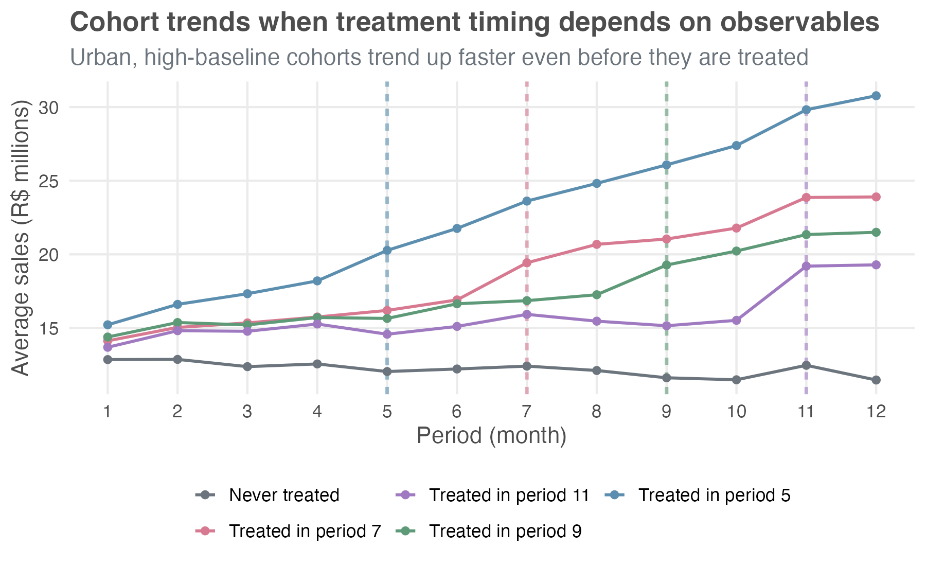
The plot in Figure 10.1 shows our 2500 stores over 12 months. The horizontal axis represents the time periods, the vertical dashed lines indicate the periods when each group of stores has been treated and is under the new layout, and the vertical axis represents the average sales. As a result, each colored line traces the average outcome for a group of stores that first received the new layout in a given month.
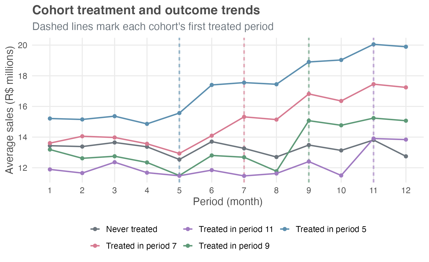
Notice that the cohorts start at different baseline sales levels — early-rollout stores sit visibly above the never-treated and late-rollout ones. For DiD, what matters isn’t that the levels match across cohorts, but that the trends would have been parallel without treatment.
Before each cohort adopts the new layout, the lines move together, suggesting parallel trends. After adoption, each treated cohort jumps, and the gap from the never-treated line widens the longer those stores have been on the new layout — the dynamic, growing effect we built into the simulation.3
Throughout this chapter, I use the terms cohort and group interchangeably, referring to a set of stores that first received the new layout in the same period.
Did you notice I labeled the cohorts as groups 5, 7, 9, and 11, instead of cohorts 1 through 4? Take group 7, for example. I could just as well have called it the second cohort, since it was the second to adopt the new layout. But “group 7” explicitly tells us when those stores were treated, without forcing us to remember the order of adoption. This is also the convention used by Callaway and Sant’Anna (2021), the paper this chapter follows.
The “forbidden comparisons”
The magic of the DiD we saw in the previous chapter comes from comparing the change in the treated group to the change in a clean, untreated control group. But with a staggered rollout, the TWFE model gets confused about who the control group is. It tries to be efficient by using all available information — and that’s why we say the TWFE is “variation hungry”, but in doing so, it mixes good and bad comparisons.
Specifically, for a group of stores that just switched into treatment (e.g., the second treated cohort, “group 7”), the TWFE model implicitly forms its comparison set from every other unit that is not switching in that same period. That set sweeps in three very different types of units: already-treated cohorts (here, group 5), not-yet-treated cohorts (groups 9 and 11), and never-treated units. The first type is the problem, so the comparison set splits into:
The good comparisons, which involve units that have not yet been treated (e.g., groups 9 and 11) and units that will never be treated. These are clean controls, just like in a simple DiD.
The forbidden comparisons, which involve units treated in an earlier period (i.e., group 5). But those can’t serve as controls because the treatment has already changed their outcomes. If you compare a newly treated unit to a unit that was treated in a previous period, you’re mixing two very different trajectories: you’re no longer isolating the effect of the treatment. That breaks the logic of diff-in-diff.
Goodman-Bacon (2021) made the diagnosis concrete: he showed that the TWFE estimate in a staggered design is a weighted average of all possible \(2 \times 2\) DiD comparisons in the data. This includes the “good” comparisons (newly treated vs. not-yet-treated) but also the “forbidden” comparisons (newly treated vs. already-treated).
When treatment effects are the same for all units and constant over time (homogeneous effects), this isn’t a disaster. The bad comparisons wash out, and the TWFE estimate is still a valid, albeit complex, weighted average of the treatment effect. But if treatment effects are heterogeneous — meaning they differ across cohorts or change as units are exposed to the treatment for longer — these forbidden comparisons can introduce bias. In some cases, the bias can be so severe that the TWFE model produces an estimate with the wrong sign, leading you to conclude that a beneficial treatment is harmful, or vice-versa.
10.2 The newer DiD toolkit
Once researchers showed that the workhorse TWFE model could mislead under staggered adoption, the DiD literature moved quickly. Since 2018, dozens of papers have proposed estimators that handle this setting more deliberately. Their details differ, but the goal is the same: avoid forbidden comparisons and use clean control groups.
The general strategy is to explicitly define which comparisons are valid and then to build an estimator that only uses those comparisons. Goodman-Bacon (2021) provided the diagnosis — the Bacon decomposition showing where TWFE goes wrong — but the practical estimators in use today fall into a few families that differ in how they construct the counterfactual:
Direct group-time estimation: Callaway and Sant’Anna (2021) estimate \(ATT(g,t)\) directly from clean comparisons, using never-treated or not-yet-treated units as controls. These group-time effects can then be aggregated into overall, cohort-specific, calendar-time, or event-time summaries. Chaisemartin and D’Haultfœuille (2020) are closely related, but their main estimator targets weighted effects under a somewhat different setup, with a focus on instantaneous effects and more general treatment selection.
Regression-based event-study corrections: Sun and Abraham (2021) keep the event-study regression logic but interact treatment cohorts with relative time, then aggregate the cohort-specific effects with explicit weights. This makes them close cousins of CS for dynamic/event-time questions, especially in the no-covariate staggered-adoption case, but they are not a full substitute for the broader CS group-time ATT framework.
Imputation-based estimators: Borusyak, Jaravel, and Spiess (2024) estimate untreated potential outcomes using observations that are untreated at each point in time, then impute the counterfactual path for treated observations and average the gaps. These methods can be efficient and intuitive, but they lean more directly on the untreated-outcome model and the maintained parallel-trends structure.
Methods for non-absorbing or multi-valued treatments: When treatment can turn on and off (we call it non-absorbing treatments), or when treatment intensity varies, the standard staggered-adoption estimators do not apply out of the box. Chaisemartin and D’Haultfœuille (2025) develop tools for these more complex designs, discussed briefly in Appendix 10.A.
In this chapter, I’ll focus on the Callaway and Sant’Anna approach – hereafter “CS” or the “cohort-time ATT approach”, after its central building block – for three practical reasons:
Common in applied work: The reference paper is now one of the main citations in the recent DiD literature, so reviewers and readers are likely to recognize the estimand and the workflow.
Easy to inspect: Estimating one effect per cohort lets you see how the treatment evolves over time and differs across cohorts before you collapse the pieces into a headline number.
Available in R and Python: The R package
didand the Python packagediff-diffboth implement the workflow we need here.
Real applications often do not fit the “one-time binary treatment” setup used in this chapter. You may have treatments that turn on and off, treatment intensity such as ad spend or upgrade depth, or several treatment categories at once. Appendix 10.A sketches what changes in those cases.
10.3 Understanding the cohort-time ATT approach
The CS method analyzes staggered DiD designs by giving up on a single average treatment effect, which can mislead when units adopt treatment at different times. Instead, it breaks the problem into smaller pieces: estimate the average treatment effect for each cohort in each time period, then aggregate those estimates depending on the research question we want to answer.
10.3.1 The building block: group-time average treatment effects
The fundamental concept in the CS framework is the group-time average treatment effect, which is denoted as \(ATT(g, t)\). Let’s break down what this means:
- g (for group): This refers to the cohort, defined by the time period when a unit first receives the treatment. In our supermarket example, we have cohorts g = 5, g = 7, g = 9, and g = 11.
- t (for time): This refers to a specific calendar period (e.g., Month 8, Month 10).
So, \(ATT(g, t)\) is the average treatment effect on the treated for the specific cohort g at the specific time t. For example, \(ATT(5, 7)\) would be the causal effect of the new layout in Month 7 specifically for the group of stores that first implemented it back in Month 5.
The cleanest way to picture what ATT(g, t) is doing is as a long difference between two snapshots of the outcome, one in pre-treatment time and one in post-treatment time. Take cohort g and a comparison group (say, the never-treated). Look at how each group’s outcome moves from the last clean pre-treatment period (g − 1) to time t, and take the difference. That subtraction is ATT(g, t), with no regression weighting tricks or forbidden comparisons.4 Every CS estimate is just a stack of these differences and the aggregations are weighted averages of that stack.
To estimate each \(ATT(g, t)\), the CS method performs a simple \(2 \times 2\) DiD. It compares the change in outcomes for cohort g between period t and a pre-treatment period (e.g., period g-1) to the change in outcomes for a clean control group over the same two periods (never-treated or not-yet-treated). The central design choice is which control group to use, and there are two main options:
The never-treated group: These are units that are never treated during the observation window. This is a very clean control group, as they are never exposed to the treatment.
The not-yet-treated group: For an effect in period t, this group includes all units that have not yet received treatment by that period. If never-treated units exist in the application, they enter this control group too. In our supermarket example, for an effect measured in period 5, cohorts 7, 9, and 11 are not yet treated, and the 800 never-treated stores are also still untreated. By period 9, cohort 11 and the never-treated stores remain available; by period 11, only the never-treated stores remain. This group shrinks over time as more cohorts become treated.
The post-treatment cells (where \(t \geq g\)) are the actual \(ATT(g, t)\) building blocks; everything we report later in this chapter is a weighted average of these. For \(t < g\), the package returns the same long-difference statistic computed before treatment occurs — a placebo estimate, not a true ATT. We display these placebo cells alongside the real ATTs because they double as a visual parallel-trends check: under the assumption, they should sit close to zero.
Figure 10.2 shows a preliminary analysis of our supermarket example. Each row is a treatment cohort and each column is a calendar period. The pre-treatment cells sit near zero (faded), while the post-treatment ATT(g,t) cells carry the causal signal (in full color).
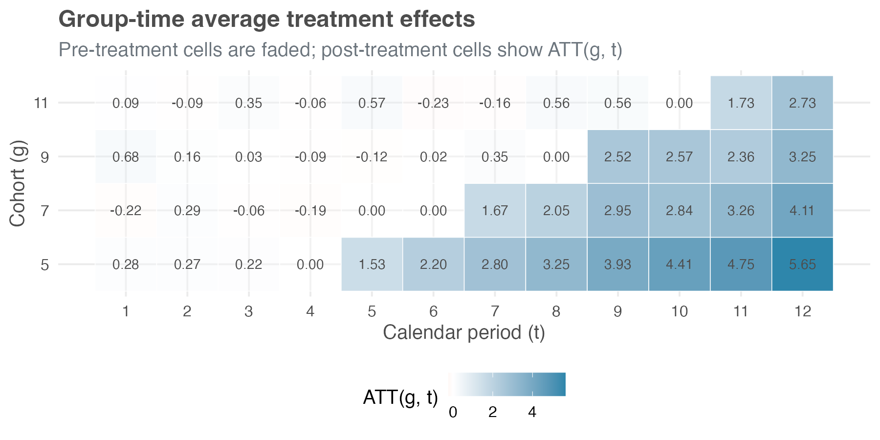
To make sense of the numbers in these cells, let’s check how we arrive at the estimated ATT of cohort 7 (the 500 stores treated in period 7) measured in period 8 – i.e., ATT(7, 8), using the 800 never-treated stores as the control. The last clean pre-treatment period for cohort 7 is period 6, and cohort 7’s average sales move from R$ 14.09 million in that period to R$ 15.14 million in period 8, a long difference of +R$ 1.05 million.
Over the same two months, the never-treated stores move from R$ 13.71 million to R$ 12.70 million, a long difference of -R$ 1.00 million, reflecting a broader dip in the environment. Subtracting the control change from the treated change gives ATT(7, 8) = +R$ 2.05 million. Notice how much the never-treated baseline matters: without that -R$ 1.00 million adjustment, cohort 7’s raw +R$ 1.05 million would have severely understated the layout’s impact because the wider environment was trending down.
10.3.2 Aggregation: answering your specific research question
Once we have this detailed matrix of \(ATT(g, t)\) estimates, we can aggregate them to answer different questions. Instead of being stuck with one single number, you can match the aggregation to the question you actually want to answer.
Here are the most common aggregation schemes:
Overall average treatment effect: A single number summarizing the average effect across all treated cohorts and time periods. As Section 10.5.1 shows, there is more than one way to collapse the matrix into that number, and they can disagree — so part of the work is choosing which one to report as the headline.
Group-specific effects: You can average the \(ATT(g, t)\)s over time for each cohort g. This gives you an average effect for each treatment cohort, allowing you to see, for instance, if early adopters experienced different effects than late adopters.
Calendar time effects: You can average the \(ATT(g, t)\)s across cohorts within each time period t. This tells you how the average effect varies with the calendar — for example, whether the new layout pays off more during peak shopping months or weakens when a broader downturn drags sales down across all stores.
Event study: This aggregation averages effects based on the length of exposure to the treatment (event time). For example, it averages all effects for units in their first period of treatment, all effects for units in their second period of treatment, and so on. This allows you to see the dynamic effects of the treatment — does it have an immediate impact that fades, or does it grow over time? It is also relevant as a parallel-trends check: the same plot extends back to the pre-treatment leads, which should sit close to zero under the assumption.
10.4 What do we need for staggered DiD to work?
CS asks five things of your data. Two you’ve already met in Chapter 9; three are new and arrive with staggered timing. Start with the familiar pair:
Stable Unit Treatment Value Assumption (SUTVA): The treatment status of one store should not affect the outcomes of another store. If the new layout in one store pulls customers away from any untreated store in the same market, whether it belongs to the same chain or a competitor, SUTVA is violated and our estimates can be biased. This assumption is often more plausible when units are geographically dispersed or operate in separate markets.
Parallel Trends: This is the heart of DiD. It states that, in the absence of treatment, the average outcomes for the treated and control groups would have followed parallel paths over time. I’ll discuss conditional and unconditional versions of this assumption in more detail below.
Three more are specific to staggered adoption:
Irreversibility of treatment
The CS method assumes that once a unit is treated, it remains treated for all subsequent periods. In other words, the treatment is absorbing or irreversible. In our supermarket example, this means that once a store adopts the new layout, it does not switch back to the old layout during the study period.
This assumption is common and realistic in many settings. Policy changes (like a minimum wage increase), infrastructure investments (like building a new highway), or technology adoptions (like implementing a new software system) are often permanent or at least long-lasting.
However, if your treatment can be turned on and off — for example, a promotional campaign that runs for a few weeks and then stops — the CS method in its standard form might not be appropriate. For such cases, you would need to use more advanced methods, such as those discussed in Chaisemartin and D’Haultfœuille (2025), which can handle non-absorbing treatments.5
Limited treatment anticipation
Units also need to avoid reacting to the treatment too far in advance. Both TWFE and CS rely on a no-anticipation assumption implicitly; CS makes it explicit through a parameter \(\delta\) (delta) that you can dial. \(\delta\) represents the number of periods before treatment during which units may anticipate and react to the upcoming treatment; setting \(\delta = 0\) reproduces the strict TWFE-style “no anticipation at all,” while \(\delta > 0\) lets you carve those contaminated pre-periods out of the baseline window.
No anticipation (\(\delta = 0\)): This is the strictest version. It assumes that units only react to the treatment once they actually receive it, with no change in behavior in the periods leading up to treatment.
Limited anticipation (\(\delta > 0\)): This allows for some anticipation. For example, if a new policy is announced two periods before it goes into effect, stores might start preparing for it, and their outcomes might change even before the official treatment date. In this case, you would set \(\delta = 2\).
Why does this matter? If units anticipate the treatment and their outcomes change before the official treatment date, those pre-treatment periods are already “contaminated” by the treatment. Using them as part of the pre-treatment baseline in a DiD comparison would lead to biased estimates. The CS method addresses this by allowing you to specify \(\delta\) and then only using periods that are sufficiently far before treatment (more than \(\delta\) periods) as the pre-treatment baseline.
In many business and policy settings, some degree of anticipation is realistic. So think carefully about the context of your study and use the plots as a diagnostic. In figures such as Figure 10.1, that means looking just to the left of each cohort’s treatment line. If, for example, stores scheduled to adopt in month 7 already stop moving in parallel with the never-treated stores in month 6, that suggests one period of anticipation, so \(\delta = 1\) would be more defensible than \(\delta = 0\). If the lines move together until the treatment month, then the no-anticipation assumption seems more plausible.
Conditional vs. unconditional parallel trends
The parallel trends assumption is the backbone of DiD, but it comes in two flavors:
Unconditional parallel trends: This is the simpler version, analogous to the standard DiD assumption in Chapter 9. It states that, without any control variables \(X\), the average outcomes for the treated and control groups would have followed parallel trends in the absence of treatment. This is what we typically check with an event study plot that shows pre-treatment trends.
Conditional parallel trends: This is a more flexible version. It states that, after conditioning on (or controlling for) a set of observed covariates \(X\), the average outcomes for the treated and control groups would have followed parallel trends. This is useful when the treated and control groups differ in observable ways that might affect their outcome trends. For example, if larger stores are more likely to adopt the new layout early, and store size affects sales trends, then controlling for store size might make the parallel trends assumption more plausible.
- These covariates should be pre-treatment characteristics, measured before each cohort starts treatment (Callaway and Sant’Anna 2021; Sant’Anna and Zhao 2020). Time-invariant traits, like store format, region, or square footage, or even time-varying variables measured before treatment — e.g., pre-treatment sales — may help establish conditional parallel trends.6
- What we should not include is anything that could itself be affected by the treatment (post-rollout staffing levels, for example), since such post-treatment covariates can be influenced by the treatment they are meant to control for.
The CS framework works with either assumption: if trends in treated vs. control groups look comparable without adjustment, estimate the model without covariates. But if parallel trends only seems plausible after accounting for observable differences, then we should add the relevant covariates. The CS method then uses them to reweight or adjust the control group so it better matches the treated group on those characteristics.
Concretely, adjusting means modeling the outcome as a regression on covariates (i.e., outcome regression model), while reweighting means giving more weight to control units whose covariates distribution resembles that of the treated (i.e., inverse probability weighting). The two can be combined into a doubly robust estimator that stays consistent as long as either the outcome-regression model or the propensity-score model is correctly specified (Sant’Anna and Zhao 2020).
Adding covariates is not a free lunch; it requires an additional assumption: overlap or common support, discussed in chapter Chapter 6. This means that for every combination of covariate values observed in the treated group, there must be units with similar covariate values in the control group. If the control group is very small or very different from the treated group, overlap may fail, and the method will have to extrapolate, which can be problematic.7
Choosing the right comparison group
The CS method gives you two options for control groups:
Never-treated: Units that are never treated during the entire study period.
Not-yet-treated: Units that are still untreated in the current period. This means including all never-treated units, if they exist, plus cohorts that will be treated in the future but have not yet received treatment.
Both are valid, but they rest on different stories about how the world works. The right choice depends on which story fits your data and business context.
When it makes sense to use the never-treated: Callaway and Sant’Anna (2021) present both groups as legitimate alternatives, but lean on the never-treated whenever a sizeable, comparable pool of untreated units exists — both reference implementations adopt that lean as their default. Use it if…
You have enough never-treated units, and they look similar to the treated units.: If the never-treated group is large and not fundamentally different from the treated units, this is the cleanest option. They never receive the treatment, so you don’t have to worry about their outcomes being contaminated later.
You want to avoid anticipation effects.: Because these units never get treated, they don’t have any reason to behave differently before treatment. With never-treated units, you don’t have to worry about “people acting early because they know what’s coming.”
When it makes sense to use the not-yet-treated: Use the broader still-untreated pool if…
You barely have a never-treated group — or it’s tiny or unreliable. When the permanent control group is missing or too small, using future-treated units dramatically expands your comparison pool and improves precision.
The never-treated units behave too differently. In most rollouts, units are treated for a reason — e.g., they self-select in, get prioritized, or sit in a market where rollout was always going to happen — so treated units may differ from never-treated units in ways that go beyond observable characteristics. When those differences are large enough that even conditional parallel trends against the never-treated group doesn’t hold, for example because the never-treated stores operate under different policies, or react differently to demand shocks, the not-yet-treated cohorts can be a more credible comparison, since they were selected into treatment by the same logic as the treated units and simply adopted later (Callaway and Sant’Anna 2021).
- Note that the “not-yet-treated” comparison group in both packages still includes the never-treated units when they remain in the dataset — they are simply units that are not yet treated at every period of interest. To compare exclusively against future-treated cohorts, drop the never-treated units before estimation.
If you have a never-treated group, try both approaches and compare the results. Similar estimates make the control-group choice less central to the conclusion. Large gaps tell you the choice matters, and that you need to defend which comparison group better matches the assignment process in your setting.
An empirical sensitivity check: Because the choice of comparison group rests on assumptions you can never fully prove — only defend in writing — it pays to show what each choice implies on your data. Below we re-run the CS estimator twice on the same dataset — once using the never-treated stores as the comparison group, once using the not-yet-treated stores — and compare the overall ATT.
Data: All data we’ll use are available in the repository. You can download it there or load it directly by passing the raw URL to read_csv() in R or pd.read_csv() in Python.8
Packages: To run the code yourself, you’ll need a few tools. The block below loads them for you. Quick tip: you only need to install these packages once, but you must load them every time you start a new session in R or Python.
# If you haven't already, run this once to install the packages
# install.packages(c("did", "panelView", "fixest"))

# You must run the lines below at the start of every new R session.
library(tidyverse)  # Data manipulation
library(did)        # Callaway & Sant'Anna estimator
library(panelView)  # Visualize treatment rollout
library(fixest)     # High-performance fixed-effects regression (TWFE comparison)
# If you haven't already, run this in your terminal to install the packages:
# pip install pandas numpy diff-diff matplotlib seaborn linearmodels (or use "pip3")
# You must run the lines below at the start of every new Python session.
import pandas as pd # Data manipulation
import numpy as np # Mathematical computing
from diff_diff import CallawaySantAnna # Callaway & Sant'Anna estimator
import matplotlib.pyplot as plt # Plotting
import seaborn as sns # Heatmap for treatment rollout
from linearmodels.panel import PanelOLS # Panel data models (TWFE comparison)The Callaway–Sant’Anna standard errors aren’t read from a single formula. Instead, the procedure repeatedly reshuffles the data and measures how much the estimates wobble across those reshuffles — a technique called a multiplier bootstrap. Because the reshuffling is random, each standard error carries its own subtle fluctuation — so the standard errors and confidence intervals you obtain in R and Python may vary slightly, even though the point estimates are identical.
On our simulated data the two estimates are within sampling noise of each other (never-treated: 3.19 with SE 0.16; not-yet-treated: 3.13 with SE 0.15) — the reassuring case. Both figures are simple overall ATTs, used here only as a control-group diagnostic; Section 10.5.1 picks the headline aggregation the chapter actually reports. When they diverge meaningfully, that’s a signal that the never-treated and treated cohorts are pulled from different populations, and you owe your reader an explanation of why one comparison is more credible than the other.
10.5 Implementing the cohort-time ATT approach
Enough theory — let’s run the thing. The 2,500 simulated supermarkets you’ve seen in two figures already become the lab we’ll use for the rest of the chapter: load the panel, estimate the ATT(g, t) matrix, and aggregate it four different ways.
We’ve already looked at this data once — Figure 10.1 plotted the cohort trends, and Figure 10.2 previewed the ATT(g,t) estimates. Before estimating anything formally, it pays to audit the panel directly. The CS method requires your data in panel format, with each row a unit-time observation. The code chunk below loads the data, inspects its structure, visualizes the treatment rollout, and counts units per cohort:
The data has the following structure:
store_id: Store identifier (1 to 2500), a variable that uniquely identifies each unit.period, which represents the \(t\) in the \(ATT(g,t)\) notation: Time period (1 to 12), a variable that indicates the time period of each observation.cohort, which represents the \(g\) in the \(ATT(g,t)\) notation: The period when the store first received the treatment (here, 5, 7, 9, or 11 for treated cohorts).- For units that are never treated, this cohort variable should be set to 0 or a value like
InforNA(depending on the package).
- For units that are never treated, this cohort variable should be set to 0 or a value like
relative_period: Event time, defined asperiod - cohort— the number of periods since treatment began. It is negative before treatment, zero in the adoption period, and positive after. The event-study aggregation later in this chapter is organized around this index.treated: A binary indicator for whether the store is currently treated (1) or not (0).pre_treatment_sales: Each store’s baseline sales level, measured before any treatment began. We don’t use it for the CS estimates here, but it returns as a covariate when we benchmark against TWFE (Section 10.6).sales: The outcome variable (monthly sales in millions of R$), the variable you want to measure the treatment effect on
This is the format we need, with cohort serving as the treatment timing variable. The rollout visualization in the code above — panelView in R, a seaborn heatmap in Python — maps treatment status at the unit-time level, and is the quickest way to surface structural issues such as an unbalanced panel. Run it on this data and every store appears in all 12 periods, so the panel is balanced. Figure 10.1 and Figure 10.2 already display that same staggered structure at the cohort level — the four cohorts switching on at periods 5, 7, 9, and 11.9
That audit shows you 2,500 stores in the dataset: 700, 500, 300, and 200 stores, in the four treated cohorts, and 800 stores are never-treated. Keep in mind that the smaller the cohort, the less precise its effect estimate tends to be.
10.5.1 Running the cohort-time ATT estimation without covariates
Time to estimate. Both packages return the same thing: the full ATT(g, t) table — one “average treatment effect on the treated for group g at time t” for every cohort and every period, no aggregation yet. That table is the raw material everything else in this chapter averages.
A first choice is how each 2 × 2 building block is estimated. CS offers three options — outcome regression, inverse-probability weighting, and doubly-robust. With no covariates, as throughout this subsection, all three return identical numbers, so the choice is immaterial here. It begins to matter only once we condition on covariates (see Section 10.5.2), so we simply keep the doubly-robust estimator (the package default) from the start, which means the call won’t have to change when covariates come in.
Three more choices shape inference: standard errors from a multiplier bootstrap; uniform (rather than pointwise) confidence bands that cover the post-treatment ATT(g, t) path jointly; and clustering at the store level, so repeated observations of the same store aren’t treated as independent. The first two are package defaults; we set them explicitly so the call states its own inference choices. The pointwise-versus-uniform distinction matters once you plot a full event study. Pointwise bands cover each estimate on its own, so the probability that all of them cover the truth at once falls as you add estimates, and a reader can then cherry-pick the one interval that happens to exclude zero. Uniform bands hold the 95% guarantee across the whole path.
One last choice — base_period, spelled the same way in both packages — controls how the pre-treatment placebo cells are computed. We use the universal baseline, which fixes period g − 1 as the reference for every cohort and reports the pre-treatment leads as cumulative differences from that last clean period. It does not affect any post-treatment ATT(g, t) or any aggregation overall — those are identical under either convention — but the universal baseline is the form an event-study plot expects.10
The output is the disaggregated result — the raw material every aggregation later averages, so it is worth slowing down to read it well. It is a table with one row per group-time cell: a cohort g, a calendar period t, the estimated ATT(g, t), its standard error, and the bounds of a uniform 95% confidence band. Those rows are exactly the cells of the matrix in Figure 10.2, now with numbers attached.
They come in two kinds. Where \(t \geq g\), the cell is a genuine post-treatment ATT(g, t) — the causal effect once cohort g has the new layout. Where \(t < g\), the cell is a pre-treatment placebo: the same long difference computed before treatment, which should sit near zero if parallel trends holds. The post-treatment cells carry the causal signal; the placebo cells are the parallel-trends check.
To read a single row, take cohort g = 5 at period t = 7. The group and time columns identify it: the 700 stores that adopted the new layout in period 5, observed two periods later. The estimate column gives ATT(5, 7) = 2.80 — average sales for that cohort rose by R$ 2.80 million per store-month against the never-treated counterfactual — alongside a multiplier-bootstrap standard error of 0.32, clustered at the store level. This is the same arithmetic we walked through by hand earlier for ATT(7, 8) = 2.05, the treated cohort’s long difference minus the comparison cohort’s, now produced for every cell at once. The last two columns bound the uniform 95% band; because it is uniform, the band covers all the cells jointly, so a reader cannot cherry-pick the one interval that happens to exclude zero.
The output functions also print a single p-value from a pre-test of parallel trends: it asks whether the pre-treatment placebo cells, taken together, are jointly distinguishable from zero. A small p-value means they are not all near zero — the visual signature of a differential pre-trend, the failure we will see on the covariates dataset in Figure 10.8. Here the p-value is 0.422: no evidence against parallel trends, a formal complement to the visual check on the event-study leads below.11
Rarely is the disaggregated table the form a decision-maker wants. There are four standard ways to collapse the ATT(g, t) matrix into something smaller, and there is no single correct collapse. Each answers a different question, and the framework’s advice is to fix the question before reading the estimates (Callaway and Sant’Anna 2021). Three of the four — the cohort, calendar-time, and event-study aggregations — return a profile (one estimate per cohort, per calendar period, or per length of exposure) alongside a single overall ATT that averages that profile down to one number. The fourth, the simple weighted ATT, returns only the one number.
Throughout the rest of this chapter, overall means that single-number aggregate summary: the effect after the relevant ATT(g, t) cells or profile estimates have been averaged into one ATT. Different aggregations can produce different overall effects.
The four subsections below follow that structure: the first builds the overall headline number, and the next three each pair a profile with the single number it rolls up to.
Overall ATT — the one-number summary, two ways
Sometimes a stakeholder wants one number: did the rollout work or not? CS gives two ways to compute it, and the gap between them is worth understanding before you quote either.
The first is the simple weighted ATT: a pooled average of every post-treatment ATT(g, t) cell, weighted by cohort size. Recipe: pool every post-treatment ATT(g, t) cell and take a weighted average, weighting each cell by its cohort’s share of treated stores. This is the only aggregation with no profile underneath it; its disaggregated counterpart is the ATT(g, t) matrix itself. A cohort treated earlier contributes more cells to the pool, because it has more post-treatment periods, so the average tilts toward cohorts treated longer. The headline does not show that tilt, which is the main reason to be cautious with it (Callaway and Sant’Anna 2021).
The second is the cohort-aggregated (or group) ATT, which first computes one average effect per cohort and then averages those numbers across cohorts. Recipe: first average each cohort’s ATT(g, t) over its post-treatment periods into one number per cohort — the group-specific profile of the next subsection — then average those across cohorts, weighting by cohort size. Each cohort now counts once, regardless of how many post-treatment periods it has. CS recommend it as the general-purpose headline because it carries the same interpretation as the ATT in a two-period, two-group DiD: the average effect on a typical treated store.
| Estimator | Weighting rule | Estimate (R$ MM) | 95% CI |
|---|---|---|---|
| Simple weighted average | ATT(g, t) cells weighted by cohort size | 3.19 | [2.88, 3.50] |
| Group-balanced overall | Within-cohort averages weighted by cohort size | 3.03 | [2.74, 3.32] |
| Simulated ground truth | — | 3.00 | — |
The two summaries land close but are not identical (Table 10.1): both bracket the simulated ground truth of R$ 3.00 million, and the cohort-aggregated number lands almost on it. They diverge because the early, long-treated cohort has the largest effect — confirmed in the next subsection — and the simple weighted ATT gives it extra weight via its longer post-treatment window. The wider the spread across cohorts in size, treatment length, or effect, the wider that gap.
From here on, when this chapter needs a single overall number, it uses the cohort-aggregated overall of R$ 3.03 million. Later (Section 10.6) we compare that CS estimate against the naive TWFE number on the same data.
Group-specific effects — heterogeneity across cohorts
Did early adopters get more out of the new layout than late ones? The cohort aggregation answers that by averaging each cohort’s post-treatment ATT(g, t) cells over time and returning one number per cohort. Recipe: for cohort g, average ATT(g, t) over all post-treatment periods t ≥ g, weighting each period equally. The output lists those per-cohort estimates — the profile — alongside the cohort-aggregated overall ATT of R$ 3.03 million, the headline from the previous subsection. The profile answers whether early adopters saw a different effect than late adopters; the overall is what you report once you have checked that question and need a single figure.
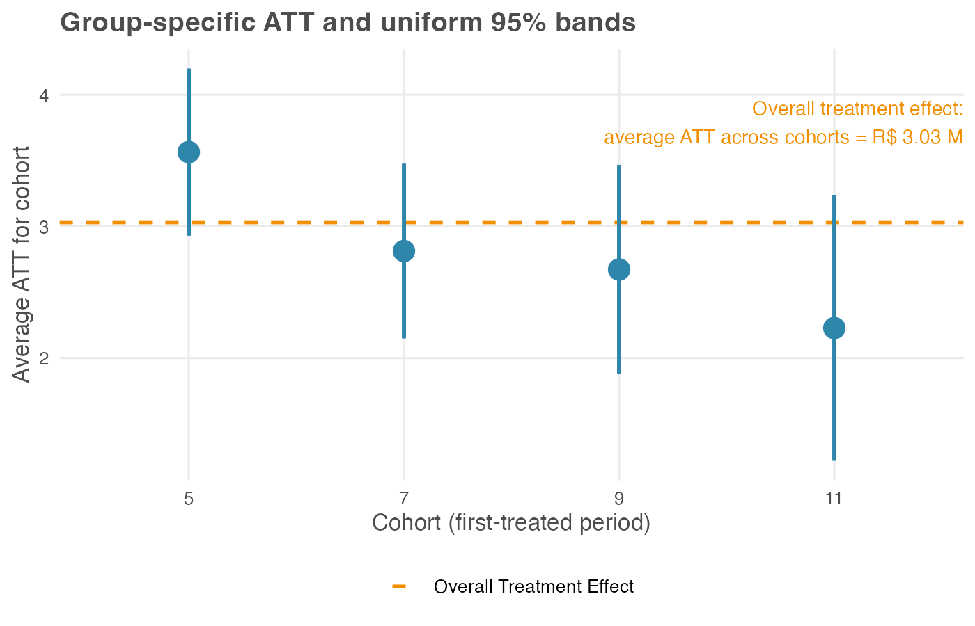
In our simulation the early-adopting cohort (treated in period 5) has the largest average effect, about R$ 3.56 million per store-month, while later cohorts cluster lower: cohorts 7, 9, and 11 average R$ 2.81 million, R$ 2.67 million, and R$ 2.23 million. The gradient is built into our data-generating process: early adopters had a longer post-treatment window over which the cumulative effect ramped up.
Two reading notes: The uniform 95% bands for cohorts 9 and 11 overlap, so at this sample size we can rank them only loosely: both sit below the early adopter, but their order is not pinned down. And cohort 11, the smallest at 200 stores, carries the widest band, a reminder that small cohorts buy imprecise estimates.
Weight these four numbers by cohort size — 700, 500, 300, and 200 stores — and they average to the R$ 3.03 million headline. The overall is the profile, averaged. In a real rollout a gradient like this is a substantive finding in itself: perhaps the playbook improved for early sites, perhaps the treated population shifted as the rollout widened. Either reading is invisible if you report only the overall ATT.
Calendar-time effects — how the effect tracks the calendar
The calendar-time aggregation averages the ATT(g, t) matrix the other way — across cohorts, within each calendar period t — returning one number per period. Recipe: for period t, average ATT(g, t) over every cohort already treated by t (those with g ≤ t). Early in the panel only the first cohort contributes; later, several do. This answers a question framed in wall-clock time rather than exposure time: was the new layout worth more in some months than others? It is the aggregation to reach for when macro context — a holiday peak, a competitor’s launch, a regulatory change — might inflate or deflate the effect at particular dates.
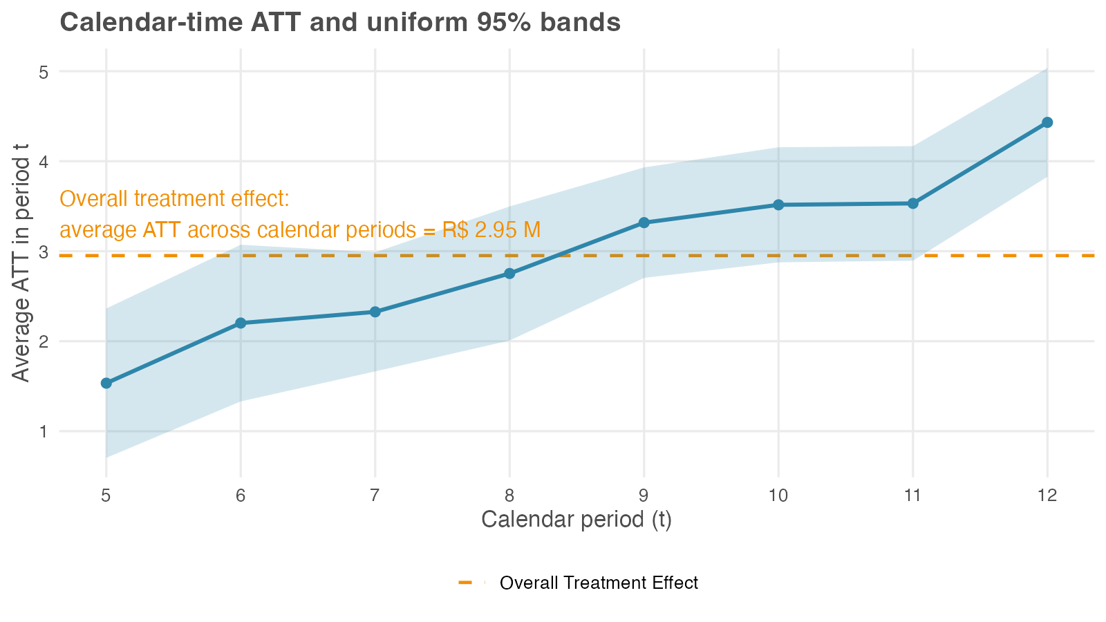
Read the profile left to right: each point is the effect averaged over whatever cohorts are treated in that month. The calendar average drifts upward here, and two forces are worth separating. One is the cumulative ramp built into the DGP: the effect grows with exposure. The other is a composition shift: the set of cohorts feeding each t changes as the rollout widens. The plot alone rarely separates the two, which is why calendar effects are best read alongside the event study, where exposure length is held fixed.
The aggregation also reports a single calendar-time overall: R$ 2.95 million, the dashed line in Figure 10.4. Interpret it carefully. It averages the eight per-period numbers, but each period is itself an average over a different set of cohorts — period 5 covers only the first cohort, period 12 covers all four. The overall therefore mixes genuine effect heterogeneity with that changing composition, which is why CS treat the calendar-time overall as less useful than the cohort-aggregated headline (Callaway and Sant’Anna 2021).
It happens to land near the R$ 3.00 million truth here because the simulated rollout is well-behaved; on messier data the composition drift can move it well off. Report the calendar-time profile as the result — it answers the wall-clock question — and use the overall only as a rough check.
Event study — effects by length of exposure
The most familiar aggregation, the event study (also called dynamic), re-indexes the ATT(g, t) matrix by event time e = t − g — the number of periods since treatment began — and averages within each value of e. Recipe: for each event time e, average ATT(g, g + e) over every cohort that actually reaches that event time, weighting by cohort size. Positive e are post-treatment lags (months after treatment began); negative e are pre-treatment leads (months before treatment began), assembled from the placebo cells of the ATT(g, t) matrix.
That gives the event study two jobs in one plot. It shows the dynamics of the effect — does it arrive at full strength and fade, or ramp up? — and it doubles as a parallel-trends check, since the leads are placebo estimates that should sit on or near zero. A lead drifting away from zero is the visual analog of a failed pre-trend test. Both packages let you trim the reported event-time window at either end, focusing the aggregation on a range e ∈ [e_min, e_max] where every cohort contributes.
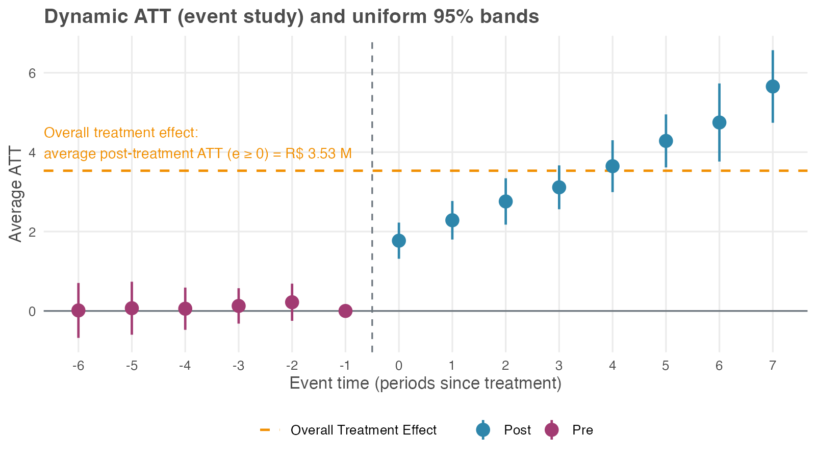
The pre-treatment leads sit close to zero, consistent with the parallel-trends assumption. After treatment the effect is positive on impact (about R$ 1.77 million at e = 0) and grows with exposure (around R$ 3.65 million at e = 4) — the cumulative ramp the simulation built in. Because the bands are uniform, you can read the whole post-treatment curve as a single statement: the whole trajectory lies above zero with 95% confidence, all horizons taken together — not just one cherry-picked month.
The aggregation also reports a single event-study overall: R$ 3.53 million, the average of the post-treatment part of this curve (every e ≥ 0). It sits above both the R$ 3.00 million truth and the R$ 3.03 million cohort-aggregated headline, and the reason is the composition shift again. The overall weights every event time equally, so the long-exposure tail (five, six, seven months since treatment) — where the cumulative effect has ramped past R$ 4 million — counts as much as the very first month of treatment (e = 0). But only the earliest cohort is observed that far out.
Averaging a rising curve over event time, with a different set of cohorts at each horizon, is not the same quantity as the average effect on a typical store. CS treat the event-study overall as less useful than the cohort-aggregated headline for this reason (Callaway and Sant’Anna 2021). Report the event-study profile, since its shape is the finding; if you need one number, use the cohort-aggregated headline instead.
The event-study aggregation averages over all cohorts that contribute to each event time e. At long horizons (large e), only the earliest cohorts contribute; at long pre-periods (large negative e), only the latest cohorts contribute. To avoid composition shifts driving the curve, restrict the event-time window so the same set of cohorts contributes throughout, or impose cohort balance — keep only cohorts observed across the full window. The trade-off: tighter bounds give a cleaner curve but lose precision at the edges.
Choosing an aggregation, and which view to report
The four aggregations answer four different questions, and a full analysis usually checks more than one. Use the table below as a guide, not as a leaderboard.
| Aggregation | Best reported as | Question answered | Use as headline? | Main caution |
|---|---|---|---|---|
| Simple weighted ATT | Rough overall check: 3.19 | Did it work, on average? | No | Overweights cohorts observed for more post-treatment periods. |
| Cohort aggregation | Cohort profile plus the R$ 3.03 million overall | Do early and late adopters differ? | Yes, use this as the single-number headline | Cohort differences are substantive findings, so also report the disaggregated effects. |
| Calendar-time aggregation | Calendar profile; overall is 2.95 | Does the effect vary with wall-clock time? | No | Calendar overall effects mix effect changes with changing cohort composition. |
| Event-study aggregation | Dynamic profile; overall is 3.53 | Does the effect grow, fade, or hold, and do pre-treatment leads look clean? | No | The overall effect averages across uneven exposure horizons. |
Two rules keep the reporting honest. First, lead with the profile and close with the headline, not the other way around. The profile shows what the single number averaged over; a headline on its own hides the heterogeneity a decision-maker may need to see. Report the disaggregated view whenever the audience can act on it: targeting a phased rollout, diagnosing why an effect varies, reading wall-clock shocks, or checking pre-trends through the event-study leads.
Second, when a binary decision genuinely needs one number — continue the rollout or stop it — use the cohort-aggregated overall of R$ 3.03 million. Of the four overalls, it is the only one whose interpretation matches the canonical two-period, two-group DiD ATT. The other three each average over treatment length or a changing mix of cohorts, which makes the single number harder to defend than the profile behind it.
10.5.2 Adding covariates: a conditional-parallel-trends example
So far (Section 10.5.1) we ran CS on a dataset where unconditional parallel trends held — the pre-treatment leads in Figure 10.5 sat near zero with no covariates needed. Most real rollouts don’t happen like this: When urban, dense, or higher-revenue units get treated earlier, their outcome trajectories differ from late-adopters for reasons that have nothing to do with the treatment. Naive estimates report that confounded gap as part of the ATT, but the fix is to bring covariates into the estimator and condition the analysis on the observables that drive the differential trend.
A companion dataset where unconditional PT fails
The companion file data/staggered_did_cov.csv tweaks the supermarket example to introduce two changes. Selection on observables: urban stores with higher baseline sales were piloted first; rural, low-baseline stores ended up never-treated. Trends correlated with the same observables: urban and high-baseline stores were already growing faster than rural ones before any treatment. Together these break unconditional PT, but they fortunately do so in a way that’s recoverable with the right covariates.
Compare Figure 10.6 with Figure 10.1. The pre-treatment lines visibly fan apart on the new data: whatever the treatment does, it’s piling onto a baseline gap that was already widening before the treatment.
What goes wrong without covariates
Run CS on this data without using covariates, as before, and look at the event study. As in Section 10.5.1, we keep the universal base_period so the leads display cumulatively from period g − 1, which makes the violation visible. The left panel of Figure 10.8 shows the result.
The pre-treatment leads drift visibly below zero, deepest at −2.70 (SE 0.31) at e = −6, with all 5 informative leads sitting outside the uniform 95% band. That’s the visual signature of treated and control stores already drifting apart before treatment — a differential trend, not anticipation. The headline ATT lands at R$ 6.44 million (SE 0.23), a clean +115% inflation over the simulated truth of R$ 3.00 million. The post-treatment lags accumulate the same trend bias on top of the true effect, climbing to about R$ 13.7 million at e = 7.
Check overlap before reweighting
Before adding covariates, verify there are comparable units across cohorts (step 7 of the checklist in Section 10.7). If cohort 5 were 100% urban and never-treated were 0% urban, conditioning on urban would force the estimator to extrapolate beyond the data, and the doubly-robust calculation would return NAs or extreme standard errors.
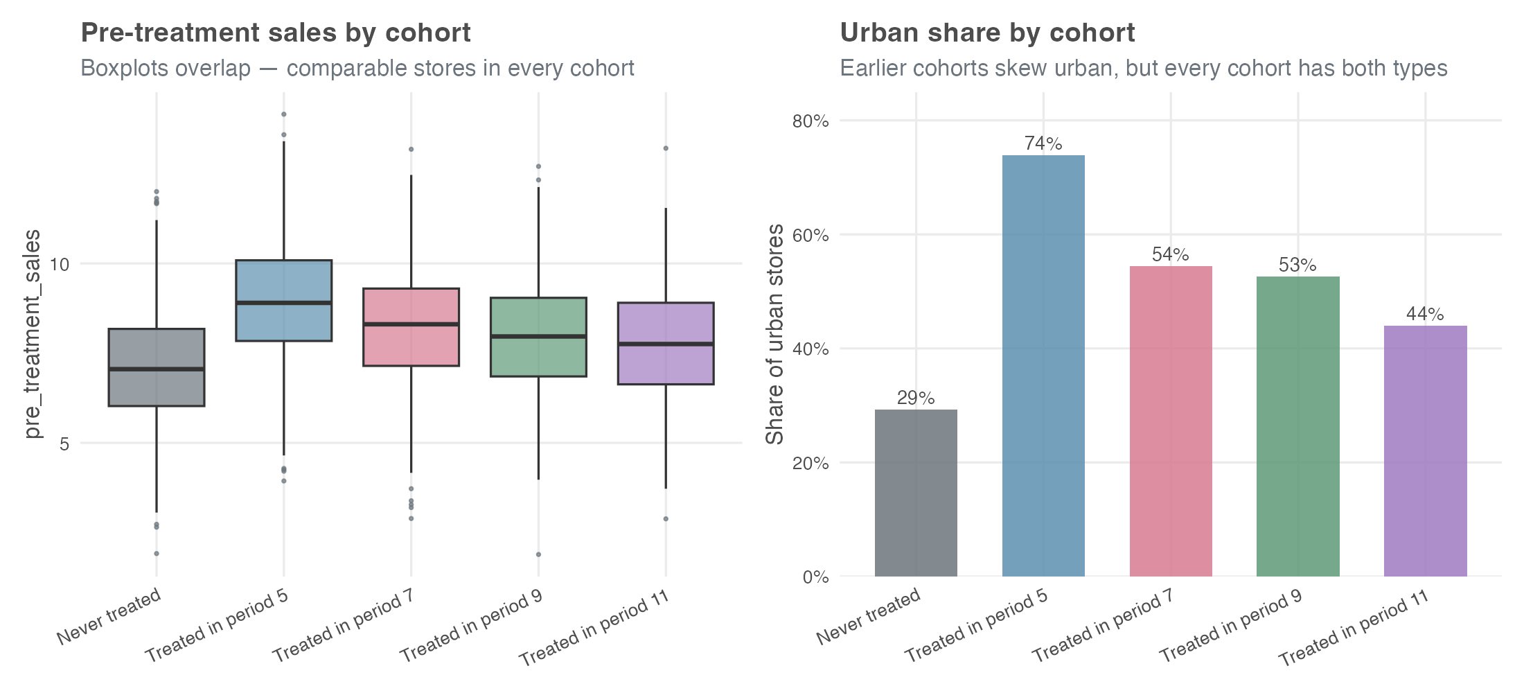
pre_treatment_sales distributions overlap across cohorts.
Urban shares span 29% (never-treated) to 74% (cohort 5), and the pre_treatment_sales boxplots overlap heavily. Every cohort has comparable stores in the covariate space — DR has something honest to reweight against.
Condition on the covariates
Re-run CS conditioning on pre_treatment_sales and urban — the two pre-treatment store characteristics that drive the differential trend. Both are admissible under the rule from earlier in the chapter (covariates must be measured before treatment can affect them): urban is fixed at baseline, and pre_treatment_sales is captured before the rollout begins. Post-rollout staffing levels would not be admissible.
With covariates, the doubly-robust estimator — the package default we kept all along — runs two models in parallel and combines them as a safety net. One predicts the change in sales from pre-treatment covariates (an outcome model); the other predicts the probability that a store ended up in cohort g rather than in the comparison group (a propensity-score model). If at least one of those two models is right, your ATT estimate stays consistent (Sant’Anna and Zhao 2020).
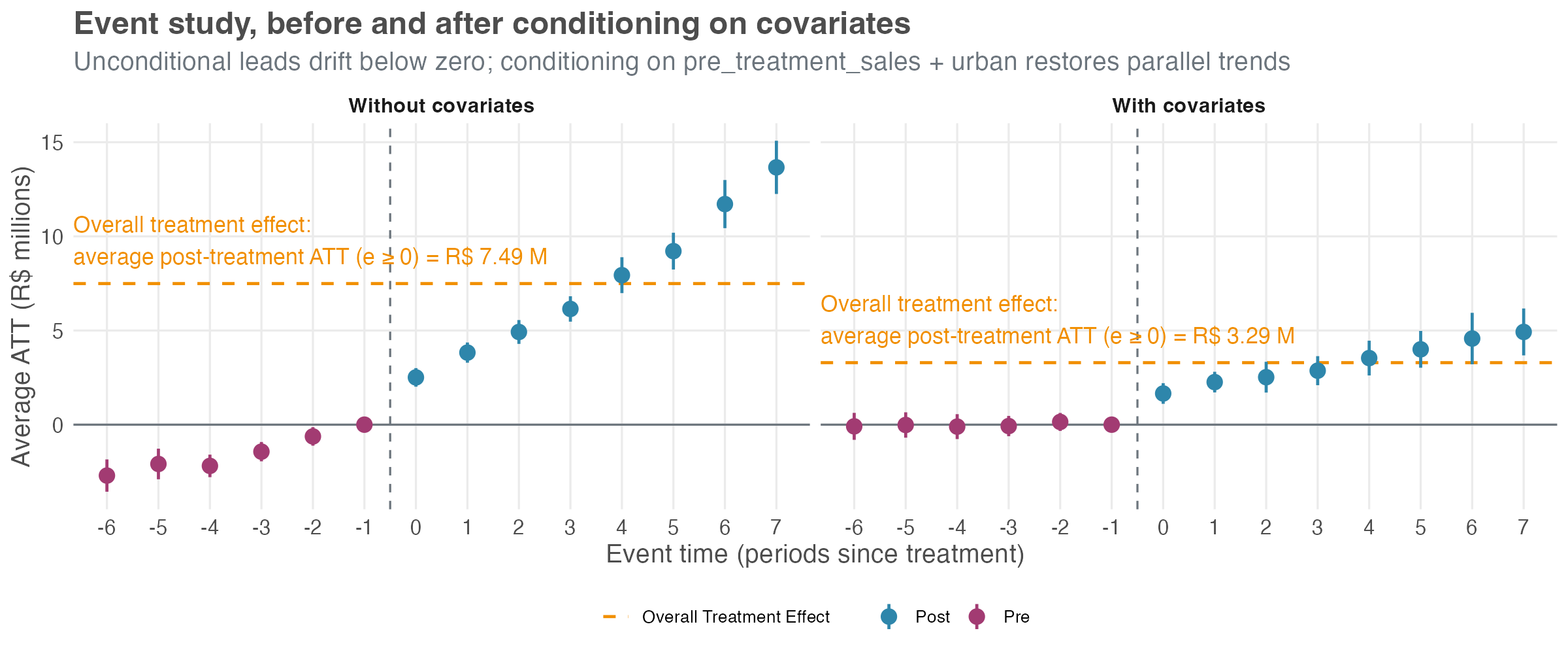
The right panel of Figure 10.8 tells a different story. Pre-treatment leads hug zero (max magnitude 0.15), all comfortably inside the band. Post-treatment lags trace a clean ramp from about R$ 1.7 million at e = 0 to about R$ 5 million at e = 7 — the true treatment-effect ramp built into the simulation. The overall ATT lands at R$ 2.98 million (SE 0.24), within 1 SE of the simulated truth.
Three things to take from this side-by-side. First, the unconditional event study is the diagnostic that flagged the problem — leads drifting away from zero with a coherent pattern. That’s the signal step 5 of the checklist (Section 10.7) tells you to look for before trusting any headline.
Second, covariates aren’t a free lunch — they buy parallel trends in exchange for an overlap requirement and a correctly specified outcome or propensity model.
Third, the doubly-robust property is useful insurance: in applied work you rarely know whether your outcome model or your propensity model is the right one, and DR asks you to get only one of the two correct. When the conditional event study still looks shaky after you’ve thrown your best covariates at it, that’s the cue to reach for the honest DiD sensitivity framework in step 9.
10.6 Comparing TWFE and modern DiD: a side-by-side look
We’ve spent the chapter learning the CS approach in isolation. Now let’s compare it head-to-head with the naive TWFE estimator on the same data. The dataset was simulated with a known true overall ATT of R$ 3.00 million per store-month — so we can score both estimators against ground truth.
| Estimator | Specification | Estimate (R$ MM) | 95% CI |
|---|---|---|---|
| Naive TWFE | Static — one treated dummy |
2.39 | [2.17, 2.61] |
| Callaway-Sant’Anna | Group-balanced overall | 3.03 | [2.74, 3.32] |
| Simulated ground truth | — | 3.00 | — |
The CS estimate is the group overall — the recommended headline from earlier in the chapter — and at R$ 3.03 million it lands almost exactly on the simulated truth of R$ 3.00 million. The naive TWFE estimate comes in at R$ 2.39 million (SE 0.11), about a 21% attenuation in magnitude. Not a sign flip, but a meaningful and silent miss. If you reported the TWFE number to a finance partner, you’d be off by roughly a fifth on a real-world rollout the size of this one. Table 10.3 lays the gap out side-by-side: the CS interval brackets the simulated truth, while the TWFE interval sits well below it.
That gap is structural, not sampling noise — and it pays to see where it comes from. The TWFE number here is the static specification: one treated dummy that switches on when a store adopts the new layout and stays on. Goodman-Bacon (2021) showed that single coefficient is a weighted average of every two-period, two-group DiD the data allows — and some of those comparisons are forbidden: a late-adopting store gets implicitly compared against an earlier-adopting one that is already treated and still ramping, a contaminated control that drags the average down.
This only bites when the treatment effect is heterogeneous — varying across cohorts or over event time. Ours is, by construction (Figure 10.3), so the static estimator is exposed. Two things can rescue TWFE: a sharper specification and a clean control group. The next two figures isolate them one at a time.
Side-by-side: event study
The overall ATT is a single number; the event study shows the whole dynamic path — and how that path depends on the specification. Figure 10.9 runs both estimators on the same full panel as Table 10.3 (with the never-treated holdout included), but it changes the TWFE side. Instead of one treated dummy it uses an event-study TWFE: a full set of relative-time indicators, one coefficient per horizon. Each horizon is now identified against the never-treated holdout instead of being averaged into the static blob, so the forbidden comparisons that bit the headline can no longer hide.
With that switch alone, the naive TWFE event study and CS are nearly indistinguishable: leads hug zero — no invented pre-trend — and lags trace the same upward ramp, from roughly +1.7 at e = 0 to +5.5 at e = 7, right alongside CS’s +1.8 and +5.7. Rüttenauer and Aksoy (2024) make this a general result: “the conventional TWFE performs generally well if the model specifies an event-time function.” Same fixed effects, same data — different specification, different answer.
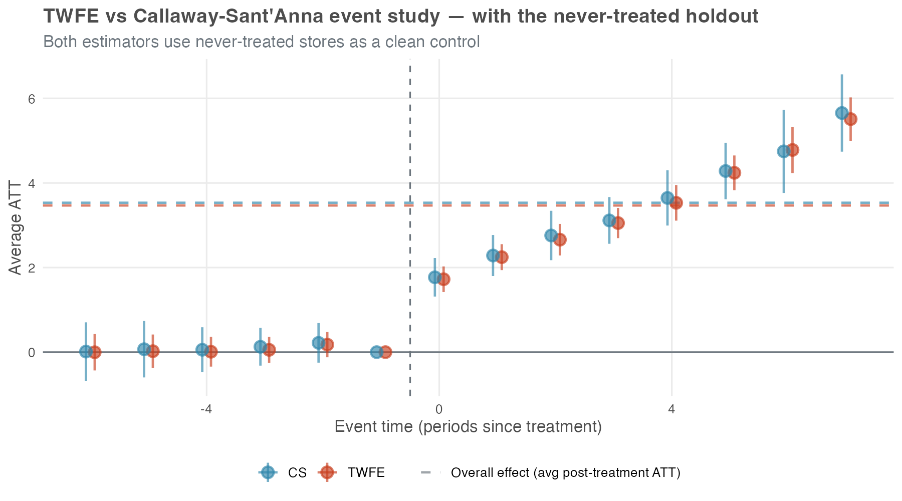
A TWFE event study is not automatically broken under staggered timing — that is the lesson. When a genuine never-treated group anchors each relative-time coefficient, the dynamic profile behaves. The static treated regression on the same data still attenuated by 21% (Table 10.3) because collapsing every post-treatment month into one number is what exposed it to the forbidden comparisons; a relative-time indicator at each horizon does not pool over event time, so the bad 2×2 comparisons cannot get mixed in.
Two reading notes for the figure itself. First, the dashed “overall effect” lines in Figure 10.9 are the average of each estimator’s own event-study coefficients for \(e \geq 0\) — close to the event-study overall from Figure 10.5, not the cohort-aggregated headline of R$ 3.03 million in Table 10.3. Different aggregation, different number; don’t read across figures as if they reported the same quantity. Second, a caveat from Sun and Abraham (2021): even event-study coefficients in TWFE are weighted sums across cohorts and can carry contamination if cohort effects vary sharply; CS-type estimators sidestep this by construction.
The picture falls apart the moment that clean control disappears — even with the same event-study specification. Figure 10.10 drops the never-treated holdout entirely and re-runs both estimators on the treated cohorts only — the situation you face when every unit eventually gets treated. The TWFE model is identical to Figure 10.9 in every respect except this. Now TWFE has no never-treated reference and is forced to use already-treated cohorts as implicit controls. The event-time function was the first fix; a clean comparison group is the second, and the data no longer carry one.
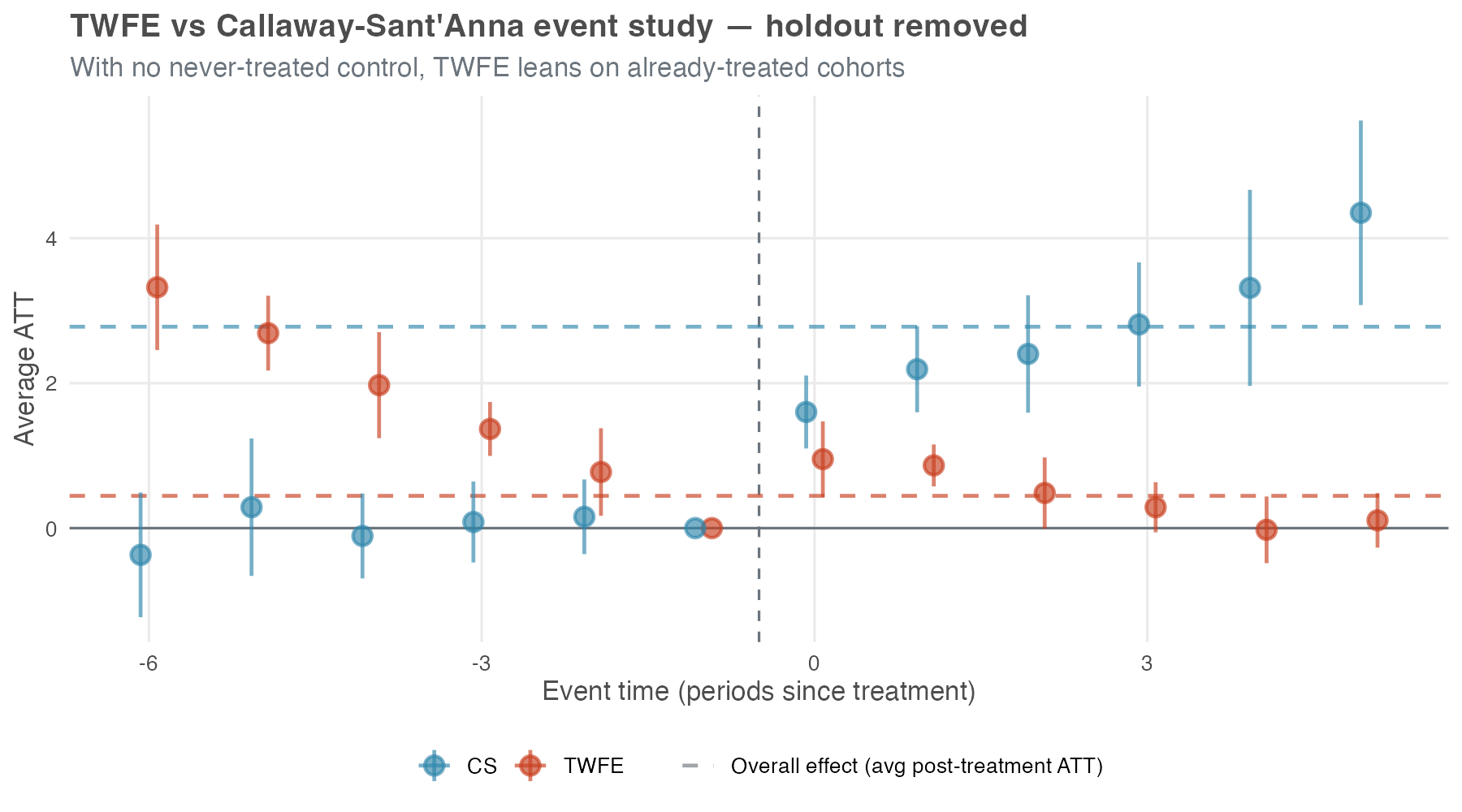
Two things to notice. First, the TWFE pre-treatment leads turn substantially positive — about +3.3 at e = −6, drifting down to zero at e = −1 — even though the simulation has no anticipation built into it at all. With no clean control left, TWFE is forced to use already-treated cohorts as the comparison group — and the bias from those forbidden comparisons spills backward into the pre-treatment estimates, inventing a pre-trend that isn’t actually in the data. A practitioner reading this curve would (wrongly) diagnose a serious pre-trend problem and abandon the design. Second, the TWFE post-treatment lags actively decline, from ~0.95 at e = 0 toward zero by e = 5 — the opposite of the true upward ramp.
CS, by contrast, falls back to a not-yet-treated control and holds its ground: the leads still hug zero and the lags still climb. The price is reach, not direction — without a never-treated group the longest horizons (e ≥ 5) lose identification and the bands widen, but the effects CS can still identify keep the right pattern. Same data, two estimators, opposite conclusions.
The three figures together pin down when TWFE bias bites and when it doesn’t, and Table 10.4 is the recap. The precondition is heterogeneous treatment effects (a constant level shift would leave even static TWFE unbiased under staggering — Goodman-Bacon (2021)); given heterogeneity, two design choices control the damage.
Specification: a static treated dummy pools every post-treatment month into one Goodman-Bacon weighted average and is exposed to forbidden comparisons; an event-study specification with relative-time indicators is not. Comparison group: even the event-study specification needs a clean control — never-treated or, failing that, not-yet-treated; without one, every horizon falls back on already-treated cohorts and the design collapses (Callaway and Sant’Anna 2021; Chaisemartin and D’Haultfœuille 2020).
| TWFE specification | Clean control in the panel | No clean control left |
|---|---|---|
Static — one treated dummy |
Biased (Table 10.3, −21%) | Biased, typically worse |
| Event study — relative-time indicators | ≈ Unbiased (Figure 10.9) | Biased: pre-trends invented, lags collapse (Figure 10.10) |
The framing is not that TWFE is useless: when TWFE behaves in a staggered design, it is usually because the specification and the comparison group keep it close to the clean comparisons that modern DiD estimators build explicitly. CS gets there more transparently and reports the per-cohort and per-horizon pieces along the way. But CS still needs the same core design ingredients: credible parallel trends, no problematic anticipation or carryover, a usable comparison group, and enough power to distinguish signal from noise.
That is also the practical lesson from large reanalyses. Rüttenauer and Aksoy (2024) call modern estimators “not a universal remedy for violations of the most critical assumptions.” Chiu et al. (2025) reanalyzed 49 published panel studies and found that switching from TWFE to a heterogeneity-robust estimator usually gave “qualitatively similar but highly variable” results. On average the two methods landed within a couple of percent of each other (median ratio of 1.01), and they always agreed on the sign of the effect. The ~21% attenuation in Table 10.3 is closer to an engineered worst case than to the everyday picture.
What shifts more often is statistical significance. In the same reanalysis, the count of studies that no longer rejected the null rose from 1 under TWFE to 12 under the heterogeneity-robust estimators. Most of that swing is not bias in the TWFE point estimate — heterogeneity-robust estimators simply produce wider standard errors, so it takes more data to clear the significance bar.
The recommendation from these reanalyses is therefore not to discard TWFE: keep it as a transparent benchmark, pair it with at least one heterogeneity-robust estimator such as CS, and dig into why the two differ when they do. It also helps to remember where TWFE is on safe ground: in the classic 2×2 setup — one treated group, one control, two periods — it still recovers the ATT under parallel trends and no anticipation even with heterogeneous effects. Staggered timing is what trips it up, not heterogeneity by itself. The credibility of the parallel-trends story is still the question that matters most.
10.7 The DiD checklist: best practices for your analysis
A staggered DiD has many moving parts: which control group to use, which parallel-trends flavor to lean on, which covariates to add, which aggregation to report. We risk skipping the diagnostic that would have caught the problem. The 10-step workflow below is from Pedro Sant’Anna, who describes it as “meant to be interpreted more as an informal guide than a protocol” — a set of questions to think through, not boxes to tick. Roth et al. (2023) offer a complementary, higher-level checklist (their Table 1) covering the same terrain at a different altitude.
Plot the treatment rollout. Use
panelViewin R or a heatmap in Python to see when each unit receives the treatment. This gives you a quick read on the structure of the data and flags awkward cases, such as all units treated at once or very few units in a cohort.Count units by cohort. Report the number of units in each treatment cohort and in the never-treated group, if one exists. Small cohorts have noisier estimates and can quietly drive an aggregation.
Plot average outcomes by cohort. Show the average outcome over time for each treatment cohort and for the control group. This is the first visual check for parallel trends and for obvious differences in pre-treatment slopes.
Choose the comparison group and parallel-trends version. Think about assignment. Who decides which units get treated, and when? What information do they have? Use those answers to choose never-treated or not-yet-treated controls, and to decide whether unconditional or conditional parallel trends is the more credible assumption.
Run the event study without covariates. Run CS, or another modern DiD estimator, without covariates. Then read the pre-treatment leads. Flat leads near zero — visually, and on the joint F-test of pre-treatment coefficients you’ve already met in chapter Chapter 9 — are evidence for unconditional parallel trends. Drifting leads, or a joint test that rejects, are your signal to move to the next step.
Add covariates when the untreated trends need them. If the leads from step 5 drift, unconditional parallel trends is unlikely to hold. Add covariates you believe are driving the differential trend — pre-treatment characteristics like unit size, location, or baseline outcome levels — not just covariates that happen to be in the dataset. CS handles them through outcome regression, inverse probability weighting, or the doubly-robust combination of the two.
When using covariates, check for overlap. If you are conditioning on covariates, you need sufficient overlap (common support) between the treated and control groups. If the control group is very small or has very different covariate distributions than the treated group, overlap may be poor, and the method will be forced to guess what would have happened in covariate regions it never actually observed, which is a fragile foundation for any conclusion.
- You can check overlap by plotting the distribution of the propensity score (the probability of being treated) for the treated and control groups. If the distributions do not overlap well, you may need to reconsider your covariate selection or your choice of control group. If you’re willing to extrapolate, the regression-adjustment variant of CS can still proceed — at the cost of leaning on the outcome model to fill regions of covariate space the data never actually covered. Be transparent if you go that route.
Re-run the event study with covariates. Re-run CS with covariates and apply the same flatness check as in step 5 — leads visibly flat, joint F-test failing to reject. If conditioning did its job, the pre-treatment leads should be closer to zero and flatter than they were unconditionally. If they aren’t, parallel trends may still be violated, and the headline estimate is suspect.
Stress-test parallel trends. Even a clean-looking event study leaves some room for post-treatment violations. The honest DiD framework of Rambachan and Roth (2023) is the standard tool here: it lets you bound the treatment effect under different assumptions about the magnitude of a potential parallel-trends violation, producing a range of plausible estimates rather than a single point estimate. See Appendix 10.A for the framework and the R/Python implementations.
Move to another design when the assumption still fails. If covariates and sensitivity analysis still leave the parallel-trends story unconvincing, consider another identification strategy: synthetic control, regression discontinuity, instrumental variables, or something else that fits the assignment process.
In the end, the checklist boils down to a few habits: use visualizations as diagnostic tools, treat parallel trends as an assumption you can assess but never prove, lean on covariates carefully without treating them as magic, and be transparent about every decision you made along the way. None of this guarantees you’re right — but it keeps the analysis honest.
10.8 Wrapping up and next steps
We’ve covered a lot of ground. Here’s what we’ve learned:
- TWFE breaks under staggered adoption: When units are treated at different times, two-way fixed effects quietly uses already-treated units as controls — a “forbidden comparison” that can shrink, inflate, or even flip the sign of your estimate.
- Group-time ATTs are the honest building block: The Callaway and Sant’Anna (CS) method estimates a separate effect for each cohort in each period, \(ATT(g,t)\), using only clean comparisons against never-treated or not-yet-treated units.
- Aggregation answers your question: One \(ATT(g,t)\) table feeds many summaries — an overall headline, a per-cohort profile, a calendar-time path, or an event study. Pick the aggregation that matches what you actually want to know.
- Assumptions are choices, not defaults: CS requires irreversible (absorbing) treatment and limited anticipation, and it asks you to choose your control group (never-treated vs. not-yet-treated) and your parallel trends flavor (unconditional vs. conditional).
- Covariates buy parallel trends — at a price: Conditioning on covariates can rescue parallel trends, but only if treated and control units overlap. The doubly-robust estimator is insurance: get either the outcome model or the propensity model right, and the estimate stays consistent.
- The event study is your diagnostic: Flat, near-zero pre-treatment leads are evidence for parallel trends; drifting leads are a warning. When leads still look shaky, the honest DiD sensitivity framework bounds how much a violation would move your answer.
How to run a modern DiD analysis (the short version of the 10-step checklist in Section 10.7):
- Visualize first. Plot the treatment rollout and the average outcomes by cohort before estimating anything.
- Think about assignment. Who decides which units get treated, and when? Use that to pick your control group and your parallel trends assumption.
- Estimate with CS. Run the method without covariates, then aggregate to the summary your research question needs.
- Read the event study. Check the pre-treatment leads for flatness. If they drift, add covariates that plausibly drive the differential trend — and check overlap before trusting the result.
- Stress-test. Run a sensitivity analysis for parallel trends violations, and be transparent about every choice you made along the way.
What’s next: With staggered DiD in your toolkit, you’ve covered the panel-data side of modern causal inference — many treated units, many timing cohorts, effects averaged across them. But plenty of real-world interventions don’t give you a panel at all. You have one treated unit — a single market, product, or country — and one intervention date, and you still need to know what would have happened without it. That’s the world of time-series causal inference, the subject of the next chapter. We’ll move from estimators that average across many treated units to estimators that build a counterfactual time path for just one, using methods like CausalImpact and CausalArima.
Appendix 10.A: Beyond the basics — a glimpse at advanced topics
The Callaway and Sant’Anna method covers a lot of ground, but it is designed for a specific type of setting: staggered adoption of a binary, absorbing treatment. The real world is messier. This section sketches the main places where you’ll need something beyond standard CS, and points you to the resources that handle each one.
When treatment can turn on and off
The CS method assumes that once a unit is treated, it stays treated. But what if your treatment is not permanent? For example, imagine a company that runs a promotional campaign for a few weeks, then stops, then runs it again a few months later. Or consider a policy that is implemented, then repealed, then re-implemented. In these cases, the treatment is non-absorbing — it can turn on and off.
For these cases, you need a different set of tools. Building on their earlier heterogeneity-robust estimator for the binary, absorbing case (Chaisemartin and D’Haultfœuille 2020), de Chaisemartin and D’Haultfœuille extend the framework to non-absorbing treatments in Chaisemartin and D’Haultfœuille (2025). Their approach handles richer treatment paths and is implemented in the R package DIDmultiplegt, the Stata package did_multiplegt (Chaisemartin et al. 2025), and the Python package py-did-multiplegt-dyn (pip install py-did-multiplegt-dyn). If your treatment can turn on and off, start there.
Continuous treatment intensity
So far treatment has been binary: you receive it or you don’t. In many settings it varies in intensity instead. For example, instead of asking “Did the store adopt the new layout?” you might ask “How much did the store invest in the new layout?” or “What percentage of the store’s floor space was redesigned?” In these cases, you have a continuous treatment variable.
Estimating the effect of a continuous treatment in a DiD framework is harder because the estimand now depends on the dose-response relationship. Does one extra unit of treatment have the same effect at low and high intensity? Recent work extends DiD methods to continuous treatments, but this is still an active research area. In applied work, you may need to discretize intensity into categories such as “low,” “medium,” and “high,” or use a method built directly for continuous treatment.
Multiple treatments and interactions
What if units are exposed to multiple treatments, either simultaneously or sequentially? For example, a store might adopt a new layout and also launch a new loyalty program. Or a state might implement a minimum wage increase followed by a new tax policy. In these cases, you need to think about how to disentangle the effects of the different treatments and whether they interact with each other.
There is no generic fix here. One approach is to define the treatment variable around the combination you care about, such as “new layout only,” “loyalty program only,” or “both.” Another is to use methods that model multiple treatments and their interactions explicitly. The book by de Chaisemartin and D’Haultfœuille (2025), “Credible Answers to Hard Questions: Differences-in-Differences for Natural Experiments,” covers these harder designs and the methods available for them.
Sensitivity analysis for parallel trends violations
Even if your event study looks clean and your pre-treatment estimates are flat, there is always some residual uncertainty about whether the parallel trends assumption truly holds. After all, we can only observe pre-treatment trends for a limited number of periods, and there is no guarantee that the trends would have remained parallel in the post-treatment periods.
Sensitivity analysis gives you a way to show how much that uncertainty matters. The standard framework is the honest DiD approach of Rambachan and Roth (2023): you specify a bound on how much the parallel trends assumption could be violated (for example, “the post-treatment trend could deviate from the pre-treatment trend by at most X units per period”) and then calculate the range of treatment effects consistent with that bounded violation. The framework is implemented in the R honestDiD package and exposed in Python through the diff-diff library (from diff_diff import HonestDiD).
That range is more honest than a lonely point estimate when parallel trends is debatable. You are saying, in effect: if the violation is no larger than this, here is the set of effects still consistent with the data. This is especially useful when the pre-treatment trends are not perfectly flat or when the assignment story gives you other reasons to worry.
Where to learn more
The DiD literature has moved fast in recent years. These are the resources I would start with:
Roth et al. (2023) and Baker et al. (forthcoming): Survey papers on the recent DiD literature, written with practitioners in mind.
Chaisemartin and D’Haultfœuille (2025): A book-length treatment of modern DiD methods, with more attention to complex treatment designs. More technical than this chapter, but useful if your treatment is not binary and absorbing.
Callaway and Sant’Anna (2021): The original CS paper. It is technical, but it gives the full theoretical foundation for the approach used here.
The R did package and Python diff-diff package: Documentation with code examples, walkthroughs, and API references for estimation and aggregation.
As Google advises, “NotebookLM can be inaccurate; please double-check its content”. I recommend reading the chapter first, then listening to the audio to reinforce what you’ve learned.↩︎
“Negative weights”: When TWFE aggregates treatment effects across different comparisons, it typically gives positive weights to effects it wants to count. But in staggered designs, some comparisons involve using already-treated units as controls for newly-treated units. These comparisons can receive negative weights, meaning they’re subtracted from the overall estimate rather than added. This is why TWFE can produce negative average effects when every individual effect is actually positive.↩︎
As in Chapter 9, this visual check is necessary but not sufficient. The event study discussed later will provide the formal test of common trends, where we expect pre-treatment leads to be statistically indistinguishable from zero.↩︎
Formally, under unconditional parallel trends and no anticipation, \(ATT(g, t) = \mathbb{E}[Y_t - Y_{g-1} \mid G = g] - \mathbb{E}[Y_t - Y_{g-1} \mid C = 1]\), where \(C = 1\) flags the never-treated comparison group. See Callaway and Sant’Anna (2021) for the conditional version that allows covariates.↩︎
The CS method can still be used for short-lived treatments like a temporary promotion, but only under specific conditions. One option is to limit your dataset to periods up to the end of the promotion for the first treated cohort; within that window, the treatment looks effectively irreversible. Another option is when you have good reason to believe that the promotion’s effects persist even after it ends, meaning the cohort remains “as-if treated” in the periods that follow.↩︎
When you pass a time-varying covariate to the CS package, it actually uses the earlier-period value within each comparison, which keeps the covariate effectively pre-treatment.↩︎
These three “new” assumptions aren’t unique to staggered DiD. Standard DiD already relies on versions of them. I highlight them here because Callaway and Sant’Anna (2021) make them explicit and formalize them in a way that’s especially useful for staggered designs.↩︎
To load it directly, use the example URL
https://raw.githubusercontent.com/RobsonTigre/everyday-ci/main/data/staggered_did.csv.↩︎A panel is unbalanced when some units aren’t observed in every period (e.g., they first appear in later periods or exit the panel before the last period). Since each ATT(g, t) is a difference \(Y_t - Y_{g-1}\) for the same units, not having some observations available for a unit prevents us from calculating all these differences. Both packages let you handle this by dropping every unit not observed in all periods, but that may bias the estimates when units disappear for reasons related to treatment or to the outcome (non-random attrition).↩︎
The packages’ default, a varying baseline, compares each pre-treatment period to the one immediately before it. The universal baseline fixes the reference at period g − 1 for every cohort and reports cumulative changes from it, normalizing the period just before treatment to exactly zero. Post-treatment estimates are identical under either convention; only the pre-treatment leads change.↩︎
Treat this p-value as a diagnostic, not a test to pass. Failing to reject does not establish that parallel trends holds, and conditioning the analysis on a pre-test result distorts the inference that follows.↩︎