3 Planning and designing credible causal analyses
A/B Testing, Causal Inference, Causal Time Series Analysis, Data Science, Difference-in-Differences, Directed Acyclic Graphs, Econometrics, Impact Evaluation, Instrumental Variables, Heterogeneous Treatment Effects, Potential Outcomes, Power Analysis, Sample Size Calculation, Python and R Programming, Randomized Experiments, Regression Discontinuity, Treatment Effects
As we saw in Chapter 2, raw data, no matter how vast, won’t necessarily help you answer causal questions on its own. And neither can advanced algorithms. Fancy methods people call Causal AI, Double ML, Causal Forest, or Meta-learners won’t give you a free pass to conclude causality either. Data and methods are the means, not the end, and they mean nothing if you’re asking the wrong question.
Instead, you need a thoughtful framework and an investigative approach. So in this chapter, I’ll guide you to put theory into practice and walk through a step-by-step on how to approach a causal data project, from formulating a precise question to executing the analysis and interpreting your findings.
I’ll introduce how to defend your conclusions against common sources of bias, ensuring your insights are not just statistically sound but also truly sensible and actionable (i.e., having practical value). Throughout the chapter, we’ll again use simple yet relatable examples from tech/digital businesses. Let’s start this journey to transform your causal thinking into a practice.
3.1 Formulating a well-defined causal question
“A problem well stated is a problem half solved.”
— John Dewey (North-American philosopher)
Every causal data project should begin with a crystal-clear question. In the real world, however, stakeholders often ask vague questions, such as “Does X work?” or “What is the impact of Y?” These questions are insufficient because they lack precision in the what, who, and how senses. So, before you start, you need to clearly and precisely define your causal question. Think of it as a hypothesis: a testable statement about a cause-and-effect relationship.
A well-formed causal hypothesis has several key components:
What is the treatment/intervention in question? (\(D_i\)): What specific action, policy, or feature are you introducing or changing? This must be clearly defined and measurable. For instance, is it “sending a push notification” or “displaying a new UI element”?
- What constitutes the intervention?: You need to be clear about what it means for someone to be treated. For example, does being treated mean a person receives a discount email, no matter if they open it or not? Or does it mean they receive the email and actually open and click on a link inside it? How you define this changes what effect you’re measuring and how you interpret your results (see Section 2.5). The right choice depends on your specific context. Often, this detail is left unsaid, but making it explicit will help you and others understand your analysis.
What’s the KPI/outcome over which you want to measure an effect? (\(Y_i\)): What specific metric or behavior do you expect to change as a result of the treatment? This should be a key performance indicator (KPI) relevant to your business goals. Examples include “daily active users,” “average order value,” or “churn rate”. You may elect to measure multiple KPIs, but it’s important to be clear about which one you’re focusing on.2
- Be precise about outcome definitions: Different teams often define the same metric differently. For example, “user churn” might mean 30 days of inactivity for the marketing team but 90 days for the commerce team. Choose the definition that best aligns with your specific business question and stick to it consistently throughout your analysis.
What’s your population and time period of interest? Who are the individuals, users, or entities that are subject to this treatment and whose outcomes you are measuring? Be specific. “All users” is rarely precise enough; remember there will be inactive users, for instance (e.g., those who haven’t accessed the platform in more than a year). Is it “new sign-ups in the last 30 days,” “high-value customers in the last year”, or “users in a specific geographic region during december 2024”?
What is the comparison group (the “feasible” counterfactual, as discussed in Chapter 2): What is the alternative scenario against which you are comparing the treatment? This is crucial for establishing causality. Is it “users who received the old feature”, “users who received no intervention,” or “users who received a placebo”?
Let’s refine a common business question using this framework. Below is an example of how some stakeholders might phrase their question (“Vague question”) and what we should help them achieve instead (“Well-defined question”):
Vague question: “Does our new feature reduce churn?”
Well-defined question: “Among users active for at least 30 days before the experiment (population in question), does exposure to the new personalized feature (treatment), compared to the standard interface (comparison), reduce their likelihood of leaving the platform over the next 90 days (outcome)?”
Notice how this refined question immediately suggests what data you need to collect, who you need to target, and what you’ll compare. It also implicitly defines exactly what effect you want to measure (in this case, the average impact on new users).
3.1.1 Avoiding hypothesizing after the results are known
Once you have your well-defined causal question, the next critical step is to pre-register your hypothesis and analysis plan. Pre-registering means documenting the question you will try to answer, the specific metrics you’ll use, your planned methodology, and even your decision rules before you collect or analyze the data. This could be as simple as writing it down in a deck of slides you use to pitch your ideas and validate them with stakeholders before you start the project.
Why is this so important? To avoid HARKing, which stands for “Hypothesizing After the Results are Known”. HARKing occurs when you formulate your hypothesis after seeing the results, often to subconsciously make your findings appear more significant or to fit a narrative. This practice, while sometimes unintentional, can lead to misleading conclusions and erode the credibility of your analyses in the long run.
Here’s a subtle example: An analyst is asked to “look into” whether a recent UI redesign affected user behavior. No specific hypothesis is written down, no primary metric is pre-registered. She dives into the data and finds… nothing dramatic. Conversion rates are flat. Bounce rates are unchanged. Session duration? Meh.
But then she notices something: users who saw the redesign scroll slightly farther down the page. “Aha!” she thinks. “The redesign increases content exploration!” She writes up a positive report, genuinely believing she found what she was looking for. Except she wasn’t looking for scroll depth when she started — it just happened to be the metric that moved. Without a pre-registered hypothesis, she had no way to distinguish between a real finding and a lucky pattern in the noise. This is HARKing as self-deception: an honest analyst fooling herself because she never committed to a specific question upfront.
Now consider a more blatant variant. A product team launches the XYZ algorithm to personalize their social feed. After running an A/B test, they discover mixed results — a modest 8% increase in total time spent in the app, but a concerning 15% drop in click-through rates for their most valuable user segments.
Faced with pressure to show success, the team makes a fateful decision. Instead of honestly reporting the nuanced findings, they quietly pivot their success metric. Suddenly, “engagement” no longer includes click-through rates — it’s redefined to mean only “time spent”. The narrative transforms: “Algorithm XYZ delivers breakthrough engagement gains!” The inconvenient CTR decline? Buried in an appendix or omitted entirely. This is HARKing as a cheating device: the team knew the results were mixed and chose to hide the inconvenient truth.
Both variants lead to the same problem: false discoveries presented as real insights. But the first is arguably more dangerous because it’s harder to detect and easier to rationalize. The analyst didn’t set out to deceive anyone — she deceived herself first. The second is more cynical, but at least someone in the room knows the full picture. Both would be avoided by pre-registering the question and analysis plan with the team and stakeholders before the experiment!
HARKing is the analytical equivalent of shooting arrows at a blank wall, then painting bullseyes around wherever they land, as in Figure 3.1. The consequences are severe: inflated false positives, misallocated resources chasing phantom wins, and most damaging of all, the gradual erosion of trust in your data practice. When stakeholders eventually discover the full picture, your credibility takes a hit that can take years to recover from.

Best Practice: Write down your causal question, estimand, and analysis plan in a shared document (e.g., a project brief) before the experiment or data collection begins. This commitment to transparency forces rigor and protects against the temptation to massage results to fit a desired outcome. It ensures that your conclusions are driven by evidence, not by post-hoc rationalization.
3.2 Business therapy session: clarifying the project goals
Now that you understand the ingredients needed to formulate a well-defined causal question, let’s take a step back. In real life, most stakeholders don’t have a clear understanding of what a causal question is, and they often ask for “causal insights” that are not actually causal. They confuse correlation with causation, or mistake prediction for causal inference. This brings us to an often-overlooked step: helping stakeholders help themselves. I call this the “business therapy session”.
Before diving into project planning, it’s essential to recognize when stakeholders are asking for something that sounds causal but isn’t. Here’s a common example:
Stakeholder request: “I want you to use our historical data to identify what characteristics make the sellers in our marketplace more prone to sales growth”.
Stakeholders love this kind of request. They believe that by studying the behaviors of high-performing sellers, they can replicate success by encouraging everyone else to do the same. It’s the hunt for the “aha moment”.
The problem? This sounds causal, but strictly speaking, it asks for a pattern in historical data. Even rich historical data can only show associations, not causes.3
For instance, you might find that sellers with higher social media engagement have better sales growth. But this alone doesn’t tell you whether:
- Social media engagement causes better sales (a causal relationship)
- Better sales cause more social media engagement (reverse causality)4
- Both are driven by a third factor like seller motivation or product quality (confounding)
Again, what stakeholders actually want is to know what behavior to encourage to achieve the desired outcome. For example: “If I incentivize sellers to engage more on social media, will their sales improve?” But to answer that, you would need an experiment or quasi-experiment (which you could then apply to historical data) that manipulated these characteristics and observed the results. Only then can you disentangle correlation from causation.
3.2.1 Four essential clarifying questions
I recommend you sit down with your stakeholders and partners to find answers to these four questions and the ones in Section 3.3. Getting these answers early is the best way to ensure your project stays on track and delivers actual value upon conclusion.
To transform vague stakeholder requests into actionable causal projects, work through these four questions together:
1. What is the endgame of the project? Clearly define “what success looks like” for this project in objective terms. Most teams already have target metrics they want to hit (revenue, retention, conversion rates). What specific outcomes do we aim to achieve, and how will we recognize when the project is successfully completed? This forces stakeholders to move beyond the vague “let’s explore the data” to concrete, measurable goals.
2. What is the core question or hypothesis we are addressing? This builds on the endgame to formulate the primary hypothesis or question the project intends to answer. Is it clear, testable, and relevant to stakeholders and to the business? More importantly, is it actually a causal question (one asking whether X causes Y) that requires causal inference methods, or is it a descriptive/predictive question (summarizing patterns or forecasting outcomes) that can be answered with standard analytics?
3. What decisions or actions will be taken based on our insights? Identify what will change based on the results. Are stakeholders committed to acting on our findings? Clearly define actionables to validate and justify our involvement. The key word here is “actionables”: if no decisions will change based on your analysis, question whether the project is worth pursuing.
4. How will we measure project success on our end? When will enough be enough? Clearly define key metrics or KPIs for your deliverables. This clarifies the roadmap of your contribution and avoids infinite loops of “deep dives” that stakeholders usually request when they don’t know how to proceed. This step also helps prevent HARKing (revising your hypothesis after seeing the results) by establishing success criteria upfront.
These questions serve as a filter: they help distinguish genuine causal questions from correlation/prediction questions, ensure stakeholder buy-in for acting on results, and establish clear boundaries for your analysis scope.
3.3 Gather more context to design effective causal studies
Once your question is locked in, the next phase is to design a study that can credibly answer it. This is where you proactively defend against the biases we discussed in Chapter 2, particularly omitted variable bias and selection bias. The core challenge is to construct a valid counterfactual – a group that accurately represents what would have happened to your treated group had they not received the treatment.
Before diving into specific methodologies, you need to ask yourself a series of fundamental questions. These questions will help you assess the feasibility of different study designs and identify potential challenges. They are essential whether you’re planning a new experiment (we call it “ex-ante”) or trying to make sense of data from an intervention that has already occurred (we call it “ex-post”).5
In the discussion below you will preview different approaches to design a credible causal study. Don’t worry, I will cover them in depth in their respective chapters. But if you want a spoiler on how they work, what are their main requirements and how they intend to achieve causal identification, you can also find a summary of these methods in Appendix 3.A.
Has anyone received the treatment yet?
This dictates the fundamental nature of your study: are you planning a new, controlled experiment before anyone is exposed (ex-ante), or analyzing existing data from an intervention that already happened (ex-post)? The answer to this question immediately narrows down the feasible causal inference methods and highlights the types of biases you’ll need to actively defend against.
If the answer is “no one has been exposed yet”, this may allow for the implementation of a Randomized Controlled Trial (RCT), a class that contains the popular A/B tests. In an A/B test, users are randomly assigned to either a treatment group (exposed to the intervention, e.g., a new feature) or a control group (not exposed). Randomization works like shuffling a deck of cards: it ensures that, on average, both groups look the same on every dimension, whether you can measure it or not. This eliminates selection bias and omitted variable bias.
If the answer is “yes, some have been exposed at different periods”, this scenario often arises from partial rollouts, phased launches, or natural adoption of a feature. While not as clean as an RCT, it opens the door for quasi-experimental designs, methods that mimic experiments using observational data. Methods designed to reconstruct a credible comparison group become highly relevant, including difference-in-differences (Chapter 9, Chapter 10).
Well, and if the answer is “yes, everyone has been exposed at once”, this is the most challenging scenario for causal inference, as there is no unexposed control group to compare against. In such cases, you often need to rely on designs with stronger assumptions, meaning more things have to be true (and harder to verify) for the analysis to be valid. For example, if a major social media platform rolls out a new feed algorithm globally, you might look for a natural discontinuity (a threshold or cutoff that creates a before/after comparison), use synthetic control methods (building a “virtual” control group from other data), or construct a counterfactual based on time series (Chapter 11).
Who decides who gets the treatment?
How much control you have over who gets the intervention directly affects how credible your study can be. The more control you have, the closer you can get to the ideal randomized experiment, which offers the strongest causal evidence. Conversely, limited control necessitates more complex methods to account for potential biases.
So if your answer to this question is “yes, I can choose individually”, you have the ideal scenario for implementing a randomized experiment. As we discussed without much details, this direct control over assignment is the most powerful defense against selection bias, as it ensures that the only systematic difference between the groups is the intervention itself. It will become clear in Chapter 4.
While individual-level randomization is often preferred, it’s not always practical or possible, especially for interventions that inherently affect groups (e.g., a new policy, a network-level change). So if your answer is “yes, I have control over who receives the intervention by groups (e.g., by region, store, time period)”, then cluster randomization (randomizing at the group level) or designs like difference-in-differences (comparing changes over time between groups) become relevant. For instance, a food delivery app might test a new checkout flow in certain cities, affecting all individuals within each city, and compare order completion rates to similar cities still using the old checkout process.
In case you have “partial control”, this often arises when treatment assignment is influenced by a rule, a policy, or a natural process that you don’t fully control but can exploit. This scenario is well-suited for methods like instrumental variables (IV, Chapter 7) or Regression Discontinuity Designs (RDD, Chapter 8).
Think of an instrumental variable (IV) as a “nudge” that pushes people toward treatment without directly affecting the outcome in any other way. Formally, an IV influences treatment but only affects the outcome through that treatment, and it isn’t related to the hidden factors you can’t measure. For example, consider a company wanting to estimate the causal effect of attending a training program on employee performance. A random encouragement to attend the training (e.g., a randomly sent email invitation) could serve as an instrumental variable. The encouragement influences attendance but only affects performance through attendance, and is not directly related to unobserved factors affecting both attendance and performance.
RDD is applicable when treatment assignment is determined by a sharp cutoff point on a continuous variable. For example, a digital advertising platform might offer a premium feature only to advertisers who spent above a certain threshold in the previous month. By comparing advertisers just above and just below this threshold, you can estimate the causal effect of the premium feature, with the only systematic difference between groups being whether they received the treatment. This design works almost like a randomized experiment near the cutoff, because advertisers just above and just below the threshold are essentially similar, just on different sides of the line. That similarity provides strong causal evidence.
If you have “no control” at all over who receives the intervention, you’ll need to work with the data you have and look for naturally occurring differences in who received the intervention and when. One approach is to explore time variation in treatment: perhaps the intervention was rolled out at different times to different groups, or there were natural periods when some individuals were exposed while others weren’t. Additionally, you can account for observable user characteristics that might influence both treatment assignment and outcomes, using statistical techniques that attempt to “balance” the groups on observable characteristics (like regression adjustment or matching) and then track how they change differently over time (difference-in-differences).
Could something else explain or influence your results?
External factors, often beyond your direct control, can significantly influence your study’s outcomes and introduce confounding. Identifying these potential confounders upfront is important for designing a study that accounts for their influence. Here are some common examples to help you identify possible competing explanations to your results:
Seasonality: Many digital businesses experience seasonal fluctuations in user behavior, demand, or engagement. For example, an e-commerce platform might see increased sales during holiday seasons, or a travel booking app might observe higher usage during summer months. If your intervention coincides with a seasonal peak or trough, attributing observed changes solely to your intervention would be misleading. To defend against this, you can:
Run your experiment during periods of stable seasonality or compare periods with similar seasonal patterns.
In observational studies, include time-based variables (e.g., month, quarter, day of week) as control variables in your regression models.
Use difference-in-differences, which by construction accounts for common time trends, including seasonality, as long as the seasonal patterns are similar between your treatment and control groups.
Concurrent marketing campaigns or product launches: Your company or competitors might be running other initiatives simultaneously with your study. A new marketing campaign could drive traffic to your website, or a competitor’s new feature could divert users away. These concurrent events can confound your results. To mitigate this:
If possible, align your study timing to avoid overlap with other major internal initiatives.
Keep track of competitor activities, industry news, and major market shifts that could impact your study. If such events occur, consider them as potential confounders and, if data is available, include them as control variables or analyze their impact separately.
If a concurrent campaign targets a specific segment of your user base, you might be able to exclude that segment from your study or analyze its impact separately.
The intuition here is that any factor that systematically influences both your treatment assignment and your outcome, and is not accounted for, can lead to omitted variable bias. By proactively identifying and, where possible, controlling for these external factors, you strengthen the internal validity of your causal claims. This often involves a combination of careful study design, data collection, and statistical modeling.
Can you establish a baseline and track changes over time?
Having data from before the intervention is one of your most valuable assets. It lets you establish a starting point, check whether your comparison groups were similar to begin with, and control for factors that could otherwise bias your results.
Establishing baselines: Pre-intervention data lets you measure the change attributable to your treatment, rather than just comparing absolute levels between groups, as shown in Figure 3.2. For example, if you’re testing a new feature to increase user engagement, knowing the baseline engagement for both treatment and control groups allows you to compare the change in engagement, not just the final levels. Without this baseline, observed differences might reflect pre-existing disparities rather than your intervention’s effect.
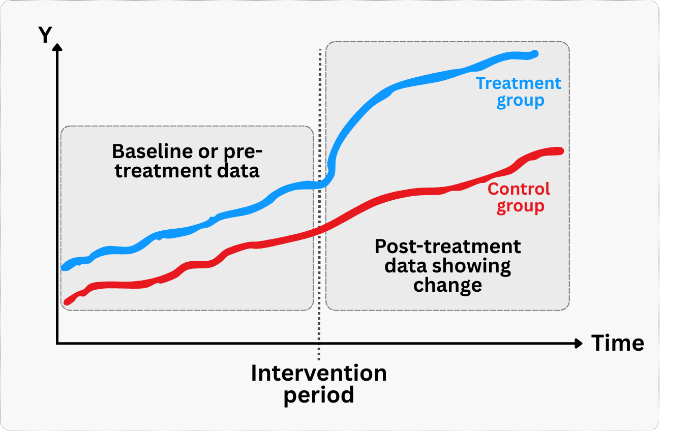
Checking that groups were on similar trajectories: Difference-in-Differences (DiD) designs rely on a key assumption: before the intervention, both groups were trending in a similar way. Economists call this the “parallel trends assumption” (also illustrated in Figure 3.2). Pre-intervention data lets you check this by plotting outcome trends for both groups before anything happened. If the trends were already diverging, you can’t trust your DiD results, because the groups weren’t comparable to begin with. For instance, if a fintech company tests a budgeting tool’s impact on savings by comparing treated and control regions, but savings trends were already different before the tool launched, the results won’t be credible.
Controlling for prior behavior: In observational studies, pre-intervention data helps control for selection bias by accounting for baseline differences between groups. You can include past behavior in your statistical models to account for baseline differences, or use it to find “look-alike” users for comparison. For example, when evaluating a new recommendation system, including users’ historical viewing patterns helps ensure you’re comparing similar users who did and didn’t adopt the new system.
Without pre-intervention data, you lose the ability to distinguish between changes caused by your intervention and pre-existing differences between groups, significantly weakening your causal claims.
How long should you wait before measuring the effect?
The time horizon for observing the effects of an intervention is a critical consideration in causal study design. Different interventions have different latency periods for their impact to manifest, and misjudging this can lead to premature conclusions, missed effects, or inefficient resource allocation. This question directly influences the duration of your study and the metrics you choose to track.
Immediate vs. lagged effects: Some interventions yield immediate results. For example, changing the color of a ‘Buy Now’ button on an e-commerce site might have an almost instantaneous impact on click-through rates or conversion. Other interventions, however, might have lagged effects. A new user onboarding flow designed to improve long-term retention might not show its full impact for weeks or months, because you need to wait and see whether users actually stick around. Similarly, the impact of a new content recommendation algorithm on user loyalty might only become apparent after users have interacted with the system for a sustained period.
Defining the observation window: Based on your understanding of the intervention and the expected user behavior, you need to define an appropriate observation window for your study. This involves:
Short-term metrics: For immediate effects, you might focus on metrics like click-through rates, conversion rates, or session duration. These can be observed within hours or days.
Long-term metrics: For lagged effects, you need to track metrics like retention, lifetime value (LTV), churn rate, or subscription upgrades over weeks, months, or even quarters. Running an A/B test for only a few days when the true impact is on long-term retention would lead to an incomplete and potentially misleading conclusion.
Getting the study duration right: Run your study too short, and you risk missing the real effect. Run it too long, and you waste resources, delay decisions, and give external factors more time to muddy the waters.
For instance, a social media platform testing a new notification strategy to re-engage dormant users would need to run the experiment long enough to observe if those users not only return but also sustain their engagement over time, rather than just a fleeting spike.
Accounting for novelty effects: New features or designs can sometimes generate a temporary ‘novelty effect’ where users engage more simply because something is new, not because it’s genuinely better. This effect typically fades over time. A sufficiently long study duration allows you to differentiate between a novelty effect and a sustained, true causal impact.
For example, a new UI design might initially boost engagement, but if the effect diminishes after a few weeks, it might indicate a novelty effect rather than a fundamental improvement. In this case, a study that only runs for the first week after launch might conclude that the new design is highly effective, when in reality the improvement is temporary.
The takeaway: effects don’t always show up right away. As illustrated in Figure 3.3, the distinct shape of the effect over time matters just as much as its magnitude. You might encounter three very different trajectories:
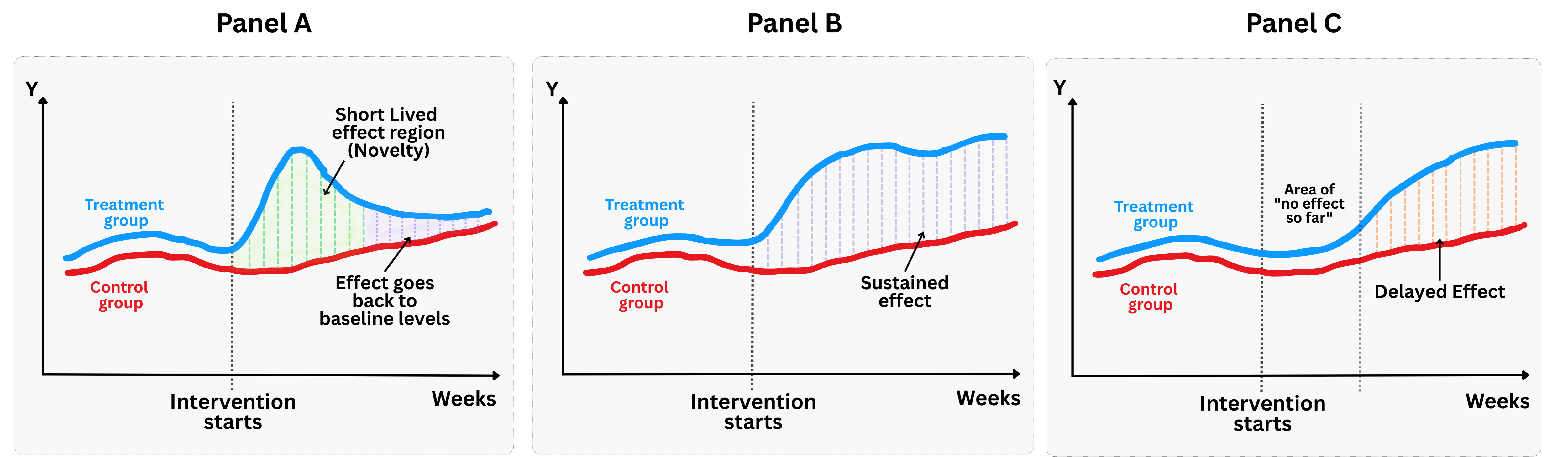
- Panel A: The short-lived effect. As the novelty wears off, the treatment group regresses back to the baseline trend of the control group. This is the classic “novelty effect” trap: if you measure too early, you see a lift; if you measure later, it’s gone.
- Panel B: The sustained effect. This is the ideal scenario for a product launch. The intervention causes a divergence between the treatment and control groups that persists over time, confirming that you created lasting value.
- Panel C: The delayed effect (“The slow burn”). After the intervention, there is a “dead zone” where the treatment and control lines remain identical. This often happens in complex products where there is a learning curve, or in network-effect features where a critical mass of users is needed before value is realized.
Knowing when to measure is clearly just as important as knowing what to measure. Get the timing wrong, and your conclusions could be incomplete, or flat-out wrong.
3.4 Executing the analysis using the steps above
Let’s walk through a concrete example together and see how to put all the pieces in motion. Imagine you’re a data scientist at a large ecommerce marketplace. Your product team is testing a new AI-based homepage layout, designed to personalize the first screen with machine-curated product recommendations. The hypothesis is straightforward: more relevant content should lead to more purchases.
To test that, you randomly assign 50% of users to see the new layout, while the other 50% keep seeing the classic homepage. The rollout is server-side, so there’s perfect compliance — no opt-ins, no app store versions to track. Everyone sees what they were assigned to. Your mission: estimate the causal effect of this change on user spending.
You’ve got clean data. Time to roll up your sleeves and get to work.
3.4.1 Defining the ingredients of the analysis
As mentioned, the treatment is the exposure to the new AI-curated homepage. In other words, the user opens the app and sees a dynamically generated layout showing products that the system believes they’re most likely to buy.
Your KPI is profit per user. But you need to be more precise. So here’s how you define it:
It’s the user-level profit (revenue minus variable costs) generated from all completed purchases, in R$ (Brazilian real), excluding refunds and canceled orders.
It only includes purchases initiated after the user saw the homepage, because our hypothesis is that the new layout is the mechanism or channel that leads to more purchases.
It’s measured from day 0 (the exposure date) to day 30, to capture both quick and delayed effects. We could even extend the window later to check whether the effect persists over time or if it’s just a novelty effect.
Our population: we’re focusing on users in Brazil who opened the app during the experiment window.
And what about the comparison group? This is an experiment with randomized assignment and perfect compliance, so we have a very clean feasible counterfactual: users who were assigned to see the classic homepage. Since randomization balances all other factors (on average), we can interpret differences in outcomes between the two groups as causal.
3.4.2 Lining up the business context
Before opening your favorite R or Python IDE, you recall what I discussed in Section 3.2. You called your main stakeholders and asked them: What’s the endgame here?
It became clear that the goal is to decide whether to roll out the new homepage layout to all users in Brazil. And if so, to quantify the upside: how much additional profit do we expect per user? Per month? What’s the return?
Here’s what you hear from stakeholders: “If the uplift is statistically significant and at least R$0.8 per user, then we’ll push the new layout to everyone.” That R$0.80 is their minimum effect of interest (MEI): the smallest practical uplift they would act on. It needs to cover the cost of building and maintaining the personalization engine and give the business a positive Return on Investment (don’t worry about how to calculate ROI yet. I’ll dive into that in Chapter 13). If the effect is weak or statistically inconclusive, the design team will go back to the drawing board.
You also learn that most users who convert after visiting the homepage do so within 48 hours, but you want to be thorough. To avoid being misled by early spikes or novelty bias, you confirm your initial plan to measure 30-day cumulative profit. This window captures both fast and slow shoppers.
If the hypothesis holds and the effect is positive, we can revisit this analysis later to see whether the impact persists over longer time horizons too.
3.4.3 Getting to the numbers
Data: All data we’ll use are available in the repository. You can download it there or load it directly by passing the raw URL to read.csv() in R or pd.read_csv() in Python.6
Packages: To run the code yourself, you’ll need a few tools. The block below loads them for you. Quick tip: you only need to install these packages once, but you must load them every time you start a new session in R or Python.
# If you haven't already, run this once to install the package
# install.packages("tidyverse")
# install.packages("RCT")

# You must run the lines below at the start of every new R session.
library(tidyverse)
library(RCT) # Implements the RCT tools
# If you haven't already, run this in your terminal to install the packages:
# pip install pandas numpy statsmodels scipy.stats (or use "pip3")
# You must run the lines below at the start of every new Python session.
import pandas as pd # Data manipulation
import numpy as np # Mathematical computing in Python
import statsmodels.formula.api as smf # Linear regression
from scipy.stats import ttest_indGood data analysis starts with good context on the business problem and the data you have. Let’s see what information you have in this dataset. Check the variables and their descriptions.
treatment: Binary treatment indicator (0/1) for whether user received the personalized feed treatmentprofit_30d(outcome): Total profit generated by each user in the 30 days following the intervention (R$)pre_profit: Total profit generated by each user in the 30 days prior to the intervention (R$)user_tenure: Number of months each user has been active on the platformprior_purchases: Total number of purchases each user made on the platform before the intervention
Since this is a randomized experiment with perfect compliance (i.e., users assigned to see the personalized feed will inevitably face this treatment if they visit the homepage), you can estimate the Average Treatment Effect (ATE) in a straightforward way: by comparing the average profit at the user level between the two groups. The code below guides you through checking the balance between groups and estimating the effect using R and Python. Run it to see the concepts in action.
Baseline comparison and covariate balance: The balance table generated by the code tab above (and shown in Table 3.1) compares pre-treatment characteristics — like user_tenure, prior_purchases, and pre_profit - between groups. As expected in a well-executed randomized experiment, there are no statistically significant imbalances (all p-values are greater than 0.05), which supports the claim that any post-treatment differences are likely caused by the intervention.
| Variable | Control Mean | Treatment Mean | p-value |
|---|---|---|---|
pre_profit |
22.6 | 22.5 | 0.843 |
prior_purchases |
4.98 | 5.01 | 0.714 |
user_tenure |
18.8 | 18.3 | 0.091 |
Estimating the treatment effect: Our first model, in that same codeblock, is a simple linear regression (profit_30d ~ treatment). This gives us a point estimate of R$2.34: users who saw the new homepage generated, on average, R$2.34 more profit over 30 days than those in the control group. The 95% confidence interval ranges from R$1.75 to R$2.93, and the p-value is near zero—indicating strong statistical significance.
Robustness checks: Later, in Chapter 14, I’ll show you how to stress-test these results to ensure they’re bulletproof. For now, let’s run two key robustness checks to ensure the results are not driven by confounding factors. Run the code in the code tab below to see the results.
The first check, model robustness1, verifies that our treatment effect remains stable when we control for baseline characteristics. The effect size holds steady: R$2.44, with similar precision. This suggests that the uplift isn’t being driven by imbalances in user history. If the effect had disappeared or changed dramatically, it might suggest our randomization wasn’t perfect or there are confounding factors.
The second check, model robustness2, ensures there was “no effect before the treatment began”. Look what you did there: you regressed pre-treatment profit on treatment assignment and found no effect (point estimate = -R$0.07, p-value = 0.84). That is, the treatment has no impact on past behavior (as it shouldn’t), reinforcing our causal story. If we had found a significant “effect” on pre-treatment outcomes, it would be a red flag indicating potential randomization failure or selection bias.
Takeaway to stakeholders: The new AI-curated homepage drove an average increase of R$2.34 per user in 30-day profit (95% CI: R$1.75 to R$2.93). The effect is statistically significant, holds after controlling for user history, and passes placebo tests. If rolled out to all users in Brazil, this translates into a projected profit uplift of R$11.7 million/month, assuming a 5 million monthly active user base.
3.5 Wrapping up and next steps
We’ve covered a lot of ground in this chapter. By now you can:
Formulate a well-defined causal question: move from vague stakeholder asks to precise, testable hypotheses that define the treatment, outcome, population, and comparison group.
Clarify the business goals before diving into data: you’ve learned how to align on what decisions your analysis will inform and what success looks like.
Tell whether you will plan an RCT (ex-ante) or analyze past data (ex-post), and what methods are feasible for each case.
Anticipate and defend against key biases: You’ve seen how omitted variables, selection bias, seasonality, and external shocks can threaten your analysis.
Execute a clean analysis on experimental data using a real example: estimating the effect of a personalized homepage using an A/B test with perfect compliance, and validating the results through robustness and placebo checks. But note that for now we saw only the fundamentals, focusing on the ideal scenario to build logical intuition.
Here we finish the first part of this book. Surely it was dense enough that we could have called it “Knowing this is half the battle”. In the next part you will learn to estimate impacts and report results as we did in Section 3.4.3, but using more sophisticated methods, including for cases were we don’t have a randomized experiment. If up to this chapter is all you will read from this book, you can find a preview of these methods in Appendix 3.A.
Appendix 3.A: A preview of the methods we will cover
Randomized experiments (such as A/B tests)
In tech, the most common and powerful tool for establishing causality is the Randomized Controlled Trial (RCT), often referred to as an A/B test. The beauty of randomization is that it, on average, balances all observed and unobserved characteristics between your treatment and control groups. This means any observed difference in outcomes can be confidently attributed to the treatment, not to pre-existing differences.
How it works:
- Random assignment: Users (or other units of analysis) are randomly assigned to either the treatment group (A) or the control group (B). This is the critical step that creates comparable groups.
- Treatment application: Group A receives the new feature/intervention, while Group B receives the old version or no intervention.
- Outcome measurement: You measure the specified outcome metric for both groups over a defined period.
- Comparison: You compare the average outcome between Group A and Group B. The difference is your estimated causal effect.
Example: A/B Testing a New Search Algorithm
Let’s say a large e-commerce platform wants to test if a new search algorithm improves conversion rates (users making a purchase after searching).
- Causal Question: Among users performing a search, does exposure to the new ML-powered search algorithm (treatment), compared to the existing keyword-based algorithm (control), increase the probability of making a purchase within the same session (outcome)?
- Population: All users performing a search on the platform.
- Design: A/B test. Randomly assign 50% of search queries to the new algorithm (Treatment) and 50% to the old algorithm (Control).
Why it defends against bias: Because users are randomly assigned, it’s highly unlikely that users in the new algorithm group are inherently more likely to convert than those in the old algorithm group due to factors like tech-savviness, income, or prior purchase history. Randomization breaks the link between these potential confounders and the treatment assignment, effectively eliminating selection bias and omitted variable bias.
Observational studies and quasi-experiments
While A/B tests are ideal, they aren’t always feasible due to ethical, technical, or business constraints. In such cases, you’ll rely on observational studies or quasi-experiments. These designs attempt to mimic the conditions of an A/B test by carefully controlling for confounding variables or exploiting naturally occurring randomization. Here are some common quasi-experimental designs and how they help address bias.
Difference-in-Differences (DiD)
Intuition: Imagine you want to measure the impact of a new pricing strategy launched in one city, but not in others. A simple comparison of sales before and after the change in the treated city might be misleading due to overall market trends (e.g., seasonality). DiD addresses this by comparing the change in the outcome in the treated group to the change in the outcome in a control group that did not receive the treatment.
How it defends against bias: DiD controls for unobserved factors that change over time and affect both groups equally (e.g., macroeconomic trends, overall market growth). It assumes that, in the absence of the treatment, the trend in the outcome would have been the same for both the treated and control groups (the ‘parallel trends’ assumption).
Example: Impact of a subscription price increase
A streaming service increases its monthly subscription price in Region A but keeps the price the same in Region B. We want to estimate the causal effect of this price increase on subscriber churn.
- Treatment: Price increase in Region A.
- Outcome: Monthly churn rate.
- Population: Subscribers in Region A (treated) and Region B (control).
- Design: Measure churn rates in both regions for a period before the price change and a period after the price change.
Let’s simulate some data for this scenario. We’ll have monthly churn rates for two regions (A and B) over several months, with a price change occurring in Region A mid-period.
Regression discontinuity design (RDD)
Intuition: RDD is used when treatment assignment is based on a sharp cutoff point of a continuous variable. For example, if users with a credit score above 700 get a special loan offer, while those below 700 don’t. The idea is that users just above and just below the cutoff are very similar in all unobserved characteristics, except for their treatment status.
How it defends against bias: By focusing on units very close to the cutoff, RDD effectively creates a quasi-randomized experiment. Any differences in outcomes between those just above and just below the threshold can be attributed to the treatment, as other confounding factors are assumed to vary smoothly around the cutoff.
Example: Impact of a premium feature unlock
A SaaS company offers a premium feature for free to users who have spent more than 10 hours in their app during the first month. We want to estimate the causal effect of accessing this premium feature on user engagement (e.g., daily active usage).
- Treatment: Access to premium feature.
- Outcome: Average daily active usage (DAU) in the second month.
- Population: Users whose first-month usage is close to the 10-hour cutoff.
- Design: Compare DAU for users just above 10 hours to those just below 10 hours.
Instrumental variables (IV)
Intuition: IV is used when you suspect that your treatment is influenced by hidden factors that also affect the outcome. An instrumental variable is a third variable that influences the treatment but does not directly affect the outcome, except through its effect on the treatment. It acts as a ‘natural experiment’ that randomly assigns treatment.
How it defends against bias: The IV method isolates the “good” variation in the treatment (the part caused only by the experiment). This isolated variation is then used to estimate the causal effect for the group influenced by the instrument, effectively removing the bias caused by unobserved confounders.
Example: Impact of ad exposure on purchase conversion
Suppose we want to measure the causal effect of seeing an ad on purchase conversion. We know that users who see ads might be inherently more engaged or more likely to purchase (selection bias). However, a technical glitch causes some users to randomly not see ads, even if they were supposed to. This glitch can serve as an instrumental variable.
- Treatment: Ad exposure (binary: 1 if user saw ad, 0 otherwise).
- Outcome: Purchase conversion (binary: 1 if user purchased, 0 otherwise).
- Instrumental Variable: Technical glitch (binary: 1 if glitch prevented ad, 0 otherwise). The glitch affects ad exposure but should not directly affect purchase conversion other than through ad exposure.
- Population: All users.
Time series approaches
Intuition: When you don’t have a control group because everyone receives the intervention at the same time (e.g., a nationwide policy change or a global feature rollout), you can use the pre-intervention history to predict what would have happened if the intervention hadn’t occurred. The “counterfactual” is essentially an extrapolation of the past into the future.
How it defends against bias: By modeling the pre-existing trend and seasonality, you can subtract these factors from the post-intervention outcome. This allows you to distinguish the effect of the intervention from the natural evolution of the metric, assuming that no other major events occurred at the exact same time.
Example: Impact of a TV ad campaign
A company launches a nationwide TV ad campaign and wants to know if it drove an increase in website visits. Since the ad aired everywhere simultaneously, there is no unexposed control group.
- Treatment: Launch of the TV ad campaign.
- Outcome: Daily website sessions.
- Population: All potential visitors (nationwide).
- Design: Use an Interrupted Time Series (ITS) or CausalImpact model to predict the expected number of sessions based on historical trends (counterfactual) and compare it to the actual observed sessions.
Choosing the right design
The choice of causal design depends heavily on the context, data availability, and the nature of the intervention. Here's a quick guide:
- A/B Test: Always prefer if feasible. It's the most robust against unobserved confounders.
- Instrumental Variables: Useful when treatment is influenced by user choice or hidden factors, and you can find a valid instrument that affects treatment but not outcome directly.
- Regression Discontinuity: Applicable when treatment assignment is based on a sharp cutoff of a running metric (like a credit score, age, or total spend).
- Difference-in-Differences: Good when you have panel data (before/after, treatment/control groups) and can assume parallel trends.
- Time series approaches: Useful when everyone receives the treatment at the same time (no control group), but you have a long history of data before the intervention to model the counterfactual.
Regardless of the method, the goal is always the same: to create a comparison that mimics, as closely as possible, the counterfactual scenario – what would have happened to the treated units if they hadn't been treated. This careful planning is your strongest defense against misleading conclusions.
As Google advises, “NotebookLM can be inaccurate; please double-check its content”. I recommend reading the chapter first, then listening to the audio to reinforce what you’ve learned.↩︎
There is an issue about testing multiple KPIs at once: the more KPIs you test, the more likely you are to find a spurious effect. Therefore, whenever you are testing multiple KPIs, you should use a multiple testing correction method.↩︎
If the stakeholder instead wanted to predict which sellers will grow fastest, a predictive model would work fine. That’s a different project entirely.↩︎
You will find more about reverse causality in the Appendix 2.A of the previous chapter.↩︎
Ex-ante (forward-looking) means you’re designing the study before the intervention happens; ex-post (backward-looking) means you’re analyzing data from an intervention that already occurred. Ex-ante designs generally produce more credible causal evidence because you can plan for proper causal identification upfront.↩︎
To load it directly, use the example URL
https://raw.githubusercontent.com/RobsonTigre/everyday-ci/main/data/advertising_data.csvand replace the filenameadvertising_data.csvwith the one you need.↩︎