4 Experiments I: Designing and running reliable experiments
A/B Testing, Causal Inference, Causal Time Series Analysis, Data Science, Difference-in-Differences, Directed Acyclic Graphs, Econometrics, Impact Evaluation, Instrumental Variables, Heterogeneous Treatment Effects, Potential Outcomes, Power Analysis, Sample Size Calculation, Python and R Programming, Randomized Experiments, Regression Discontinuity, Treatment Effects
Randomized experimentation (A/B tests, RCTs) is the gold standard for causal truth (Kohavi, Tang, and Xu 2020). But a valid experiment is not simply about splitting your sample into random groups. The randomization itself is just one piece of a much larger puzzle.2
Most textbooks cover the theoretical principles, then jump straight to analyzing experimental data. This chapter takes a different path. I want to focus on what happens before you have data to analyze — the experimental design decisions that determine whether your estimates will be unbiased in the first place.
Throughout this chapter, we’ll walk through many scenarios of what can go wrong — imperfect randomization, contamination between groups, differential attrition, insufficient power, novelty effects, etc. — and how to prevent these problems before they corrupt your results. Prevention is worth far more than cure.
If you’ve ever looked at historical data and thought, “Wow! Users shown more recommendations spend way more money — let’s double down!” — hold up. As we saw in Part I, effects measured using observational methods are often 2–3 times larger than what you get from running a proper experiment (Gordon, Moakler, and Zettelmeyer 2023). And even using sophisticated statistical methods won’t save you — the bias can still be massive.
But the moment we hear “randomized experiment,” our skepticism often vanishes. We assume that because it is an experiment, it must be rigorous. But experiments can lie just as convincingly as observational data or even lead to misinterpretations of the results (take a look at Boegershausen et al. 2025). If the design is flawed — whether through botched randomization, contamination between groups, or users dropping out at different rates — your results will be corrupted, even if the numbers look perfectly clean.
Think of this chapter as the architectural blueprint for running reliable experiments. We will walk through the entire design process — from defining a hypothesis to analyzing results — so you can spot potential failures before they happen. Our focus here is on the decisions you need to make before you launch the experiment.
Some topics — like sample size and statistical power — deserve a deep dive, which I will provide in the next chapter. For now, let’s focus on the overall flow.
I’ll focus on fixed-horizon experiments — we calculate upfront how many users we need, run the test for a set duration, and analyze only after all data is in. This contrasts with sequential experiments, which let you peek at results along the way and stop early if the signal is strong enough.
Sequential designs are great when speed matters, but to prevent premature conclusions they demand statistical tools we don’t have right now. So I’ll stick to fixed-horizon designs, which are the foundation, easier to implement correctly, and sufficient for most business decisions.3
4.1 What makes randomization so powerful
The mechanics are simple: flip a coin for each individual to decide whether they get the treatment or not. This random assignment ensures that, on average, all observed and unobserved characteristics are equally distributed between the groups. It eliminates “selection bias” and ensures that no hidden factor like motivation or income drives the results. Any differences between groups are due to chance, not pre-existing traits.
Figure 4.1 illustrates the core logic of an RCT. Let me walk you through it step by step:
Population (some call it “audience”): We start with a pool of individuals (at the leftmost column). Notice their different shapes and colors — these represent observable characteristics like age, purchase history, or device type, and unobservable traits like motivation or preferences. In any real population, people vary in countless ways.
Random assignment (some call it “randomization”): The arrow between stages 1 and 2 represents the randomization step. Here, we use a mechanism equivalent to a computer-generated coin flip to assign each individual to either treatment or control. The key point is that this assignment is independent of any individual characteristics — your shape or color has no influence on which group you land in.
Balanced groups (some call it “comparable groups”): After randomization (the two rightmost columns), look at the distribution of shapes and colors in each group. They are similar. Both observed and unobserved characteristics end up balanced across groups. This balance is what allows us to attribute differences in outcomes to the treatment itself. Given some of the statistical properties you saw in Appendix 1.A, we need enough individuals in the population to ensure that the balance holds up.
Outcome comparison (some call it “evaluation”): With balanced groups, we expose the treatment group to our intervention and withhold it from the control group. Any difference in outcomes we observe after the intervention can now be credibly attributed to the treatment, because the groups were statistically equivalent before the intervention.
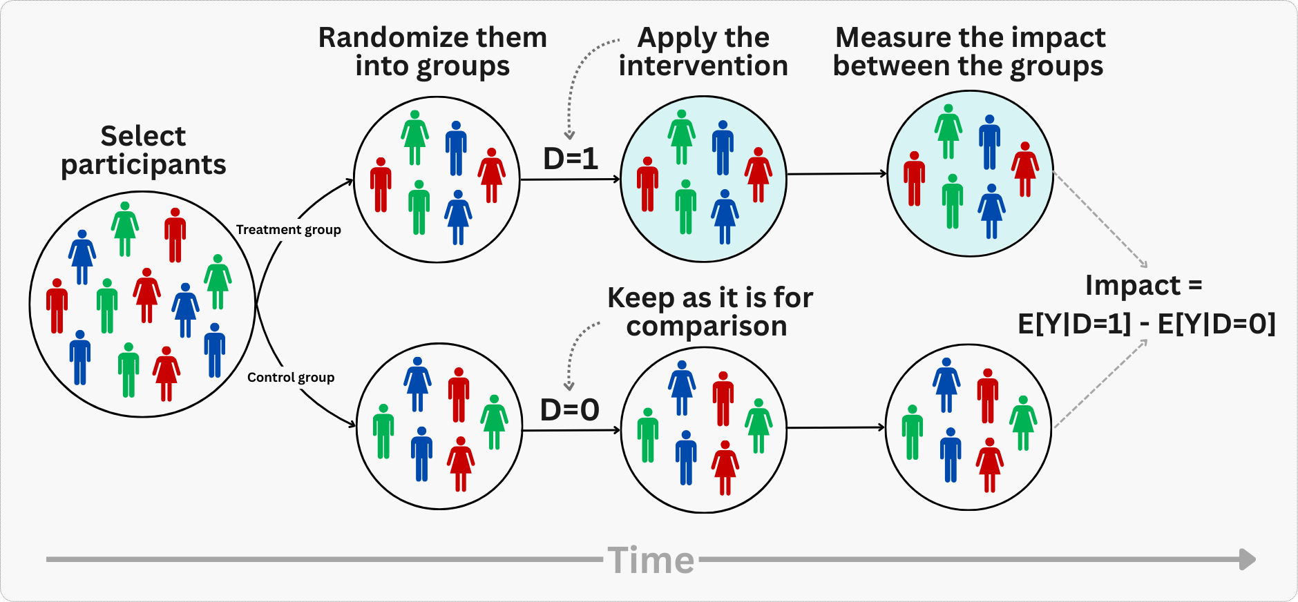
In other words, the magic of randomization isn’t mysterious — it’s mathematical. When you flip a coin to decide who gets your new feature and who doesn’t, you’re breaking the link between user characteristics and treatment assignment. That’s why any statistically significant differences observed in outcomes between the treatment and control groups can be credibly attributed to the intervention itself.
Notice that we never measure the absolute impact of a treatment in isolation. Instead, we compare outcomes between the treatment and control groups to estimate the causal effect. The control group serves as our approximated counterfactual — showing what would have happened without the intervention.
This counterfactual logic is the foundation of internal validity. But here is the catch: just because you proved something works here doesn’t mean it will work there.
Internal vs. external validity
The power of randomization generally creates a tradeoff between two types of validity:
Internal validity answers the question: “Can I trust that the effect I measured is real within my study?” An experiment has high internal validity when we can confidently attribute the observed difference in outcomes to the treatment itself, rather than to confounders, measurement error, or chance.
External validity answers a different question: “Will this effect hold up outside my study?” An experiment has high external validity when its findings generalize to other populations, settings, time periods, or variations of the treatment.
Random assignment gives us exceptional internal validity. We can be highly confident that any differences between treatment and control groups represent true causal effects within our study population. The mathematical properties of randomization ensure our estimates are unbiased and represent genuine cause-and-effect relationships.
However, this internal validity often comes at the cost of external validity. Just because we found a causal effect in our specific experiment doesn’t mean it will generalize beyond that context. The effect we measure is specific to:
- Our particular implementation of the treatment
- The exact population we sampled from
- The time period and environment of our study
So while randomization gives us strong claims about causality within our experiment, we must be cautious about extrapolating those findings to other contexts, populations, or variations of the treatment. The very control that makes experiments powerful internally can limit their broader applicability.
A fintech app tests a new onboarding flow and measures a 15% lift in activation — but only among urban users from an initial rollout. But when shipped globally, the lift vanishes in markets with slower connectivity. The lesson is to always ask: “Does my sample reflect where I intend to ship?” If not, replicate the experiment in underrepresented segments before rolling out.
4.1.1 Some assumptions for experimental validity
So what can go wrong? For a simple comparison of treatment and control to yield clean causal insights, at least three conditions must hold:4
Random assignment creates comparable groups
Random assignment means treatment and control groups will be similar on average across all characteristics — both the ones you can observe (age, previous purchases, location) and the ones you can’t (motivation, satisfaction, underlying preferences).
This is important because it eliminates the risk that a hidden factor — like motivation or income — drives both who gets treated and what they buy (i.e., “omitted variable bias” Section 2.2). When you randomly assign treatment, there’s no systematic relationship between who gets treated and any confounding variables. The groups are balanced by design.
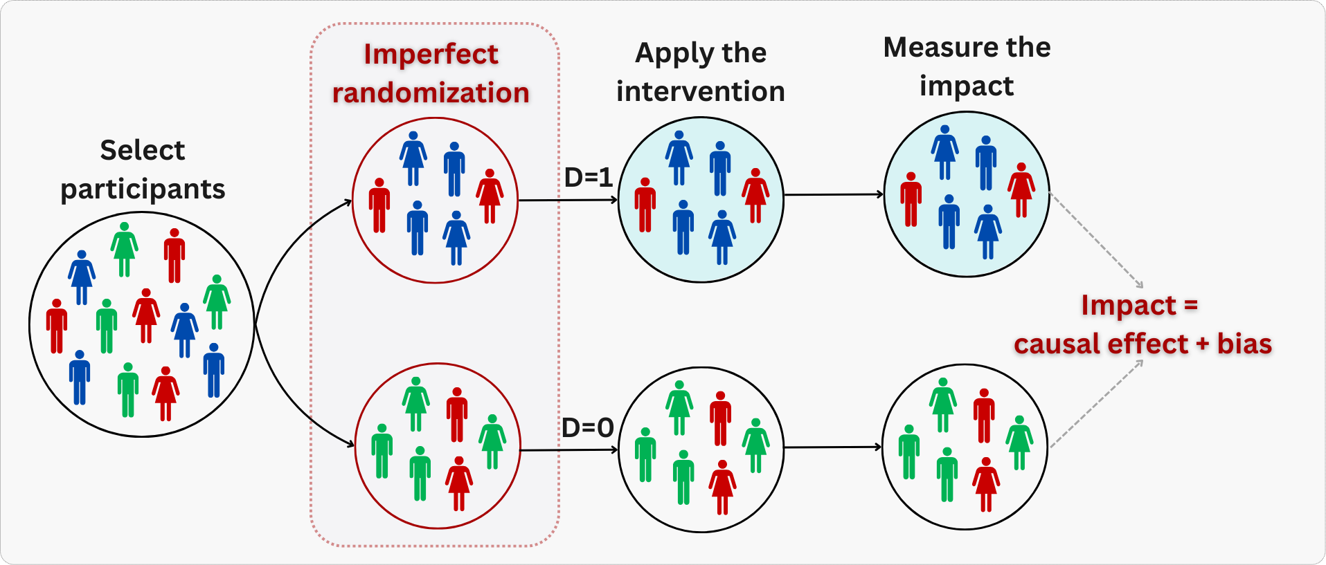
When randomization is not properly implemented, treatment and control groups won’t be perfectly balanced on all characteristics. This may happen due to chance, when we have small sample sizes, or due to failures in the randomization process - for example, when engineers accidentally assign treatment only to iOS users while sampling control users from both iOS and Android.5 This can lead to bias, as illustrated in Figure 4.2: notice how all blue subjects in the figure are assigned to treatment, while all green subjects are assigned to control.
To mitigate this, we may rely on stratified randomization and diagnostic tools like balance checks, which we will detail later on.
Stable Unit Treatment Value Assumption (SUTVA)
Two practical requirements must hold for your estimates to be valid: no interference between users, and a consistent treatment definition. Statisticians bundle these into the acronym SUTVA (Stable Unit Treatment Value Assumption), but the intuition matters more than the name.
No interference: One user’s treatment assignment shouldn’t affect another user’s outcome. If you’re testing a personalized homepage, User Robson seeing the new design shouldn’t change how User Cristiane behaves — even if they’re co-workers or family members sharing recommendations.
This matters because when interference exists, the “treatment effect” you measure becomes a tangled mess of direct effects and ripple effects from other users, making it impossible to isolate what your intervention actually did.
This assumption is also called “no spillovers” in some contexts. In social networks, ride-hailing platforms, or two-sided marketplaces (i.e., where there are sellers and buyers), interference is common by design. Why? Because these platforms create interconnected ecosystems where actions on one side ripple to the other.
In a ride-hailing app such as Uber, drivers and riders compete for the same finite pool of matches — if you test a pricing algorithm that incentivizes some drivers to work longer hours, they absorb demand that would have gone to drivers in the control group, changing outcomes for users you never intended to affect. Similarly, in a social network, if you boost one user’s content visibility, it displaces someone else’s posts in their friends’ feeds.
When you suspect interference, cluster randomization (randomizing at the group level, like cities or driver pools - see Section 4.2.3 for more details) or network experiment designs can help, but the latter is beyond our scope here.
Consistent treatment: The intervention must be clearly defined and uniformly applied to everyone who receives it.6 If you are testing a “new checkout flow”, every treated user should see the identical experience — not Version A for some users and Version B for others (unless you are distinctively running a multi-arm experiment where A and B are separate treatment arms - see Appendix 4.A), nor a flow that changes halfway through the experiment. Without consistency, you are not estimating a single treatment effect; you are averaging across multiple definitions of the treatment, making it impossible to isolate what actually drove your results.
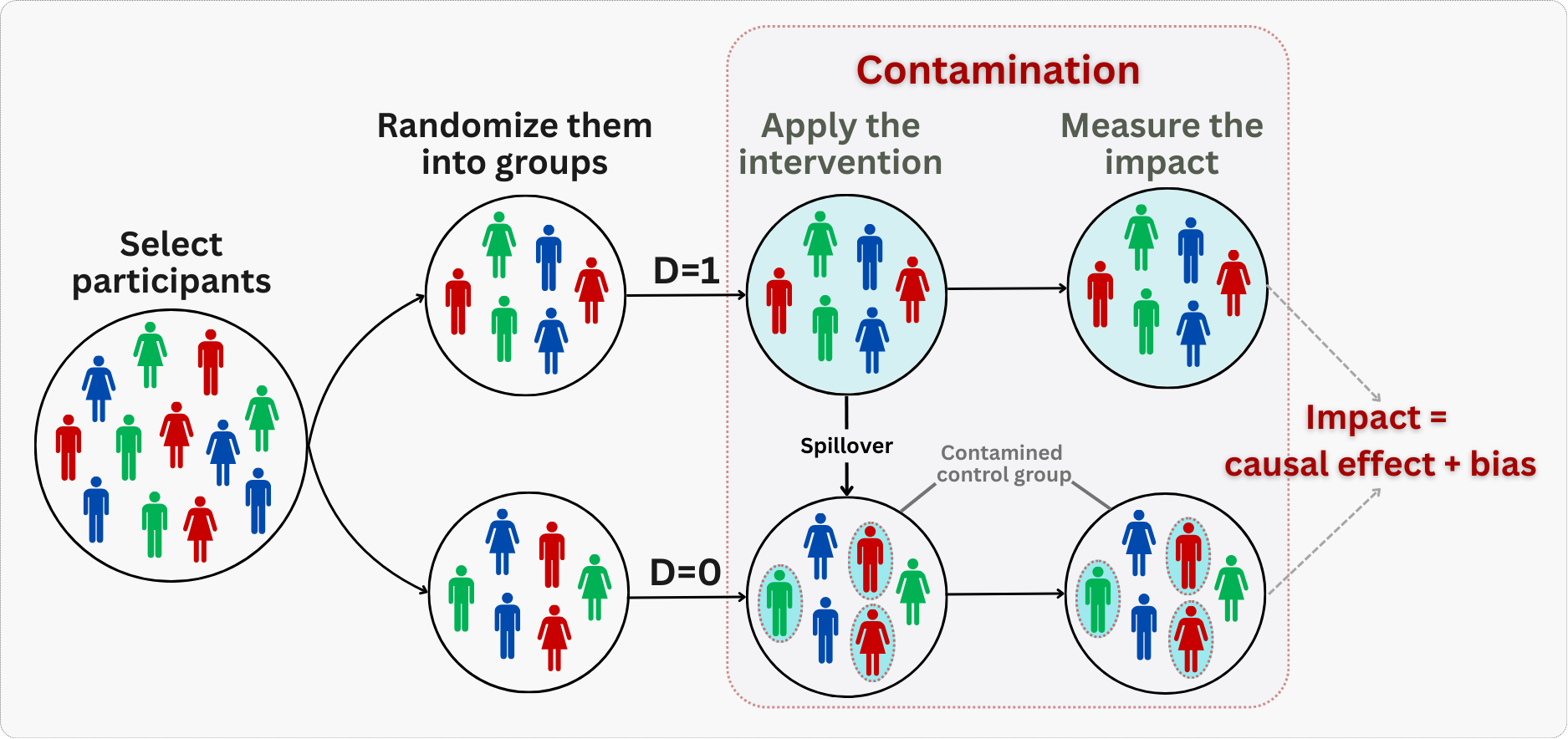
What happens when SUTVA breaks down? One manifestation is contamination — when the lines between treatment and control get blurred. This happens when control group members accidentally receive the treatment (perhaps a friend shares a coupon code), or when treatment group members don’t fully experience the intervention (the feature fails to load), as illustrated in Figure 4.3. Both scenarios blur the line between your groups. The result is typically a diluted treatment effect — you underestimate the true impact because the contrast between groups has been muddied.
Contamination blurs the treatment distinction; a related but separate threat arises when attrition is unequal across groups.
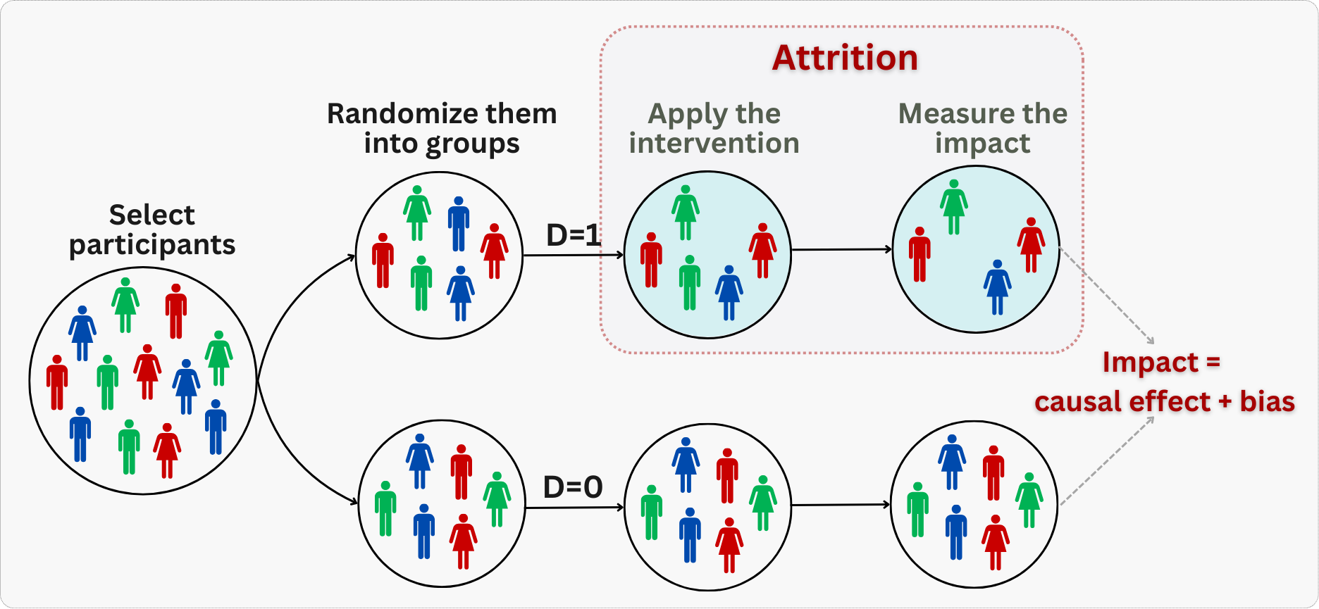
No systematic attrition
For valid causal inference, we need to ensure that dropping out of the experiment isn’t related to treatment assignment. If users are more likely to leave the study when assigned to treatment versus control (or vice versa), this creates selection bias in our results, as illustrated in Figure 4.4.
For example, if a new interface causes frustrated users to abandon the app more often, measuring outcomes only among remaining users will overstate the treatment’s effectiveness. We’ll explore techniques that may be used to handle differential attrition in Chapter 7, but for now, we’ll focus on experiments where dropout rates are similar between groups.
With these foundations in place — what randomization gives us and what can undermine it — let’s turn to the practical workflow of designing and running an experiment.
4.2 How to run experiments that actually answer your questions
“To consult the statistician after an experiment is finished is often merely to ask him to conduct a post mortem examination. He can perhaps say what the experiment died of.”
— Ronald A. Fisher (British statistician)7
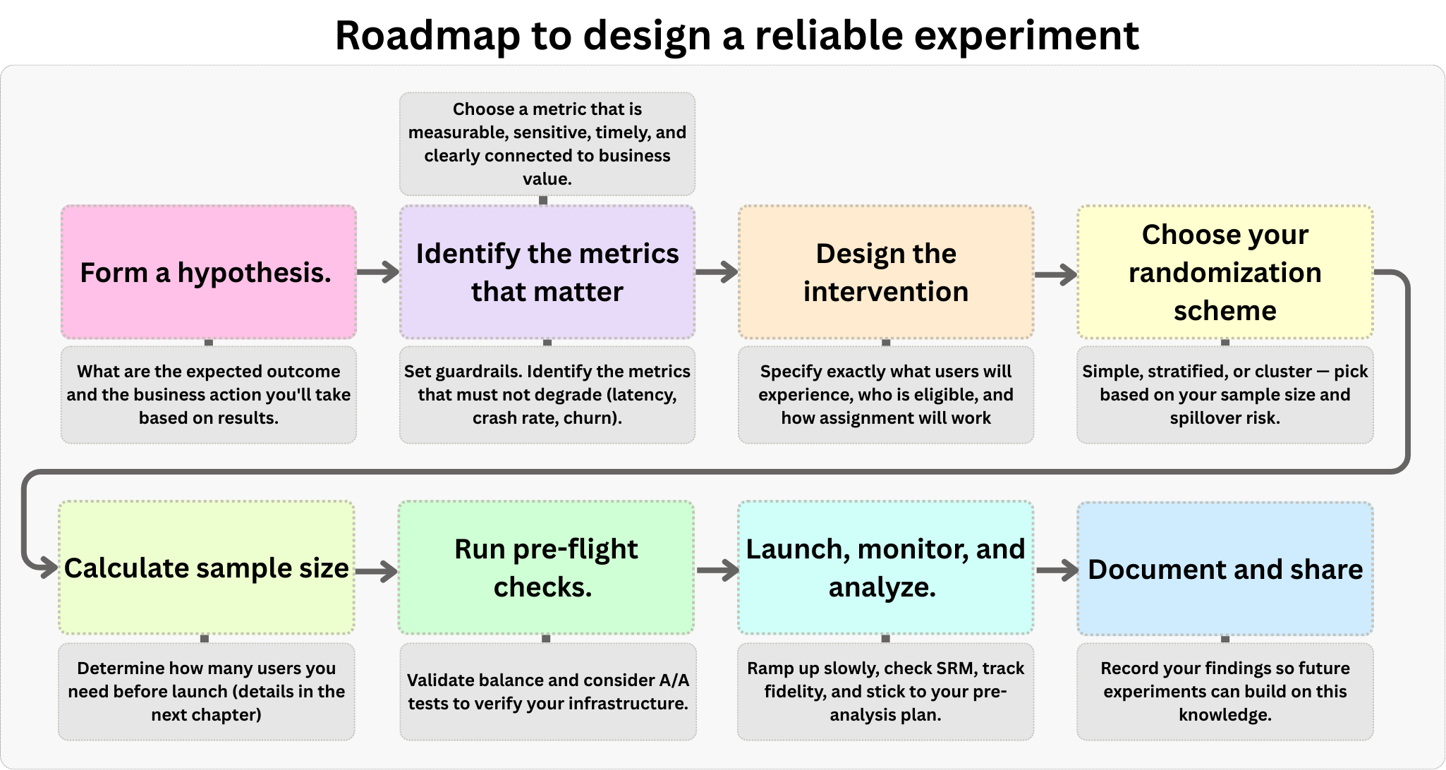
Running an experiment without a plan is just a fancy way to waste resources. It requires a deliberate blueprint. While every situation is unique, most experiments follow a similar structure. Figure 4.5 outlines the step-by-step framework we will follow in this section, which you can adapt to your specific needs. It starts with defining a hypothesis, moves to selecting metrics and designing the intervention, covers sample size planning and pre-flight checks, and concludes with execution and analysis.
4.2.1 Start with a hypothesis and an action
Every experiment should start with two key elements: a clear hypothesis you can test, and a specific action you’ll take based on the results. A hypothesis states what you expect to happen and why (as discussed in Chapter 3), while the action plan ensures you’ll actually use what you learn.8
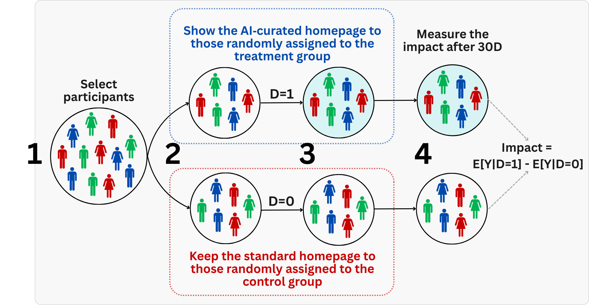
Let’s use the example from Section 3.4.3: “Showing a personalized, AI-curated homepage will increase user profit in the following month”. This hypothesis works because we can clearly imagine two parallel worlds for each user; one where they see the personalized feed, and one where they don’t. The difference in profit between these worlds is precisely what we want to measure. And as an action, we’ll implement the personalized feed if the experiment shows a positive impact on profit that exceeds the cost of implementing and keeping the feature.
But where do good hypotheses come from? Too often in organizations, ideas flow down from the “HiPPO” - the Highest Paid Person’s Opinion. While the experience of the HiPPO may matter, strong hypotheses should be grounded in evidence: internal data analysis showing current user behavior, market research revealing customer needs, or academic research suggesting promising interventions. This evidence base helps ensure we’re not just testing random ideas.9
The hypothesis also needs to be both actionable and relevant to the business. There’s no point proving something works if you can’t implement it, or if it doesn’t advance your strategic goals. A well-crafted hypothesis naturally leads to clear next steps, regardless of the experimental outcome.
Remember: the goal isn’t just to run experiments - it’s to learn something meaningful that can guide decision-making. A clear, evidence-based hypothesis is your map through the noise of data to actual insights.
4.2.2 Identify the metrics that matter
Once you have a clear hypothesis, you need to identify the key metrics that will tell you whether your intervention worked. The metric you choose shapes everything — from sample size calculations to the final go/no-go decision.
Goal, Driver, and Guardrail metrics
To choose the right metrics, it helps to distinguish between three types of metrics that serve different purposes in your organization:
Goal metrics (also called Success or “North Star” metrics): These reflect what the organization ultimately cares about — results like long-term revenue, customer lifetime value (LTV), or user retention. While critical, they are often hard to move in a short-term experiment. They can be noisy, slow to materialize, or affected by too many factors outside your control.
Driver metrics (also called Signpost or Surrogate metrics): These are shorter-term, faster-moving, and more sensitive metrics that you believe drive the goal metrics. For example, “active days”, “sessions per user”, or “successful searches” are often used because they are sensitive enough to detect changes in a 2-week experiment and are causally linked to long-term success. In experimentation, your Overall Evaluation Criterion (OEC) is typically a driver metric (or a combination of them).
Guardrail metrics: In traffic, guardrails are safety barriers preventing falls or collisions. In experiments, they are metrics that protect your experiment from breaking things. They ensure that in your pursuit of the goal, you don’t violate important constraints (like crashing the app or confusing users).
Overall Evaluation Criterion
The Overall Evaluation Criterion (OEC) is the quantitative measure that defines whether your experiment succeeded or failed (Kohavi, Tang, and Xu 2020). Think of it as your experiment’s decision rule: a single, well-defined metric (or a carefully constructed combination of metrics) that translates your business objective into something measurable. Without a clear OEC, different teams may interpret results differently, leading to conflicting conclusions and decision paralysis.
In our personalized feed experiment from Section 3.4.3, the OEC could be user-level profit generated in the 30 days after first exposure. If that takes too long to measure, we might use a driver metric like “number of purchases” as our OEC, provided we have evidence it leads to long-term profit. Other metrics like scroll depth or time on site might serve as diagnostic metrics (helping explain why changes occurred) but wouldn’t drive the go/no-go decision.
Once you pick a candidate OEC, imagine your treatment succeeded and moved that metric. Now ask yourself: “So what?” If the answer isn’t obviously good for the business, you have the wrong metric. For example, if time spent on site goes up, is that good? Maybe users are engaged, or maybe they are lost and frustrated. A good OEC leaves no room for such ambiguity.
What makes a good OEC?
Not every metric makes a good OEC. According to Kohavi, Tang, and Xu (2020), an effective OEC for experimentation should satisfy some criteria:
Measurable and attributable: You must be able to measure it in the short term and attribute it to the specific variant. Post-purchase satisfaction might be a great goal, but if it requires a survey with low response rates, it’s a poor experimental metric.
Sensitive: The metric must detect meaningful changes while filtering out noise. If your OEC doesn’t move when you make changes that matter (e.g., trying to detect a 1% revenue lift using a volatile metric like “stock price”), you won’t learn anything.
Timely: The metric should be computable within the experiment’s duration (e.g., 1–2 weeks). If your goal is specifically “User LTV over 3 years”, you simply cannot wait 3 years to make a decision. You need a timely surrogate.
Relevant: The OEC should predict long-term strategic success. A metric that is easy to move (like “clicks”) but disconnected from real value is dangerous.
This brings us to a warning about gameability: Goodhart’s Law, which states that “When a measure becomes a target, it ceases to be a good measure”. A classic cautionary tale involves the “Cobra Effect”. British colonial rulers in Delhi wanted to reduce the cobra population, so they offered a bounty for every dead cobra.
The result? Enterprising locals began breeding cobras to kill them and collect the reward. When the government realized this and canceled the program, the breeders released their worthless snakes, increasing the wild cobra population.
In experimentation, this happens when you optimize for a metric that can be moved by “bad” behavior. If you optimize for “emails sent”, you’ll incentivize spam. If you optimize for “clicks”, you’ll incentivize clickbait. Always ask: “How could I cheat to improve this metric without actually creating value?” If cheating is fairly achievable, you have the wrong metric.
Balancing multiple objectives
Sometimes business goals are too complex for a single metric. For instance, you might care about both profit and user satisfaction, or about revenue and retention (e.g., you may want to increase revenue but not at the cost of user satisfaction). In these cases, a composite OEC combines multiple metrics into a single score.
Building a composite OEC typically involves three main steps:
Metric selection: Identify a small set (typically 2-4) of metrics that collectively capture your business objective. Including too many dilutes focus.
Rescaling: Metrics often have different units (e.g., “latency in milliseconds” vs. “revenue in BRL”). To combine them, you must either scale them to a common range (e.g., 0 to 1) or convert them into a single “currency” (e.g., converting time savings into BRL value).
Weighting and combination: Assign weights to each metric based on their relative importance (or economic value) and sum them up. These weights encode your business priorities—effectively defining how much of Metric A you are willing to trade for a unit of Metric B.
For example, a simplified composite OEC might look like: OEC = 0.7 * profit' + 0.3 * active_days', where profit' and active_days' are scaled versions of short-term profit and a measurable proxy for satisfaction (like active days). This equation explicitly states that the business values immediate profit more than retention in this specific context, guiding the algorithm to optimize accordingly.
Kohavi, Tang, and Xu (2020) provides a concrete example of the “common currency” approach from Amazon’s email notification experiments. Initially, the team used a simple OEC: revenue from email clicks. This seemed logical — more money is good, right? The problem was that this metric increased with volume. Sending more emails generated more clicks and revenue, even if it annoyed users. It created a perverse incentive to spam customers, which hurts the business in the long run.
To fix this, they created a composite OEC that treated “unsubscribes” as a financial cost. They estimated the lifetime value lost when a user unsubscribes and subtracted that “penalty” from the immediate revenue of each email: OEC = Revenue - (Penalty * Unsubscribes)
By converting a negative user behavior (unsubscribes) into a dollar value, they created a single metric that balanced short-term gain against long-term loss. The algorithm would only send an email if the expected revenue exceeded the cost of potentially losing a subscriber.
That said, composite OECs come with pitfalls. They can mask important opposing trends (one component improves while another deteriorates). That’s why Kohavi emphasizes this is not a rigid formula but an iterative process of tuning weights until the OEC drives the behavior you actually want.
A logistics company is under pressure to shorten delivery windows. They decide to skip the manual address verification step — it’s slow and rarely catches errors anyway. On-time deliveries improve dramatically. But within weeks, wrong-address returns spike. Drivers are delivering faster, but to the wrong places. The warehouse is busier than ever handling returns, and net delivery costs actually increase.
Guardrail metrics: protecting the downside
While your OEC tells you if you’re winning, guardrail metrics make sure you aren’t breaking anything else in the process. Guardrails fall into two categories:
Organizational guardrails monitor business health and user experience — verifying that your shiny new feature doesn’t silently spike latency (e.g., page loads > 2 sec.), increase crash rates, or cannibalize other revenue streams. Airbnb learned this the hard way when hiding house rules increased bookings (OEC) but tanked review ratings (guardrail), forcing them to scrap the test (Kohavi, Tang, and Xu 2020).
Trustworthiness guardrails protect the experiment’s validity — including checks for sample ratio mismatch (SRM) to detect when users are not splitting as expected (see Section 4.2.6), and tests for pre-experiment bias to confirm groups were balanced from the start.
When a guardrail flashes red, it triggers a mandatory review: you don’t just ship the winner; you pause to understand the cost.
When selecting guardrails, choose carefully: pick metrics that reflect critical business health and user experience, but be selective. Every additional guardrail increases the risk of a false alarm. Think of it structurally: if you test one metric at a 5% significance level, you accept a 5% chance of a false flag. But if you monitor ten independent metrics, that probability compounds to roughly 40%. You end up getting false alarms that are just random noise.
If you absolutely need a battery of guardrails, apply multiple testing corrections (see Chapter 5) to keep your experiment valid. Just as importantly, set clear thresholds: define specific acceptable ranges and percentage changes that trigger review. This provides objective criteria and prevents overreacting to normal variation.
4.2.3 Design the intervention and the randomization process
Now that we have our metrics, let’s return to the personalized feed experiment and design the actual intervention. This involves clearly defining five components:
The intervention itself: It must be a specific, reproducible change — e.g., “AI Model v2.4 displayed in the main feed container”, not just a vague concept of “personalization” that does not enforce consistency or allow for replication.
Unit of randomization: Decide what to randomize (e.g., users, sessions, cookies, etc.). In most cases, you want to randomize by user (using the User ID) to ensure a consistent experience (Alice always sees the new homepage). Randomizing by session implies Alice could see the Treatment in the morning and Control in the afternoon, if she started the app at different times.
A classic mistake is randomizing by user (e.g., based on user ID) but analyzing the data at the session level (e.g., treating every visit as an independent data point). Since one user has multiple sessions, their outcomes are correlated, violating the assumption of independence between units. This leads to “fake precision” — you think you have more independent data points than you actually do, making you overconfident in the results. Always ensure your analysis level matches your randomization level (e.g., analyze users, not sessions).10
Eligibility (who is in vs. out): Clearly define who should be in the experiment (e.g., active users with app version > 5.0) and who should not (e.g., internal employees, bots, users with incomplete profiles). Filtering these out beforehand reduces noise.
Trigger conditions: When is a user considered “in” the experiment? Triggers should be precise — for instance, a user is only assigned when they actually visit the homepage. If you assign users who never open the app (inactive users), you dilute your effect with noise, making it much harder to detect a signal.
Consistency: Every individual in a specific arm must receive the exact same version of the treatment. If the experience varies — for example, if the feature looks different on Android vs. iOS, or if a bug causes some users to fall back to the control experience — you violate consistency. This muddies the definition of your intervention and may dilute your estimated effect.
In our case, we want to test if showing users an AI-curated homepage increases their purchases compared to the classic layout, as illustrated in stages 2 and 3 of Figure 4.6.
Implementation: randomization schemes and server-side logic
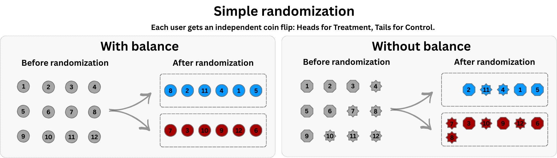
The default approach for most straightforward A/B tests, and the one I’ve been talking about so far, is simple randomization: each unit (e.g., user, session) is independently assigned to treatment or control with a fixed probability (like flipping a coin), as shown in Figure 4.7.
This works beautifully at scale. Flip a coin a million times, and you’ll get nearly a perfectly even split. But in smaller samples, luck plays a messy role. Just as flipping a coin ten times might give you seven heads, simple randomization can accidentally stack the deck, giving one group more users — or worse, more high-value users — than the other (see the right panel in Figure 4.7).
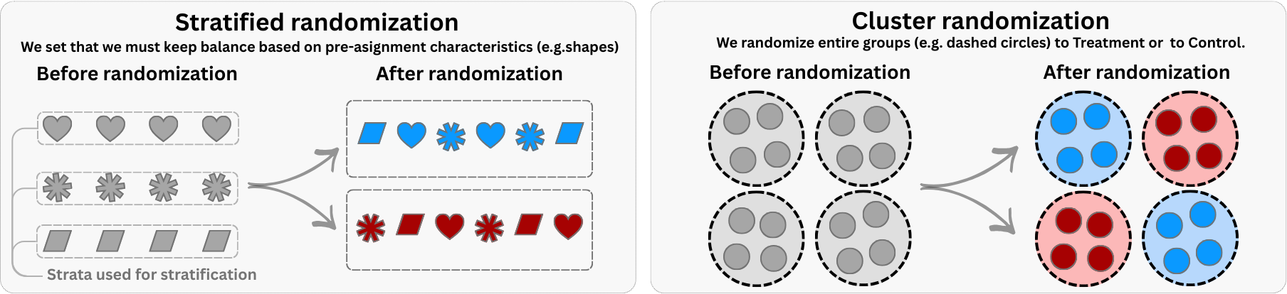
To address specific design challenges, we can use more advanced schemes, as illustrated in Figure 4.8:11
Stratified randomization corresponds to the left panel in Figure 4.8. Before randomizing, you first divide the population into buckets (strata) based on key observable characteristics (like the purple and green shapes). Once stratified, you randomize within each bucket — for example, ensuring that half the users in each region go to treatment and half to control.
The main benefit is that it forces balance over the stratified variable. If you know that the characteristic ‘Region’ drives revenue, stratifying ensures that both Treatment and Control have the same regional composition, reducing noise and increasing power. The catch is that you must observe the covariate before assignment; you cannot stratify on something that hasn’t happened yet.
Cluster randomization corresponds to the right panel in Figure 4.8. Instead of randomizing distinct individuals, you randomize entire groups or “clusters” (represented by the circles enclosing multiple shapes). For example, you might assign all users in ‘City A’ to Treatment and all in ‘City B’ to Control. This prevents contamination such as neighbors getting highly different ride-hailing fares, siblings being exposed to different versions of the app, and so on (SUTVA violations).
If an intervention meant for one user spills over to their neighbors (like in marketing or ride-sharing markets), treating individual users would muddy the results. Randomizing by cluster isolates these networks. On the other hand, it drastically reduces your effective sample size — the effective sample size is driven primarily by the number of clusters and the intra-cluster correlation, not the raw number of individuals — and lowers statistical power.12
Server-side implementation
In digital experiments, randomization has to play nicely with backend architecture. One option is pre-randomization: you generate a list of user IDs and pre-assign them to treatment or control. This is useful when you want to analyze balance before launch or run a holdout design. However, some assigned users may never show up—wasting traffic and potentially lowering power.
Alternatively, trigger-based randomization assigns treatment at the moment a user crosses a threshold—like visiting a page, opening the app, or reaching eligibility. This ensures that only users who are actually exposed to the feature are counted, making the design more efficient. However, it may require careful coordination to log when assignment happened and prevent crossover between groups.
A common production-grade technique is deterministic assignment — think of it like a fingerprint scanner for user IDs. You run each ID through a scrambling function (called hashing) that spits out a seemingly random number. If the number falls below 50, the user goes to treatment; otherwise, control. Because the same ID always produces the same hash, the same user always sees the same variant — no lookup table required.
Regardless of the method, three principles hold: (1) assignment must be independent of user characteristics, (2) exposure must be accurately logged, and (3) group integrity must be preserved throughout the experiment.
Why it matters: How you implement randomization affects both statistical efficiency and debugging. Choose the method that fits your traffic and logging capabilities.
4.2.4 Define your sample size and duration
Think of your experiment as a magnifying glass. Before you gather a single data point, you must decide how much “zoom” you need. Spotting a massive trend—like an elephant in the room — is easy; a standard lens (small sample) will do. But if you’re hunting for a tiny, subtle 1% improvement — a germ — you need a high-powered microscope (a massive sample).
Why it matters: Calculating this sample size is your primary insurance policy against two business disasters:
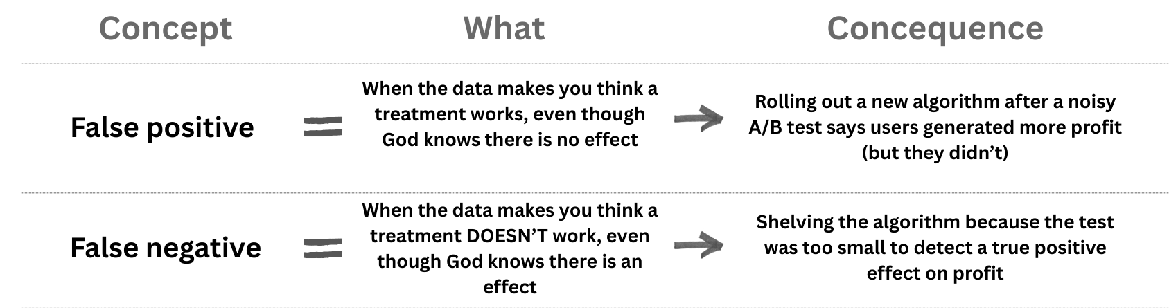
The risk of illusion (false positives): You “detect” a lift that isn’t there and was captured by random variation in the data. As a result, you ship a feature that causes nothing, cluttering your codebase and wasting team focus.
The risk of blindness (false negatives): The feature actually works, but your lens was too weak to detect its effect. As a result, you scrap a winning idea because your experiment failed to prove its value, and you miss out on some money.
We will explore the mechanics of this trade-off — and how to tune the knobs of significance (\(\alpha\)) and power (\(1 - \beta\)) — in the deep dive in the next chapter.
For now, just remember the concepts of false positives and false negatives, and the rule of experimental design: commit to your sample size before you launch. This guarantees you are essentially “pre-registering” your intent, protecting you from the temptation of “peeking” — prematurely monitoring the test and stopping it the moment the results look positive — which is the fastest way to fool yourself.
4.2.5 Pre-flight checks: A/A tests and baseline balance
You have your hypothesis, your metrics, your design, and your sample size. You are ready to launch, right? Not quite. Before going live, you need to verify your infrastructure and your specific randomization.
A/A tests: validating your experimentation infrastructure
Before running a real A/B test, how do you know your experimentation system works correctly? One highly effective method is the A/A test. In an A/A test, you split users into two groups exactly as you would for an experiment, but you show them the exact same experience (typically the control version).
Since there is no actual difference in treatment, you generally expect the groups to behave identically. If you find a massive, statistically confident difference between two identical groups, it is a strong signal that your randomization or data pipeline is broken.
But here is the nuance: statistics is probabilistic. Recall “the risk of illusion” or false positives, from the previous section. If you use a standard 5% significance level, you explicitly accept that roughly 5% of your A/A tests will show a significant difference purely by chance. This is not a bug; it is a feature of the statistical design.
This property implies that observing a single significant result in an A/A test doesn’t necessarily mean your system is broken — it might just be bad luck. However, observing too many significant results is a smoking gun. If you run many A/A tests (or simulate them) and 20% come back significant instead of the expected 5%, your system is miscalibrated — flagging false alarms far too often.
A/A tests are your primary defense against several invisible failures:
Randomization bugs: If your assignment code has a flaw (e.g., systematically routing certain user types to one group), an A/A test will reveal unexplained differences between groups that should be identical.
Pipeline errors: Sometimes the issue is not in the assignment but in the measurement. An A/A test can uncover cases where metrics are computed differently for each group due to subtle logging bugs.
Calibration issues: They verify that your statistical machinery produces false positives at the expected rate. If significantly more than 5% of your A/A tests are significant, your p-values are not trustworthy.
In practice, data-mature companies run A/A tests periodically as a sanity check, especially when onboarding new metrics or upgrading their infrastructure. Some even keep a “permanent” A/A test running in the background to monitor system health.13
Collect baseline data and check balance
Once you trust the system, you must check the specific experiment. A randomized experiment aims to create treatment and control groups that are statistically similar before any intervention. Collecting and examining pre‑treatment covariates helps catch bugs or faulty randomization.
A comparison of means of baseline characteristics or a regression of a pre‑experiment outcome (e.g., pre_profit) on the treatment indicator should yield no significant effect if the randomization worked. Without such measurements, you have no way to discover that your assignment script failed.
Baseline covariates that are correlated with the outcome can also make your estimates more precise (List, Muir, and Sun 2025; Kohavi, Tang, and Xu 2020). Adjusting for these pre-existing traits acts like a noise cancelation headphone: it filters out the background variation (what we already knew about users) so the signal from your experiment comes through clearer.14
Standard analysis looks only at the averages by using a simple linear regression model. It ignores what we already knew about users before the experiment started. By including strictly predictive baseline variables (covariate adjustment), you filter out noise. Studies show this can cut the required sample size by 20–30% while keeping the same statistical power.15
Finally, baseline data enables specific validity checks. First, you can run sensitivity analyses: does your estimated effect stay stable when you add or remove covariates? In a clean experiment, adjusting for user history might shrink your standard errors, but it shouldn’t radically shift the main coefficient. If it does, your groups might differ in ways randomization failed to fix.
Second, you can conduct placebo tests on pre-experiment data, as we did in Section 3.4.3. Apply your analysis code to a period before the intervention started. You should find a “treatment effect” of zero. If your model finds a significant lift in the past, you’ve caught a pipeline bug or a pre-existing bias before it could ruin your real analysis.
4.2.6 Run, monitor, and analyze
You’ve done the hard work upfront. Now it’s time to launch. However, a randomized experiment doesn’t end with the assignment. You need to verify that the intervention is delivered to the right users and that you aren’t harming other parts of the business.
Experiments do not run in a vacuum. External events — a competitor’s price cut, a holiday sale, a platform outage — can hit treatment and control groups differently. A pricing test launched during Black Friday may show effects that vanish during normal weeks. Avoid launching during known anomalies when possible; if unavoidable, document the context and consider replicating the test later.
Ramp up exposure slowly
Don’t just turn the experiment on for 100% of users immediately. Start small—for instance, 1% of users in Treatment and 1% in Control (sometimes called a “1% vs 1%”). Monitor your guardrail metrics and error logs for a few hours. This “ramp” protects you from catastrophic bugs that could crash the app or destroy revenue for your entire user base. If you detect such critical failures, terminate the experiment immediately — this is a valid safety stop, distinct from the statistical “peeking” we warned against earlier. Once you confirm the system is stable, you can ramp up to your full target allocation (e.g., 50% vs 50%).
Monitor fidelity
In a clinical trial, fidelity means asking: “Did the patient actually take the pill?” In a digital business, it means asking: “Did the code actually execute?”
Intervention fidelity is defined as the degree to which an intervention is delivered as initially planned. It is easy to assume that if a user is assigned to “Treatment”, they experienced the new feature. But in the messy reality of software, that’s often false. Maybe the new “Smart Recommendations” widget failed to load on slow connections. Maybe the push notification was blocked by OS settings. If you don’t track this, you might conclude your feature is useless when, in reality, no one ever saw it.
Monitoring fidelity reduces the risk of false negatives (missing a winner because it wasn’t delivered) and helps you spot technical failures before they ruin the experiment.
Practical ways to monitor fidelity in digital experiments include:
Instrumentation and event tracking: use analytics platforms (e.g., Amplitude or Mixpanel) to track impression events, clicks, and notification deliveries. By tagging events for the personalized feed variant, you can confirm that the right users received the treatment and measure adherence.
Logging assignment and exposure: keep a log of assignment decisions and exposures so you can audit whether any contamination occurred (e.g., users switching back and forth between feed versions).
Automated alerts: set up alerts to flag failures (e.g., notification delivery failures, API errors) so that you can pause the experiment and fix issues quickly.
Sample ratio mismatch (SRM)
Imagine you set up a 50/50 split, but when you look at the data, it’s 55/45. That’s a sample ratio mismatch (SRM) — and it’s a red flag, as illustrated in Figure 4.10. SRM can be explained using a coin-flipping analogy: if a supposedly fair coin lands heads 80% of the time over many flips, we suspect something is wrong.
In experiments, SRM signals selection bias or implementation errors. Causes include eligibility filters that send certain users disproportionately to one variant, decoupling enrollment from exposure (e.g., control users see their variant immediately while treatment users must scroll), non-random assignment code, or crashes that affect only one group.
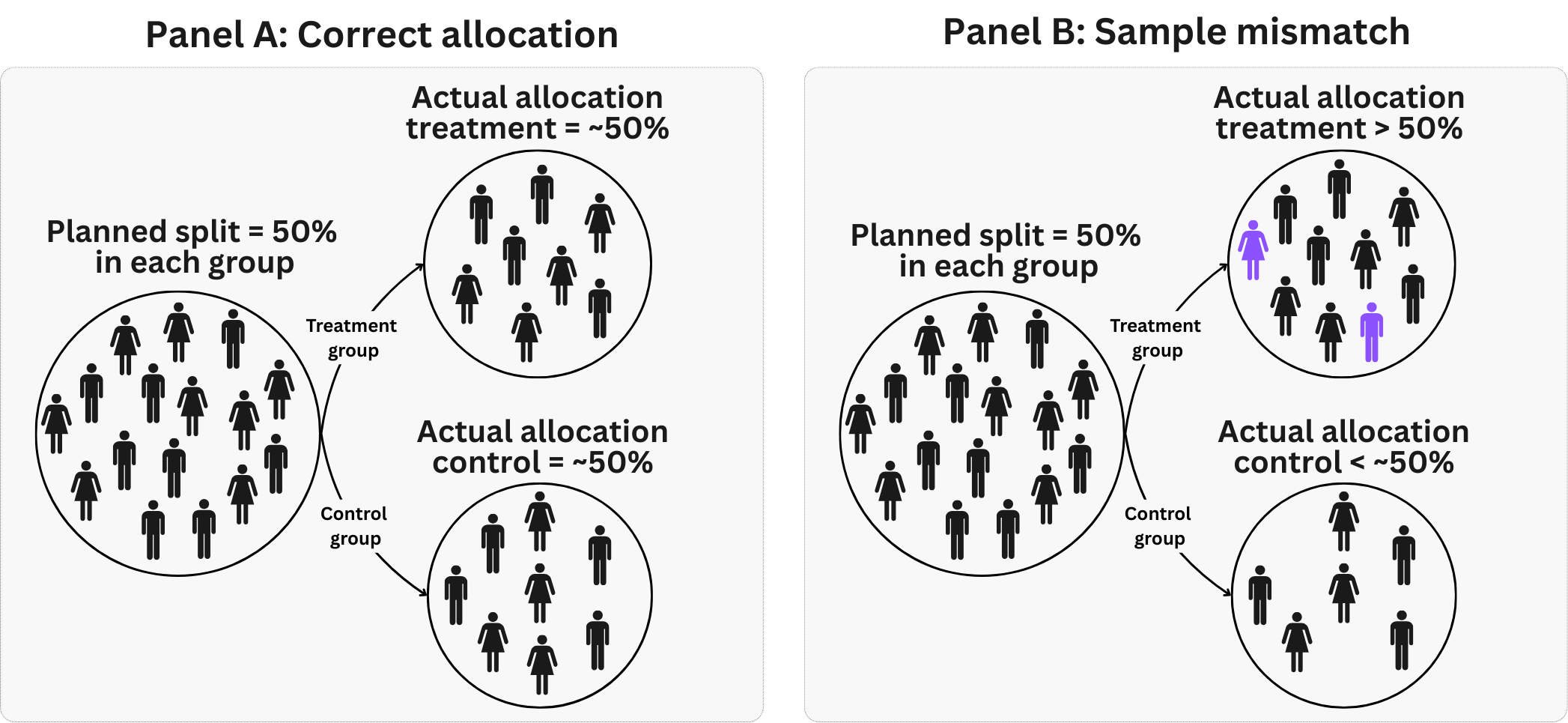
The simplest check is a sanity test: you compare the observed group sizes (e.g., 5,300 vs. 4,700) against what you expected (5,000 vs. 5,000) and ask, “Is this gap bigger than random noise would produce?” Statisticians call this a chi-squared test. Compare your observed user counts against the expected counts under your planned allocation. For a 50/50 split with 10,000 total users, you would expect 5,000 in each group. If you observe 5,300 treatment and 4,700 control, the chi-squared statistic tells you whether this deviation is larger than random chance would produce. Most experimentation platforms run this check automatically and flag experiments with statistically significant mismatches.
A practical rule of thumb: if the p-value from your SRM test is below 0.001, treat the experiment as suspect until you understand why. Even a “small” imbalance like 51/49 can indicate a serious bug if your sample is large enough to make that difference statistically significant.
Discovering SRM after the experiment has ended is uncomfortable, but not necessarily fatal. Before any statistical adjustment, dig into why the mismatch occurred. Check assignment logs, exposure logs, and any filters applied during analysis. Sometimes the problem is in the analysis pipeline (e.g., a join that drops users) rather than the randomization itself. In such cases, fixing the pipeline resolves the issue without discarding data.
What you should not do is apply complex statistical fixes (like weighting or propensity scores) to “correct” an SRM without understanding its source. Such adjustments assume you know which characteristics drove the imbalance, but SRM often stems from unobserved technical issues. Adjusting blindly may introduce new biases rather than remove existing ones.
A real example comes from Microsoft’s Bing search engine, where an experiment testing a new backend system showed significantly more users in the treatment group than expected. Investigation revealed that web crawlers and bots were being assigned to variants but only counted in the treatment group’s metrics because the new system handled bot traffic differently. This created an artificial SRM that would have biased the results if not detected. The solution was to properly filter out automated traffic before analyzing the experiment data.
Sample ratio mismatches are one form of implementation issue that undermines validity. Another common pitfall is confusing short-term reactions with long-term value.
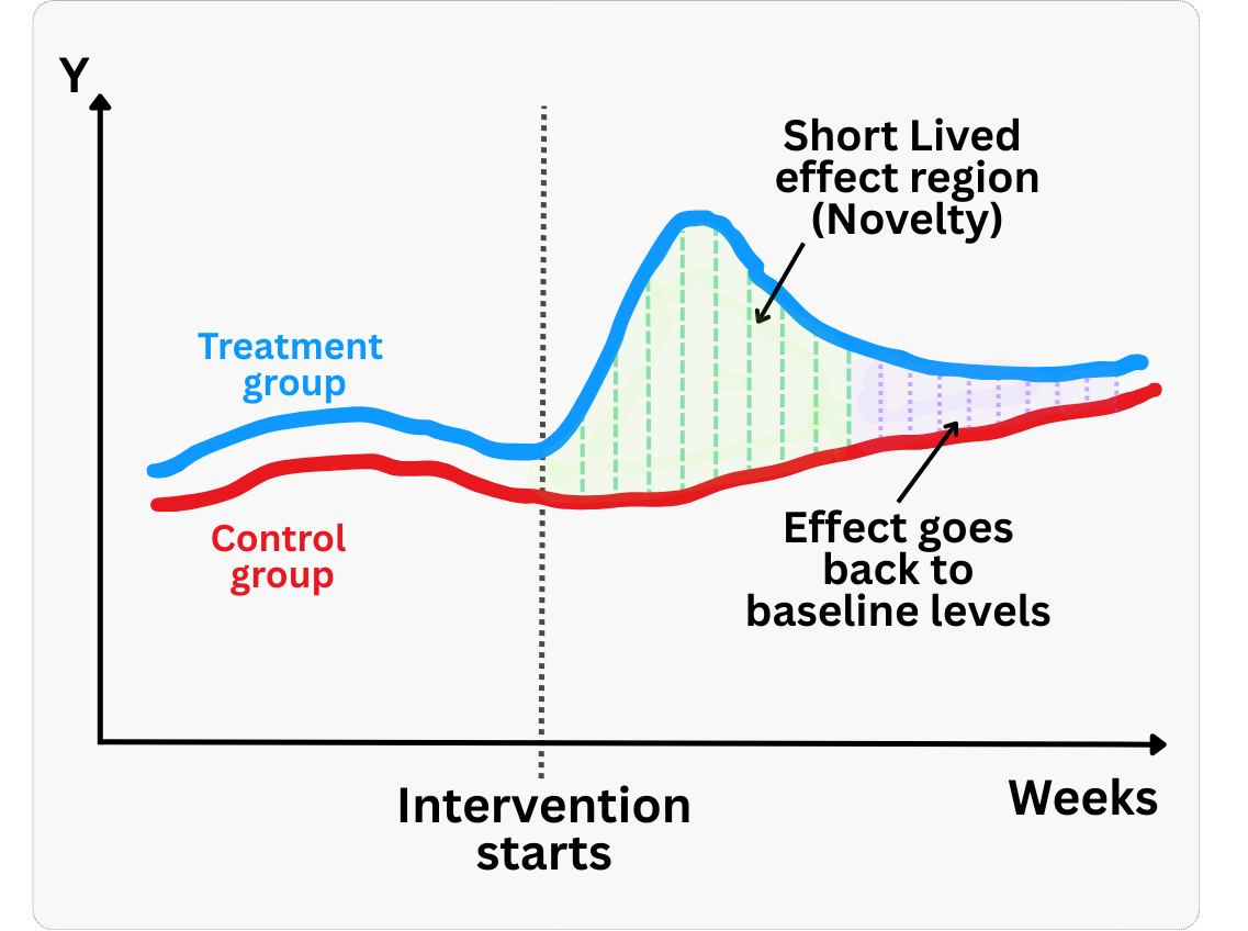
Novelty effects
The novelty effect, briefly discussed in Section 3.3, is a temporary boost or dip in metrics caused by the newness of a feature rather than its long‑term value. These are short‑term responses that wear off as users acclimate. Because they are real (not measurement error), they shouldn’t be “corrected” statistically — instead, you should wait for them to fade before drawing long-term conclusions.
The danger is that if you draw conclusions from early data dominated by novelty, you may over‑estimate or under‑estimate the true long‑term impact. To diagnose novelty, examine the daily or “days since exposure” treatment effect curve — if the effect diminishes over time, as shown in Figure 4.11, novelty may be at play. For shallow metrics like click‑through rate, complement them with deeper engagement or retention measures and consider discarding the first few days of data when novelty is suspected.
“Interesting” results are usually wrong
A core principle of trustworthy experimentation is Twyman’s Law, named after Tony Twyman, a media and market researcher. It states: “Any figure that looks interesting or different is usually wrong”.
If you run an experiment and see a massive 50% lift in revenue, don’t open the champagne. Check your data pipeline. In mature products, true breakthroughs are rare. Extreme results are far more likely to be caused by instrumentation errors, logging bugs, or sample ratio mismatches (SRM) than by a brilliant product change. Adopt the mindset of a skeptic: the more surprising the result, the more evidence you need to believe it.
This applies to negative surprises too. In a famous example from Google, an experiment increased the number of search results from 10 to 20. The team expected a small drop in revenue due to slightly slower page loads (latency), but the results showed a massive 20% drop in revenue. That was too “interesting” to be true. Invoking Twyman’s Law, they investigated and found that the glitch wasn’t just latency—the extra results physically pushed the advertisements off the user’s screen (Kohavi, Tang, and Xu 2020). The metric was correct, but the initial theory was wrong.
When you see an outlier result:
- Check for mismatched sample ratios (SRM): Ensure your treatment and control group sizes match your allocation (e.g., 50/50).
- Segment the data: Does the effect exist everywhere, or is it coming from just one browser, one country, or one specific device type? (Often, a bug is isolated to a specific segment).
- Validate against other sources: If your experiment says “Purchase” events doubled, check your actual sales database. Do they match?
Evaluation and knowledge management
When you’ve reached the planned sample size, which you will learn to calculate in Chapter 5, analyze the data using the model specified in your pre‑analysis plan. Resist the urge to peek at the main effect until this point. Disciplined experimenters strictly adhere to fixed data‑collection periods or predefined analysis rules.
In our exercise in Section 3.4.3, the primary metric showed a positive lift with tight confidence intervals (an ATE of R$2.34, 95% CI = [R$1.75; R$2.93]). Including baseline variables like user_tenure, prior_purchases and pre_profit in the regression improved precision without materially changing the point estimate (an ATE of R$2.44, 95% CI = [R$2.17; R$2.72]).
We already knew from the previous chapter that adjusting for prognostic variables reduces variance — this can also be achieved using CUPED (Controlled-Experiment Using Pre-Experiment Data), a technique that subtracts each user’s pre-experiment outcome to reduce noise.
Under most conditions, CUPED and OLS adjustment yield the same estimate; try both and adopt CUPED if it tightens your confidence intervals. Always interpret the results alongside your guardrail metrics; a lift in engagement isn’t a “win” if churn has increased.
Once the experiment starts, never filter or control for variables that could be affected by the treatment itself. For example, if you test a new checkout flow and then say “Let’s compare satisfaction only among those who bought”, you are breaking the experiment. The treatment likely changed who bought, so you are no longer comparing comparable groups. Only control for variables measured before the intervention (pre-treatment covariates).
A quick note on what you are estimating: In most business A/B tests, you measure the impact of the offer, not just usage. This is called the Intent-to-Treat (ITT) effect — you compare everyone you intended to treat versus the control group, regardless of whether they actually used the feature (see Section 2.5 for a refresher). Because assignment is random, ITT is unbiased — even when compliance is imperfect. If you want to measure the effect on users who actually engaged with the treatment, you need advanced methods like Instrumental Variables (discussed in Chapter 7). Ideally, stick to ITT for go/no-go decisions.
After drawing your statistical conclusions, document the experiment. Write down the hypothesis, the design and sampling plan, the analysis code, the estimated effect, and any subgroup analyses. This post‑mortem transforms a single test into knowledge that others can build upon.
Some companies go further by institutionalizing this knowledge. Booking.com, for example, has built a repository of all past experiments (Thomke 2020). Their platform acts as a searchable archive of successes and failures dating back to their first test. This repository is more than just a history lesson — it is a goldmine for planning future tests.
You can use it to set realistic priors for your expected effect sizes (MDE), estimate compliance rates based on similar past interventions, and understand the natural variability of your key metrics. Maintaining this history requires extra work, but it enables cross-pollination between teams and avoids reinventing the wheel.
Moreover, in the era of AI and the Model Context Protocol (MCP), accessing this institutional memory has never been easier. Instead of manually sifting through database tables or PDF reports, you can now connect conversational agents to your repository.
This allows anyone in the organization to simply ask questions like, “What was the average lift in our last three checkout experiments?” or “How did retention behave when we last changed the onboarding flow?” By making this knowledge instantly accessible, you democratize experimentation and accelerate learning across the entire company.
4.3 Wrapping up and next steps
We’ve covered a lot of ground. Here’s what we’ve learned:
Randomization is powerful but fragile. Randomly assigning treatment breaks the link between user characteristics and outcomes, eliminating selection bias. But this only works if the randomization is correctly implemented and maintained throughout the experiment.
Most failures are preventable — and happen before data collection. Threats like interference (SUTVA violations), contamination, and differential attrition corrupt your results silently. Balance checks, proper units of randomization, stratification, and fidelity monitoring help you catch them early.
The metric is the message. A p-value on the wrong metric is useless. Define a clear OEC that passes the “so what?” test, track driver metrics that move fast enough to detect, and set guardrail metrics to prevent collateral damage.
Trust but verify. From A/A tests validating your infrastructure, to SRM checks catching assignment bugs, to Twyman’s Law reminding you that “interesting” results are usually wrong — skepticism is your best friend.
Document everything. A well-documented experiment becomes institutional knowledge. Pre-register your hypothesis and analysis plan, log decisions, and archive results so future teams can build on your work.
In the next chapter, we turn to the mechanics of statistical power and sample size. We will walk through how to calculate the sample size you actually need — with working R and Python code — and explore the trade-offs between significance level, effect size, and allocation ratios when you cannot simply add more users. We will also cover variance reduction techniques (like CUPED and winsorization) that help you detect smaller effects without inflating your sample, and explain why poor compliance is a silent power killer.
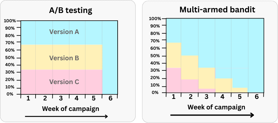
Appendix 4.A: A/B/n tests and Multi‑Armed Bandits (MAB)
A/B/n testing: A/B/n tests generalize the classic binary comparison by evaluating multiple variants simultaneously (A, B, C, …). This is essentially a straightforward RCT extension. You predefine the sample size, allocate traffic equally (or with a fixed ratio), and conduct hypothesis tests to determine winners with statistical significance. This method is ideal when you need a definitive, interpretable answer and clear inference. However, when you compare many variants, it demands a large sample and can be slower, increasing opportunity cost from sending users to low-performing variants.
Use A/B/n when precision, interpretation, and confidence are essential—such as long-term product decisions, or when questions extend beyond maximizing a single metric (e.g. retention vs. revenue).
Multi‑Armed Bandits (MAB): MABs offer a dynamic alternative to classical A/B testing. Unlike A/B testing, where exploration (testing) and exploitation (rolling out the winner) are distinct phases, MAB algorithms intertwine these stages. As visualized in Figure 4.12, the algorithm continuously adjusts traffic allocation, during the experiment, based on performance: the best-performing variant gradually receives more traffic (exploitation), while lower-performing ones still run with a smaller share (exploration). This “test as you go” approach minimizes the opportunity cost of keeping users in inferior variants such as the traditional A/B testing does.16 Popular algorithms include ε-greedy, Upper Confidence Bound (UCB), and Thompson Sampling, a Bayesian approach proven in many online settings.
Use MAB when you want to minimize opportunity cost and adapt in real time—like optimizing seasonal campaigns or UX variants on a high-traffic page where fast adaptation matters more than deep inference.
But what are the main challenges of MAB? MAB introduces complexity: it requires tuning hyperparameters, managing exploration/exploitation trade-offs, and accepting weaker statistical guarantees than traditional hypothesis testing. Convergence can be slower, and results harder to interpret causally. Moreover, if user behavior changes over time (non-stationarity) or if context matters, bandit algorithms may misallocate traffic or converge prematurely on suboptimal variants. Careful design, monitoring, and choice of algorithm are essential to avoid these pitfalls.
As Google advises, “NotebookLM can be inaccurate; please double-check its content”. I recommend reading the chapter first, then listening to the audio to reinforce what you’ve learned.↩︎
If your life revolves around experiments, do yourself a favor and also read Kohavi, Tang, and Xu (2020) and Georgiev (2019).↩︎
Sequential experiments have real appeal: they let you stop early when results are clear, reducing opportunity cost and accelerating learning. But they come with trade-offs. They require careful “alpha-spending” rules to control false positives, are harder to interpret when stopped mid-course, and are easier to misuse (peeking without proper guardrails). Most importantly, they build on fixed-horizon logic. Master the fundamentals here, and sequential methods become a natural extension later.↩︎
There are other conditions that should hold, such as proper outcome measurement, adequate sample size, etc., but let’s master the basics first.↩︎
Since random assignment often relies on complex backend logic implemented by humans, errors can (and do) happen. For instance, in a Bing experiment, a misconfiguration caused all Microsoft users to always see Control. This created enough of a bias to skew results (Kohavi and Longbotham 2011).↩︎
Think of it as ensuring everyone in the treatment arm gets the exact same pill—same dosage, same packaging, and same delivery method. This ensures the measured effect is attributable to the specific treatment, not to variations in how it was administered.↩︎
Fisher wrote this long before modern data roles such as yours and mine existed, so don’t focus too much on the word “statistician”. The lesson nonetheless is timeless: as we said earlier, prevention is worth far more than cure. No amount of sophisticated analysis can rescue a flawed design.↩︎
If you are not sure what to do with the results, reflect on why you would do the experiment in the first place.↩︎
A well-defined hypothesis does more than just guide your experiment - it protects against common pitfalls. Without a clear question and success criteria established upfront, it’s tempting to cherry-pick whatever metrics look good after the fact. We’ve seen teams celebrate increased engagement metrics while missing that their intervention was actually cannibalizing long-term revenue.↩︎
Either ensure your unit of analysis matches your unit of randomization, or use cluster-robust standard errors.↩︎
Note that these illustrations are stylized. Real-world randomization rarely yields perfectly symmetrical groups.↩︎
Your analysis must also account for the fact that observations within the same cluster are correlated (using techniques like cluster-robust standard errors).↩︎
Now, a quick reality check: while textbooks may present A/A tests as mandatory, I must acknowledge that not all teams have the hands or time to run them — and that is okay. Think of this as a diagnostic tool rather than a rigid precondition for every test you run.↩︎
These “pre-existing traits” are treated as covariates in a regression analysis, and act as “noise cancelation headphones” by reducing the variance of the treatment effect estimate, as we will discuss in Section 4.2.6.↩︎
Gains are largest when baseline variables are strongly related to the outcome.↩︎
Here are two quick references comparing A/B testing and MABs: Medium and GeeksforGeeks.↩︎