graph LR
Recs[Recommendations] --> Spend[Total spent]
2 Biases, causal frameworks, and causal estimands
Keywords
A/B Testing, Causal Inference, Causal Time Series Analysis, Data Science, Difference-in-Differences, Directed Acyclic Graphs, Econometrics, Impact Evaluation, Instrumental Variables, Heterogeneous Treatment Effects, Potential Outcomes, Power Analysis, Sample Size Calculation, Python and R Programming, Randomized Experiments, Regression Discontinuity, Treatment Effects
2.1 Data alone isn’t enough for causal questions
A classic big data scenario: you’re surrounded by numbers on clicks, sales, and user-session data. You might believe this is enough for answering all sorts of causal questions. But here’s the hard truth: “data itself is profoundly dumb”. It can reveal patterns, but never the “why” behind them. No matter how massive your dataset, you won’t answer key business questions unless you layer on a causal model (Pearl and Mackenzie 2018).
I like to illustrate this limitation with the tale from Taleb (2007). Imagine a turkey fed by a butcher every day for a thousand days. Every single data point reinforces the statistical model that the butcher is a benevolent guardian of the turkey. The trend is undeniable, and the confidence intervals tighten as this conclusion becomes more credible. But on the Wednesday before Christmas2, the turkey undergoes a sharp “revision of belief”.
This story forces us to face a hard truth: the idea that we can rely on purely ‘data-driven’ approaches. Data alone cannot distinguish between a caregiver and a predator waiting for the right moment. Without a framework to interpret it, data is just a record of the past, blind to the possibilities of what could happen and what could have happened.
Tip💻 Want to run the code? Set up your environment: click here
Data: All data we’ll use are available in the repository. You can download it there or load it directly by passing the raw URL to read.csv() in R or pd.read_csv() in Python.3
Packages: To run the code yourself, you’ll need a few tools. The block below loads them for you. Quick tip: you only need to install these packages once, but you must load them every time you start a new session in R or Python.
# If you haven't already, run this once to install the package
# install.packages("tidyverse")

# You must run the lines below at the start of every new R session.
library(tidyverse) # The "Swiss army knife": loads dplyr, ggplot2, readr, etc.
# If you haven't already, run this in your terminal to install the packages:
# pip install pandas numpy statsmodels (or use "pip3")
# You must run the lines below at the start of every new Python session.
import pandas as pd # Data manipulation
import numpy as np # Mathematical computing in Python
import statsmodels.formula.api as smf # Linear regressionNow let’s build an example that is more relatable to our daily lives. Your marketplace app launches a new recommendation system — an algorithm designed to suggest the most relevant items to each user based on their preferences. You notice the more recommendations suggested by this new recommendation system a user sees, the higher their total R$ spent in a session, as shown in Figure 2.1. Makes sense, right? With a good recommendation system, users are more likely to find what they are looking for and buy it.
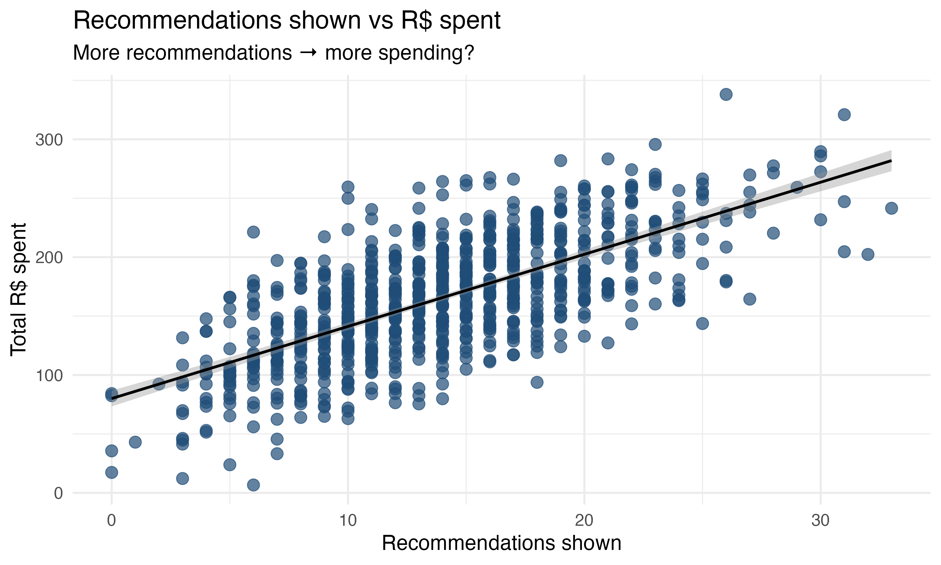
Your director asks you to analyze the data on 800 clients and measure the impact of the new recommendation system on the total amount spent by users. In Chapter 1, you learned regression analysis, so you start by estimating the simple linear regression in Equation 2.1. You’ll find the code for running this regression in both R and Python in the code tab below.
\[ \text{total spent} = \beta_0 + \beta_1 \times \text{recommendations shown} + \varepsilon \tag{2.1}\]
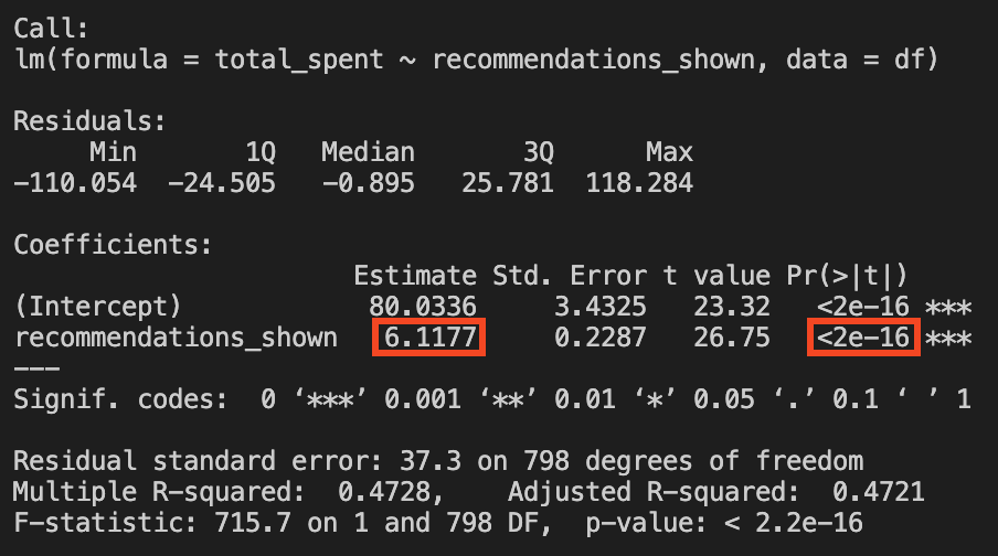
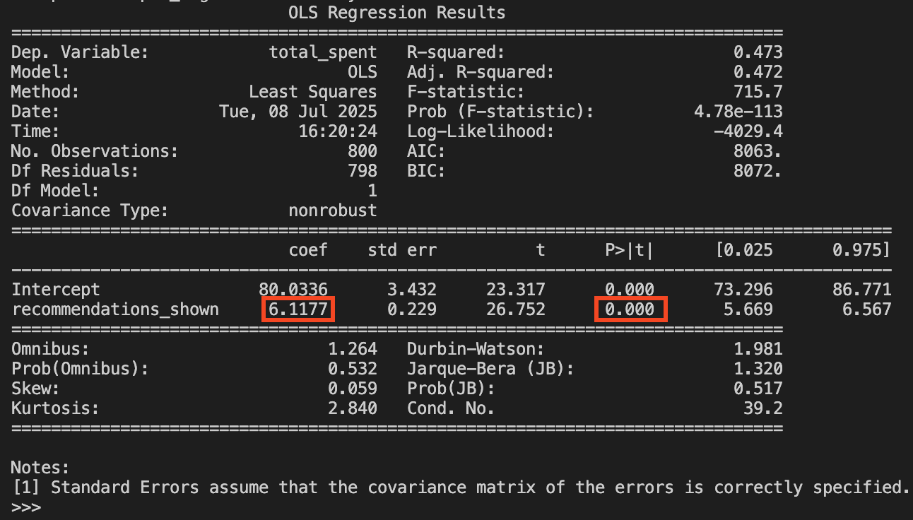
We find that \(\hat{\beta_0}=80.03\) and \(\hat{\beta}_1 = 6.12\). The intercept \(\hat{\beta_0}\) suggests that a user shown zero recommendations is expected to spend R$80.03 on average. As for \(\hat{\beta}_1\), it tells us that for every additional recommendation shown, the user spends on average R$6.12 more, a result that is statistically significant at the 1% level. This makes a lot of sense, right? The more we show users recommendations, the more they spend. With the former being the cause for the latter.
But wait, there is more to this story!
Remember from Chapter 1 that this interpretation holds if our model is close to the true model known to the all-knowing God (i.e., if it captures how the world actually works). An experienced colleague, who is more familiar with causal inference, tells you to plot the data and see if there is a relationship between the number of recommendations shown to users and previous engagement levels of these users.4 This is plotted in Figure 2.2.
The only difference between the two plots is that, in the second one, each dot is colored according to the user’s previous engagement level before the recommendation system was launched: red dots show users with lower previous engagement (fewer minutes in the app), and green dots show users with higher previous engagement (more minutes in the app).5
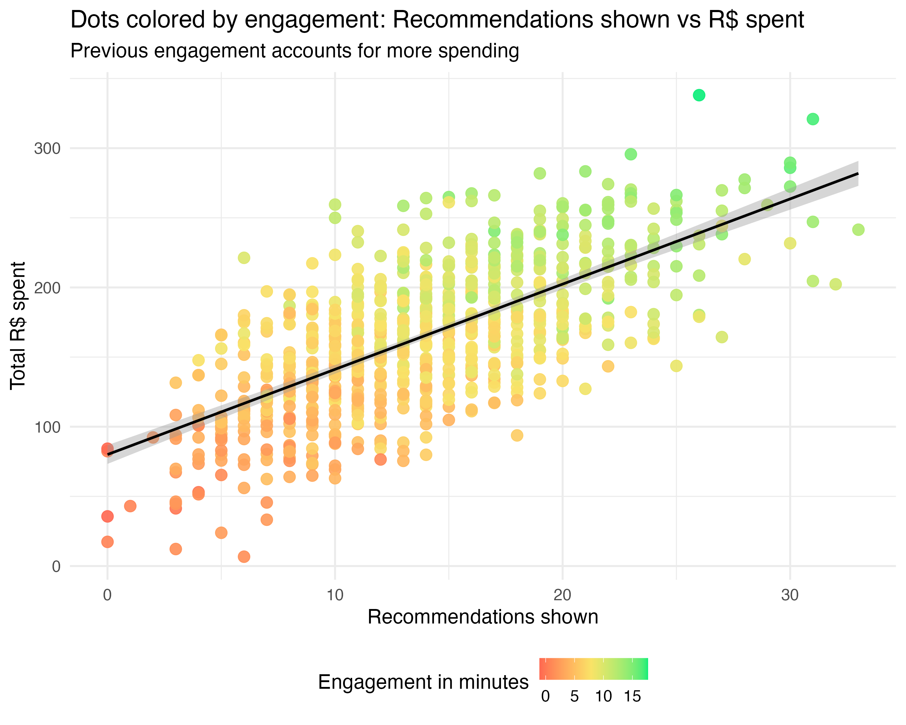
Now we begin to suspect that lower previous engagement (represented by red-ish dots) is correlated with lower recommendations shown to these users, and lower total R$ spent by these users, while higher previous engagement (represented by green-ish dots) is correlated with higher recommendations shown to those users, and higher total R$ spent by those users. Let’s run the multiple regression including both variables, as in Equation 2.2, to confirm this:
\[ \text{total spent} = \beta_0 + \beta_1 \times \text{recommendations shown} + \beta_2 \times \text{engagement} + \varepsilon \tag{2.2}\]
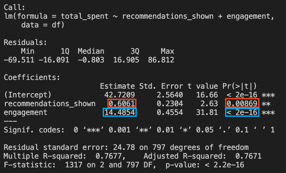
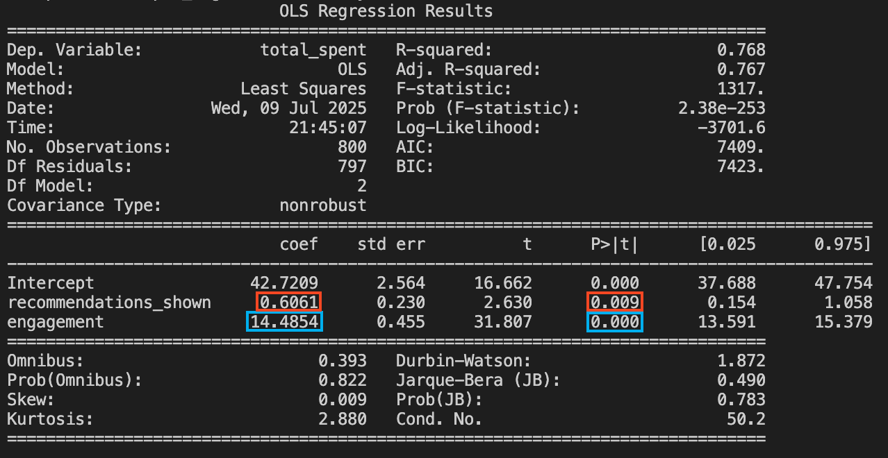
To your surprise, the results reveal a much smaller impact for your recommendation system. Once we control for engagement, the estimated effect of showing an additional recommendation plummets from R$ 6.12 to just R$ 0.61. The real driver of spending is engagement itself: independent of recommendations, every additional minute a user spends on the app adds about R$ 14.49 to their total spend. If you fail to control for this, you’ll be misled into thinking your algorithm is a money-printing machine, when in reality, it’s mostly just “riding along” with users who already love your platform.
These kinds of misleading, overly optimistic conclusions like the one you initially reached are common in large datasets. Behavioral economists call this the illusion of causality: our brains are naturally inclined to find order in randomness and to see patterns, even when none truly exist. When two variables that seem plausibly connected move together, it’s all too easy to jump to causal conclusions, sometimes with disastrous business consequences (Kahneman 2011).
What you’ve encountered here is a textbook case of omitted variable bias (OVB). By leaving engagement out of your model in Equation 2.1, you miss the true story — one that only becomes clear when you include engagement, as in Equation 2.2. This example perfectly sets the stage for everything you’ll learn in this book about how to avoid these pitfalls and uncover genuine causal relationships.
2.2 The anatomy of omitted variable bias
The statistical concept of bias
In statistics and causal inference, bias is any systematic error that pushes your estimate away from the true effect you’re trying to measure. It’s not about random mistakes, but about consistent mismeasurement. Think of it as a kind of “invisible hand” that quietly and consistently nudges your results in the wrong direction.
These errors might come from who ends up in your sample (selection bias), what you fail to measure (omitted variable bias), who drops out along the way (attrition bias), or even misunderstanding the direction of influence (reverse causality and simultaneity). In the following sections, we will discuss omitted variable bias in more detail, while the other types of biases and misleading relations will be discussed in the Appendix 2.A of this chapter.
The anatomy of OVB
We can visualize the problem using a causal diagram (also called a Directed Acyclic Graph or DAG). DAGs are visual tools that help us map out our assumptions about how variables relate to each other in the real world. Think of them as flowcharts for causality: each variable is represented by a node, and arrows show the direction of causal influence. In our case, the DAG helps us see why simply looking at the correlation between recommendations and spending led us astray.6
In Figure 2.3, we see what we thought we were measuring: a direct path from recommendations to spending. But Figure 2.4 shows the reality: engagement is a confounder that creates two pathways to higher spending. Highly engaged users naturally see more recommendations (because they spend more time in the app), and they also spend more money directly (because engaged users simply buy more).
graph LR
    Eng[Engagement] --> Recs[Recommendations]
    Eng[Engagement] --> Spend[Total spent]
    Recs[Recommendations] --> Spend[Total spent]
This creates a misleading correlation. When we ignore engagement in our first regression, we accidentally attribute all of its effect to recommendations. It’s like crediting a rooster’s crow for causing the sunrise — they happen together, but one doesn’t cause the other.
In this example, we could see “engagement” in our data table — we simply forgot to include it in our regression. But omitted variable bias can be much more insidious. The missing variable might be something we can’t directly observe or measure, like a customer’s true satisfaction level, their underlying propensity to spend, or their personal financial situation. These unobservable factors can still create the same misleading patterns, making it appear that recommendations drive spending when the real driver is something we never measured at all.7
This is why omitted variable bias is particularly dangerous in practice: sometimes the confounding variable is right there in our dataset (like engagement), but other times it’s completely hidden from view, lurking in the background and distorting our conclusions without us even knowing it exists.
WarningDon’t panic: I’ll translate the math
If Greek letters give you flashbacks to high school calculus, don’t worry. We will translate every term below into plain English.
The goal isn’t to master proofs, but to grasp where the bias comes from and, most importantly, how to kill it. If you prefer the intuition over the derivation, strictly speaking, you can skip to the “Key insight on OVB” callout — but I promise this section is painless.
Let’s peek under the OLS hood. Suppose the true model is the “long regression” (Equation 2.2), which includes engagement. But in our ignorance (or lack of data), we estimate the “short regression” (Equation 2.1), which omits it. Econometric theory gives us a famous result that explains exactly why our result was wrong. I show this in Equation 2.3.8. The symbol \(\mathbb{E}\) stands for “Expected Value” — stat-speak for the average. It indicates that this result holds if we run this regression in several different samples and take the average of the estimated effects we found.
\[ \begin{aligned} &\textcolor{#f77a05}{\text{average values of } \hat{\beta}_1} = \textcolor{#f77a05}{\mathbb{E}[\hat{\beta}_1]} = \textcolor{#0572f7}{\beta_1} + \textcolor{#ff0585}{\text{Bias}} \\[1em] &\textcolor{#f77a05}{\mathbb{E}[\hat{\beta}_1]} = \textcolor{#0572f7}{\beta_1} + \left[ \textcolor{#f70505}{\left( \begin{array}{c} \text{Effect of engagement} \\ \text{on total spent} \end{array} \right)} \times \textcolor{#800080}{ \left( \begin{array}{c} \text{How recommendations and} \\ \text{engagement move together} \end{array} \right)} \right] \\[1em] &\textcolor{#f77a05}{\mathbb{E}[\hat{\beta}_1]} = \textcolor{#0572f7}{\beta_1} + \left[ \textcolor{#f70505}{\beta_2} \times \textcolor{#800080}{\frac{\text{Cov}(\text{recommendations shown}, \text{engagement})}{\text{Var}(\text{recommendations shown})}} \right] \\[1em] \end{aligned} \tag{2.3}\]
First, read each equation above, knowing that each line is is a result of the previous one, maintaining the colors so you understand what each term represents. And now that you understand the correspondence, let’s decode the last row of Equation 2.3 into plain English, term by term:9
\(\mathbb{E}[\hat{\beta}_1]\): This is the expected value, the average, of what our “short” model spits out as a coefficient for recommendations. It’s the average estimated effect we would obtain from running this regression in several different samples.
\(\beta_1\): This is the true causal effect of recommendations on spending. This is known by the gods of causal inference; we want to find it but can’t see it directly.
\(\beta_2\): This is the true effect of the omitted variable (engagement) on spending.
Fraction: This represents the relative size of the relationship between the treatment and the omitted variable. In our case, it measures how strongly “recommendations shown” correlates with “engagement”.10
Here is the punchline: The estimate you get is a mix of the truth that you seek plus a bias term. And this bias term is the product of two things:
- The effect of the omitted variable on the outcome (red).
- The correlation between the omitted variable and your treatment (purple).
As a product, the bias will be zero only if either of the two terms is zero. So this formula reveals exactly why we got fooled. Omitted Variable Bias (OVB) doesn’t appear just because we forgot a variable. It strikes only if the omitted variable is related to both the outcome (“Total Spent”) and the treatment (“Recommendations”).
In our example, we hit the OVB jackpot in a bad way:
- Engagement strongly drives spending, so \(\beta_2\) is positive and large.
- Engagement correlates with recommendations, so the purple term is positive.11
Because both terms were non-zero and positive, our simple regression inflated the value of recommendations. It took the credit that actually belonged to engagement and misattributed it to our algorithm. If either of these links were broken — if engagement didn’t affect spending, or if it wasn’t correlated with recommendations — we would be safe.
ImportantKey insight on OVB
OVB only occurs when the variable you leave out of your model is related to both the outcome you’re measuring (“total spent”) and the treatment variable you’re studying (“recommendations shown”). If the omitted variable only affects one or the other — but not both — then leaving it out won’t bias your estimated effect.
But attention is needed: as we will see in Chapter 6, there are exceptions to this rule. If the covariate is part of the mechanism (what we call a mediator) or an effect of both treatment and outcome (what we call a collider), adding it to the model can actually introduce bias or remove the effect you are trying to measure.12
When we can’t measure or control for all the confounding variables, we need different methods to get clean estimates of causal effects. These methods all share a common goal: finding ways to estimate treatment effects that aren’t contaminated by omitted variable bias (Part II of this book).
The key insight is that we need to find variation in who gets treated that isn’t related to the unobserved factors that also affect the outcome. In other words, we want the assignment of treatment to be “as good as random” - even if it’s not actually random.
This is the same principle behind randomized experiments, just applied in different ways. In a true experiment, we randomly assign treatment, which breaks any connection between treatment assignment and unobserved confounders. When we can’t run experiments, we look for situations where treatment assignment happened in ways that mimic randomness - or we use statistical techniques that can isolate the causal effect despite the presence of confounders.
2.3 Selection bias: when “who gets what” ruins causal answers
Sometimes, the problem runs deeper than simply leaving a variable out of our model. It’s not just that we missed a factor (observed or unobserved), but that the mechanism determining who gets the treatment is itself biased. That’s where selection bias, a cousin of omitted variable bias, comes in.
Both stem from differences between treated and control groups that also affect the outcome. But while OVB often happens because we omit a confounder in our model, selection bias happens upstream — when the process of deciding who gets the treatment effectively rigs the game by favoring those who would perform either better or worse than average anyway. And very often, one leads to the other: selection bias creates the conditions for OVB when you try to estimate causal effects without properly modeling the selection process, or when the selection relies on hidden factors you simply cannot measure.
Example: let’s get back to our new recommendation system example, but this time suppose the product team launches it only for users who have logged in at least 5 times in their first month. They want to “reward” active users and make sure the new feature is seen by people most likely to use it. When your manager asks for a report on the system’s impact, you might be tempted to simply compare total R$ spent between users with and without the new system.
But here’s the catch: users with high engagement and lots of logins are selected into the treatment group. They are different from less engaged users, and those same differences — like being more active or more interested in shopping — also make them likely to spend more, regardless of the new system.
So when you run total spent ~ recommendation system enabled … you’ll see a positive effect. But this isn’t necessarily the effect of the recommendation system — it’s a mix of the effect of being highly engaged and having access to the new feature. You’re seeing selection bias in action.
Think of selection bias as a problem with the data generation process: the treated and untreated groups were not comparable to begin with. Omitted variable bias is the resulting error in your statistical model when you fail to adjust for those differences. Selection bias creates the distortion in the world; OVB is what you get when your analysis ignores it.
2.4 The potential outcome model
So far, we could correct the omitted variable bias by including the variable in the regression model, but as we said, the missing variable might be something we can’t directly observe or measure, like a customer’s true satisfaction level, their underlying propensity to spend, or their personal financial situation.
To deal with our own ignorance about the true model, economists, statisticians, philosophers and computer scientists developed causal frameworks to help us think and plan our causal studies. The most disseminated model in my field is the potential outcomes model (Imbens and Rubin 2015), which requires a leap of imagination to consider alternate realities.
The potential outcomes model allows us to compare what would happen to the same unit with and without treatment — a “what if” machine for causal reasoning. The terminology (treatment, control) has roots in medicine and agriculture, but the logic applies universally. For the rest of this chapter, we’ll assume a simple binary treatment: you either get it or you don’t.13 Figure 2.5 illustrates the idea with a marketing campaign example.
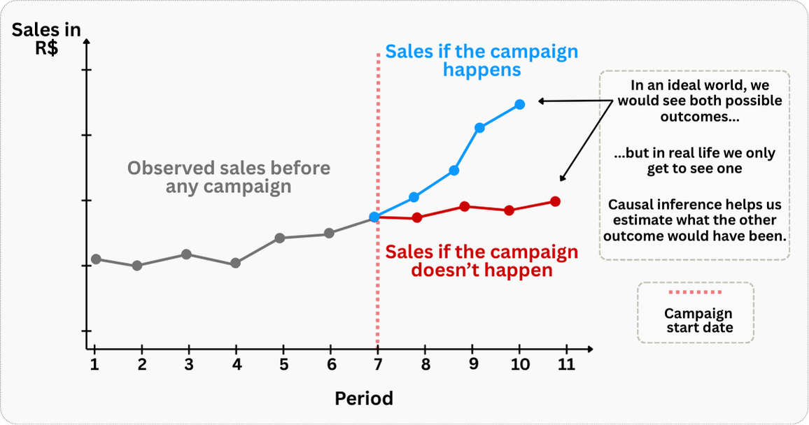
Of course, this exercise is purely hypothetical, but it illustrates a key insight: if we could somehow observe both potential outcomes for the same unit, causal inference would be straightforward. We would simply calculate the difference between these two scenarios to determine the true causal effect of the campaign.
However, this is precisely what makes causal inference challenging in practice. In the real world, we face what’s known as the “fundamental problem of causal inference”: for any given unit, we can only observe one potential outcome - either the treated state or the untreated state, but never both simultaneously. When a company implements a global marketing campaign, we cannot simultaneously observe what would have happened to its sales if the campaign was not executed.
Here’s where the potential outcomes framework earns its keep. Even though we cannot observe these counterfactual scenarios directly, the framework helps us think systematically about what we’re trying to estimate and guides us toward creating valid comparison scenarios or groups.
By understanding that our goal is to approximate the unobserved counterfactual, we can design studies and employ methods that help us construct the best possible substitute for the missing potential outcome, ultimately enabling us to make credible causal inferences despite this fundamental limitation.
NoteModel and notation
The standard notation below may feel abstract at first — that’s normal. Like learning a new grammar, it might take a few reads to click. Stick with it: this framework is the key to solving every problem in this book.
Before we go further, let’s lock in the vocabulary we’ll use throughout this book.
Treatment (denoted by the variable names \(T_i\) or \(D_i\)):14 It represents the intervention received or adopted by individuals, such as being exposed to a new recommendation algorithm, a discount coupon campaign, or a new product feature. In the binary treatment framework, it can take on the values \(0\) for those assigned to stay in the control group or \(1\) for those assigned to receive the treatment.
Treatment group (represented by \(D_i=1\)): It denotes the group of individuals who where assigned to received the treatment. For instance, if the company sends a discount coupon campaign to a group of customers, the treatment group is the group of customers who received the coupon campaign.15
Control group (represented by \(D_i=0\)): It denotes the group of individuals who did not receive the treatment. In the same coupon campaign example, the control group is the group of customers who did not receive the coupon campaign.
Potential outcome (denoted by \(Y_{i1}\) or \(Y_{i0}\)): It indicates the value of the outcome variable \(Y\) that an individual \(i\) would have in each scenario. For instance, it’s as if God knows beforehand what your outcome would be if you were treated (\(Y_{i1}\)) and what it would be if you were not treated (\(Y_{i0}\)). In the same example, it’s as if God knows beforehand what your total spending would be if you received the coupon campaign (\(Y_{i1}\)) and what it would be if you did not receive the coupon campaign (\(Y_{i0}\)).
Counterfactual (also denoted by \(Y_i(1)\) or \(Y_i(0)\)): It refers to the unobserved potential outcome or to “what would have happened to an individual under the alternative condition”. For example, if a customer received the coupon campaign (\(D_i=1\)), we would observe their outcome as \(Y_{i1}\), but their counterfactual would be \(Y_i(0)\) - what their spending would have been without receiving the coupon campaign. Conversely, if a customer didn’t receive the coupon campaign (\(D_i=0\)), we would observe their outcome as \(Y_{i0}\), but their counterfactual would be \(Y_i(1)\) - what their spending would have been if they had received it. The counterfactual is always the “what if” scenario we can’t observe; the “road not taken” for each individual customer.
Put simply, selection bias means the dice are loaded: who gets the treatment depends on traits that themselves predict the outcome. The assignment isn’t random — it reflects pre-existing differences.
2.4.1 Explaining bias through the potential outcomes framework
Let’s say you work in the data team of a food delivery app. The marketing team wants to boost the number of orders, so they came up with the “Super Promo Banner”, a big ad at the top of the app home screen with special discounts. The app is programmed to show the banner to users who don’t order much and never show the banner to users who already order a lot. According to them, “this is a business rule” (we all have been through this, haven’t we?).
Having the purely hypothetical framework of the potential outcomes model, and supposing you can see the state of each user in each of the two scenarios of being exposed to the banner or not, let’s study the table Table 2.1:
| João (Low-orders user) |
Maria (High-orders user) |
|
|---|---|---|
| Did this person see the banner? \((D_i\)) | Yes \((D_{João}=1\)) | No \((D_{Maria}=0\)) |
| Orders this month (observed) (\(Y_i\)) | 3 (\(Y_{João}\)) | 8 (\(Y_{Maria}\)) |
| Orders if NOT shown banner (\(Y_{i0}\)) | 2 (\(Y_{João,0}\)) | 8 (\(Y_{Maria,0}\)) |
| Orders if shown banner (\(Y_{i1}\)) | 3 (\(Y_{João,1}\)) | 8 (\(Y_{Maria,1}\)) |
In this hypothetical world, were we could see potential outcomes, the true effect of showing the banner would be:
- Effect for João = \(Y_{João,1} - Y_{João,0}\) = 3 (with banner) - 2 (without banner) = 1
- Effect for Maria = \(Y_{Maria,1} - Y_{Maria,0}\) = 8 (with banner) - 8 (without banner) = 0
But, in real life, we can never observe both potential outcomes for the same person. For example, we don’t get to see what João’s orders would have been without the banner (\(Y_{João,0}\)), or what Maria’s orders would have been with the banner (\(Y_{Maria,1}\)). All we see is each user’s actual, observed outcome.
This leads many analysts to make a classic mistake: they simply compare the observed results for João and Maria and call it the “effect” of the banner. For instance, \(Y_{João} - Y_{Maria} = 3 - 8 = -5\). Not only might a naive analyst conclude that the banner makes things worse, but scarily enough, they may craft a persuasive narrative to justify this biased result — arguing, for instance, that the banner is intrusive and damages the user experience.
Here’s the real issue: except in randomized experiments, people who get the “treatment” are usually selected for a reason — and that reason is often related to the outcome we’re measuring. That’s what creates confounding and bias in our causal effect estimates.
In this example, the negative “effect” isn’t telling us the true story. What’s really happening is that Maria would have had more orders than João, banner or not. João was targeted to see the banner specifically because he’s a low-order user. This is selection bias — the treated and untreated groups are fundamentally different before the treatment even happens.
Takeaway: Whenever “the treated, if they hadn’t been treated” are different from “the untreated as observed,” any naive difference in averages will mix bias into the true causal effect.
2.5 Main causal estimands
“I learned very early the difference between knowing the name of something and knowing something.”
— Richard P. Feynman (American physicist)
In causal inference, estimands are the core conceptual causal questions we want to answer. They are conceptual because they rely on comparing what would have happened to the same unit with and without treatment - but in reality, we can only observe one of these outcomes for each unit.
Due to the fundamental problem of causal inference presented above, it’s important to keep in mind that these estimands are conceptual in nature: they describe ideal comparisons we’d make if we could observe both potential outcomes for each unit.
Later, when we move from concept to data, our challenge will be to approximate these estimands as closely as possible using the right combination of sample data and research design.
Feynman’s point applies directly here. You’ll meet plenty of data scientists who can rattle off “ATE, ATT, ITT, LATE” like a catchy acronym, yet struggle to explain what each one actually measures or when to use which. That’s knowing names, not knowing things.
So let’s do the opposite. Below are the most common estimands you’ll encounter, each answering a different version of a causal “what if” question. For consistency, all examples assume the treatment is implementing a new recommendation algorithm on a marketplace app. My goal is for you to walk away understanding what each estimand captures and why you’d choose one over another, not just memorizing the labels.
Average Treatment Effect (ATE)
The ATE represents the average effect of a treatment if everyone in the population of interest were treated, compared to if no one were treated. In other words, it compares two hypothetical worlds: one in which the entire studied population receives the treatment, and one in which the entire population receives the control.
For that reason, this estimand is particularly useful for answering questions like: “Should we roll this feature out to everyone in our user base?”
To make this clear: imagine a marketplace app testing a new recommendation algorithm on 100,000 users. The ATE is the difference between the average total spent if all users had used the new algorithm and the average total spent if all users had remained on the old one:
ATE = (Average total spent if all users used the new algorithm) − (Average total spent if all users used the old algorithm)
Average Treatment Effect on the Treated (ATT)
The ATT focuses on the average effect of the treatment only for those who actually received it - often by their own choice. The conceptual comparison is between the observed outcomes of the treated users and the outcomes they would have had if they had not been treated.
This estimand is best suited for answering questions like: “How effective is our feature for users who actually adopt it?”; especially relevant when adoption is voluntary, which is often the case in digital products.
To make this clear: suppose only 60% of users chose to use the new algorithm. The ATT measures the difference between the total spent of those users and the total spent they would have had if they had continued using the old algorithm:
ATT = (Average total spent for algorithm users) − (Average total spent those same users would have had without the algorithm)
Intention-to-Treat Effect (ITT)
The ITT measures the average effect of being assigned to treatment, regardless of whether users actually receive or comply with the treatment. This estimand compares outcomes between those assigned to the treatment group and those assigned to the control group, based purely on the initial randomization.
This estimand is essential for answering questions like: “What is the overall impact of our feature rollout campaign, including both users who adopt it and those who ignore it?”
To make this clear: suppose the marketplace randomly assigns 50,000 users to receive an email promoting the new algorithm, while another 50,000 users receive no email. The ITT measures the difference in average total spent between these two groups, regardless of whether users in the first group actually enabled the new algorithm after receiving the email:
ITT = (Average total spent for users assigned to receive the email) − (Average total spent for users assigned to the control group)
Relationship to ATE: The ITT and ATE are closely related but serve different purposes. While the ATE asks “what if everyone were treated?”, the ITT asks “what if everyone were assigned to treatment?” In scenarios where everyone assigned to treatment actually receives and uses the treatment, ITT equals ATE. However, when this relationship is imperfect — as it often is in real-world applications — the ITT will typically be smaller than the ATE because it includes the “diluting” effect of those who were assigned to treatment but didn’t actually receive or use it. Think of ITT as the “realistic” version of ATE that accounts for the messiness of actual implementation.
Local Average Treatment Effect (LATE)
The LATE captures the effect of the treatment only for users whose behavior changes because of being assigned or encouraged to receive the treatment. These are called compliers: people who adopt the treatment only if prompted, such as by a notification or email.
The relevant comparison here is between compliers who were assigned to treatment and compliers who were assigned to control. This estimand is ideal for answering questions like: “How effective is our email campaign at encouraging feature adoption and improving outcomes for those who respond to it?”
To make this clear: imagine some users only enable the new algorithm after being emailed about it; they would not have used it otherwise. The LATE would then measure the causal effect on these email-persuaded users:
LATE = (Average total spent for users who enabled the algorithm due to the email) − (Average total spent those same users would have had without the email)
We’ll unpack compliers and LATE in much more detail in Chapter 7.
Conditional Average Treatment Effect (CATE)
The CATE breaks down the average treatment effect to see how it differs across specific subgroups within the population. Instead of a single, one-size-fits-all effect, CATE provides a portfolio of effects for different user segments, which is the cornerstone of personalization.
This estimand is essential for answering questions like: “Is this feature more effective for new users than for our loyal subscribers?” or “Does the algorithm’s impact depend on the user’s preferred genre?”
To make this clear: the marketplace might find that the ATE of the new algorithm is a R$ 10 increase in total spent. However, the CATE could reveal that for users who buy electronics, the effect is a R$ 25 increase, while for users who buy books, there is no effect at all. This insight allows the platform to personalize the user experience by rolling out the feature only to the subgroups for whom it is most beneficial.
CATE for electronics buyers = (Average total spent for electronics buyers with the new algorithm) − (Average total spent they would have had with the old algorithm)
Individual Treatment Effect (ITE)
The ITE represents the treatment effect for a specific individual — the most granular level of causal analysis possible. It answers the question: “What would be the exact effect of this treatment on this particular user?”
This estimand would be ideal for answering questions like: “Should we recommend the new algorithm specifically to User Robson based on their individual characteristics and predicted response?”
To make this clear: the ITE for a specific user would be the difference between their total spent with the new algorithm and their total spent with the old algorithm. For instance, User Robson might have an ITE of + R$ 15, while User Cristiane might have an ITE of - R$ 5 (meaning the new algorithm actually decreases her spending).
ITE for UserRobson= (UserRobson’s total spent with new algorithm) − (UserRobson’s total spent with old algorithm)
Feasibility and relationship to CATE: The ITE is fundamentally unobservable because we can never observe the same individual in both treated and untreated states simultaneously. However, the ITE is the theoretical foundation that underlies other estimands.
The CATE, for instance, can be thought of as an aggregation of ITEs across a subgroup of users with similar characteristics. The finer we make these groups, the closer we get to individual-level effects. In practice, modern machine learning techniques for estimating CATE — such as causal forests or meta-learners — are essentially sophisticated ways of approximating individual treatment effects by creating very fine-grained subgroups based on user characteristics.
2.5.1 From counterfactuals to comparison groups: the bloodhound’s job
Let’s step back and connect the dots. Every topic in this chapter, from omitted variable bias to selection bias to the parade of estimands, revolved around one core problem: we can never observe what would have happened to a user under the alternative treatment condition. João saw the promo banner; we’ll never know his orders without it. Maria didn’t see it; her response to the banner remains forever hypothetical.
This is why causal inference often feels like detective work. We’re hunting for the next best thing: a comparison group that can stand in for the missing counterfactual. The closer that group resembles what our treated users would have looked like without treatment, the more credible our causal estimate becomes. Every method in Part II of this book, from randomized experiments to difference-in-differences, is essentially a different strategy for finding (or constructing) that substitute.
And this is precisely why randomized experiments are the gold standard. When we flip a coin to decide who gets the new recommendation algorithm and who doesn’t, we guarantee that, on average, the two groups start out identical; their potential outcomes, observed or not, are statistically interchangeable. The control group becomes the counterfactual. No selection bias sneaks in. No hidden confounders distort the comparison. The bloodhound’s job, for once, is easy.
With the fundamental challenge and the language of estimands now under your belt, you’re ready to learn how to actually run these studies. In the next chapters, we’ll move from concepts to action: designing experiments, handling non-compliance, and knowing when you can (and can’t) trust your comparison group.
2.6 Wrapping up and next steps
We’ve covered a lot of ground in this chapter. By now you can:
- Recognize that raw data alone can’t prove causality; as the turkey example showed, even a thousand data points can’t distinguish between a caregiver and a butcher without a causal model to interpret them.
- Identify the two main enemies of causal inference: omitted variable bias (when hidden factors like engagement drive both treatment and outcome) and selection bias (when the treated group is fundamentally different from the control group to begin with).
- Understand the fundamental problem of causal inference: we can never observe both potential outcomes for the same unit. This forces us to rely on counterfactual thinking — always asking “what would have happened in the alternative scenario?”—and to search for valid comparison groups.
- Speak the language of causal estimands to match the right metric to the right business question, whether it’s deciding on a global rollout (ATE), measuring impact on actual users (ATT), or personalizing offers (CATE).
- Appreciate why randomized experiments are the gold standard: by deciding who gets treated by a flip of a coin (or a random number generator), we eliminate selection bias and ensure that, on average, our comparison groups are identical.
In the next chapter, we will move from concepts to action. You will learn:
- A practical framework to plan and design causal analyses, ensuring you never start a project without a clear path to a valid answer.
- How to translate vague business requests into precise, testable causal hypotheses (and how to perform “business therapy” to get stakeholders on board).
- The difference between design-based (ex-ante) and model-based (ex-post) approaches, and how to choose the right one for your constraints.
- A high-level view of how to execute a complete analysis, from checking assumptions to interpreting the results and pressure-testing your conclusions.
Appendix 2.A: More biases and misleading relations
Attrition bias
Technical explanation: Attrition (also known as dropout or non-adherence) happens when participants leave a study or sample over time. This can lead to attrition bias if those who exit differ systematically from those who remain, potentially skewing the results.
In this context, researchers look for a “balanced panel” — simply a dataset where we have a complete history for every participant. The opposite is an unbalanced panel, which has missing data points. Depending on why the data is missing, unbalanced panels might lead to biased estimates of treatment effects. If attrition is unrelated to the treatment assignment or the outcome of interest, no bias is introduced.
Intuitive explanation: Think of attrition as people dropping out of a mid- to long-term study. If those who leave differ from those who stay (for instance, dissatisfied customers quit while satisfied ones continue), our assessment of how effective an intervention truly is can become distorted. It’s similar to judging a restaurant’s quality when only happy customers leave reviews.
Reverse causality
Technical explanation: Reverse causality occurs when the assumed cause-and-effect relationship between two variables is inverted: the observed “effect” actually influences the “cause”. In digital businesses, this often arises when analyzing user behavior or product metrics, where temporal sequencing is misidentified.
Intuitive explanation: Imagine a fitness app claims its “daily achievement badges” boost user activity. The data shows badge earners exercise more frequently. However, reverse causality could mean that users who already exercise regularly are more likely to unlock badges. The badges aren’t causing activity — they’re reflecting preexisting habits.
If models suffering from reverse causality are interpreted as causal, they can lead to misguided investments: For instance, a social media company might prioritize a feature correlated with engagement (e.g., live streaming) based on biased models, only to find the feature attracts existing power users — not new ones.
Simultaneity
Technical explanation: Simultaneity occurs when two variables influence each other at the same time, making it difficult to determine which one is causing changes in the other. This reciprocal relationship creates ambiguity about the direction of causality and results in biased estimates if standard statistical methods are applied.
In causal inference, simultaneity is problematic because it creates a circular loop. If X causes Y and Y causes X, a standard model can’t tell which one is driving the bus. Ignoring simultaneity leads to biased and misleading causal estimates.
Intuitive explanation: Consider a social media platform analyzing the relationship between ad spending and user growth. Increased ad spending may attract more users, but simultaneously, rapid user growth might prompt the platform to spend more on advertising to maintain momentum. Both variables feed into each other simultaneously, blurring the line between cause and effect.
Consequence on causal interpretation: If simultaneity is ignored and results are interpreted causally, businesses risk misallocating resources based on faulty assumptions about which factors drive outcomes. This could lead a company to overly rely on ad spending, mistakenly believing it’s the sole driver of user growth, without recognizing that user growth itself fuels spending decisions. Properly addressing simultaneity usually requires specialized methods such as instrumental variables or simultaneous equation modeling.
Appendix 2.B: Mathematical demonstration of the OVB
Let’s demonstrate mathematically how omitted variable bias arises. In the beginning of this chapter, we used total_spent as the dependent variable, recommendations_shown as the main variable of interest, and engagement as the omitted variable. To generalize the demonstration below, we will use \(Y\) as the dependent variable, \(X_1\) as the main variable of interest, and \(X_2\) as the omitted variable.
Suppose the true model is:
\[ Y = \beta_0 + \beta_1 X_1 + \beta_2 X_2 + \varepsilon \tag{2.4}\]
But we estimate the simpler model, omitting \(X_2\):
\[ Y = \beta_0 + \beta_1 X_1 + \nu \tag{2.5}\]
In a large sample, the estimator \(\hat{\beta}_1\) converges to:
\[ \hat{\beta}_1 = \frac{\text{Cov}(Y, X_1)}{\text{Var}(X_1)} \tag{2.6}\]
Substituting the true model from Equation 2.4:
\[ \hat{\beta}_1 = \frac{\text{Cov}(\beta_0 + \beta_1 X_1 + \beta_2 X_2 + \varepsilon, X_1)}{\text{Var}(X_1)} \tag{2.7}\]
Using the linearity of covariance:
\[ \hat{\beta}_1 = \frac{\text{Cov}(\beta_0, X_1) + \beta_1 \text{Cov}(X_1, X_1) + \beta_2 \text{Cov}(X_1, X_2) + \text{Cov}(\varepsilon, X_1)}{\text{Var}(X_1)} \tag{2.8}\]
Using the properties of covariance — specifically that \(\text{Cov}(\beta_0, X_1) = 0\) (a constant doesn’t vary) and \(\text{Cov}(\varepsilon, X_1) = 0\) (by assumption)—we arrive at:
\[ \mathbb{E}[\hat{\beta}_1] = \frac{0 + \beta_1 \text{Var}(X_1) + \beta_2 \text{Cov}(X_1, X_2) + 0}{\text{Var}(X_1)} \tag{2.9}\]
This simplifies to the final form showing the omitted variable bias:
\[ \mathbb{E}[\hat{\beta}_1] = \beta_1 + \left[ \beta_2 \times \frac{\text{Cov}(X_1, X_2)}{\text{Var}(X_1)} \right] \tag{2.10}\]
The bias term \(\beta_2 \times \frac{\text{Cov}(X_1, X_2)}{\text{Var}(X_1)}\) shows that bias occurs when: 1. The omitted variable \(X_2\) has a non-zero effect on \(Y\) (i.e., \(\beta_2 \neq 0\)) 2. The omitted variable \(X_2\) is correlated with the included variable \(X_1\) (i.e., \(\text{Cov}(X_1, X_2) \neq 0\))
As Google advises, “NotebookLM can be inaccurate; please double-check its content”. I recommend reading the chapter first, then listening to the audio to reinforce what you’ve learned.↩︎
The original passage is about thanksgiving, but I find Christmas more relatable to most readers, including those outside the US.↩︎
To load it directly, use the example URL
https://raw.githubusercontent.com/RobsonTigre/everyday-ci/main/data/advertising_data.csvand replace the filenameadvertising_data.csvwith the one you need.↩︎Common measures of engagement are (i) the average time users spent in the app before the recommendation system was implemented (i.e., before the intervention), (ii) the number of items purchased before the recommendation system was implemented, (iii) the amount spent before the recommendation system was implemented, (iv) a combination of these measures, etc.↩︎
Note that “time spent” isn’t always a good proxy for engagement. In an app with poor UX, a user might spend a long time just trying to figure out how to complete a task! But for established marketplaces, we can generally assume that more time spent browsing correlates with higher interest and more product searches. we will use it here just for the sake of simplicity↩︎
Just follow this example and don’t worry about DAGs for now. We’ll explore DAG concepts and applications in Chapter 6, building on ideas we haven’t covered yet.↩︎
In real life, people tend to control for past measures of user’s Recency, Frequency, Monetary (RFM) variables when studying customer behavior. For sure, this is not enough to account for all the differences between users, but it’s a useful framework for you to know. See more here.↩︎
If you are curious about the derivation of this omitted variable formula, check Appendix 2.B↩︎
Experienced readers will notice I’m trading statistical and mathematical precision for intuition here. Strictly speaking, the purple term in Equation 2.3 represents the covariance of recommendations and engagement scaled by the variance of recommendations (formally, the coefficient \(\alpha_2\) from the auxiliary regression \(\text{engagement} = \alpha_1 + \alpha_2 \times \text{recommendations shown} + \eta\)). But since this book focuses on practitioners solving business problems rather than scholarly proofs, I prioritize simplicity and intuition over precision. If you spot a misleading inaccuracy, please leave a comment with a suggested fix that fits the context of this book.↩︎
Formally, this is the coefficient \(\alpha_2\) from the auxiliary regression \(\text{engagement} = \alpha_1 + \alpha_2 \times \text{recommendations shown} + \eta\).↩︎
You can confirm this positive relationship by looking at Figure 2.2, or by checking the correlation with
cor()(R) ordf.corr()(Python) as shown in Appendix 1.A.↩︎A confounder is a common cause of both treatment and outcome (e.g., Engagement causes both Recommendation and Spending); controlling for it blocks bias. A mediator is a step in the chain (mechanism); controlling for it blocks the effect you want to measure. A collider is a common effect (e.g., both Recommendation and Spending cause Support Tickets); controlling for it creates a spurious correlation. To know what to include, you need a causal story.↩︎
Another framework is the continuous treatment framework, where the treatment can take on different values: for instance, the dosage of a medication in medicine. This is called the “intensity” of the treatment.↩︎
I will use the term \(D_i\) to denote the treatment assignment variable, just because I’m more used to it from my readings. Some other books use \(T_i\).↩︎
Notice I say “assigned to receive” instead of “received”. This is because in real-world settings, users might be assigned to a treatment but not actually receive or take it - think of a medication given to a patient to take at home. We have no guarantees that the treatment will be in fact consumed. We will address these distinctions in detail starting in Chapter 4, so don’t worry about it for now.↩︎