5 Experiments II: Sample size, power, and detecting real effects
A/B Testing, Causal Inference, Causal Time Series Analysis, Data Science, Difference-in-Differences, Directed Acyclic Graphs, Econometrics, Impact Evaluation, Instrumental Variables, Heterogeneous Treatment Effects, Potential Outcomes, Power Analysis, Sample Size Calculation, Python and R Programming, Randomized Experiments, Regression Discontinuity, Treatment Effects
In the previous chapter (Chapter 4), we laid the blueprint for reliable experiments: randomization, metrics, pre-checks, and so on. I asked you to abstract away the foundations of significance and power so we could focus on the design logic first. You did a good job being patient with those concepts.
Now, that patience pays off. We are ready to tackle the question: how many people do we actually need? Is one person in each group enough? Probably not. What about five, or fifty? At what point can we stop increasing the sample size? This is where statistical power comes into play. You need enough data to confidently distinguish a real effect from random noise. With only 10 users, a 2% conversion lift looks like luck. With 1,000, it looks like a strategy.
This chapter will provide an intuitive, step-by-step guide to understanding and calculating the statistical power you need to run experiments that produce trustworthy results. We will cover hypothesis testing, the business impact of Type I and Type II errors, and how to deal with messy factors like compliance rates and high outcome variance.
I’ll focus on fixed-horizon experiments — we calculate upfront how many users we need, run the test for a set duration, and analyze only after all data is in. This contrasts with sequential experiments, which let you peek at results along the way and stop early if the signal is strong enough.
Sequential designs are great when speed matters, but to prevent premature conclusions they demand statistical tools we don’t have right now. So I’ll stick to fixed-horizon designs, which are the foundation, easier to implement correctly, and sufficient for most business decisions.2
5.1 Experiments as hypothesis testing
At its core, an experiment is a form of hypothesis testing. As established in Chapter 1 and Chapter 4, we start with a null hypothesis \((H_0)\), which usually states that our intervention has no effect. The alternative hypothesis \((H_1)\) is what we believe to be true — that our intervention does have an effect.
Imagine your e-commerce company launches a new feature, and the data shows that the treated group spent, on average, R$20 more than the control group. Is that R$20 difference a real effect, or could it just be random noise from the specific sample of people in your experiment? The hypothesis test answers a very specific question:
“Assuming the new feature had no effect at all (i.e., \(H_0\) is true), how likely would it be to observe an average difference of R$20 or even more, just by pure chance?”
This probability of the “how likely” is the famous p-value. If the p-value is very low (typically less than 0.05), we conclude that it would be very unlikely to see such a large difference by random chance alone. This gives us the confidence to reject the null hypothesis and conclude that our feature likely had a real effect.
If the p-value is high, we fail to reject the null hypothesis (orthodox data-people may beat you if you say “we accept the null hypothesis”), meaning we lack sufficient evidence to conclude the effect was real — which is not the same as proving there’s no effect.
Now let’s see exactly how this reasoning plays out with real numbers.
5.1.1 Opening the black box of hypothesis testing
Let’s formalize the experiment above. Product managers created a new functionality to increase spending. Historical data show that customers have a baseline spend of R$ 150/month, and these PMs expect the new system to increase average spending by R$ 15 (a 10% lift).
After running an A/B test, they see that the treatment group spent, on average, R$ 20 more per user than the control group. Does this difference reflect a genuine effect or is it a fluke?
To answer this, we calculate a single number that summarizes how far our result is from zero — this is the test statistic (the t-statistic is one common example). We then compare it to a threshold called the critical value — the cutoff that marks the boundary of “too extreme to happen by chance”.
This cutoff comes from our chosen significance level \(\alpha\) (typically 0.05), which sets how rare a result must be before we call it statistically significant. If the test statistic exceeds the critical value, we reject the null hypothesis; otherwise we fail to reject it (never say “accept the null hypothesis”).
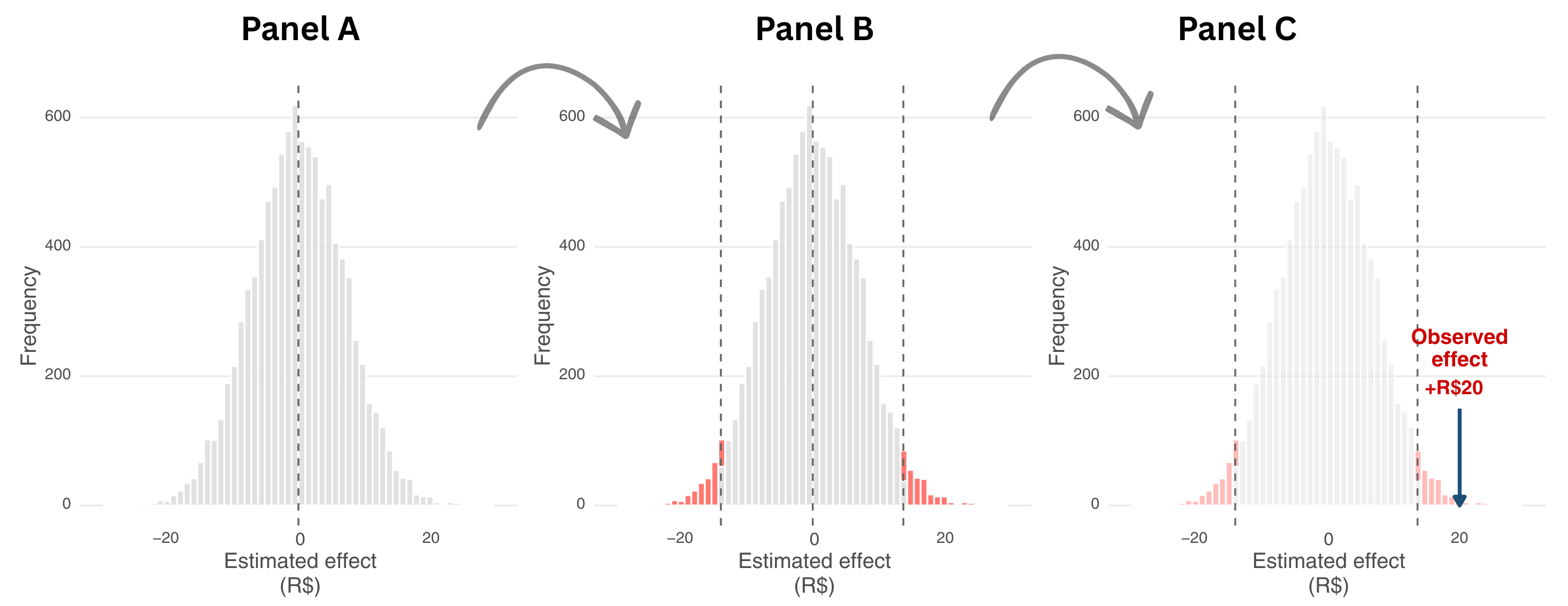
Figure 5.1 walks you through this decision process in three steps. Panel A shows the range of possible results we would see if the feature had no real effect. Imagine running the same experiment thousands of times in parallel universes where nothing actually changes.
Randomness alone would produce different estimates each time, and most would cluster near zero (the dashed vertical line). Statisticians call this spread of possible outcomes the sampling distribution — it shows what you might measure when the feature has no real effect. The gray histogram represents all those possible outcomes, the natural scatter we would see from random variation alone.
Panel B introduces the decision rule. Before running the experiment, we set a significance level \(\alpha\) = 0.05, which creates two rejection regions (the red tails). These regions contain only 5% of all possible outcomes under the null hypothesis — the most extreme 2.5% on each side. Any result landing in these red zones is so unlikely under the assumption of no effect that we would reject the null hypothesis.
Panel C shows our actual result for the feature example. The experiment produced an observed effect of +R$20 (marked by the blue arrow). Notice where it lands: well inside the right rejection region. A result this extreme would occur less than 5% of the time if the feature truly had no effect. This is what a low p-value means — our observation falls in the red zone, so we reject the null hypothesis and conclude the feature likely works.
That’s why the rule of thumb is to reject the null hypothesis if the p-value is very low (conventionally below 0.05), and conclude it would be quite unlikely to see such a large difference if the campaign had no effect. This gives us confidence to say that the feature likely works. If the p-value is high, we can’t rule out that the R$20 difference is just random noise, so we fail to reject the null hypothesis.3
Notice: the p-value isn’t about proving something. It’s about quantifying our uncertainty and deciding whether we have enough evidence to act. A p-value below 0.05 means “if the feature had no effect, we’d see a difference this large or larger only 5% of the time by chance alone”. That’s strong enough evidence for most business decisions.
But no matter how well we design an experiment, our conclusions are still probabilistic. That means we can be wrong. Understanding the types of errors we can make, and how to minimize them, is the next step.
5.1.2 Understanding test errors and statistical power
Because our conclusions are based on a sample of data and probabilities, we can never be 100% certain. In hypothesis testing, there are four possible outcomes, which arise from the intersection of our decision and the unknown reality that only God knows. I illustrate this in Figure 5.2; two outcomes are correct - marked with green checkmark, and two are errors - marked with a red X.
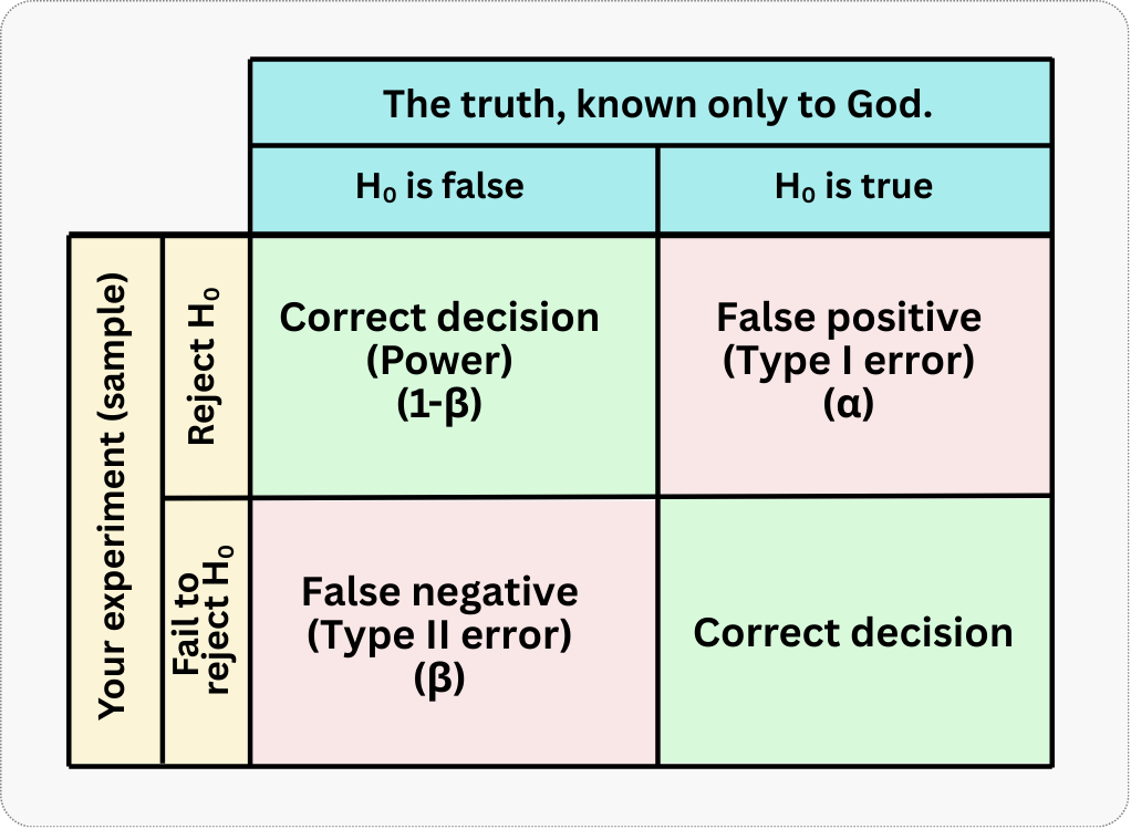
Let’s break down each quadrant:
Top-left: You reject \(H_0\) when it’s actually false. This is a correct decision — you’ve successfully detected a real effect. The probability of making this correct detection, given a true effect of a specific size, is called statistical power (represented by \(1-\beta\)). We would love to maximize this probability.
Top-right: You reject \(H_0\) when it’s actually true. This is a false positive (statisticians call it a “Type I error”). You conclude there’s an effect when there isn’t one. The probability of this happening is the significance level (represented by \(\alpha\)), typically set at 0.05. We would love to minimize this probability.
Bottom-left: You fail to reject \(H_0\) when it’s actually false. This is a false negative (statisticians call it a “Type II error”). You miss a real effect that exists. The probability of this happening is denoted \(\beta\).
Bottom-right: You fail to reject \(H_0\) when it’s actually true. This is another correct decision — you correctly conclude there’s no effect when there truly isn’t one.
The trade-off between the two types of error
A helpful way to remember is to think about pregnancy tests (see Figure 5.3). If a pregnant person consults a doctor and gets diagnosed as being pregnant, this is a desirable outcome. The probability of this happening is the power of the test (\(1-\beta\)). If a non-pregnant person goes through the same test and is diagnosed as non-pregnant, this is also a proper diagnosis! The problem happens when:
- The test says a person is pregnant but they are not; what we call a false positive (Type I error). This can cause unnecessary worry and wasted preparations.
- The test says a person is not pregnant but they actually are; that’s false negative (Type II error). This can delay important prenatal care.
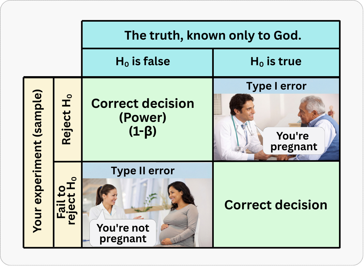
Neither error is desirable, but in different contexts, one might be more costly than the other. What you must understand is that there is an inherent trade-off between Type I and Type II errors. If you want to be extremely cautious about avoiding false positives (e.g., by setting \(\alpha\) to 0.01 instead of 0.05), you make it harder to reject the null hypothesis. This stringency, in turn, increases the risk of missing a real effect (a false negative, or Type II error). It’s a balancing act.
For most business applications, a significance level of 5% and a power of 80% are considered acceptable standards, but this can be adjusted based on the context:
If you have a high-risk or high-cost product, you might prefer to be more conservative. Use a lower \(\alpha\) (e.g., 1%) to minimize the chance of a false positive, and consider replicating the experiment to confirm any findings.
If you are doing exploratory research, you might be more willing to accept a higher \(\alpha\) (e.g., 10%) to increase your power to detect a potential signal, with the understanding that any promising findings will need to be validated in future, more rigorous tests.
If you want a rule of thumb based in my experience, it is that, in business contexts, false positives often cause more damage than false negatives. When you make a false positive error, you conclude that a useless feature or campaign works, so you roll it out. This leads to:
- Wasted engineering resources building and maintaining something that doesn’t work
- Opportunity cost — you could have tested something better instead
- Institutionalized “learnings” that are wrong, poisoning future decisions
- Potential harm to user experience if the feature is actually detrimental
When you make a false negative error, you conclude that something doesn’t work when it actually does. This is less immediately painful because truly great ideas tend to produce large effects that are harder to miss, you don’t invest resources in something that seemed unpromising and good ideas often come back in new iterations or from different team members (Kohavi, Tang, and Xu 2020).
This doesn’t mean false negatives are fine — missing real opportunities still hurts. But the asymmetry in business costs is why we’re typically more worried about keeping \(\alpha\) low (reducing false positives) than about maximizing power. That said, we still want reasonable power (typically 80%) to avoid missing too many real effects.
All the power formulas in this chapter assume that each observation is independent of every other. In practice, this means one user = one observation. Violations occur when:
- You measure multiple transactions per user and treat each transaction as independent
- Users share accounts or devices
- There’s social/network interference between users
When independence is violated, your standard errors are too small, and your calculated power is overly optimistic. Consider clustering standard errors or using user-level aggregates.
5.2 Elements of power analysis
Power analysis helps you figure out how much data you need to reliably detect an effect of a given size.
Think of power analysis as an equation with four connected variables: sample size, effect size, significance level, and power. Know any three, and you can solve for the fourth. Most often, you fix the significance level at 0.05 and target 80% power, then ask: “Given the effect I want to detect, how many users do I need?” But the math works in reverse too. Sometimes your stakeholder caps the sample at 10% of users — in that case, you calculate what power you can achieve with that constraint.4
Here are the main ingredients for power analysis. You might have seen some of these in the previous chapter, but let’s refresh our memory:
Minimum detectable effect (MDE): The smallest true effect you want to be able to detect. The MDE can be expressed in raw units (e.g., R$15 more spending), as a percentage lift (e.g., a 10% increase over baseline), or as a standardized effect size using Cohen’s d, which divides the raw difference by the standard deviation.
Sample size (\(N\)): The number of observations per group or the total across groups, as we’ll specify in the exercises below.
Significance level (\(\alpha\)): The probability of committing a Type I error (false positive). Lower \(\alpha\) (e.g. 1%) reduces false positives but requires larger \(N\).
Statistical power (\(1-\beta\)): The probability of correctly detecting a true effect. Higher power (e.g. 90 % instead of 80%) lowers Type II errors but requires larger \(N\).
Here are some additional factors that also affect power. I treat them separately because they are often overlooked:
Variance of the outcome variable: The amount of natural variability in your metric. Higher variance acts as “noise” that drowns out the treatment signal, requiring larger samples to detect the same effect.
Treatment allocation ratio: The proportion of the sample assigned to treatment vs control. Equal allocation (50/50) maximizes power for a given total sample, while unequal splits reduce precision and require larger total samples to achieve the same power.
Compliance rate: The proportion of assigned participants who actually receive or use the treatment. Lower compliance dilutes the observed effect, meaning you’ll need larger samples to achieve the same power.
5.2.1 Minimum Detectable Effect (MDE) and Cohen’s d
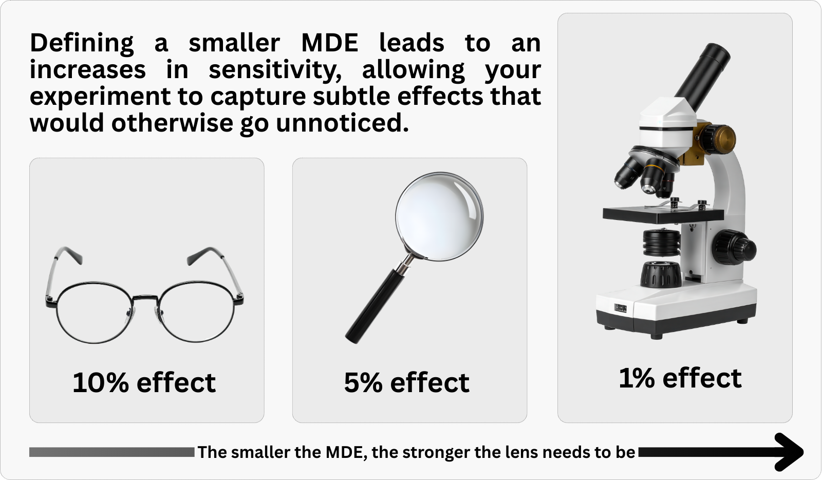
The Minimum Detectable Effect (MDE) is one of the most important but least understood concepts in experimental design. Here’s the key insight: your experiment is like a magnifying glass, and the MDE determines its resolution.
If your experiment is designed to detect a minimum effect of 5%, then a real effect of 3% might go completely unnoticed — not because it doesn’t exist, but because your experimental “magnifying glass” doesn’t have enough zoom to see something that small. You’ve tuned your instrument to see 5% effects, so anything smaller than that is invisible to you.
This has huge practical implications. Before running an experiment, you need to ask: “What’s the smallest effect that would be worth detecting?” This depends on your business context:
- If you’re testing a major product redesign that’s expensive to implement, you might only care about effects of 10% or larger
- If you’re testing a low-cost email variant, even a 1% improvement in click-through rate might be worth rolling out
- If you’re in a mature product with millions of users, even a 0.5% increase in retention could translate to millions in revenue
Setting your MDE too small requires a massive sample size — you might need hundreds of thousands of users to reliably detect a 0.5% effect. Setting it too large means you might miss meaningful but modest improvements.
Uncertainty in effect size estimates: Your power calculation is a function of your assumed effect size. If the true effect is smaller than expected, your experiment will be underpowered. Consider:
- Run a sensitivity analysis: Calculate required sample sizes for a range of plausible effect sizes (optimistic, realistic, pessimistic). This shows you how robust your design is if the true effect differs from your best guess.
- Plan for the pessimistic scenario: Design your experiment around the lower bound of your expected effect. If you can detect a small effect, you can certainly detect a large one — but not vice versa.
- Ground your assumptions in data: Use pilot studies or results from similar past experiments to calibrate your effect size estimate. Historical data beats gut feelings.
If you assume a 10% lift but the true effect is 3%, your experiment designed for 80% power may actually have less than 20% power. Base your effect size assumptions on historical experiments with similar interventions, not on what you hope to see. When in doubt, plan for the pessimistic scenario.
But different products, campaigns, and features may have different sizes of effect. How can we make MDE comparable across different experiments? That’s why we need an effect size measure such as Cohen’s d.
To make the MDE comparable across different contexts, we often standardize it. For comparing two means (like the average purchase amount between a treatment and control group), the most common standardized effect size is Cohen’s d. It is calculated as:
\[ d = \frac{|\text{mean treatment} - \text{mean control}|}{\text{pooled standard deviation}}\]
- \(\text{mean treatment}\) is the mean outcome in the treatment group
- \(\text{mean control}\) is the mean outcome in the control group
- \(\text{pooled standard deviation}\) combines the variability from both groups into a single number.
Think of the pooled standard deviation as an average of how “spread out” the data is in both groups. We combine them rather than use one group’s variability alone because we want a single, representative measure of noise in our experiment.
You might ask, “how am I supposed to know the standard deviation if the experiment hasn’t happened yet?” There’s a common-sense solution: we assume homogeneity of variance between the treatment and control groups. This assumption means that the treatment will shift the mean of the outcome, but not its spread. The discount coupon might increase average spending from R$150 to R$165, but customers in both groups will show similar variability around their respective means.
Under this assumption, you can use historical, pre-experiment data to estimate the standard deviation. Simply calculate the standard deviation of the outcome variable for the population from which you’ll draw your experimental sample. If you’re testing a new feature on all active users, compute the standard deviation of your metric (say, monthly spending) for that same user base over a recent, representative period. This historical estimate becomes your best guess for the pooled standard deviation.
You may also ask, “how am I supposed to know the means of treatment and control if the experiment is still to happen?” We’ll use a mix of domain expertise and historical data to estimate the expected means, but let’s leave it for the next section.
Cohen’s d tells you how many standard deviations separate your treatment and control groups. For instance, if treated customers spend R$165 and control customers spend R$150, with a standard deviation of R$75, then Cohen’s d = 0.2 — the groups differ by 0.2 standard deviations, a small but meaningful gap. This measure is useful because:
It’s scale-free: a Cohen’s d of 0.5 means the same thing whether you’re measuring BRL, USD, clicks, or days
It connects directly to power calculations: the formulas that determine required sample size use Cohen’s d
It provides intuitive benchmarks: Cohen suggested that \(d = 0.2\) is “small,” \(d = 0.5\) is “medium,” and \(d = 0.8\) is “large”. However, these benchmarks came from social science research. In mature digital products, typical effects are often smaller than \(d = 0.2\), so don’t assume your experiments will produce “medium” or “large” effects.
5.3 Hands-on example: Recommendation system A/B test
Let’s put these concepts into practice with a complete power analysis. We want to run an A/B test to measure the impact of a new product recommendation system on customer purchase amounts. We need to calculate the number of users required in each group. For simplicity, we’ll use a 50-50 allocation (equal number of users in treatment and control). Later in this chapter we’ll explore how different allocation ratios affect power.
Data: All data we’ll use are available in the repository. You can download it there or load it directly by passing the raw URL to read.csv() in R or pd.read_csv() in Python.5
Packages: To run the code yourself, you’ll need a few tools. The block below loads them for you. Quick tip: you only need to install these packages once, but you must load them every time you start a new session in R or Python.
# If you haven't already, run this once to install the package
# install.packages("tidyverse")
# install.packages("pwr")

# You must run the lines below at the start of every new R session.
library(tidyverse) # The "Swiss army knife": loads dplyr, ggplot2, readr, etc.
library(pwr) # Power analysis
# If you haven't already, run this in your terminal to install the packages:
# pip install pandas statsmodels matplotlib numpy (or use "pip3")
# You must run the lines below at the start of every new Python session.
import pandas as pd # Data manipulation
import numpy as np # Mathematical computing in Python
import matplotlib.pyplot as plt # Data visualization
from statsmodels.stats.power import TTestIndPower # Power analysisBased on historical data and our goals, we have the following information:
- Baseline: The type of customer who will participate in the experiment spend, on average, R$150.
- Expected Uplift: Based on the expertise of our PMs and previous research, we expect the new system will increase this average by 10%, bringing the treated group’s average to R$165.
- Variability: The pooled standard deviation of the purchase amount is R$75.
Our goal is to determine the sample size needed to detect this 10% increase with 80% power and a 5% significance level.
First, we calculate Cohen’s d to standardize our effect size:
\[ d = \frac{|165 - 150|}{75} = \frac{15}{75} = 0.2 \]
A Cohen’s d of 0.2 is what researchers call a small effect — subtle, but detectable with proper planning. With this standardized effect size in hand, we can now ask the real question: how many users do we need to reliably detect it? The code below plugs our effect size into a power calculation and returns the answer. Given the extensive examples in the next sections, I leave most of the code to the scripts for this chapter in the repository of the book here.
Running either script returns a required sample size of approximately 394 participants in each group, so 788 participants in total. Note that rounding up is important: if the power function suggests 393.4 participants, we round to 394 to ensure the desired power.
One-sided vs. two-sided tests: We used a two-sided test, which checks for effects in either direction. Some argue for one-sided tests when you only care about improvements, but this is risky: you’d miss evidence that your feature is harmful. Stick with two-sided tests unless you have a strong, pre-specified reason to only look in one direction — and even then, remember that a one-sided test at \(\alpha\) = 0.05 is equivalent to a two-sided test at \(\alpha\) = 0.10.
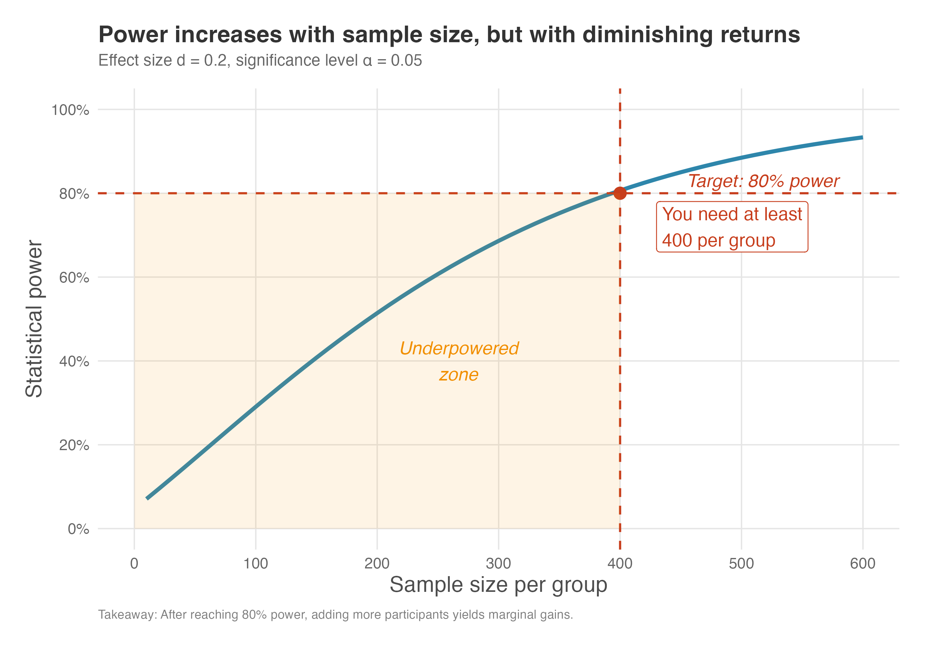
Power is not a linear function of \(N\); initially power grows quickly and then levels off. Figure 5.5 plots statistical power against sample size per group for an effect size of 0.2 at \(\alpha=0.05\). The dashed red lines indicate the conventional 80% power threshold and the minimum \(N\) that crosses it.
The graph shows that with \(d=0.2\) we need around 390–400 individuals per group to achieve 80% power (our worked example required 394 per group). The orange-shaded region in the figure marks the “underpowered zone” — any sample size in this area gives you less than 80% power, meaning you’d likely miss a real effect more than 20% of the time. With smaller sample sizes the test is under-powered, while increasing beyond 500 yields only marginal improvements in power.
This is an example of diminishing returns: at first, each additional participant buys you a lot of extra power, but eventually the gains shrink. This pattern has practical implications. Notice how the curve flattens as sample size grows: going from 100 to 200 participants per group boosts power substantially (from roughly 30% to 50%), but going from 400 to 500 adds only a few percentage points (from 80% to about 87%).
If each additional participant costs money, time, or opportunity, you hit a point where the incremental gain in power no longer justifies the incremental cost. For most business experiments, reaching 80% power is a sensible stopping point. Pushing to 90% or 95% power requires substantially more participants and rarely changes the decision you would make.
Practical minimum: Even when power calculations suggest a small sample is sufficient, beware of experiments with fewer than ~100 participants per group. Small experiments are fragile: a handful of outliers or dropouts can swing your results, and randomization may not fully balance confounders. Treat power calculations as a lower bound, not a target.
How to read Figure 5.5: Find your target power on the y-axis (typically 80%), draw a horizontal line until it intersects the curve, then drop down to the x-axis to find your minimum sample size. Any point to the left of the intersection puts you in the underpowered zone.
5.3.1 Don’t calculate power after the experiment
Here’s a trap that catches even smart data scientists: calculating power after the experiment is over. This usually happens when a result is disappointing, and we want to explain it away.
Picture this: you run an A/B test and find no statistically significant difference (\(p > 0.05\)). You look at the flat line on your dashboard and wonder, “Is the feature actually a dud, or did I just miss a real effect because I didn’t have enough data?” In a moment of desperation, you plug your observed effect size back into a power calculator. The calculator spits out a low number — say, 20% power — and you feel a wave of relief. “Aha!” you think. “The experiment was underpowered! The effect is probably real, I just missed it”.
This logic is comforting, but it is circular — the statistical equivalent of predicting yesterday’s weather by looking at puddles. Power is the probability of a future event given a specific assumption; once the experiment is done, the event has happened or it hasn’t. Worse, if your result was not significant, your observed effect was by definition small. Plug that small effect into the power formula and it guarantees a low result. You haven’t learned anything new; you’ve just restated your non-significant p-value in a confusing, optimistic disguise.
So, what should you do instead? Ignore post hoc power and look at your confidence interval. It tells you the full story of what your data actually knows.
- Evidence of absence: If the interval is narrow and centered near zero (e.g., [-0.1%, +0.1%]), stop hoping. You have strong evidence that there is no meaningful effect. You didn’t “miss” it; it’s just not there.
- Absence of evidence: If the interval is wide and includes meaningful positive values (e.g., [-1%, +5%]), admit ignorance. Your experiment was too imprecise to conclude anything. You can’t rule out a zero effect, but you also can’t rule out a huge win. The verdict isn’t “no effect” — it’s “we need more data”.
With power fundamentals in place, let’s turn to the levers you can pull during the design phase.
5.4 How different factors affect experimental power
Understanding how different design choices and experimental conditions influence your ability to detect effects will help you make informed tradeoffs when designing experiments.
5.4.1 Effect size
The size of the effect you are trying to measure has a direct impact on statistical power. Larger effects are easier to detect than smaller ones. Think of it like trying to spot a whale versus a dolphin in the ocean — the whale is much harder to miss. In statistical terms, for a given sample size, an experiment will have more power to detect a large effect than a small one.
A larger effect requires less “zoom” to spot, as we discussed in Figure 5.4. If the signal is already strong, you don’t need as massive a sample to detect it.
Conversely, if you want to detect a very small effect, you will need a much larger sample size to do so with adequate power. Figure 5.6 illustrates this relationship: as the effect size (Cohen’s d) increases, the sample size required to achieve 80% power decreases dramatically.
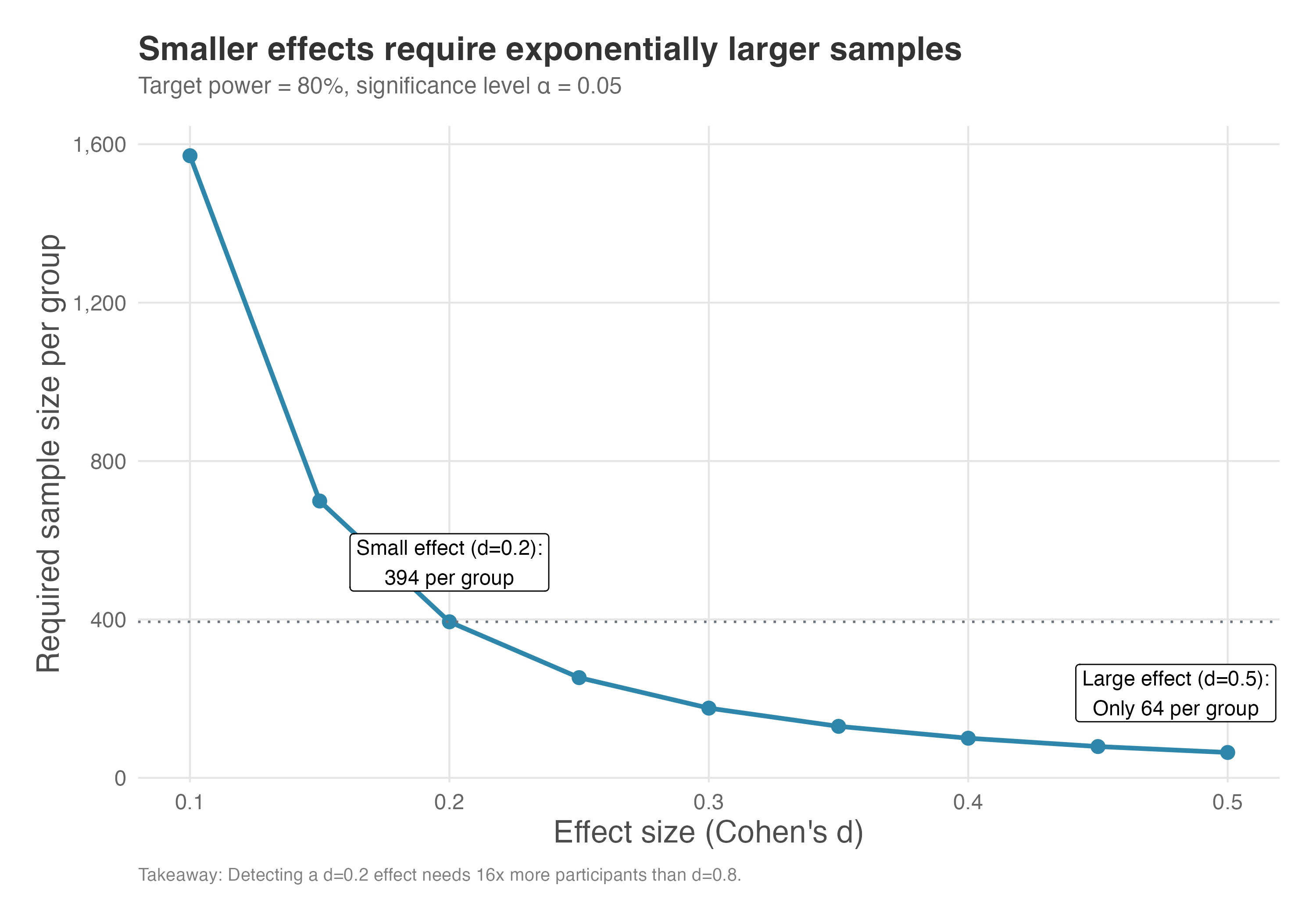
How to read Figure 5.6: Start with your expected effect size on the x-axis. Move up to the curve to find how many participants per group you’ll need. Notice the steep drop-off: the curve is nearly vertical at small effect sizes, meaning tiny changes in your effect size assumption can dramatically change required sample size.
The key insight from Figure 5.6: detecting a small effect (say, \(d = 0.2\)) requires about 400 participants per group, while detecting a large effect (\(d = 0.8\)) requires only about 25 per group. That’s a 16-fold difference! This has dramatic cost implications: if you decide you need to detect a 5% lift instead of a 10% lift, you’re not doubling your experiment cost — you’re roughly quadrupling it.
This has major practical implications:
- Be realistic about effect sizes: If you’re testing a minor UI tweak, don’t expect huge effects. You’ll need a large sample.
- Prioritize high-impact tests: Tests of major features or fundamental changes are more likely to produce detectable effects.
- Consider iteration: Sometimes it’s better to test a bolder version first (more likely to produce a detectable effect) and then optimize it in follow-up experiments.
5.4.2 Significance level (\(\alpha\))
The significance level, \(\alpha\), represents our tolerance for Type I errors (false positives). A stricter (lower) \(\alpha\) makes it harder to reject the null hypothesis. While this reduces the risk of declaring an effect when none exists, it also reduces the power of the test, making it harder to detect a real effect. This means that if you want to be more certain that any effect you find is not a fluke (e.g., by setting \(\alpha\) = 0.01), you will need a larger sample size to maintain the same level of power.
The plot below shows power curves for a fixed effect size (d = 0.3) at different significance levels. As you can see, for any given sample size, the test has more power when \(\alpha\) is higher (e.g., 0.10) and less power when it is lower (e.g., 0.01).
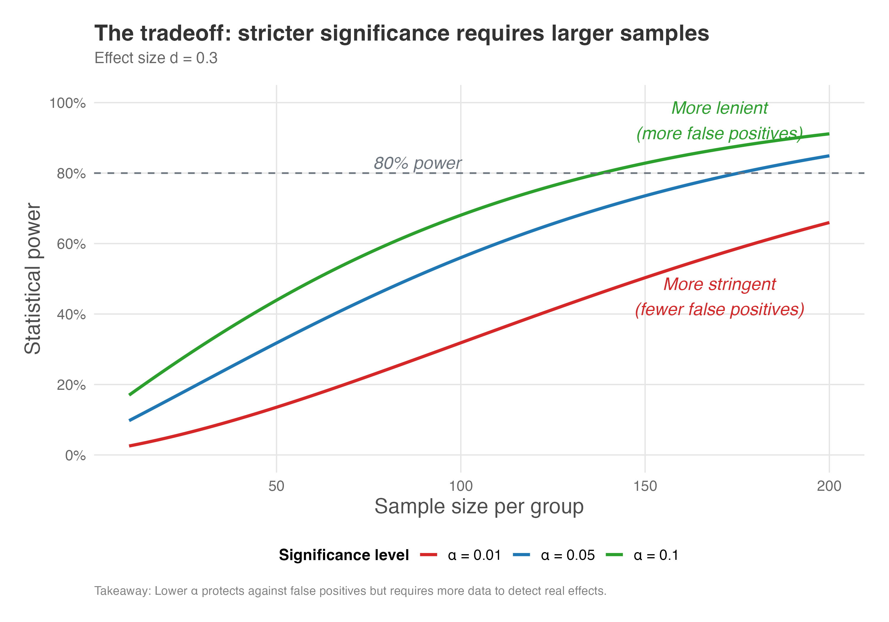
How to read Figure 5.7: Each curve represents a different significance level. Pick a sample size on the x-axis and trace upward to see how power differs across the three \(\alpha\) choices. The vertical gap between curves shows the “cost” of being more stringent — at 100 participants per group, for example, \(\alpha = 0.01\) gives you about 40% power while \(\alpha = 0.10\) gives you about 75%.
Notice how the curves in Figure 5.7 separate: for a given sample size, experiments with \(\alpha = 0.10\) have higher power than those with \(\alpha = 0.05\), which in turn have higher power than \(\alpha = 0.01\). This illustrates the tradeoff: being more conservative about false positives means you’re more likely to miss true effects unless you increase your sample size.
(As before, more data is the only way out of this tradeoff.)
Practical guidance:
- Standard practice: Most industry experiments use \(\alpha = 0.05\) as a reasonable balance
- High-stakes decisions: If a false positive would be very costly (e.g., a major product redesign), consider \(\alpha = 0.01\)
- Exploratory research: If you’re doing early-stage exploration and false positives are less costly, \(\alpha = 0.10\) might be acceptable
- Always pre-specify: Whatever you choose, decide before running the experiment and stick to it
5.4.3 Treatment allocation ratio
For interventions that are expensive or risky, stakeholders often suggest running experiments with a 10/90 split — 10% in treatment, 90% in control — to save budget and limit exposure to an unproven change. This intuition is understandable, but the math pushes back hard: allocation ratio directly affects power, and unequal splits come with a steep statistical cost.
The experiment’s power is maximized when the treatment and control groups are of equal size (a 50/50 split). Any deviation from an equal split will reduce the statistical power of the test, assuming the total sample size remains constant. This means you will need more participants overall to achieve the same level of power if the groups are imbalanced.
Why might you use an unequal split? Sometimes the treatment is expensive or risky, so you expose fewer people to it. Other times you want more users to access a potentially beneficial feature. Either way, know the cost: as allocation becomes more skewed, power drops sharply because the smaller group provides less information, making the comparison less reliable.
Figure 5.8 shows how power changes as we vary the allocation ratio, keeping total sample size fixed at N=1,000.
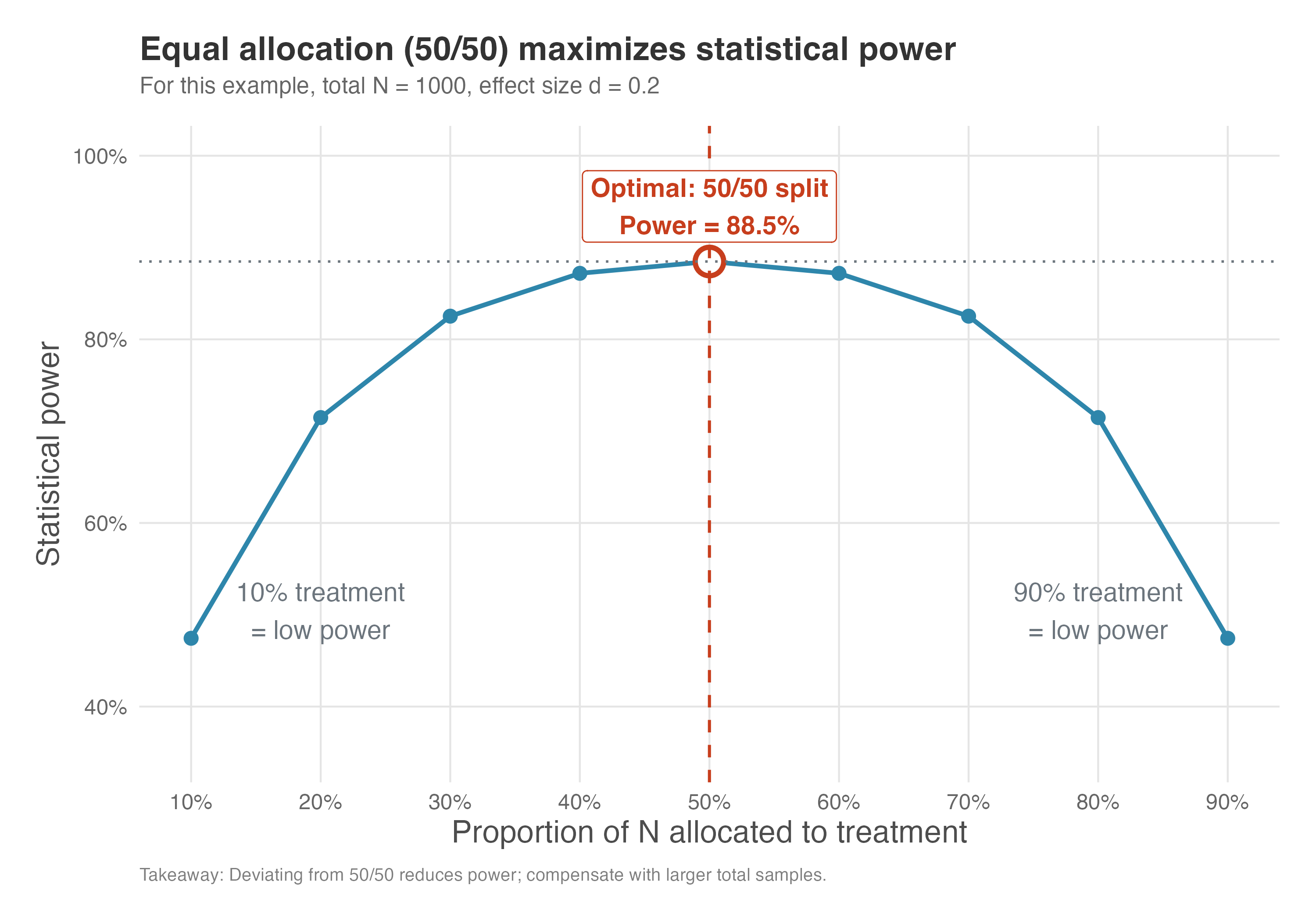
How to read Figure 5.8: The x-axis shows what fraction of your total sample goes to the treatment group. At 0.5 (50/50 split), power peaks. As you move toward either extreme (10/90 or 90/10), power drops sharply. The circled point marks optimal power; anything away from it costs you detection ability.
The curve in Figure 5.8 peaks at 0.5, where power reaches approximately 88.5%. As you move toward extreme allocations (10/90 or 90/10), power drops dramatically to about 47.4%, nearly half the optimal value. This symmetry reflects the underlying mathematics. Power depends on the standard error of the difference between groups, which is minimized when the sample is equally split.
With unequal allocation, the smaller group becomes the bottleneck: its limited observations increase the standard error of the estimate, making it harder to detect the same effect. In our example, moving from 50/50 to 70/30 allocation reduces power from 88.5% to 82.5% — a noticeable penalty, but perhaps acceptable. Moving to 90/10, however, cuts power nearly in half.
When might you deviate from 50/50? While 50/50 maximizes power, there are situations where you might choose unequal allocation:
- Risk aversion: If the treatment could have negative side effects, you might allocate fewer users to it initially (e.g., 20/80)
- Holdout groups: You might want a small control group (5%) and large treatment group (95%) when rolling out a feature gradually
- Cost differences: If the treatment is expensive to deliver (e.g., sending physical samples), you might want fewer users receiving it
The bottom line: any deviation from 50/50 costs you power, so budget for a larger total sample to compensate.
5.4.4 Outcome variance
The variance of the outcome variable you are measuring is a critical component of power. High variance in your metric acts as “noise,” making it harder to detect the “signal” of the treatment effect. Imagine trying to hear a whisper in a quiet library versus at a loud rock concert. The whisper (the effect) is the same, but the background noise (the variance) determines whether you can detect it.
If the outcome you are measuring has high natural variability (e.g., customer spending, which can range from a few dollars to thousands), you will need a larger sample size to distinguish the treatment effect from this random noise. Conversely, a lower-variance metric (e.g., a binary outcome like “made a purchase” vs. “did not make a purchase”) will generally require a smaller sample size.
The density plots in Figure 5.9 illustrate this trade-off. In both scenarios, the control group has a mean outcome of R$100, while the treatment group has a mean of R$120 — a difference of R$20. The vertical dashed lines mark the mean of each group. In the high-variance case (SD = 20), the two distributions overlap substantially, making it difficult to tell the groups apart just by looking at individual observations. In the low-variance case (SD = 5), the groups are clearly separated, and the R$20 effect is immediately obvious.
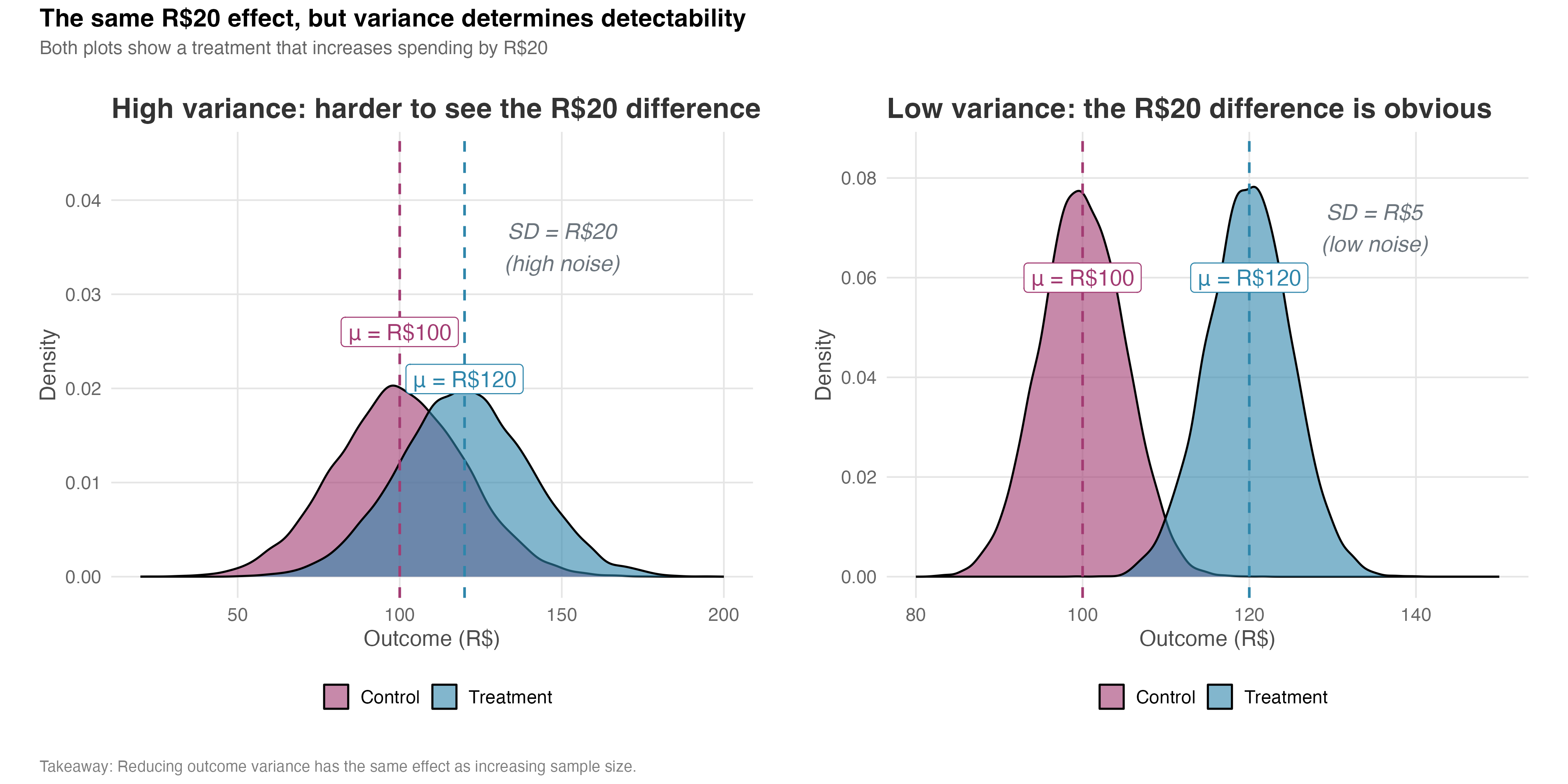
How to read Figure 5.9: Focus on the overlap between the two distributions. When overlap is high (left panel), you can’t tell if a given observation came from treatment or control — the effect is hidden in noise. When overlap is low (right panel), group membership is obvious. The size of the overlap tells you how hard it will be to detect your effect.
We can demonstrate this relationship empirically through simulation. The code for this chapter – see the repository – runs 1,000 simulated experiments for each standard deviation level (ranging from 15 to 50), keeping total sample size fixed at N = 800 (400 per group with 50/50 allocation), effect size at 5%, and allocation at 50/50. For each simulation, we generate treatment and control groups, run a t-test, and count how often we correctly reject the null hypothesis. The proportion of significant results is our estimate of statistical power.
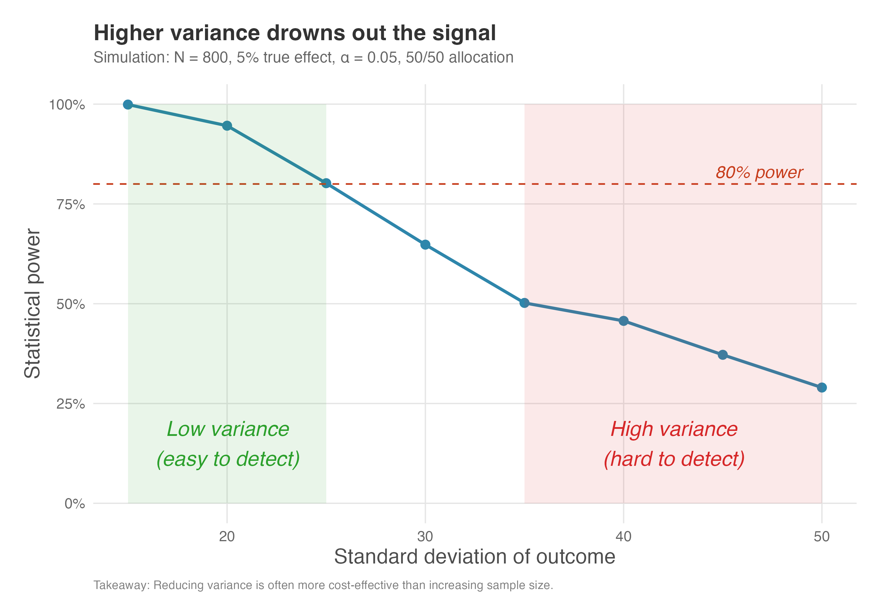
Figure 5.10 reveals a steep inverse relationship between outcome variance and statistical power. With a standard deviation of 15, our 800-person experiment (400 per group) achieves nearly perfect power (close to 100%). But as variance increases, power degrades rapidly — at SD = 30, power has dropped to around 60%, and by SD = 50, it falls below 20%. The experiment designed to detect a 5% effect becomes essentially useless when noise overwhelms the signal.
How to read Figure 5.10: The green-shaded zone marks “low variance” territory where power is high and detection is easy. The red-shaded zone marks “high variance” territory where you’re fighting an uphill battle — even a well-designed experiment may fail. The dashed line at 80% power is your target; notice that you can only hit it when variance stays below about SD = 25 in this example.
The practical implication is clear: variance reduction is a force multiplier. Reducing your outcome’s standard deviation by half has the same effect on power as quadrupling your sample size. This is why techniques like stratified sampling, covariate adjustment (CUPED), and choosing lower-variance metrics are so valuable — they effectively give you more statistical power without requiring more participants.
Where does your variance estimate come from? Power calculations require you to estimate the outcome’s standard deviation before running the experiment. Use historical data from a similar time period and population. Be cautious of:
- Seasonality: Variance may differ during holidays, fiscal quarter-ends, or other special periods
- Population drift: If your user base has changed since the historical data was collected, variance may differ
- Metric changes: If the metric definition has been modified, historical variance may not apply
When uncertain, inflate your variance estimate by 20-30% as a safety margin.
In practice, you can reduce variance through several techniques:
- Winsorization or Outlier Exclusion: Capping extreme values or removing outliers can reduce noise, but this should be done cautiously and declared in advance to avoid cherry-picking.
- Choosing Lower-Variance Metrics: Sometimes, a binary indicator (e.g., converted vs. not converted, making the difference in means a difference in conversion rates, a proportion) is less noisy than a continuous one (e.g., revenue per user).
- Covariate Adjustment: Techniques like CUPED (Controlled-experiment Using Pre-Experiment Data) or OLS Regression using pre-experiment covariates to reduce variance and increase power.
- Triggering: Only include users who could have been affected by the treatment in your analysis — for example, if you’re testing an intervention that appears only in the checkout flow of an e-commerce platform, analyze only users who started checkout. Users who never encountered the intervention have a treatment effect of zero by definition, so including them adds noise. This can dramatically improve power (see Appendix 5.B for details and pitfalls).
Highly skewed distributions: If your outcome is extremely right-skewed (a few users account for most revenue), the t-test may perform poorly in small samples. Consider log-transforming the outcome or using non-parametric tests. With large samples (N > 100 per group), the Central Limit Theorem makes normality less critical.
5.4.5 Compliance rate
Power is also significantly affected by compliance (also called treatment adherence). In the real world, not everyone assigned to the treatment group will actually use the treatment. Some users might not open the email with the discount coupon; others might not adopt the new feature they are given access to. This is known as non-compliance.
Non-compliance dilutes the observed treatment effect. The average outcome of the entire treatment group (which includes both compliers and non-compliers) will be dragged towards the control group’s average. This makes the true effect, which only occurs for the compliers, much harder to detect.
To see this concretely, consider an experiment with 1,000 users in each group. In this simulation, only 10% of the treatment group actually uses the coupon (we will call them “the compliers”). The control group has a mean spending of R$50.16, while the compliers — those who actually used the coupon — have a mean of R$75.73, yielding a true treatment effect of about R$25.57. That’s a substantial lift.
But here’s the problem: what a standard A/B test measures is the difference between the entire treatment group (compliers and non-compliers combined) and the control group – remember what we discussed about ITT? The non-compliers, who didn’t use the coupon, have a mean spending of R$52.39 — similar to the control group. When you mix the 10% of compliers with the 90% of non-compliers, the combined treatment group mean drops to R$54.72. The observed difference is now just R$4.56, roughly 18% of the true effect. The other 82% of the signal got drowned out by dilution.
Figure 5.11 shows the distribution of outcomes for the three distinct populations: the Control group (red), the Non-compliers (gray), and the Compliers (blue). The vertical dashed lines mark the group means. You can see that the compliers are clearly separated from the other groups — they benefited substantially from the treatment. The difference between the Compliers and the Control group is the effect on people who actually use the treatment. Researchers call this the Local Average Treatment Effect (LATE). The word “local” here doesn’t mean geographic — it means the effect applies only to people who actually used the treatment (the compliers). If you offer a coupon but only 10% redeem it, the LATE tells you how much those 10% benefited, not the average across everyone who received the offer.
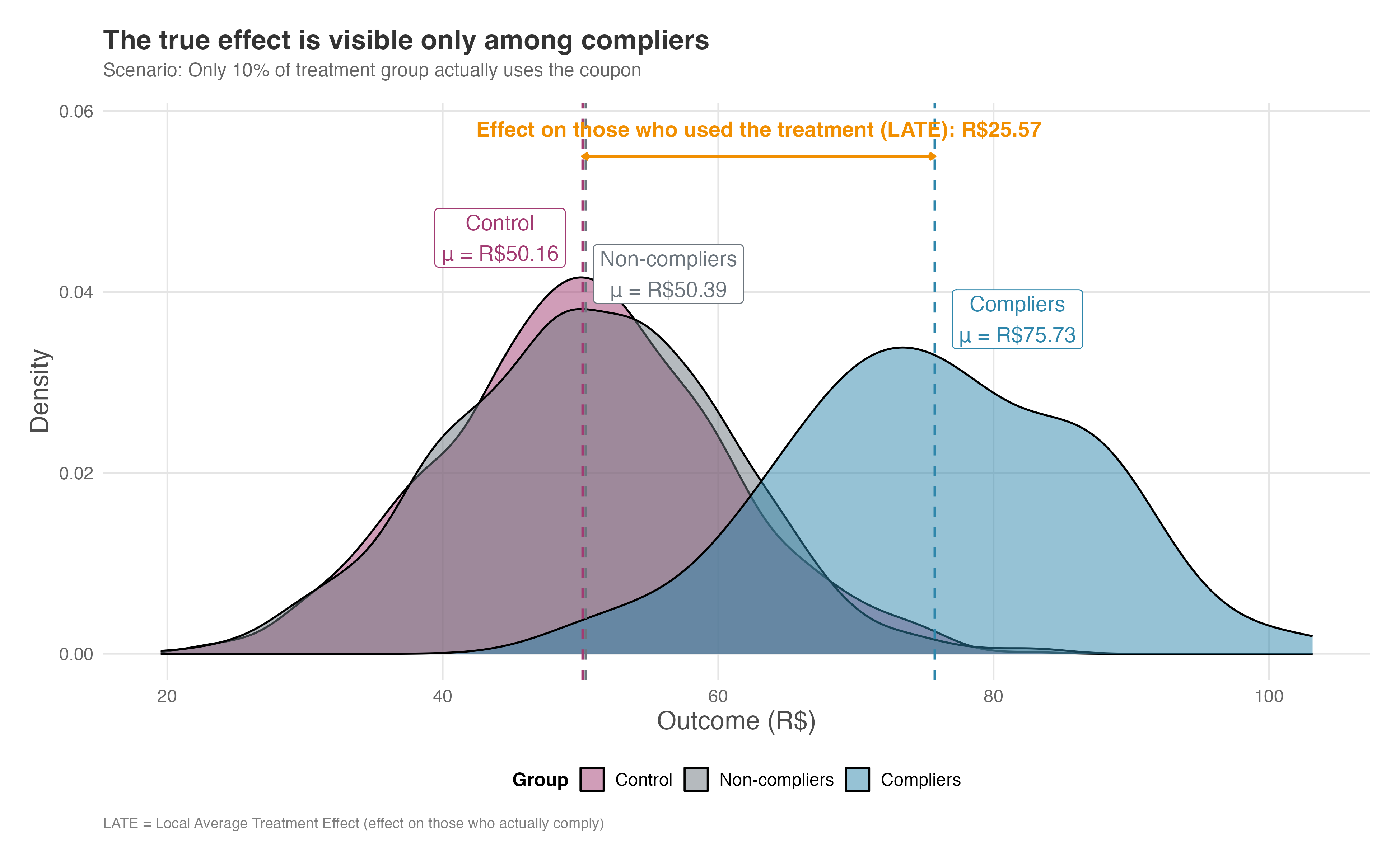
How to read Figure 5.11: Focus on the horizontal arrow labeled “LATE” at the top — that’s the true effect you’re after, measuring R$25.57. The compliers (blue) are clearly shifted right compared to control (red), showing a real benefit. But notice how the non-compliers (gray) overlap almost perfectly with control. When we combine compliers and non-compliers into one “treatment” group, we get Figure 5.12.
However, a standard A/B test doesn’t compare compliers to controls; it compares the entire treatment group to the control group. Figure 5.12 shows what happens when we combine compliers and non-compliers into a single “treated” distribution. The vertical dashed lines show the mean of each group — and the difference between them is now much smaller. Instead of the R$25.57 true effect, we observe only R$4.56. This diluted effect is the Intent-to-Treat (ITT) effect — so named because it measures the impact of offering the treatment, not receiving it. Your standard t-test compares everyone assigned to treatment against everyone in control, regardless of compliance.
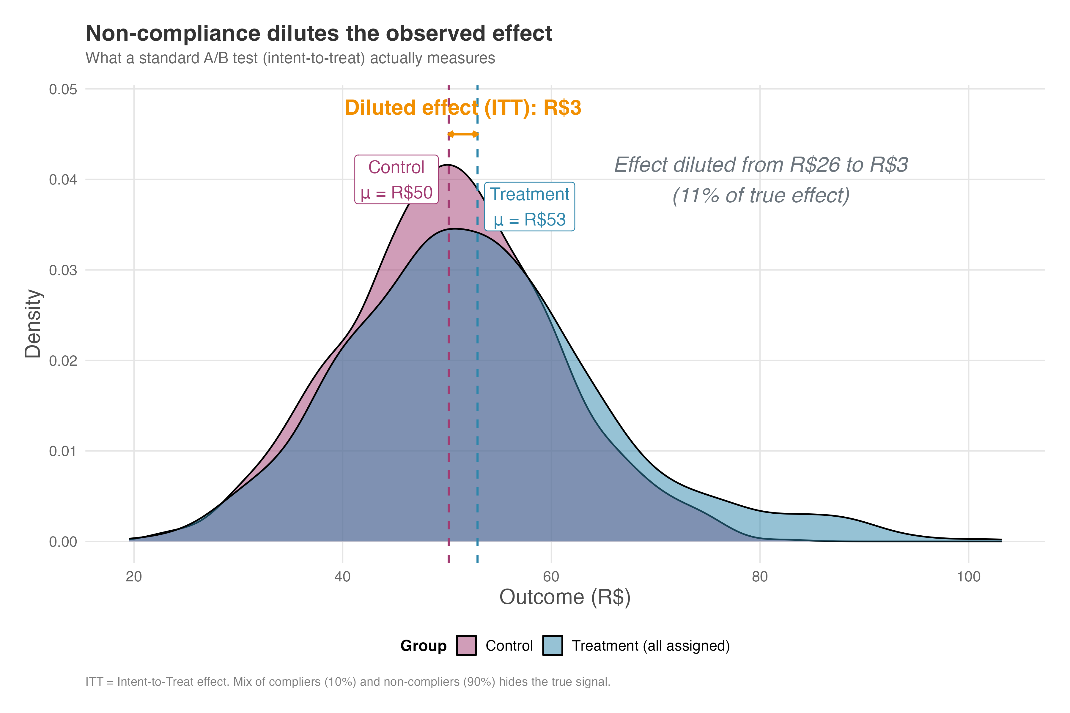
How to read Figure 5.12: Compare this to the previous figure. The compliers’ advantage has been “averaged away” by the non-compliers. The arrow now shows only a minor difference (the ITT), even though the true effect on people who actually used the treatment was R$25. The annotation in the figure calculates that we’re only observing 18% of the true signal — the rest is buried under noise from non-compliers.
(How do we recover the true effect on compliers from the diluted ITT estimate? Instrumental variable methods can help, but that’s a topic for a future chapter on handling non-compliance — for now, just know that it’s possible and that the random assignment itself serves as the instrument.)
When you anticipate low compliance, you must account for it in your power analysis. A lower compliance rate requires a significantly larger sample size to detect the diluted effect. The mathematical details are in Appendix 5.A, but the practical implication is straightforward: if only 50% of your treatment group complies, you’ll need roughly four times as many participants per group to maintain the same power.
Key takeaways for dealing with non-compliance:
Compliance matters quadratically: If only a fraction \(p\) of treated units actually comply, the ITT effect shrinks to roughly \(p\) times the true treatment effect. Since required sample size scales with \(1/d^2\) (where \(d\) is the effect size), a \(p\)-fold reduction in effect size requires a \(1/p^2\)-fold increase in sample size to maintain the same power.
Instrumental variable methods recover complier effects: When compliance is imperfect, you can use the random assignment as an “instrument” to estimate the LATE (Local Average Treatment Effect) — the effect specifically among those who would comply when offered treatment.
- This approach leverages the fact that random assignment affects outcomes only through its effect on compliance, allowing us to isolate the causal effect for compliers. However, this comes at the cost of higher variance and therefore requires larger samples. We’ll cover IV methods in detail in Chapter 7.
Design for adherence: Whenever possible, simplify treatment adoption and monitor fidelity (as discussed in Section 4.2) to reduce non-compliance and the resulting loss of power. Making the treatment easy to adopt is often more cost-effective than increasing sample size.
5.4.6 Spillover and interference
Power calculations assume that treating user A doesn’t affect user B’s outcomes. (Statisticians call this the Stable Unit Treatment Value Assumption, or SUTVA.) When this assumption fails — like in marketplaces where buyer and seller behavior is linked — your power calculations can become unreliable. In practice, this fails when:
- Marketplace effects: Giving buyers a discount changes seller pricing, affecting control buyers
- Network effects: Treated users share information with control users
- Competition effects: Limited inventory means one user’s purchase prevents another’s
To make this concrete, suppose you’re testing a seller discount on a marketplace. Treated sellers lower prices, which drives buyers to them and away from control sellers. The control group’s sales decline, not because of some external factor, but because your treatment affected them indirectly. Your experiment now measures the difference between “sellers with discount” and “sellers harmed by discount” — a much larger effect than the true causal impact. Your power calculation, built on the smaller true effect, is meaningless.
When SUTVA is violated, not only is your effect estimate biased, but your power calculation is built on the wrong effect size. Consider cluster randomization or market-level experiments for these cases.
5.5 Common experimental pitfalls and how to avoid them
Armed with this knowledge, let’s discuss pitfalls that may seem minor but can invalidate your results entirely.
The most obvious pitfall is underpowered experiments, which we’ve already discussed — meaning you may miss real effects (Type II errors, false negatives) and produce inconclusive or misleading results. But there is much more to consider.
5.5.1 Peeking at results early
If you were ever involved in A/B testing, either you were this person or you met someone who kept asking the data-team to peek at the results as early as 1 day after the experiment started. Unplanned, this is called peeking. Planned and properly controlled, it becomes sequential testing or anytime valid inference.
Peeking — looking at interim results and stopping a test early based on them — might feel tempting but it destroys your statistical validity. P-values are only valid for a single planned comparison after data collection is complete. If you check repeatedly, you fall into the “sequential testing” trap (Georgiev 2019).
Each time you peek and have the option to stop, you roll the dice on a false positive. Doing this repeatedly inflates your error rate well beyond the nominal 5%. Statsig’s guide notes that checking results daily can increase your false positive rate to over 20% or even 30%. You are essentially fishing for a “significant” result that is merely random noise.
Here’s the key insight: the danger of peeking comes from the cumulative probability across multiple looks, not from any single look being more dangerous at a particular sample size. At any fixed sample size, if the null hypothesis is true, the probability of seeing p < 0.05 is exactly 5%. But when you peek repeatedly, the probability of ever seeing a spurious significant result grows with each additional look.
To see why, I ran a simulation of 1,000 A/A tests — experiments where both groups receive the exact same treatment, meaning any “significant” result is a false positive by definition. In each simulated experiment, I checked the p-value at regular intervals as the sample grew, mimicking what happens when you peek at results before your planned sample size.
The results are striking. Figure 5.13 shows how p-values bounce around as the sample accumulates. Even with no true effect, p-values regularly dip below the 0.05 threshold. Notice that two of the three trajectories cross early (at small sample sizes), where the test statistic is more volatile — this makes borderline results feel more common when sample sizes are small. The third trajectory crosses much later, illustrating that peeking can fool you at any stage of your experiment. If you stop the moment you see “significance,” you lock in a false positive.
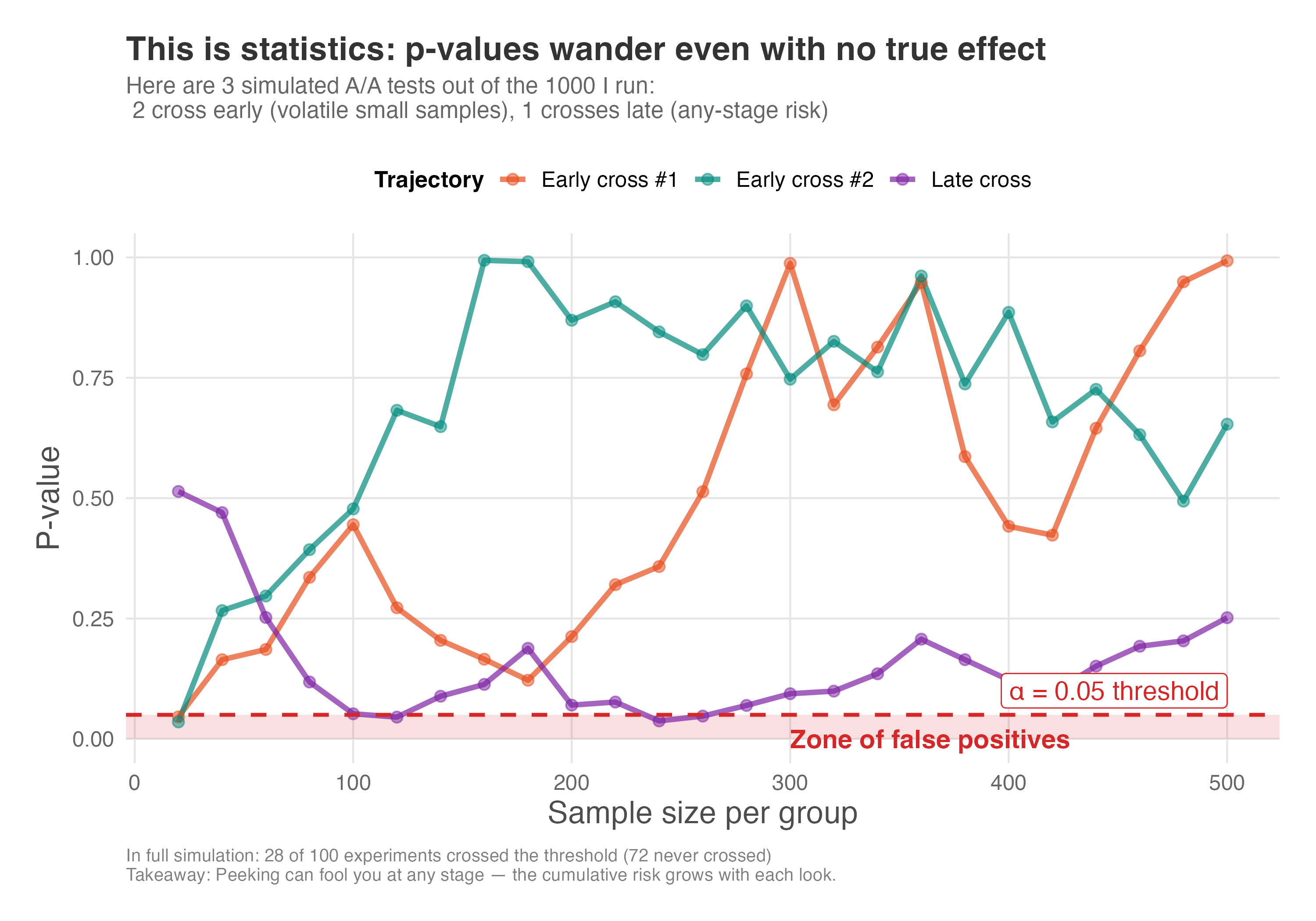
How to read Figure 5.13: The red shaded zone at the bottom marks p-values below 0.05 — the “false positive zone”. Every time a trajectory dips into this zone, that’s a moment when you might stop and declare “significance,” even though there’s no real effect. The trajectories bounce randomly because, under the null hypothesis, p-values have no tendency to settle anywhere. The lesson: p-values are random variables, and given enough peeks, one will eventually fall below 0.05 by chance.
Figure 5.14 shows the cumulative false positive rate — the probability that at any point during the experiment you would have seen a significant result and might have stopped. With a properly planned experiment (no peeking), the false positive rate stays at the nominal 5% — “nominal” means “in name only” or “as promised,” the rate you set when you chose \(\alpha = 0.05\). But with repeated peeks, the actual rate climbs to around 20%, four times higher than you intended.
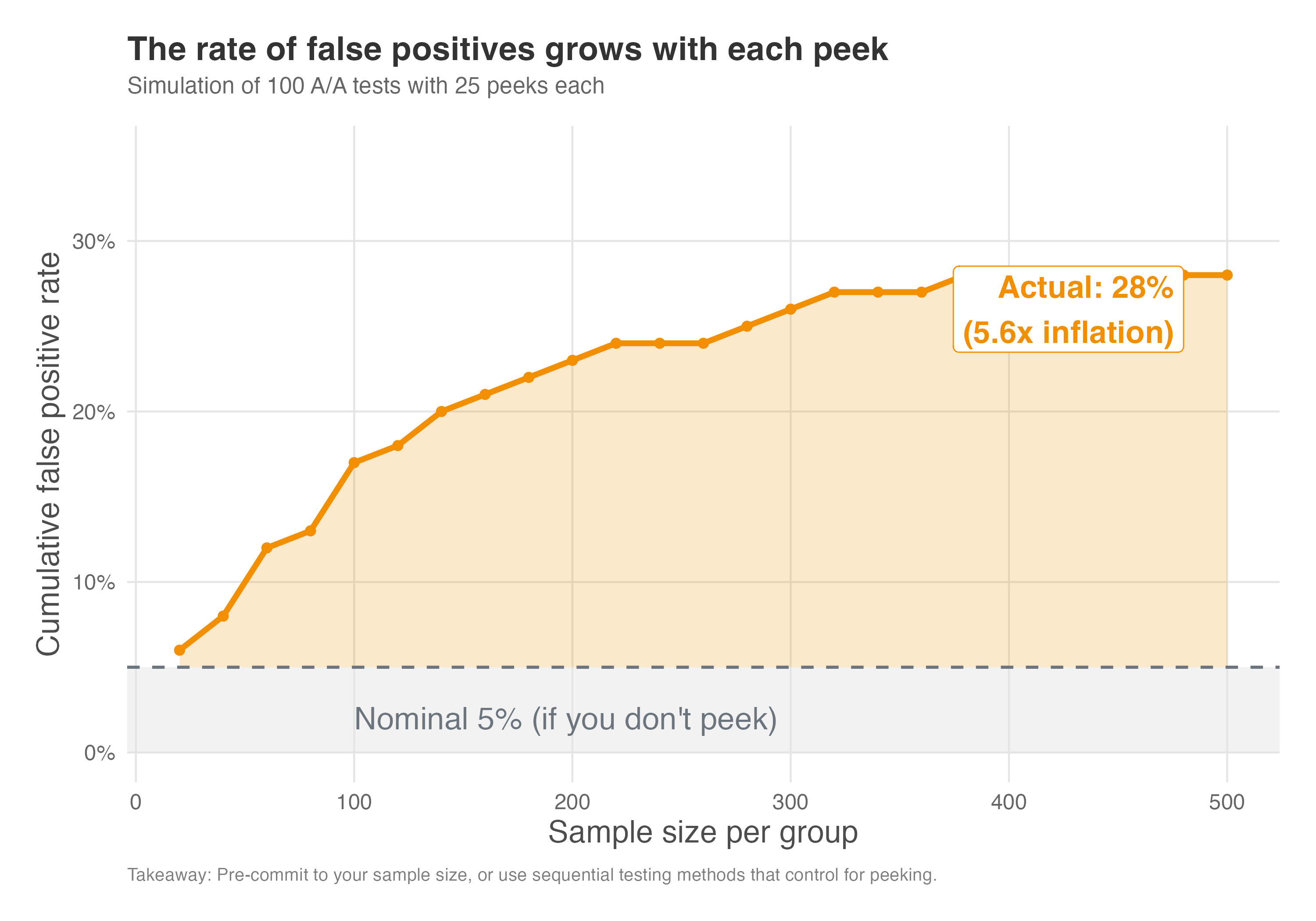
How to read Figure 5.14: The gray band at the bottom represents the “nominal 5%” — the false positive rate you’d have if you ran your experiment once, at the planned sample size, without any peeking. The orange curve shows what actually happens when you peek repeatedly: the cumulative probability of ever having crossed into significance territory keeps rising. The orange shaded area between the curve and the 5% line represents the “inflation zone” — the extra false positives you’re accumulating beyond what you signed up for. When the curve reaches ~20%, you’re getting four false positives for every one you expected.
The lesson is clear: predefine your sample size or test duration and resist the urge to peek. If you need the flexibility to check results before the experiment ends, use sequential analysis methods — statistical techniques designed to control error rates even when you peek at interim data. Alternatively, Bayesian methods offer another framework for drawing conclusions as data accumulates without inflating false positives. If your goal is to optimize traffic dynamically rather than just testing a hypothesis, consider Multi-Armed Bandits (discussed in Appendix 4.A).
5.5.2 Ignoring multiple testing
Recall the discussion we had in Section 4.2.2 about picking metrics that are relevant, because they can explain strategic success to the business, sensitive, timely and so on? It was a commitment device so we don’t start looking at a long list of metrics and end up fooling ourselves into thinking we found something significant when it was just random noise.
Testing many metrics or subgroups increases the chance of false positives. GrowthBook’s documentation notes that at a 5% significance level, testing 20 metrics yields about a 64% chance of at least one statistically significant result by chance alone. To mitigate this, limit the number of metrics you declare up front and adjust for multiple comparisons using multiple testing corrections methods (List, Shaikh, and Xu 2019). If you explore many segments, clearly label those analyses as exploratory and follow up with confirmatory tests.
The math behind this is straightforward but often overlooked. If you set your significance level at 5% (\(\alpha = 0.05\)), you accept a 5% chance of a false positive for any single test. But when you run \(n\) independent tests, the probability of finding at least one false positive grows according to the formula \(P(\text{FP} \ge 1) = 1 - (1 - \alpha)^n\).
As shown in Figure 5.15, testing just 20 metrics gives you a 64% chance of finding a “significant” result purely by accident. This is the multiple comparisons trap: the more you look, the more likely you are to find something that isn’t there.
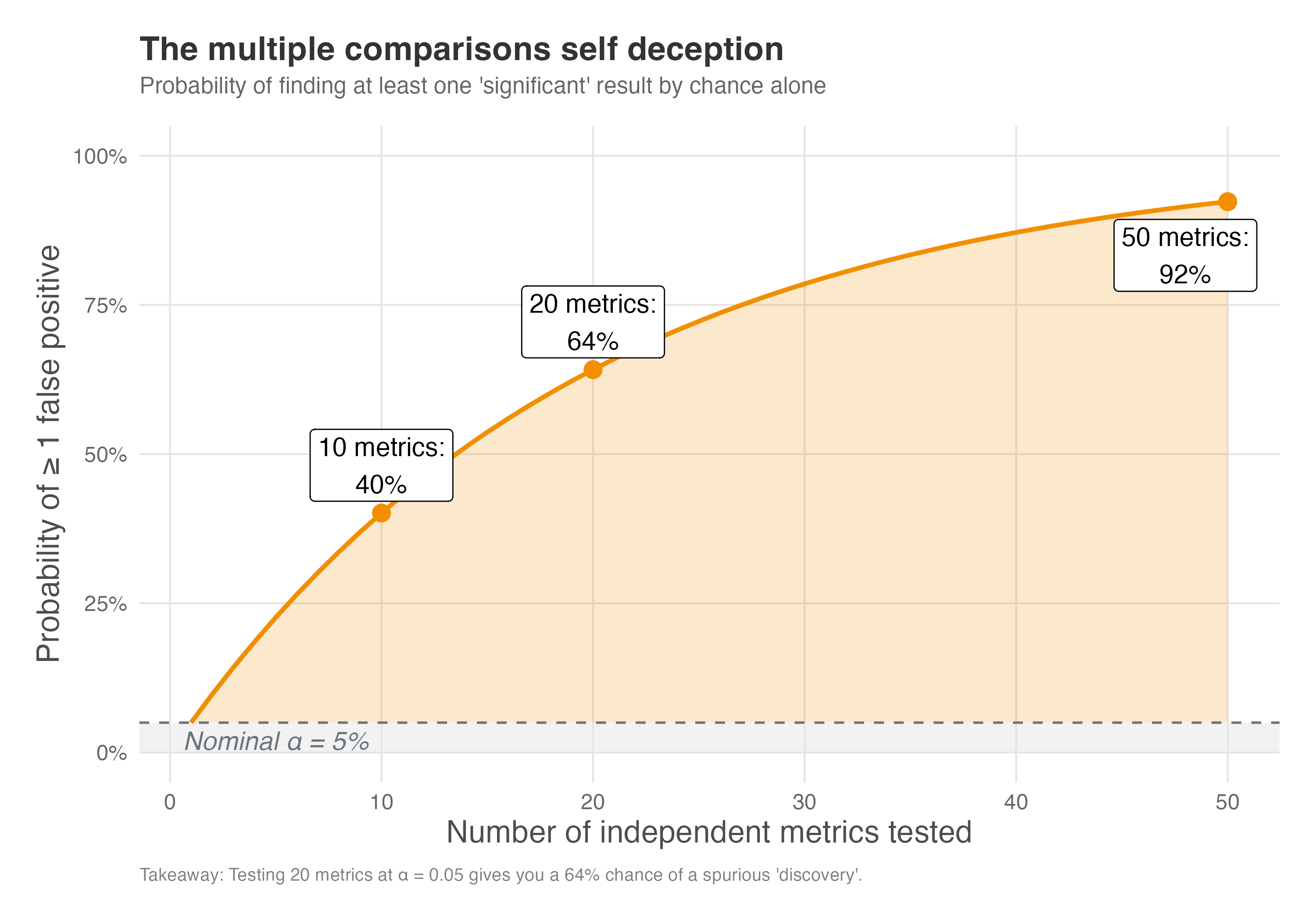
How to read Figure 5.15: The gray band at the bottom represents the nominal 5% — your supposed tolerance for false positives. The orange curve shows what actually happens as you test more metrics: the probability of at least one false positive among your discoveries rises steeply. By 20 metrics (a typical dashboard), you’ve crossed 60%. By 50 metrics, you’re virtually guaranteed to find something “significant” that isn’t real. The orange shaded area is your inflation zone — the extra risk you take on beyond the 5% you thought you accepted.
The most common correction is the Bonferroni adjustment: divide your significance threshold by the number of tests. Think of it like adjusting your lottery expectations — if you buy 20 tickets instead of 1, your odds of “winning” (seeing a false positive) are higher, so you demand a bigger prize (a smaller p-value) before you celebrate. If you’re testing 20 metrics at \(\alpha = 0.05\), each individual test should use \(\alpha = 0.05/20 = 0.0025\).
This is conservative but simple. More sophisticated methods like Benjamini-Hochberg offer a middle ground: instead of ensuring none of your findings are false (which is very strict), they aim to keep false discoveries as only a small fraction of your total discoveries — a more forgiving but still controlled approach. Think of it as accepting that a few fish in your net might be the wrong species, as long as most are what you’re looking for.
5.6 Wrapping up and next steps
We’ve covered a lot of ground. Here’s what we’ve learned:
Power is about detection probability: An experiment with 80% power has an 80% chance of detecting a true effect as statistically significant. Low power leads to missed opportunities and, paradoxically, exaggerated effect sizes when you do detect something.
Four elements determine power calculation: Sample size, minimum detectable effect, significance level, and power itself are mathematically linked. Know any three, and you can calculate the fourth.
Effect size drives sample requirements: Small effects require dramatically larger samples than large effects. Detecting a \(d = 0.2\) effect might need 400 participants per group, while \(d = 0.8\) needs only 25.
Design choices matter: Equal allocation (50/50) maximizes power for a given total sample size. Lower variance in your outcome metric means you need fewer participants. Stricter significance thresholds require larger samples to maintain power.
Non-compliance dilutes effects: When only a fraction of assigned users actually receive treatment, your observed effect shrinks proportionally. A 50% compliance rate can require four times as many participants per group.
Avoid common pitfalls: Peeking at results inflates false positive rates well beyond the nominal 5%. Testing multiple metrics without correction creates the same problem. Pre-register your sample size, metrics, and stopping rules.
In the next chapter, we shift from the controlled world of experiments to the messier reality of observational data. You’ll learn how to think carefully about which variables to include (and exclude) from your models, using Directed Acyclic Graphs (DAGs) to map out your assumptions about the world. We’ll explore the conditions under which regression adjustment can recover causal effects, and why getting this wrong — whether by ignoring confounders or controlling for bad variables like mediators and colliders — can bias your results. This foundation will prepare you for the quasi-experimental methods that follow.
Appendix 5.A: Power calculation formulas for non-compliance
This appendix provides the mathematical foundations for power calculations, particularly when dealing with imperfect compliance. The formulas presented here follow the treatment in Duflo, Glennerster, and Kremer (2006), which is a great reference for power analysis in field experiments. While we used software packages like pwr in R and statsmodels in Python for calculations in the main text, understanding the underlying formulas may help you grasp why certain design choices matter.
The general power formula
The minimum detectable effect (MDE) for a two-sample comparison with equal allocation is given by:
\[ MDE = (t_{(1-\beta)} + t_{\alpha}) \sqrt{\frac{2\sigma^2}{N}} \]
Where:
- \(MDE\) = the smallest true effect the experiment can reliably detect
- \(t_{(1-\beta)}\) = critical value from the t-distribution for power \(1-\beta\) (typically 0.84 for 80% power, where \(\beta = 0.20\))
- \(t_\alpha\) = critical value for significance level \(\alpha\) (typically 1.96 for \(\alpha = 0.05\), two-sided)
- \(\sigma^2\) = variance of the outcome variable
- \(N\) = total sample size (or sample size per group if specified that way)
This formula reveals why larger variance requires larger samples: the \(\sigma^2\) term appears in the numerator. It also shows why higher power or lower \(\alpha\) increases the MDE (making effects harder to detect) for a given sample size.
In plain terms: \(\sigma^2\) is the “noisiness” of your metric (higher variance means more noise), and the \(t\) values are multipliers that depend on how confident you want to be. Larger \(N\) shrinks the whole expression — more data means you can detect smaller effects.
Adjusting for unequal allocation
When treatment and control groups have unequal sizes, the formula becomes:
\[ MDE = (t_{(1-\beta)} + t_{\alpha}) \sqrt{\frac{\sigma^2}{N}} \sqrt{\frac{1}{P(1-P)}} \]
Where \(P\) is the proportion allocated to treatment. The term \(\sqrt{\frac{1}{P(1-P)}}\) is minimized when \(P = 0.5\), confirming that equal allocation maximizes power.
Adjusting for non-compliance
When compliance is imperfect, we need to account for dilution of the treatment effect. The adjusted MDE becomes:
\[ MDE_{ITT} = (t_{(1-\beta)} + t_{\alpha}) \sqrt{\frac{1}{P(1-P)}} \sqrt{\frac{\sigma^2}{N}} \frac{1}{c-s} \]
Where: - \(c\) = compliance rate in treatment group (share who actually receive treatment) - \(s\) = compliance rate in control group (typically 0 in one-sided non-compliance) - The factor \(\frac{1}{c-s}\) inflates the MDE because the observed intent-to-treat (ITT) effect is smaller than the true effect among compliers
Practical implications
For sample size calculations with imperfect compliance:
- Calculate the required sample size \(N_{perfect}\) assuming perfect compliance
- Adjust for expected compliance rate: \(N_{adjusted} = \frac{N_{perfect}}{(c-s)^2}\)
For example, with 50% compliance in treatment (\(c = 0.5\)) and 0% in control (\(s = 0\)): \[N_{adjusted} = \frac{N_{perfect}}{0.5^2} = 4 \times N_{perfect}\]
This means you need four times as many participants per group compared to perfect compliance. This quadratic relationship explains why even moderate non-compliance dramatically increases sample size requirements.
Key insight: The compliance rate appears squared because low compliance hurts you twice: it shrinks the effect you observe (fewer people benefiting) and increases the noise (you’re basing conclusions on a smaller group of actual users). For example, if only half your treatment group complies, you lose half the signal and your estimate gets noisier — so you need roughly four times as many participants to maintain the same power.
Simplified approach for practitioners
When you anticipate that not all participants in the treatment group will comply with the treatment, you need to adjust your sample size calculation to account for the dilution of the effect. The observed effect in an intent-to-treat (ITT) analysis will be smaller than the true effect on the compliers (the LATE).
The formula to adjust the required sample size is straightforward. You first calculate the sample size N as if you had perfect compliance, and then you divide it by the square of the expected compliance rate C:
\[ N_{adjusted} = \frac{N_{perfect\_compliance}}{C^2} \]
For example, if your initial power analysis indicated you need 394 participants per group (as in our earlier example) but you expect only 50% of the treatment group to actually use the new feature (a compliance rate of 0.5), the adjusted sample size would be:
\[ N_{adjusted} = \frac{394}{0.5^2} = \frac{394}{0.25} = 1576 \]
You would need 1,576 participants per group, a fourfold increase, to detect the same underlying effect with 80% power. This demonstrates how critical compliance is to the feasibility of an experiment. Low compliance rates can quickly make an experiment prohibitively expensive or time-consuming.
Appendix 5.B: Triggering for improved sensitivity
Triggering is a variance reduction technique that improves statistical power by filtering out noise from users who could not have been impacted by the experiment (Kohavi, Tang, and Xu 2020). The core idea is simple: if a user never encountered the feature or change you’re testing, their treatment effect is zero by definition. Including them in your analysis only adds noise and dilutes your signal. Figure 5.16 illustrates this concept: only users who actually encounter the test condition (the triggered population) are included in the analysis, while untriggered users are excluded.
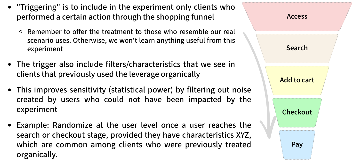
How triggering works
Users are “triggered” into the analysis if there is some difference in the system or their experience between the variant they are in and any other variant (the counterfactual). Common triggering scenarios include:
- Intentional partial exposure: If your change only applies to users from a specific country, browser, or segment, only analyze those users.
- Conditional exposure: If your change affects the checkout process, only trigger users who started checkout. If you’re testing a collaboration feature, only trigger users who participated in collaboration.
- Coverage changes: If you’re testing a lower free-shipping threshold (say, R$25 vs R$35), only trigger users whose cart value fell in the R$25-R$35 range where the experience differs.
The power gains can be substantial
Consider an e-commerce site where 5% of users make a purchase, and you want to detect a 5% relative improvement. With standard analysis, you need approximately 121,600 users. But if you’re testing a checkout change and only 10% of users initiate checkout (where half of those complete a purchase), the triggered population has a 50% conversion rate. This reduces your required sample to about 6,400 users who go through checkout — roughly 64,000 total users. The experiment achieves the same power in about half the time.
Validating your triggering
Two checks ensure trustworthy triggering:
- Sample Ratio Mismatch (SRM): If the overall experiment has no SRM but the triggered analysis does, there’s likely a bias in how triggering was implemented.
- Complement analysis: Generate a scorecard for never-triggered users. This should look like an A/A test — if you see statistically significant differences among users who were never exposed to the change, your trigger condition is incorrect.
Common pitfalls
Diluting the overall impact: A 3% improvement among 10% of triggered users does not automatically mean a 0.3% overall improvement. The triggered population may spend more or less than average, so you must properly dilute the effect using the formula:
\[ \text{Diluted Impact} = \frac{\Delta_\theta}{M_{\omega C}} \times \tau \]
where \(\Delta_\theta\) is the absolute effect on triggered users, \(M_{\omega C}\) is the overall control metric value, and \(\tau\) is the triggering rate.
Counterfactual logging: To trigger correctly, you often need to log what would have happened in the other variant. For machine learning models, this means running both the old and new model and comparing outputs. This adds computational cost and complexity.
Forgetting to include triggered users going forward: Once a user triggers, you must include all their subsequent activity in the analysis, even if it occurs outside the triggered context. The treatment might influence their future behavior.
Triggering is a powerful technique that grows more common as experimentation programs mature. When implemented correctly, it can dramatically reduce experiment duration without sacrificing statistical rigor.
As Google advises, “NotebookLM can be inaccurate; please double-check its content”. I recommend reading the chapter first, then listening to the audio to reinforce what you’ve learned.↩︎
Sequential experiments have real appeal: they let you stop early when results are clear, reducing opportunity cost and accelerating learning. But they come with trade-offs. They require careful “alpha-spending” rules to control false positives, are harder to interpret when stopped mid-course, and are easier to misuse (peeking without proper guardrails). Most importantly, they build on fixed-horizon logic. Master the fundamentals here, and sequential methods become a natural extension later.↩︎
But there’s a catch. For this whole framework to work properly, we need to have designed our experiment correctly from the start. That includes having enough participants to reliably detect effects when they exist. This brings us to the concept of statistical power.↩︎
This calculation doubles as a negotiation tool. If the offered sample size leaves you with, say, 40% power, you can return to the table with hard numbers showing why the experiment would likely fail to detect even a real effect.↩︎
To load it directly, use the example URL
https://raw.githubusercontent.com/RobsonTigre/everyday-ci/main/data/advertising_data.csvand replace the filenameadvertising_data.csvwith the one you need.↩︎