graph LR
    classDef unobserved stroke-dasharray: 5 5;

    Module["Credit Education<br/>Module Use (X)"] --> Spending["Spending<br/>Behavior (M)"]
    Spending --> Defaults["Default<br/>Rate (Y)"]
    U["Unmeasured<br/>Confounder (U)"] -.-> Module
    U -.-> Defaults

    class U unobserved

    linkStyle 0,1 stroke:#2E86AB,stroke-width:2px;
    linkStyle 2,3 stroke:red,stroke-width:1.5px;
15 What’s next for your causal journey
Keywords
A/B Testing, Causal Inference, Causal Time Series Analysis, Data Science, Difference-in-Differences, Directed Acyclic Graphs, Econometrics, Impact Evaluation, Instrumental Variables, Heterogeneous Treatment Effects, Potential Outcomes, Power Analysis, Sample Size Calculation, Python and R Programming, Randomized Experiments, Regression Discontinuity, Treatment Effects
By now, you can ask causal questions with the discipline needed to answer them. When you see a number, you ask, “Compared to what?” You know that estimates rest on assumptions, and you map the problem’s structure before reaching for a tool.
That instinct runs through everything we built together. Experiments, instrumental variables, regression discontinuity, difference-in-differences, time series methods — different answers to the same question: can I recover a causal effect from the data I have, and under what conditions?
But this book didn’t cover everything. Some topics deserve more room than a compressed treatment would allow: structural causal models, causal discovery, machine learning for causal estimation, Bayesian approaches, sequential treatments, interference, policy learning, and the study of causal mechanisms.
This chapter is your map to eight of them, in two halves: four tools for doing causal inference, then four problems that strain the standard setup. I’m not trying to teach each one — that would need its own book. The goal is to give you enough orientation to recognize when a problem needs a tool you don’t yet have, and to point you toward the right entry for going deeper.
“We shall not cease from exploration, and the end of all our exploring will be to arrive where we started and know the place for the first time.”
— T. S. Eliot, American-born British poet.
The quote is about a different kind of journey, but the line fits. Open a paper on causal discovery and you’ll recognize the identification logic from our DAG chapter (Chapter 6); read about marginal structural models and you’ll meet the same confounding problem you first saw in an observational study. The assumptions get harder to defend and the estimation gets heavier, but the question underneath doesn’t change.
15.1 Other tools of causal inference
These four topics extend the toolkit you already have: they represent causal problems, uncover structure, estimate effects, and quantify uncertainty.
15.1.1 Structural causal models
In Chapter 6, we used DAGs as a visual reasoning tool — drawing arrows between variables, identifying front-door and backdoor paths, and deciding which covariates to include in a regression. That informal use gets you a long way. But there are situations where eyeballing a graph is not enough.
When the causal structure is complex and several adjustment strategies seem plausible, you need a principled way to decide whether the effect you care about is identifiable from the data you have at all. Structural causal models, or SCMs, are the formal framework behind the DAGs we have been sketching on whiteboards.
From DAGs to structural equations
As Pearl (2009b) defines it, a structural causal model (SCM) has three parts — and the graph is not one of them. To keep each part concrete, take the case this section builds toward: suppose a fintech’s credit education module changes customers’ spending behavior, which in turn changes their default rate.
- The endogenous variables — the ones whose values the model explains. Here they are module use (the treatment), spending behavior (the mediator), and default rate (the outcome). Each gets one equation.
- The exogenous variables — the ones the model takes as given. They feed into the endogenous variables, but the model doesn’t try to explain what caused them, so they get no equations of their own. Usually they are unmeasured, though nothing stops one from being observed. Pearl collects them in a set written \(U\). One exogenous variable can feed several endogenous ones: if an unmeasured variable drives both module use and default rate, it confounds exactly the relationship you want to estimate.
- One structural function per endogenous variable — the rule that turns that variable’s inputs into its value. The inputs are the endogenous variables that directly cause it, plus whichever exogenous variables feed it. Three endogenous variables, three functions.
The causal diagram is then an abstraction derived from those functions: each variable’s arrows come from exactly the causes that appear in its equation. You do not supply the graph alongside the equations — you read it off them.
Think of one of those functions as writing down a rule: “default rate = some function of (spending behavior, everything else we missed).” In notation, a variable \(Y\) is produced by \(Y = f_Y(\mathrm{pa}(Y), U_Y)\), where \(\mathrm{pa}(Y)\) is the set of \(Y\)’s direct causes the model tracks — treatment, confounders, mediators, not just the covariates from earlier chapters — and \(U_Y\) collects the background inputs feeding \(Y\). For the fintech case, with spending as the one tracked cause: \(\text{Default} = f_{\text{Default}}(\text{Spending}, U_{\text{Default}})\).2
TipThe equations come first; the diagram follows
It is tempting to think of an SCM as a DAG with equations bolted on. Pearl builds it the other way round: the equations on their own are deterministic. Fix the background causes and the outcome follows. State how often each combination of those background causes occurs — a distribution \(P(u)\), where \(u\) is one such combination of values for the variables in \(U\) — and you have what Pearl calls a probabilistic causal model. That is the step that lets you write probabilities at all, including anything of the form \(P(Y \mid do(X = x))\).
The do-operator: seeing vs doing
Pearl’s do-operator — written \(P(Y \mid do(X = x))\) — captures the difference between observing and intervening. Observing is like checking the thermostat reading; intervening is like overriding it to 22°C regardless of room conditions.
In the graph, you delete every arrow pointing into the variable you manipulated — it no longer responds to its usual causes — while every other relationship stays intact (Pearl 2010). This distinction between seeing and doing is precisely the gap between correlation and causation that runs through the whole book. The do-operator just gives it a formal language (Pearl 2019).
Do-calculus builds on this language with three rules that answer one question: can you estimate the causal effect using only the data you already have, without running an experiment? The rules work by converting “what happens if we intervene” into expressions that only involve “what we observe.”
If the conversion succeeds, the effect is identifiable — answerable from existing data. If it fails, no amount of clever regression will get you there. The do-calculus is complete: if it cannot reduce the effect to observable quantities, no other method can identify that effect from the same graph and observational data alone (Pearl 2009b; Shpitser and Pearl 2006; Huang and Valtorta 2006).
The escape hatches are things the graph does not encode: a functional form such as linearity, an actual experiment, or a willingness to answer a narrower question — the monotonicity assumption behind LATE (Section 7.4.4) identifies the effect on compliers, which is a different quantity from the one the calculus just ruled out.
When you need SCMs: the front-door example
A fintech company wants to know whether working through its credit education module reduces loan default rates. Running an experiment is off the table — regulators require that all eligible customers have access to the module, so you cannot randomize who is offered it. What varies, and what you can observe, is uptake: access is universal, but only some customers actually work through the material. That is the treatment.
There is no natural instrument, no eligibility cutoff for a regression discontinuity, and no staggered rollout for difference-in-differences. With the methods in this book, you would be stuck.
But suppose you map out the causal chain: the education module improves financial literacy, which changes spending behavior, which affects repayment outcomes. If spending behavior fully mediates the effect of the module on defaults — there is no unblocked backdoor path from the module to spending, and all backdoor paths from spending to defaults are blocked by conditioning on the module itself — then the causal structure satisfies what Pearl calls the front-door criterion (Pearl 2009b).
Chapter 6 called the causal channels front-door paths, and the criterion is what turns one of those paths into an identification strategy — but only under the three conditions just listed, not simply because the path exists.
Those three are conditions on the graph. Recovering the effect needs one more that no graph can express: the data have to contain support for the treatment–mediator combinations the formula relies on — the positivity condition, which Pearl writes as \(P(x, m) > 0\) (Pearl 2009b). This condition has observable implications in the data. If both variables are discrete, cross-tabulate them to diagnose empty or sparse observed cells; if spending is continuous, inspect overlap as in Section 6.4.3. These checks can reveal support problems, but they cannot establish whether positivity holds in the population.
Figure 15.1 maps the structure. The front-door path (blue) flows through the mediator; the unmeasured confounder (dashed) creates a backdoor that no adjustment can close directly — but the front-door path provides an alternative route to identification.
Instead of trying to block every confounder between the module and defaults (the back door), you measure the effect by following it forward through the mediator. You get the effect even though no experiment ever randomized who works through the module — not because a cleverer regression turned up, but because the framework verified that the available paths in the graph are sufficient.
WarningThe DAG must be right
SCMs come with a heavy assumption that is easy to understate: every arrow you draw — and every arrow you omit — is a substantive claim about the world. If working through the module moves default through any channel other than spending behavior — a confidence effect, say, or a nudge to consolidate debt — full mediation fails. If an unmeasured confounder links spending behavior to defaults, the third condition fails. Either way the front-door criterion breaks and the identification result collapses.
Unlike parallel trends in DiD or placebo tests in RDD, there is often no empirical diagnostic that will tell you a missing arrow is biasing your results. You are betting on your domain knowledge being complete — and that bet deserves scrutiny.
The best practice is to defend your DAG with subject-matter experts, document every exclusion explicitly, and run whatever sensitivity analyses you can. Pearl et al. (2016) is the gentlest introduction to the formal tools underneath, and Pearl and Mackenzie (2018) offers the conceptual foundation in accessible form.
SCMs are also the formal foundation for the mediation analysis in Section 15.2.4: they tell you whether an effect can be decomposed, and mediation tells you what you learn when you do.
The arrows you draw, and the ones you leave out, are inputs to the analysis rather than results of it — behind every causal conclusion lies a causal assumption that observational data alone cannot test (Pearl 2009a). That is why this book had you start from a question and a DAG, not a dataset.
The graph still leaves a testable footprint in the data: the conditional independencies implied by d-separation, which you used in Chapter 13. Causal discovery reverses that logic, starting from observed independencies and working back toward the structure. Those patterns constrain the graph without identifying a unique one (Glymour et al. 2019). Before quantifying an effect, then, we face a prior question: where does the graph come from when we cannot draw it by hand?
15.1.2 Causal discovery
Drawing DAGs by hand works when you have strong domain knowledge and a manageable number of variables. With thirty variables and uncertain arrows, that approach breaks down. Causal discovery reverses the process: algorithms attempt to learn the DAG from data instead of assuming it before estimating effects.
Learning the DAG from data
Back in Chapter 6 you learned to read a DAG forward: trace the arrows, spot the colliders, decide what to control for. That reading rests on d-separation, which tells you which variables a given graph says should be independent of which others, once you condition on the right set.
Discovery algorithms run the rule backwards. They measure which independencies actually hold in the data, then ask which arrangements of arrows could have produced them. If two variables turn out to be independent once you condition on a third, certain arrows between them are ruled out.
The PC algorithm (Spirtes et al. 2000), among the most widely used, refines the earlier SGS procedure from the same authors and works by elimination. Imagine drawing an arrow between every pair of variables — a web where everything might cause everything else. The algorithm then tests each link: “are these two variables still related once I account for other variables?” If the answer is no, the link gets cut. What survives is the structure the data supports. Its trick for coping with many variables is that it only tests each pair against the variables sitting next to them, rather than every possible combination.
After the pruning is done, orientation rules determine which surviving edges point in which direction. Data alone usually cannot pin down a unique graph. What you get back is not a single answer but a shortlist — several DAGs that are all statistically indistinguishable given your data (formally called a Markov equivalence class). “Ad spend drives site traffic drives signups,” for example, leaves the exact same statistical footprint as the same chain read backwards, so no amount of data can separate the two.
Resolving the remaining edge directions takes outside knowledge. Time is often the most reliable tiebreaker: a variable measured before another cannot have been caused by it, which rules out many arrows the data could not orient.
Figure 15.2 illustrates the logic on a toy example with five variables. What the algorithm returns is a CPDAG — a completed partially directed acyclic graph, where some edges carry arrowheads and some do not.
graph LR
    A --- B
    A --- C
    A --- D
    A --- E
    B --- C
    B --- D
    B --- E
    C --- D
    C --- E
    D --- E
graph LR
    A --- B
    A --- C
    B --> D
    C --> D
    D --> E
The “before” panel (Figure 15.2 (a)) is where the PC algorithm begins: ten undirected edges connecting every pair. The “after” panel (Figure 15.2 (b)) is what survives after testing — most links were explained away by conditioning on other variables.
Orientation then happens in two steps, each with its own rule.
The first rule applies wherever two variables are not directly connected but both connect to a third — B and C here, with D between them. If D were a link in a chain from B to C, or their common cause, D would have to appear in any set that makes B and C independent. The tests found such a set, conditioning on A alone, and D is not in it. That leaves one arrangement: both arrows point into D, a collider, the same structure you learned to spot in Chapter 6. So B→D and C→D get oriented.
The second rule propagates that orientation. D→E must point away from D, because pointing it into D would create additional colliders at D — E paired with B, and E paired with C — that the independence tests did not support. The two remaining edges (A—B, A—C) stay undirected. Either one could run either way, but they cannot both point into A: that would make A a collider too, and the tests already found B and C independent once you condition on A. Three arrangements survive, and no observational data can tell them apart. That leftover ambiguity is the Markov equivalence class in miniature.
An e-commerce example
To see why this matters, consider an e-commerce platform tracking 30+ user behavior signals — page views, searches, wishlist additions, cart actions, review reads. The team wants to map the causal chain from first visit to first purchase, and drawing that DAG by hand is infeasible: the number of possible edges is enormous, and intuitions about which signals drive which others will not agree across team members.
Running the PC algorithm on observed sessions, the team finds that review reading and wishlist usage are conditionally independent given search depth. That rules out a direct arrow between them, though it cannot orient what remains — search depth could be a common cause of both, or a link in a chain.
The conditional-independence result rules out the team’s premise, a direct line from wishlist to reviews, so there is no direct link for a product change to act on. What replaces it is an experiment on the variable the data implicated: move search depth for a random set of users — with an intervention that touches review reading and wishlist use only through search depth — and watch how the two behaviors respond. The algorithm did not hand them a causal effect, or even an arrow. It handed them a better question.
One reason the 30-variable case is harder than it looks: the algorithm runs a separate test for every pair of variables against different subsets of their neighbours, and that count grows fast. Run that many tests and some will flag a link by chance — the multiple-comparisons trap from Section 5.5.2 — so discovery tools apply corrections that demand stronger evidence before drawing an edge. Those corrections cost power: real but subtle links slip through, and the problem sharpens as the number of variables grows (Huber 2024). Causal discovery is data-hungry: the more variables you feed it, the larger the sample you need before the output is worth trusting (Glymour et al. 2019).
TipCausal discovery = hypothesis generation
Do not use causal discovery to replace the domain knowledge you bring to a DAG. Use it to challenge that knowledge — “you assumed A does not affect C, but the data suggests otherwise” — and then defend or revise your graph accordingly.
The assumptions underneath
Using it that way is not optional, because the algorithms carry assumptions of their own:
The causal Markov condition assumes the arrows account for the dependencies: condition on a variable’s direct causes and it becomes independent of everything that is not one of its effects. This is what lets the algorithm read independence off the graph at all. Faithfulness, below, is the converse — Markov says the graph’s structure produces the independencies you see, faithfulness says nothing else does.
Faithfulness assumes every independence in the population distribution comes from the structure of the graph, not from causal effects cancelling out. This rules out a scenario like a drug that raises blood pressure through one biological pathway and lowers it by the exact same amount through another — the net looks like zero, but two real causal paths exist. Faithfulness says that kind of perfect cancellation does not happen in the population you are studying.
Causal sufficiency assumes no unmeasured common cause sits behind any pair of variables you did measure. An unmeasured variable that touches only one of them is harmless — it just becomes noise. One that touches two is a hidden confounder, and no conditioning set built from your measured variables can screen it off.3
No selection bias assumes the independencies in the sample you analyze still reflect those in the target population. If inclusion depends on a common effect of the variables under study — analyzing only completed sessions, say, when several behaviors affect completion — then the act of sampling conditions on a collider, and the resulting dependencies can produce spurious edges or orientations (Spirtes et al. 2000; Glymour et al. 2019). It is the mirror image of the sufficiency problem: there the hidden variable is a common cause, here a common effect.
Independent and identically distributed (IID) data — in their standard form, these algorithms expect each observation to be unrelated to the others and drawn from the same process, which is why applying them naively to time series can mislead.
A separate family of methods sidesteps some of this ambiguity by leaning on the shape of the relationships rather than independencies alone. If the disturbances in the underlying equations depart from a normal distribution — heavy tails, skew, two humps, any departure will do — or if the links between variables bend rather than run straight, then A causing B leaves a different fingerprint in the data than B causing A. LiNGAM exploits non-Gaussian disturbances in linear systems (Shimizu et al. 2006); additive noise models exploit nonlinearity (Hoyer et al. 2008). Both can orient edges that d-separation leaves undecided (Peters et al. 2017).
When these assumptions hold and the sample is large enough for the independence tests to have power, causal discovery can reveal structural relationships you would never have hypothesized on your own. When they fail, it can confidently produce the wrong graph.
Recovering an entire causal graph for a complex system is usually out of reach because the assumptions are too demanding and real data are rarely informative enough. Causal discovery is most useful for narrower, more answerable questions (Huber 2024).
Two are especially useful. The first is which variables directly affect an outcome, screening dozens of candidate drivers down to the handful with a direct line to the metric you care about. The second is whether the identification assumption you are about to lean on survives scrutiny — but only when you have a spare instrument-like variable, one that moves the treatment and reaches the outcome only through it. You test whether that variable is independent of the outcome once you condition on the treatment and your covariates (Huber 2024). Take the result for what it is: it stress-tests unconfoundedness and instrument validity jointly, and cannot separate them or test unconfoundedness on its own.
Glymour et al. (2019) provide a review of when these algorithms deliver and when they mislead, and Molak (2023) offers a hands-on, code-driven introduction to both causal discovery and causal inference in Python. For a rigorous treatment that connects discovery algorithms to the broader causal inference framework, Peters et al. (2017) is the modern reference. For an accessible survey written for economists and social scientists — covering d-separation, Markov equivalence, and these identification-testing uses — see Huber (2024).
Suppose you now have a defensible graph, whether drawn by hand or refined with an algorithm, and the graph identifies the effect you care about. Identification says the effect is recoverable, but not how to estimate it when the relationships are too tangled to specify by hand. On a digital platform, outcomes may depend on hundreds of unanticipated feature interactions. That is where machine learning enters causal estimation.
15.1.3 Causal machine learning
In Chapter 12, we used causal forests to estimate how treatment effects vary across subgroups. That chapter introduced one corner of a much larger field. Causal machine learning takes ML’s core strengths — handling hundreds of variables at once, capturing patterns that no linear model would find, and guarding against overfitting — and points them at causal estimation rather than prediction. Athey and Imbens (2019) survey the ML methods behind this shift and where they meet causal estimation.
The goal is not to predict outcomes. It is to estimate the causal effect of an intervention in settings where the analyst cannot pre-specify the right functional form.
The methods we built throughout this book carry functional form assumptions that are easy to forget: linear regression assumes linearity in the covariates, two-stage least squares assumes it in both stages, and RDD’s local polynomials escape a single global form only by narrowing the question to a window around the cutoff.
Those assumptions are fine with a handful of well-understood covariates. They become liabilities on a digital platform where the effect might depend on order frequency interacted with time-of-day patterns interacted with device type interacted with recency of last session — an interaction no analyst would think to specify. Causal ML lets the data find it while keeping the causal discipline this book has spent its length developing.
Separation of concerns: the DML approach
Causal ML divides estimation between flexible models for the background patterns you must account for but do not care about—the nuisance component—and the causal effect itself, which remains under causal discipline (Chernozhukov et al. 2018). Neither half works alone (Brand et al. 2023).
Double/Debiased Machine Learning, or DML (Chernozhukov et al. 2018), uses a move you have already met: the residualize-then-estimate logic from inside the causal forest (Section 12.6.5), now applied on its own. The process has three steps:
- Use any ML model to predict the outcome from background characteristics (age, usage patterns, location) and compute how far off each prediction lands — the residual, what the background could not explain.
- Do the same for the treatment variable: predict who got treated from the same characteristics and compute those residuals.
- Check whether the leftover variation in the outcome lines up with the leftover variation in treatment. That relationship is your causal estimate.
Provided unconfoundedness holds (meaning you have measured all relevant confounders), stripping away the predictable background patterns leaves variation that is as good as random — exactly the variation you need for causal identification.
One technical guard rail is essential: cross-fitting. The simplest version: split your data in half, train on the first half, generate residuals on the second, then swap and average.4 This prevents the ML model from overfitting to the same data it is cleaning, which would quietly bias the causal estimate (Chernozhukov et al. 2024). This is what separates a valid causal estimator from a prediction exercise dressed up in causal language.
Cross-fitting is one safeguard; residualizing the outcome and treatment in steps 1 and 2 is the other. Flexible models are deliberately held back from fitting the training data as closely as they could. That restraint is what stops them from memorizing noise, but it also leaves a systematic tilt in their predictions: models fitted under a penalty or stopped early can introduce regularization bias, and in a naive estimator that bias flows straight into the treatment effect.
Residualizing both sides is what makes the final estimate locally insensitive to how well the nuisance models did. Concretely: small errors in the nuisance models do not pass through one-for-one to the effect estimate. They matter through their product, so as both models improve, their combined influence shrinks faster than either error alone. Those are DML’s two protections: cross-fitting against overfitting on a unit’s own observation, and orthogonal residualization, which removes first-order sensitivity to nuisance-estimation error (Chernozhukov et al. 2018).
Notice what the guarantee does not ask for. There is no minimum \(R^2\) for the outcome model and no minimum AUC for the treatment model. What it asks is that both models’ errors shrink as the sample grows, and shrink fast enough that the product of those errors dies away faster than the causal estimate’s own convergence. That product is exactly what orthogonal residualization leaves behind, which is why it is the quantity the condition binds — and why a fast-converging treatment model can buy slack for a slower outcome model, without either being allowed to stay inaccurate.
So inspect first-stage fit, but read it correctly: a treatment model that is too predictive is its own warning — when estimated propensities (each user’s modeled probability of being treated) pile up near 0 or 1, that is an overlap failure, not a triumph. And no first-stage fit, however good, can strip out confounding from a variable you never measured; that bias passes straight through — exactly the identification wall we return to at the end of this section.
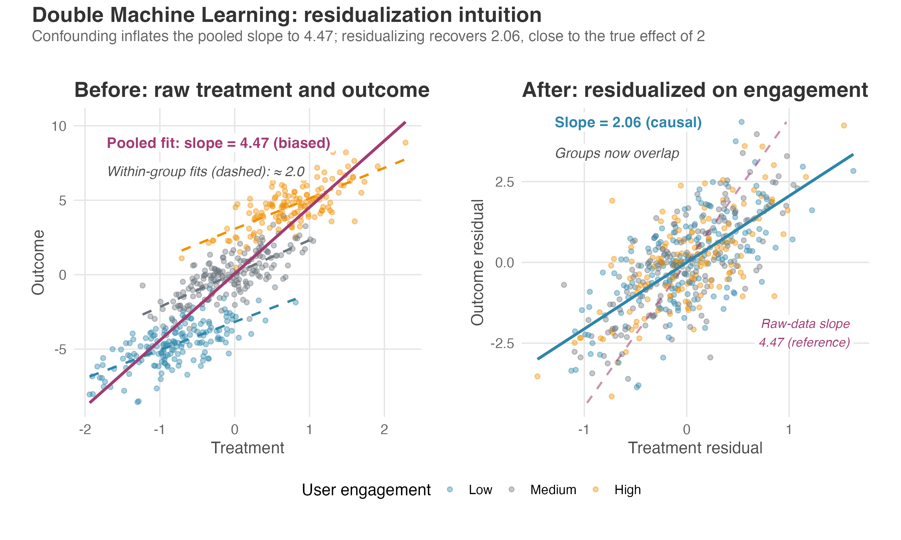
Figure 15.3 illustrates the residualization intuition behind DML — the worked picture promised in Section 12.6.5. The full estimator adds the cross-fitting pipeline described above: nuisance models are trained on one fold and used to produce out-of-fold nuisance predictions on another before the final residual regression.
Meta-learners: different bets on different weaknesses
Meta-learners skip residualizing and estimate the potential outcomes directly. Chapter 12 teaches the S- and T-learners in full and names the other two in passing; those two are the ones worth meeting properly here. Do not ask which meta-learner is “best.” Ask which one will fail most gracefully given your data’s particular weaknesses; each makes a different bet about where modeling errors will hurt least (Chernozhukov et al. 2024; Künzel et al. 2019; Kennedy 2023).
- The X-learner borrows predictions across groups to fill in what you did not observe. It handles group imbalance well but depends on accurate cross-group predictions.
- The DR-learner (doubly robust) hedges its bets by combining outcome modeling with propensity weighting. Its conditional bias is a product of the nuisance-model errors — the two models’ mistakes multiplied together rather than added — so it vanishes if either the propensity score or the outcome regressions are correctly estimated (Kennedy 2023). That is what doubly robust names. It is the most robust on paper, but where the true propensities sit near 0 or 1 it divides by numbers close to zero and turns unstable — that is the overlap problem again, not a misspecification you can fit your way out of.
Uplift modeling applies this logic to targeting: predict each user’s treatment effect, rank by predicted lift, and allocate the intervention to those with the highest expected response — the ranking-and-targeting workflow Chapter 12 validated with GATES and the TOC curve. For a hands-on, code-driven walkthrough of these methods, Facure (2020) is the accessible entry point.
From estimates to deployment
What changes at platform scale is not the estimate but the deployment. A food delivery app running DML over 200+ user features to target a R$5 discount does not stop at a number in a report. It builds a scoring pipeline that runs nightly, ranks every user by predicted effect, feeds that list into the notification system, and retrains as fresh experimental data arrives.5 That is causal inference embedded in a decision system rather than sitting in a research report.
The identification wall hasn’t moved
WarningML does not fix omitted variable bias
The identification assumptions underneath causal ML are exactly the ones we have been stress-testing throughout this book. If an unobserved confounder drives both treatment and outcome, no amount of gradient boosting will remove the bias — it just hides behind a more complex model (Brand et al. 2023).
Unconfoundedness — the assumption that all confounders are observed and included — remains the central identification requirement, and I find it hard to defend in most observational settings. You are claiming your feature set captures everything that jointly determines who gets treated and how the outcome behaves.
The overlap problem — the common-support requirement from Section 6.4.3 — also gets worse. With hundreds of features, you can easily find corners of your data where every user was treated — or every user was control. In those corners, the model has no comparison group and is guessing. The more features you add, the more of these dead zones appear. Huber (2023) works through both problems with examples, and is where to go for the estimator-level detail this section skips.
Interpretability also degrades. A linear interaction term tells the team why the effect differs. A causal forest tells you that the effect is 0.8 for a particular user profile, and spreads the why across a thousand trees instead of putting it in a coefficient. Post-hoc tools help — variable importance, SHAP values, distilling the forest down to one shallow tree (Chernozhukov et al. 2024) — but they explain the model you fit, which is a weaker thing than an effect you can defend. That trade-off is sometimes worth making; make it with eyes open.
Causal ML sharpens how you estimate an effect, but not how you express your confidence in one — it still hands you a point estimate and a standard error. That leaves the question every stakeholder actually asks unanswered: how sure are you about the size of an effect, not as a p-value, but as a direct probability?
15.1.4 Bayesian causal inference
What decision-makers actually want
Most effect estimates in the earlier chapters were presented in frequentist terms: a point estimate, a standard error or confidence interval, and often a p-value. The p-value answers a narrow question: how surprising would data this extreme be if the true effect were zero?
That is useful, but it is not the question your stakeholders are asking. They want to know the probability that the effect is positive, or the probability that ROI exceeds 10%, or whether the evidence is strong enough to justify a R$2M infrastructure investment. Bayesian causal inference answers those questions directly by producing posterior distributions over causal effects — full probability curves that tell you how likely each effect size is, given your data and your prior knowledge.
How Bayesian updating works
You start with a prior distribution encoding what you believe about the effect before seeing any data — flat and agnostic (“I have no idea”) or informed by previous experiments (“past tests suggest effects between 1 pp and 5 pp”). You combine it with the observed data through a likelihood function, which measures how well each possible effect size explains what you actually collected. That is the same probability engine behind the regressions and tests of earlier chapters, just pointed at a different question.
What comes out is a posterior distribution: an updated probability curve balancing what you knew before against what the data says now. From it you read off the statement your stakeholder wanted in the first place — “there is an 87% probability the effect exceeds our minimum threshold.”
Estimating an effect you never fully observe
Bayesian methods make the missing-data structure of causal inference explicit. As Chapter 2 showed, each user has two potential outcomes — what happens if they get the treatment and what happens if they do not — but you only ever observe one. The causal effect is the gap between those outcomes. Under the potential outcomes framework, causal inference, as Li et al. (2023) put it, is a missing-data problem.
Bayesian causal inference is a recipe for filling in that missing half: you define the effect you care about, put a model on the outcomes, and let the model impute the unobserved potential outcomes — the posterior over the effect then falls out of the completed data (Li et al. 2023).
That is also what makes a Bayesian credible interval say the thing a 95% confidence interval famously does not — “95% chance the true effect is in this range” — conditional on the model and prior being reasonable. Appendix 11.A, in the time series chapter, works through the distinction; Kruschke (2014) argues at length that posterior estimation should replace hypothesis testing entirely.
The prior in action: a worked example
A subscription platform runs an A/B test on a redesigned onboarding flow, targeting 30-day retention. The frequentist result comes back with a positive coefficient but p = 0.14 — not statistically significant at the conventional threshold.
The significance test alone leaves the team with nowhere to go. The result is “inconclusive,” and the recommendation is either to run a larger test or move on.
The team also has evidence from three previous onboarding experiments on the same platform, which showed retention lifts of +2, +3, and +5 percentage points. Those results inform everyone’s intuition, but the significance test on the current experiment does not use them. Frequentist pooling tools exist — meta-analysis or a hierarchical model that shares strength across experiments — but teams rarely set them up for a routine ship decision, so the history often sits unused.
A Bayesian analysis encodes that experimental history as an informative prior, combines it with the current data, and produces a posterior showing a 93% probability that the new flow improves retention by at least 1 percentage point.6 The frequentist says “inconclusive.” The Bayesian says “very likely positive, probably small.” If a one-point lift is the team’s minimum worthwhile effect and 93% clears its evidence bar, the posterior supports shipping without a larger experiment.
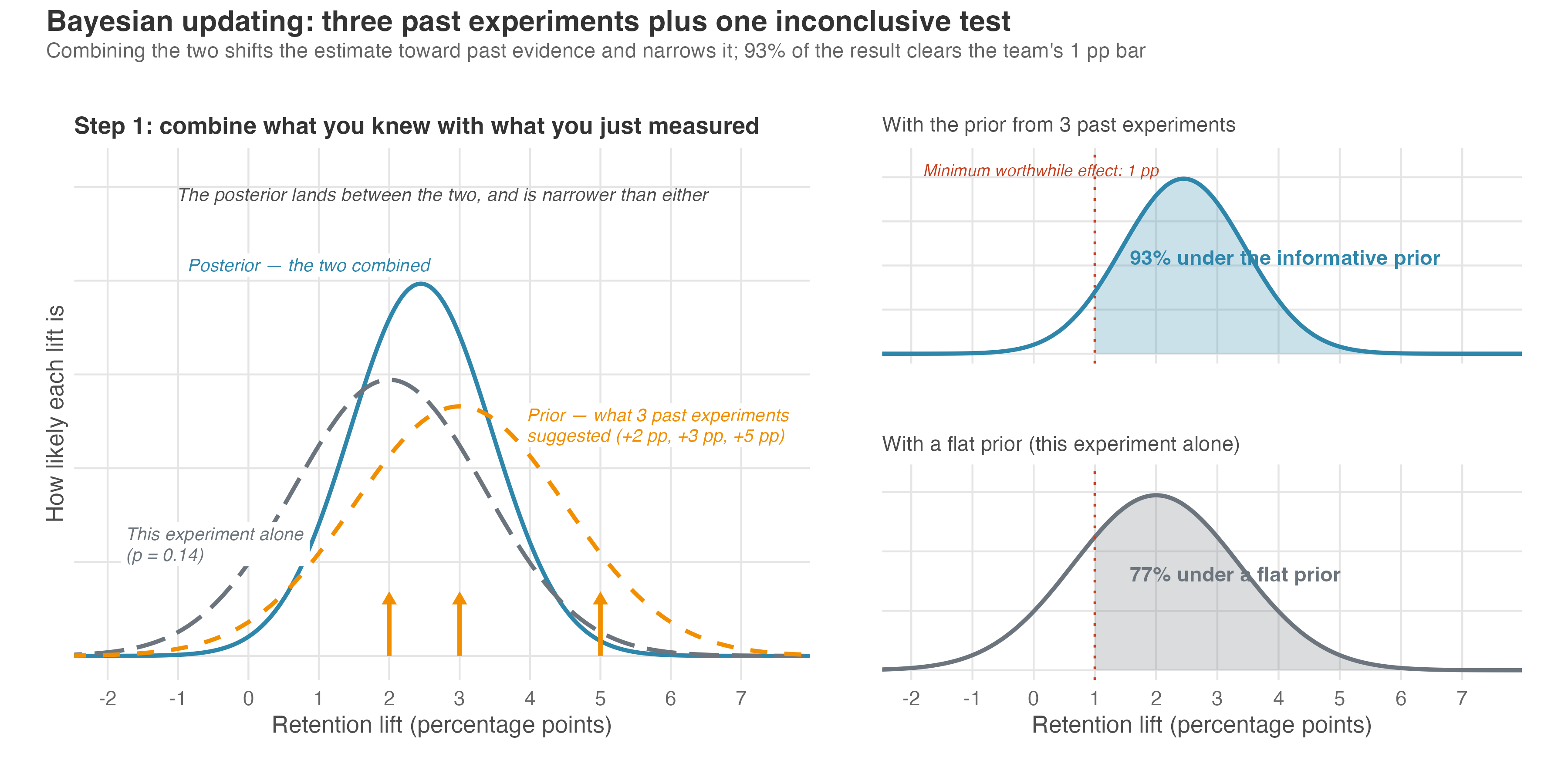
That 93% (Figure 15.4) is conditional on the prior being reasonable — change the prior and the number moves. A flat prior, which spreads belief evenly instead of leaning on the history, would put 77% of the posterior above the threshold instead of 93%. Re-centre the prior on zero — same width, but starting from “I don’t believe onboarding moves retention” — and the same data give 54%. Nothing about the experiment changed; only where the prior sat. The prior is doing real work here, which is why it belongs in the write-up next to the number it produced.
If this sounds familiar, it should. CausalImpact, the Bayesian time series method from Chapter 11, is this same framework applied to one specific data structure, and the logic extends to experiments and observational studies alike. McElreath (2020) walks through building priors, likelihoods and posteriors from scratch, starting from first principles rather than software defaults.
The estimation engine: BART
In the worked example the model was simple enough to write by hand. Real platforms are not: outcomes depend on hundreds of features interacting in ways no analyst would specify correctly. The Bayesian and machine-learning threads meet in Bayesian Additive Regression Trees (BART), the algorithm by Chipman, George, and McCulloch (Chipman et al. 2010) that Hill (2011) brought to causal inference. BART flexibly models the response surface: how the outcome responds to each combination of input features. It then estimates each unit’s effect as the difference between its predicted outcome under treatment and under control.
It “requires no information about how these variables are parametrically related,” yet “is able to detect interactions and nonlinearities in the response surface” (Hill 2011); and because it is Bayesian, credible intervals come with the fit, widening where treated and untreated units are thin on the ground. Read that widening as a prompt to check common support yourself, not a substitute for checking it. Hill is direct about why: the same priors that keep BART from overfitting also cap how wide its intervals can get, so where the two groups barely overlap the interval stops widening before it should and its coverage drops below nominal — precisely where you most need the warning (Hill 2011).7
Its successor, the Bayesian Causal Forest (Hahn et al. 2020), extends the idea to strong confounding and heterogeneous effects.8
When the prior helps — and when it hurts
The prior is both what makes the framework useful and what makes it fragile. Grounded in domain knowledge, previous experiments, or published evidence, it gives the analysis a legitimate head start and produces more decision-ready answers than a lone significance test that ignores everything the team already knows.
Specified carelessly, it overwhelms weak data and pushes the posterior toward the analyst’s assumptions rather than the evidence. Large samples forgive this, since the data eventually swamp any reasonable prior and Bayesian and frequentist results converge (Gelman et al. 2013); small samples do not. A prior borrowed from a different population or a different product passes that mismatch straight through. So state where the prior came from, test sensitivity to alternatives, and put it in the write-up next to the posterior it produced.
Bayesian computation is also slower. The posterior is typically approximated via Markov Chain Monte Carlo (MCMC) sampling, which can take minutes to hours where a frequentist regression takes seconds.9
WarningBayesian does not mean causal
Bayesian methods improve how you quantify uncertainty about an effect, not how you identify it. A Bayesian regression on observational data with an unmeasured confounder produces a beautifully precise posterior over the wrong parameter. The prior cannot rescue a model that estimates the wrong thing. Every identification challenge from earlier chapters — omitted variable bias, selection bias, confounding — applies equally here (Li et al. 2023). Use Bayesian methods to sharpen your answers, not as a substitute for the identification strategy that ensures those answers are causal.
15.2 Other problems of causal inference
Everything so far shared an unstated setup: one treatment, at one moment, applied to units that don’t affect each other, with the goal of estimating an effect. The next four topics each strain a different part of that setup — treatment that unfolds over time, treatment that spills from one unit to another, the shift from estimating an effect to deciding what to do about it, and the shift from asking how large an effect is to asking how it comes about.
15.2.1 Sequential causal models
In digital products, interventions rarely arrive as a single exposure. Users receive streams of decisions over time: a welcome email in week 1, a push notification in week 3 triggered by declining engagement, a discount in week 5 triggered by inactivity after the push. Each decision depends on what happened after the previous one.
The question is not “what is the effect of sending an email?” but “what is the effect of this strategy — this adaptive sequence — on a downstream outcome?” For treatments that unfold over time, there is no single effect until you specify the strategies being compared: always send the discount after a lapse versus never send it, trigger the push after one quiet week versus after three, escalate messages when engagement drops versus keep intensity fixed. Sequential causal models are the framework built to answer those strategy-level questions.
The time-varying confounding trap
The reason standard methods break here traces back to the logic we developed in Chapter 6. That chapter teaches a clear rule: condition on confounders to close backdoor paths, but do not condition on mediators because that blocks the causal pathway you are trying to measure.
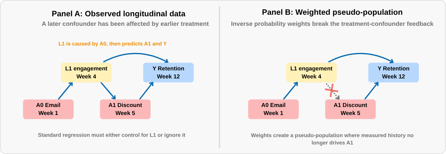
Time-varying confounding creates a variable that is both at once. Consider user engagement measured at week 4. It is a confounder for the week-5 discount — engagement history determines who gets the offer. But it is also an outcome of the week-1 email, which was designed to boost engagement.
Control for it and you block the causal path from the week-1 email through engagement to the final outcome. Leave it uncontrolled and the backdoor path stays open for the week-5 treatment. A variable that mediates an earlier treatment and confounds a later one would have to be both in and out of the model at once, so there is no third option and no control set that threads the needle. The fix is not a better set of controls — it is a different estimator.
Figure 15.5 maps this trap using two of those decisions: the week-1 email and the week-5 discount, with engagement measured in between. Read it left to right: engagement at week 4 sits on the causal path from the email, affects the week-5 discount, and also predicts final retention. Control for it or ignore it — both produce bias.
G-methods and marginal structural models
G-methods address this problem (Hernán and Robins 2020). They are designed for treatment strategies that unfold over time, especially when later confounders have been affected by earlier treatment. The family has three members — the g-formula (standardization), inverse probability weighting with Marginal Structural Models, and g-estimation of structural nested models — which differ in what they model and what they are robust to. Doubly robust estimators sit alongside them, combining a treatment model and an outcome model in one estimator. For a first pass, the most intuitive entry point is IP weighting with Marginal Structural Models, or MSMs (Robins et al. 2000).
MSMs do not solve the trap by putting week-4 engagement into an ordinary outcome regression. They rebalance the data instead. The idea: if a user was very likely to receive the discount given their history, their observation gets less weight — their treatment was close to determined by that history, so their outcome is less informative about the discount’s effect. If a user was unlikely to receive it but got it anyway, their observation gets more weight — they represent a more surprising, and therefore more informative, comparison.
Technically, you estimate the probability of each user’s actual treatment at each time point given their past treatment and covariate history, then weight each user by the inverse of the product of those probabilities across the whole sequence. That is the nonstabilized weight, and the product is why it blows up on long timelines: every extra decision point multiplies in another number below one.
In practice the weights are usually stabilized, which is not that weight rescaled after the fact but a different quantity. Each decision point contributes a ratio of two probabilities rather than one inverse. The denominator is the probability just described: the treatment the user actually received, given past treatment and covariate history. The numerator is the probability of that same treatment given past treatment only, leaving the covariate history out. Multiply those ratios across the sequence and each user ends up with one weight. Because the numerator moves with the denominator, the extremes pull in and the weights center near 1 instead of all sitting above it — which cuts the variance without changing what the weighted model estimates. The positivity discussion below explains why stabilization may still leave extreme weights.
The reweighted dataset creates a pseudo-population. What matters is the ratio between weights: a user who was unlikely to receive the discount but got it anyway carries several times the weight of one who was very likely to receive it. Stack up the reweighted observations and you get what the population would look like if the discount had been assigned at random rather than driven by past engagement.
Because the outcome is a single endpoint per user — retained at the end of the quarter or not — each user carries one weight, not one per decision point. You form the stabilized ratio at each of the three decisions, then multiply them into a single cumulative weight per user, and the weighted model for retention follows.
In that rebalanced world, treatment assignment at each time point is independent of the measured covariate history used to build the weights, assuming the treatment models and identifying assumptions are credible. A weighted regression can then estimate the causal effect of the treatment strategy without conditioning on post-treatment variables in the outcome model. The intuition parallels inverse probability weighting from observational studies — covered in the IPW appendix — extended across the full timeline.10
A naive comparison would point the wrong way entirely: struggling users receive the most attention, so the raw correlation between messaging and retention comes out negative. The weighted model compares strategies rather than users. Suppose it pits send the push after one quiet week against wait until three: the first lifts retention by 8 percentage points, the second does nothing at all. By the third week, disengagement has compounded beyond what a nudge can recover.
The assumptions compound
The identifying assumptions are familiar in spirit but more demanding in practice. Sequential unconfoundedness — often called sequential exchangeability — means you have measured all relevant confounders at every decision point, not just the first one. It must hold throughout the entire sequence.
Here that means at week 1, week 3, and week 5 — at every decision point — the team must have measured everything that influenced both who received the next message and who stayed. If user motivation is unmeasured and drives both the sending rule and retention, the estimate is biased at every step, and the bias compounds. This is unconfoundedness on repeat, and it gets harder to defend as the sequence grows longer.
Positivity must also hold at each period: every unit needs a nonzero probability of receiving every treatment option given its history. Adaptive systems with deterministic thresholds (“always send the discount if engagement drops below X”) can violate positivity by construction — certain user profiles always get treated and others never do, leaving no comparison group for those profiles.
Even when positivity technically holds, near-violations produce the extreme weights the IPW appendix warns about, and the same discipline applies across a sequence: inspect the weight distribution before trusting the estimate, and if you truncate the extremes, report how the estimate moves across several cutoffs rather than picking one and calling it done (Robins et al. 2000).
Consistency asks two things. First, the strategy has to be specified precisely enough to be a single intervention: “send a discount” is too vague if one user gets 10% off a single order and another gets free delivery for a month, and both are counted as the same treatment. Timing, dose, and decision rules matter. Second, a user’s observed outcome has to equal the outcome under the strategy they actually followed.
And as before, these models assume no interference unless you explicitly use methods designed for spillovers. If one user’s discount changes another user’s outcome — a referral code shared between friends, say — the unit-by-unit sequential model is no longer enough.
If this framework interests you, Hernán and Robins (2020) — particularly Part III on time-varying treatments — is the most accessible treatment and the place I would start.
Sequential models handle treatments that unfold over time for individual users. But there is another dimension none of these methods address: what happens when treating one user changes the outcome for another?
15.2.2 Interference and spillovers
SUTVA and when it breaks
There is one quiet assumption running beneath every design we have built: the Stable Unit Treatment Value Assumption, or SUTVA — introduced in Section 4.1.1.2 and revisited when spillovers threatened DiD in Chapter 9. Of its two parts, the interference problem concerns the first: treating one unit does not affect another unit’s outcome. The network experiment designs Chapter 4 set aside as beyond its scope are exactly what this section covers.
When that breaks, the standard A/B test may no longer answer the question the team thinks it is asking. The estimand — the quantity the comparison actually recovers — has changed, because outcomes now depend on the whole assignment pattern rather than on each user’s own treatment status alone.
In networked digital platforms, SUTVA breaks routinely:
- A rider’s wait time depends on how many other riders are requesting cars simultaneously.
- A seller’s revenue depends on whether competing sellers received a promotional boost that shifted demand away.
- A user’s feed engagement depends on whether friends in the treatment group saw different content and changed their sharing patterns.
On platforms built on user interactions, this is the normal case. The cost of ignoring it is that nothing looks wrong: the estimand has changed, but the confidence interval around it looks exactly like a valid one.
Redefining treatment
One common framework starts by redefining what “treatment” means. Instead of treating exposure as a binary indicator (this user got the feature, that user did not), interference-aware methods distinguish the assignment the experiment controls from the exposure each unit actually receives. Was this user treated, and were any of their friends treated? What fraction of the local market was exposed? Did aggregate treatment intensity cross a threshold that shifted equilibrium behavior?
This richer definition of who is “exposed” to what — formally called an exposure mapping (Aronow and Samii 2017) — maps the treatment assignment and relevant unit traits, such as network position, into exposure conditions. The mapping might distinguish “directly treated,” “untreated but connected to treated users,” “treated with treated neighbors,” and “no exposure.” It can also use market-level saturation rather than network ties.
That move helps only if the mapping captures the real interference structure. If the analyst says spillovers travel only through direct connections, but two-hop contacts or market prices also matter, the estimator is still answering the wrong question. Interference-aware methods replace “no interference” with a different assumption: the exposure model is good enough for the causal question.
Three design strategies
Once you accept that richer framing, three experimental design strategies follow.
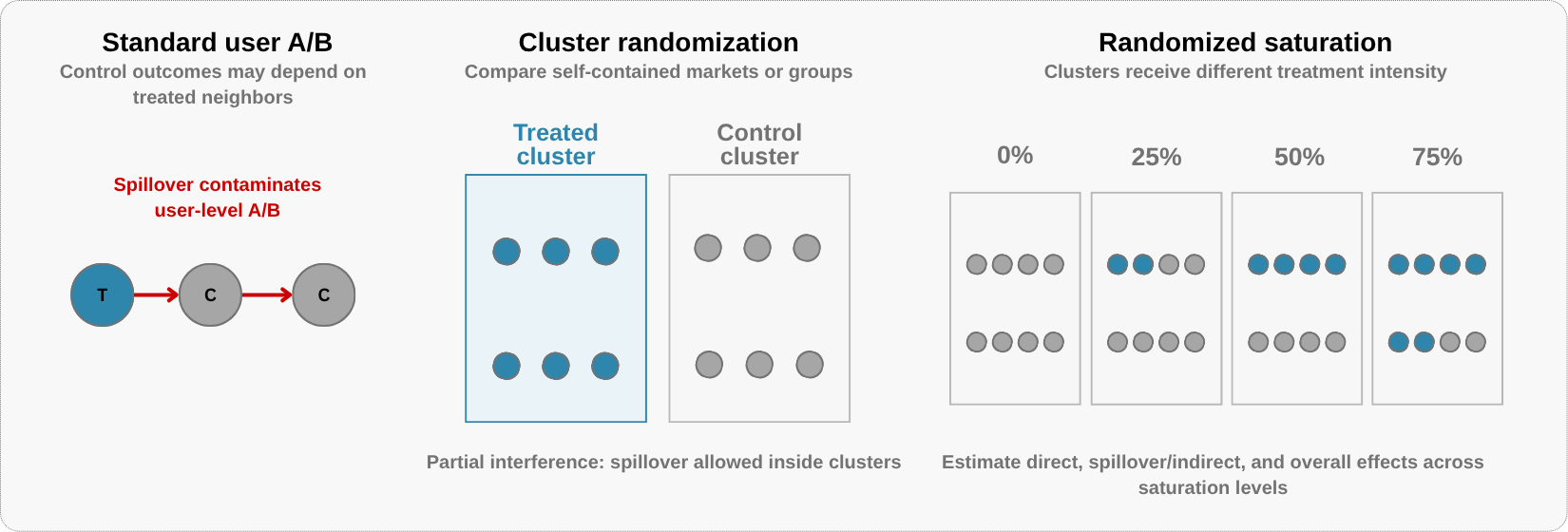
As Section 4.1.1.2 explained, cluster-randomized experiments assign treatment at the group level—cities, schools, time slots, or marketplace regions—with the expectation that spillovers stay within clusters rather than crossing between treatment and control. This design depends on partial interference: units may affect others inside their cluster but not in other clusters (Sobel 2006; Hudgens and Halloran 2008). When clusters are self-contained, the comparison estimates the effect of changing the treatment strategy for an entire cluster.
Randomized saturation designs go one step further. First randomize clusters to different treatment intensities — for example, 0%, 25%, 50%, or 75% of eligible users treated — and then randomize individual treatment within each cluster. This variation in saturation lets the analyst ask how outcomes change as more of the local environment is treated (Baird et al. 2018).
Partial population experiments (Moffitt 2001) are a simple version of that idea. Some clusters are pure controls, while treated clusters expose only a fraction of eligible users. This creates three comparison groups:
- Users who got the feature.
- Users who did not get the feature but whose neighbors did — they might be affected by spillovers.
- Users in a completely separate environment where nobody was treated.
The comparisons are not as simple as “treated versus pure control equals the total effect.” Treated versus untreated users inside the same treated cluster gives the direct effect at that saturation. Untreated users in treated clusters, compared with pure controls, gives the indirect effect — the spillover onto the non-treated.
Stack the two and you get the total effect: a treated user in a treated cluster against an untreated user in a pure control cluster. Average across everyone in the cluster instead, treated and untreated alike, and you get the overall effect — what the whole market gains from running at that saturation. These are the direct, indirect, total, and overall effects — carried over from the epidemiology literature and put in potential-outcome terms by Hudgens and Halloran (2008), alongside the randomized saturation design trade-offs studied by Baird et al. (2018).
Those group comparisons are how you estimate the four effects, not how they are defined. Hudgens and Halloran (2008) define each one against an allocation strategy — a rule such as “treat a random half of every cluster” — and average each user’s outcome over every treatment pattern that rule could produce, not just the one your experiment happened to draw. That has a consequence: each effect is tied to a saturation level, and each number tells you what the policy delivers on average the next time you run it, not what happened to the particular users treated this time.
Cluster randomization estimates what happens when the treatment strategy changes for an entire market. Randomized saturation estimates how effects change as more of the local environment is treated. Partial population designs separate the direct effect on treated users from spillovers onto untreated users nearby.
Figure 15.6 summarizes the design shift: standard user-level A/B testing assumes away spillovers, cluster randomization relies on partial interference, and randomized saturation designs deliberately vary exposure intensity.
The profile boost lesson
A professional networking platform introduces “profile boost,” a feature that increases a user’s visibility in search results and activity feeds. A standard user-level A/B test measures +15% profile views and +10% connection requests for boosted users, which the team reads as evidence that the feature works.
But the platform’s feed has limited real estate. Every boosted profile shown is an unboosted profile pushed further down the page. The test measured a redistributive effect — treated users gained visibility at the direct expense of control users — and the standard design could not detect it because it attributed control-group losses to normal variance.
At full rollout, the boost applies to everyone, the redistribution may net out, and the apparent lift can vanish. The team may have shipped a feature that cost engineering months and produced little incremental engagement.11
A market-level cluster-randomized design is built for that question. Randomize the boost at the city or market level, compare total engagement across boosted and unboosted markets, and the experiment can test whether the feature creates aggregate value rather than merely reallocating attention inside the same market.
The assumption shift
Interference-aware methods do not eliminate assumptions; they replace “no interference” with an explicit interference structure. Cluster and randomized saturation designs usually assume spillovers stay inside clusters, so if users across cities interact — a recruiter in a treated city searching for candidates in a control city — the design leaks, and the analysis is left with a precise estimate of the wrong exposure contrast.
These designs also carry the power trade-off from Section 4.2.3. Effective sample size tracks the number of clusters, not users, so a platform with ten million users but only 40 viable city-level clusters has far less precision than its user count suggests. Randomized saturation adds another trade-off: the variation that identifies spillovers reduces precision for simpler pooled effects, especially when outcomes are highly correlated within clusters (Baird et al. 2018).
TipThe diagnostic question
Before any experiment on a networked platform, ask: can one user’s treatment plausibly change another user’s outcome? If the answer is yes — and on marketplaces, social networks, and shared-resource platforms, it often is — standard user-level randomization may not answer the policy question you care about. The design and estimand must account for interference.
Kohavi et al. (2020), Chapter 22 (“Leakage and Interference between Variants”), offers design guidance for product teams facing these trade-offs.
Local spillovers (treating user A directly changes user B’s outcome through a network connection) and equilibrium effects (treatment shifts market-level prices, wait times, or inventory that affect everyone) require different designs. Cluster randomization can handle local spillovers when the cluster contains the relevant network. Equilibrium effects operate through market mechanisms that may not respect cluster boundaries (Kohavi et al. 2020).
My own read is that this sets a higher bar: for equilibrium effects the cluster has to be large enough to behave like its own market, a stronger requirement than merely containing a social graph. Perfect isolation is rare either way — Kohavi and coauthors report that cutting the LinkedIn graph into ten thousand clusters still left over 80% of connections crossing between them.
Getting the causal estimate right — whether by accounting for interference, adjusting for confounding, or handling sequential treatments — is necessary. But it is not the final step. Once you know how effects vary across users, the question becomes operational: given a fixed budget, who should you actually treat?
15.2.3 Policy learning and optimal treatment assignment
From “what is the effect?” to “what should we do?”
Up to this point, nearly every analysis has answered the same question: what is the causal effect? That is the right question for understanding how the world works. It is not the right question for deciding what to do next.
Policy learning turns heterogeneous effect estimates into assignment rules. Chapter 12 introduced the idea with a policy tree that converted CATE estimates into a short targeting rule; this section explains the theory behind that move. The decision is which assignment rule maximizes total impact.
Without policy learning, targeting is a manual exercise: the analyst eyeballs subgroup effects, draws a few threshold rules, and recommends whom to include. That works when you have three segments and one intervention. It breaks down on a digital platform with fifty million users, a dozen possible interventions, budget constraints, and assignment rules that must remain simple enough for people to review. Policy learning formalizes and automates that judgment.
How policy learning works
Suppose you have a score for the value of treating each user, built from conditional treatment effect estimates, costs, and correction terms for how the data were collected. The simplest rule is a threshold: treat when the predicted gain exceeds the cost. That rule is useful, but it is only one policy in a much larger class.
Policy learning (Athey and Wager 2021) generalizes it. Instead of committing to one hand-built threshold, the analyst pre-specifies a class of allowed policies — linear rules, say, or finite-depth decision trees — and the algorithm picks the rule in that class with the highest estimated value. The policy class is where constraints live: budget, fairness, simplicity, functional form. Restrict it to shallow trees and the result reads like this:
“Offer the trial if usage_frequency > 3 sessions/week AND days_since_last_session < 14 AND content_categories_watched > 5.”
That is the same kind of object as the policy tree Chapter 12 fit to the coupon data: a short set of if-then rules the product team can inspect, question, and override. Interpretability is not automatic, though — it comes from restricting the policy class.
The hard part is that you cannot directly test a new assignment rule against reality because you only know what happened under the old rule. The algorithm must estimate what would have happened if you had assigned users differently. Athey and Wager build the policy-learning objective from doubly robust scores — the same pairing of outcome modeling with propensity weighting behind the DR-learner earlier in this chapter, and the construction Chapter 12 recommended as the policy tree’s reward input — while earlier work in computer science used doubly robust estimators for policy evaluation and learning (Dudík et al. 2011). The causal toolkit is repurposed here for a decision problem.
But the evaluation step is fragile. These methods still need support in the historical data: for the users and actions the new rule would choose, the old data-generating process must have assigned those actions with enough probability to learn from them. If the proposed policy moves far outside that support, the value estimate can become unstable no matter how attractive the point estimate looks. Before committing resources, check overlap and the reliability of the propensity and outcome models used to build the policy value estimate.
A streaming platform example
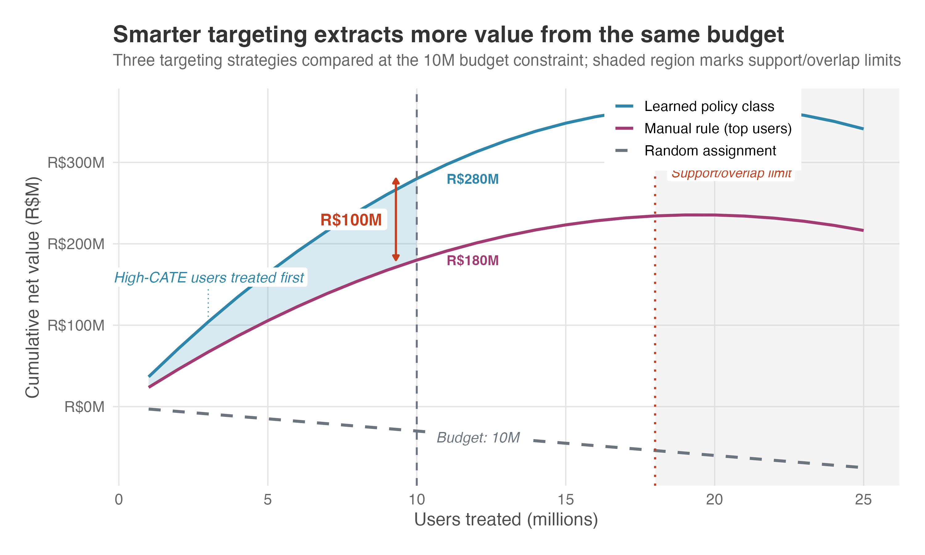
A streaming platform tests free premium trials costing R$15 each. The average effect on 12-month conversion is +4 percentage points, so treating all 50 million eligible users costs R$750M for an expected R$600M in incremental revenue — a net loss, and the experiment looks like a failure.
But a causal forest shows the effect varies sharply: +12 points for users who already watch daily, barely +1 for those who open the app once a month. With budget for 10 million trials, a manual “top users” rule captures some of that, but misses the medium-usage users whose content preferences and session recency mark them out and no simple threshold would flag. Policy learning optimizes the assignment directly, and the gap lands in the money: R$280M in net revenue against R$180M from the manual rule (Figure 15.7), on the same budget.
Fragility and fairness
This next point is my concern rather than a result from the policy-learning papers: optimal assignment can systematically exclude users whose predicted effects are small but positive — often the same populations that already receive less investment from the platform. At scale, that pattern compounds.
This is a design choice that belongs in the policy class and objective, not something bolted on once the algorithm has already optimized for revenue. The policy-learning papers explicitly allow constraints such as fairness, budget, simplicity, and functional form. That does not make fairness automatic; it means the analyst has to state the constraint before optimization and then accept the efficiency trade-off it creates.
WarningThe policy is only as good as the metric it maximizes
The assumptions underneath policy learning inherit the identification assumptions behind the policy value scores — if the outcome model, propensity model, or observational design is biased, the policy that optimizes over those scores will be confidently wrong. And the objective function itself carries risk: optimizing short-term conversion may select users who subscribe and churn at month two, generating cost without value.
The assignment rule may not travel well because it was optimized for a specific group of users at a specific point in time. If the deployment population has a different user mix, competitive environment, or season, the learned rule may underperform the naive baseline it was designed to beat.
Cross-validation is essential here, because overfitting does not just mean poor out-of-sample prediction — it means systematically misallocating resources. Zhou et al. (2023) — whose exhaustive tree search underlies the policy tree in Chapter 12 — extend the policy-learning framework to offline settings with multiple treatment actions, unknown propensities, and policy classes constrained to decision trees. That is closer to the reality most platforms face, where the question is not just who should receive the intervention, but which of our interventions this user should receive, on this budget, with the data we actually have.
Policy learning, like every method before it, takes the effect as a settled quantity — something to estimate and then act on. It never asks why the treatment works, only how large the effect is and for whom. That leaves one final piece of the standard setup unopened: the effect itself.
15.2.4 Mechanisms and mediation
From “how big” to “how”
Every effect-estimation method in this book answers how large the effect is, often with a number and an interval. The discount lifts orders by 0.3; the redesign raises retention by six points. Neither estimate explains why the outcome moved or which channel carried the effect.
That question is the study of mechanisms, and its workhorse is mediation analysis. The variable the effect travels through — the intermediate step on the causal path from treatment to outcome — is called a mediator. A causal mechanism, in Imai and coauthors’ words, is “a process whereby one variable causally affects another through an intermediate variable” (Imai et al. 2011).
Mediation analysis estimates how much of the effect runs through the channel you specified and how much follows another route. Pearl and Mackenzie (2018) devotes a chapter to it.
Direct and indirect effects
The central move is a decomposition. The total effect of a treatment splits into two pieces: an indirect effect that flows through the mediator, and a direct effect that does not. As VanderWeele puts it in his practitioner’s guide, “the total effect is the sum of the direct and indirect effects” (VanderWeele 2016).12
Their formal counterparts — introduced in counterfactual terms as the pure direct and total indirect effects by Robins and Greenland (1992), then renamed natural by Pearl (2001) — are the natural indirect effect and the natural direct effect. Each moves one thing and pins the other, and which one gets pinned matters — it is what makes the two add up to the total effect. For the indirect effect, switch the treatment on and leave it on, then move only the mediator from where it would have sat without treatment to where treatment puts it: whatever the outcome does is the part traveling through the channel. For the direct effect, pin the mediator at its no-treatment value and switch the treatment on: whatever the outcome does now is the part that took some other route.
The decomposition is the whole point. Two features can each lift retention by the same six points and call for opposite roadmaps — one because it removed friction, the other because it was merely novel. The headline effect cannot tell them apart. The split can.
The mediator trap
The obvious way to isolate the direct effect — drop the mediator into your regression as a control and read the treatment coefficient — is biased, sometimes badly enough that a channel which helps comes out looking harmful and the direct effect lands larger than the total effect (VanderWeele 2016). The mediator, unlike the treatment, was never randomized, so any unmeasured factor that drives both the mediator and the outcome leaks straight into that coefficient.
And even with that confounding ruled out, a single treatment coefficient is not a general direct effect once treatment and mediator interact — it pins the effect at one value of the mediator, and says nothing about the rest.
Robins and Greenland (1992) established this decades ago, and VanderWeele states the implication directly: “we get nonsense from the traditional approach if we ignore mediator-outcome confounding” (VanderWeele 2016). The familiar regression “causal steps” ritual has no defense against it.
You have met this trap from the other side. Back in Chapter 6 the rule was don’t condition on a mediator, because doing so blocks the very path you want when you are after the total effect. Mediation analysis is what you reach for when that path is the question — and getting the answer right takes more than toggling a control variable in and out of a regression.
A language-learning example
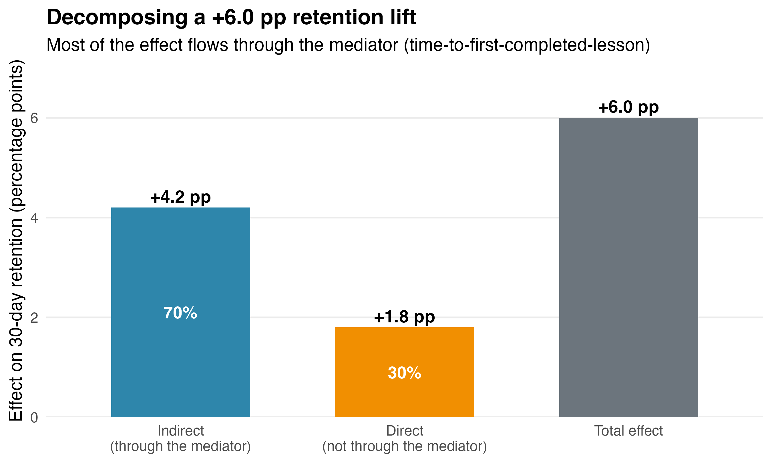
A language-learning app redesigns its lesson flow, and a randomized experiment shows that 30-day retention rises by 6 percentage points. Leadership cares less about the six-point lift than whether the next quarter should invest in more of the same. The team therefore measures the suspected mechanism: time-to-first-completed-lesson, or how quickly a new user finishes their first lesson.
Mediation analysis decomposes the lift (Figure 15.8). About +4.2 points — roughly 70% — is the indirect effect running through that mediator: the redesign got people to an early win faster, and the early win is what kept them. The remaining +1.8 points — about 30% — is a direct effect the mechanism does not explain, plausibly a one-time novelty bump.
If the durable mechanism carries most of the lift, you scale the friction-reduction pattern to every onboarding flow you own. If it were mostly the novelty residual, you brace for the effect to decay and stop crediting the redesign for it.
The assumptions, and how to stress-test them
None of this is free. The decomposition leans on a demanding assumption, and one you mostly cannot check. To read the indirect effect as causal, you must assume there is no unmeasured confounder of the mediator–outcome relationship — and this holds even in a randomized experiment. Randomizing the treatment buys you a clean total effect; it does nothing for the mediator, because users were never randomly assigned their time-to-first-lesson.
The formal name is sequential ignorability, and it is stricter than it sounds: the covariates you adjust for have to be pre-treatment. A confounder of the mediator–outcome link that the treatment itself moved — the redesign changing who contacts support, say — breaks the assumption even when you measured it. Imai, Keele and Yamamoto are candid that it “cannot be directly tested even in randomized experiments” (Imai et al. 2010).
So the discipline is not to assert the assumption but to stress-test it. A sensitivity analysis asks how far an unmeasured confounder would have to bend the data before your 70/30 split collapsed — and the same paper supplies a usable one, sweeping a single correlation parameter and reporting how the mediation effect moves (Imai et al. 2010).13
Treat a decomposition that survives only under implausibly clean assumptions as a hypothesis, not a finding. Hernán and Robins (2020) (Chapter 23, “Causal mediation”, in the online edition) is the place to go for the full catalog of what can go wrong, and Celli (2022) reviews how mediation dovetails with the identification strategies you already know — instrumental variables, difference-in-differences, synthetic control — when the mediator itself needs an identification argument.
Asking how an effect happens, not just whether it does, is the most demanding version of the question this whole book has been training you to ask. It is a fitting place to end the tour — which brings us back to where we started.
15.3 Concluding our journey
Before closing, I want to introduce a companion for putting the book’s lessons into practice.
15.3.1 A companion to practice with
The through line of this book was never the code. A coding agent can already write the regression for you — point it at a table, ask for the effect of an intervention, and it hands back a script and a starred coefficient in minutes. But unlike predictive machine learning, where a held-out metric scores the model, causal work has no scoreboard.
You can trust the output only by auditing whether the method fits, its assumptions were checked, and the treatment effect was interpreted consistently with those assumptions. That auditing reflex is the craft this book has taught, so I built it into the agent’s workflow.
An AI skill is a set of instructions your coding agent loads into its context before handling a specific kind of task. A plugin is a bundle of related skills installed at once.
everyday-causal-skills is a plugin of fourteen skills for Claude Code, Gemini CLI, GitHub Copilot CLI, Codex CLI, and Cursor. It can support brainstorming and planning or map a full evaluation after you answer its questions. The plugin recommends a method, checks its assumptions, writes estimation code in R and Python, stress-tests the result, and interprets it in plain language.
Its guardrails are concrete and grounded in the literature: /causal-rdd will not move past assumption-checking until the density manipulation test has run on your running variable (Cattaneo et al. 2020); /causal-iv reads back the first-stage F before it trusts an instrument; /causal-did flags pre-trends that are not flat; and /causal-auditor stress-tests a finished analysis across five threat categories to flag what you missed.
They run as a five-stage workflow: plan the analysis, choose and implement a method, stress-test the result, translate it into money, and report it — with /causal-exercises beside the planning stage as an optional practice path that generates realistic data with a known true effect.
Table 15.1 lists all fourteen, what each one does, and where this book teaches the reasoning behind it — so when the agent’s output raises a question, you know which chapter to go back to.
| Skill | What it does | Where in this book |
|---|---|---|
/causal-planner |
Turns a causal question described in plain language into a method recommendation and an analysis plan | Chapter 3 |
/causal-dag |
Maps causal relationships, finds adjustment sets, and detects bad controls | Chapter 6 |
/causal-experiments |
Designs and analyzes RCTs and A/B tests: power analysis, randomization checks, balance diagnostics | Chapter 4 and Chapter 5 |
/causal-did |
Difference-in-differences, including staggered adoption, TWFE, and event studies | Chapter 9 and Chapter 10 |
/causal-iv |
Instrumental variables with 2SLS, weak-instrument diagnostics, and exclusion checks | Chapter 7 |
/causal-rdd |
Sharp and fuzzy regression discontinuity with bandwidth selection and manipulation tests | Chapter 8 |
/causal-sc |
Synthetic control with donor weighting, pre-treatment fit diagnostics, and placebo tests | No dedicated chapter; Chapter 3 discusses when to reach for it, Chapter 9 briefly introduces synthetic DiD, and Chapter 13 covers its placebo logic |
/causal-matching |
Propensity score matching, IPW, and doubly robust estimators with balance diagnostics | Chapter 6 and its IPW appendix |
/causal-hte |
Heterogeneous treatment effects with causal forests, DML, and policy learning | Chapter 12 and Section 15.2.3 |
/causal-timeseries |
Interrupted time series and CausalImpact with pre-period validation | Chapter 11 |
/causal-auditor |
Stress-tests a completed analysis against five categories of threats to validity | Chapter 13 |
/causal-roi |
Translates an estimated effect into money: incremental ROI, breakeven, a projection waterfall, and a ship/stage/size/kill verdict | Chapter 14 |
/causal-report |
Compiles the analysis into a structured report in business, academic, or hybrid mode | Chapter 13 (the credibility memo) and Chapter 14 |
/causal-exercises |
Generates practice problems with simulated data and known ground truth | The method chapters throughout the book |
One caveat from the plugin’s own documentation is worth repeating here: /causal-dag helps you organize your domain knowledge into a formal graph, but it cannot supply the subject-matter expertise that makes the graph credible. Its output encodes your assumptions; it does not validate them.
/causal-roi automates the translation discipline Chapter 14 teaches: it pins down what the estimate measures and which population it covers before any money math, walks a projection waterfall from the naive number to the honest one, reports ROI as a range, and refuses to invent decay rates, margins or discount rates — they come from your data or your finance team, or the verdict is withheld.
The point of practicing this way is that the answer is known going in. Start with /causal-exercises and you get a problem with planted ground truth: you watch the workflow recover it end to end, and that is what earns your trust on the next question, where the truth is hidden.14 If you already have a live causal question, start with /causal-planner instead and describe it in plain language. To install it into Claude Code:
/plugin marketplace add RobsonTigre/everyday-causal-skills
/plugin install everyday-causal-skills@everyday-causal-skills
/reload-plugins
Other agents install differently; the GitHub repository covers Gemini CLI, GitHub Copilot CLI, Codex CLI, and Cursor.
The goal is to make the resulting estimate auditable and defensible.
15.3.2 Final words
This book started with the premise that causal inference is a way of thinking rather than a catalog of techniques. What we built is not one more method but a reflex: distrust numbers from the start, ask how the data were generated, and embrace uncertainty instead of rushing past it.
Before this book, a “statistically significant” result might have been the end of the conversation. Now you know that significance is not the same as correctness or relevance, and an estimate without an identification strategy behind it is just a number conveying false confidence.
The field will keep moving—new estimators will arrive, assumptions will be relaxed, and today’s new tools will become standard. Much of the specific material will age. The habit of questioning the data-generating process and assumptions before choosing an algorithm will not.
And if any of the subareas in this chapter or in this book caught your attention, start there. Follow the references, discuss them in forums or with an AI companion of your choice — the plugin above is one — or go the traditional route of books and papers.
And thank you for trusting me with your time.
As Google advises, “NotebookLM can be inaccurate; please double-check its content”. I recommend reading the chapter first, then listening to the audio to reinforce what you’ve learned.↩︎
Each equation is a mini data-generating process. Together, they define how the world produces the data you observe.↩︎
A variant called FCI (Fast Causal Inference) relaxes the “no hidden variables” requirement and can handle unobserved confounders — but the more unobserved structure there is, the more ambiguous the output becomes, leaving more edges undecided.↩︎
In practice, K-fold cross-fitting improves finite-sample performance — the two-fold version here is for exposition. Chernozhukov and coauthors report that 4 or 5 folds work well on medium-sized datasets, and that a larger number of folds works better on small ones (Chernozhukov et al. 2024).↩︎
Production-grade implementations of DML, meta-learners, and uplift models are available in open-source libraries such as Microsoft’s
econmland Uber’scausalml.↩︎The stylized numbers are fully reproducible. The prior is Normal with mean 3 and standard deviation 1.5, informed by the three historical lifts of +2, +3, and +5 points — their average is 3.3; the prior center rounds that to 3. The current experiment enters as a Normal likelihood with mean 2 and standard error ≈ 1.36 — the value at which a two-sided test gives exactly p = 0.14. The conjugate update — prior and likelihood are both Normal, so the posterior has a closed form — yields a posterior with mean 2.45 and standard deviation 1.01, so the probability of the effect exceeding 1 percentage point is ≈ 93%; under a flat prior the posterior is the likelihood itself, giving ≈ 77%. Treat that prior as illustrative rather than estimated: the spread of three past point estimates is not the same quantity as uncertainty about the current effect, and pinning it down properly would need those experiments’ standard errors and a hierarchical model that separates true variation between experiments from ordinary sampling noise.↩︎
BART is implemented in the
BARTpackage in R, withbartCausewrapping it for causal estimands, and inpymc-bartin Python.↩︎The
bcfpackage in R implements the Bayesian Causal Forest specifically; the BART packages above do not.↩︎Convergence diagnostics — checking that the sampler has explored the posterior thoroughly — are mandatory, not optional.↩︎
Dynamic treatment regimes are the strategies themselves: sequences of decision rules that adapt treatment to a person’s history. Designs such as SMART trials and methods such as Q-learning help develop or learn those regimes; g-methods such as the g-formula, IP weighting/MSMs, and g-estimation help evaluate treatment strategies under the relevant assumptions.↩︎
Blake and Coey (2014) document this kind of test-control interference on eBay, in an email campaign that alerted bidders to auctions about to close. Because the supply of items was fixed, revenue the emails appeared to generate was partly revenue reassigned from control users who would have bought anyway — inflating the measured effect by roughly a factor of two. Whether the bias runs up or down depends on how elastic demand is.↩︎
The identity is exact for the natural effects defined next, and only when they are defined as a complementary pair — the direct effect holding the mediator where it would have sat without the treatment, the indirect effect measured with the treatment switched on. Other pairings, and the controlled direct effect, do not add up this way.↩︎
The decomposition is dual-coded; the sensitivity analysis is not. In R, the
mediationpackage implements the natural direct/indirect decomposition with the correlation-based sensitivity analysis built in (Tingley et al. 2014). In Python,statsmodels.stats.mediation.Mediationports the decomposition, and DoWhy estimates natural direct and indirect effects — and the front-door estimator from the structural-causal-models section — directly (Sharma and Kiciman 2020). Neither Python option ships the sensitivity analysis, so stress-testing the assumption means reaching for R.↩︎A full session is walked through in Guardrails for causal analysis with AI agents: a marketplace feature rolled out region by region, with a planted effect of 5.30 GMV per user that
/causal-didrecovers at 5.41 using the Callaway–Sant’Anna estimator (Callaway and Sant’Anna 2021), where a naive two-way fixed-effects regression reports 4.54.↩︎